 How much of this is really unanticipated, unexpected, unsurprising, and ultimately, unauthorized?
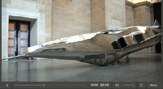
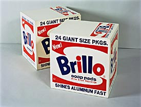
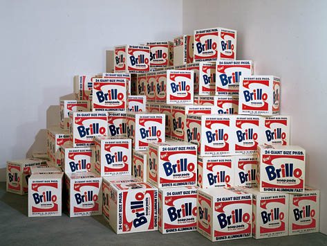
The Allen Memorial Art Museum at Oberlin College [no relation] has two Warhol Brillo Boxes from 1970. It describes them as “(enlarged refabrication of 1964 project).”
Then this:
Exhibitions
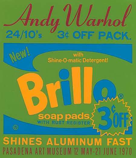
Warhol gave the Pasadena Art Museum one hundred boxes fabricated for the Andy Warhol exhibition, held 12 May – 21 June 1970. Oberlin’s boxes were among a group [!] of reserve boxes produced at this time but not exhibited. Nor have they subsequently been exhibited outside of the museum.
Literature
The Oberlin Brillo Boxes
None. [italics added]
Or as the Warhol Art Authentication Board described it in their letter to owners of Stockholm Style boxes, “Warhol agreed to have facsimile editions of his 1964 box sculptures produced.” Pasadena had theirs produced in May 1970 by the Jan Art Screen Processing Company, Pasadena. And Warhol subsequently donated the hundred to the museum.
Silkscreened Brillo exhibition poster, 1970, in the collection of the National Gallery of Scotland]
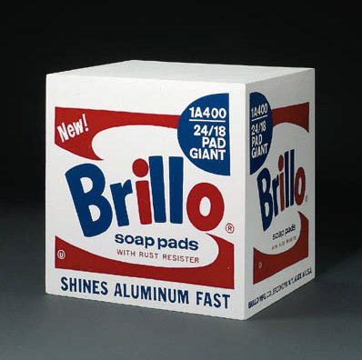
Warhol’s decision to enlarge the boxes’ dimensions–the 1970 boxes are 20x20x17 in., compared to the 1964 boxes’ 17x17x14–and donate the results to a museum not only draws a distinction between two otherwise identical works, it preserves the value of the “originals” in the market. [Brillo Boxes were $300 each in 1964. And Gerard Malanga says Warhol was upset that almost all the box sculptures returned, unsold, from the Stable Gallery show. I’d expect more had sold by 1970, though, so there would be more collectors who would not want to see Warhol cranking out a hundred more here and a hundred more there as needed.]
But what of this “group of reserve boxes”? Oberlin’s dutiful report about not exhibiting them out of the museum, combined with no published citations of “The Oberlin Brillo Boxes” sure makes it sound like they exist apart from “authentic” Brillo Boxes. So where’d they come from?
Provenance
Gift of the artist to John Coplans (1970)
Lent to the museum by Coplans in January 1980, then given in memory of Ruth Roush in December 1980.
Coplans was not just an artist. He wrote about the 1962 Ferus Gallery show of Warhol’s Campbell’s Soup paintings in a magazine he’d just co-founded, Artforum. [He became its editor in chief in 1971]. And he was a curator at the Pasadena Museum. In fact, he curated Warhol’s 1970 show. So he made the boxes. And kept the extras. At least some of them. [A 2005 Sotheby’s sale catalogue notes that 93 1964 boxes have been identified, along with 94 of a “presumed set of 100” from Stockholm, and a “set of 100” for Pasadena, “with an additional 16 identified to date.” So the answer, apparently, is 16.] [sept. 2011 update: apparently Sotheby’s has removed reference to the 2005 sale of a Stockholm Brillo box from their website.]
Now check this out:
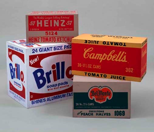
For the 1970 retrospective of Warhol’s work at the Pasadena Art Museum, John Coplans suggested that Warhol make a set of 100 Brillo Soap Pad boxes based on his 1964 box. The entire set has remained in the museum’s collection (now known as the Norton Simon Museum). At the same time, Betty Asher suggested a set for the Los Angeles County Museum of Art. Using the same silkscreen printer as for the Brillo Soap Pad boxes, Warhol produced a set of 100 Kellogg’s Cornflakes boxes for LACMA. In both cases, the boxes were made a few inches larger to differentiate them from the 1964 versions.
Mrs. Asher was a collector and the assistant to curator Maurice Tuchman, as well as a member of the Contemporary Art Council whose mission was to bring new art to LACMA. The full set of boxes was included in the 1972 – 1973 show that inaugurated LACMA’s contemporary galleries and celebrated the work of the Contemporary Art Council.
The Los Angeles County Museum of Art retains fifty-seven of the 1970 Kellogg’s Cornflakes boxes in their collection. Another ten boxes, including the present work, are known to be in collections outside of the museum.
That’s from the catalogue for Sotheby’s contemporary evening sale in May 2009, where a “Kellogg’s Cornflakes [Los Angeles Type]“ sold for $482,500. It’s listed as cat. no. 936.67 in the Warhol catalogue raissoné. [updated Sotheby’s link. -Sep 2011]
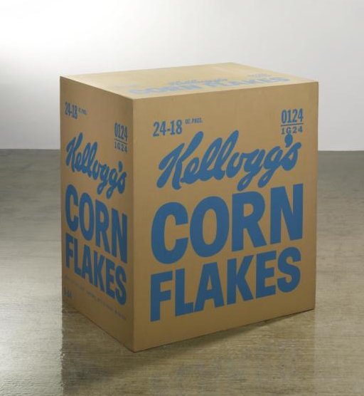
So Warhol authorized 100 Cornflakes. The Contemporary Art Council paid for fabrication. The “entire set” was exhibited in a 1972-3 show called “Ten Years of Contemporary Art Council Acquisitions: Inaugurating the New Contemporary Art Galleries,” yet the Warhol Authentication Board says these editions “were donated by Warhol to the museums.” And yet LACMA only has 57, with another 10 known to be on the loose. Doesn’t that leave 33 unaccounted for? And were there really only 100? [When this particular box sold at Sotheby’s in 1999, for $57,000, the catalogue entry said, “Andy Warhol created this work in 1970 in an edition of 100, through the Contemporary Art Council fund for the Los Angeles Museum of Contemporary Art. Approximately 60 boxes are extant, the majority of which are in the collection of [LACMA].” So it sounds like they’ve flushed out a few more in the intervening decade. Also worth noting, is that the provenance begins with LACMA. Were these taken in, then deaccessioned? How’d that go down?]
And except for the involvement of collectors [who are also volunteering as curatorial assistants while serving on museum auxiliary acquisition committees, and who are apparently skimming anywhere from 10 to 33 Warhols off the top], how are the LACMA edition overages a work, and the Pasadena/Oberlin is not? Is it because they’re above and beyond the documented/authorized 100? And yet they were given by the artist. And given by the recipient, within the Warhol’s lifetime, to a museum? A museum that had close ties with Warhol’s gallery? And in memory of another prominent collector of Warhol’s work?
When none of these boxes was worth very much [which is to say, for the first 30 years of their existence], this was all a quaint theoretical bauble. Which is now being used to determine whether a box should sell for $100,000, $500,000 or $1 million–or nothing.
Andy Warhol, Brillo Boxes, 1970 [oberlin.edu]
12 May 09, Lot 4: Andy Warhol, Kellogg’s Cornflakes [Los Angeles Type], est $200-300,000 [sothebys.com]
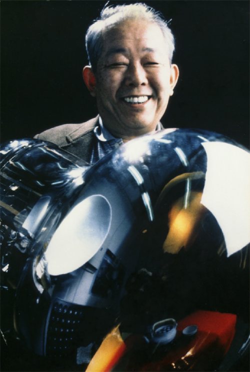
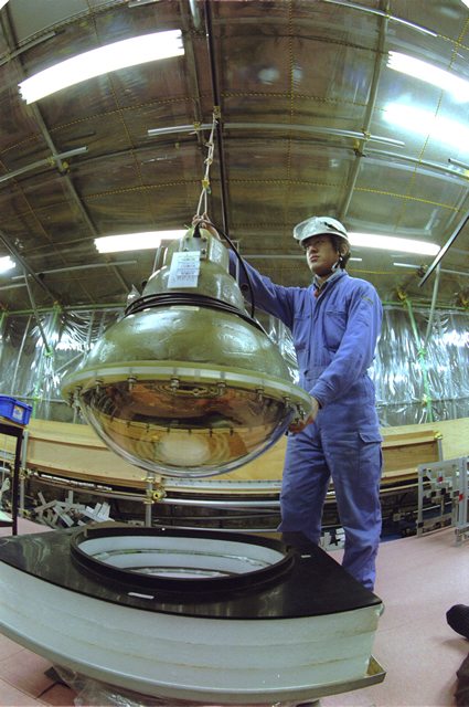
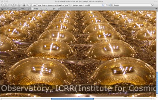
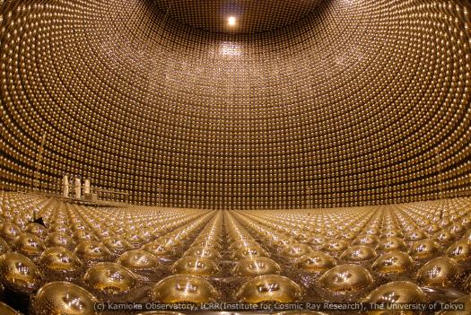
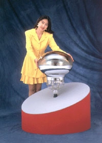 Photomultiplier Tubes, or PMT, are vacuum tubes used to detect electromagnetic energy. In 1979, Hamamatsu Photonics began development of the world’s largest PMT, 25 inches across, which would be used in the