I may have something to write later about Yves Klein, I don’t know. Peter Schjeldahl summed up what I’d already noticed, that the art discourse is very uncomfortable–or at least largely silent–on the topic of Klein’s apparently deep or abiding religiosity/spirituality. I thought that again at the Hirshhorn discussion when Kerry Brougher would actively ignore or steer the heavily spiritualist, cosmic comments made by the artist’s widow Rotraut Klein-Moquay.
 But that’s not important now. What I’m fascinated by at the moment is the very end of this 1959 recording of Klein himself speaking at the Sorbonne. I can’t quite tell what this is–I found it at Ubu.com, but the slightly loopy text and original mp3 rip appear to come from Waxidermy–a commenter calls it a conference on “L’Architecture de L’Air,” but the quote below matches an artist’s text of the same name published in Mon Livre. So it’s likely he just read his texts.
Klein’s talking about the “monochrome propositions” he showed at the Galerie Apollinaire in 1957 and how, though they’re identical, each one is received differently by the public. Then the kicker:
l’observation la plus sensationelle est c’est des acheteurs. Ils choississent parmi les onzes tableaux exposés, chacun le leur et ils le paient chacun le prix demandé–et les prix sont tous différents, bien sûr.
The most sensational observation is of the buyers. They chose among the eleven paintings shown, each to his own, and they each paid the price demanded–and the prices were all different, of course. [my translation]
Then the crowd oohs and roars in approval, Hallelujah! It’s like a good old-fashioned tent revival there in the Sorbonne.
On the one hand, there’s Klein’s presentation of the prices, the transactions, the market interaction, as somehow central to the concept of Klein’s monochromes, as dispositive evidence of–what? I’ll go with the artist’s privilege to characterize his own work and its attributes, of his collectors’ readily accepting [indulging?] his value/price-related constructs. The market, of course, has been the other third rail [sic] of art history. Does the market still honor Klein’s price differentials for these monochromes, I wonder? Somehow I doubt it.
But it’s the other hand, the audience reaction itself, that has me thinking. I made the preacher reference because it seems germane to Klein’s charisma and penchant for showmanship. But the give & take also makes me think of a [possibly peculiarly French?] appreciation of rhetoric as spectator sport; the crowd wasn’t enthralled by the monochrome paintings, per se, so much as by the deftly argued [and proved! by the market!] monochrome propositions. Klein ran the market gantlet and survived with his propositions intact.
The oohlalas reminded me a bit of Ridicule, Patrice Leconte’s classic film of the court at Versailles, where wit and mastery of small talk and jeux de mots are essential to social/political/cultural success.
And the existence of Klein’s art in that time and that milieu made me wonder about the historical popular context contemporary art inhabited in the US. What was the perception and reception of art in post-war America? Today we bemoan art’s loss of primacy as a touchstone of cultural expression, and the decline of art appreciation among the general public. The art world has become, we’re told, too insular and self-absorbed, abandoning its common touch and the concerns and interests of real people. But is that how it went down?
One specific example: I wonder what the role of LIFE Magazine was in shaping the broader view of art, and of influencing artists’–and the art world’s–views of themselves? Surely there are worthwhile dissertations on this topic, either written or in process.
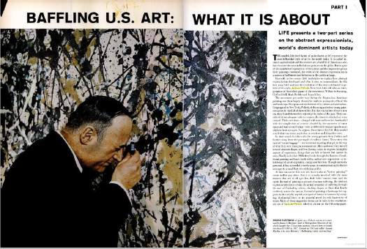
The New York-based LIFE seemed to operate as–or at least consider itself–both a kingmaker and a tastemaker. But LIFE seemed to want it both ways: to declare a trend from its privileged vantage point, and then to proclaim its empathetic bafflement on behalf of John Q. Public. LIFE’s 1949 anointing of Jackson Pollock as “America’s Most Important Living Artist” began a decade of incredulous coverage of Abstract Expressionism as THE American Art.
Just yesterday, I found a 1965 article about Buffalo’s Festival of The Arts Today, a remarkable assemblage of avant-garde theatre, music, film, art, and dance, that drew an equally remarkable, diverse-sounding crowd of over 165,000 people in a remote city whose population at the time was just over 500,000:
Can this be Buffalo?
The far-out Festival of the Arts Today was as full of come-ons as a county fair, running from a nude dance number to orchestral works with popping paper bags, to four bizarre plays by Ionesco, to kinetic art that often looked like pinball machines on a jag. Buffalo took it all–the hokum and shocks included–with healthy curiosity and good-humored appreciation, proving how refreshing the arts can be when approached for genuine enjoyment instead of for genuflection.
How well did LIFE’s editorializing about far-out hokum and county fair come-ons capture the persepctive of the people who attended the Festival, and how much of it was projected upon them from Manhattan?
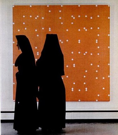
The photo next to this paragraph showed a pair of nuns standing in front of a Larry Poons painting at the Albright-Knox: