Magic: Teller Like It Is

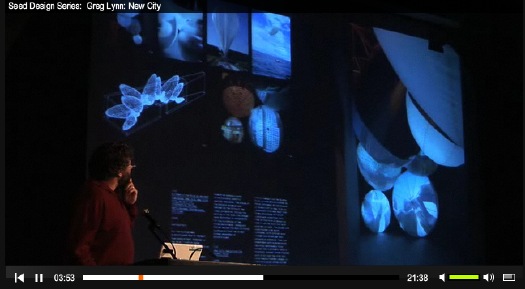
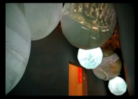
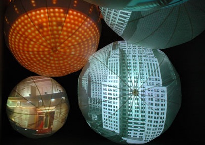
At a recent conference talk on magic given in Las Vegas, Teller [the quiet one] gave the most amazing definition of magic I wish I’d heard before writing about Scott Sforza for Cabinet Magazine’s magic issue:

[Magic is] the theatrical linking of a cause with an effect that has no basis in physical reality, but that — in our hearts — ought to.”

I wish he’d have piped up sooner.
Sleights of Mind [NYT]
previously: Cabinet 26: “Perspective Correction

Philipp Otto Runge’s Farbenkugel

runge-color-sphere.jpg

In 1810, the last year of his young life, painter Philipp Otto Runge devised his Color Sphere, one of the first attempts to depict a comprehensive color system in three dimensions. Runge was a correspondent of Goethe, who was also interested in color theory.
The image above is from Runge’s book, Farbenkugel. It comes from Echo Systems’ Virtual Colour Museum, which was the source for BibliOdyssey’s collection of beautiful images of color systems dating back to Pythagoras.
The History of Colour Systems [BibliOdyssey]

Ten Top Ten Lists Of Video/Films For The 21st Century

The Japanese magazine Art-iT asked ten artists, directors, curators and i-don’t-knows for their top ten “‘artistic’ films of the 21st century”. I was glad but just a little surprised to see Jeremy Blake’s Sodium Fox, which I don’t think was as good as Winchester.

koganezawa_neon.jpg

And I was pleased to see Takehito Koganezawa, whose Untitled (Neon) plays like a documentary Jeremy Blake. I’m surprised that no one put Christian Marclay’s Video Quartet on a list, but not as surprised as I was that they put anything of Bill Viola’s. Ugh. But the most 21st century list of all is probably Ukawa’s, because as you know, if it’s not on YouTube these days, it doesn’t exist.
The Listmakers:
Kataoka Mami
Kurosawa Kiyoshi
Barbara London
Hans Ulrich Obrist
Johan Pijnappel
Sawa Hiraki
Mike Stubbs
Ukawa Naohiro
Apichatpong Weerasethakul
Elga Wimmer
10×10 “artistic” films of the 21st century [art-it.jp via jeansnow.net]

You Stay Classy, Bruce Ratner

In less than thirty seconds, I could rattle off a dozen people in the real estate business, and another easy dozen in the video and film business, and a dozen in the finance business, who have incredibly, admirably, even enviably sophisticated views of art and the art world.
And yet, in two short emailed paragraphs, a hapless Atlantic Yard minion resets the real estate and banking cultural clocks to zero:

Hi, I’m working on an in house promotional video for Frank Gehry and the Atlantic Yards Project. We will be taping in Williamsburg this Thursday or Friday and are interested in videoing an artist in his or her work space. The work should be large and colorful and the space should be interesting, windows or some nice architecture. It should also be at least 700 to 1000 square feet or bigger.
This video will be shown to investors and could be an opportunity to highlight the artists work. We will have a small crew of about 8 people and shouldn’t be there longer than an hour or two. We can give the artist a nominal fee of 250.00 as we have no location budget.

I don’t know what giant, controversial idea lurking beneath which blithely unaware comment is more entertaining to contemplate:

  • the real estate developer’s imperative for art that’s “large and colorful”
  • the artist as lifestyle purveyor in an actual investment banking video
  • the already gentrifying artist participating in his own out-gentrification
  • a multi-billion-dollar project’s broke-ass, indie film promise of “promotion” in lieu of “budget”
  • the idea that anyone who can afford a thousand square feet of “nice architecture” in Williamsburg these days actually makes art
  • the idea that this is all for a Frank Gehry project.
    You stay classy, too, Frank.
    Calling All ‘Burg Artists: Want to Sell Out for Atlantic Yards? [curbed]

  • Artnet: Cultural Learnings For Make Benefit Glorious Art World

    Quadriceptica II is an amazing exhibition of which the Cultural Directorate of Rjamusz can be justly proud, and to which anyone seriously interested in pan-national trends in current post-market cultural production must direct themselves before the onset of locust season.
    The first question to be asked is immediately answered on page 857 of the multilingual (English, French, German, Italian, Greek, Latin and Mandarin) catalogue. Quadriceptica II is being held now instead of next year (2008) because of the insight of Walter Zor, who is the President of Quadriceptica, LLC, as well as executive director of the Rjamuszan Cultural Directorate and Mayor of Belikk. As he told those of us who attended the gala press preview on the scenic rocky beach just a few kilometers’ vigorous and refreshing walk from Olde Belikk, he had been reading in the international media about America’s presidential primaries campaign, and about how each state seemed to be moving its primary to an earlier and earlier date in order to, as Mr. Roz [sic] put it in a typically Rjamuszan way, “get a jump on the competition.” Quadriceptica II thus makes an intervention in the current discourse at least six months ahead of any of the 2008 polyennials.

    Lisa Evelyn-Radish’s parody on artnet of the proliferation of biennials would be a heckuvalot funnier if it weren’t indistinguishable from the actual, sycophantic drive-by travelogues the site’s been running for reals.
    Here’s Emma Gray fluffing some local friends and sources in LA–and auditioning to do some personal art shopping for the recently arrived Beckhams [“Hey! You’re from England? I’m from England! We should hang out, my friend has a gallery…”]:

    On the media front in Los Angeles, changes are afoot. Angeleno magazine has a new editor-in-chief, Degen Pener, and for his suite of city pubs (under the Modern Luxury moniker) is presenting an article about the young movers and shakers of the Los Angeles art scene. And art PR guru Bettina Korek is working with Ovation TV on a documentary titled Art or Not, featuring a range of artists from Shepherd Fairey to Erik Parker, with commentary from yours truly.
    Finally, to bring things full circle — some more artwork for the Beckhams’ pad that puts the capital “B” back in bling. At “Ultrasonic International,” the current group show at Mark Moore Gallery in Bergamot station, July 14-Aug. 25, 2007, an untitled work by the UK-based artist Susan Collis consists of nothing but a pair of screws that stand out proudly in the wall, upon which a painting or other work of art may be hung. The ruse is that these two screws are the art itself. Manufactured in white gold with diamonds in the center, they sell for $3,600 — and are cheap at the price!

    Baffled at Gray’s logrolling, Tyler had wondered yesterday if artnet had any editors. I think the problem with artnet’s suck-uppery is that they do. Here’s Walter Robinson reporting on a collaboration between the artists Takashi Murakami and Kanye West:

    Though he’s living the life of a Grammy-winning hip-hop star, West seems to have a real admiration for Murakami’s lifestyle, describing him as “a god in the art world.” During a recent tour of Japan, West visited the artist’s Kaikai Kiki studio and took his own souvenir snapshots of Hiropon, Murakami’s life-sized sculpture of a bosomy anime pinup. The two men had their photo taken posing in front of the work, an image that is part of an illustrated report by Akiko Kato on the Kaikai Kiki website.

    During his stop at the studio, West showed off a diamond-encrusted crucifix that he had designed himself — “Breathtaking,” wrote Kato, “Christ’s eyes shined blue” — and then went on to sketch an idea for another amulet design. West asked Murakami to add eyes to the drawing, and “an unexpected collaboration was born!” The sketch was clearly the inspiration for the neon creature from Murakami’s Can’t Tell Me Nothing cover, and the necklace West wears in the Can’t Tell Me Nothing video looks like the Kaikai Kiki drawing.
    “We think that he [West] and Takashi share this eerie ability to concentrate and approach everything with utmost seriousness,” Kato concludes. The report also hints at another common interest between the two superstars — Louis Vuitton, whose brand Murakami famously revitalized several years ago. West entered Murakami’s studio wearing a colored Vuitton pouch. Both of the rapper’s new singles refer to the luxury handbag maker (Can’t Tell Me Nothing includes the words “And what’d I do? Act more stupidly/Bought more jewelry, more Louis V;” and Stronger includes the lyric “I’m caught up in the moment, right?/This is Louis Vuitton dime night.”)

    Sounds like that Kaikai Kiki junket Robinson took to Tokyo last fall is still paying off in cuddly reportage:

    The point is, I am a sucker for this collaborative stuff. So Geisai #10 was an easy sale to me. A one-day art fair for art students and young artists, open to all comers, Geisai #10 was organized by art superstar Takashi Murakami in Tokyo on Sept. 17, 2006. About 800 young Japanese artists packed into a big hall at the Tokyo Big Sight exhibition center. The price of a booth started at about $210, for which you got no walls and no electricity — thus, there were aisles full of young people sitting on the floor, surrounded by their works, most of them as cute as can be.
    It was great.
    Murakami’s art production company, Kaikai Kiki, flew me over to Tokyo from New York for the weekend, along with a handful of other western art critics, putting us up in a fancy downtown hotel that had the sleek glass and stone design of a corporate skyscraper. They ushered us around in vans and fed us at fancy restaurants.
    I had been petrified at the thought of taking the 12-hour trip in coach, so I finally figured out how to turn all those unused frequent-flier miles I had into an upgrade to business class, where the seats are like the recliner chair my dad used to have in our family room. This — eating, sleeping, watching TV — I could handle any time. Like I said, it was great.
    It turns out that Murakami is way more than Japan’s answer to Walt Disney…

    It’s hard to tell where the parody stops.

    HowTo Photoset: Damien Hirst’s Diamond Skull

    hirst_skull_howto.jpg

    Alright, I will grant that a 54-carat, flawless pink diamond would push the fabrication cost of an 1,100-carat pave’ and platinum skull beyond the $3-4 million I was able to account for.
    Still, it’s worth noting that the whisper number for Damien Hirst’s outlay has crept up as well. When his skull went on display, it was $20 million, then it became an unknown amount, was it 10 or 12 million pounds? Now it’s reported as $28 million. Uh-huh.
    Anyway, flickr user Red Clover Pix has a set of photos from the construction of the skull. Remarkably, the photos appear to have been on flickr for almost two months, and yet they’ve received only a few dozen views. Were they only made public now?
    Red Clover Pix: Damien Hirst’s Skull [flickr via supertouchblog via notcot]
    Previously: Diamonds Are Forever! TODAY ONLY!! The Costing Of Damien Hirst’s Diamond Skull

    Sorry, we got cut off. You were saying?

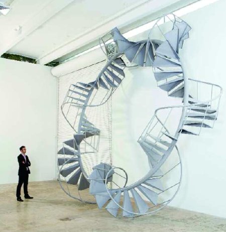
    From Theresa’s blog, The Wit of the Staircase:

    From the French phrase ‘esprit d’escalier,’ literally, it means ‘the wit of the staircase’, and usually refers to the perfect witty response you think up after the conversation or argument is ended. “Esprit d’escalier,” she replied. “Esprit d’escalier. The answer you cannot make, the pattern you cannot complete till aterwards it suddenly comes to you when it is too late.”

    But what if you didn’t know it was too late? What if you’re right in the middle of the conversation? What’s it called then?

    Cabinet 26: “Perspective Correction”

    Can I just say, I’ve reached a point in my life where I don’t know what’s left to accomplish? I mean, how can I top the thrill of getting to write for Cabinet Magazine? I just don’t know.
    I’ve had a puppydog crush on Cabinet since Issue 3, where they interviewed John Cliett about the implications of his definitive/exclusive photos of Walter deMaria’s Lightning Field. Then there was the magazine’s plan in 2003 to lease the ten tiny, lost slivers of surveying-mistake-generated land that Gordon Matta-Clark once bought from the New York City government for his unrealized project, Reality Properties: Fake Estates. What began as an offhand bemusement grew into an exhibition at the Queens Museum and a book–and an important contribution to the resurgence of Matta-Clark’s influence on the art world. It can be self-conscious and super-nerdy, but the magazine consistently finds overlooked and convincing perspectives on the culture and art taking shape around us.
    Whenever I read it, I was never able to imagine how to write one of those Cabinet essays. What offbeat subject did I have a slightly too obsessive familiarity with that a dozen art history phd’s didn’t already turn into 300-page dissertations? Then guest editor Jonathan Allen and Sina Najafi emailed me out of the blue, asking if I’d like to interview Scott Sforza about stagecraft for the special issue on Magic. Uh, YEAH.
    Sforza never came to the phone, though, so instead, I ended up with an attempt to put a bit of political and visual context around the exercise of control of the vantage point. I also threw in some discussion of the impact of the switch from binocular [eyes] to monocular [camera/lens] vision and the construction and interpretation of media images. For good measure, I connected some dots from Sforza to Andrea del Pozzo to the spiritualist photographers of the 19th century to Jan Dibbets to Michelangelo Antonioni. Susan Sontag and Gilles Deleuze provided much of the theoretical seasoning, along with a rather candid Karl Rove, circa early 2001. To top it off, there are the incredible anti-Sforzian photographs of GWB’s visit to Monolia shot by Iwan Baan.
    I tell you this now because the article isn’t online, so you should all go re-up your subscriptions pronto so you can read it. I still can’t believe it’s there.
    Cabinet 26: Perspective Correction: The beguiling stagecraft of American politics [cabinetmagazine.org]

    “Viewfinder” Opens July 14th At The Henry In Seattle

    There’s only a partial list of artists included, but the premise of this show holds a lot of promise. Though I would hope that assimilation has more to do with exploration and manipulation, not just funny camera angles:

    Since photography’s inception, our world has become an ever more visual culture, where deciphering media images is an increasingly important form of literacy. Viewfinder provocatively suggests that we see photographically and that contemporary artists assimilate the camera’s mechanics as they compose technically and conceptually complex work.

    Viewfinder runs from July 14 to December 30 at the Henry Art Gallery [henryart.org via archinect]

    UbuWeb Sitdown With Archinect

    There’s an excellent, loong interview on Archinect with Kenneth Goldsmith, the artist, poet, dj, theory karaokeist [?], professor, and web developer behind the incomparable UbuWeb.
    Ubu began with just texts, and as collections and formats and partners came their way, it’s expanded into other media: sound, performance documentation, artist film and experimental video. The focus remains resolutely on the undeservedly inaccessable and out of print/circulation.
    Goldsmith: “My only regret though is that there aren’t fifteen or twenty UbuWebs.” They talk about theater, dance, and architecture Ubus, but I confess, I have a hard time seeing how those might come together as well as Ubu’s collection of conceptual/concrete poetry. Could happen, though. Anyone have some unlimited bandwidth and server space? There may be a MacArthur in it for you.
    UbuWeb Vu – Kenneth Goldsmith [archinect]

    Huge Props

    serra_moma_2f.jpg

    So if you’re going to see the Richard Serra exhibition at MoMA–and you should, it’s really quite spectacular–you should see it when the museum is closed, because then you have the whole place to yourself.
    A friend John and I went last Tuesday morning, and we started on the sixth floor. By the second room, it was obvious that the experience of the show was really incredible. Serra’s an artist who, by design, almost prevents you from seeing multiple examples of his work; they’re site-specific–not just permanently installed in or made for, but actually about the site and the experience of being in it. By the second Serra, then, you realize you’re in rarified territory. And the first three room-filling works you encounter at the entrance of the sixth floor space really makes this clear.
    The silence was shortlived; there was a crowd of middle school students sitting on the floor in the next gallery, which was crowded with very early works. I wanted to go grab each of these kids by the shoulders and shake him, saying “Do you know where you are? Remember this!” But I figured they’d figure it out by the time they got downstairs.
    Was it Peter Schejldahl who mentioned how sad and domesticated the corral of prop pieces looked? I’m afraid he was right. I’m also afraid I couldn’t imagine any other way MoMA, with its constant crowds, could show the precarious work. These delicate, human-scale pieces are not the Serras around which the new building was designed, and it shows. [The hands-down best prop piece I’ve ever seen, by the way, was in the office of a dealer on 24th street. It was a square metal sheet held up by a roll that sat on the floor like a lead umbrella. The fleshy soft surface was in seductively pristine condition, too, a testament to a life in careful storage, I guess.]
    The massive second floor galleries, where Serra’s early lead and timber scatter piece seemed so lost in front of the Twombly when the museum reopened, now seemed complete. The torqued ellipses and ribbons of Serra’s late/current period are, as John aptly pointed out, our real Peace Dividend. They’re made possible–and made–by advances in Military Industrial design software and manufacturing. Prowling around NASA in the past, I’ve seen utterly utilitarian instruments, objects, and components whose stunning aesthetics would drive a hundred MFA’s into the web design business.
    Serra seems like one of the few artists to make a sustained, legitimate attempt at actually engaging the means of production of the Cold War. And when you consider the price tag of the new MoMA as a purpose-built context machine for these works compared to, say, the Pentagon’s weekly expenditure in Iraq, the ROI is off the charts.

    serra_circuitii_moma.jpg

    All that said, my favorite piece in the show was not, in fact, one of the sexy, transporting, transformative curved mazes on two, but a much earlier piece on six. [It could be, but it’s not To Lift, the 1967 piece made of sheet rubber, which is easily the most elegant.] Circuit II, [1972-86] is a giant prop piece which has been in MoMA’s collection for a while. Four straight steel plates are wedged into the corners of a room, creating an unsettling, compressed void where they would intersect. Circuit II was installed when I first moved to New York; it was in the Philip Johnson annex gallery known as the basketball court, which, at the time, had been the largest space in the Modern. The simplicity of the execution and the visceral spatial experience left a real impression on my fragile little just-graduated college mind. It was a kind of non-academic awe that my skeptical art history professor’s cursory lessons on contemporary art had not prepared me for.
    I’d like to say I felt that sensation again, but to be honest, the new sixth floor galleries are so high, and the beautiful skylight overhead was so open, Serra’s once-overwhelming plates felt a bit quaint and conceptual, the idea of awe instead of awe itself. Or maybe it’s just me. Maybe it’s not so much the work, but my own spatial nostalgia, the kinaesthetic memory of it, that I’m loving so much, that thrill of paradigm-shifting discovery when you’re young and stupid–and your paradigms are due for several hefty shifts. Maybe Richard Serra’s works are not just shapers of space; after you’ve encountered them once, they become manipulators of time, too.
    Richard Serra Sculpture: Forty Years [moma.org, thanks alex]

    Ferran Adria Exhibiting In Documenta’s ‘G Pavilion’

    chez_pim_bulli_beets.jpg

    Holy smokes. Artforum reports that chef Ferran Adrià is participating in this year’s Documenta 12 in Kassel, Germany, by leaving a table for two open at El Bulli every night for exhibition visitors. El Bulli is in Costa Brava, outside Barcelona. Barcelona, Spain.
    D12 director Roger Buergel will select two people at random every day during the 100-day run of the exhibition, who will receive airfare and dinner. El Bulli is officially known in the Documenta program as “the G pavilion.”
    [Though judging by David Velasco’s predictably self-important Artforum reportage, a free ticket away from Kassel is just what this Documenta requires.]
    Adrià’s G Pavilion [artforum]
    Adrià traslada su participación en la Documenta de Kassel a “El Bulli” [lavanguardia.es, google trans]
    image of El Bulli’s beet ribbons via chez pim’s stunning photos. [chezpim and flickr]

    Untitled (America)

    felix_pools_sophiefels.jpg

    It’s actually happening. Ever since it was first announced that Felix Gonzalez-Torres would be the artist representing the US at the Venice Biennale, I’ve kind of held my breath to see if it would actually come off. And it has.
    The New York Times plays to the ambiguity of meaning and open-ended experience in Felix’s work, which I guess is diplomatic. But to anyone who delves into Felix’s work and the politically charged ideas that underpinned it, I can’t see how this exhibition of these particular works, which had to be approved by the State Department, can be read as anything but an unfettered indictment of the present administration, its policies, and the culture of fear, authoritarianism, corruption, and bigotry that it foments and feeds upon.
    Part of me is baffled that curator Nancy Spector and the advisory committee who recommended Felix’s inclusion “managed” to “get the work by” the State Department. But the more realpolitik side thinks that it’s just evidence of the total disregard and disinterest the administration has for something as irrelevant and inconsequential as art. In some random gallery somewhere. In Italy. Made by a dead Cuban homo. And fawned over by a passel of rich effete liberals from New York and who else? That’s it.
    So really, it’s like two indictments, pushed up against each other, a damning pair.
    felix_posters_sophiegrel.jpgAnd speaking of pairs, the posthumous pools look absolutely stunning. I’d wondered and doubted about them when I first heard of the project, but a while back, Andrea Rosen and I were talking about them, and their validity, not just as work, but as Felix’s work, really sunk in. Now to see them–or to see pictures of them, we’re not at the opening this year–they are spectacular. And to remember that the original commission for them was scuttled when a university official learned Gonzalez-Torres was gay, well, they fit all too well with the rest of the show.
    Hats off to flickr user SophieGrel, who is the first to post any real photos of the Biennale, including the beautiful detail above of the pools in the rain. Another favorite, which will no doubt be repeated over the next five months, is the abandoned posters around Venice.
    I remember realizing I was getting closer to Felix’s show at the Museum of Modern Art in Paris as the concentration of people carrying free, rolled up posters increased. The inverse, seeing how far and how long people will carry the posters before they decide to leave them behind, is an interesting metaphor for something, too, I’m sure. What that is, I’ll leave to your own interpretation.
    Previously: 1985 Act Up 1989 FU State Dept. 1996 Died 2007 Venice Biennale
    Death and Venice
    “On Politics And Art”, transcript of a 1995 interview Rob Storr did with Felix Gonzalez-Torres,

    Diamonds Are Forever! TODAY ONLY!

    hirst_diamond_skull.jpg, image: science, ltd and white cube

    First things first: if someone DOES buy Damien Hirst’s diamond-and-platinum skull, it won’t be for $100 million. Any shlub billionaire walking in off the street would get 10% off, and any actual collector would get 20%. So if someone’s been around the art block already, that’s where he’ll start talking.
    Second, by floating a $20 million cost figure, Hirst is taking a page–and a number, even–from Christo’s playbook that likely has more to do with setting a context for potential buyers than with the actual outlay.
    Hirst told the Times, “The markup on paint and canvas is a hell of a lot more than on this diamond piece.” but the difference is far less than it first appears.
    8,160 diamonds but only 1,100 carats, those are some small stones. A quick glance at the Rapaport Report will tell you what dealers would pay for 1,000 carats of 0.125 carat D-F stones. [0.23 carat D IF stones are $4,900/carat retail on BlueNile.com. Comparable 0.5c stones are double that, so let’s assume comparable 0.125 stones are half, or $2,500/c retail.] Depending on how far back along distribution chain Hirst was able to reach, the actual cost–or if you’re cold about it, the actual “value”–of his diamonds could be a half, a third, a quarter of that.
    Diamonds, it turns out, are a lot like art: heavy on perceived, light on actual, value. They’re are no more or less intrinsically valuable than dead flies, another medium Hirst has employed for his art. The only difference is the cultural assumptions of decadence or disgust attributed to them [and given the bloody, terrorist- and tyranny-funding origins of so many African diamonds, decadence and disgust aren’t mutually exclusive.]
    Apart from their subjective value, then diamonds and art share an aura of exclusivity. Which turns out to be almost entirely artificial as well. Diamonds have been historically rare because of their geographical concentration and the difficulties in extracting them, but the DeBeers cartel has also manipulated the supply and perceived scarcity of diamonds for over 100 years.
    Even as diamond stocks from beyond DeBeers’ direct control have entered the market, it remains in dealers’ and suppliers’ economic interests to maintain the DeBeers-created industrial and distribution system–and margins. But those monopolistic days are numbered.

    christofle_centerpiece.jpg

    In 2003, Wired reported on two companies who were developing technologies to manufacture flawless diamonds for use initially in jewelry, but the real goal is to revolutionize the semiconductor industry by making diamonds economical enough to replace silicon. From there who knows how cheap diamonds could become?
    Before mass production techniques were developed in the 1890’s, aluminum was a rare and precious substance, too. For example, in 1858, Charles Christofle made an extravagant centerpiece from aluminum for Emperor Napoleon III’s Chateau de Compiègne. By the turn of the century, aluminum was being used for luggage. Now I have an aluminum centerpiece decorating my table: a pyramid of empties made for me by Diet Coke.
    If there’s any significance at all to Hirst’s skull, it’s as a symbol of a far-reaching, manipulative cartel of dubious ethics at the center of an elaborately collusive web of mutually beneficial delusion. Whether that’s the diamond market or the art market or both, as subjects go, it’s not bad at all.
    On the bright side, Hirst may be onto something in his quest for museological immortality after all, even if our grandchildren are paving their driveways with diamonds a hundred years from now. By employing master craftsmen with royal warrants to create an object of superlative, if fleeting, value, an object that has been the subject of religious, artistic, and cultural interpretation for millennia, and an object that doesn’t take up even a fraction of the vitrine space of, say, a tiger shark in a tank of formaldehyde–Hirst may have guaranteed that at least one piece of his art will be shown in a museum a hundred years from now.

    crystal_skull_brit_mus.jpg

    Update: Hirst suggested the British Museum would be a good spot for his skull. A reader reminded me that the British Museum is the home of the Crystal Skull, which was a controversial hit in the Age of Aquarius [ie., the Seventies]. That’s when no less an authority than Leonard Nimoy suggested the only way the Mayans–or was it the Atlantisans?–could have carved it 3,600 years ago was with extraterrestrial help. Turns out it was manufactured in Germany in the 19th century. And like all the world’s Crystal Mystery Skulls, it originated with a French art dealer in Mexico named Eugene Boban.
    If the British Museum is looking to deepen their holdings of shiny, over-hyped skulls made by charlatans that lie irrelevant and forgotten within thirty years, Hirst may be in luck. Then again, judging by the similarities between the Museum’s photo of the Crystal Skull and Hirst’s own images, it looks like that was his plan all along. And he’s only out a couple million pounds to pull it off? Brilliant.