
The tile in the guest bathroom in North Carolina was handmade and sun-dried in Mexico, as you can tell by the single square with the artful flaw, a footprint from a wandering dog.
Woodworking aficionados get off on things like grain patterns and joinery, the more intricate the better. So it’s at once surprising and totally not that after spending so much time finishing this wood, I’m starting to dig its industrial qualities, its intrinsic Ikeaness.
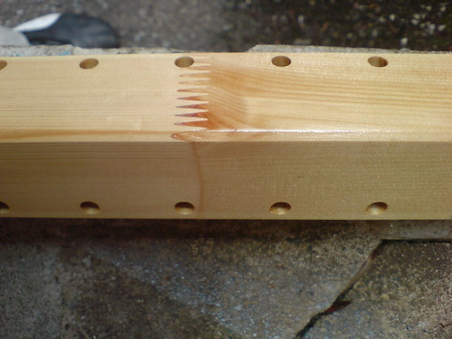
Ikea’s IVAR shelving system is made from unfinished pine, but that’s barely half the story. When you start looking closely, you see that even the simplest board is actually made up of several pieces of wood, spliced together.
It’s never the same, either. Each identical-seeming 72-in. post is unique. It’s almost like they piece all these scraps together with this insane, zig-zag scarf joint, into a single, endless piece of wood, which gets extruded, drilled, and cut to length on the other end.
Once you notice these joints–this one is the highest-contrast of the whole pile–your eyes are drawn to them, like learning a new word and suddenly hearing it everywhere.
The shelves are glued up from pine strips, that’s obvious. But was I really so focused on selecting the “right” color ranges that I didn’t notice this string of lozenge-shaped plugs which filled a massive gap in one of the the shelves? I think that will be the table’s dog footprint.
Category: art
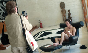
Elmgreen & Dragset & The Collectors
But enough about muscly, young, naked performance art hustlers in Venice staging homoerotically charged events for attention and acclaim for a moment.
My friends Michael Elmgreen & Ingar Dragset just won a Special Mention Award at the Biennale for their awesome, curated installation at the Nordic and Danish Pavilions, The Collectors. Here’s a picture from the Guardian:
Starting With Chris Burden’s TV Ad, Through The Night Softly
In 1973, Chris Burden bought a month worth of late-night ad time on a local TV station in Los Angeles, and aired a 10-second film clip of Through the Night Softly, a performance where Burden, clad only in bikini underwear, crawls across a parking lot full of broken glass with his hands behind his back.
Below is a video of Burden explaining the work, its background, and its reception. [It’s taken from a 35-min. compilation reel where the artist documents some of his performance pieces from 1971-4, which he exhibited in 1975. The whole thing is at UbuWeb.]
The poetic title, Through the Night Softly is mentioned in an intertitle in the commercial itself, but the piece is treated separately. Burden calls it “TV Ad,” and “TV Ad piece,” as in “The TV Ad piece came out of a longstanding desire to be on television.” Burden’s ad is preceded by a Ronco record ad and followed–almost too perfectly–by another naked guy, lathering up in a soap commercial.
In retrospect, Burden’s ideas for the piece are almost quaint. He wanted to be on “real TV,” which he defined at the time as “anything you could flip to on a dial. Anything else–cable, educational, video–was not real TV.”
And he also expressed “satisfaction” at knowing that 250,000 people a night would see his video “stick out like a sore thumb” and “know that something was amiss.”
The juxtapositions certainly look absurd, or surreal, anyway, but did the work really generate the cognitive dissonance Burden hoped for? The artist’s action in the film reminds me immediately of the kind of head-down, low army crawl that would have been a familiar experience for veterans–and a common sight from news coverage of Vietnam, the “First Televised War,” which was, by 1973, one of the longest-running shows on the air.
I haven’t really read much about Burden in terms of politically charged art, and his slightly self-absorbed narrations of these early, controversial pieces don’t betray any real hints of the political references–about crime, gun control. domestic violence, war, Vietnam–that have been ascribed to them.
Still, Burden made directly political work later on–the video I linked to yesterday shows him talking about The Reason for The Neutron Bomb (1979) and how he used 50,000 nickels and matchsticks instead of commissioning 50,000 toy tanks because being stuck with a garageful of toy tanks was as the same kind of crazy as amassing the real things on Europe’s border, just on a different scale.
And his 1992 work, The Other Vietnam Memorial, The giant copper Rolodex containing three million computer-generated Vietnamese names, representing the missing and killed–soldiers and civilians alike–who weren’t mentioned on Maya Lin’s walls, blew my mind when I saw it in 1992 at MoMA.
As Christopher Knight pointed out at the time [in the run-up and aftermath of what would later be renamed the First Gulf War], the power of Burden’s work lay in its contrast to the gut-wrenching personalization of The Vietnam Memorial, its unflinchingly cold acknowledgment of Americans’ general lack of interest in the specifics of the wars being fought in our name:
Transcending topical politics, the hoary conception of a Homogeneous Us versus an Alien Them allowed the fruitless slaughter. “The Other Vietnam Memorial” is as much an officially sanctioned tribute to American fear, ambition and loathing as it is to slain men and women. Its shocking moral ambivalence is the source of its riveting power.
It all makes me want to see a Burden retrospective on The Mall. Would the Hirshhorn or the National Gallery ever be up for the challenge? Come for the flying steamroller and the Erector set skyscrapers, stay for the excoriation of our national indifference to the predations of the Military Industrial Complex? Hmm, the pitch might need a little work.
Chris Burden’s Beam Drop, &c.
Apparently, it’s Chris Burden day. Kottke just posted a clean clip of Chris Burden’s 1979 work, The Big Wheel, in which a massive, 19th century iron fly wheel is set into rapid motion by a little motorcycle wheel. I think he took it from this longer video of a 1989 Burden retrospective, which includes Samson, in which the museum visitors passing through a turnstile slowly expand a 100-ton jack which is pushing against the gallery’s loadbearing walls; and his awesome-looking B-Car, 1976, a 200-lb bicycle/car hybrid with a fabric skin. More of which later.
So no sooner did we finish watching his flying steamroller installed last year at Tate Britain,
than an email announcement arrived for Burden’s retrospective at the Middelheim Museum in Antwerp. The “climax” of which, I’m told, will be–or was, since it happened last week–a re-creation of Beam Drop, a work originally executed in New York in 1984 at Art Park. Using a remote controlled latch, Burden dropped steel I-beams into a pit of wet cement.
The Belgian sponsors rather over-enthusiastically proclaim Beam Drop Antwerpen to be at once a “performance,” an “action painting” and a “large abstract expressionist sculpture using coincidence and gravity.” My favorite part of the videos of the all-day construction is the audience’s polite clapping after each beam is dropped, as if they’re watching an oversized game of lawn darts. Or quoits. It’s Europe, after all.
“Beam Drop” on flickr [flickr]
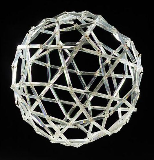
Found, Sort Of: That Buckminster Fuller Prism Chandelier
You remember how Buckminster Fuller had some folks handwire together a basketweave Perspex prism truncated icosahedron chandelier as his wedding present [two years late] for Princess Margaret and Lord Snowdon? Of course you do.
Now it turns out that the rare book dealer who sold it to the current owner probably bought it at Sotheby’s Olympia in May 2003. The estimate was 300-400 GBP, and it went for 1,920:
LOT 208
Property of the Right Hon. Earl of Snowdon, GCVO
W – An unusual perspex spherical ceiling light by Buckminster Fuller
89 cm diameter
So now not only do we have a price range, but also a complete photo suitable for insane knocking off. Stay tuned.
Khaan! A 23rd Century Portrait
Wow, the 2-minute clip of Daniel Martinico’s 15-minute Khaan! is fantastic. This is more what I thought Douglas Gordon and Philippe Parreno’s Zidane would be like, but wasn’t.
LA Weekly review from a 2008 screening [laweekly via boingboing]
Oasis 7, Haus-Rucker, Documenta 5
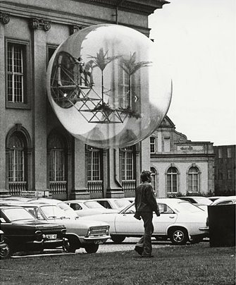
In 1972, the Austrian architecture collective Haus-Rucker installed Oasis Nr 7 at Documenta 5.
A steel pipe structure was cantilevered out the window of the Friedericianum, and a platform, two palm trees, and a hammock were installed. The entire thing was enclosed in an 8-meter translucent vinyl bubble.
Oasis 7 was re-created last September It was built on a fake Friedericianum facade at the Victoria & Albert Museum for the exhibition, “Cold War Modern: Design 1945-1970.
Haus-Rucker project archive [ortner.at]
Time lapse making of video: Oasis 7 in the Victoria & Albert Museum [iconeye.com]
via atelier, where I’ve been lifting all sorts of interesting things this week.
77 Million Paintings On The Sydney Opera House, By Brian Eno

Composer Brian Eno is projecting some of the 77 million iterations of his 77 Million Paintings series onto the Sydney Opera House as part of the Luminous Festival.
The Festival, which Eno is also curating, consists of three weeks of performances, talks, and exhibitions. It runs through June 14.
I’m not a huge fan of Eno’s painting, necessarily, but it looks pretty fantastic in the photos that have hit flickr so far. I’ve got a short list of buildings which should have art projected on them, and I was wrong not to include Utzon’s opera house.
That said, once the infrastructure’s in place to project Eno’s work, it should be equally possible to project other artists’ works, too. I know he has 77 million works to get through, but maybe Eno could have curated someone besides himself into his big show?
Luminous Festival, curated by Brian Eno [sydneyoperahouse.com via city of sound]
Mariner 2 Float In The Rose Bowl Parade
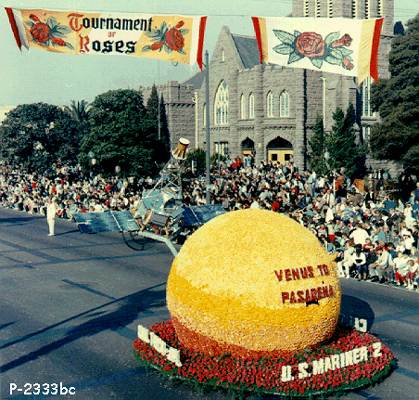
Amazing to think that all this was happening at the same time as the satelloons of Project Echo and just five years after Sputnik.
NASA Jet Propulsion Laboratory director William Pickering was the grand marshal of the 1963 Rose Bowl Parade. Behind him followed a float of the Mariner 2 space probe, which had successfully reached Venus in December 1962.
A Venus made of roses with a flower satellite probe orbiting it. And a little window cut out of Venus so the driver can see. Fantastic.
Mariner 2 Rose Parade Float [nasa jpl via nasaimages.org]
Pastel By Numbers
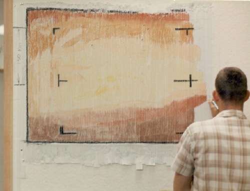
In 1965, after the Mariner 4 probe had possibly transmitted its first closeup images of Mars and in the many hours before JPL computers would finish processing that image, mission scientists were concerned about what, if anything the data would reveal.
So Richard Grumm and his fellow mission managers came upon the idea of printing out the brightness values onto vertical strips, taping them up on the office divider, and coloring each number in with pastels. Thus it was that the world’s first transmitted, televised image of Mars was drawn by hand.
That drawing, cut out of the divider, framed, and presented to JPL director William Pickering, was included in “Data + Art,” an exhibition curated by JPL educators Dan Goods and David Delgado at the Pasadena Museum of California Art, which closed in April 2009.
The closeup reminds me of Beuys: Data + Art installation shots and closeups of Grumm’s Mars drawing [directedplay.com]
The full making of story, plus additional images, by Dan Goods–AWESOME [directedplay]
Dan detailed the circumstances of the making of the drawing in the comments on Boing Boing Gadgets today. [g.bb]
The image above, “First Image of Mariner 4,” is available via NASA Images, a service of the Internet Archive [nasaimages.org]
Call Me When Sir Charles Has An Audience
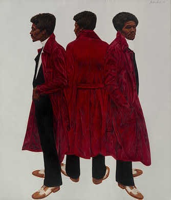
According to the very slowly reported story [1] in the Wall Street Journal, the Obamas have been selecting modern and contemporary art for the White House from among pieces in national and museum collections. The artists they requested includes several African American artists, including the wonderful DC abstractionist Alma Thomas, whose paintings from the Hirshhorn are already installed in the White House’s private quarters. But they’ve also chosen plenty of white contemporary artists, too, though the Journal obviously doesn’t identify them as such: works by Ed Ruscha, Richard Diebenkorn, Robert Rauschenberg, Louise Nevelson and Jasper Johns all came from the National Gallery, for example.
The Obamas’ decorator Michael Smith apparently insisted on borrowing only works that were not currently on view. Hmm, African American artists, in national collections, not currently on view. Why didn’t they ask–or why didn’t the National Gallery offer–a major work by the art world’s longest-time-coming overnight sensation, Barkley Hendricks?
I’m dying to hear the story of how the National Gallery came to acquire their awesome, awesome Hendricks, Sir Charles, aka Willie Harris, 1972, in 197-freakin-3, when the paint was barely dry And as soon as that story’s finished, someone tell me how it is that the intensely classical triptych portrait–inspired, we are told, by van Dyck, Rubens, and Botticelli, with a little Shaft thrown in for good measure–is not only not on display now, but has never been exhibited at the National Gallery, ever.
I’d certainly be willing to look at one less Thomas Demand mural of the Oval Office in exchange for three Willie Harrises. And I’d trade all five Demands to see Harris in the Oval Office itself.
Holy smokes, the comments are a seething pit of powerless white guy rage: Changing the Art on the White House Walls [wsj]
[1] Though the story’s filed 5/22, Kerry Brougher is quoted as acting director of the Hirshhorn, a position he hasn’t held for over a month.
Enzo Mari x Ikea Mashup, Ch. 5: In Process [Rev.]

An update on the Enzo Mari x Ikea autoprogettazione table project:
I just finished putting on the second coat of varnish sealer, and now everything’s drying and curing in the basement. The picture above was how the wood sat for a week between the first coat and this morning, stacked on our radiator [I moved it up after about 24 hours when it wasn’t quite cured, and then my schedule got away from me for the week.]
Continue reading “Enzo Mari x Ikea Mashup, Ch. 5: In Process [Rev.]”
Dress, 1952, by Ellsworth Kelly??
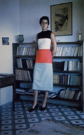
Though I suspect the easiest thing would be for Michael to let Cerre know where he scanned the image from, here’s what I can figure out about this dress made by Ellsworth Kelly in Sanary, France in 1952:
Sanary, west along the Mediterranean coast from Toulon, was where Kelly spent a great deal of time during his formative postwar sojourn in France, from 1949 to 1953 1948 to 1954. It was where Kelly found color:
While working in Paris after the war everything was grey and, as I’ve said, I used very little colour. When I finally went to Sanary, I did Colors for a Large Wall. It was the first work I painted in the south of France.
That was in 1951, when his, um, friend and fellow artist Ralph Coburn was with him on one of his four 6-mo to 1-yr long visits. [Is it, to quote a too-well-known idiot, impossible to fully understand Kelly’s work unless you know he’s gay? Was Coburn his boyfriend, or just the guy he lived with and took to dinners with John Cage and Alice B. Toklas the whole time? Kelly’s certainly out, but from the way Coburn’s bio was written, there are still closet doors a-slammin’.]
Kelly was looking at the colors around him, using found, “readymade” colors from papers and color wheels as inspiration and raw material for studies and collages. Such as this 1952 collage in the Philadelphia Museum, Boats in Sanary Harbor:
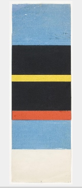
Back to that Tate interview, where Kelly talks about other foundational developments in his work that took place in Sanary, including his interest in “painting objects,” monochrome canvases abutting each other [e.g., Colors for a Large Wall, 1951, at MoMA; and Méditerannée,1952], which prefigured Minimalism’s interest in a painting as a thing itself, not a depiction or image of something:
I didn’t want to paint an overlap, meaning that it would be a deception or illusion. I no longer wanted to depict space, but to make a work that existed in literal space. Thus, my recent works are one canvas as a relief over another canvas. Another important example of a panel painting that explores the idea of the mural was Red Yellow Blue White (1952). It’s the only one I ever did using actual dyed fabric of ready-made colours, which moves the painting into the realm of real objects. It consists of five vertical panels, each with five canvases. The vertical panels are separated on the wall and the intervals of the wall surface between them are part of the painting. [emphasis added on the seemingly dress-relevant part]
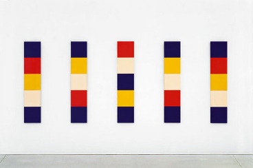
Seemingly relevant indeed. In Branden Joseph’s book, Random Order, on Robert Rauschenberg’s relationships with the “avant-garde,” the extensive discussion on Kelly’s highly specific use and treatment of color confirms that Kelly used the same fabrics from Red Yellow Blue White to make a dress for his friend Anne Weber. The footnote says “a photograph of Weber wearing the dress designed by Kelly” was reproduced in Diane Waldman’s catalogue for the Guggenheim’s 1997 Kelly retrospective–what a spectacular show that was, btw, though I remember Lisa Dennison telling stories of the museum expecting Kelly and other artists who get retrospectives to donate their work, essentially a quid pro quo, and then she bragged about the giant, arced Kelly sculpture that was in the theater at one point–as well as in Nathalie Brunet’s extremely detailed and informative “Chronology 1943-1954,” which appeared in Ellsworth Kelly: The Years in France, 1948-1954, the catalogue for the National Gallery’s 1992 exhibition, which looked infinitely better at the Jeu de Paume.
Weber, who was married to the cubist pioneer Max Weber–really? He had to have been in his 70’s in 1952, yet in that photo, she doesn’t look 30–later ran a gallery in Georgetown, Maine. [Mar 2015 update: No. Thanks to a reader Laura’s incredulity, which was stronger than mine in 2009, I dug a bit and realized that Anne was not married to Max. I had to have read that somewhere, because it’s just too odd a pairing to make up. She turns out to have been married to Swiss artist Hugo Weber, who taught at the Illinois Institute of Technology with Mies van der Rohe and Moholy-Nagy. Glad to have that straightened out.]
Last year, Kelly was on hand for the opening of theWeber Kelly Preserve and Trail . Weber financed the 1999 purchase and donation of 105 acres on Georgetown Island by selling an early Kelly painting.
So there you go. Ellsworth Kelly dress.
[Other March 2015 update: However obscure this dress has been, my friend and former MoMA committee colleague Sharon Coplan Hurowitz worked with Kelly to recreate the dress in late 2013. It was created as an edition of 10 by Calvin Klein’s Francisco Costa. Copies were donated to the Met’s Costume Institute and the Philadelphia Museum, where Kelly donated Red Yellow Blue White in 2010. Nice hustle.
300×404: The Making Of
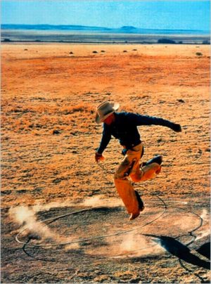
So the other day, I was still trying to wrap my head around the fact that Slate’s editors were, “ironically, unable to get permission” to reproduce Richard Prince’s Untitled (Cowboy), 2003 for Sarah Boxer’s slideshow review of “Into The Sunset,” MoMA’s exhibition of photography’s role in creating the concept of the American West. [The irony, of course, is that Prince’s work is actually a rephotograph of a Marlboro Man ad, which was probably photographed originally by Jim Krantz.] [Update: actually, last year, PDN identified the original photographer as Sam Abell. thanks Joerg.]
And so I blithely grabbed an image of Untitled (Cowboy) online, resized and retitled it, and republished it as my own work, 300 x 404, After Untitled (Cowboy) 2003 by Richard Prince, and offered to let Slate show it instead. Though I’ve written for Slate before, they have not, as yet, taken me up on my offer.
Not that I expect them to. The point that Slate felt copyright-constrained while Prince so clearly didn’t was so obvious, it’s barely interesting. And even their complete abrogation of fair use principles, which specifically allow reproduction of copyrighted work for purposes including “criticism, comment, [and] news reporting,” is kind of equivocal.
Boxer’s piece was decidedly not a review, and it could arguably not be news, but I can’t see how Slate could decide it wasn’t comment. I have to assume they just accepted some publicist’s refusal–whether MoMA’s or Prince’s dealer Barbara Gladstone [at the time the work was made, anyway. Now it’s Gagosian.] they don’t say–to provide a suitably hi-res file. If they’d wanted to run the image, they could have grabbed a slightly smallish version online, or they could have scanned Prince’s work from the catalogue, but they acquiesced to the wishes of someone somewhere who, ironically, did not actually control the copyright anyway. Fine, now we know.
After posting my one-liner, though, I started thinking more about this work I’d just created, what claim I really had to it, and what relationship it really had vis a vis Prince’s–and Krantz’s Abell’s–work. The pixel count in the title seemed to hold a key. A relatively new articulation of fair use exemptions has emerged specifically to deal with the no-permission-necessary reproduction of images online. Though it didn’t offer any technical guidelines, a 2002 lawsuit, Kelly v Arriba Soft Corporation, helped establish a fair use exemption for thumbnail images.
And that’s what interests me most about my re-reproduction. What’s a thumbnail? What size and quality does an image have to be to qualify for online fair use? What does its thumbnail-ness relate to? The size of the screen? Of the page? Of the original? Does it relate to the resolution, or just the display size? It’s an issue I think about every time I grab someone else’s image and post about it here. Beyond just giving credit and a link, I try not to create a perfect substitute for someone’s original, or for the context they put it in. [Ironically-again, that word–when I started greg.org way back in 2001, I was still a little hippie dippie Xanadu-ey about it all, and would hotlink to too many images. Too many of those impolite, dead links are still lurking in my archives, waiting for my ghost army of interns to fix.]
And what happens when you start reproducing a work that begins online and is defined first and foremost, not by its resolution, but by its pixel count?
When I started looking for a place to print 300 x 404 on canvas, I found that it wasn’t so easy. The original web resolution, 72 dpi, would only produce a tiny, 4×5-in painting. I wanted to see something, you know, more Princeian, a 30 x 40-in. painting [10 ppi] or maybe even a Gurky-esque 60 x 80-in. [5 ppi], 60 inches being the maximum width of canvas today’s printers can handle.
As any Photoshop user can tell, increasing the pixel size is like zooming in on a digital image. Except in this case, it’s not the size of the magnifying glass, but the size of the pixel itself that increases. And since it’s the pixel count, not the size that’s important, I figured I’d go with a round number, 1 px = 1 mm, or 25.4 ppi, which would produce a nice, manageable little 12 x 16.2 painting.
Or at least it should. According to all the print studios I’ve spoken to, you can’t adjust the print resolution on their state-of-the-art inkjet printers; you can only get “the best” resolution. And if your image isn’t hi-res enough, no problem; they’ll fix it for you:
We understand that almost no one has a digital camera capable of producing native resolution for a 30X40 giclee at 150ppi. We can use image interpolation to compensate.
For example, if ordering a 30X40″ print, we would generally require to have a file that measures 30X40″ at 200 ppi.
Digital cameras compete on megapixel counts, and generations of printers claim they can [finally!] be “true” to an original work of art. And when an original doesn’t hold up, “image interpolation” comes to the rescue. The assumptions of accuracy, authenticity, and fidelity are embedded deep in our image-saturated world. And just as HD television forced the development of new makeup techniques to save large-pored actresses’ careers, our own perception of veracity is constantly changing in ways we don’t acknowledge.
Now consider Sarah Boxer’s assessment of Prince on Slate which is, at every level, incorrect:
Although the photo looks authentic, it is, at every level, inauthentic…Prince didn’t really take the picture of the cowboy himself. And even the original photographer wasn’t catching a real moment in a cowboy’s life; he was just shooting an ad.
That “just shooting an ad” kills me. Has there ever been an ad campaign more relentless in its pursuit of visual and content authenticity than Marlboro’s? Is the photo “inauthentic” because it’s an ad? Because it’s not a “documentary”? Is the cowboy inauthentic only if he is auditioned, dressed, placed or directed? Isn’t Prince’s photograph of the photograph a near-perfect 1:1 representation? Prince’s work provokes these kinds of questions and challenges these kinds of assumptions, the very ones Boxer seems completely oblivious to.
But I can’t laugh too hard; as my little offhand attempt to accurately reproduce my 121,200 pixels is proving, I’m just as likely to be oblivious to the limits of my own assumptions, too.
West Trademark F(*#$Up
From Slate’s review of MoMA’s “The Wild West,” “Into the Sunset,” [thanks todd] a scattershot exhibit on photography’s role in forming perception of the American West:
And the opening shot of the show–right at the entrance to greet you–is Untitled (Cowboy), a Richard Prince photo from 2003 that was stolen, adapted, or made–depending on what you think of this artist–from a Marlboro ad. Although the photo looks authentic, it is, at every level, inauthentic. (We were, ironically, unable to get permission to reproduce it here.) Prince didn’t really take the picture of the cowboy himself. And even the original photographer wasn’t catching a real moment in a cowboy’s life; he was just shooting an ad.
Here, let me help. I can’t do anything about the review’s stubborn fixation on unnuanced terms like “authentic,” “true,” and “lie.” But I can and do hereby grant Slate permission to reproduce my latest work, 300×404, After Untitled (Cowboy), 2003 by Richard Prince, 2009. It’s much lower-res than the original [sic], but at least I will not try to thwart fair use of it by reviewers. Seriously, people, wtf.
