
Oh Gerhard-Richter.com, why did I ever doubt you?
Last February, while holed up in the Snowpocalypse, I thought the hell out of the Serpentine Gallery’s catalogue for Richter’s 4900 Colours. The work consists of 25 enamel color squares arranged randomly on 196 5×5 aluminum laminate panels, and it relates very closely to the random, pixel-like stained glass window the artist created for the Cologne Cathedral in 2007, which was in turn related to an earlier color grid painting Richter did in the 1970s.
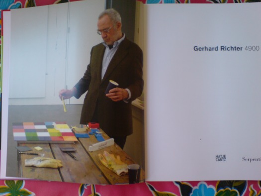
The frontispiece of the catalogue [above] shows the artist, nattily dressed, with brush and paint in hand, contemplating the final yellow square on a 25-square panel. Yet the text describes the actual production process for 4900 Colours, which involved random color placement determined by computer [the same program used to create the window], and mass production of enamel tiles, which were assembled and bonded to the aluminum substrate.
How to reconcile this apparent contradiction: Benjamin Buchloh praising the work’s industrial facture, while the making of photo captures The Touch of The Master’s Hand? And to complicate matters–or to solve the paradox–the grid on the painting Richter was photographed working on does not match any of the 196 panels in the piece.
The answer was right there on gerhard-richter.com all along. Almost. A search for all paintings made in 2006 and 2007, around the time of the cathedral window and 4900 Colours, turns up ten paintings, all 2007, titled 25 Colours, which have identical dimensions and materials, and which appear to have identical colors, as the 196 panels in 4900 Colours.
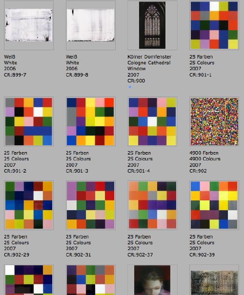
Thanks to the artist’s catalogue-raisonne-as-you-go numbering system, we can see the order in which they were created, and their apparent relationships or context. The Cologne Cathedral window is actually listed under paintings as CR:900, and is followed by four 25 Colours works, CR:901-1 through 901-4. Then comes 4900 Colours, CR:902, and six more 25 Colours numbered–wait for it–CR: 902-29, -31, -37, -39, -49, and -50. Which sounds like a series of four works, plus a series of panels, 196 of which go together, and 6 of which become autonomous works.
But. The photo Richter’s painting up top doesn’t match any of these ten, either. And if sharing a CR number means anything about their production, then the six 902 paintings are made exactly like 4900 Colours: at an auto body shop. Are CR:901’s handpainted? Is the photo in the book of a reject, or a study, a 900.5 whose handpainted facture didn’t pass muster? I guess we still don’t know.
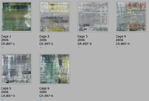
This chronological view, though, adds another dimension to the context of Richter’s process, and it ties together three major projects involving randomness: 4900 Colours, the Cathedral window, and a suite of six large abstract paintings named for John Cage. There are 25 more squeegee paintings in between the window and the Cage paintings, but they are listed under only two CR numbers: 898 and 899. If I understand my Richter process, that means he worked on them in two batches, which might have taken “weeks.”
I’d completely forgotten that the installation video for 4900 Colours reminded me of Cage’s incredible exhibition-as-performance, Rolywholyover.
But I remembered watching Rob Storr talk about the Cage Paintings, though he doesn’t project their relationship forward. Or sideways. Richter’s window was dedicated in 2007, but the design was unveiled, fabrication had begun, and fundraising had been completed in September 2006. Which means Richter was working on the window and the Cage Paintings concurrently.
Storr quotes Cage on how, whatever randomness exists in your process, what’s not “an accident is what you decide to keep.” Which is about as close an answer as I can get for what happened to that grid painting up top.
So did the need for window randomness lead Richter to Cage, or did Cage lead Richter to randomness? I guess I’ll have to start digging.
Tag: gerhard richter
Gerhard Richter 4900 Colours Microsite
In addition to the world’s greatest artist website, artist Gerhard Richter also makes paintings.
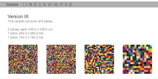
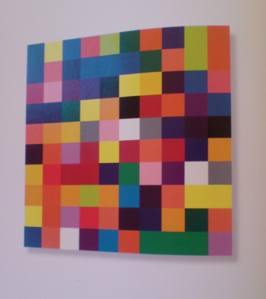
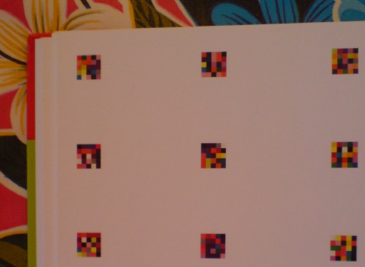
Now these two endeavors come together with the debut of a micro-site devoted to 4900 Colours, the set of 196 5×5 grids of 25 randomly applied enamel-painted squares, mounted on Aludibond panels. 4900 Colours can be exhibited in any of 11 configurations. Above is Version IX, which I chose for its apparent zooming-in-on-pixels quality.
One point of note: the website lists 4900 Colours in the /editions/ folder. Update: the microsite URL has changed; it is now listed in /paintings/
And two points of great relief: the 4900 individual squares were indeed sprayed-on enamel, not handpainted by the finely dressed artist; and there are no drop shadows. I think we are making real progress here.
www.gerhard-richter.com/art/paintings/4900-colours/ [gerhard-richter.com via @gerhardrichter]
Previous coverage of 4900 Colours:
The Making Of, with special guest star Benjamin Buchloh
About facture and that handpainted square
About drop shadows and diagrammatic abstraction
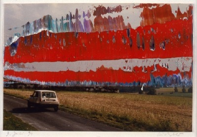
FAZ Overpainted Of, By Gerhard Richter
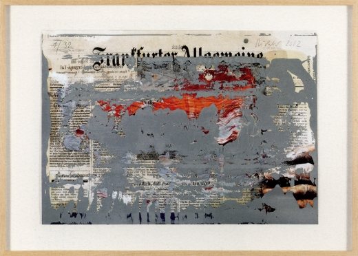
According to the Gerhard Richter’s website, FAZ Overpainted, a 2002 squeegee paint-on-paper edition is
based on a photograph of a 2001 copy of the Frankfurter Allgemeine Zeitung (FAZ). The hand visible on the right is that of Richter. The photograph was taken for a FAZ advertising campaign with the slogan ‘There is always a clever head behind it’
Which would mean that Tante Marianne, his 1965 painting based on a photograph of the artist as an infant and his teenage aunt is not, as the Dresden’s Galerie Neue Meister claims, Richter’s only self-portrait, just his first.
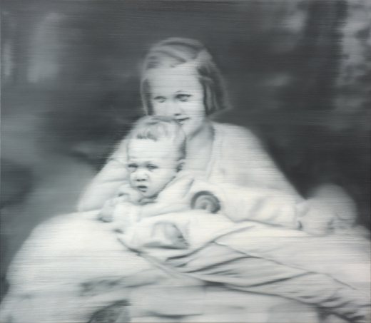
[Ironically, the quickest recap I’ve found of Tante Marianne‘s devastating backstory is in Sotheby’s 2006 catalogue for the painting’s sale. Is it really true that Marianne’s death at the hands of the Nazi’ and Richter’s discovery of his first father-in-law’s involvement in the euthanasia programs that killed her only came to light in 2005? What does it mean that Richter painted this image, and then let the psychological timebomb of Marianne’s story sit, unexplicated, for 40 years? Was he just sure it’d come out, and he was willing to wait?]
Anyway, the Met has an incredible, painting-like photo self-portrait from 1966; there are three double-exposure, overpainted photographs called, Self-Portrait, Three Times from 1990; and two straight-up, bust-size self-portraits painted in 1996.
Meanwhile, I’m going to assume that FAZ Overpainted isn’t Richter’s only appearance in an ad, either, just his first. Especially if they have Banana Republic in Germany.
FAZ Overpainted appears in “Press Art,” an exhibition of print media-related works from the Annette & Peter Nobel Collection, at the Museum der Moderne in Salzburg. [via @gerhardrichter]
Uncle Rudi, Is That You?
Who are the freaks and nerds who call out picayune corrections in newspaper articles? Me, for one.
On a New York Times piece I did once, I changed an entire line during the copyediting process. The piece was much, much better for it, I think, but I got chewed out afterward because, apparently, it required several people staying late to re-layout a whole page, which delayed the closing of the section.
As penance, I’ve been pretty fastidious ever since about quickly slipping the Times’ web editors little corrections–usually of peoples’ names, ex the kind of things that might cause unnecessary embarrassment–for Arts stories. [Oy, in one pseudo-liveblog post from Miami Art Basel, the correspondent misspelled basically every name she dropped. And no, it was not Linda Yablonsky; she is an exquisite name dropper.]
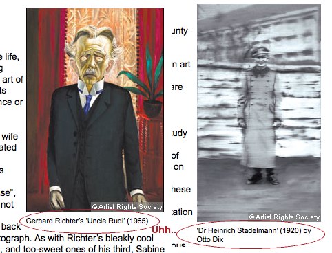
Anyway, last weekend, the Financial Times mentioned the new Gerhard Richter biography in Jackie Wullschlager’s survey of books on German painting. Their whole point was about how loaded Richter’s blurred portraits of his family were, such as Uncle Rudi.
The FT transposed the captions with the Richter and a portrait by Otto Dix. When I tried to do my typical one-click correction, I was surprised to find that the FT doesn’t appear to even publish an address for corrections. Or for reaching the editors.
Setting aside the whole implication that the very idea of being corrected didn’t cross their minds, the whole FT website contact interface turns out to be oriented to subscribers/users and the support of the paid consumption experience.
As such, it has taken a week for me to receive an automated reply, and now my comment had been forwarded to the appropriate department. As the fresh screenshots show, the error remains.
100 Colours Down, 4800 To Go
On Drop Shadows And Diagrammatic Abstraction
I swear, I didn’t plan to go all Errol Morris and do three posts about one photo in one catalogue about one artwork. So look at this other photograph!
The second thing you notice–first if you just crack it open, second if you start from the front–in the Serpentine Gallery’s Gerhard Richter | 4900 Colours is what I bought it for: page after page of reproductions of the panels in all eleven possible configurations. The Serpentine’s own Version II comes first, with large, 2×2 assemblies shown, one per page.
With drop shadows. Seriously. Drop shadows. Are these photographs? Part of me wants to think that photos in a Richter book would all be taken under such perfectly identical lighting that it creates exactly identical shadows. But I am doubtful.
There is one squeegee painting reproduced, but it has no shadow, or frame, or any indication of three dimensionality. And it’s pretty obvious that all the other Versions of 4900 Colours are illustrated, not by photos, but computer graphics–diagrams. Does this matter? And if it doesn’t, what does it mean to simulate three dimensionality with dropshadows?
Buchloh, whatchagot?
The Diagram
A diagram is not a painting. It’s as simple as that…I can make a painting from a diagram, but can you? – Frank Stella [ed note: this is from an apparently cantankerous 1964 radio interview with Judd, included in Gregory Battcock’s “Minimal Art: A Critical Anthology.”]
…the diagram contributed a dissenting voice to the heroic chorus of abstraction, recognizing the degree to which the painter and the spectator as perceptual and desiring subjects are always already contained in systems of spatio-temporal quantification, control, and statistical registration.
Mhmm. I like this idea of diagrammatic abstraction and how it is an overlooked underdog. But could that just be my own subjective anti-subjectivity talking? Maybe I agree because I happen to have found my own “schemata of statistical data collection” to use as my “necessary and primary matrices determining a pictorial/compositional order”?
Also, I don’t see how Richter’s “low-tech colour production [could] subvert the new digital spectacularisation of colour [8]” while he simultaneously publishes more-perfect-than-real digital simulacra of his work, augmented with Adobe Illustrator’s systems of simulated tempo-spatiality.
I take issue with this. I also realize that I’m putting Buchloh on the hook directly and Richter, too, by implication, for tiny, seemingly peripheral-to-picayune issues I have with the catalogue that fall well within the scope of book design. But they transform the book from a documentation to a blueprint, a schematic. Which is fine. But drop shadows?
And anyway, why should any spectator’s seemingly arbitrary perceptual minutiae take a back seat to Buchloh’s, or anyone else’s?
Do my questions really and truly seem less germane than this spectacular footnote to the digital spectacularisation of colour–I mean, wow. Just wow–and tell me what is going on here?
[8] It is certainly not accidental at all that at the time of the writing of this essay, a new electronic device operates on the site of an advertisement for eBay Europe. Under the imperative appellation ‘CHOOSE YOUR COLOUR’ a field of randomly ordered colour chips appears, very much in the manner of one of Richter’s earlier colour chip paintings. The site’s digitally vibrating colour squares appeal to spectators to find precisely ‘their colour’, i.e., to comply with an order to suture their desire (performed on the computer’s touch pad) and to yet another commodity to be acquired.
A banner ad on eBay Europe! What does Benjamin Buchloh buy–or sell?!–on eBay Europe? It is certainly not accidental at all!
Meanwhile, the commodity that is 4900 Colours, 2007, was acquired by La Collection de La Fondation Louis Vuitton pour la creation. I don’t think I’ve enjoyed reading an exhibition catalogue this much in fifteen years.
Gerhard Richter: 4900 Colours
4900 Colours: The Making Of
OK, now it’s been bugging me a bit, this catalogue photo of Gerhard Richter with a paint brush, ostensibly going to town on the work that is the lone subject of the book, 4900 Colours, which is comprised of randomly generated color grids on 196 enamel-on-aluminum panels.
First off, I think the explanation is correct that the painting in the photo is actually a study, a prototype, a concept, a related-but-distinct work. But as the first thing a reader sees upon opening the catalogue, the photo powerfully argues–or implies–that Richter painted the work we are about to see.
Which I am relieved to know he didn’t, remember? Mine is not one of those gripes about an artist painting his own paintings, a la Koons–who proudly doesn’t–or Hirst–who shamelessly doesn’t, except when he embarrassingly does. If any painter actually is a painter, it’s Gerhard Richter, amiright?
But Richter’s whole project seems based on the premise of not romanticizing the painter’s gesture or the artist’s subjectivity. It’s why he uses photographs as subject matter. And color charts. Mechanical. In the case of 4900 Colours, it’s why he outsourced the colors and placement to a randomizing computer program. [Not that he was remotely the first artist to deploy randomness or computer instructions in his work, of course.]
But wait, that’s not all! Here’s Benjamin Buchloh’s rather torturous description of the making of 4900 Colours:
Analogously to expanding the technological order of painting’s composition, Richter has also decided to dislodge the very process of manufacturing the painting from the hand to the mechanical devices of the spraygun handled by a technical collaborator. (The colour chips making up the paintings are individually spray-painted lacquer squares. Once solidified, they are inserted like elements of a mosaic into the prefixed structural arrangement. Each element consists of 25 coloured squares glued or taped onto the supporting Aludibond panel.) These decisions form the base for the permutability of the 4,900 colour chips and panels, since they were conceived from the start as a structure of permutation that could vary its own quantitative arrangements in 11 different presentational constellations.
[I know, I could have stopped before that last sentence, but that’d be like leaving a birthday party just as they’re bringing out the cake. Someone needs to endow an editorship at Harvard.]
Buchloch goes on to say Richter is not, like some artists [Moholy-Nagy, *cough* Judd], triumphantly declaiming “the superceding of painting’s artisanal past,” with his mechanicism; his is “a rather detached, not to say resigned, acceptance of the inevitable regimes of technological production.”
Sigh. Then if the facture-free production of 4,900 Colours is so intrinsic to both its “monotonous polychromy” and its–I love this–“almost Beckettian complacency in the exhaustion and hopelessness that technological progress without social transformation has inflicted on the subject,” why is the artist posing on with a brush as he gets ready to lay down the last stroke?
I think the explanation lies in the contradictory expectations that persist around Richter and his work. The Buchlohs among us want their Beckettian techno-anomie. The Joe Hage collector-fanboys among us want the intimacy of hanging around the studio and being present for The Moment of Creation. The gallerygoers among us want permission to just soak, guilt-free, in the beauty of a work. While the bookreaders and bloggers among us apparently just want to overanalyze a single photo in a single book on a single work.
One Of 4900 Colours
So my copy of the Serpentine Gallery’s catalogue for “Gerhard Richter: 4900 Colours“ finally came. This is the frontispiece, a photo by Joe Hage [who is turning up everywhere in Richterland now? He’s the collector who’s helping the artist with his evermore-info-intensive website. The staff of whom are also running the @gerhard-richter Twitter feed. He bought a half-interest in September, RIchter’s little painting of the World Trade Center, which he and the artist donated to MoMA. And now he’s hanging out with the artist as he puts the finishing touches on the 4900th colour? (It’s tough when you start out on a parenthetical, only to end up with it as your main thought. Makes me want to just leave off the last bracket.)]
Anyway, my points–besides, “notice how sharply Mr. Richter is dressed for work”–are two, and somewhat inter-related:
He is painting with a brush and taping his edges. Enamel on aludibond, a European brand of aluminum composite panel. Not being any kind of painter, I’ve been slightly obsessed with what Benjamin Buchloh regularly calls facture, the technique for application of the paint. And frankly, I’ve been wary/nervous/feelin’ like a cheater for thinking about taping my polygonal edges on my Dutch Landscape Paintings, for whatever reason.
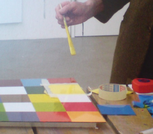
So when I posted his 2001 quote to Michael Kimmelman this morning, before the book arrived, “Idiots can do what I do,” I didn’t think it would feel like such a personal invitation. “Thanks, I will!”
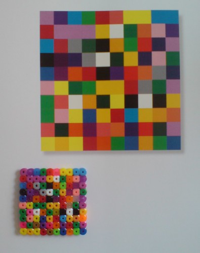
But now to the issue of Richter using tape and a brush. 4900 Colours is comprised of 196 48.5 sq. cm panels, each with 25 squares. That’s [hold on, doing the math] 4900 squares–ah, right–in 25 colors. The colors were arranged on each panel following a randomizing computer program.
4900 Colours has 11 “Versions,” which I believe refers to their possible configurations on the wall. Version I was all 196 in a single 49×49 square. The Serpentine showed Version II, 49 2×2 squares. And so on. The position and orientation of each panel is similarly determined in aleatory fashion. But as far as I understand it, there is only one set of 196 panels, not eleven. But even if there are not 1,960 additional panels that Richter had to paint with masking tape, a brush, a Dixie cup, and a fine tweed jacket, that’s still a helluva lot of squares to paint.
Why that surprises me? I guess I just saw the vast, pixilated scale of this work, and the industrial luster of the panels themselves, and I assumed he had it fabricated. That the paint was mechanically applied. That he just hit ENTER on his random colorgrid generator app and exported the data file to a shop. That they glued the acrylic paint chips to the Aludibond, so mechanical and repetitive, an idiot could do it. And then a couple of weeks later, a truck backs up to his studio with all those gorgeous crates. It appears this was not the case at all, and that is really pretty stunning.
[But surely, this is not standard operating procedure? Is that how massive, repetitive/mechanical images like the electron microscopic photo mural made for the atrium of the De Young, made, too? Entirely by Richter’s hand? Doesn’t he have people for that? He’s closing in on 80, I want him to have some people for that. See, here I am again with the parenthetical wrapup.
update: eh, bad example. The De Young’s Strontium is made of C-prints.
update update: with encouragment from @manbartlett, I checked all 196 panels, and I can’t find one with that color configuration. Which would mean it’s a one-off or a study or a prototype. Whew.
Buy Gerhard Richter: 4900 Colours for around $43 at amazon [amazon]
Previously: What I looked at today – Gerhard Richter
Richter On Idiots
A 2001 visit to Gerhard Richter’s studio, from when Michael Kimmelman used to write about art:
He puts a canvas on an easel at the end of the room and slides the photograph into a projector. The photo appears, projected onto the canvas, and Richter begins to trace it with a piece of charcoal and a ruler. Tracing each minute detail of a photograph, as he does, usually takes Richter a couple of hours. Then he is ready to paint.
”Idiots can do what I do,” he says, although of course he doesn’t really think so. ”When I first started to do this in the 60’s, people laughed. I clearly showed that I painted from photographs. It seemed so juvenile. The provocation was purely formal — that I was making paintings like photographs. Nobody asked about what was in the pictures. Nobody asked who my Aunt Marianne was. That didn’t seem to be the point.”
The point, among other things, was to distance himself from the clichés of artistic expression — all the spontaneous, fiery, warm and fuzzy modes of painting — so as to make people really look and not reflexively swoon. By using deliberately banal photographs, impersonally mimicked, he was doing the exact opposite of what painting was expected to do, not grabbing a viewer by the lapels but methodically copying an everyday image. In time, some of the pictures have come to look expressively painted, perceptions having changed, but making methodical copies was Richter’s intent.
An Artist Beyond Isms [nyt via john bailey]
Mind The Storr: On Gerhard Richter’s September
Seriously, I could fall into Gerhard Richter’s website and not surface for days. There’s just so much stuff. And related stuff. And meta-stuff. Auction histories for specific works? Cross-referenced Atlas pages? It just goes on and on and on.
Recently, two interviews with Rob Storr were added: one is about Richter’s Cage Paintings, which Storr showed at the Venice Biennale in 2007, and which are now at the Tate. [It’s a comically great business model to make and sell giant series of paintings intact instead of slogging it out one by one.] There’s a lot of discussion and still photos of the making of palette knife & squeegee process for the abstract pictures–I always thought Richter only painted them on a table, but there he is on his ladder. And Storr has a thoroughly enjoyable smackdown of the fiercely “deterministic” Rosalind Krauss’s connection of Richter and Johns. I’d pay cash money to see that panel discussion.
Same day/same outfit is another video, Storr is in the office at Marian Goodman, discussing September, the small monitor/TV screen-sized painting of the World Trade Center attack that opened Richter’s latest show at the gallery. [Yeah, I know it was actually a photo of the painting.]
It’s funny, I’d conveniently forgotten how central war, destruction, civilian casualties, and terrorism have been to Ricther’s work and his experience. How does that happen? Anyway, it’s interesting stuff.
Gerhard-Richter.com [gerhard-richter.com]
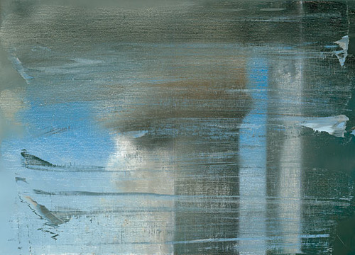
German Landscape Paintings? Triangulation X Gerhard Richter
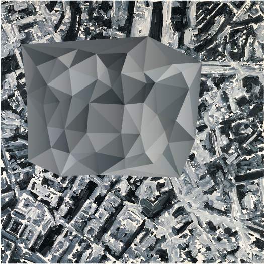
Now that I can make any map or image into a color-averaged, triangular camo abstract wonderscape, I am in big trouble.
Triangulation – web interface [triangulation.jgate.de via andy]
original image: Stadtbild PL, 1970, Gerhard Richter [gerhard-richter.com]
What I Looked At Today – Gerhard Richter
Gerhard Richter used a randomizing computer program to place the 11,500 hand-blown squares of glass in 72 different colors in his 2007 stained glass window for the Cologne Cathedral.
He used the same program at the same time to create 4900 Colours, a work which revisits the color chart and color chip paintings he made in the 1970s. For 4900 Colours, square acrylic paint chips were glued to Aludibond, a European brand of aluminum composite panel.
4900 Colours, Version II, shown at the Serpentine Gallery last fall, consists of 196 panels, each nearly 1m square and containing 25 computer-placed chips. The panels were hung in randomly selected groups of four to make one work comprised of 49 panels. Hans Ulrich Obrist talks about the work and its various versions in this video.
I can’t get over how gorgeous they look, even in the crates. Watching the installation and listening to the several random elements Richter deployed reminds me of John Cage’s rolywholyover exhibit from 1993-4. Using a a list and map created each day by an I Ching-based program, the museum’s art handlers would essentially perform by installing, moving, and removing artworks selected for the show. When not on the walls, paintings and such were stored on rolling walls, still visible, in a roped off section of the gallery. One of my absolute favorite art experiences ever.
Gerhard Street View
A Google Street View image of a French radar-jamming installation obscured by order of the Ministry of Defense or an overpainted photograph by Gerhard Richter? You decide.
A Favorite Kippenberger Made From A Favorite Richter
The Martin Kippenberger retrospective closed yesterday at MoCA, which means it’s just a few weeks away from opening at MoMA, which means I’ll finally be able to see one of my favorite-from-afar Kippenbergers in person.
The Happy Ending To Franz Kafka’s Amerika is always fun. And I love the Metro-Net subway stairs and vents for the trains that connect the world–the NY-style ventilation grate in the front lawn of LA’s Schindler House on Kings Rd still conflates those two cities for me.
“Haven’t you people ever heard of coasters??”
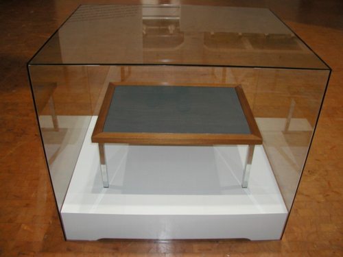
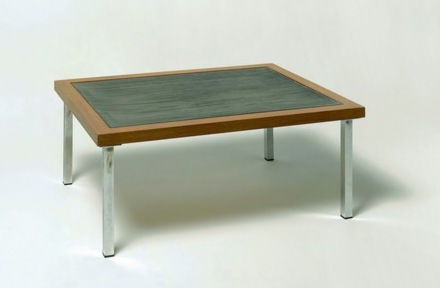
But the one I’ve been waiting to see is Modell Interconti. It’s a coffee table that Kippenberger made in 1987, and the top is made from a Gerhard Richter Grau painting. Kippenberger bought the painting as a Richter, then sold it as a Kippenberger, promptly destroying–or at least disappearing–a significant percentage of its market value.
Though I’m sure he didn’t take too big a hit. Richter’s grey paintings have never been as pricey as his less boring work: the blurred photo-based paintings, the gloppy aerial landscapes, the hard color grids, the squeegees. Which is part of why I like the grey paintings so much; they can be so successful at eliminating the extraneous elements and letting you focus purely on the paint, the surface, the object. And the range is anything but boring. Those giant grey glass paintings at Dia:Beacon create a space as seductive and perceptually disorienting as any Serra.
Ten years after Kippenberger made Modell Interconti, you could get a slightly smaller Richter grey painting at the Armory Show for around $10,000. Which was probably the price of a major Kippenberger by then, too. So within a decade, Kippenberger had caught up with Richter’s market. And now a major Kippenberger–like, say, Modell Interconti–is surely worth more than a small, demure Richter. At least it was pre-meltdown.
Modell Interconti, 1987, collection Gaby and WIlhelm Schürmann [image: swo.de, link broken (2016)]
The MoCA photo used by the LA Times is probably better. [latimes]
2016 update: Chin-Chin Yap’s case study of the moral rights associated with Modell Interconti, from July 2009 [artasiapacific]
Gerhard Richter’s Cologne Cathedral Window Up-Close
Seriously, the Cologne Cathedral is so on my list of places to visit, once the sunlight returns. I love this photo.