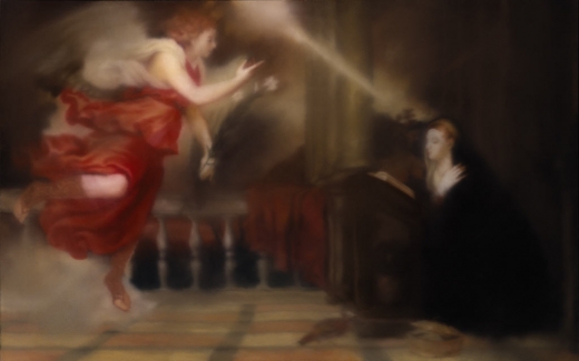
Annunciation after Titian, CR 343-1, 1973, collection Hirshhorn Museum, image: gerhard-richter.com
I confess, I love Gerhard Richter in the 70s. Here are some of the best/funniest excerpts from a interview he did with art historian/curator Gislind Nabakowski that was first published in Heute Kunst in 1974. The subject was Annunciation after Titian, a series Richter painted in 1973, after visiting Venice in 1972 for the Biennale.
The first in the series, above, is in the Hirshhorn’s collection. The series has not been shown together since it was first exhibited in 1973 at the Galleria la Bertesca in Milan.
GN:What made you choose a fifteenth-century painting as a model and create a sequence based on Titian’s Annunciation?
GR: Because there’s something about this painting, or any painting, that grabs me if they’re good–irrespective of the impact they had at the time, why they were made, the story behind them. I don’t know what motivated the artists, which means that the paintings have an intrinsic quality. I think Goethe called it the “essential dimension”, the thing that makes great works of art great. I beg your pardon?!
First, Happy Birthday, Mr. Richter.
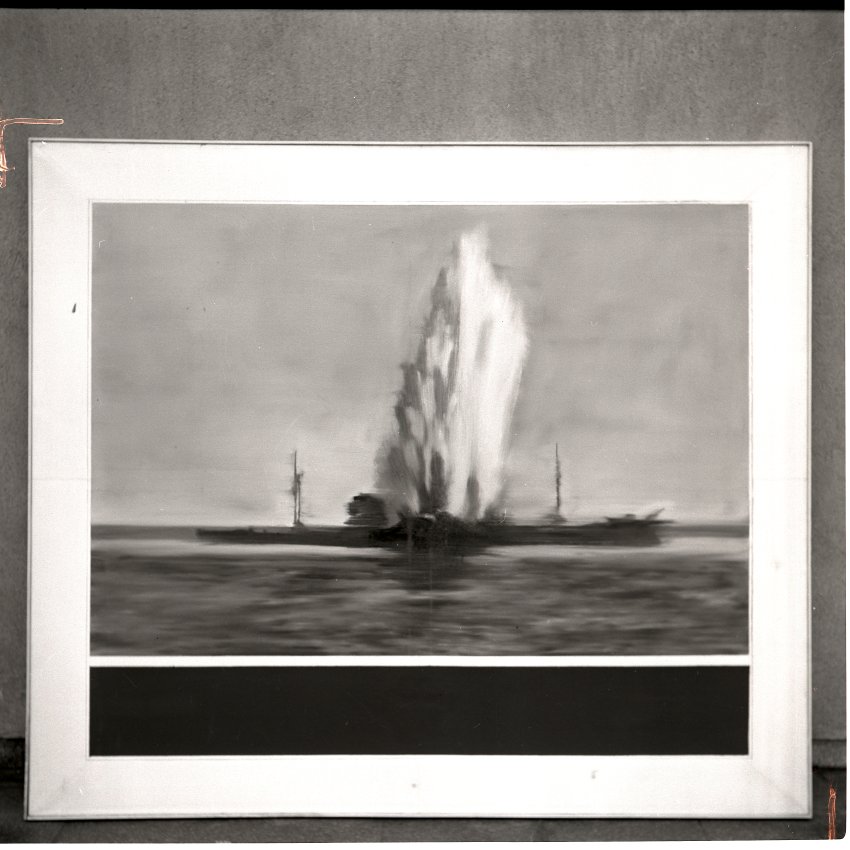
Destroyed 1964 Richter painting, image from Gerhard Richter Archkiv via Spiegel
I don’t know if Joerg knew at the time he first tweeted about it–he is plugged in and German, so who knows?–but I certainly had no idea when I picked up on the topic of Gerhard Richter “destroying” paintings by painting over them. But it turns out that the 74 paintings listed as “[DESTROYED]” on Richter’s website are only a fraction, barely half, of the paintings he’s actually destroyed so far. In an interview with Ulrike Knöfel for Spiegel, Richter talks about the 60 or so photo-based paintings he destroyed in the 1960s during a very self-critical period of his career. Not to worry, though, because, being Gerhard Richter, he photographed them first
These photos, most of which were never published, are now either in the Gerhard Richter Archive in the eastern German city of Dresden, where the painter was born, or in a box in his studio in the western city of Cologne. They are testaments to his refusal to compromise.
Mhmm. Though the ambivalence/regret/equivocation Richter expresses in the interview reveal that a refusal to compromise is not automatically a win. Couldn’t he have just put them away and not looked at them for a while instead?
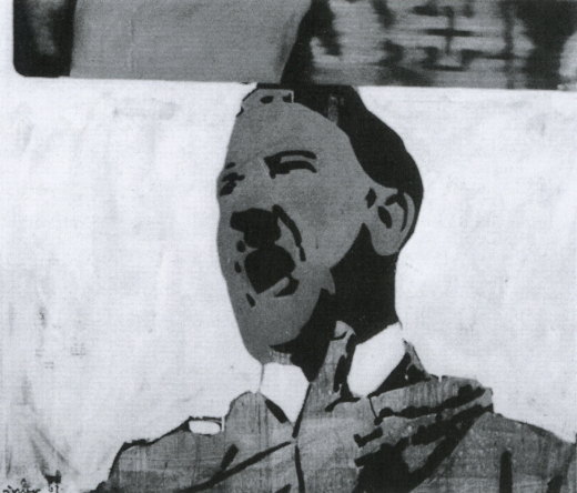
None were apparently included in Richter’s first catalogue raisonne, the source for his website’s “[DESTROYED]” list. And many appear to date from the earliest phase of his recognized work, 1962-4. Oh but wait, his much-discussed 1962 Hitler IS online, described as “believed to have been destroyed.” Hitler, 1962, image via gerhard-richter.com
That seems like a new category, loaded with ambiguity. I like it much better than “[DESTROYED]” or even “Richter painted over this work in ___. The painting is now entitled ____.” Which, it turns out, has another example:
Today, Richter says he’s surprised at how many works he continued to destroy after the 1960s. Perhaps he will return to one motif or another, he adds, noting that “otherwise it would be a shame.” One painting, in particular, comes to mind. It was painted in 1990 and shows two young people standing in front of Madrid’s Museo del Prado, Spain’s national art museum. However, two years later, he painted over this work, turning “Prado, Madrid” into “Abstract Painting, 1992.”
Which, yeah, there is no Prado, Madrid in the CR, and there are at least 279 Abstraktes Bild done in 1992, so, this’ll take a bit of digging. I’ll update the post when/if I find it. [I’ll have to do an update post anyway, because I’ve already found at least two other overpainted paintings.]
This painting over thing is one thing. The other, which I’m kind of fascinated by now, is the relationship between painting and photography as it plays out in these destroyed paintings. Which, of course, still exist as the artist’s photographs. It’s like Barthes’ Camera Lucida; they’re gone, but not. I can’t tell if this is Spiegel’s interpretation or reportage:
Still, since his urge to destroy some of his paintings also made him feel uneasy, he photographed them before doing so.
But someone has to have already looked at this backup, insurance, documentary, archival, post-mortem, forensic, ghost aspect of the way these two mediums intertwine. Right? Photo of destroyed Gerhard Richter painting, 1960s, by Gerhard Richter, image: Gerhard Richter Archiv Dresden via Spiegel
Meanwhile, the obvious thing–and isn’t that what I’m here to point out?–is to recreate these destroyed Richters. Whether you paint the archival photo, crop marks and background and all, in a meta-Richterian gesture, or just try your darnedest to bring their destroyed, painted subjects back to life, I’ll have to figure out. But paintings based on a painter’s photographs of paintings based on photographs? What’s not to love?
It’d be trivial to the point of meaninglessness to just print the Spiegel jpgs on canvas, or to order them up from Chinese paint mills. But I’d be interested to see just how much more meaning could be gleaned by painstakingly copying them by hand. Even if the answer is very little, that’s still an important datapoint. His Own Harshest Critic | A New Look at Works Destroyed by Gerhard Richter [spiegel.de via bigthink]
Joerg tweeted last night about a “[DESTROYED]” 1982 Gerhard Richter candle painting, and heeyeahsure, I’ll look at that.
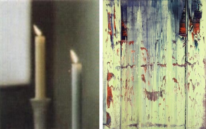
It turns out though, that the artist’s own term is not entirely accurate. Because according to his website, the painting, 2 Candles 1982, (CR 499-3), still exists: “Richter painted over this work in 1996. The painting is now entitled Abstract Painting (CR 837-4).”
l: 2 Candles, 1982-96 state; r: Abstract Painting 837-4, 1996-, images via gerhard-richter.com
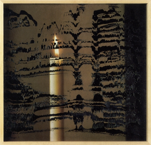
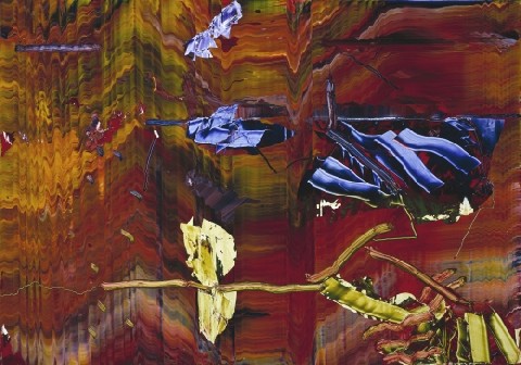
Which would be interesting enough if it were a one-off thing. And no, it appears that Richter has not painted over any of the 73 other paintings listed as “[DESTROYED]”. But by 1996, he had already been painting on photographs for a decade. In 1989, in fact, he produced two editions of candle images overpainted with squeegees. Candle III, 1989, ed. of 30+10, image: gerhard-richter
There are at least a dozen other such editions since then which combine photos or photoreproductions and squeegeed abstract overpainting. They constitute a persistent connection between the two seemingly diametrically opposed bodies of Richters’ work: photo-based representation and so-called aleatoric, or mechanized, gestureless abstraction. It’s a dichotomy that continues to stump even the illustrious Benjamin Buchloh, who laments while writing, at great length, in the latest Artforum: “The question posed over and over again (and which has basically remained unanswered) was how these photographic images could be related to the emerging works of abstraction.”
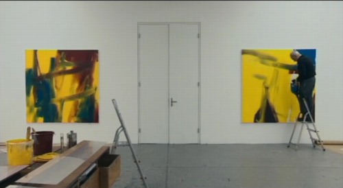
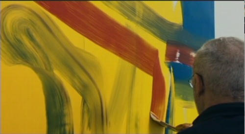
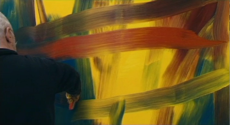
But my bigger point here, which Buchloh also cursorily notes, as does anyone who’s seen Corinna Belz’s film Gerhard Richter Painting, is that overpainting is central to Richter’s abstract practice. In these stills from the scene that appears in Belz’s original trailer, Richter very thoughtfully creates classical gestural abstractions:
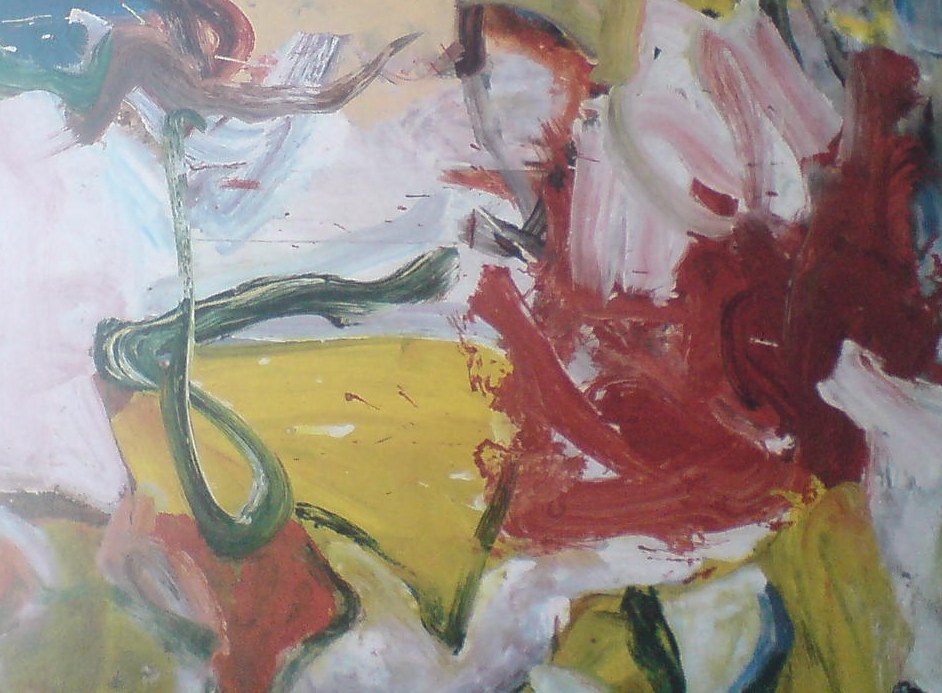
Which remind me of nothing so much as the great, underappreciated-until-just-now, large-scale paintings of Willem de Kooning from the mid-1970s.
It’s one of the main reasons I hustled back to MoMA to see the de Kooning show on the last day, after seeing Belz’s film, and after getting both the Richter and de Kooning catalogues for Christmas. Because these amazing wet-on-wet structures that Richter laid down
felt almost like reincarnations of some of the virtuoso brushstrokes de Kooning made in 1975 paintings like Screams of Children Come from Seagulls [check out this dark blue, sideways L from the upper right quadrant, for example]
or the single, epic loop at the center of the Art Institute of Chicago’s Untitled XI (1975):
And then when they’re just right, Richter takes his squeegee to them. As if getting erased by Rauschenberg wasn’t enough.
But–oh man, I really did just mean to do a quick, “ooh, look, overpainted Richter!” post here–but this is the thing that bugged me so bad about Buchloh’s reading: his extraordinarily limited range of references in discussing Richter’s work. I mean, it’s basically Johns and Stella [Stella!]. And he dismisses Johns on false pretenses. And doesn’t mention de Kooning once.
Here’s what Buchloh got from Belz’s film–WHICH HE WAS IN: some kind of Surrealist theatrical something or other:
Starting the production of each canvas with strange rehearsals of various forms of gestural abstraction, as though moving through recitals of its legacies, in the final phases Richter seems literally to execute the painting with a massive device that rakes paint across an apparently carefully planned and painted surface. Crisscrossing the canvas horizontally and vertically with this rather crude tool the artist accedes to a radical diminishment of tactile control and manual dexterity, suggesting that the erasure of painterly detail is as essential to the work’s production as the inscription of procedural traces. Thus an uncanny and deeply discomforting dialectic between enunciation and erasure occurs at the very core of the pictorial production process itself, opening up the insight that we might be witnessing a chasm of negation and destruction as much as the emergence of enchanting coloristic and structural vistas.
Alright, so maybe it’s not that wrong. No, it is, because after 20 years working on layers and layers of paint with that “crude tool,” Richter has proved, I think, that he has all the control he needs.
Just as Rauschenberg’s erasing were not negation, but creation through another type of mark, I think Richter’s squeegee strokes are generative additions to, not killers of, the rich repertoire of markmaking techniques he inherited. Maybe it took Belz’s film to show how tightly the squeegee marks are linked to Richter’s body and movement. They don’t diminish, but magnify; they’re full-body gestural abstraction.
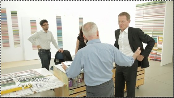
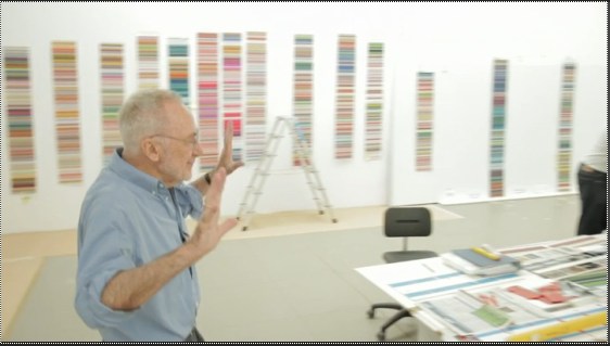
For a great illumination of the specifics of Richter’s abstract production, I keep going back to Tate Modern conservator Rachel Parker’s discussion with blogger Mark Godfrey during the Panorama show:
If we think about the very large scale of Wald 3, we must consider the logistics of one man making this painting. Although Richter probably dragged the squeegee across the wet surface in two separate applications this process must have demanded enormous physical energy. The two resulting squeegee tracks are obvious: one track extends from the top to about 5/8 of the way down the painting surface and the other starts just below this. It would appear that Richter applies the squeegee first to the left side of the work and then drags it from left to right: with both tracks he appears to stop ¾ of the way across for a rest before completion. You can also tell exactly when the momentum of dragging the squeegee across the very tacky surface began to slow down as the drag marks become more shallow. The upper track is characterised by the squeegee having embedded itself more deeply into the paint resulting in slightly sharper surface disturbances and deeper excavations. The lower track has glided more fluidly across the surface creating lighter disturbances. There is undoubtedly an element of chance in the results of this technique: the first track will bear most influence on the final composition whereas with the second track, Richter tries to replicate the same direction, speed and weight behind the squeegee to re-create the same marks in the paint. The compositional balance between track 1 and track 2 in Wald 3 exposes Richter’s trust in his materials and intuitive craftsmanship.
I’ve got more bone to pick with Buchloh’s analysis, which ultimately fails to convince because it seems so disengaged, so cut off within the hermetic, Richterworld bubble. But maybe later.
Because Parker and Godfrey make a very persuasive case, I think, for some of the implications of Richter’s overpainting,. In this case, they discussed SFMOMA’s 1999 Abstract Painting (CR 858-6) [above] on aludibond panel:
Richter has applied his paint in a similar manner as before, manipulating the paint with a squeegee when the paint is very newly applied, hence its fluid character…Once the paint has dried Richter has taken a sharp wide-head palette knife and gouged and scraped features out of the paint layer, exposing the paint-stained white preparatory layer beneath. The technique creates a hallucinatory effect (are the shapes portals or are they solid elements floating in a multi-dimensional composition?).
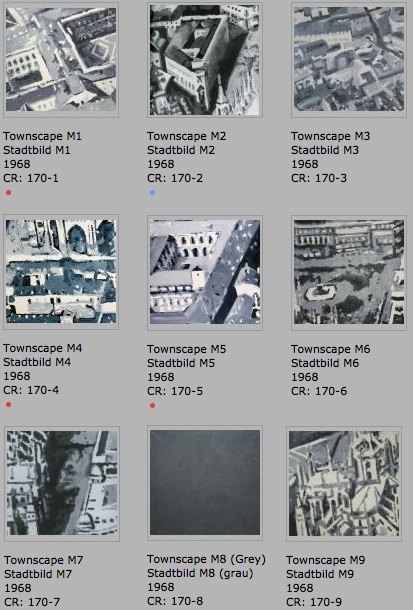
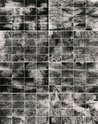
These underlying paintings aren’t destroyed; they just become something else. UPDATE: Alright, I’m righter than I knew. There are at least three more overpainted paintings. Stadtbild M1-M9, 1968, rearranged into a 3×3 grid, image: gerhard-richter.com
The earliest known example is from the Stadtbild/Townscape series, from 1968. Richter first created a large, 2.7m x 2.7m painting based on an aerial photograph of the center of Milan, which he then cut into nine nearly square paintings, numbered M1-M9. Townscape M8, however, he painted over with grey [above]. Joe Hage, the collector/technologist/uber-groupie behind Richter’s website notes:
Townscape M8 depicted what was presumably a detail taken from the same source photograph and was painted over with grey paint later.
…
The series Townscapes M1 up to M9 illustrates Gerhard Richter’s engagement in the process of abstraction: starting from a concrete depiction, which was enlarged at first and then cropped, the final image can barely be traced back to the source photograph. The numbering of the single parts of the painting, which do not relate in any way to their initial positions in the original large format, also suggests that any kind of identification is less important to Richter than the painterly process of abstraction.
So in this case, at least, there is currently only the presumption of underpainting, based on the series, the title, and the procedure of its making. Hanged and Blanket, both 1988, via gerhard-richter.com
The next example, though, is the opposite. While painting his October 18, 1977 series in 1988, Richter made two identically sized versions of Hanged [above, left], only to partially paint over one and retitle it, Blanket, after the blurred photo-based image that remains visible under the squeegee. The CR numbers show that Blanket [680-3] was completed some time after Hanged [668], with at least two dozen squeegee paintings in between [including two “[Destroyed]” works]. After evoking the “function of a curtain in art history: a painted curtain indicates that a glance is allowed at something that should not necessarily be seen,” Hage’s note offers an interpretation of this overpainting: “It appears almost as if Richter wanted to shield the events from view, by painting over the second version of the painting almost completely.” Which would be true enough in isolation, but which seems to mean not considering the existence of the un-squeegeed version. Which is nevertheless blurred, as if there’s a continuum of obscuring and revelation.
The third example comes from the Spiegel story on Richter’s destroyed paintings. Ulrike Knöfel writes of a work
painted in 1990 [which] shows two young people standing in front of Madrid’s Museo del Prado, Spain’s national art museum. However, two years later, he painted over this work, turning “Prado, Madrid” into “Abstract Painting, 1992.”
There’s no Prado related work mentioned on the side, but there are two Atlas pages of photos from Madrid. I’m still looking through the 279 108 abstract paintings from 1992 to see if I can figure out which one it is. update from a few minutes later: no idea.
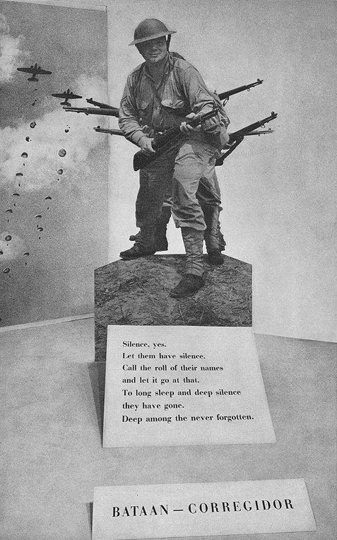
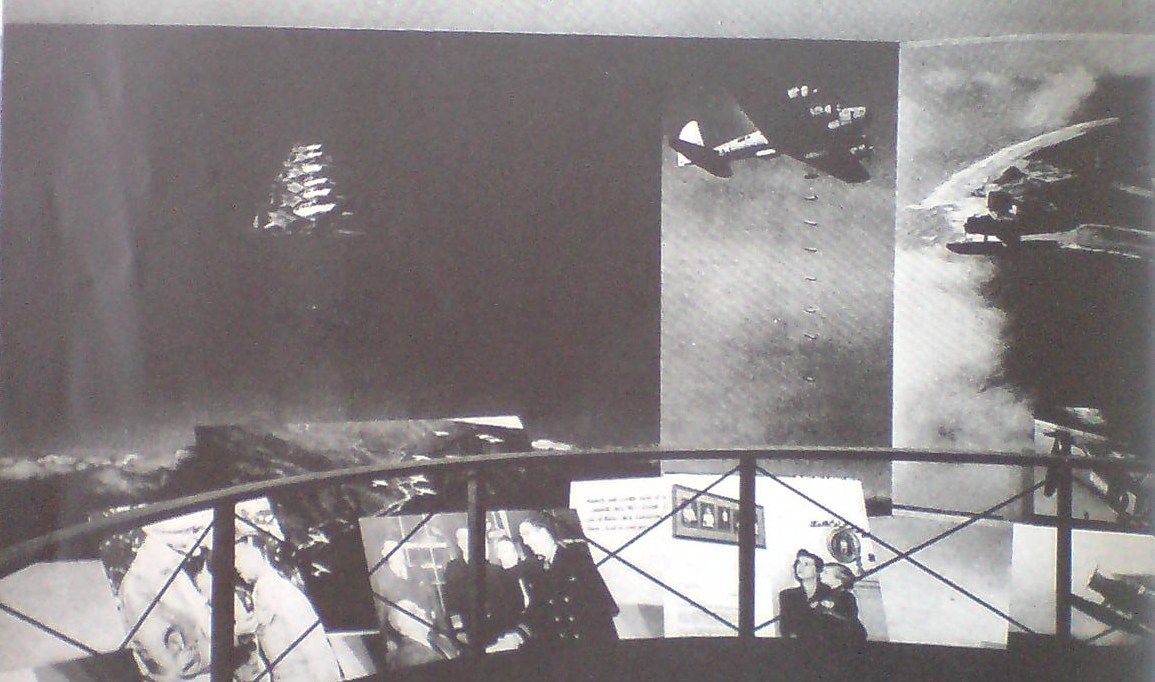
See, this is why I wonder about whether Gerhard Richter, “shocked” by seeing Edward Steichen’s MoMA exhibit Family of Man in West Berlin in 1955 while he was a student, ever went on to research Steichen’s earlier photography exhibitions, such as the 1942 Road To Victory.
Because all around the life-size photo cutout of a GI on Corregidor is a whole series of giant aerial photos of US bombers and fighter planes at work. Over the skies of Germany.
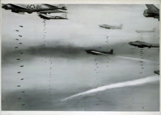
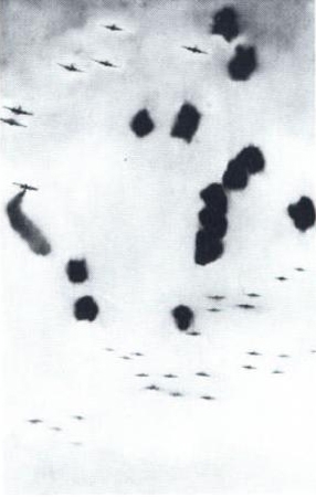
And though Atlas shows Richter took a specific image from a newspaper for his first airplane painting, it does look very much of a type–and of a scale–that Steichen was using, too. Bombers, 1963, image: gerhard-richter.com
And then this one which, like the one behind the cutout, is clearly taken from the ground–and, just as clearly, from the business end of a bombing run: Airplanes, 1963, image: gerhard-richter.com
Loads of death, tons on tons of annihilation, out of
the sky and down down down on the enemies of
the free world–killers with wings–dropping
polished cylinders to let loose tornadoes of hell
and ashes on the hideouts of the “New Order.”
Photographers once again assumed a special role for this reconstruction, this production of a new, new vision and new, new man. Such was the mission adopted programmatically by Edward Steichen for The Family of Man, for example,
So whatever Family of Man‘s photographs may have told Richter “about modern life, my life,” once he came West and started painting, I’m not so sure he was still buying it.
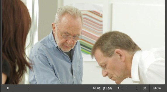
The Tate video of Nic Serota and his team in Gerhard Richter’s studio is nice for many reasons: it includes some squeegee action scenes from Corrina Belz’s Gerhard Richter Painting [which I’m trying to get a copy of; Is there anyone in London who can pick up a DVD for me? Or in the UK anywhere who can accept a shipment and forward it onto me?]
For filming, they moved the model of Tate Modern’s galleries into the main studio room, which was full of strips of the Strips series [and hey-ho, a bent strip too, what’s up with that?]
But the most interesting thing to me, anyway, is this exchange from Serota’s interview of Richter, about leaving East Germany:
GR: We had also the possibility to go every a year at least twice to West Berlin, to saw movies and exhibitions. It was the first time I saw the wonderful Family of Man
it was a famous exhibition. NS: This was the exhibition made by Edward Steichen GR: Uh-huh, and this was a real shock for me, this show. NS: Why? GR: Yeah, so, to see these *pictures,* and I only knew paintings, I was very interested. And they showed so much, and they told so much, these pictures, these photographs. They told so much about modern life. my life. NS: So was this the moment when you discovered photography? Or the power of photography? GR: Let’s say the power, yeah, of what photography can do.
Serota delivers that question with an intensity that makes it feel like a scoop, and I don’t think his reaction is [just] for the camera. I haven’t found any previous mention of Family of Man either by Richter or in relation to his work. Steichen isn’t in the index for the collected writings. There’s no mention of it in Christine Mehring’s study of Early Richter. And though Elger’s bio for the period in question–Family of Man opened 17 September-9 October 1955 at the Hochschule für Bildende Künste–mentions Richter’s trips to West Germany during what was his last year studying mural painting at the Academie in Dresden, there’s no mention of the photo exhibit itself.
As for Richter’s nascent interest in photography, the artist did tell Rob Storr that he received copies of Magnum magazine from an aunt in the West. And Elger notes that his family photo album was “one of the few belongings Richter would take with him when he fled to the West.” But the artist now adds Family of Man to the list of his early photographic influences. It makes me wonder what the show actually showed Richter about photography’s power, and whether the artist went on to study Steichen’s other MoMA photo exhibits, the ones that didn’t travel to Berlin.
Image above: Edward Steichen in the Berlin installation of Family of Man, 1955, via moma.org Tate Channel | Gerhard Richter (21:58) [tate.org.uk via @aodt]
Previously: The Family of the Family of Man: Steichen, Miller, Rudolph, Stoller
Alright, I’ve looked into it and talked to some folks, and while I was and am right to be incredulous, I now feel a little better about Gerhard Richter’s Strip series of digitally printed works Marian Goodman is showing in Paris [above].
So I talked with some Richter collectors, some people who have seen the work in person, either in Paris or elsewhere, and some folks at Marian Goodman, who thoughfully listened to my grave declaration that “I have some real issues with these works,” and gamely engaged it, almost as if a real sale were hanging in the balance, which, obviously, it was not.
The easiest and best first thing to do: ignore Buchloh. I started reading his catalogue essay, and just decided that his ruminations on the implications these digital prints under plexiglass have for the history of facture would just piss me off, so I set it aside for another day. Ultimately, the way I’ve come around to the work, or at least come to see it as credible, is by considering it within Richter’s own practice and history, not as a dubiously hyped innovation of global import.
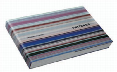
Invariably, in every conversation, the first reply to my skepticism about these giant pixel extrusions was, “Have you seen the book?” “The book” is not the slim exhibition catalogue for Goodman’s show, which reproduces 14 examples of Strip, and edition of 72 unique digital prints [53x105cm, mounted on Aludibond] which were chosen from 4,096 possible strips by “chance operation”; as well as the much larger [160x300cm, plexi] works made by combining “selected” strips. [There are also the oil-poured-on-glass Sindbad pictures, but whatever. Off topic. I just want to contrast the different processes, one clearly Cageian, one clearly not, that went into making works out of the system Richter devised.]
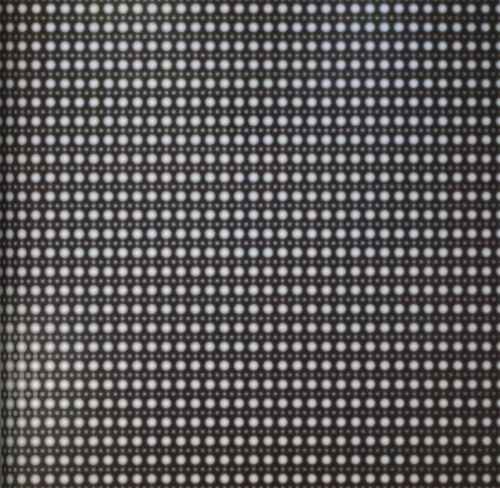
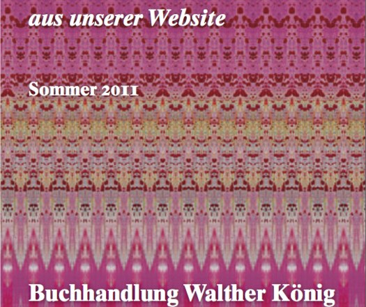
And that system is what’s only really expressed fully in “the book.” Patterns. Divided – Mirrored – Repeated, the massive artist book [41x27cm, 520 pages] published by Walther Koenig in an edition of 800+50, is overwhelming. It consists of 221 spreads showing strips from each of the “twelve stages of division” being mirrored and repeated. I found myself constantly turning back to the key, a diagram of Abstraktes Bild CR724-4, the 1990 squeegee painting which is Richter’s “ready-made” source overlaid with the division and subdivision matrix used to generate the strips. I should have snapped a photo of it, but instead, I’ve simulated it here by hand, with only six divisions, instead of Richter’s twelve:
The exponential increase reminds me of the old illustrations of a nuclear chain reaction, which is kind of relevant; Richter has printed digitally manipulated photos of atoms taken with an electron scanning microscope, like his Strontium photomural [below] at the deYoung in San Francisco. Richter conceives of a similarly infinitesimal division continuing here, too, and he apparently only stopped at 4,096 0.8mm-wide strips because the next level of would require magnification to see. Strontium 2004, 910x945cm, CR888, image via gerhard-richter
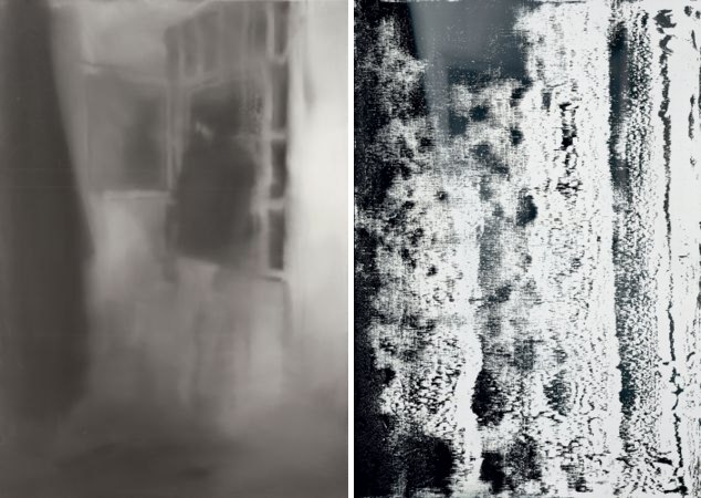
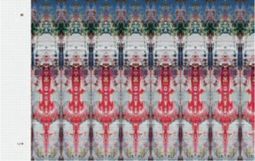
Before seeing Patterns, I originally thought these Strips were just pixel-wide extrusions. They are not. The wider, lower-order strips clearly show the mirroring and repeating. Here’s a detail from the cover of Koenig’s 2011 catalogue [pdf] and an unsatisfying page shot from inside. I’d say these are from the 256 and 128 divisions, respectively:
Even on the 2,048 division strips, you can still see the pointy, mini-Rorschach forms. And yet all the stand-alone editions and works came only from the 4,096 level. Which I assume means the static/boring horizontal stripes running across the larger prints should vibrate up close with nearly invisible mirrorings. And since no one has mentioned it, and everyone’s first and last resort to the book instead, I’m going to assume that effect is either not evident, not successful, or not compelling.
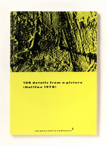
This is not the first time Richter has undertaken a photographic dissection of a painting, of course. He reworks reproductions of his paintings for editions all the time. [He also cut at least one squeegee painting into pieces, which were sold separately, but that’s another story.] His most closely related experiment dates from 1978, where he took black and white pictures of an abstract painting, Halifax, which he used in a photogrid, 128 Photographs of A Picture, and in several artist books, beginning in 1980 with the edition that inspired the title of this post,128 Details From A Picture (Halifax 1978) I.
Unlike the computational precision that generated Strips, Richter took the 128 Halifax photos “from various sides, from various angles, various distances and under different light conditions.” And yet the end result of both is an apparently randomized, disorientated view of deracinated fragments. A nod to photography’s mechanical “magnifiying vision,” but also a deliberate and thorough sandbagging of its objective, informational idiom. 128 Details from a Picture (Halifax 1978) II, 1998, offset prints, image via gerhard-richter
For years, I’ve loved the Halifax photow way more than the painting. Richter’s expedition across the surface of the painting turns it into a landscape, which his images don’t even pretend to map. Richter must like them, too, because he’s kept reissuing them over the years as new booksandeditions.
So already in 1978, Richter demonstrates there is no way to reconstitute the image of the original painting from the distorted, incomplete photofragments. Not news. But that might be fine. I bet you could reverse engineer a pretty reasonable approximation of 724-4. Or at least an actionable one. Or an interesting one.
And I would bet that, if you fed a hi-res photo of Halifax and the 128 photos into a computer, it would now be possible to crunch the images and solve the puzzle. Not only could you identify all the parts in the photos, analyzing the light angles and camera distances in a 3D animation program should reveal Richter’s position, sequence, and the path he took as he wandered around the painting with his camera.
Richter was able to stay a generation or so ahead in his flight from intentionality, but it seems to have caught up with him.
Previously: Gerhard Richter Strip Show
Similar but not related: Marion Thayer MacMillan’s Water Pictures
For the record, I think a press conference is a pretty suboptimal forum for discussing art, even worse than for discussing film.
So while I was first leaning towards laughing at Gerhard Richter’s apparently gruff, uselessly short-for-a-sound-bite answers at yesterday’s Tate press preview, now that I read the mostly stupid questions, I will cut him some slack. If I were a museum marketing guy, I might wish for the artist’s quotable help in promoting a big show, but that is also clearly not Richter’s M.O. He paints, they shoot, he leaves.
This exchange toward the end, though is pretty damn funny:
Q: Members of the press may be surprised to hear that the published version of your collected words runs to more than a thousand pages (laughter) all of which are fascinating and enlightening. And I wondered if you still write about your work?
GR: “No. not enough!” (laughter).
Gerhard Richter: Peinture 2010-2011, installation view, Marian Goodman Paris, image via
Yes, well.
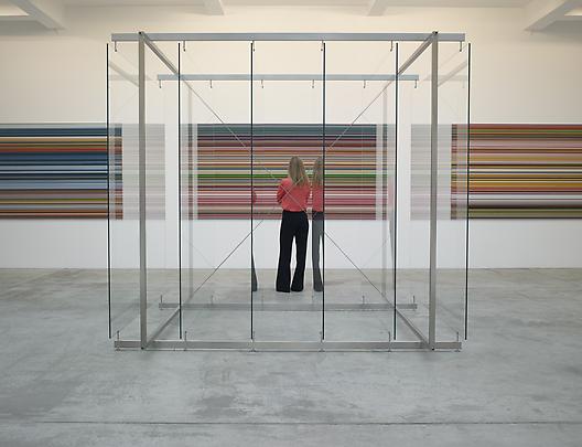
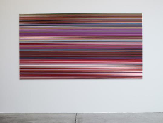
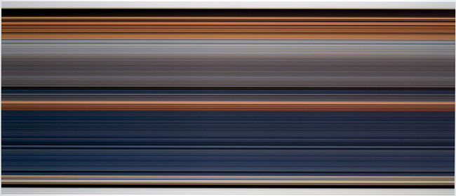
While everyone is transfixed with Gerhard Richter’s c. 2009 on-camera squeegee technique, the artist himself has moved on to a schmear of the digital kind. Gerhard Richter: Paintings 2010-2011 is on right now at Marian Goodman Paris, and most of the work on view barely seems to meet the promise of the show’s title. There is a large glass plate structure at the center of the gallery, and there are some small poured-paint-on-glass works. And then there’s the Strip series, unique digital prints mounted under Perspex.
To make Strip, Richter digitally mirrored/extruded vertical slices of an abstract painting–here, the description for the project’s artist book, Gerhard Richter: Patterns. Divided – Mirrored – Repeated explains it better:
The artist’s book documents Gerhard Richter’s experiment of taking an image of his original Abstract Painting [CR: 724-4] and dividing it vertically into strips: first 2, then 4, 8, 16, 32, 64, 128, 256, 512, 1024, 2048, up to 4096 strips. This process (twelve stages of division) results in 8190 strips, each of which is the height of the original image. With each stage of division the strips become progressively thinner (a strip of the 12th division is 0.08 mm). Endless more divisions are possible, but they would soon only become visible by enlargement. Each strip is then mirrored and repeated, which results in patterns. The number of repetitions increases with each stage of division in order to make patterns of consistent size.
Abstract Painting, CR:724-4, 1990, via gerhard-richter.com
The 520 page [!], EUR450 book documents 221 of these repeated patterns. Marian Goodman’s showing six. At first I expected the Strip works to be the same dimensions as 724-4 (92x126cm), but no, not at all; the Strips are much bigger, 160x300cm.
Buchloh is, as always, agog at the import and implications. An excerpt from a book-length essay as quoted in the gallery’s press release:
The status of painting in these new works is figured as exceptionally fragile, yet it is powerfully formulated in its assimilation to its technological challenges, as though painting was once again on the wane under the impact of technological innovations. Yet in its application of almost Duchampian strategies of fusing technology and extremely refined critical pictorial reflection, Richter’s astonishing new works open a new horizon of questions. These might concern the present functions of any pictorial project that does not want to operate in regression to painting’s past, but that wants to confront the destruction of painterly experiences with the very practice of painting as radical opposition to technology’s totalizing claims, and as manifest act of mourning the losses painting is served under the aegis of digital culture.
Mm-hmm. Richter has been working with photos of paintings and photos of overpainted photos for some time, so on the one hand, there is internal context for the artist’s pixel-width extrusions.
But the horizon of questions Richter’s new works open is only new if you’ve never left the studio. And how could painting, after all Richter’s work over all these years, still have it so rough? If we agree–and we have, cf., Liz Deschenes, Walead Beshty, Cory Arcangel, Tom Friedman (even), Andreas Gursky–that the aegis of painting has long since expanded in the digital culture, then can’t we welcome Richter to the party without pretending he threw it?
Tom Friedman, Untitled, 1998, image via metmuseum.org Gerhard Richter: Peinture 2010-2011, through Nov. 3 [mariangoodman] Same thing, documented work by work on the artist’s site [gerhard-richter]
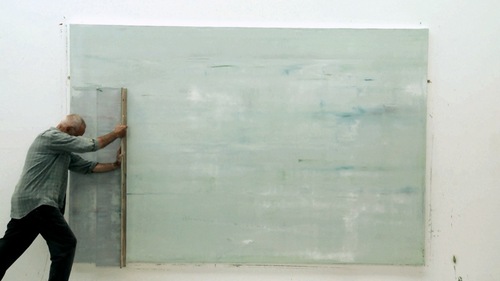
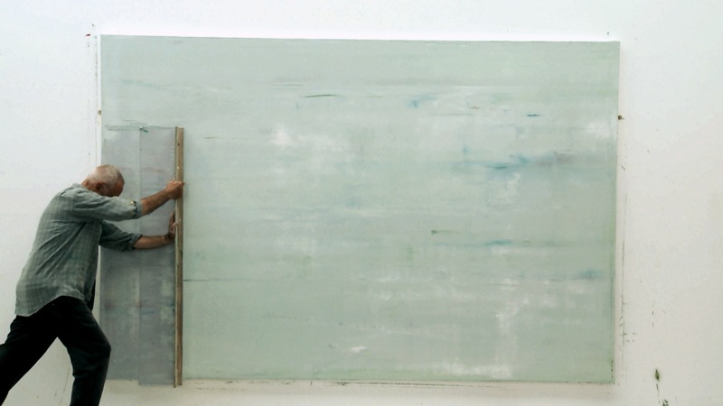
Gotta get a piece of that Gerhard Richter Painting. After completing a documentary about the artist’s Cologne Cathedral stained glass windows in 2007, filmmaker Corinna Belz began working on another project, filming Richter at work in his studio. She waited a year and a half for the artist to begin a new series of abstract paintings, and then she pretty much filmed the whole process.
It’s kind of crazy how jazzed I am after just watching the trailer. Those squeegees are so huge. And they’re clear. And he wields them by hand. Some of this we [I] knew, but it’s still kind of riveting to watch. Belz in an interview:
Books are a better medium to articulate theoretical positions. And the actual act of painting is hard to describe in words: The way Richter mixes primary colours on the canvas, generating such a complex colour system. How layers are built up and submerged, how sculptural they appear on canvas. The most important thing for me in this film was to show something uniquely visual.
I am aware of the work of Pablo Neruda Gerhard Richter.
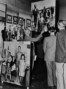
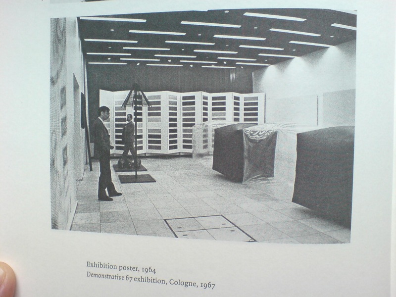
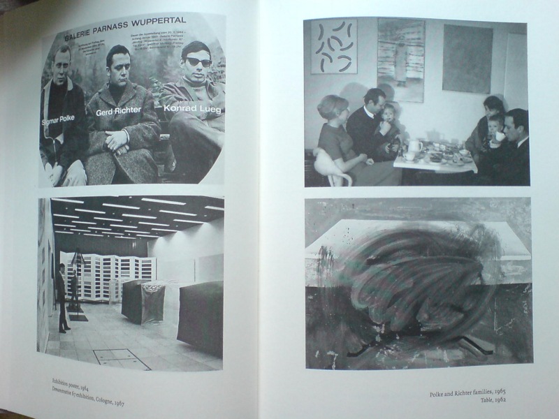
I have not been reading Gerhard Richter: Writings 1961-2007 straight through, of course, but it’s been with me a lot lately. And it’s kind of annoyed me that there is not really anything about this incredible photo, showing part of the installation of Demonstrative 1967, Galerie Heiner Friedrich’s weeklong exhibition at DuMont Publishers, down the street from the inaugural Cologne Art Fair, from which he had been excluded.
In addition to Richter, the display included works by his Capitalist Realist cofounders Sigmar Polke [I think that’s a raster bild there on the left] and Konrad Lueg [the inflatable cube structures], as well as by Blinky Palermo, Reiner Ruthenbeck, the British painter John Hoyland–and Cy Twombly.
Now about that Richter. That giant color chart painting which looks like a folding screen. For a while, it threw me off precisely because it looked like a folding screen. Considering 1967 was also the year Richter started working with glass panes and doors and other materials that related to a painting plane but were not, I was wondering if this painted, free-standing panel object embodied some lost chapter in the color charts’ “pop meets abstraction, quietly upends both” story.
Orrrr maybe, the painting was just too big to go on that wall, and Blinky needed that other wall, and Lueg’s balloons block everything anyway, and what the hell, it’s a week, and an art fair. Ten Large Colour Charts/ Zehn große Farbtafeln, 1966, via gerhard-richter.com
Because there is no color chart folding screen. That work is Ten Large Colour Charts (1966), a ten-panel painting in the K20 collection in Dusseldorf. It is one of the earliest color chart paintings Richter ever showed, but it’s probably the first that many German art worlders ever saw. [Eighteen Colour Charts was the first first shown, in Richter’s one-person show at Friedrich’s Munich gallery in May 1967.]
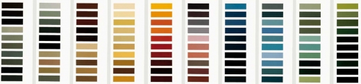
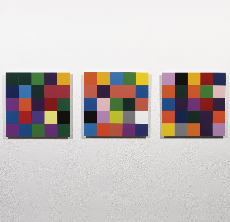
Anyway, point is, or one point is, I think, that looking at Richter’s color chart paintings, and his 4900 Colours grids before that, and his Cologne Cathedral stained glass window before that, and so on, changes the way you look at the world. And by you, I mean, of course, me. It changes the way you look at color samples, whether in the paint store, or at the moment, in a grid laid out on a governmental stylebook website.
And it’s not just a matter of this looks like that, or not entirely. Because there’s also the context in which Richter painted his color charts–and the larger biographical/political context that shoots through Richter’s entire practice. That Demonstrative 67 photo is in a spread with what may be my favorite snapshot in the Writings book: on the right there, not Table, 1962, CR-1 [!]–which, if Christopher Wool can take up painting with that thing already in the world, color charts are not gonna hold me back–the one on top, with the caption, “Polke and Richter families, 1965.”
Oh, just drinking some tea with the kids and Uncle Rudi.
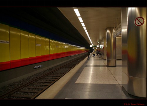
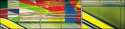
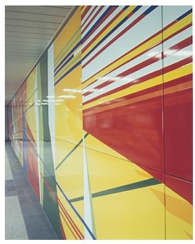
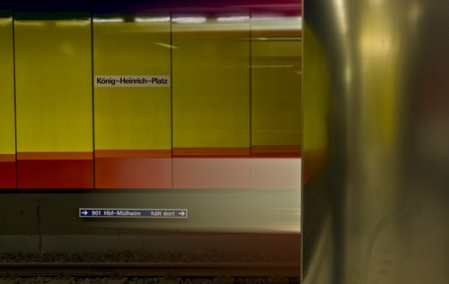
It’s hard enough for me to wrap my head around the fact that Gerhard Richter and Isa Genzken were married for 13 years. Now I find out they made a subway station together. A subway station about their relationship.
In a 1993 interview, Hans Ulrich casually asks Richter, “What works of yours exist in public spaces? The Underground station in Duisburg; the Hypo-Bank in Dusseldorf?”
And at first, I’m like, “Oh, right, besides the underground station in Duisburg.” But then when I looked it up, I see that it was only completed in 1992, so the Duisburg Metrocard in Hans Ulrich’s suit pocket probably still had two weeks left on it.
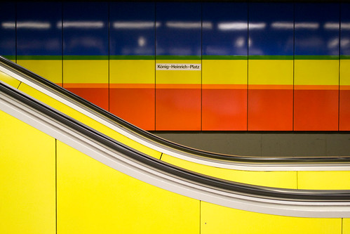
Anyway, the work seems remarkably undocumented. These are about the only pictures I could find. Genzken and Richter received the commissioned for the König-Heinrich-Platz U-bahn station in 1980. All the pieces of the project seem to be enamel on steel wall panels installed throughout the station.
Genzken made two murals facing each other on the train platform, with arcs from circles with radii of 3 and 5km, which relate to scaled down diameters of certain planets,” according to the Google cache of one mobile travel site.
Dietmar Elgar’s bio of Richter quotes Genzken’s project statement: “One curve corresponds to the curvature of Mars on a scale of 1:1,000, another curve to VEnus on a scale of 1:30,000.” Elgar then notes these references were “no coincidence. She was alluding to her romance with Richter.” [Richter apparently painted two abstracts, titled Juno and Janus, in response. Which is adorable.]
As for the station, Richter’s abstract mural adorns the west lobby, while in the east station entrance, the couple installed 24 enamel signs with historical facts about Duisburg. Frankly, I’m not feeling it. Maybe if someone were to go to Duisburg and shoot a flickr photoset of the station, we could get a better sense? Bitte-schoen?
Or maybe the thing to do is to stop looking for art, then you can see it. Here are some photos of the station from the web which happen to show some of Richter or Genzken’s works: fotocommunity.de
by R + G Team Dülmen, via fotocommunity.de
by ati sun via flickr U-Bahn Kunst [duisburg.de]
Previously: giant Richter triptych commissioned by BMW
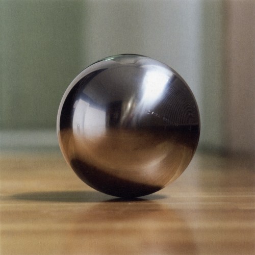
Oh no! I mean, oh yeah!
Gerhard Richter did do other steel balls. At the end of his 1973 interview with Irmeline Lebeer, he complains about my favorites of his series, the grey monochromes:
the only problem with them is that they are so beautiful. And that bothers you?
No, but it’s like a blank canvas. A blank canvas is the most beautiful thing, and yet you can’t just leave it like that. You have to add other elements to it. If it were only a question of perfection, we wouldn’t do anything any more. You need dynamics and a certain tension.
Without those, everything would be dead. We would all come to an agreement, once and for all, on the sphere. At home, I have these particularly beautiful steel balls.4 But it’s impossible to get any closer to perfection. But we start down that path, it’s all over.
Which is an odd place to put a footnote saying that “Indeed in 1989 and 1992 Richter produced three editions of balls made of gleaming stainless steel.”
The largest was the last, Sphere III [above, via g-r], which was done in an edition of 11. In addition to the title, signature, number and date, each ball is engraved with the name of a Swiss mountain. Spheres I and II are 8cm [ed. 25] and 5cm [ed. 11], respectively, with no mountains involved. According to the Dallas Museum of Art, which has all of Richter’s balls, they were all published by Anthony d’Offay and fabricated by FAG Kugelfischer, which I will assume is a company. Indeed, under the Schaeffler Group’s guidance, FAG has been a leading German manufacturer of ball bearings for over 120 years. search results: kugel [gerhard-richter.com]
Previously: Richter’s Balls, Regrets
So I’m reading along in my new copy of Gerhard Richter: Writings 1961-2007–which is pretty awesome, and which does appear to supersede the artist’s previous collected writings, The Daily Practice of Painting, which is good to know, but really, what to do with all this information?–and I come across this discussion of glass and mirrors and readymades in a 1993 interview with Hans Ulrich Obrist, and I’m like, holy crap!
When did you first use mirrors?
In 1981, I think, for the Kunsthalle in Dusseldorf. Before that I designed a mirror room for Kasper Koenig’s Westkunst show, but it was never built. All that exists is the design–four mirrors for one room. The Steel Balls were also declared to be mirrors
It’s strange about those Steel Balls, because I once said that a ball was the most ridiculous sculpture that I could imagine. If one makes it oneself.
Perhaps even as an object, because a sphere has this idiotic perfection. I don’t know why I now like it.
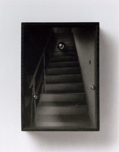
Richter’s mirror Steel Balls? Whew, never mind, they turn out–I think–to be Kugelobjekt, 1970, these odd, little postcard-sized objects, three steel ball bearings suspended in plexiglass in a shadowboxed photo of a staircase. Kugelobjekt I, 1970, image: gerhard-richter.com
And anyway, on the next page, Richter explains how all the work on the dimensions and framing and installation of 4 Panes of Glass meant it’s “not a readymade, any more than Duchamp’s Large Glass is,” when he goes,
At one point I nearly bought a readymade. It was a motor-driven clown doll, about 1.5 metres tall, which stood up and then collapsed into itself. It cost over 600 DM at that time, and I couldn’t afford it. Sometimes I regret not having bought that clown. You would have exhibited it just like that, as an uncorrected readymade?
Just like that. There are just a few rare cases when one regrets not having done a thing, and that’s one of them. Otherwise, I would have forgotten it long ago.
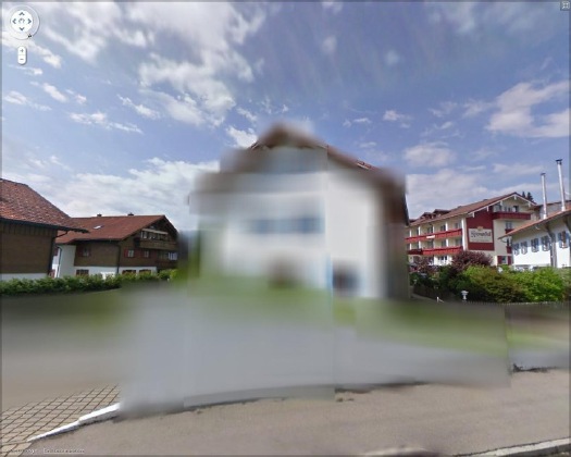
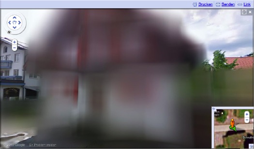
Amidst a fierce, ongoing, politicized debate, Google has released the first Street View panoramas for Germany. To assuage privacy concerns, the company is allowing homeowners to assert their Verpixelungsrecht, that is, their Right to Pixelation.
Some 240,000 locations are thus set to be blurred out. From what I can understand, though, the rollout is still in its early stages, and so only a handful of blurred buildings have gone live.
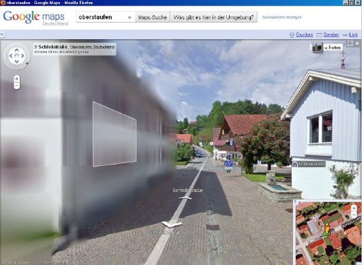
And the hunt is on. The few opt-out houses spotted so far have fed the media firestorm anew, and the examples cited by Der Speigel or FAZ [Google Translate] from Oberstaufen, the tourist village which first invited Street View to town, have been removed by Google “for review.”
At the center of the debate is my old blogging 1.0 buddy Jeff Jarvis, whose rather hyperbolic post on the subject, “Germany, what have you done?” was translated and republished by FAZ. [thanks greg.org reader/cinematographer Sanne Kurz, who tweeted about Jeff’s column.]
Sanne had referenced Germany’s complicated history of a giant state surveillance apparatus that elisted millions of citizens to spy on each other. Jeff’s having none of it:
This is not a matter of privacy. And don’t tell me it has a damned thing to do with the Nazis and Stasi; that’s patently absurd. If anything, the Stasi would have exercised their Verpixelungsrecht to obscure their buildings from public view, taking advantage of the cloak of secrecy the idea provides. That’s the danger of this.
Well, who’s Stasi now, because that is exactly what is happening next door in the Netherlands, where the Intelligence and Defense Ministries actively distort the Google Maps imagery and block Street View access for dozens of sites they have unilaterally deemed sensitive. [Search greg.org for “Dutch Camo” for details, such as they are.]
While obscuring active military bases or the royal palaces may be justified for security reasons, the Dutch government’s Google Maps pixelation program also renders maps of entire villages and town centers unusable as it hides abandoned NATO weather stations–or nothing at all.
The state needs to be held accountable in its efforts at information control and censorship, but I can’t disagree more strongly with Jarvis’s unnecessarily extreme, incendiary language to criticize the individual assertion of some control over his own data. Referencing the Street View pano above:
Ugly, isn’t it? As someone in the audience said when I spoke on the topic at a meeting of the Green party in Berlin a few weeks ago, it is as if they are digitally bombing the German landscape.
Actually, no it isn’t, and–holy crap, wtf?–no it isn’t.
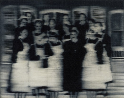
Google’s German Street View blurring looks utterly fantastic. And for that matter, fantastically German. By which I mean, of course, that it looks like a Gerhard Richter painting. Nurses, 1965, image: gerhard-richter.com
Richter’s signature blurring technique calls into question the status, context, and veracity of the photographs that are his source material. Richter, Rosemary Hawker has argued,
refers not to the visual plenitude and truth that we usually associate with photography, but rather to its moments of representational inadequacy, to photographic blur and lack of focus that results in deliberately obscured imagery.
It’s worth noting that Richter began his blurred photo-painting series soon after fleeing East Germany.
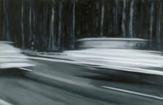
I would think that the persistence of a few deliberately obscured images on Google Street View will serve as a useful corrective to the convenient, info-rich panorama’s seductive call, and will help remind users that they are, in fact, not in “the German Landscape,” but in a corporately controlled, commercial, and contested simulacrum of it. Two Fiats, 1964, via gerhard-richter.com
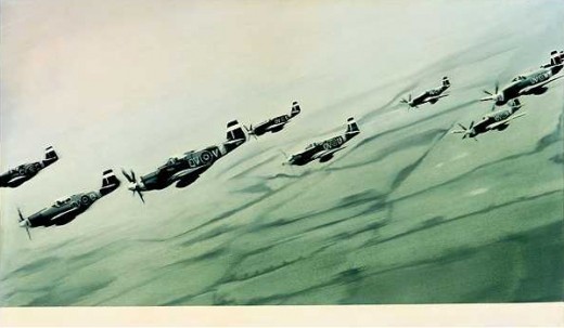
Far from “bombing” the supposed digital public sphere, the people who exercise their Verpixelungsrecht are asserting the individual’s right to virtual protest, to engage the digitization of his entire world on his own terms. Mustang Squadron, 1964, image: gerhard-richter.com
Google has filed for patents to place advertising, “virtual billboards,” within Street View, reserving for itself the right to control and alter its ostensibly objective representation of the world for its own reasons, including, but not limited to, its own commercial gain. If someone painted their URL on the front of their store, would there be an outcry if Google threatened to blur it out unless they got a piece of the action?
Jeff argues that it’s folly for politicians to restrict innovation like geo-tagged facial recognition that, who knows, might be useful in locating Katrina victims. But who’s to say that, when our reality gets augmented to death with advertising and tracking, opt-out blurring isn’t where the real value will be? It’s the unlisted number of the future.
Or the vanity phone number. As an inadvertent-but-eager connoisseur of Google Map pixelation techniques, I could just as easily envision a premium Street View image management business emerging out of this controversy. In fact, it’s already started.
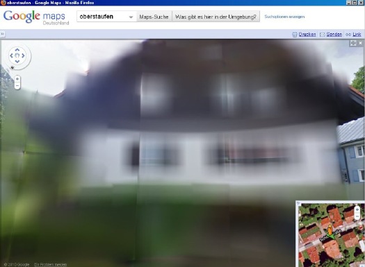
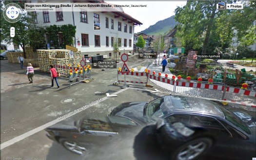
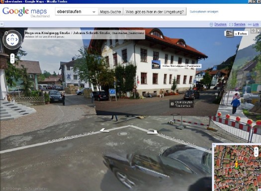
Just look at the unsightly street closure and construction project right in front of the Tourism Office of the otherwise-scenic Oberstaufen. Sheesh, no wonder they baked Street View a cake. Now check out the screenshot Spiegel got, where an embedded photograph from Panoramio helps clean things right up, mostly:
The Street View we see now is a mere shadow of the virtual world–or the virtualized real world–to come, and I’d like to think that when it comes to building and designing that world, digital citizens will be able to vote with more than their wallets.
At the very least, when people start paying Google to decorate their Street View houses with Blingee crap and animated gifs, mark my words: we’ll be grateful for the visual respite these Richterian Street View sites will provide.
Related, actually from over a year ago: Gerhard Street View

 Serota delivers that question with an intensity that makes it feel like a scoop, and I don’t think his reaction is [just] for the camera. I haven’t found any previous mention of Family of Man either by Richter or in relation to his work. Steichen isn’t in the index for the collected writings. There’s no mention of it in
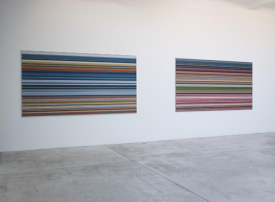
 “The book” is not the slim exhibition catalogue for Goodman’s show, which reproduces 14 examples of Strip, and edition of 72 unique digital prints [53x105cm, mounted on Aludibond] which were chosen from 4,096 possible strips by “chance operation”; as well as the much larger [160x300cm, plexi] works made by combining “selected” strips. [There are also the oil-poured-on-glass Sindbad pictures, but whatever. Off topic. I just want to contrast the different processes, one clearly Cageian, one clearly not, that went into making works out of the system Richter devised.]
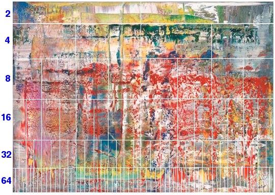
 fotocommunity.de