
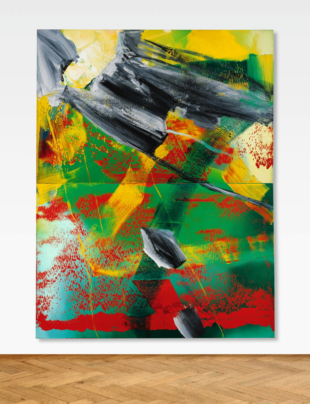
Destroyed Gerhard Richter paintings come in a variety of flavors.
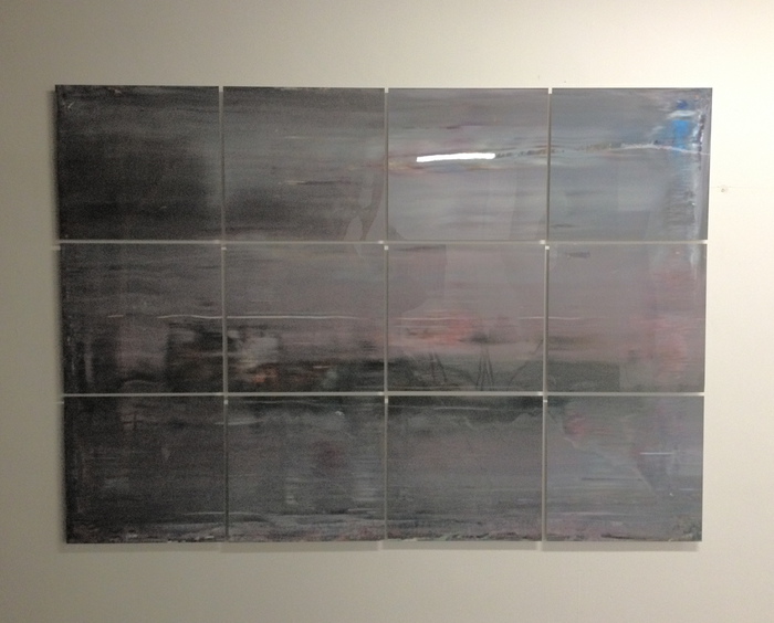
Destroyed Richter Grid 004, 2016, it me
Some just get destroyed out there in the rough and tumble world. They’re usually the ones listed as “[DESTROYED]” in Richter’s Catalogue Raisonné. [I remade a couple this year, including Destroyed Richter Grid 004, above, which was based on a 2009 squeegee painting that’s currently the last painting listed as destroyed.]
Others he destroyed himself. For the most part, I think they’re not in the CR. Like the batch of super-early Informel-inspired paintings he did when he first arrived in the West, which he burned publicly. And then there’s the 60+ early works he destroyed in the late 1960s, either because 1) they were painted with cheap materials, 2) he moved studios and didn’t have anywhere to put them, and/or 3) he just grew dissatisfied with them. Richter documented them in his archive, but not in the CR, so I guess they’ve been destroyed twice.
At some point around the 1980s, when he was developing his signature abstract series, Richter seems to have stopped destroying paintings; instead he overpaints them. A work’s never unacceptable, just unfinished, Which I guess is a kind of optimism; nothing is irredeemable.
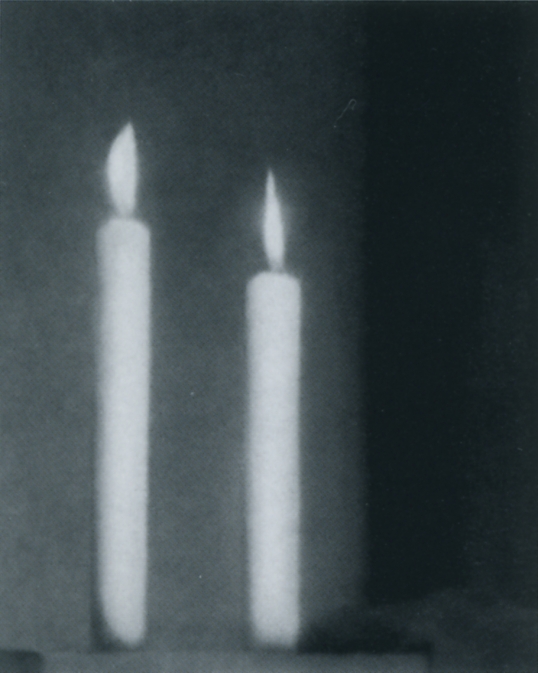
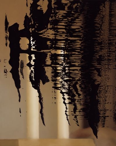
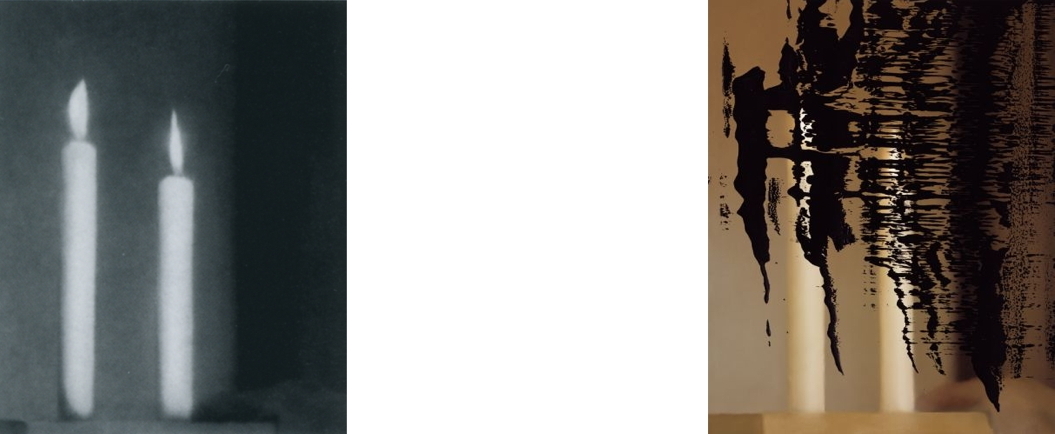
Zwei Kerze [ÜBERMALT]/ Two Candles [OVERPAINTED], 1982, CR 497-2, image: gerhard-richter
I’ve been looking at and thinking about these exceptional, destroyed Richters for several years now, but until today, I hadn’t really noticed this unusual case of how “[OVERPAINTED]” plays out in the CR. In particular, two early Kerze/Candle paintings are listed as “[OVERPAINTED]” on their original entries, and then again as new works, with new listings, in their overpainted states. Zwei Kerze (1982) starts as CR 497-2 [above], but a year later, it’s back as Abstraktes Bild [ÜBERMALT] (1983), CR 536 [below].
Abstraktes Bild [ÜBERMALT]/ Abstract Painting [OVERPAINTED], 1983, CR 536, image: gerhard-richter
CR numbers are not necessarily chronology for Richter, but this painting is bracketed by a series of identically sized abstract paintings he showed (and thus presumably created) together at Konrad Fischer Galerie in Dusseldorf in the summer of 1983. Maybe it was an inspiration or a catalyst, or maybe it was a foil. Or maybe it just got in the way, abstract collateral damage. [It was not included in the show, but another two candles painting was.]
Zwei Kerze [ÜBERMALT]/ Two Candles [OVERPAINTED], 1982, CR 497-3, image: gerhard-richter
Then in 1989, the other, very similar Zwei Kerze, CR 497-3 [above], got a big, old black squeegeeful across the face, and became Abstraktes Bild CR 687-1.
Abstraktes Bild (1989) CR 687-1, the painting formerly known as CR 497-3. image: gerhard-richter
And then CR 536 got a black/white/grey squeegee veil and became Abstraktes Bild CR 687-2. Forget the candles, the bright abstract passages barely make it through to the surface.
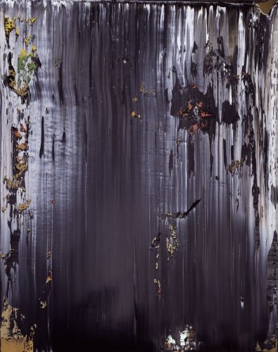
Abstraktes Bild (1989) CR 687-2, the painting formerly known as CR 536, f/k/a CR 497-2. image: gerhard-richter
With just a couple of earlier exceptions, 1988-89 is when Richter stepped up his practice of overpainting snapshots and offset prints, including prints of candles. So something was in the air, or rather, the studio.
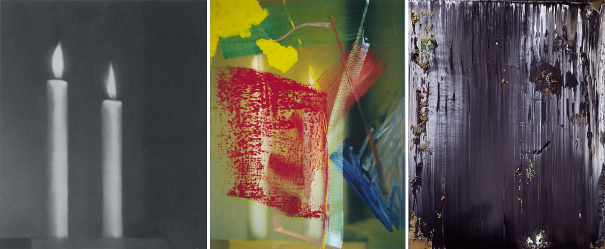
top: 1982 and 1989. bottom: 1982, 1983, and 1989. images all from you know where
Ever since he constructed his Catalogue Raisonné, Richter has been actively shaping the narrative it tells, editing the list of works included, and the order they appear, using the authoritative construct as a medium in itself. And for whatever reason, as these particular pictures got hit with whatever fresh treatments or gestures were in play at some moment, Richter considered them new works, reborn, and reborn again, while retaining their traces in the history.
Tag: gerhard richter
Richtersgarten
Part of me wants to make this post about auction houses shooting coverage, or about editing-generated hype for off-season auctions of off-peak squeegees. But I think I really just wanted to register my disapproval that such videos of such sales of such paintings are now a sufficient hook for attention from the Times. Which even I don’t care about at this point. So it must be the very existence of this video. But that is enough.
[sotheby’s via nyt]
World’s Greatest Richter Or World’s Greatest Non-Richter?
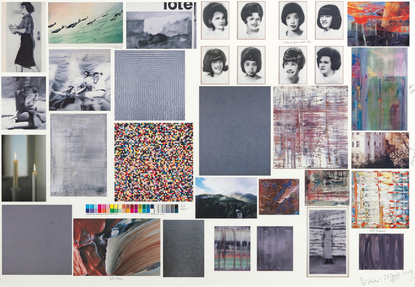
There’s an interesting selection of unusual Gerhard Richter swag coming up for auction in Vienna, an assortment of unnumbered editions and test prints that look like many years’ worth of artist gifts to a collaborating printer, publisher, or assistant.
The greatest, though, has to be this one, a veritable one-page Atlas of Richter’s greatest hits. It is a proofsheet of the color plates in the catalogue for Richter’s 2004-5 exhibition at the Albertinum in Dresden. Besides the artist’s annotations, it is also signed and dated in the corner. The auction description says it “is the only signed edition paper by Gerhard Richter for the Albertinum Exhibition.” Which, uh, sure? Maybe? Unlikely?
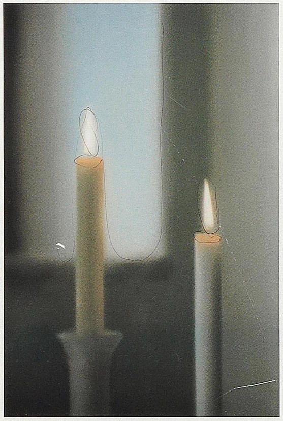
image of Two Candles (CR:499-2), 1982, with artist annotation, image: dorotheum
With an estimate of EUR25,000 – 30,000, the auction house is certainly hoping it comes across as an actual edition, or an art work at all, for that matter. But I am uncertain.
Actually I am just being polite. I think this falls squarely into what Hubertus Butin, the co-editor of Richter’s print catalogue raisonné calls, “star autographs.” In a 2007 Getty symposium on early Richter, Butin’s co-editor Stefan Gonert discussed the implications of the artist’s very hands-on management of his catalogue raisonné. And there is a whole category of objects, mostly gifts, that are recognized as “authentic,” but are nonetheless excluded from the CR.
There’s another category of objects that are signed, and that’s it:
These can only be described as signatures added as favors, which have the value of an autograph. Classified simply as reproductions, these prints have the same status as postcards or posters not designed by the artist, which he sometimes autographed.”
Sounds bleak.
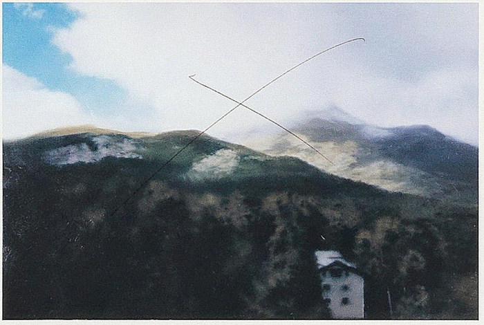
Sils Maria, 2003, was struck from the exhibition, but at least it’s still in the CR. (882-1). Image:dorotheum, detail.
But wait. For into this lowly pot fell at least one set of out-of-edition gift prints which Richter had apparently signed and numbered, and which were originally included in Butin’s CR appendix. And postcards, posters, and offset prints are all media RIchter has actively used for both source material and recognized works. And remember, Butin threw down this simple “reproduction” shade before Richter conceived of his massive facsimile object program, where thousands of numbered-but-unsigned photo prints of paintings appear to be buoying up the museum benefit edition industry.
So who knows what status this 70x100cm framed sheet will end up with? It is awesome at any price. Though personally, I’d expect it to be about 95% less expensive.
Lot 782 Gerhard Richter, offset print, estimate EUR 25,000 to 30,000 [dorotheum]
UPDATE: It appears that most or none of this swag collection sold.
UPDATE AGAIN I stand happily corrected, this object apparently sold for EUR 15,000, including fees, which is remarkable.
Gerhard Richter Facsimile Objects
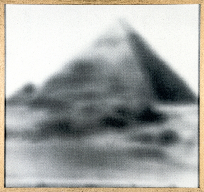
The Gerhard Richter edition Pyramid, 1966, 92 x 98 cm, image: gerhard-richter.com
In 1966, Gerhard Richter made a small edition titled Pyramid, for a multiples group show in Karlsruhe. Pyramid is a photo printed on treated canvas of a 1964 painting, Small Pyramid, which is itself based on an offset photograph illustrating an encyclopedia entry. In addition to variations in mounting and frames, Richter made each of the 13 prints (ed. 10+3 proofs) unique by altering the exposure time.
Cage Grid I, complete
Richter’s made a lot of photo versions of his paintings, but I think this was the only time Richter used photo-on-canvas, and it came to mind a couple of years ago when I was looking at Cage Grid, the only first time Richter used giclée prints.
Those Cage Grids were made for sale at/by Tate Modern during the retrospective, sort of a giant benefit edition. It’s a situation artists know well, where the museums and arts institutions who show them ask them to donate works to auction or fund a show. [The corollary is dealers being hit up to fund exhibitions, or the production of new work, which then turns the museum, or the biennale pavilion, into a showroom.]
Anyway, for an extremely successful artist like Richter, the willingness to support the many public exhibitions of his work is probably only surpassed by the eagerness of museums to get in on some of that Richter swag. Fulfilling every request for auction donations or benefit editions could probably consume the artist’s entire practice, becoming a distortion or distraction. And so a compartmentalized, systematic approach was needed.
Enter the “facsimile object.”
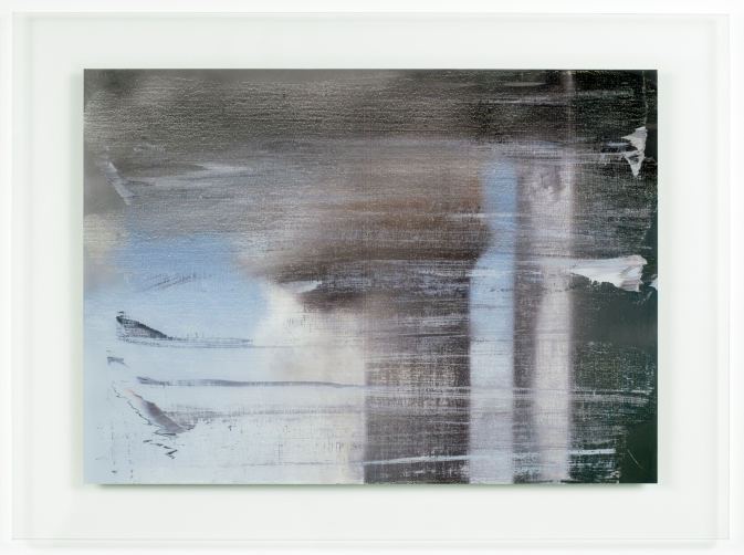
P1 “Abstraktes Bild”, 2014 “A Diasec mounted chromogenic print of: Abstraktes Bild, [1990,] Catalogue Raisonné 724-4″, image: gerhard-richter.com”
Facsimile object is Richter’s term for photographic reproductions of Richter’s paintings, produced “under Richter’s direction and approval,” in large, numbered but unsigned editions, which are sold through museum shops to support an exhibition. Since 2014, 13 facsimile objects have been created, all mounted on aluminum, and all but one in editions of 500. That’s more than 6,000 objects. They all sold out almost immediately at prices from EUR1,000-1,500. Whatever their status as art, facsimile objects turn out to be a highly efficient mechanism for crowdfunding Richter exhibitions.
Richter’s facsimile objects are created by a company called HENI Productions, which was founded by Joe Hage, a lawyer, collector, and Richter confidante. Hage was the force behind the artist’s website; he bought half of September; and he produced Cage Grid I. If he’s not the COO of Richter Gmbh, he’s at least in charge of biz dev.
P2 “Haggadah”, 2014, a 100cm print of a 152cm painting, image: gerhard-richter.com
As actual, signed editions, Cage Grids were a proof of concept; the first batch of official facsimile objects came and went without my noticing. P1 “Abstraktes Bild” , P2 “Haggadah” , and Bouquet (P3) were produced for sale at the Fondation Beyeler’s Pictures/Series show. I did pay attention when a P1 came through Sotheby’s a couple of months later with a £4-6,000 estimate. Because it sold for £41,250.
The first two Beyeler facsimile object subjects are significant in their own right. Richter used CR 724-4 as the basis for generating his Strip Series, and to produce a set of tapestries. Haggadah, CR 895-10, is a much-shown, much-reproduced 2006 squeegee painting that appears on the frontispiece of Tate’s Panorama catalogue, and in an atypically large set of detail photos on the artist’s website.
P10 “Bagdad”, 2015, image: serpentine galleries
From there things get merch-y pretty quick. P3 is a 1:1 facsimile of Bouquet (2009), a small, blurred painting of flowers that’s been overpainted with a squeegee. P4 – P7 are slightly enlarged pictures of the enamel-on-glass Flow series.
P8 – P11, meanwhile, were pictures of more enamel-on-glass for The Serpentine, which sold them all out at £1,500/each, thanks in no small part to vigorous flipping of P1 – P3, and the entrance of seasoned Banksy, Hirst, and Murakami print investors into the market. I think we’ve found the level of the room.
Despite the best laid terms & conditions of The Serpentine’s shop [pdf], all of these facsimile objects are being flipped constantly, in every contemporary auction, and on every online art sales platform. They’re the Richter plastic microbeads in the secondary market ocean. In almost every case, they’re presented as artworks, editions, and the description is entirely of the work depicted. For most art functions, especially shopping, these objects do indeed operate as perfect facsimiles.
And that fascinates me.
I was kind of obsessed with Richter’s facsimile objects last year. I was parsing the relationships between the object and its subject, the information around it, and its viewers, and ultimately, between the object and the artist. Whoever that might be. And then I put them aside, only to find, now, that they got even more interesting. Facsimile objects now have their own category on Richter’s website: Prints. The website text is slightly different than the object labels: “A Diasec mounted chromogenic print of: Abstraktes Bild” vs “A facsimile object of: / Gerhard Richter/ Abstraktes Bild,” for example.
These are not just facsimiles of Richter; they are by him as well.
P12 “Annunciation after Titian”, 2015, 125 x 200 cm facsimile object, image: gerhard-richter.com
The next objects seem to bear out the artist’s interest in exploring the nature of the gift shop souvenir. P12 “Annunciation after Titian” is a full-scale facsimile object of the iconic blur painting which Richter made after a postcard he picked up in Venice. [This Annunciation, now at the Hirshhorn, was reunited with the artist’s other four Annunciation paintings for the first time since 1973 in the Fondation Beyeler show.] Though they’re still unsigned, these 125x200cm objects number only 50, “+ 3 A.P.”, whatever that means in this context.
Which brings me back to the pyramid. The Thomas Kinkade Editions Pyramid, devised by the late artist’s company to explain the auratic and financial calculations of the various facsimile objects on offer. Because I think it’s time someone make one for Richter.
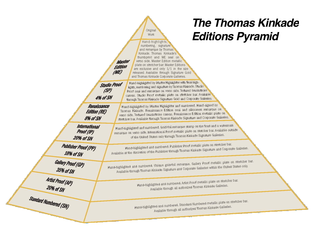
Huh, this adds up to 105%.
Richter told an interviewer at the time he made the Annunciations, “I wanted to trace him as precisely as possible, maybe because I wanted to own such a beautiful Titian…[laughs]” Exact replicas to sate the thirst for an otherwise unobtainable masterpiece? It turns out he’s been making facsimile objects all along.
[2020 Update: a facsimile edition of Abstraktes Bild (P1) (no. 325/500(!)) estimated to sell during the pandemic for $20-30k just sold for $60,000. And a smaller, duskier (P2) sold for $62,500. What is even happening.]
Representational Bild Of Abstraktes Bild
Untitled, 2006, 28x40cm, or roughly legal pad-size, “color print” on dibond, image: phillips
I’m still puzzled by this Gerhard Richter that sold in London a couple of weeks ago. It’s a photo of a squeegee painting mounted on dibond. The print is dated 2006, but the painting it’s based on is from 1999. There’s no useful provenance or any other documentation mentioned, and little is expected; the auction houses, and Phillips especially, regularly bail on providing even cursory info on off-season, entry-level lots like these. Time is money.
But the artist himself hasn’t published any info on it, either. It’s not mentioned in his exhaustive website, and though it seems related to other Richter photo versions of paintings, there’s nothing quite like it in Richter’s published editions.
Until very recently, that is. This picture seems to be a precursor to the Cage Grid giclee prints, which in turn led to the “facsimile objects” Richter collector and entourage member Joe Hage has started publishing as museum fundraisers. More on those later.
Abstraktes Bild CR:858-4, 1999, 50x72cm, oil on aludibond, image: gerhard-richter.com
Untitled (2006) is a photo of Abstraktes Bild 858-4. Both are on dibond panel, but the photo is 2/3 smaller: 28×40 cm vs 50x72cm. I’ve sized the two images above to scale for comparison. As its CR number suggests, Abstraktes Bild 858-4 is one of a series, a suite, actually, of eight squeegee paintings. Seven are on identically sized aludibond panels, and one is larger, on canvas. I have to think they were sold together out of Marian Goodman’s Sept. 2001 exhibition, because they have been shown a lot, and all together.
So someone got the full set, a whole roomful of squeegee paintings, and someone else got a small photo of one, a consolation prize? A bonus? A one-off gift to a friend or employee? I have no idea, which is one reason it interests me.
Untitled (2006) is a highly realistic representation of a completely abstract painting. Yet for all its apparent transparency, it hints at an aspect of Richter’s practice that is undocumented, or at least undisclosed. It’s like an update of Stella: what you see is what you don’t see.
9 Dec 2015, Lot 59: GERHARD RICHTER Untitled, 2006, est. £10,000 – 15,000, sold for £27,500 [!] [phillips.com]
Abstraktes Bild 858 and Cage Grid: Gerhard Richter and the Photo Copy
The Daily Practice Of Erasing

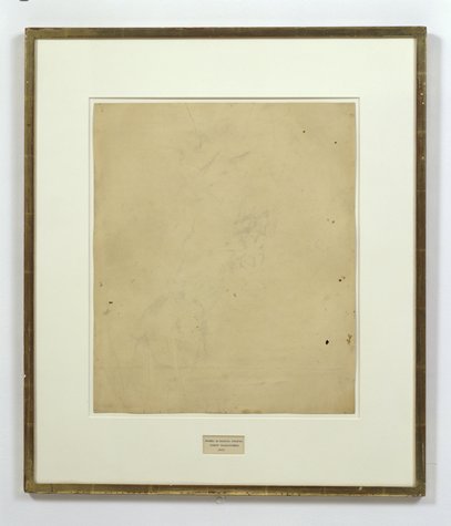
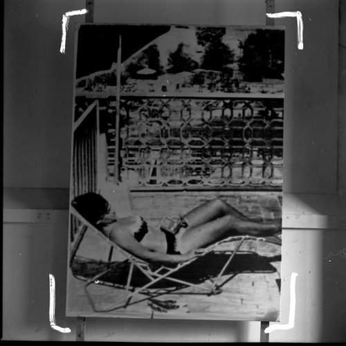
This is a great photo, btw. I love the edge, the space, the painting’s objectness. I assume it’s old, pre-frame, but I don’t really know; and the site I ganked it from didn’t seem to have any awareness, much less answers. Anyway, it’s here on purpose.
I’m not sure when I knew that the blur in the center of Gerhard Richter’s Tisch/Table (1962, CR:1) isn’t a brushstroke, but a smear, but I didn’t give it any thought until I started looking hard at Rauschenberg’s work on Erased deKooning Drawing. Then it completely changed for me.
The first time I saw it in person was 2002. Richter told Rob Storr that he had “canceled the painting by blurring.” I read Table‘s blob alongside the brushy blur of the early photopaintings. And those soupy loopy Vermalung paintings whose AbEx-style gestures preceded but didn’t exactly prefigure the squeegees.
But that’s not what’s happening.
In trying to understand what Jasper Johns did to Erased deKooning Drawing, I also had to figure out what Rauschenberg had done:
He was trying to make a mark with an eraser. It’s the difference between erasing a drawing, and drawing with an eraser. And when he was done, the result was both an erased de Kooning and a drawing.
At just that moment I read John J. Curley’s essay, “Richter’s Cold War Vision,” in Gerhard Richter: Early Work, which tied them together:
Richter’s Informel-esque brushstroke was not painted over the image of the table (as some have suggested), but was the product of erasure. The artist attacked the canvas with a solvent (perhaps turpentine) after the initial image was already painted. The new mark has diminished the original painted surface, leaving traces of bare canvas showing through.
But as with Rauschenberg, this is not negation; cancelation is not rejection. [Richter would later designate Table as the first work in his Catalogue Raisonné, even though it is not.] As Curley wrote, the erasure “naturalizes a false realism” in Tisch; its abstract disruption provides cover and credibility for the table’s “off-kilter” representation and “structural impossibility.” Erasure becomes “the crux of both the table and the painted gesture.”
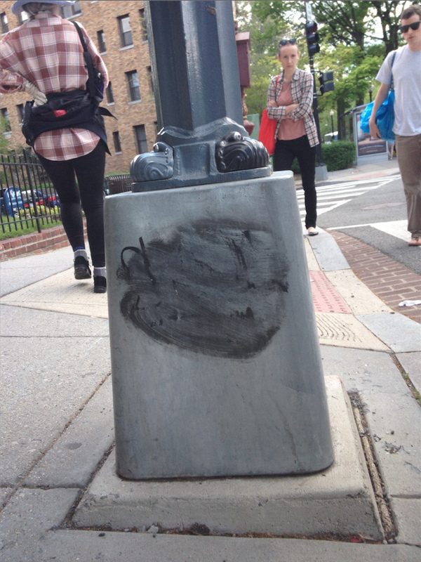
Well that blew my mind. I’ve ended up thinking about Tisch all the time, at first because of the blogging, and then the Destroyed Richter Paintings project. But then mostly because there’s a lamp post near our place in DC that I pass almost every day on my way to the train or the store. It has a basic graffiti tag that someone tried to erase–I was about to say unsuccessfully, but I think it looks a hundred times better like this.
Overpainting Photographs
It was the first thing I thought of when I saw them, and so I noticed when Roberta Smith’s otherwise incisive review didn’t mention it, and thought maybe it was just me. Then my very sharp friend Sam emailed, shocked at the omission, and the more general lack of discussion of the connection. Which was a relief, then a puzzle.
Urs Fischer, 2014, huge, image via gavinbrown.biz
Because Urs Fischer’s giant, printed overpainted photos at Gavin’s last month felt like such clear shoutouts to Gerhard Richter’s overpainted photos it was ridiculous.

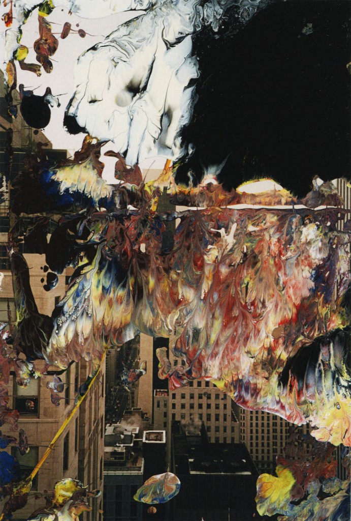
Gerhard Richter, Overpainted Photograph, image via hatje cantz
The differences actually feel like similarities. Richter has been smearing, wiping, knifing, and dripping paint on 10x15cm snapshots for more than twenty years now. Combining his paint-covered squeegees and family photos, Richter captures a single, quick gesture that works, and the photo lives, or doesn’t, and the mess goes in the trash. The survival rate’s around 50%. The first survivors ended up in Atlas; they proved themselves and became their own thing. A couple of deliberately made series became artist books. He’s given them away to friends and studio visitors; he’s used them as party favors; and he has quietly sold overpainted photos through Fred Jahn, a dealer in Munich. They had their first dedicated show and catalogue in 2009.
Richter’s overpainted photos exist as documents of chance, while Fischer’s show definite marks. Fischer paints on photographs. I would say that this, not the size, or the printing, is the main difference.
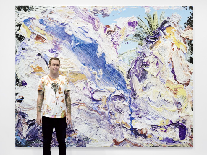
Man with palm tree outfit next to Urs Fischer, 2014, image: gbe
On the size: Fischer’s works are gigantic, like 9×11 feet. I imagined the contortions I might undergo to get one in our apartment; which window would I cut out to load them in? Since our ceilings are only barely 9 ft, could we live with it, under it, like a lean to? We’re gonna need a bigger house.
Conversely, in discussing Richter’s works, Markus Heinzelmann writes of the artist’s central interest in monumentality:
The overpainted photographs, despite their extremely small format, make an extremely monumental pictorial impact because the intricate photograph entices viewers into studying microscopic details. Encouraging viewers to increase their visual acuity in this away automatically transfers to photograph-related painting.
Only the Fischers are disoriented by their enlargedness, but both artists clearly like what the disparity between the paint mark and the photographic space underneath it does to a viewer’s sense of scale. [Fischer’s painting-related photographs feel like they began as 8×10-in prints, or maybe even bigger. That’d make them the size of a small but real canvas.]
Gerhard Richter, Overpainted Photograph, image via ndlr
Both artists are also equally interested in their pictures as objects. Heinzelmann entire essay is about Richter’s overpainted photos as “objects of contemplation.” Fischer, meanwhile, forefronts his works’ physicality through description. They’re not merely “prints on aluminum,” but, “Aluminum panel, aluminum honeycomb, two-component epoxy adhesive, two-component epoxy primer, galvanized steel rivet nuts, acrylic primer, gesso, acrylic ink, spray enamel, acrylic silkscreen medium, acrylic paint.”
Which is ironic, given how they converge so completely and float so freely online. I would really like to see the two artists’ work side by side.
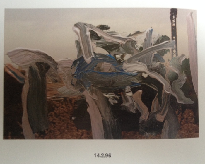
Richter, 14.2.96, from the book
update: I’ve been looking through the Hatje Cantz catalogue again, Richter’s are so fantastic. Several clear typologies emerge, including some that have been scraped after schmearing, but the actively worked over structure of this one, from Valentine’s Day 1996, may be unique. Maybe the thing to do is blow a few of them up, Fischer-size. Or half-Fischer-size, to start. First, though, I’ll wait and see if he sends me one for my birthday. He meaning Richter OR Fischer, I’m open.
Urs Fischer, 2014 exhibition [gavinbrown.biz]
Five years on, Gerhard Richter: Overpainted Photographs is getting expensive and staying awesome [amazon]
Nuclear Chain Reactional Aesthetics
As cool as it might be as an object, there’s something about that “Manhattan Project Glass” window that just ain’t sitting right with me. I will not be bidding.
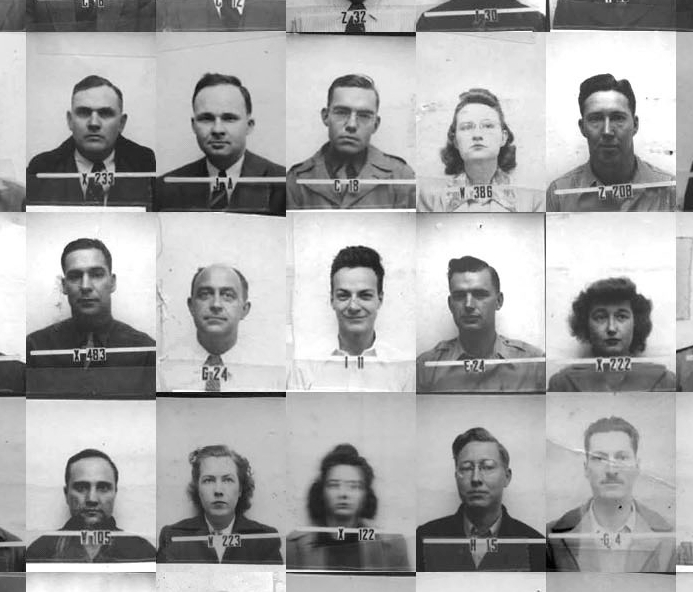
The Faces of Project Y, detail, assembled by Alex Wellerstein, via nuclearsecrecy.org
But researching it has led me to some absolutely amazing other objects from the dawn of the nuclear age that are well worth pursuing in an artistic context.
Let’s start with The Faces of Project Y, by historian Alex Wellerstein. A couple of years ago Wellerstein pulled all the recently declassified ID badge photos from the 1,200+ people who worked on Project Y, the code name for the Los Alamos section of the Manhattan Project. Then he tiled them up into one giant, 31×40 grid. It’s awesome.
That’s Richard Feynman smirking in the center of the detail, just above the woman with the Gerhard Richter blur. Wellerstein puts faces to other notable names on his blog, Nuclear Secrecy, and has created some swag coffee cups and other merch with the images on it. A giant print would be nice. But what’s needed, clearly, is wallpaper. Rather than lose the 29 folks on the bottom, incomplete row, maybe you could get all the images as individual files, and just let it flow till the wall is full.
I don’t know how I missed the extraordinary career and sad story of nuclear sculptor James L. Acord. Thanks to Seth David Friedman for pointing me to Tom Moody’s incredible 2001 tale of Acord’s rare, realized masterpiece, Monstrance for a Grey Horse. I will keep reading.
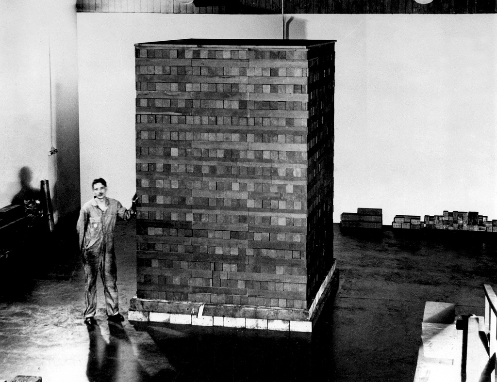
Then there is the first nuclear reactor, the Chicago Pile-1, built under the football stadium of the University of Chicago in 1942. To create a sustained, controlled nuclear chain reaction, Enrico Fermi and his team embedded uranium balls in a giant, quasi-spherical lattice of 45,000 graphite bricks, which were supported by a lumber grid, which was enclosed by a square, black rubber balloon.
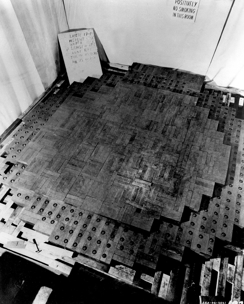
Last year the Dept. of Energy posted photos of CP-1 to flickr, and it was basically Carl Andre’s greatest sculpture. Ever.
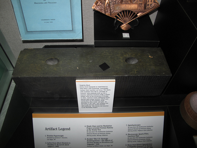
CP-1 graphit brick at the Atomic Testing Museum, img via flickr user rocbolt’s CP-1 photo album
At least four of the graphite bricks are known to survive. Here’s one at Oak Ridge. This photo by Kelly Michals is of the brick at the Atomic Testing Museum in Nevada. I don’t know why you couldn’t recreate the thing anew. From a window with a dodgy backstory, an untimely death, and a bunch of mug shots, to a nuclear Carl Andre Death Star inside a Kaba’a. These dots practically connect themselves!
Cy Twombly’s Gerhard Richter
RO/LU has the photos of Cy Twombly’s palazzo from that 1966 Vogue feature, and hey ho, he had a Richter. How’d that happen?
Richter had shown Frau Marlow (1964) in his earliest exhibitions: at Galerie Schmela in Dusseldorf and the Capital Realism group show at Rene Block in Berlin. Twombly had been in a 2-person show with Rauschenberg in Dusseldorf in 1960, and the Venice Biennale in 1964, and so on. But I guess I wonder how Twombly came to own a painting by the just-emerging Richter.
Frau Marlow wasn’t seen in public for 35 25 26 years, until 1991. #math.
Frau Marlow CR:28, 1964 [gerhard-richter.com]
UPDATE Thanks to Wayne Bremser for the prodding me to click through on 032c’s 2010 feature on Twombly’s interiors, as photographed by Horst, and as re-energized by Joseph Holtzman in nest. I miss nest.
Also, this classic Mondo Blogo roundup of photos from Horst’s Twombly shoot.
Cage Grid: Gerhard Richter & The Photo Copy
I was kind of baffled when I saw this Richter in Christie’s February sale in London, and I’ve had it on my desktop ever since. It’s called Cage Grid I, and it’s a 16-panel giclée print [!!, oh how I hate that word] mounted on aluminum that reproduces the 2006 squeegee painting, Cage 6, basically at 1:1 scale.
In fact, if you include the small gaps between the 75cm square panels, the giclée version is slightly larger than the 3×3-meter painting. It pulls the painting apart instead of occluding it with a grid overlay. Though there are digital prints and inkjet prints in the artist’s CR, Cage Grid is the only edition listed as a giclée. There are both complete editions Cage Grid I and 16 individual quadrants, Parts A-P, Cage Grid II.
Richter has chopped up his paintings before, turning full-size squeegee paintings into a series of tiny squeegee fragments. He’s made giant gridded photo panels before, like Strontium (2004), at the deYoung Museum. He’s got reconfigurable grid paintings [mounted on Aludibond, btw], like 4900 Colours.
He’s made photos of Strip paintings, which are actually manipulated photos of fragments of another squeegee painting, digitally printed, and mounted on aluminum and sometimes under plexi.
And he’s made photo versions of paintings before. These 1998 Orchid offset prints are done at full-scale of the 1997 painting, but cropped in five different ways. Herr Heyde is a little 2001 offset print on Aludibond that’s the same size as the little 1965 painting. [Richter favored offset prints, then a few c-prints, before going digital, except for Ice 2, a 2003 half-scale reproduction of a 1989 squeegee painting that’s actually a 41-color screenprint.] There’s 1:1 Uncle Rudi (2000), and the 1996 photo edition of the painting of the photo of his wife, which I thought would make a good Richard Prince nurse painting. Seven Two Four (2005) are 1:1-scale blurred photos of a 1990 squeegee painting. [A painting for which Richter has atypically posted 21 detail photos.]
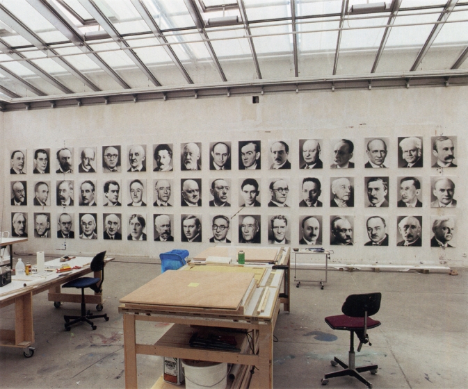
Wow, when you shoot it that way, the 1:1 photo edition of Mustang Squadron (2005) looks amazing, and not at all like a bridge line version of the couture original. Speaking of which, back in 1998 Richter made a 1:1 photo edition of 48 Portraits, his landmark blurred painting grid from the 1972 Venice Bienale.
And this is one thing that nags at me about Cage Grid: even if I buy the arguments about photo vs. painting, experimentation, or materialist variation, I feel like what’s actually being sold is iconic sameness. It’s not so much the Capitalist Realism that–actually, yes, it’s the capitalist reality that gets me, but not the supply, the demand. I feel less undone by the artist churning out a towering Kinkadian pyramid of merch than by the critico-consumer desert criss-crossed by collectors, institutions and speculators that swallows it up.
It’s not that Richter makes readily monetizable editions of iconic works he loans to museums. [The Cage series is at Tate. Modern. The Cage Grid prints were actually sold by Tate Modern, during the 2011 Panorama retrospective.] It’s that despite my ambivalence, I want some. [Oh, look, that Mustang Squadron that sold at Phillips in 2006 is up for sale at Sotheby’s.]
14 Feb. 2014, Lot 120: Gerhard Richter, Cage Grid I (Complete Set), 2011, 15/16, plus 4ap, sold for £566,500 [christies.com]
15 May 2014, Lot 243: Gerhard Richter, MUSTANG-STAFFEL (MUSTANG SQUADRON), ed. 39/48, 1 AP, est. $250,000-350,000 [sothebys]
Previously, uneasily related, partly because I only just now remembered I had similar qualms about a similar situation last year: Gerhard Richter’s Septembers
Gerhard Richter’s Septembers
tl;dr version: Gerhard Richter made a small painting, September, based on a photo of the WTC getting hit by a plane, and gave it to MoMA, which has never shown it. Then he made a print version, which he sold here and there, and which has been seen in NYC once. The image is the same, but the experience of them is quite different, which is something no one really mentions or talks about. It’s almost like the propagation of the image is more important than the actual objects, or than the particulars of seeing them in person. Which, in addition to being the kind of distancing tactic Richter’s very fond of, is also a non-trivial observation that can be made about the WTC attacks themselves.
I had not wanted to write about the WTC attacks [or “September 11th”] on September 11th, and though it was the day I actually started thinking about this post, I didn’t want to write about Gerhard Richter’s September on September 11th, either. And I’m glad I’ve waited; my reflex was to be a bit cynical, and that has largely dissipated. So.
Richter was in the air on September 11th, traveling to New York and grounded/diverted to Nova Scotia. His eventual artistic engagement with the attacks was a small painting, September [CR: 891-5], above, which he made in 2005. Joe Hage, the collector who is also the instigator behind the artist’s ambitious website, acquired a half interest in the painting in order, the story goes, to prevent Richter from deciding to destroy it.
The aura of ambivalence surrounding the painting’s existence is of a piece with the painting itself, which is based on a FAZ photo of the hijacked UA175 hitting the South Tower. [A newspaper image the artist didn’t see at the time, because he was stuck in Canada. Which means he hunted it down at some point.] Richter knifed and scraped the canvas, deploying abstraction to obscure or even erase the representational image.
As far as I can tell, the small painting, just 52x72cm, dimensions Rob Storr compared to a TV screen, but which I’d say is more computer monitor-size, has never been shown in New York.
It wasn’t in Richter’s solo show at Marian Goodman in 2005-6, even though squeegee paintings listed before and after it in the artist’s roughly chronological CR were. MoMA acquired a dozen of them, a series of abstracts, CR 892-1 through 12, titled Wald/Forest.
When Goodman showed Richter’s paintings again in 2009-10, September the painting was not among them. That’s when the artist and Hage donated it to The Modern, and when Storr made a video about it. His take on the painting and its context were expanded into a book-length essay published in 2011.
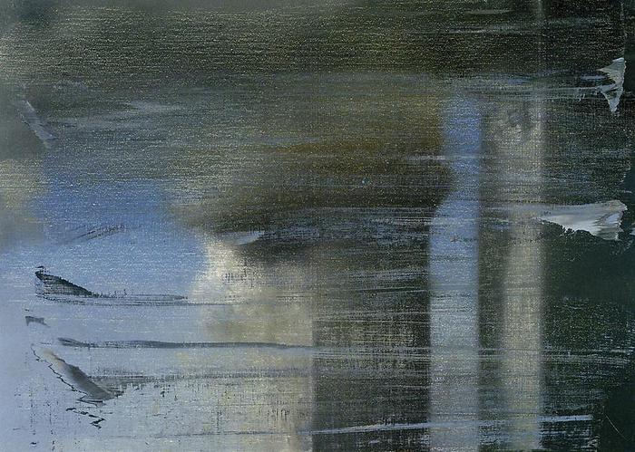
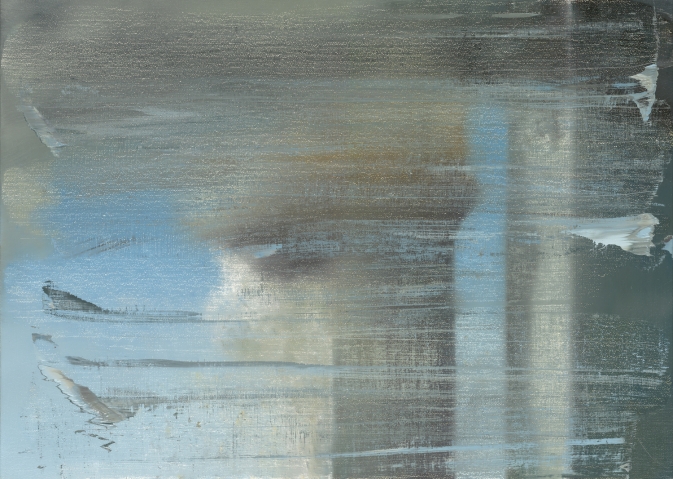
But wait, wasn’t it–no. That 2009 show did include a September. But it was a print. As the gallery checklist describes it, a “print between glass”. September 2009 turns out to be an enlarged [66x90cm] inkjet on vinyl mounted between two sheets of glass, and published in an edition of 40.
September, 2009, CR 139, digital print between two panes of glass, image: gerhard-richter.com
The gallery’s own reproduction of the print leaves out the glass mount; and smooth, sealed surface; and the reflection it inevitably creates. Even though these have to be considered as central elements of this work, as different as can be from the scarred, textured surface of the painting it reproduces.
Here’s an installation shot from We Heart New York that shows the gallery and other work reflected in the print’s mirror-like surface:

And here’s a shot of it installed last year at a retrospective of Richter’s editions at Collectors Room, Berlin. It’s big and glass and framed, and looks and feels completely different than a painting. Because it’s a blown up, face-mounted photo of a painting.
Yet even here, in a show about editions, curator Hubertus Butin mostly talks about September as a painting. And so did Storr. And I confess, I’d seen the Goodman show, and read Storr’s book, and seen his interview, but it wasn’t until I saw this shot that it even registered with me that there was an edition. And that’s what I’d seen, not the painting I thought I’d seen.
When I realized this last week, on September 11th, I felt a rush of cynicism, reading Richter’s production of an edition as a sell-out. Just as he donated his Important Historical Image to the Modern, he’d quietly sold 40 copies of it to lesser [sic] museums and collectors. Dallas got one. But then I saw one in Beirut, and it occurred to me that an edition circulates the image in ways that transcend the painting itself. It puts September in more, wider, and more varied contexts than MoMA’s loan policy could ever accommodate. [UPDATE: John from BR&S adds that a print was in this 2011 exhibition at Montserrat College of Art. Indeed, it’s on the catalogue cover. Storr also spoke.]
In that video tour, Butin talked about Betty, calling Richter’s painted portrait of his daughter the “most famous and probably the most successful picture that he has ever created.” Successful, Butin continued, because “No other subject of his has been as frequently reproduced in books, catalogues, postcards and posters.” The Betty in his show is, of course, an edition, not the original. It’s a print of a photo of the painting [of a photo.] And as an image, at least one metric of its success, is its rate of reproduction.
September the print has exactly the same relationship to September the painting. And even more than a painting, a glassy digital print ends up capturing September‘s electronic screen essence that Storr originally identified. Which makes me wonder how, why, New York, of all places–of all places–has only seen the print, and not the painting. Not the visceral, physical experience of the original, but the distanced, reflective, mediated simulation. Or maybe it’s all incidental to September achieving historic, Betty-scale “success”.
September, CR| 891-5, 2005 [gerhard-richter.com]
September, CR 139, 2009 gerhard-richter.com]
September: A History Painting by Gerhard Richter, by Robert Storr [amazon]
Deployed Gerhard Richter Paintings
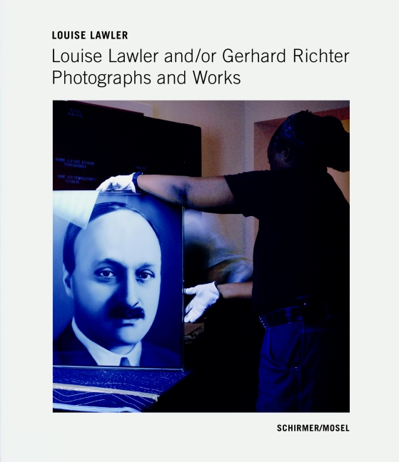
Via the New Yorker’s photodesk, an excellent slideshow of a sampling of Louise Lawler’s photographs of artworks by Gerhard Richter, in situ and in transit.
My favorite is still the site-specifically distorted No Drones, which I posted about last winter. But for the newly published book, Louise Lawler and/or Gerhard Richter, Richter archivist Dietmar Elger looks to have stuck with each of the 29 photo’s original dimensions.
Interestingly, the US edition of the book has retitled its way out of the authorial ambiguity of the original: Louise Lawler: The Gerhard Richter Photographs.
Slide Show | Louise Lawler’s Gerhard Richter [newyorker via @janehu and @briansholis]
Previously:the disco ball next to the Lawler
About Destroyed Richter Paintings
Also: the crates for Richter’s 4,900 Colours are so sexy
An Intentionally Incomplete Inventory of Pictures: Richter’s Bilderverzeichnis
Photograph of a painting destroyed by Gerhard Richter, Gerhard Richter Archiv via Spiegel
Since I first started looking into them, I’ve wanted to know why Gerhard Richter destroyed some of his paintings. Because, of course, some of them weren’t “destroyed” destroyed, but just painted over, with their previous state being technically defined as a momentary completion, not a work in process. There are only a few like that in the Catalogue Raisonné, though; most of the works listed as “Destroyed” are presumably actually destroyed.
But at least they all got Catalogue Raisonné numbers. Ulrike Knöfel wrote about a different category of destroyed Richters, largely undiscussed and unseen, which were destroyed before the artist began his catalogue raisonné, and which thus, with maybe one exception, don’t have a CR number, and are thus excluded from Richter’s declared oeuvre. Even if they were authentically created by Richter, and shown in exhibitions, and offered for sale.
As Dietmar Elger points out in his biography of Richter, A Life In Painting, Richter actually conceives of the Catalogue Raisonné as a work of art in itself, one which, like Atlas, is still in process.
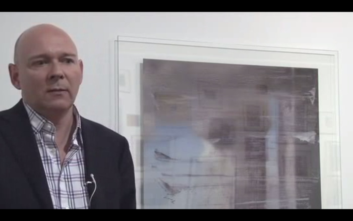
I recently met with Dr. Elger during a trip to New York, and we spoke about these dynamics of creation, destruction, recognition, and archiving as they play out in Richter’s practice. Elger runs the Gerhard Richter Archiv at the Staatlichen Kunstsammlungen Dresden, and maintains the Catalogue Raisonné, so he has a seat at the table for much of this history. After a brief fanboy prelude, in which he signed my book [and my copy of the Felix Gonzalez-Torres catalogue raisonne which he was also involved in], we got to talking. [We met for information, not as an actual interview, so I didn’t take notes or record our conversation, and I won’t directly attribute quotes, but just try to capture my recollections.]
Continue reading “An Intentionally Incomplete Inventory of Pictures: Richter’s Bilderverzeichnis”
Fingerspuren
Fingerspuren/Finger Marks, with Palermo, 1970, image via gerhard-richter.com
Despite an 11-year difference in their age, Gerhard Richter and Blinky Palermo became fast friends in the early 1960s. Richter’s first wife Ema sewed Palermo’s groundbreaking Stoffbilder/Cloth Pictures starting in 1966, and Palermo influenced Richter’s move towards readymade abstraction with the Color Chart paintings.
In 1970, while Palermo was studiosurfing among his Dusseldorf friends, he painted the first stencil/multiple version of his blue triangle over Richter’s door. And then the two artists collaborated for the first time, on a painting.
Or rather, two paintings: Fingerspuren (Fingermarks) was a grey monochrome diptych, painted by hand, one side by each artist, that formed a 2-meter square whole. Palermo’s canvas is the much busier one on the left.
In Dia’s 2009 book on Palermo’s masterpiece, To the People of New York City, Christine Mehring wrote about Fingerspuren:
It is tempting to see this as a manifestation of what many believe are differences in the artists’ temperaments: Richter’s more calculated, meticulous manner of painting versus Palermo’s more process-oriented practice…It seems more likely that Palermo’s disarrayed, isolated marks are gestures of self-assertion. After all, the gray monochrome was the domain of Palermo’s friend, who furthermore relayed that the diptych originated from his own working on a gray monochrome and asking Palermo to “join in, and make one too.” Fingerspuren remained a merely semi-collaborative beginning to Palermo and Richter’s collaborative period.
This collaborative period was at its peak in 1971, when the duo’s painted wall and sculpture installation was shown at Heiner Friedrich’s gallery in Cologne, and when Fingerspuren was included in Richter’s first major retrospective at the Kunstverein in Dusseldorf.
I haven’t been able to find any info on the when or the how of Fingerspuren‘s subsequent destruction, but maybe its merely “semi-collaborative” nature accounts for some of the why.
Our Man In Venice
I’ve liked this explanation Gerhard Richter gave in 1972 to Rolf Schön about the relationship in his work between photography and painting for a long time, but it’s been particularly awesome lately:
RS: How do you stand in relation to illusion? Is imitating photographs a distancing device, or does it create the appearance of reality?
Illusion in the trompe-l’oeil sense is not one of my techniques, and the effect isn’t illusionistic. I’m not trying to imitate a photograph; I’m trying to make one. And if I disregard the assumption that a photograph is a piece of paper exposed to light, then I am practising photography by other means: I’m not producing paintings that remind you of a photograph but producing photographs. And, seen in this way, those of my paintings that have no photographic source (the abstracts, etc.) are also photographs.
How objective, in the documentary sense, is your photographic painting?
It isn’t. First of all, only photographs can be objective, because they relate to an object without themselves being objects. [hmm, well. -ed.] However, I can also see them as objects and even make them into objects–by painting them, for instance. From that point onwards they cannot be, and art not meant to be, objective any more–nor are they meant to document anything whatever, whether reality or a view of reality. They are the reality, the view, the object. They can only be documented.
Richter’s interview with Schoen was first published under the headline, “Unser Mann in Venedig [Our Man In Venice],” in Deutsche Zeitung, on April 14, 1972, exactly 40 years ago. It was included that summer in the catalogues for both the German Pavilion and the Venice Biennale.
It’s also included in both The Daily Practice of Painting and the reboot edition, Gerhard Richter: Writings 1961 – 2007 [pp. 59-60].