The Light String Going On And Off

a screenshot of kriston capps instgagram of a felix gonzalez torres lightstring hanging from the ceiling and pooling on the wooden floor of the national portrait gallery, with the toplit line of white wrapped candy against the white wall behind it, with the caption "the most peaceful/paintful experience you will find in the district today is always to return at the national portrait gallery. felix gonzalez-torres is the guide you need right now. the guide we need. find my review in artforum this month. and a comment by gregdotorg, me, "they turned it off!"
screenshot of Kriston Capps’ IG of an installation photo from the National Portrait Gallery of Felix Gonzalez-Torres’ light string work, “Untitled” (Leaves of Grass), turned off. photo: Matailong Du/NPG

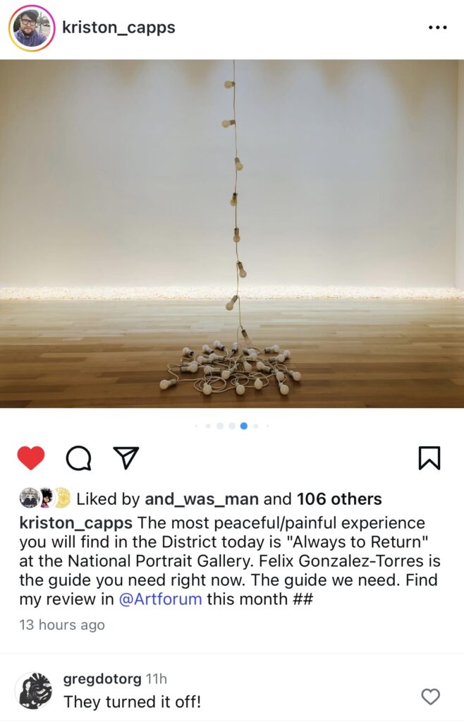
As my comment on Kriston Capps’ insta shows, it’s somehow always a surprise to see a Felix Gonzalez-Torres light string with the lights off. My reaction led Kriston to doublecheck with the National Portrait Gallery whether it’d been OK to post [tl;dr it was, but hold on], and it sent me looking for more.

a black and white 1992 installation photo of andrea rosen gallery in soho includes one gonzalez torres light string, lit up and swagged across the concrete beam ceiling and stretching down the right wall, and another hanging in the right corner, turned off. from the felix gonzalez torres foundation
“Untitled” (Toronto) [on] and “Untitled” (Miami) [off], installed in 1992 at Andrea Rosen Gallery, image via FG-T Foundation

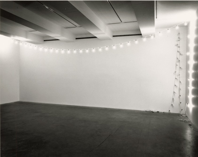
Of course, it goes back to the beginning, where they were shown on and off, side by side. Gonzalez-Torres’ whole point of his works was that the owner [or exhibitor] was to decide how to display them, and that includes whether to turn them on. The Felix Gonzalez-Torres Foundation has photos of an unlit “Untitled” (Tim Hotel), 1992, in a collector’s home, which feels like the normal, private state. Maybe it gets turned on for company, which raises the question of public vs. private presentation as well as space.

Because obviously, they look the sexiest when they’re on, and it’s understandable for curators of public exhibitions to want that glow. But that allure also underscores the impact and importance of seeing them turned off sometimes.

Continue reading “The Light String Going On And Off”

Dominique de Menil’s Cousin Hung Their Rothko Upside Down

the black and white limestone tile of the stair hall in pierre and sao schlumberger's parisian mansion was photographed by horst to show its decoration, the white painted swagged console flanked by two white upholstered and painted fauteuils were arranged under an upside down rothko painting in red, black, orange, and brown. in the back of the space, under the curve of the stone staircase, a vertical ad reinhardt painting of dark blues hung in shadow. the intense spot of light on the base of the stairs indicates a glass door just out of the photo on the right. via collector walls instagram, but originally from vogue 1974
1974 Horst photo for Condé Nast of Pierre & São Schlumberger’s house in Paris, where they hung Rothko’s No. 21 (Red, Brown, Black, Orange), 1951 (but dated 1953), upside down. via ig/collectorwalls

Speaking of hanging paintings upside down, a few days ago Claudio Santambrogio shared a link to a Sotheby’s Magazine story by Lucas Oliver Mill about a Franz Kline that Cy Twombly’s brother-in-law had hung upside down. In it he mentioned Pierre & Sã0 Schlumberger “famously [hanging] their Rothko upside down in the entryway of their Paris home out of pure preference.”

Which sounds like new information from last July, when Mill posted Horst’s photos of the Schlumbergers’ hall on his Instagram @collectorwalls. Then it wasn’t famously, but “Curiously,” and it was unclear if the inversion was “by personal choice or perhaps by mistake.”

Well, when Horst shot their house for Vogue in 1974, the Schlumbergers were the life of the party in Paris; São was the biggest single customer of couture in the world; and in 2014, Sotheby’s liquidated their estate, including the Rothko. So no one in that crowd was going to say the Rothko hang was anything but a masterful decorating gambit, sir.

Continue reading “Dominique de Menil’s Cousin Hung Their Rothko Upside Down”

Phone It In, Vol. 1: an Art Writing Mixtape

Thanks to everyone who called in, and who shared the word about this little audio experiment, which I’ve called an anthology, a compilation, and now a mixtape. Phone It In, Vol. 1 [mp3] is also a reading list, with sources and links to the included quotes. As you’ll see from the playlist below, there are some classics, some fresh finds, and even a breaking news story.

Whatever it is, if you come across some art-related writing that sticks with you for whatever reason, please call and share a bit of it at 34-SOUVENIR, and I’ll bundle those up, too, and put them out here.

As I was putting the tracks together, I discovered that when I first downloaded the calls, I’d accidentally overwritten Carolina Miranda’s call over everyone who called after her. And for a minute I thought, her call is such a mic drop, I really should just go with that. Instead, I moved it to the end, one of the only chronological shifts in the compilation. [Miranda’s cold open is a lol clapback to my voicemail greeting, which I shortened from a full explanation of the project to “Whadja find??”]

Miranda’s quote, from Annie-B Parson, really laid bare the unspoken essence of what I was hoping for here: not just favorite line, or a moment of memorable or powerful writing, but something that you read now that had an impact now.

It feels like an impossible ask, or at least a daunting one, but I really wanted to hear examples, even snippets, where art-related writing mattered in this dire af moment. I think everyone came through, and I am psyched and grateful.

Play or download Phone It In, Vol. 1, an art writing mixtape from greg.org [mp3, 7.4 mb, 15:20]

Continue reading “Phone It In, Vol. 1: an Art Writing Mixtape”

This Is The Time To Hang Your Johns Flags Upside Down

an installation view of three jasper johns flag paintings on a white wall with a dark floor, from a 2018 show at the broad collection in los angeles, but each painting has been turned upside down. original image by eugenio rodriquez via artforum
altered installation photo of upside down flag paintings from The Broad’s 2018 exhibition, “Something Resembling Truth,” original image by Eugenio Rodriguez, via artforum

When I first thought of it, it was still within the framework that has dominated art critical discussion of Jasper Johns’ work since the beginning: Is it an upside down flag painting or a painting of an upside down flag?

But this is not the moment for glib rhetorical dualities. Right now an upside down flag does not have to be either “a signal of dire distress in instances of extreme danger to life or property” or a political protest. With active attacks on democratic institutions and the rule of law under the US Constitution, it can be and must be, unfortunately, both.

Continue reading “This Is The Time To Hang Your Johns Flags Upside Down”

Cy Twombly—Rainer Speck at Maison D’Art

a nearly empty off white title page of an exhibition catalogue has cy twombly printed in very very small letters in the upper center, and "To Rainer, Cy T" written by hand by the artist. from the collection of rainer speck at maison d'art in los angeles in feb-may 2025
the signed title page of Rainer Speck’s copy of the 1987 exhibition catalogue for Cy Twombly Series Sobre
Paper 1959-1987, which traveled from Bonn to Fondació la Caixa. image: Maison D’Art

I’ve been hearing about it from people in LA and seeing it on various instagrams, and the Maison D’Art exhibition of Dr. Rainer Speck’s collection and correspondence with Cy Twombly sounds like an absolute winner. It runs through May; I bought the little catalogue instantly.

Speck rolled up on Twombly in Rome in 1970 as a young collector, and the two kept in touch:

A selection of letters from Twombly to Speck is the foundation of this project. For Speck, the thrill of collecting lies in interrogating the ways that art, reading, and writing influence one another; these letters are a personal manifestation of this interest. In placing these letters alongside the ephemera and artworks they discuss, this exhibition and its publication strive to materialize these conversations and to create a tangible transcript of their relationship.

With their layers of text and imagery, Twombly’s works function as another kind of transcript, merging poetic and painterly elements and creating subtle visual palimpsests. Twombly’s works evoke the literary, mythical, and historical worlds of Western culture and interweave them with his abstract gestures and contemporary reflections. These works reveal Twombly’s artistic depth and highlight the integral role of language and literature to his process—a pursuit that resonates with Speck’s devotion to literature.

This relationship between drawing and writing, art and poetry, is an endlessly rewarding way into Twombly’s work. Poet Dean Rader talked about this last year at the Nicola del Roscio Foundation; and Tacita Dean spent part of her night in the Menil’s Twombly Pavilion trying to replicate words from his paintings. As with his photographs, bringing Twombly’s letters and books into consideration of his project feels long overdue.

NGL, the way the jpg above was cropped in my browser left me reeling as I imagined Twombly breaking out his sickest, most stripped back letterhead to write Speck the most stripped back letter: “To Rainer, Cy T.” But it turns out to be the title page dedication of an exhibition catalogue. Which is still great, but it does mean I don’t have to jump on a plane to LA this second; I can plan a little.

Cy Twombly—Reiner Speck: Fragments of an Adoration, curated by Donald Ryan and Sabine Schiffer, is at Maison D’Art in LA through 24 May [maisondart]

Rochelle Feinstein Is Over The Rainbow

a concrete-colored granite slab floored gallery with a bright white grid of overhead lighting and a stairway in the corner at the secession in vienna is installed with several large square paintings in red, orange, and yellow, on the far wall, plus a square of the same size marked out in blue tape containing three rows of smaller images. two strings of laminated postcard-size photos hang from the ceiling; a cart loaded with some rainbow palette abstract paintings is in the left corner, and an indistinct object in a swirl of color and solid acrylic slab is on the floor in the lower foreground, an installation view of rochelle feinstein's 2024-25 show, the today show
Installation view of Rochelle Feinstein’s The Today Show, at Secession, Vienna, Dec 2024-Feb 2025, photos: Oliver Ottenschläger via Galerie Francesca Pia

In her solo presentation, The Today Show, which closed a couple of weeks ago at the Secession in Vienna, Rochelle Feinstein left blue painter’s tape around some works to reveal the process of exhibition making and encased other objects in slabs of acrylic. Obviously, I was very interested.

a top-down photo of a flat, slightly rectangular object, a blurrily painted canvas dropcloth, predominantly blue orange and a hint of yellow and green, is encased in a slab of acrylic resin slightly larger than it. it is called embedded, a 2024 work by rochelle feinstein
Installation view of Rochelle Feinstein’s The Today Show, at Secession, Vienna, Dec 2024-Feb 2025, photos: Oliver Ottenschläger via Galerie Francesca Pia

I was especially interested in the beautiful and slightly inexplicable object on the floor, which looked like a painting embedded in a slab of acrylic. There was no checklist, and no caption. [shoutout @voorwerk for reblogging @peabah on tumblr.]

In the press kit it is called Embedded (2024), and is described only as a “resin floor piece.” In his catalogue essay the show’s curator, Damian Lentini calls it Embedded I, and notes how its “creased, slightly-off-rainbow-coloured dropcloth…appears as an almost fossilised remnant from a bygone era.”

three white ppl sitting on a very low dais in viennese chairs with viennese side tables between them: from left, rochelle feinstein, in dark clothes with long, curly hair parted in the middle; in the middle justin lieberman, a bald bearded thin fellow in khakis and a festive red printed shirt, is pointing toward feinstein; on the right, stephanie weber, younger-seeming, with short bobbed brown hair, also parted in the middle, black pants and a geometric sweater. all have their legs crossed. behind them is a two-part painting by feinstein whose main element is vertical stripes of primary/rainbow/or tv test pattern colors, crossed multiple times with thick passes of sprayed color of the same palette. it is a screenshot of a conversation from december 2024 at the secession in vienna.

About 36 minutes into their pre-opening conversation with the artist last December, Justin Lieberman and Stephanie Weber asked Feinstein about the resin-embedded work [tl;dr I’m not interested anymore]:

Continue reading “Rochelle Feinstein Is Over The Rainbow”

Calling it: lmk a great bit of art text

What’s a bit of art writing that you loved? That stuck with you? That made you think? That made you cringe? That made you want to see something? That made you want to say something? Something in a review? A critique? An essay? A blog post? A social media post? A press release? An auction catalogue? A wall text?

If you read an amazing, short piece of art-related writing recently, why not hold up to the light, so we can all marvel at it together?

Call the greg.org voicemail at 34-SOUVENIR (347-688-3647) and leave a message with:
* your name or handle [optional],
* you reading one brief art-related text [e.g., a sentence or two, 200 hundred or so words, a paragraph max, not the whole thing]
* the writer and source.

You can quote yourself, and if you’re sitting on a gold mine of great texts, you can call more than once, but please keep it to one quote per call. And no slop, bots or twitter.

When I get enough, I’ll edit them together and post a compilation here with links to the sources. Will that be in a day? A week? A month? Never because the idea of making a voice call is ridiculous? I have no idea!

So your recording may be used [unless it’s hateful or absolutely sucks, obv, editor’s call], but any other info goes nowhere and nothing is done with it.

For mine I’m gonna go with either a couple of lines from My night with Cy, the notes Tacita Dean made while spending the night in the Menil’s Twombly galleries, which are inserted in Cy Dear, her new book from the Menil & MACK books, or nine words I could never have imagined before, and which I now can’t imagine being without: “This copy of Ulysses belongs to me, Marsden Hartley.”

[NEXT MORNING UPDATE: After living with this expectation for a few hours, I see that it cannot be a crowdsourced panning for art writing gold, which is anxious and stressful. Instead, I’m treating it as a note to myself, a way to mark, remember, and share a good quote or idea as I find them. So if you read something that makes you think, stop, lol, or smdh, take a second and share it by calling 34-SOUVENIR.]

Hitting Frieze Like Peak Drone Strike Obama

a telepresence robot at a frieze la art fair booth running into a wall-sized painting by flora yuhknovich while a black-clad gallery attendant reacts in startled horror. is the concept here, but the original video is from a telepresence robot test in the offices of the verge
live Frieze LA booth attendant reaction:

I already mentioned it on social media, but am archiving it here for the future, but Nate Freeman calling Benjamin Godsill’s remote navigation of Frieze LA via an on-the-ground assistant, facetime, and a desktopful of preview PDFs “Peak drone strike Obama” was just about perfect. The Nota Bene boys truly are the chroniclers of this, our historic art world moment. [chef kiss emoji] [target emoji]

the situation room at the white house in which obama and a younger and alert joe biden (sigh) sit across from hilary clinton and a bunch of other ppl all staring off camera to the left, as they watch on a monitor out of the image as their art advisor facetimes in from frieze la art fair, reporting on the condition, suitability, and availability of various paintings. in front of hilary, exposed to the camera, are images of the tyler mitchell preview pdf she got from gagosian, and the rashid johnson preview pdf on her computer screen that iwan wirth sent over for her consideration, is the concept here. they were actually, i believe, watching seal team six take out osama bin laden. i don't know of any images of peak drone strike obama
Rashid & Tyler preview

For History—and for Carolina Miranda—I made these explanatory graphics.

Mies Kampf

memorial to the november revolution was a horizontally oriented solid jenga structure of unaligned and asymmetrical blocks, constructed of brick salvaged from buildings damaged in the revolution, or the walls against which anti-fascists were shot. a large five pointed star with a hammer and sickle on the upper right section of the memorial had a flagpole attached next to it. a low border of flowers in the berlin cemetery where the memorial was built sits behind a gravel sidewalk, and a chained, low gateway. designed by mies van der rohe and destroyed by nazis
Mies van der Rohe, Revolutionsdenkmal, Berlin, 1926, photo by Arthur Köstler via thecharnelhouse

On this, the anniversary of Rosa Luxemburg’s birth, I recalled the memorial erected to her and other anti-fascists, constructed out of the bricks taken from the walls against which they were shot in 1919. It was designed by Mies van der Rohe, built in 1926, and torn down by the nazis in 1935.

I have not yet found the testimony Mies gave in front of Joseph McCarthy’s House Unamerican Activities Committee, but I did find this paragraph from Dietrich Neumann’s foreword to his 2024 biography, Mies Van Der Rohe: An Architect in His Time:

“Politically, Mies was the Talleyrand of modern architecture,” historian Richard Pommer sarcastically noted, referring to the famously opportunistic diplomat Charles Maurice de Talleyrand-Périgord, who was active under different masters before, during, and after the French Revolution. And indeed, a series of projects by Mies seem to suggest his indifference to political persuasions, be they the Bismarck Memorial, the Monument to the November Revolution [above], the Barcelona Pavilion, or the design for the Brussels World’s Fair pavilion for the nazi regime. Mies’s stand was hardly a profile in courage, but rather driven by opportunism and a desire to maintain the respect of his many left-leaning friends, while keeping his options open with conservative clients or the nazi regime. In the United States, he was suspected both of being a nazi spy and questioned by Joseph McCarthy’s House Un-American Activities Committee about Communist leanings due to the Monument to the November Revolution.

Wait, what? Mies van der Rohe, whose most famous building was the German Pavilion for the 1929 Barcelona World’s Fair, also designed a German Pavilion for the nazis at the 1935 Brussels World’s Fair? Was this not mentioned in Mies in Berlin, Terry Riley and Barry Bergdoll’s 2001 MoMA exhibition on the architect’s work through 1937?

Continue reading “Mies Kampf”

The Whole World + The Work = ?

the brick industrial garage on the corner in the west village that was gavin brown's enterprise is painted white, and martin creed's work no. 300, the whole world + the work = the whole world, is painted in lower case, sans serif font along the top of the first floor, like frieze. a blurry figure is walking on the sidewalk in front of the bulding.
Very much not what I was referring to: Martin Creed, Work No. 300, 2003 image via martincreed.com

Looking at some art from a year or two ago, and the irrelevance really hits hard.

Reading a 70s catalogue essay trying to make the case for a then-difficult artist—an artist whose work I love—and it sounds so banal and uncompelling. Is that what really mattered then? Was that the best you could do? Is that really what all this art history was built on, and how we got here?

The world is always changing, and art with/ahead/after it. But there are times when it shifts so much, it feels like it’s thrown the relationship between art and the world out of whack.

If You Want A Picture Of The Future, Imagine A Glass Tabletop

debora delmar's 2015 sculpture smooth sailing is a giant tan teddy bear, like as big as an adult human, sprawled on its back on a terra cotta tile floor of a belgian art gallery with a round glass tabletop on top of it. decorative white rocks supposedly from a beach are under the bear's feet to raise them up and into contact with the tabletop. via the royal academy, where delmar studied soon after this show.
Débora Delman Corp., Smooth Sailing (Tan), 2015, bear, decorative rocks, glass, image via, cf Royal Academy, and installation shot from a student era show at Mon Cheri in Brussels

This 2015 sculpture, Smooth Sailing (Tan) by Débora Delman, is as perfect as Gunther Sachs’ 1969 table by Allen Jones is repulsive.

an allen jones misogyny table from 1969 sold at sothebys for a million pounds in 2012 had a white female mannequin on all fours, head down, black leather knee high boots and long black gloves, and a tits-out corset of black and yellow for its base, with a glass tabletop on the mannequin's back. the mannequin sits on a four-part white sheepskin, and appears to stare down at a round mirror laying under its face on the skin. this table was owned by party pig gunther sachs, who for a very long time owned the townhouse paul rudolph made for halston.
Allen Jones, Table, 1969, from an edition of six, sold by the estate of Gunther Sachs at Sothebys in
2012 for a million pounds

Meanwhile, though the coffee table in which Anthony Michael Hall’s Geek was encased is nowhere to be found,

the purported glass dining table from John Hughes’ 1984 racist teen date rape comedy Sixteen Candles was sold at a COVID compliant estate sale in Highland Park in October 2020.

a glass dining table with a wavy edge sits on two square glass bases sits on a beige sisal area rug in a beige travertine floored beige dining room where the sconces have been removed from the beige wall above the beige wainscotting. supposedly this table was used in filming the final scene of john hughes' 1984 date rape teen comedy Sixteen Candles, where jake the rich senior, after trading away his passed out girlfriend to be raped by anthony michael hall's geek, sits on this table with molly ringwald's character, a sixteenth birthday cake in between them. the estate sale manager of this highland park illinois sale claimed without any documentation that this table moved from the movie location house to its c.2020 house, though nothing else in the estate seems to indicate any connection to hughes or the film.

h/t @voorwerk

Better Read #40: Tacita Dean’s Directions To The Spiral Jetty

a detail of a photo of a page of a book,  Tacita Dean: Selected Writings and Complete Works & Filmography, showing the header of a fax sent in June 1997 to Dean by the Utah Arts Council, the second of two pages of directions to Spiral Jetty. The text partially reproduced here is read in full in the audio below, but for conceptual reasons not explained in the audio, it felt relevant to have the directions interrupted by the header. hopefully this image gives a sense for what will happen in the robot audio performance.

Though a review of USGS historic data for water levels at the Great Salt Lake show it had re-emerged briefly in the 1980s, the first reported sighting of Robert Smithson’s Spiral Jetty occurred in the Spring of 1994. I saw it in August 1994, following a half-sheet set of directions and a hand-drawn map provided by the ranger at the Golden Spike National Historic Site, whose parking lot abuts the dirt road to Rozel Point.

In 1998 Tacita Dean made an artwork, Trying to find the Spiral Jetty, of directions to Spiral Jetty, which filled one and a half of two pages of a four-page fax she received from the Utah Arts Council. This edition of Better Read is an audio performance of that those now-obsolete directions, as preserved in Dean’s artwork. The fax is reproduced in Tacita Dean: Selected Writings and Complete Works & Filmography, published by the Royal Academy in 2018, which I surreptitiously photographed at Glenstone while waiting for my copy to arrive.

Trying To Find Trying To Find The Spiral Jetty

In June 1997 Tacita Dean was attending the Sundance Institute, and decided to find the Spiral Jetty, which had begun to resurface intermittently starting in 1994.

In 1998 she made an audio work—an installation and an audio cassette edition—titled, Trying to find the Spiral Jetty, and in 1999 she added a slideshow accompaniment, Rozel Point, Great Salt Lake, Utah, 1997.

an acrylic case for an audio cassette tape, trying to find the spiral jetty, has a cover that reproduces 1.5 pages of text on two sheets which were faxed to the artist tacita dean, are directions to the spiral jetty. via some british estate auction house
Tacita Dean, Trying to find the Spiral Jetty, 1998, audio cassette, ed. 100, sold in 2019 for like a pound

I’ve looked intermittently for years for a cassette edition, and have not heard it, but I do know the cover art: a set of typed directions provided by the Utah Arts Council, which were faxed to Dean at Sundance. [According to Tacita Dean: Selected Writings and Complete Works & Filmography, published by the Royal Academy in 2018, her saved fax is also a work in its own right.]

On a recent search for the cassette, I found a 1999 interview with Dean from Audio Arts, a cassette-based art magazine, which has been preserved by Tate Modern. In it she discusses Disappearance at Sea (1998), a short film for which she was nominated for the Turner Prize, and the Spiral Jetty search and works.

I had always assumed that Trying to find the Spiral Jetty was a field recording, a documentation of the trip made following the directions across increasingly remote and rough dirt roads. But Dean explains the audio is a fabrication, an exercise of memory. She and her companion, an audio engineer named Greg, reconstructed the trip in conversation, and then constructed it anew via Foley sound effects, to augment some ambient recording begun as they approached the lake.

Especially in the earliest, uncertain days of Spiral Jetty‘s re-emergence, and based on her work’s title, it seemed that searching for the Jetty had to be at least as relevant as whether she found it. But I also think that Dean was less concerned with the experienced reality on the ground than the produced reality on the tape. At least that’s how it sounds in her interview.

And of course, the embraced ambiguity worked its way through her practice, and led [as] directly [as possible, via the inspired machinations of Jeremy Millar] to her correspondence with JG Ballard, whose writings inspired Smithson, and to JG, her 2013 anamorphic 35mm film work which circled around Spiral Jetty.

Untitled (Joyce Hartley), 2025

a diptych of 1) the pale turquoise blue cover of the first edition of james joyce's ulysses has the title and author's name in white, thin, serif typeface. and 2) the limitation page from the edition, which is printed with info about the first 1,000 copies, the paper they're on, and which are signed vs numbered. this one is number 478 of the edition of 750 on handmade paper, and it is inscribed below in black ink: "This copy of Ulysses belongs to me, Marsden Hartley, arrived in Berlin, April 1, 1922/ from Paris" which is kind of wild because it was only published a couple of weeks before that. Anyway, somehow Georgia O'Keeffe ended up with this, and then her groupie/handyman/caretaker/heir to her entire fortune and controller of her and alfred stieglitz's legacy, juan hamilton, got it. hamilton sold it in 2019 at sotheby's along with a bunch of other stuff. and now (as of feb 2025) he has died.
Study for Untitled (Joyce Hartley? James Marsden?) Or I should really just call it, “This copy of Ulysses belongs to me, Marsden Hartley,” 2025, prints of some kind, 4to, 242 x 190 mm

I have no idea why, maybe it’s the limpid blue of the unusually clean dust jacket, or the corny way he inscribed it with,

“This copy of Ulysses belongs to me,
Marsden Hartley,”

But as soon as I saw it, I wanted to make a print diptych of the cover and limitation page of Hartley’s first edition copy of James Joyce’s Ulysses.

OK, this isn’t why why, but I’m pretty sure I would not have thought of it without seeing Robert Gober Potato Prints BTS.

Oh, interesting, that was within just a couple of days of seeing these 1920s Marsden Hartley paintings.

[Also, though Arches is obviously everywhere, Verge d’Arches seems to be a term or paper type only associated with Ulysses and like two other works. Is there a backstory there?]

March 5, 2019, JAMES JOYCE | ULYSSES. PARIS: 1922; FIRST EDITION, MARSDEN HARTLEY’S COPY, formerly owned by Alfred Stieglitz and/or Georgia O’Keeffe and then Juan Hamilton [sothebys]