
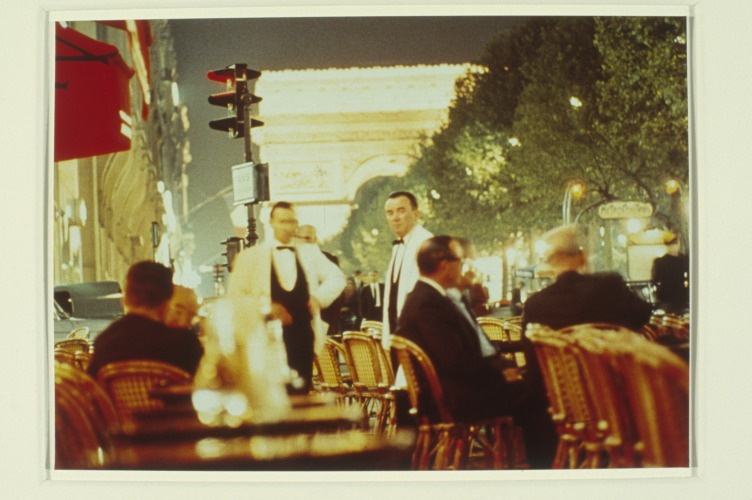
Shanzhai Gursky 002, 2014, not included in the show
Brian Droitcour and Zanna Gilbert have curated “It Narratives: The Movement of Objects as Information,” which just opened at Franklin Street Works in Stamford, Connecticut. The show examines shifting networks, and how artists use the postal system and the web in the production and distribution of artworks.
I am quite pleased to have some pieces included in the show, which runs through November 9.
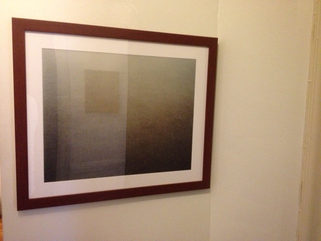
In addition to some Destroyed Richter Paintings, the show includes a photo from the Shanzhai Gursky project, previously known in less ethnosocioeconomically critical times as Ghetto Gurskys. [Though the pejorative aspects of “ghetto” still apply to the project itself, in a self-critical way, I think the racialist connotations ultimately kill it for me. “Shanzhai” seems a little pluckier and resourceful than I’d originally pictured the series to be, but I really like it.]
The series are somewhat related, in that they both originate in images circulating online. The Destroyed Richter Paintings are made by Chinese Paint Mill and based on jpgs of photos Richter took in his studio before destroying certain paintings. The Shanzhai Gursky photos are produced to the specifications of the original using the highest resolution jpgs I could find in the wild.
In both cases, the web is the source of the image and the site of production for objects which are intended to be experienced in person. For this reason, and also because the show sounds very interesting, and is put together by sharp folks, I would encourage everyone to go see it.
It Narratives: The Movement of Objects as Information, runs from Sept. 5-Nov. 9, 2014, at Franklin Street Works [franklinstreetworks.org]
Previously, related: Ghetto [sic] Gursky
Unrolling Ghetto [sic] Gursky (Rhein) [which, archivists take note, is now titled Shanzhai Gursky 001.]
This Looks Like That: Henry Codax Silver Paintings At Martos Gallery
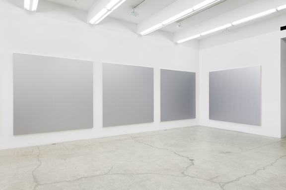
Remember how, when Christie’s tried to sell a Henry Codax painting as being by Jacob Kassay and Olivier Mosset, Kassay issued a statement saying he had nothing to do with the painting, and his “name should not be associated with it”? I don’t think Henry Codax got that memo. Because the new, silvery Codax paintings as Martos Gallery look like they’re trying to give Kassay a big ol’ hug.
Installation shot of Jacob Kassay’s 2013 show at The Kitchen titled, interestingly, Untitled (disambiguation)
For an artist who exists only in the pages of a crowdsourced novel, Codax sure keeps busy IRL. There have been multiple shows every year since 2011, and honestly, just look at this detailing; these paintings are not slapdash affairs:
Clearly, Codax knows his way across the surface of a monochrome.
Henry Codax iridescent paintings, at Martos Gallery through Oct 4, 2014 [martosgallery]
Henry Codax at Shoot the Lobster at Gavin Brown
Colored
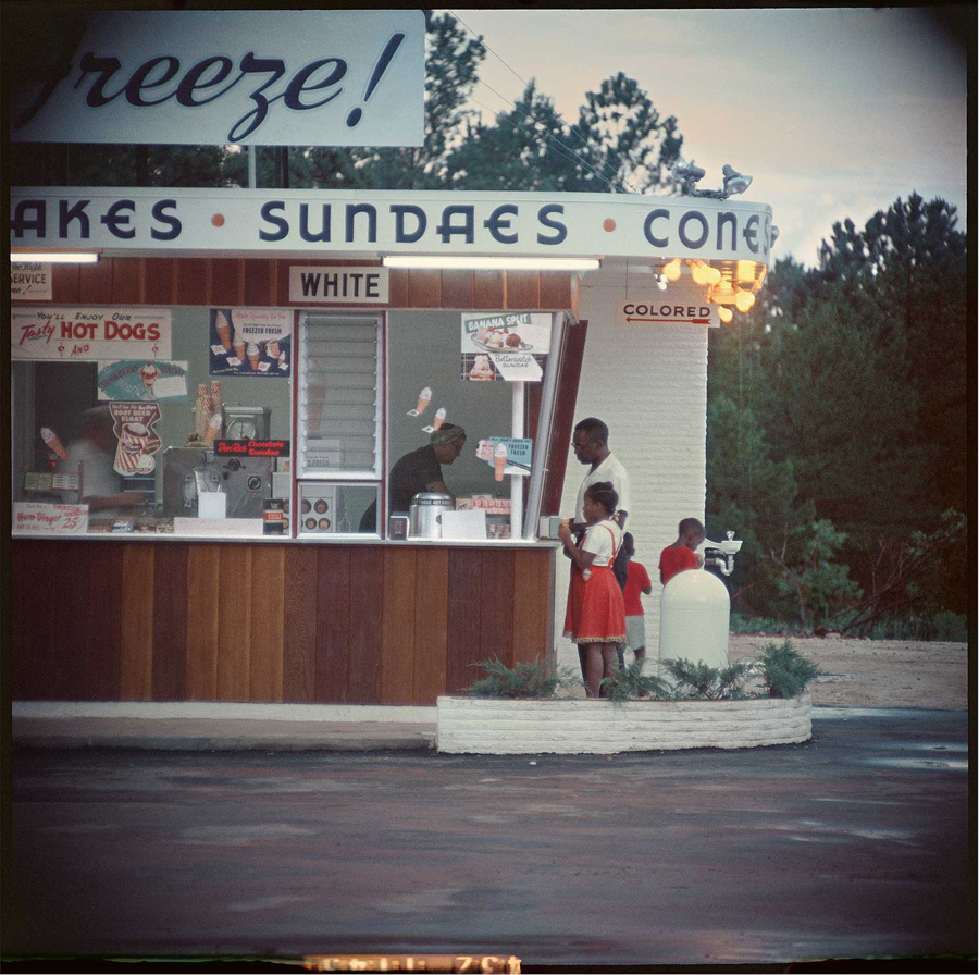
Gordon Parks, Untitled, Shady Grove, Alabama, 1956, image via arthurrogergallery
Hilarie M. Sheets’ recent Artnews article on black artists and abstraction includes Howardena Pindell, whose intensive work making paintings by punching out tiny circles in the 1970s triggered this childhood memory:
On a car ride through Kentucky in the 1950s, she and her father, who lived in Philadelphia, stopped at a root-beer stand and were served mugs with red circles on the bottom.
“I asked my father, ‘What is this red circle?'” she recalls. “He said, ‘That’s because we’re black and we cannot use the same utensils as the whites.’ I realized that’s really the origin of my being driven to try to change the circle in my mind, trying to take the sting out of that.”
And I realize I’ve never heard of this. Even though it makes sense within the perverse, racist logic of the segregated South. That discrimination would be manifest not just in signs over drinking fountains and bathroom doors, but that it would be in products, too, woven right the fabric of the material world.
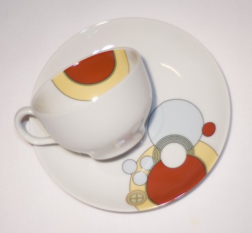
I looked around for examples of such discriminatory dishware, and I haven’t found any yet. I wonder what they looked like. The only red dot image I can muster is of Frank Lloyd Wright’s Imperial Hotel tea cups, which were supposedly designed to mask ladies’ lipstick marks on the rim. I’m going to assume this was not like that.
Were the dishes sold with red circles on them, or did each diner paint them themselves? Is there a folk taxonomy of segregated china and utensils, the racist equivalent of the coded language of hobos? Were they on the bottom, only visible to the waitress, on the side, where everyone could see, or legible only to those who knew? Are they hidden in plain sight in photos of the era?
Do people collect these artifacts, or is it too fraught? Is taking too great an interest suspect, like collecting Nazi dishes or mammy cookie jars? Are these things buried in attics like Japanese-American internment camp objects, too painful to unearth or discuss? Am I just looking without knowing the proper ebay keywords?
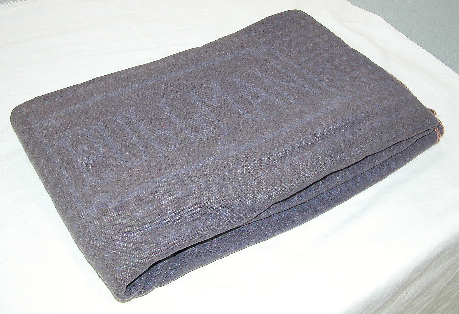
While searching, I did come across this: a Pullman Porter’s Blanket, at the National Museum of American History.
The standard Pullman blanket in the 20th century was dyed a salmon color, which became almost a trademark of the company. When a blanket became worn or damaged in service, it was assigned to those blankets reserved for porters’ use.
This wool blanket in use between the 1930s and the 1950s, was used by African American railroad porters. According to Pullman service rules, a porter’s blanket was never to be given to a passenger. Ostensibly to avoid mixing these with the passengers’ blankets, the porters’ blankets were dyed blue. This was to comply with statutes in the South that dealt with the segregation of blacks and whites.
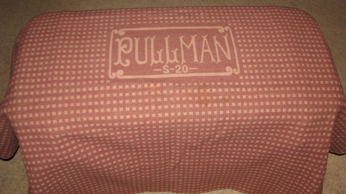
Here’s a salmon-colored Pullman blanket [via collectorsweekly]. I can’t see how you could dye this to make the blanket up top. Which means these were dyed at the factory. Am I wrong, textile people?
The Changing Complex Profile of Black Abstract Painters [artnews]
Related: “Segregation,” an exhibition of Gordon Parks’ photos of the 1950s South, is at Arthur Roger Gallery through Sept. 20 [arthurrogergallery]
Art In The Age Of Koons
One Does Not Simply Walk Into Portbou
Now that I’ve read up on it, and on the philosopher’s harrowing last days, I think I experienced the Walter Benjamin Memorial in Portbou, Spain the only way it really should be experienced: by total accident. Which is almost impossible.
We’d been visiting family in Provence, and one of the kids, the one who has been taking Spanish, not French, was wanting to go somewhere they spoke her language for a change. Plus, they wanted to go to the beach. Relenting, I pulled up the last town I knew in France, Banyuls, and looked to see what, if anything, was across the border.
The answer was Portbou. Google Maps said it was 3.5 hours away; we figured we’d drive to Spain for lunch and a couple of hours on the beach, send a postcard, and head home for dinner. Extraordinary traffic which had the autoroute backed up for several kilometers before the border, and the caravan of caravans winding along the 1.5 lane coastal mountain road, easily doubled our drivetime, and we arrived in Portbou starving and almost late for lunch.
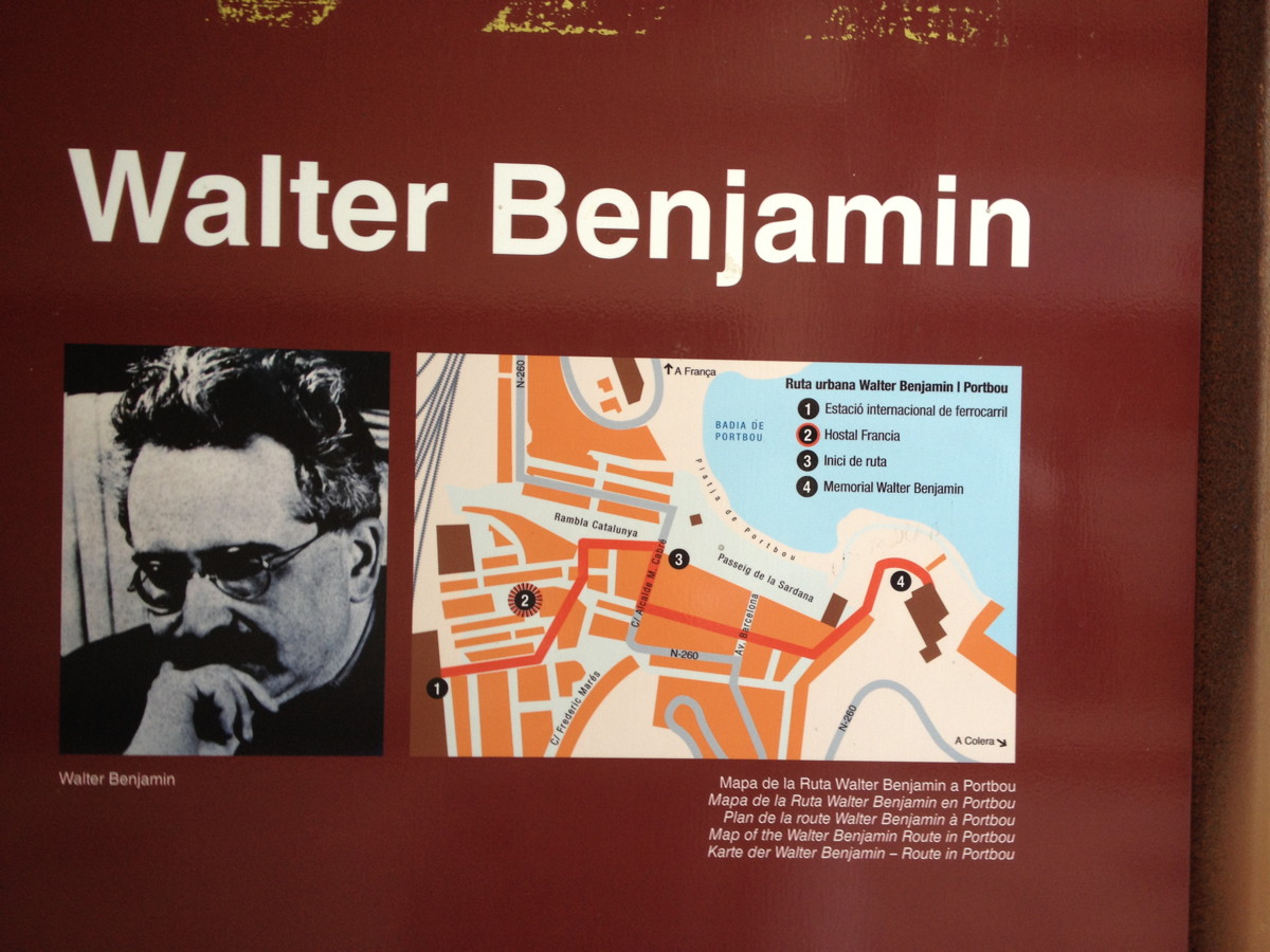
We quickly parked in a massive tunnel-turned-one-way parking lot, and wandered back through town to find any open cafe. And that’s when I spotted the Walter Benjamin information panel. It turned out to be No. 2 on the town’s four-stop Ruta Walter Benjamin, the Hotel de Francia, where Benjamin and his fellow refugees stayed after sneaking across the Spanish border in September 1940. And where he, where, well, as the panel puts it, “What happened over the next few hours is a striking illustration of all of the tragedy of barbarism.”
This town has erected a plaque in front of the hotel where Benjamin killed himself.
It’s Hard Out There For, Uh, Let Me Start That Again
Well this is getting complicated: The Trouble With Donelle Woolford [dis]
l’Autre Jetée
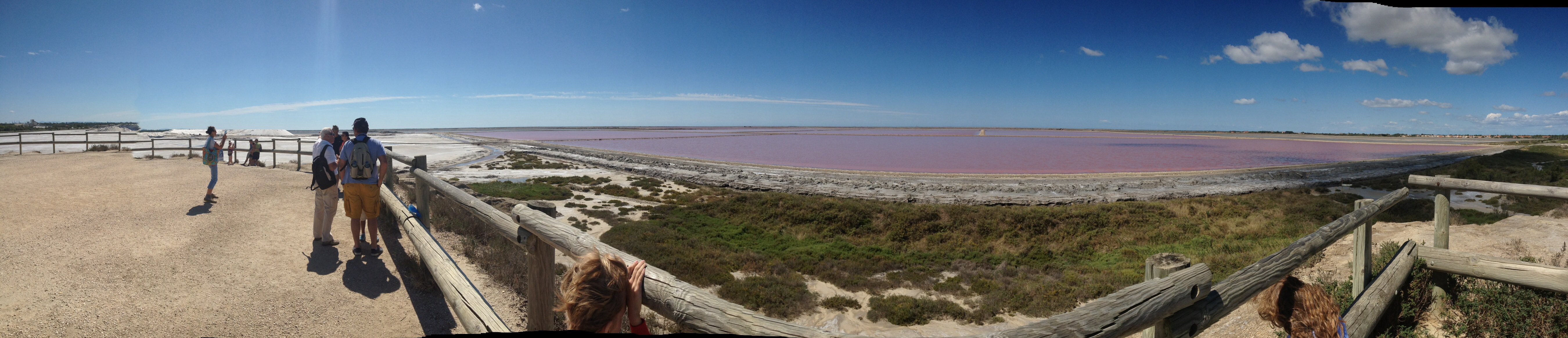
We went exploring the Camargue today, and came across these giant mounds of salt being processed south of Salin de Giraud, which looked a lot like the ones in Doug Aitken’s app, commissioned by Maja Hoffman’s LUMA Foundation in Arles. It turns out to be next to some evaporation fields which are the color of The Great Salt Lake at Rozel Point, the color which inspired Robert Smithson to choose the site for his most famous work. This panorama shows these two artists’ fields together for the first time.
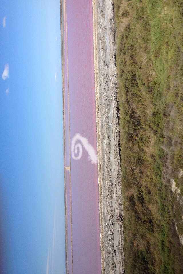
The obvious thing, then, is to combine the two landscapes, creating a spiral jetty out of mounds of pure salt in the pink evaporation ponds. It won’t last, of course, but that’s what entropy’s all about, and public art. To the extent such a word is applicable in this site and situation, the LUMA Foundation is the obvious partner and platform to make this Phantom Spiral Jetty appear.
When Artists Used Photographs In Paris
This popped out at me while reading the Christopher Williams catalogue, The Production Line of Happiness (yellow edition, btw) last night:
“Christopher Williams, On Paris (detail), 1985; Cibachrome, Ilford Cibachrome II Paper CRC .44M; 10 x 14″ (image size), 17.5 x 21.5″ (framed size); The Image Bank — Morton Beebe”2
…
2 Caption from a poster produced by Galerie Crousel-Hussenot, Paris, France, for the exhibition, “Stephen Prina, Mark Stahl, Christopher Williams,” 1985 [p.36]
There was no image anywhere in the book, but in his essay Mark Godfrey discusses the show, one of a series of group shows in 1984-85, and the photo diptychs Williams produced for them:
In 1984, for his contributions to a set of group shows in Paris (at Galerie Crousel-Hussenot), Ghent (at Gewald), Amsterdam (at De Appel), and New York (at Marian Goodman Gallery), Williams juxtaposed a reshot Pulitzer Prize-winning photograph of an execution by bayonet in Bangladesh with a photograph of the city where he was exhibiting, produced for the tourist industry and sourced from local image banks. When the four works were brought together in a group show at the New Museum of Contemporary Art in New York in 1985, Abigail Solomon-Godeau wrote that Williams’s “insistence on site-specificity, both in a geographic sense (the city represented by the tourism photo is changed to represent whatever city the work is exhibited in) and in an institutional sense (the work is conceived to call attention to the museological “frame”) militates against the neutralization of the works’ politics by the art institution that houses it.” [p.79]
There was nothing on Google, but the New Museum’s awesome digital archive has installation shots of Williams’ works in the show, “The Art of Memory / The Loss of History,” which was curated by William Olander.
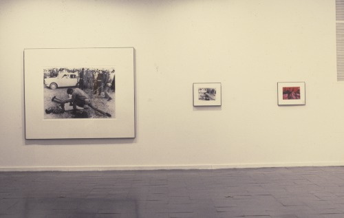
Here is how On New York II [sic, I’m sure the actual title’s 10x longer] was installed [see archive.newmuseum.org for larger images and details]. Those look like 10×8 to me, tbh, not 10×14. Here’s a pairing of stock tourism photos the New Museum’s calling On Amsterdam / On Paris. Fine, maybe that is 10×14.
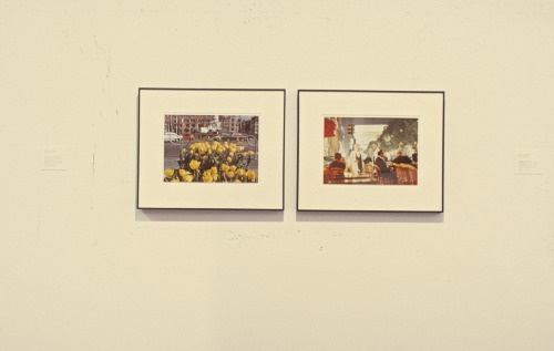
Anyway, it’s the Paris installation that caught my attention, and that’s what I’m trying to imagine. So these thin frames, these deep mats, and these two images side by side:
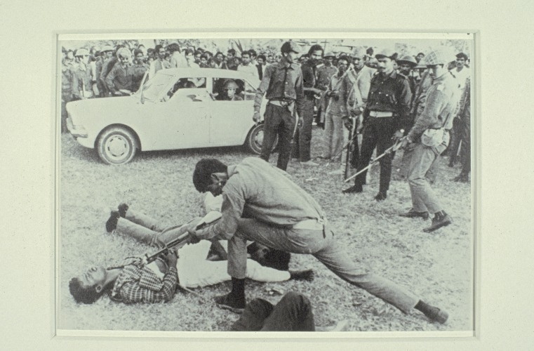
a rephotograph [!] of a Dec. 18, 1971 photo by AP correspondents Horst Faas & Michel Laurent [this 2012 tribute page to Faas has a shot from a different angle of a different guy bayonetting the same guy in the plaid shirt. It doesn’t take Errol Morris to realize the scene is extended and complicated, and the presence of the photographers is not neutral.]
and a glittery night scene in a café on the Champs-Élysées, by Morton Beebe. The red awning makes me think it’s Fouquet’s, just south of the Georges V metro entrance, unless there was a café across the street, where the Louis Vuitton store is now.
It didn’t occur to me until I started putting together this post just how sparse the online information is about Williams’ work and history, but also how fragmentary any of it is. The New Museum’s online archive is extraordinary and almost unprecedented in its scope and accessibility, especially for an institution of its size. And yet there is so much of the work and the experience that is not captured, so much that must be interpolated from these documentary traces. From the titles to the dimensions to the catalogues, checklists and installations, Williams’s exacting practice indexes and exposes the limitations of the archival view, and thus, of photography and history.
Which had nothing to do with why I’m writing about this at all right now. It was the name Morton Beebe, the photographer of the Image Bank picture for Paris, which caught my eye. Beebe sued Robert Rauschenberg in 1979 for copyright infringement for using one of Beebe’s images in Pull a Hoarfrost series print on silk. Beebe himself and the copyright industry professionals have cited the case regularly over the years as a victory against appropriation. [I wrote a couple of posts about Beebe v. Rauschenberg in 2012. Apparently I was the first/only person who’d ever requested the actual court documents. Which makes it even worse that I still haven’t written my final post on the case. It’s on my list, though, I swear!]
I was ready to concede that Beebe’s presence in Williams’s work was a coincidence, but then I remembered Beebe’s battle was the opening anecdote in what turns out to be the first substantive coverage of photo-based appropriation, a 1981 article in ArtNEWS by Gay Morris titled, “When Artists Use Photographs: Is it fair use, legitimate transformation, or rip-off?” And I can’t believe that Williams, of all artists who use photographs, would not have noticed.
Marie Antoinette’s Dog House
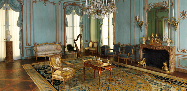
We took the kids to the Met yesterday, and in one of the period rooms in the Wrightsman Galleries, which I’d probably been in a hundred times, at least, one kid goes, “Is that a dog house?”
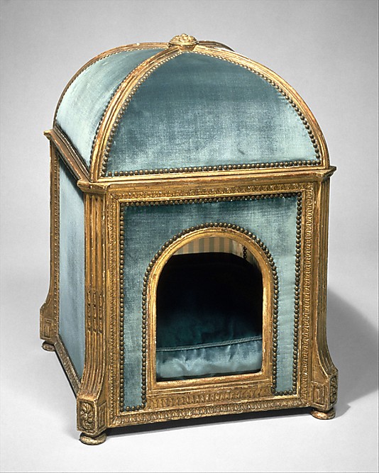
Why yes, yes, it is, and not just any dog house. This kennel, carved in the 1770s by Sené in gilded beech and pine and upholstered in silk and velvet, is stamped GARDE MEUBLE DE LA REINE. It is Marie Antoinette’s dog house. One of just three pieces of furniture belonging to the queen in the Met. The Wrightsmans bought it in 1960, but didn’t give it to the Met until 1971. Guess they wanted to use it for a while themselves.
But wait, Aestheticus Rex has a post about two other 18th c. dog houses in the Wrightsman collection–and a mystery. These two were apparently part of the Wrightsmans’ gift to the Met, but were then returned to the donors. [To be sold in 2010 at Sotheby’s, the hook for AR’s post.] And there is some curatorial ambiguity about the provenance of the above house, for which research is apparently lacking, but which nonetheless remains on view. Decades or centuries later, the gossip of the court continues on blogspot.
Dog Kennel, c 1775-80 [metmuseum.org]
Abstract In Concrete (1952), The Making Of
Nayland Blake just posted this on his always eye-opening tumblr Knee-deep in the Flooded Victory. Abstract in Concrete is a 10-minute short film by John Aravonio, which pairs reflections of neon signs in the rain puddles of Times Square with a jazz/classical score by Frank Fields. The date given on this recent YouTube upload is 1954. And it is credited to the United States Information Agency.
Which is just nuts.
Continue reading “Abstract In Concrete (1952), The Making Of”
Cy Twombly’s Gerhard Richter
RO/LU has the photos of Cy Twombly’s palazzo from that 1966 Vogue feature, and hey ho, he had a Richter. How’d that happen?
Richter had shown Frau Marlow (1964) in his earliest exhibitions: at Galerie Schmela in Dusseldorf and the Capital Realism group show at Rene Block in Berlin. Twombly had been in a 2-person show with Rauschenberg in Dusseldorf in 1960, and the Venice Biennale in 1964, and so on. But I guess I wonder how Twombly came to own a painting by the just-emerging Richter.
Frau Marlow wasn’t seen in public for 35 25 26 years, until 1991. #math.
Frau Marlow CR:28, 1964 [gerhard-richter.com]
UPDATE Thanks to Wayne Bremser for the prodding me to click through on 032c’s 2010 feature on Twombly’s interiors, as photographed by Horst, and as re-energized by Joseph Holtzman in nest. I miss nest.
Also, this classic Mondo Blogo roundup of photos from Horst’s Twombly shoot.
Roland Barthes On @TheRealHennessy Tweet Paintings
In his canonical text, The Death of the Author, Roland Barthes states: “The text is a tissue of citations, resulting from the thousand sources of culture […] The writer can only imitate a gesture forever anterior, never original […] If he wants to express himself, at least he should know that the internal ‘thing’ he claims to ‘translate’ is itself only a readymade dictionary.” Understood in this context, by transcribing @TheRealHennessy tweets onto canvases greg.org sheds light on the dynamics of language, appropriation, authorship and the enigmatic presence of a distinctive voice
@TheRealHennessy Tweet Paintings
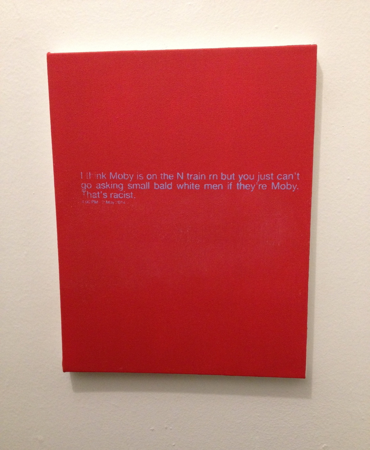
@TheRealHennessy Tweet Painting, Moby, 2014, 14×11 in., acrylic and screenprint on canvas SOLD
If anything I think they’re tragic.
greg.org is pleased to introduce @TheRealHennessy Tweet Paintings, inspired by Donelle Woolford’s Dick Joke series, which were buzzworthy standouts at the most recent Whitney Biennial. update: more here.
Instead of the expressive, gestural application of paint that was so fashionable, @TheRealHennessy tweets are silkscreened onto a flat, monochrome canvas. Similar to his re-photography of existing images, this approach removed the artist’s hand from the work. Despite this conceptual strategy, @TheRealHennessy Tweet works are nonetheless considered first and foremost as paintings. As he jokingly remarked, “the ‘Tweet’ paintings are abstract. Especially in Europe, if you can’t speak English.”
The series of monochrome tweet paintings, of which @TheRealHennessy Tweets, Moby is an outstanding example, presents the viewer with a strangely puzzling juxtaposition of a minimalist canvas and painted words. Although this can be interpreted as a reference to postmodern linguistic theory, the work also points to two quintessentially American features: hard-edge abstraction and popular humor. Cleverly subverting the clean and serious language of abstract painting, the tweets’ amalgamation of low and high culture characterizes @TheRealHennessy Tweet’s most iconic work. This intelligent fusion of conceptual strategies with popular cultural references, which has been the driving force throughout @TheRealHennessy Tweet’s influential practice, is perfectly merged in @TheRealHennessy Tweets, Moby. Wittingly parodying the uncomplicated jokes from vernacular literature, the artist has found a way of incorporating a difficult subject-matter – humor – into a deeply serious artistic practice.
More @TheRealHennessy Tweet paintings are below.
Biography Of On Kawara: 29,771 Days
Most reports of On Kawara’s death place it on July 10, the day the news was made public. I have heard from sources who would know that the artist passed away as much as two weeks earlier. Given the nature of Kawara’s practice, it seems like a non-trivial point to identify the actual date. Given his family’s prerogative and their loss, it seems indelicate to speculate or pry.
As Roberta Smith wrote in her NY Times obituary for Kawara, published today,
Mr. Kawara’s family declined to provide the date of death or the names of survivors, in keeping with his lifelong penchant for privacy.
But she also ends with this:
Keeping the viewer focused on time’s incremental, day-by-day omnipresence was one reason for Mr. Kawara’s deliberately low profile and his habit of listing his age in exhibition catalogs in terms of the number of days he had been alive as of the show’s opening date. In the catalog to a show at the David Zwirner Gallery, an otherwise blank page titled “Biography of On Kawara” put the count at 26,192 days on Sept. 9, 2004. Last week the gallery calculated he had reached 29,771.
When news of Kawara’s death began to circulate, his birthdate, via Wikipedia, was reported as January 2, 1933. Wikipedia’s citation is the Encyclopedia Britannica. But calculating back from the Zwirner show results in a birthdate of Dec. 25, 1932.
The artist’s bio in Henning Weidemann’s book, On Kawara is reported as “(June 9, 1991) 21,351 days,” which also calculates back to Dec. 25, 1932.
Given this birthdate, it becomes clear that Kawara’s family and gallery chose to report, on his own terms, not his death, but the culmination of his life, 29,771 days later, on June 29, 2014.
Update: Now we have a situation. Dia lists Kawara’ bio as “29,622 days on January 15, 2014,” which calculates back to a birthdate of Dec. 10, 1932. Now I feel compelled to cross-check Kawara’s other published biographies. Any citations are appreciated.
The canonical source, such as it goes, would be Kawara’s own 100-Year Calendar, on which he indicates he was born Dec. 24, 1932. Which could mean everything above is off by one day.
According to Weidemann, filling in a dot on his calendar was the very last thing he’d do every day. A green dot meant one date painting. A red dot meant more than one; a yellow dot meant none. It’s conceivable that the artist lived through the 29,771st day, the 28th, but did not complete the 29,772nd. Suddenly, this calculation feels intrusive.
Other biographies:
For the opening of On Kawara 1973 –One Year’s Production at Kunsthalle Bern, his bio reads, “(August 16, 1974) 15 211 Tage.” [Dec. 24, 1932.]
On Kawara Today
News came today of On Kawara’s death, and I’m finding it difficult to articulate much of my own reaction. It’s a sense of profound loss, coupled with naturalness, a frustrating mix of the inevitable and the unexpected.
The kids and I just painted new Today series paintings yesterday, to update the ones they painted for me in 2012 as preparation for RO/LU’s Today series project at the Walker Art Center. So we’ve had On on our minds.
And of course, the Guggenheim just announced that the artist was collaborating with curator Jeffrey Weiss on a full-scale retrospective set to open in February. And I fired off some exuberant tweets about getting my turn in the booth to read for the One Million Years project.
And my recent foray onto tumblr had reminded me that I have to reinstall fromnowon.us, the project we announced during RO/LU’s Walker residency, of commissioning Chinese Paint Mill to continue the Today series, first to fill in the days when Kawara himself didn’t complete a painting, and then to open the project up to everyone when eventually, some day, far in the future…
This idea had struck me during Kawara’s huge 2012 show at Zwirner’s, which had Today paintings from four decades and dozens of cities. The newest painting was Jan. 3, 2012, just three days before the opening. And other paintings appeared during the show’s run, though the artist himself, of course, did not. But Lei Yamabe wrote in the catalogue that on those days when Kawara did not complete a painting, he was like Schrodinger’s Cat, “shut in the closed room of time, simultaneously alive and dead.” And, most alarmingly, and unexpectedly, at least for me, that “the series will be complete when Kawara’s body ceases to exist.”
Damien Hirst had just floated the possibility that his spot paintings could continue into infinity, and frankly, the idea that Hirst would persist and Kawara would not felt devastatingly wrong. Thus, fromnowon.us. But I think the project only gelled because I really didn’t imagine Kawara not continuing himself. Yet now here we are, and now here he is not.
On Kawara’s 2012 Zwirner show was the only exhibition I’ve ever had to walk out of due to overwhelming existential dread.
— Rachel Wetzler (@rwetzler) July 10, 2014
Rachel’s tweet shows, not everyone was as impervious as I, was but reading back a bit today, I see the shadows of non-existence throughout Kawara’s entire practice, which I either ignored or relegated to an abstraction before. In 1991 Henning Weidemann wrote that “the picture of a past date becomes a memorial,” and the very title “lead[s] us to suppose that for the spectator it will always be a question of a “Yesterday”-series.”
Even when using the speediest means of communication available to him in 1970, the telegram, Kawara’s I am still alive was fraught with contradiction:
In a certain sense the phrase “I am still alive” can never be sent as it cannot be received by the addressee instantaneously…It is only valid at the very instant that it is being written, and in the very next second it no longer is a certainty. If the addressee receives the telegram a few hours or days later and reads it, he merely knows that the sender was alive at the very instant the telegram was sent. But when he is reading the telegram, he is totally uncertain if the content of the text is still relevant or if it is still valid The difference, the small displacement between sending and receiving, is that particular unseizable glimpse of the presence of the artist. Likewise, it is a sentence of self-reassurance…”I am still alive.” The activity of telling oneself and the world “I am still alive.”
Now the uncertainty is removed, and that difference, that once-small displacement, will stretch into history. In fact, it’s already bigger than we first thought. I’ve heard from a couple of folks that know that Kawara actually passed away as far back as two weeks ago, after some period of difficulty, but that the artist’s family had requested his passing not be made public before now. [update: according to this calculation, Kawara’s 29,771th and last day was June 29, 2014.]
And so our paintings, my exuberance about the Guggenheim announcement, my continued procrastination, it all went down when I [we] only thought Kawara was still alive, when in fact, he was not.
For some as-yet unknown time, all but Kawara’s close friends and family thought he was still possibly/probably alive, shut in that closed room of time, but he was not. This specific moment, this window, this condition, of knowing something that turns out no longer to be true, feels significant in ways I cannot pin down right now. I’ll think about it every time I see my kids’ paintings, which are now not prescient memorials of Kawara’s own last full day, but which instead mark the last day of our thinking he was still alive.
But it also highlights an important distinction that’s so often lost, especially here, between the artist and his practice, the human being and his work. Just a couple of weeks ago I wondered if Kawara’s family or lover or the deli guy was included in I Met, or was it just his work contacts.
Kawara had a wife, and at least two children. He lived on a street in SoHo. He had neighbors. Kawara didn’t give interviews or talk about his work, but when Nick Paumgarten called about a young Leo Koenig crashing at the Kawaharas’ loft, On answered the phone and gave a quote. Kawara’s work marked one man’s passage through time, space and society, and the end of that project which has inspired me for so long makes me sad. But these were “the traces left on paper and canvas,” as Yamabe wrote, “the shadows that Kawara cast.” For others who shared Kawara’s life, he was a husband, a father, a friend. 謹んでお悔やみ、申し上げます。
2016 update: as time passed, I thought about this project more and decided not to pursue it. after a couple of years, I have taken the unusual (for me) step of letting the domain name expire. I still think about Kawara’s work often, and it is possible that a related project responding to it might arise in the future. But not right now.
Previous Kawara on greg.org:
On Kawara Data
On’s Location
Setting: Fredericianum, Documenta 11 | The voice of a woman reading from within a freestanding glass booth echoes