Richard Meier’s Fire Island Houses

[2018 UPDATE: In 2018 The New York Times reports that five women who worked with Meier, either at his firm or as a contractor, have come forward to say the architect made aggressive and unwanted sexual advances and propositions to them. The report also makes painfully clear that Meier’s behavior was widely known for a long time, and that his colleagues and partners did basically nothing to stop it beyond occasionally warning young employees to not find themselves alone with him. This update has been added to every post on greg.org pertaining to Meier or his work.]

meier_new_fire_island_tondro_nyt.jpg
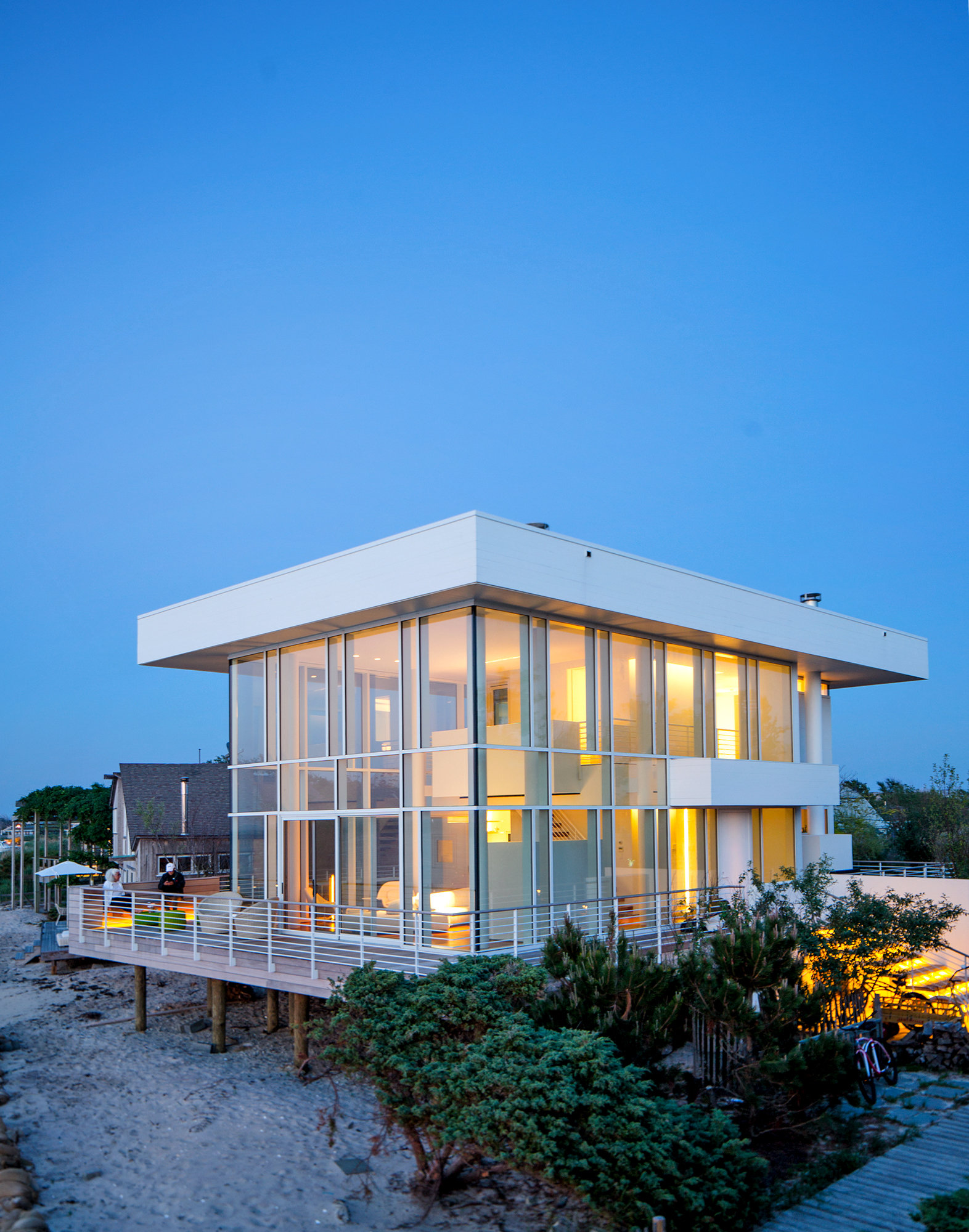
Suarez House, Richard Meier, 2012-13, photo Trevor Tondro/NYT
It’s the funniest thing, just last night I was thinking about Richard Meier’s first house, which he built on Fire Island in 1962. And lo and behold, Meier’s second Fire Island house just turned up on the front page of the Home section of the Times.
The Times says “it was like coming full circle,” but honestly, if the projects show anything, it’s how far Meier has traveled in the intervening 50 years. The 1962 house, built for Saul Lambert, was a prefab box, assembled in a couple of weeks from a pile of lumber cut to order by a log cabin manufacturer in Michigan. The 2012 house, built for Phil & Lucy Suarez, is a 2,000-sf steel and triple-glazed cube which the contractor called “a little skyscraper,” and which the Times dubs “Meier’s high and mighty beach house.” It’s basically a penthouse from Meier’s West Village towers, plopped down amidst the scrub oak and stick shacks of Fair Harbor.
Which is not to say it doesn’t look great. 2,000 square feet turns out to be plenty to get the full Meier Effect.
richard_meier_lambert_house_2.jpg
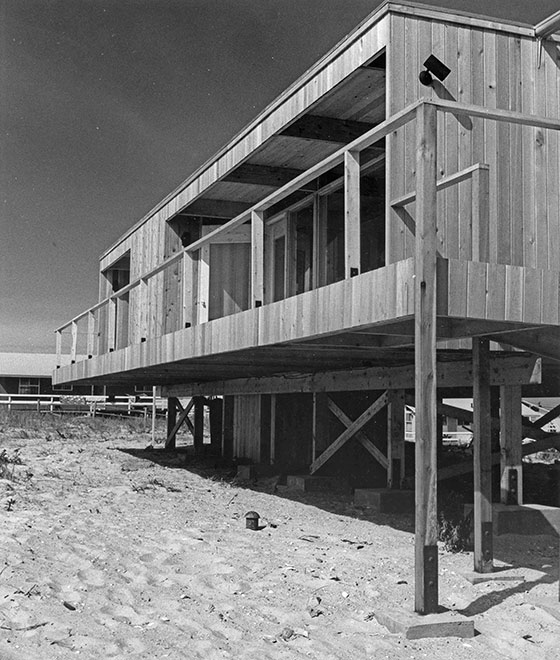
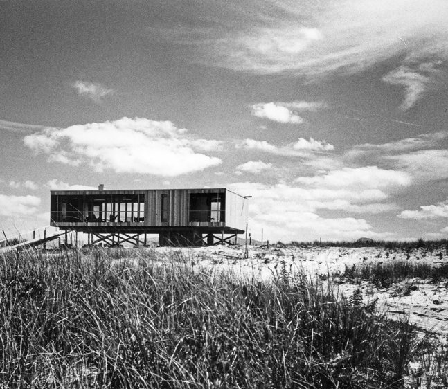
Lambert House, Richard Meier, 1961-2, image via architect/NYMag
But call me old-fashioned, I really like his first house best.
The Lambert House is special for me because it was one of the first obscure things I dug up. An architect friend, Chad Smith, had noticed an interview with the actress Anne Bancroft, where she mentioned living in a shingle-clad Meier beach house with her husband Mel Brooks. Which set off some cognitive dissonance. So I started Googlediving and turned up more info on the oceanfront house, which was in Lonelyville.
richard_meier_lambert_house_1.gif
Over the course of a couple of days of back and forth, Chad wrote about the Lambert/Brooks/Bancroft House on his architecture blog; and he heard from neighbors, and eventually, from the house’s current owners, who shared stories and pictures. It was a somewhat euphoric process, connecting these blog worlds to the real world, and pushing information, then knowledge, out there.
meier_lambert_brooks_house_tropolism.JPG
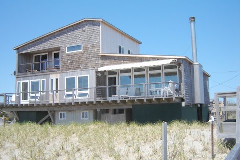
Chad was stoked, too, and kept up conversations with the owners for a while, maybe floating the idea of a renovation, but I don’t think anything ever happened. For my part, it was too soon so speak ill of the dead in 2006, and though Mel Brooks is still a genius, let’s face facts: between the shingles, the second story, the rooflines, the doors and cut-out windows, the add-ons, and on and on, they completely ruined Meier’s design.
The only proper thing to do is to strip the house back to the original box.
I mean, just look at it; there’s nothing there, and it’s perfect. How many times has this exact open-plan, 2BR house been designed by prefab-loving modernists on a budget in the last 50 years? It’s the Glass House made out of 2-by, on stilts. Anyway, I resolved [again] last night to earmark my 15th, but certainly no later than my 20th million toward buying Richard Meier’s first house and restoring it to its stripped down glory. And if someone beats me to it, that’s probably fine with me.
Richard Meier’s High and Mighty Beach House [nyt]

The Artist And The Frame

arthur_dove_snow_thaw_phillips.jpg
Arthur Dove, Snow Thaw, 1930, phillipscollection.org
In this interview with Hans Ulrich Obrist, Franz Erhard Walther talks about becoming interested in the early 1960s in frames:

The original idea was to have a frame with nothing in it. It asked the spectator to project his or her idea, image, object, whatever. So, a projection field. Through the decades, it’s a main theme for me, working with a frame, and the idea of projection, filling the frame by imagination.

Which I find particularly interesting because I’ve been looking at just the opposite: artists who paint frames around their work.
stuart_davis_blue_cafe_phillips.jpg
Stuart Davis, Blue Cafe, 1928, phillipscollection.org
Folks like Seurat painted his frames and considered them as integral elements of his works, of course. But at the Phillips Collection a few weeks ago, I noticed that American modernist painters like Stuart Davis and Arthur Dove were painting frames, and painting borders around their paintings. It gives the paintings a sense of self-containment, completion, wholeness, but it also sets them apart. With aluminum strips on each side Dove gave one later collage a window effect. ANd Davis did some kind of frame treatment on nearly every painting in the Phillips. [And on prints, the border of the paper beyond the stone serves the same formal function.]
I imagine it was something early modernists had to take on themselves because they didn’t want some collector or dealer slapping a pie-crusty traditional frame on there. It was a control thing. But also a gesture of breaking with the norms of the established painting and art world of their day.
In either case, frames were still the place where the terms on which the artist’s work met the world were set.
Also, I just love this Dove painting, even more than the many great Doves in the Phillips collection.

Nice Grouping

Screen Shot 2014-03-28 at 9.33.10 AM.png

I’ve began noticing these twitter juxtapositions about 18 months ago, and have been collecting and occasionally retweeting them since last fall.
Now I’ve put these groupings together in one place, to see what to make of them. At grpg.greg.org, I’m caught up through April, and will start functioning in realtime in a week or so.
johnny_mnemonic_upload_printout.jpg
When I first started, I connected these abutments of random images and texts to, of all things, the upload scene in Johnny Mnemonic, where Keanu tells the renegade Japanese pharma chemists to encrypt the data by capturing three images from the television.
But I just rewatched that scene now, and it’s meaningless, also hilarious. First off, they print hard copies and then fax the three images to Newark? Don’t get me started. Anyway. That is definitely not important now, but I am interested to see how these things look together.
grpg: nice grouping [grpg.greg.org]

Readymake: And You May Find Yourself 3-D Printing A Marcel Duchamp Chess Set

duchamp_chess_set.jpg
A couple of years ago Scott Kildall created Playing Duchamp, an online chess program designed to simulate the chess play of the artist, and incorporating the designs of two of the chess sets Duchamp created over the years.
duchamp_pocket_chess_set_pma.jpg
As a non-chess-player, my own personal favorite is the Pocket Chess Set, 1943, which he planned as a mass market product, but which ended up as a limited edition. [The image above is from the example the Arensbergs donated to the Philadelphia Museum.]
But I also like the sleek, Art Deco-inspired set Duchamp had carved in Buenos Aires when he arrived there in 1918-19. The knight especially reminds me of the Futurist-ic Horse sculptures of Marcel’s brother, Raymond Duchamp-Villon.
duchamp_chess_set_3D_bryancera.jpg
Anyway, Kildall has collaborated with Bryan Cera to recreate Duchamp’s Buenos Aires chess set from archival photos, and to release them as 3D-printable models. The first draft was uploaded to Thingiverse a few weeks ago. Titled Readymake, the Duchamp Chess Set has already been printed in several media and finishes by Makerbot community members. They look pretty sweet. [That’s Cera’s image of his proof set above.]
Cera writes that his and Kildall’s concept was “resurrecting objects [like the Chess Set] that have been lost…This set no longer exists save the archival photograph pictured above.” Well, and this photo:
duchamp_ba_chess_set_proa.jpg
And the chess set itself. This pic’s from a 2008 Duchamp exhibit at the Fondacion Proa in BA, that lists the chess set as belonging to a private collection. And Francis Naumann included the set in his 2009 exhibition, Marcel Duchamp: The Art of Chess in New York. [UPDATE: He did not.]

No problem: if the set was not exactly lost before, thanks to Cera and Kildall’s project, it is now much easier to find.

UPDATE:

No, there is another. This carved knight on the page for Francis Naumann’s exhibition catalogue, Marcel Duchamp: The Art of Chess, is different from the “lost” Buenos Aires set.
duchamps_other_chess_set_naumann.jpg
Please don’t make me dig out my copy of Naumann’s catalogue raisonnesque Marcel Duchamp: The Art of Making Art in the Age of Mechanical Reproduction to figure this out…

2019 UPDATE: Or do make me dig it out. Because I’d based my assumption that the knight above was too light to be from the set depicted up top, but Naumann uses the same photo with better balance, and it’s entirely plausible. Also there is zero mention of another set. So I would have been less wrong for five years had I checked the book. [Thanks to reader jp for asking wtf I was referring to.]

Readymake: Duchamp Chess Set [kildall.com]
Resurrecting Dead Objects [bryancera.blogspot.com]

Uncle Sam’s Club

uncle_sams_club_s1-visit-az-lg.jpg
The Department of Homeland Security released this photograph of Secretary Jeh Johnson and Arizona Governor Jan Brewer and their respective entourages visiting the Males 16-17 aisle in the Nogales Placement Center, where several hundred ? thousand? unaccompanied minors are being detained, after being arrested while crossing into the US.
I’m going to be Gurskying up images of these juvenile prison warehouse stores as I find them. I just cannot even right now.
Readout of Secretary Johnson’s Visit to Arizona [dhs.gov/news]

It’s The Little Differences

wade_guyton_fire_studio_07.jpg
A couple of commentators crystallize what is becoming the conventional wisdom about Wade Guyton’s Instagram provocation last month, a few days before one of his paintings headlined a heavily hyped sale at Christie’s. It’s the idea, first expressed by a giddy Jerry Saltz, that Guyton is trying “to tank his own market by flooding it with confusing real-fake product.”
wade_artmkt_uu_thumb.jpg
Marion Maneker expressed concern that the Guyton’s “threat” to create “a whole series of works from the previously unique printing of an image file” had backfired, and if we were all obsessed with his market now instead of his work, it’s basically Wade’s fault. From Art Market Monitor:

It’s hard to tell whether Wade Guyton is inadvertently steering the conversation away from his art and toward his market or whether the artist has simply fallen prey to the Barbra Streisand effect where the more one tries to deflect attention to an event, the greater the interest.

I just don’t buy it.
As Guyton’s own Instagram photo above showed, the Times [and Christie’s themselves] had already made him the poster child for anxiety marketing for a auction that was actually full of guarantees and third-party pre-bids. If Guyton really wanted to destabilize his market, he could just pull a Cady Noland and demand the auction house remove his name from a work. This did not happen. Instead he reaffirmed the central element of his practice: that his paintings are each machine-printed renderings of infinitely reproducible digital files, whose uniqueness derives from the circumstances of their production. And record resale prices continued apace.
loicgouzer_firesale.jpg
[How uncontroversial was Guyton’s backup copy situation? Christie’s auctioneer Loic Gouzer made–and signed–his own batch and sold it as an edition of 10, with proceeds going to Leonardo diCaprio’s favorite shark conservation charity.]
If it did anything, Guyton’s Instagram posts served as public critique of the Auction Week hype. It was a way to align himself critically against the system of relentless commodification–and to inoculate his work against the charges of speculation and cynicism that are leveled against auction stars. Even while his work was jostling around in the center of the hypercapitalist scrum.
Perhaps it’s not fair to blame Maneker for toeing Carol Vogel’s NY Times line, but he did it again in the very next paragraph, about the art market’s very next get-together. In her Art Basel roundup, Vogel made a lot of hay about Guyton giving each of five dealers “a black painting, all the same size and all made from the same disk.” Guyton calls it “a way of talking about the repetitive experience of seeing similar artworks throughout a fair and embracing that aggressively by showing almost identical works.”
Which is taken by Maneker to be the artist’s “ploy” to “orchestrate his market” and emphasize the arbitrage-friendly chasm between the insider/primary vs speculator/secondary channels. Except that’s exactly how almost every artist deals with auction spikes, as any art market monitor would know.
guyton_tif_rothkopf_os.jpg
And there’s another salient fact that’s missing: Guyton makes all his black paintings from the same “disk,” or as we call it nowadays, a “file.” It’s called bigblack.tif, and there’s a screenshot of it in Scott Rothkopf’s essay for the Whitney’s 2012 OS exhibition catalogue.
guyton_crousel_2008_install.jpg
installation view, 2008 Black Paintings show, Galerie Chantal Crousel
And he makes them in groups that at first seem indistinguishable. In 2007-8, he made three shows in a row, at Friedrich Petzel (NY), Chantal Crousel (Paris) and Portikus (Frankfurt) of nearly identical black paintings, installed identically. Just this spring, he recreated his entire 2008 show at Crousel, black plywood floor and all. Everything was the same. Except for the things that weren’t.
guyton_crousel_2014_install.jpg
installation view, 2014 Black Paintings show, Galerie Chantal Crousel
John Kelsey wrote in the 2010 Black Paintings catalogue:

What this work displays is the difference between sending information and receiving aesthetic objects in the gallery, or what happens when “black” moves from desktop to printer to museum, and whatever is lost along the way. The monochrome is a record of circulation. As it is copied and communicated, discrepancies are produced. And these are what now stand in for painting.

Guyton: it’s the little differences. And those are precisely what is lost when paintings are seen one at a time, in auction catalogues, art fair slideshows, and drifting by in infinite Instagram scrolls. Guyton’s inky black paintings cast a harsh light on the impoverished experience of art-as-shoppertainment, of paintings decontextualized from the artist’s practice and the flow in which they were conceived, and remerchandised as, well, merchandise. Paintings remain ruthlessly efficient units of exchange even though they’re often no longer optimal units of aesthetic experience. That divergence marks what’s lost when painting becomes nothing more than, as Ben Davis’s timely quote of John Berger puts it, “a celebration of private property.”
But it also marks a shift in artistic practice. Guyton’s just one of many artists who create on the scale of the series, the installation, the context, the network, not the lone object. Rather than throw up his hands, or lalalala pretend it’s not happening, Guyton’s recent actions show him to be conscious of the art market’s experiential crisis, and actively seeking out a way to engage or overcome it without throwing his paintings on the fire.

The Red-Blue Proposition

albert_mertz_bluered_abelow.jpg
The late Danish artist Albert Mertz spent decades working with what he called “The Red-Blue Proposition.”
Mertz died in 1990, and was reincarnated as a YouTube video uploading quality assurance tech at Google Zurich.
Albert Mertz, ‘Watch Red-Blue TV,” Jan-Mar 2014 [tifsigfrids]
image of unidentified installation via art blog art blog
Previously, uncannily related: Webdriver Torso as Found Painting System

On Kawara Data

kawara_journals_66-2010.jpg
I’ve had this image of a spread from On Kawara’s Journal on my desktop for months now. I love the reduction of the Today Series paintings to desk calendar size. There is one binder journal for each year since 1966, when the series began. [chungwoo has more images and details the content and format of the journal. In Korean.]
on_kawara_boites_trilogy_didier.jpg
Anyway, while surfing through Michele Didier’s site just now, Kawara’s Trilogy stood out for a couple of reasons. First, and obviously, is its sculptural presence. They look so Juddy, especially with the sliding front covers on.
on_kawara_boites_closed_didier.jpg
Kawara’s not necessarily known as a sculptor, but then, it’s not just these boxes, is it? The paintings are objects in boxes, too. And books and binders and CDs, however unreadable their information, always read as physical objects. [The file name on this image even turned out to be on_kawara_boites.jpg,]
Didier published the Trilogy over four years: I Met (2004), I Went (2007), and I Got Up (2008). Each twelve volume set is an edition of 90, with 10 APs. I Met is now only available as part of Trilogy.
kawara_i_got_up_didier.jpg
I Got Up, detail. Wait, so will there also be a I Photographed Postcards? How did he get pictures with postmarks? Did he get the cards back? This is no small task. [images: micheledidier]
The sets overlap in time, an 11.5-year period from May 10, 1968 to September 17, 1979. Actually, I Went, in which Kawara traces his movements on a map of whatever city he’s in, didn’t start until June 1st. Which now makes me curious. Did it take a couple of weeks to figure out? Did the idea only come once he’d started logging his interactions [the people he met and the ones to whom he sent his wake up postcards]? Did he have somewhere to hide?
on_kawara_i_went_1973_didier.jpg
Or to use Didier’s term, “the information within [I WOKE UP] intersects with the facts reported in I MET and I WENT.” Information and facts. Data. Kawara was logging by hand exactly the kind of information our computers and phones now track automatically. As metadata. For Kawara, metadata is the data. The difference, of course, is that he’s tracking himself, intentionally marking his passage through time and space, and across his social matrix. [btw, does I Met include the cashier at the deli? Does he live in a doorman building? Is his partner in there? His hookups? What do these maps of Kawara’s mindfulness communicate?]
eric_doeringer_I_went_after_kawara.jpg
The takeaways here are clear: What IS it like maintaining such total personal information awareness? Since Kawara’s not talking publicly about it, we can turn to Eric Doeringer, who has re-enacted three Kawara projects, including I Got Up (2008-13) and I Went (2010) [above].
Also, who’s going to digitize the 14,000 pages of Trilogy to create the On Kawara Database Beautiful boxes of books are great, but information wants to be free of the box. Why flip through a book when we could be reliving Kawara’s 1970s day by day on Street View? At a time when we’re all unwitting, indifferent, or dispirited subjects of constant surveillance, the lessons of Kawara’s project have never been more important.
UPDATE: Or it might be the exact opposite, hard to say.
gps_sloth_kong_wallygpx.jpg

On Roman Balls

garbatella_balls_of_rome.JPG
I was looking up something else entirely when I came across this post at the travel blog, Rome the Second Time, an architecture professor explaining how giant balls are a “very fascist” architectural element, which were popular starting in the 1920s.
The photo above is of a fascist-era housing complex in Garbatella, for example, and there are several more great examples.
https://greg.org/archive/struth_pantheon.jpg
Which, on the one hand, good to know, because seven years ago, when I first mapped out the world for places that could accommodate showing a 100-foot-diameter satelloon as an art object, the Pantheon in Rome was one of only a handful of possibilities. In concept, in fact, it seems like it’d be the perfect choice. [Eventually the Grand Palais in Paris joined the list, too.] But if spheres read to Romans as fascistic artifacts, you’d need to take that into account.
richter_sphere_iii_12769.jpg
The perfection the fascists loved also made Gerhard Richter very skeptical of spheres. He complained that with spheres it’s “impossible to get any closer to perfection,” and so you stop. Except when you don’t; 16 years after he said this Richter created his own shiny steel sphere editions.
The Balls of Rome [romethesecondtime]
previously:
If I Were A Sculptor, But Then Again…
Les Sateloons du Grand Palais
Shiny Balls by Gerhard Richter

It’s Hard To Keep The Cowboys Straight

rick_perry_gays_drunks_gop_ap.jpg
Republicans: Gays, Drunks, Let God Sort’em Out, image: AP/Rex C. Curry via TPM
Yesterday I tweeted about Texas governor Rick Perry wearing his “Smart Glasses” and standing “in front of a Richard Prince mural” in San Francisco where he was condemned for comparing homosexuality to alcoholism.
This morning Mr. Prince tweeted the following, which, like most tweets that don’t mention me, I assumed to be about me:

Upon further review, it turns out the photograph of Governor Perry was actually taken last Thursday at the Texas GOP Convention in Fort Worth, where the party was condemned for endorsing anti-gay “conversion therapy.”
rick_perry_gay_cure_gop_ap.jpg
images ap/ray c. curry via chron
The image projected behind Gov. Perry is Lone Rider, Texas, a 1974 photo by William Albert Allard, originally published in National Geographic Magazine.
rick_perry_allard_natgeo_crop.jpg
detail of “West Texas Cowboy,” Allard’s National Geographic wallpaper
It is one of the first five results on Google Image search for “texas cowboy riding,” and given the saturation levels and pixellation, I suspect Gov. Perry’s people got their jpg from the National Geographic wallpaper collection and cropped out the copyright info and logo,
allard_west_texas_cowboy_natgeo.jpg
and not from the C-prints for sale in Allard’s gallery.
allard_lone_rider_steven_kasher.jpg
Allard was one of the original photographers for the Marlboro Man and Marlboro Country ad campaigns after they switched from models to real cowboys in the 1970s. Prince would begin rephotographing these print ads around 1980. As far as can be discerned, this image has not appeared in a Marlboro ad, and has not been rephotographed by Mr. Prince. Yet.
greg.org regrets the error.

Danh Vo On ‘We The People (Detail)’


Here is an interview [in Danish, subtitled] with Danh Vo, on the making and exhibition of We The People (Detail), his full-scale copy of the Statue of Liberty. Many of the 400+ pieces of We The People were rotated and stored at the Statens Museum for Kunst in Denmark in 2012-13.
I am enthralled with this work; it strikes me as one of the smartest, most elegant, and provocative sculpture projects in years, and yet it didn’t occur to me until Vo mentioned it that Gustave Eiffel, who designed a steel armature to support Bartholdi’s copper repousse skin, did not see the Statue of Liberty installed in the US.
centennial_exhib_liberty_torch_stereogram.jpg
But reading up on the Statue’s history, it turns out the entire statue was assembled in Eiffel’s factory in France, and then disassembled for shipping. Also–and I did know this and should have remembered it–the statue began as parts, exhibited. Bartholdi made the statue’s arm and torch, which traveled to the US for the 1876 US Centennial, and which remained installed in Madison Square Park for several years afterward. And the head was exhibited at the Paris World’s Fair in 1878, all as part of a fundraising, promotional effort for the project.
SMK TV: Danh Vo – We the People [smk.dk youtube via @aservais1]

Stapler Man’s Identity Is Unknown To This Day

stapler_deleted_from_weibo_barkcheekmark.jpg
Rohit Mahajan tweeted tonight that this was one of the images deleted from Weibo on June 4th. It’s an amazing photo, though apparently not amazing enough to elude interpretation.
If I’m reading this correctly, it also seems that the weibo user, with the name Freedom Abib/barkcheekhandle is posting from the US, not from within China. FWIW. morning after update: and now the account, which I’d seen via the tw.weibo.com site, has been deleted.
Screen Shot 2014-06-06 at 8.10.14 AM.png
[via @heresrohit]

Force Luke The Use: Star Wars Alphabetized, By Tom 7


OK, this is quite good. Tom Murphy 7 just released ARST ARSW, all the dialogue of STAR WARS Episode IV: A New Hope re-edited into alphabetical order.
I just watched the whole thing while clearing my inbox, and it is surprisingly interesting. Surprising, I guess, because the concept’s instant graspability seems seductively complete. You think you get it.
Auerbach_Alphabetized_Bible.jpg
Tauba Auerbach’s Alphabetized Bible (2006) [above] is a bit like that. By alphabetizing the letters instead of the words, Auerbach atomizes not just the meaning of the text, but any hope of meaning at all. It becomes an object made of symbols, signifying nothing.
But that’s not what Tom 7’s film turns out to be. Even chopped so finely, the text, plus the film image and sound, still carry a lot with them. And since the fulltext of Star Wars saturates people more fully than the fulltext of the Bible, the experience of watching ARST ARWS is one of constant recollection and recognition. It feels like watching an actual movie, even though its structure has been obliterated. Not obliterated, but replaced. And that structure turns out to have surprises, tension, and meaning of its own.
arst_arsw_a.jpg
To be honest, it starts out slow and kind of muddled with “a,” a word that barely gets its sound right in 201 citations. The first real drama, as Kenny Goldsmith noted, comes with the 20 mentions of “Alderaan.”
arst_arsw_here.jpg
arst_arsw_there.jpg
I did not expect it, but “hey” [19], “here” [67], and “there” [51] were very exciting, appearing in scenes of recognizable cinematic immediacy.
arst_arsw_father.jpg
“Father” [12] was almost always said with unhurried purpose, which makes sense, but not with any systematic foreshadowing, which would have been brilliant. [And not beyond notice. According to Wookieepedia, Lucas tweaked the audio in a line of Aunt Beru’s for the 1997 Special Edition: “The line ‘Luke’s just not a farmer Owen. He has too much of his father in him.’ There is a slight pause before she says father and the word “father” is changed to sound more worrisome.” There are, however, no pauses in ARST ARSW, so this change is difficult to register here.]
arst_arsw_sir.jpg
arst_arsw_threepio.jpg
And there are a couple of standout solos [no pun]: C3PO’s “sir” [44] aria gets a response a few minutes later when mostly Luke mostly screams “Threepio” [13]. And though it’s only said once by anyone, Han really makes “worshipfulness” count. Tom 7 himself notes that “lightsaber” also only appears one time. “Death Star,” meanwhile, is two words, and so it dissolves into “Death” [6, but at least one is “death sentence” from the cantina], and “Star” [11].
Like any good film, ARST ARSW leaves you wondering how it was made and eager to see what comes next. The project has yet to appear on Tom 7’s site, but I expect the making of involved some tricky data scrubbing to sync each word with each clip. I’m guessing the subtitle file was used, but anything beyond that’s still in the movie magic category for me. [update: YOW, in the YT comments, Tom says he labeled all the words manually using purpose-built software!]
What I would like to see, though, is the data. Now that every word is synched to every clip, it can be released for remixing. Turn Star Wars into a database for generating whatever text you can imagine.
This has already happened, of course, with news footage, where there’s a whole genre of YouTube videos of remixed presidents saying things they didn’t originally say. The ultimate example for me is still Dan Warren’s 2011 breakthrough, Son of Strelka, Son of God, a mythical epic woven out of Barack Obama’s audiobook recording of Dreams of My Father.
If Tom 7’s process for turning movies into words can be scaled, we won’t need to stop at Star Wars; we could turn every clip of everything into the raw material for anything.
ARST ARSW: Star Wars sorted alphabetically. [youtube]
Son of Strelka, Son of God, by Dan Warren

For Months He Wanted To Live Between The Billboards

njtpk_signs_far.jpg
Can I just say how much I like the new aesthetic of the New Jersey Turnpike expansion project? I honestly cannot imagine that many people going to or from the Pennsylvania Turnpike; at least in my 10 years of DC-NYC shuttling, I’ve never seen that kind of volume, but aesthetically, I’m generally for it.
It’s not the only place that has it, and maybe it’s just the standard now in overpass and on- and off-ramp construction, but instead of bulky concrete pillars, the ramps are held up by huge, road-spanning I-beams. They all have a beautiful, oxidizing protective finish, too, like the best Richard Serras.
njtpk_signs_med.jpg
Even cooler, though, are the new electronic signs, which are constructed of square, Cor-Ten pipe, and they have meshed-in spaces for maintenance. Not just catwalks, or ledges, but actual spaces. What we perceive as a flat thing–a sign–turns out to be a space. Like the window halllways at Grand Central or Philadelphia 30th Street Stations. The Turnpike signs are New Jersey’s newest architectural icons, suspended across that state’s iconic landscape: a 12-lane highway.
And someone designs this stuff. Probably someone at PKF Mark III, the firm which the Turnpike Authority awarded three contracts in 2011, totaling over $44 million, for the “Installation of Variable Message Signs at New and Existing Locations on the Turnpike.”
njtpk_signs_cu.jpg
Oh wait, nope. Here it is, from the NJ Turnpike Interchange 6 to 9 Widening Program website: “Advanced Fabrication of Overhead Span Sign Structures for Variable Message Signs and Variable Speed Limit Signs,” awarded to RCC Fabricators, Inc., on August 13, 2009.
njtpk_rcc_fabricators.jpg
The project was one of the highlights in the 2011 newsletter for the Railroad Construction Company, Inc. family of companies [pdf, img above]. RCC Fabrication made 61 VSM sign structures, 41 for the Turnpike and 20 for the Garden State Parkway. The structures span up to 95 feet, and were built entirely off-site. I can’t tell from the acknowledgements who is actually responsible for this form, but it works.
The architect/sculptor Tony Smith famously described the revelatory experience of driving down the unfinished New Jersey Turnpike in 1951 [pdf]. Me, I would like to move in before it opens. And before it gets too hot.
Previously: Michael Ashkin, “For Months He Lived Between The Billboards”, 1993
Related infrastructure as domestic architecture: That Minnesota Skyway for sale again/still
Mies Gas Station