

hello, new headshot
I wish I could be there right now, for the opening, but I’m stoked to announce the inclusion of some work in a group exhibition at Glitch Gallery in Charlestown, Massachusetts titled, “Challenging the law without infringing the law.” The show is curated by Primavera Di Filippi, and includes Brian Dupont, Sara Hendren, Esmerelda Kosmatopoulos, Kofhschlag, and Sara Newman & Matthew Battles.
The show is the first time that Untitled (300×404), a project I began in 2009, is being exhibited IRL. The work’s original is a 300x404px jpg image of a Richard Prince Cowboy photo, but the most widely known manifestation is the print edition published by 20×200.com. [Which is once again available, btw, in limited numbers.]
If you’re in or near Charlestown, I hope you’ll check out the show.
Glitch Gallery Exhibit 005 — Challenging the law without infringing the law, opens Sept 20, 2014 [glitchmonster.com]
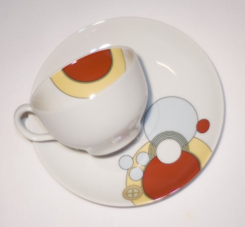
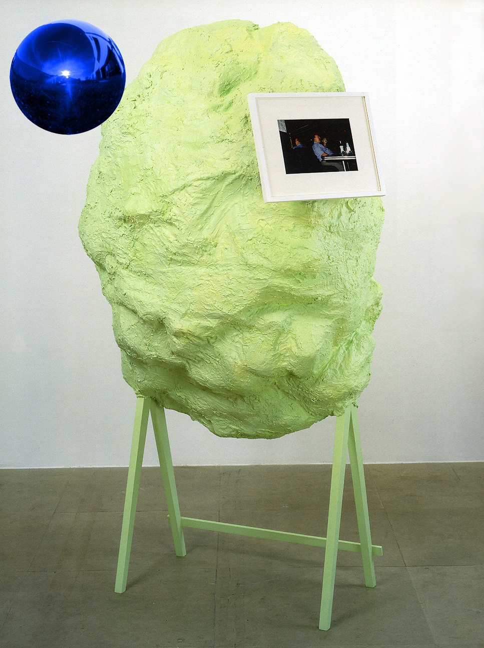
“Untitled” (ArtEverywhereUS)
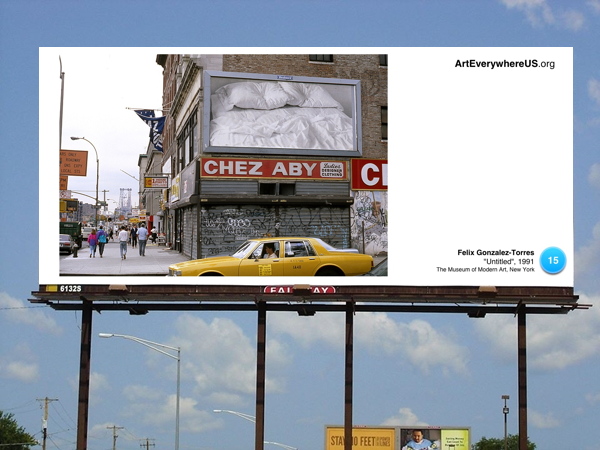
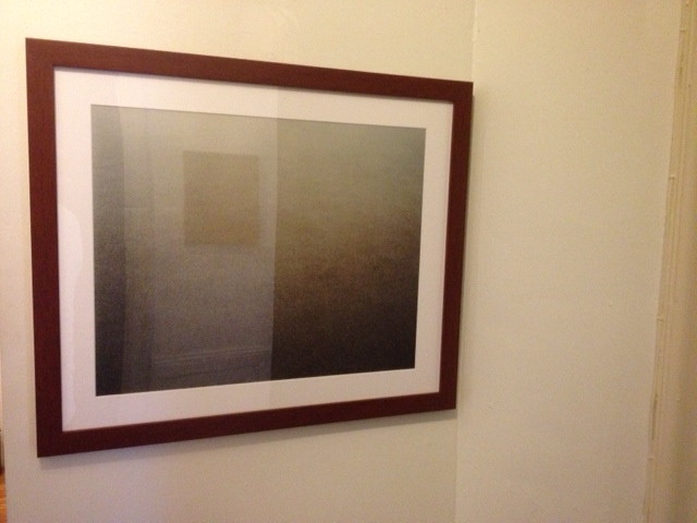
Untitled (happy place), 2014
Untitled (happy place), 2014, 15.5×11 in., digital print on glossy stock, ed. 25+5AP, $100, shipped.
From Robert Smtihson & Mel Bochner’s “The Domain of The Great Bear” to Gerhard Richter and Ellsworth Kelly’s special editions of Die Welt, I’ve been interested print as art. A couple of years ago Printed Matter turned up a big stack of Inserts, a tabloid-sized portfolio of full-page artworks by the members of Group Material. The Public Art Fund helped the collective produce 90,000 copies, which were inserted in the Sunday New York Times on May 22, 1988, and distributed downtown and in Greenpoint/Bushwick. [even then.] A few turned up at Printed Matter a couple of years ago.
Group Material member Julie Ault recalled that they’d negotiated for nearly a year with the NY Daily News, but that when they submitted the artworks, they were rejected “on the basis that ‘it wasn’t art it was editorial.'” That tension or ambiguity is one of the things I like most; it upsets a seemingly small but persistent expectation.
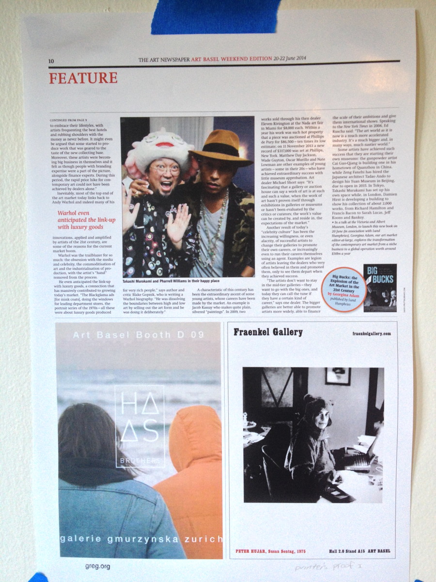
I also love The Art Newspaper’s art fair editions, reported and published on the spot every day. And when I saw this page from this summer’s Art Basel paper, it seemed like an almost perfect object. It includes an excerpt from TAN editor-at-large Georgina Adams’ book, Big Bucks: The Explosion in the Art Market in the 21st Century which, like so much of the page, provides a salient, vital picture of the moment.
It’s taken me a little while to get it just right, but I am pleased to present Untitled (happy place) as a print in an edition of 25, with 5 artist proofs. It is digitally printed on gloss stock, handstamped and numbered, and measures 15.5 x 11 inches. It will ship flat for USD100.
Marseille Vieux Port Clubhouses By Foster+Partners
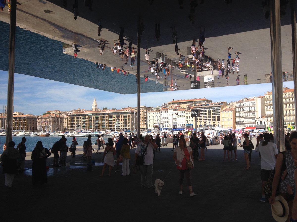
Marseille fixed its Vieux Port for their stint as European Capital of Culture last year, and it turned out pretty great. The biggest win was to pedestrianize it. It’s now wide open and full of people.
The flashiest change is the addition of a kind of ridiculous mirror-finish awning on the east end. I guess if you’re going to stick a giant awning/pavilion structure on your vast, bare waterfront, you should make it pop, and it does. It actually steals all the attention from what was my favorite element of the port’s makeover: these awesome little timber clubhouses that line the north side, along the Quai du Port.
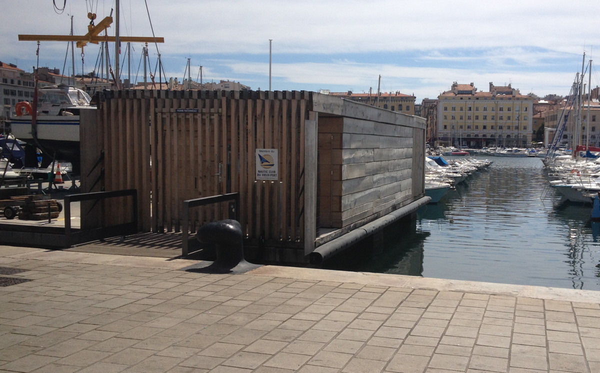
I was ready to move into one on the spot, even before I realized they were designed by Foster + Partners.
Continue reading “Marseille Vieux Port Clubhouses By Foster+Partners”
Maybe I Should Paint Them
One of the quotes that sticks with me from Richard Prince’s deposition in Cariou v. Prince:
Q. All right. Now, you say you picked up a book on them?
RP: In — literally, yes, I picked up a book.
Q. Okay. And that’s the Yes Rasta book —
RP: Yes.
Q. — that we’ve been talking about, that’s in front of you? okay. now, down a few lines you said, But I love the look, comma, and I love the dreads. What did you mean by that?
RP: What do you mean what do I mean by that? I just said it. I love the look and I love the dreads.
Q. What did you love about the look?
RP: I love the way they looked.
Q. How so?
RP: I don’t know how to answer that question, how so. I love the way they looked. I mean that’s usually I get — that’s how I respond to images.
I think maybe I liked the way that they were so different.
Q. Than what?
RP: Than myself. I don’t have dreads. I wish I could. I mean I think that was some of the thinking or some of the — perhaps it goes back to the girlfriends.The reason why I took the girlfriends is I wanted to be a girlfriend.
I think some of the attraction that I had to some of these people who looked like Rastas in St. Barth, hanging out at the bars, I said to myself, Gee, I wish I could look like that some day.
So if I can’t tweet like that maybe I should paint them. Maybe that’s a way to substitute that desire. I mean that’s the only way I can answer that love question.
Then he goes on to talk about his stepson turning him onto the reggae cover band Radiodread. It’s really awesome.
Nice Work If You Can Get It: Kreuk v. Vo & Co.
JUNE 2015 UPDATE: The Dutch judge ruled in Kreuk’s favor, ordering Vo to create “a large and impressive” work as he apparently originally committed to do. There are other conditions and instructions, like, they have to get along and stuff [not kidding]. It’s an extraordinary ruling, and while I’m sure Borgias or burghers compelled artists to make stuff in the past, this proposes an almost unprecedented situation for the creation of a contemporary artwork. I’ll do a separate post on the matter, I think. Kreuk emailed me to let me know of the judge’s decision, reminding me that I had called his suit “folly.” I’m happy to be corrected when I’m wrong, but I’m not so sure I was. Winning can still be folly. I do know I’m even happier not to be involved in this mess.
 oy, is this a mess, and the reporting about it is not helping. As the English-speaking art world has learned in the last week or so, Dutch collector Bert Kreuk is suing Danh Vo for around EUR900,000 ($US1.2m) for failing to deliver a $350,000 installation commissioned for a show of Kreuk’s collection at the Gemeentemuseum in The Hague last summer.
The original RTL story [in Dutch] didn’t have many details of the case, but it did mention that Kreuk had been criticized for selling 11 works from the exhibition at Sotheby’s just weeks after it closed. This translated into artnet’s headline calling Kreuk an “art-flipper.” Which was apparently worse than losing a $350,000-1.2m Danh Vo, because it was the focus of much of Kreuk’s sympathetic q&a with Sotheby’s & BLOUIN ArtInfo writer Abigail Esman.
It all seemed rather confusing and odd to me, and frankly, cut and dry, legally, when an artist takes money and then doesn’t deliver. Kreuk had also said that “Danh Vo has already been ordered by the courts to finish another, different work in my collection, backed by an immediate due and payable fine of 40,000 euros and 2000 for each day of delay.” Which, again, seemed pretty severe, so I wanted to see the actual court documents, to see the facts underlying the various, specific claims Kreuk was making. Fortunately, one of Kreuk’s first tweets was a Dutch art law firm’s facebook post which linked to the Rotterdam District Court’s preliminary finding [Case no. C/10/442131 / HA ZA 14-57, by the way]. And now I am more confused. But I also find some of Kreuk’s characterizations inaccurate at best, and I think his lawsuit is folly, and he would be wise to withdraw it.
Continue reading “Nice Work If You Can Get It: Kreuk v. Vo & Co.”
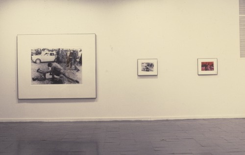
Opening In Stamford: It Narratives At Franklin Street Works
Shanzhai Gursky 002, 2014, not included in the show
Brian Droitcour and Zanna Gilbert have curated “It Narratives: The Movement of Objects as Information,” which just opened at Franklin Street Works in Stamford, Connecticut. The show examines shifting networks, and how artists use the postal system and the web in the production and distribution of artworks.
I am quite pleased to have some pieces included in the show, which runs through November 9.
In addition to some Destroyed Richter Paintings, the show includes a photo from the Shanzhai Gursky project, previously known in less ethnosocioeconomically critical times as Ghetto Gurskys. [Though the pejorative aspects of “ghetto” still apply to the project itself, in a self-critical way, I think the racialist connotations ultimately kill it for me. “Shanzhai” seems a little pluckier and resourceful than I’d originally pictured the series to be, but I really like it.]
The series are somewhat related, in that they both originate in images circulating online. The Destroyed Richter Paintings are made by Chinese Paint Mill and based on jpgs of photos Richter took in his studio before destroying certain paintings. The Shanzhai Gursky photos are produced to the specifications of the original using the highest resolution jpgs I could find in the wild.
In both cases, the web is the source of the image and the site of production for objects which are intended to be experienced in person. For this reason, and also because the show sounds very interesting, and is put together by sharp folks, I would encourage everyone to go see it.
It Narratives: The Movement of Objects as Information, runs from Sept. 5-Nov. 9, 2014, at Franklin Street Works [franklinstreetworks.org]
Previously, related: Ghetto [sic] Gursky
Unrolling Ghetto [sic] Gursky (Rhein) [which, archivists take note, is now titled Shanzhai Gursky 001.]
This Looks Like That: Henry Codax Silver Paintings At Martos Gallery
Remember how, when Christie’s tried to sell a Henry Codax painting as being by Jacob Kassay and Olivier Mosset, Kassay issued a statement saying he had nothing to do with the painting, and his “name should not be associated with it”? I don’t think Henry Codax got that memo. Because the new, silvery Codax paintings as Martos Gallery look like they’re trying to give Kassay a big ol’ hug.
Installation shot of Jacob Kassay’s 2013 show at The Kitchen titled, interestingly, Untitled (disambiguation)
For an artist who exists only in the pages of a crowdsourced novel, Codax sure keeps busy IRL. There have been multiple shows every year since 2011, and honestly, just look at this detailing; these paintings are not slapdash affairs:
Clearly, Codax knows his way across the surface of a monochrome.
Henry Codax iridescent paintings, at Martos Gallery through Oct 4, 2014 [martosgallery]
Henry Codax at Shoot the Lobster at Gavin Brown
Colored

Gordon Parks, Untitled, Shady Grove, Alabama, 1956, image via arthurrogergallery
Hilarie M. Sheets’ recent Artnews article on black artists and abstraction includes Howardena Pindell, whose intensive work making paintings by punching out tiny circles in the 1970s triggered this childhood memory:
On a car ride through Kentucky in the 1950s, she and her father, who lived in Philadelphia, stopped at a root-beer stand and were served mugs with red circles on the bottom.
“I asked my father, ‘What is this red circle?'” she recalls. “He said, ‘That’s because we’re black and we cannot use the same utensils as the whites.’ I realized that’s really the origin of my being driven to try to change the circle in my mind, trying to take the sting out of that.”
And I realize I’ve never heard of this. Even though it makes sense within the perverse, racist logic of the segregated South. That discrimination would be manifest not just in signs over drinking fountains and bathroom doors, but that it would be in products, too, woven right the fabric of the material world.
I looked around for examples of such discriminatory dishware, and I haven’t found any yet. I wonder what they looked like. The only red dot image I can muster is of Frank Lloyd Wright’s Imperial Hotel tea cups, which were supposedly designed to mask ladies’ lipstick marks on the rim. I’m going to assume this was not like that.
Were the dishes sold with red circles on them, or did each diner paint them themselves? Is there a folk taxonomy of segregated china and utensils, the racist equivalent of the coded language of hobos? Were they on the bottom, only visible to the waitress, on the side, where everyone could see, or legible only to those who knew? Are they hidden in plain sight in photos of the era?
Do people collect these artifacts, or is it too fraught? Is taking too great an interest suspect, like collecting Nazi dishes or mammy cookie jars? Are these things buried in attics like Japanese-American internment camp objects, too painful to unearth or discuss? Am I just looking without knowing the proper ebay keywords?
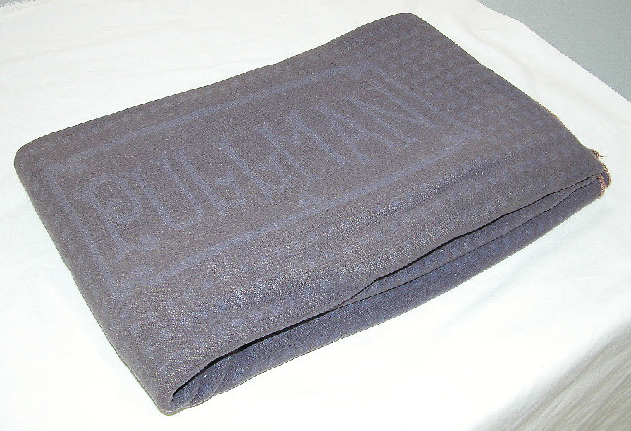
While searching, I did come across this: a Pullman Porter’s Blanket, at the National Museum of American History.
The standard Pullman blanket in the 20th century was dyed a salmon color, which became almost a trademark of the company. When a blanket became worn or damaged in service, it was assigned to those blankets reserved for porters’ use.
This wool blanket in use between the 1930s and the 1950s, was used by African American railroad porters. According to Pullman service rules, a porter’s blanket was never to be given to a passenger. Ostensibly to avoid mixing these with the passengers’ blankets, the porters’ blankets were dyed blue. This was to comply with statutes in the South that dealt with the segregation of blacks and whites.
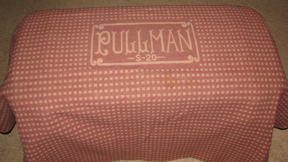
Here’s a salmon-colored Pullman blanket [via collectorsweekly]. I can’t see how you could dye this to make the blanket up top. Which means these were dyed at the factory. Am I wrong, textile people?
The Changing Complex Profile of Black Abstract Painters [artnews]
Related: “Segregation,” an exhibition of Gordon Parks’ photos of the 1950s South, is at Arthur Roger Gallery through Sept. 20 [arthurrogergallery]
Art In The Age Of Koons
One Does Not Simply Walk Into Portbou
Now that I’ve read up on it, and on the philosopher’s harrowing last days, I think I experienced the Walter Benjamin Memorial in Portbou, Spain the only way it really should be experienced: by total accident. Which is almost impossible.
We’d been visiting family in Provence, and one of the kids, the one who has been taking Spanish, not French, was wanting to go somewhere they spoke her language for a change. Plus, they wanted to go to the beach. Relenting, I pulled up the last town I knew in France, Banyuls, and looked to see what, if anything, was across the border.
The answer was Portbou. Google Maps said it was 3.5 hours away; we figured we’d drive to Spain for lunch and a couple of hours on the beach, send a postcard, and head home for dinner. Extraordinary traffic which had the autoroute backed up for several kilometers before the border, and the caravan of caravans winding along the 1.5 lane coastal mountain road, easily doubled our drivetime, and we arrived in Portbou starving and almost late for lunch.
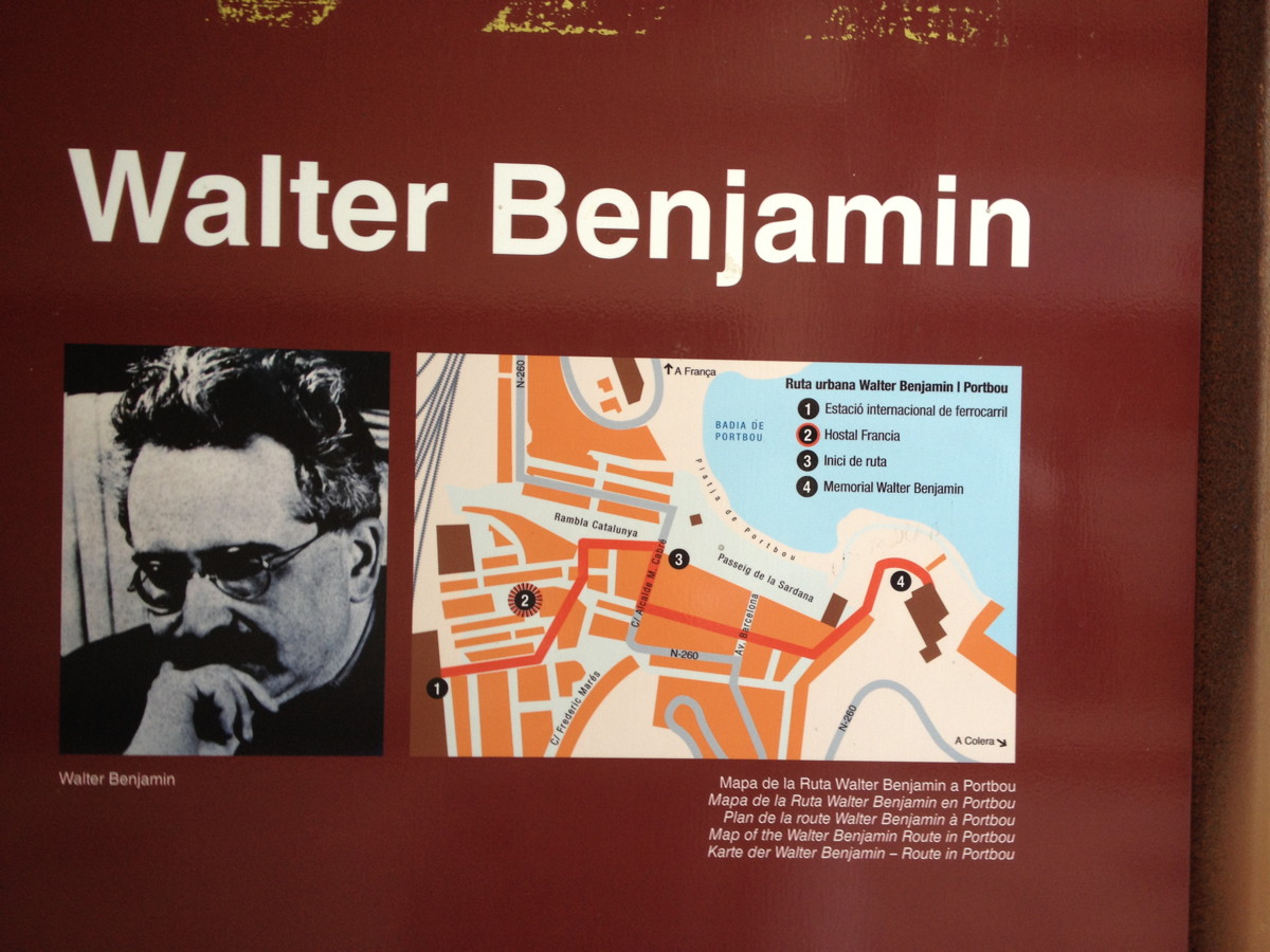
We quickly parked in a massive tunnel-turned-one-way parking lot, and wandered back through town to find any open cafe. And that’s when I spotted the Walter Benjamin information panel. It turned out to be No. 2 on the town’s four-stop Ruta Walter Benjamin, the Hotel de Francia, where Benjamin and his fellow refugees stayed after sneaking across the Spanish border in September 1940. And where he, where, well, as the panel puts it, “What happened over the next few hours is a striking illustration of all of the tragedy of barbarism.”
This town has erected a plaque in front of the hotel where Benjamin killed himself.
It’s Hard Out There For, Uh, Let Me Start That Again
Well this is getting complicated: The Trouble With Donelle Woolford [dis]
l’Autre Jetée
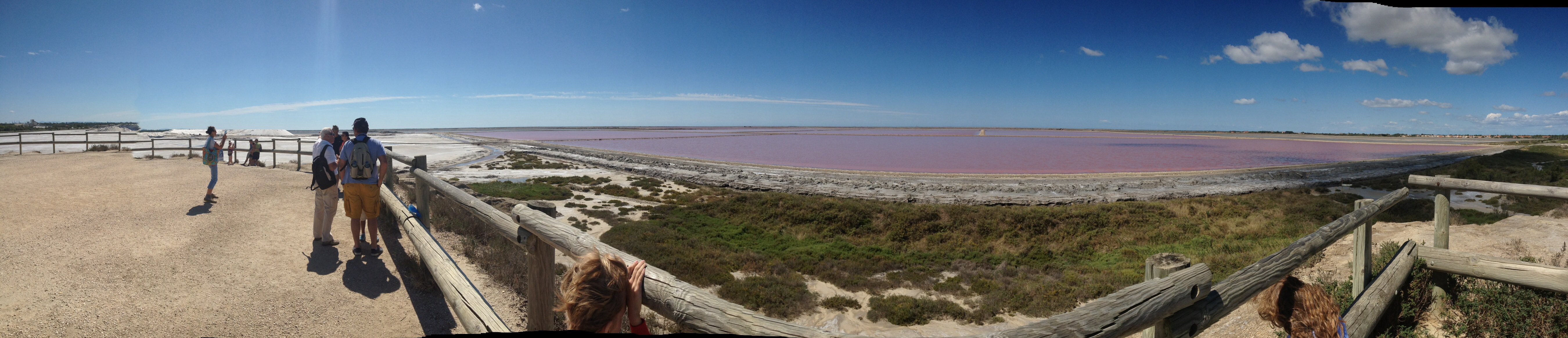
We went exploring the Camargue today, and came across these giant mounds of salt being processed south of Salin de Giraud, which looked a lot like the ones in Doug Aitken’s app, commissioned by Maja Hoffman’s LUMA Foundation in Arles. It turns out to be next to some evaporation fields which are the color of The Great Salt Lake at Rozel Point, the color which inspired Robert Smithson to choose the site for his most famous work. This panorama shows these two artists’ fields together for the first time.
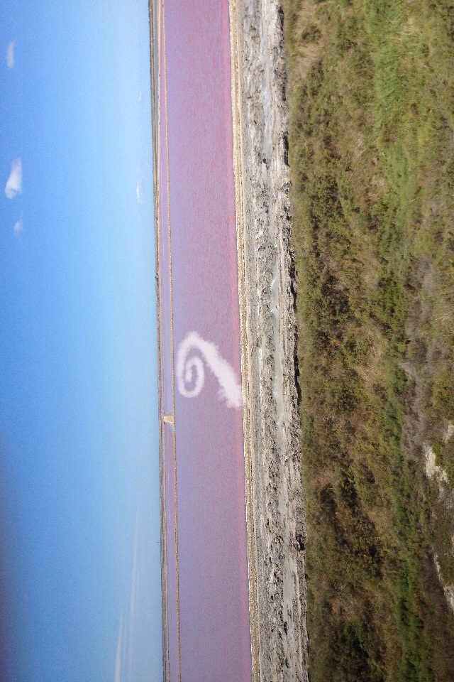
The obvious thing, then, is to combine the two landscapes, creating a spiral jetty out of mounds of pure salt in the pink evaporation ponds. It won’t last, of course, but that’s what entropy’s all about, and public art. To the extent such a word is applicable in this site and situation, the LUMA Foundation is the obvious partner and platform to make this Phantom Spiral Jetty appear.
When Artists Used Photographs In Paris
This popped out at me while reading the Christopher Williams catalogue, The Production Line of Happiness (yellow edition, btw) last night:
“Christopher Williams, On Paris (detail), 1985; Cibachrome, Ilford Cibachrome II Paper CRC .44M; 10 x 14″ (image size), 17.5 x 21.5″ (framed size); The Image Bank — Morton Beebe”2
…
2 Caption from a poster produced by Galerie Crousel-Hussenot, Paris, France, for the exhibition, “Stephen Prina, Mark Stahl, Christopher Williams,” 1985 [p.36]
There was no image anywhere in the book, but in his essay Mark Godfrey discusses the show, one of a series of group shows in 1984-85, and the photo diptychs Williams produced for them:
In 1984, for his contributions to a set of group shows in Paris (at Galerie Crousel-Hussenot), Ghent (at Gewald), Amsterdam (at De Appel), and New York (at Marian Goodman Gallery), Williams juxtaposed a reshot Pulitzer Prize-winning photograph of an execution by bayonet in Bangladesh with a photograph of the city where he was exhibiting, produced for the tourist industry and sourced from local image banks. When the four works were brought together in a group show at the New Museum of Contemporary Art in New York in 1985, Abigail Solomon-Godeau wrote that Williams’s “insistence on site-specificity, both in a geographic sense (the city represented by the tourism photo is changed to represent whatever city the work is exhibited in) and in an institutional sense (the work is conceived to call attention to the museological “frame”) militates against the neutralization of the works’ politics by the art institution that houses it.” [p.79]
There was nothing on Google, but the New Museum’s awesome digital archive has installation shots of Williams’ works in the show, “The Art of Memory / The Loss of History,” which was curated by William Olander.
Here is how On New York II [sic, I’m sure the actual title’s 10x longer] was installed [see archive.newmuseum.org for larger images and details]. Those look like 10×8 to me, tbh, not 10×14. Here’s a pairing of stock tourism photos the New Museum’s calling On Amsterdam / On Paris. Fine, maybe that is 10×14.
Anyway, it’s the Paris installation that caught my attention, and that’s what I’m trying to imagine. So these thin frames, these deep mats, and these two images side by side:
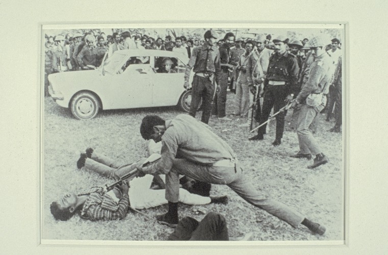
a rephotograph [!] of a Dec. 18, 1971 photo by AP correspondents Horst Faas & Michel Laurent [this 2012 tribute page to Faas has a shot from a different angle of a different guy bayonetting the same guy in the plaid shirt. It doesn’t take Errol Morris to realize the scene is extended and complicated, and the presence of the photographers is not neutral.]
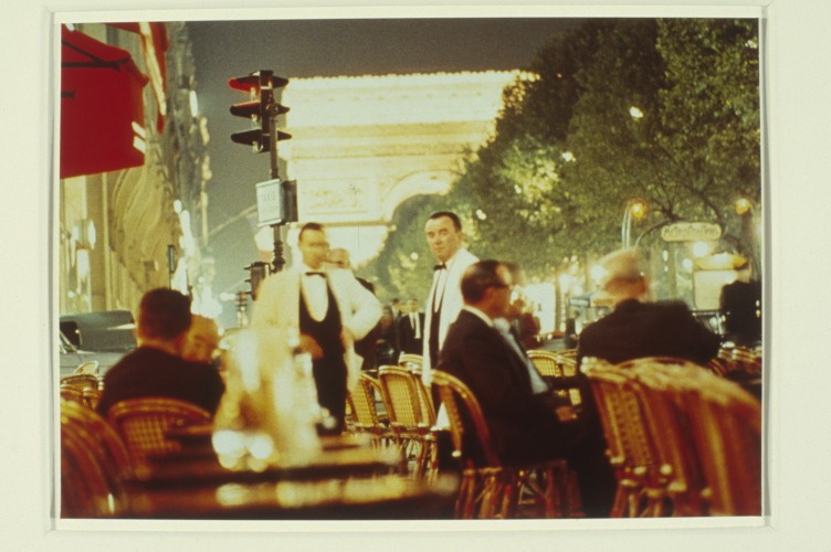
and a glittery night scene in a café on the Champs-Élysées, by Morton Beebe. The red awning makes me think it’s Fouquet’s, just south of the Georges V metro entrance, unless there was a café across the street, where the Louis Vuitton store is now.
It didn’t occur to me until I started putting together this post just how sparse the online information is about Williams’ work and history, but also how fragmentary any of it is. The New Museum’s online archive is extraordinary and almost unprecedented in its scope and accessibility, especially for an institution of its size. And yet there is so much of the work and the experience that is not captured, so much that must be interpolated from these documentary traces. From the titles to the dimensions to the catalogues, checklists and installations, Williams’s exacting practice indexes and exposes the limitations of the archival view, and thus, of photography and history.
Which had nothing to do with why I’m writing about this at all right now. It was the name Morton Beebe, the photographer of the Image Bank picture for Paris, which caught my eye. Beebe sued Robert Rauschenberg in 1979 for copyright infringement for using one of Beebe’s images in Pull a Hoarfrost series print on silk. Beebe himself and the copyright industry professionals have cited the case regularly over the years as a victory against appropriation. [I wrote a couple of posts about Beebe v. Rauschenberg in 2012. Apparently I was the first/only person who’d ever requested the actual court documents. Which makes it even worse that I still haven’t written my final post on the case. It’s on my list, though, I swear!]
I was ready to concede that Beebe’s presence in Williams’s work was a coincidence, but then I remembered Beebe’s battle was the opening anecdote in what turns out to be the first substantive coverage of photo-based appropriation, a 1981 article in ArtNEWS by Gay Morris titled, “When Artists Use Photographs: Is it fair use, legitimate transformation, or rip-off?” And I can’t believe that Williams, of all artists who use photographs, would not have noticed.
Marie Antoinette’s Dog House
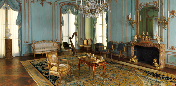
We took the kids to the Met yesterday, and in one of the period rooms in the Wrightsman Galleries, which I’d probably been in a hundred times, at least, one kid goes, “Is that a dog house?”
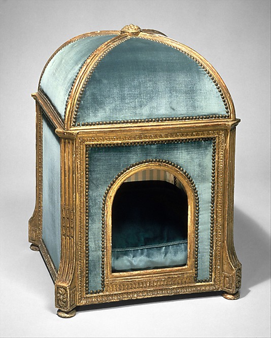
Why yes, yes, it is, and not just any dog house. This kennel, carved in the 1770s by Sené in gilded beech and pine and upholstered in silk and velvet, is stamped GARDE MEUBLE DE LA REINE. It is Marie Antoinette’s dog house. One of just three pieces of furniture belonging to the queen in the Met. The Wrightsmans bought it in 1960, but didn’t give it to the Met until 1971. Guess they wanted to use it for a while themselves.
But wait, Aestheticus Rex has a post about two other 18th c. dog houses in the Wrightsman collection–and a mystery. These two were apparently part of the Wrightsmans’ gift to the Met, but were then returned to the donors. [To be sold in 2010 at Sotheby’s, the hook for AR’s post.] And there is some curatorial ambiguity about the provenance of the above house, for which research is apparently lacking, but which nonetheless remains on view. Decades or centuries later, the gossip of the court continues on blogspot.
Dog Kennel, c 1775-80 [metmuseum.org]