The Fall Of Bootleg (Empire)

gordon_bootleg_empire_pdp.jpg
In 1997 Douglas Gordon surreptitiously videotaped two hours of Andy Warhol’s Empire during an installation in Berlin. He called it Bootleg (Empire):

‘I did a version of ‘Empire’, which was called ‘Bootleg Empire’, it is almost like the amateur version of the auteur masterpiece — it’s very shakily done. I lived in Berlin for a while and I went to see Warhol’s ‘Empire’ and I thought ‘I may never get to see this again’, so I filmed it for an hour went to the pub and then came back and filmed it for the last hour. So mine only lasts for two hours — so it’s like ‘the best of’ or something. But quite often my version is seen with his films in exhibitions, which is kind of funny as mine is slightly more dramatic as it is shaky and there are shadows of people walking in front of the camera.’ (Jean Wainwright ‘Mirror Images’ (Interview with Douglas Gordon) Art Monthly, Dec-Jan 2002/03, No. 262) [via a new path]

In 1998, he released Bootleg (Empire) as a video edition of eleven. For whatever reason, maybe because he has the word “bootleg” in the title, it’s often referred to as an homage. How many intellectual property battles could be dodged if everyone made sure to use that word, I wonder.
Anyway, one of the Bootleg (Empire) editions didn’t sell Friday at Philips de Pury. The estimate was $30-40,000.
And the details seem confusing. The lot description says “installation dimensions variable,” as you’d expect from a Gordon. But when another of the edition sold in 2000 at Christie’s [for $9,400], the description said it was “for view on monitor only.” The Christie’s edition also contained two tapes, a VHS and a Beta, but the duration is given as only 62 minutes, not two hours. Philips doesn’t bother to provide the duration information in their catalogue, but the piece was two hours long at the Guggenheim’s “Haunted” exhibition last fall.
So far, I can find mentions of at least three other Bootleg works, all of which predate Empire. Bootleg (Big Mouth, Cramped and Stoned), use slowed down, slient concert performance footage from the Smiths, the Cramps, and the Rolling Stones, respectively.

Wow, The Unseen Original Ending From Alexander Payne’s Election


Wow. It’s amazing how awkward and wrong this original ending to Alexander Payne’s 1999 feature Election seems. According to Peter Sciretta at Slashfilm, this six-minute segment comes from a VHS transfer of an original work print found at a flea market. The ending tested so badly, Payne went back to shoot additional footage for the more satisfyingly harsh ending he released.
Sciretta notes that there’s never been any discussion of another ending to the film, but hey-ho, It’s right there in Payne’s and Jim Taylor’s original script.
Watch The Never Before Seen Original Ending of Alexander Payne’s ‘Election’ [slashfilm via matthew clayfield]
Previously: I co-hosted a MoMA Film Dept. party for Alexander Payne in 2003. more recapping here.

Shh, Don’t Speak.

From Dennis Lim’s brief Q&A with Gus Van Sant at Cannes, where Restless is [finally?] debuting:

We did silent takes of almost every scene so we could maybe use them in the editing. Terry Malick apparently shoots silent takes so he can mold what he wants out of the scenes. But with our takes we actually created a silent version because we had enough material and we realized we could — maybe it’ll be on the DVD. Everything is there except the dialogue — all the sounds and music, and you hear all the footsteps, but there’s nobody talking and no lips moving. They’re the same scenes, but it has the distance of not being dialogue-driven. It’s the exact same love story but it plays like a different movie.

It’s funny, because Gerry and Elephant only have like 10 pages of dialogue between them anyway.
Previously: Gus Van Sant’s go-to guy, the greg.org 2003 interview with producer Dany Wolf

The Artist Presently Known As Man

140hberlin_standingflag.jpg
Not quite sure what to make of this, but this image showed up this morning on the golden livestreaming page for Man Bartlett’s piece, #140hBerlin.
And though maybe he wasn’t even born when it came out, it immediately made me think of… Sandra Bernhard’s 1990 performance film, Without You I’m Nothing
bernhard_flag_without_you.jpg
So yow, I just watched that clip on rutube.ru? Which, while it might offer Man some programming, if not costuming, ideas, also ties into Berlin’s own history.
And wow, I just listened to Bernhard’s cabaret cover of “Little Red Corvette” for the first time in maybe a decade, and damned if it isn’t one of the most American things about America this American has ever heard.
#140hBerlin runs for 140 hours through May 17. [manbartlett.com]

Leviathan Is Architecture

echo_satelloon_color1.JPG
Believe me, I know how this looks.
kapoor_sphere_portrait.jpg
But also this. Balloons and the Grand Palais go way back:
gimpel_grand_palais_airshow09.jpg
And anyway also this, Leviathan has a groin vault:
leviathan_groin_vault.jpg
and is the venue for a concert performance by minimalist composer and maximalist stuffed animal shaman Charlemagne Palestine:
kapoor_leviathan_palestine.jpg
[image of Anish Kapoor posing in front of Leviathan via mymodernmet, as baited by starwarsmodern. Images of Charlemagne Palestine performance inside Leviathan via Monumenta 2011]

Sforzian, Deleuzian. Deleuzian, Sforzian.

“One idea could be using mirrors so photographers could do their jobs out of the president’s sight line, the White House’s Earnest said.”
My mind is blown and I am still picking up the pieces after contemplating the possibility that White House photographers might be instructed to shoot using mirrors so as not to disrupt the president’s line of sight.
I mean, the compositional challenges pale in comparison to the artistic compositional goldmine that such an environment would provide. I mean, just imagine. Here’s one AP shot I didn’t post the other day about Sforzian backdrops at Fort Campbell. Check out how the floating reflection of the camo netting draped over the crowd barrier, which is picked up in the teleprompter:
obama_campbell_camo_ap.jpg
With mirrors, photos of the president would be like rainbows, visible only from the single specific angle that aligns the lens, the mirror, and the face.
Street photographers would suddenly have an edge. Lee Friedlander, traveling with the President:
friedlander_rushmore.jpg
I’ve slowly been making my way through Kierran Horner’s analysis of Andrei Tarkovsky’s The Mirror in relation to Gilles Deleuze’s concept of the ‘time-image.’ I had just gotten to this part when I found the AP White House photo policy story:

Left alone, Alexei locates and sits in front of a large mirror hung on the wall. The next shot begins stationary behind Alexei, facing his reflection in the mirror, and the camera slowly pans in over his shoulder, focusing ever more tightly on his reflection, until, gradually, the reflection becomes the sole image of the frame, staring back toward the actual Alexei.
tarkovsky_mirror_0.jpg
There is then a sharp cut to reveal a medium close-up of Alexei sat contemplating his reflection from the opposite angle. This shot/reverse shot dynamic and the ‘eye-line match’ are common to most conventional cinema, establishing an object, or person, as perceived by a character from their point of view.
tarkovsky_mirror_1.jpg
As David Bordwell and Kristin Thompson describe it ‘shot A presents someone looking at something off-screen shot B shows us what is being looked at’ (2004: 303). However, as in this case, the ‘eye-line match’ refers conversely to an interaction between two characters, here, the actual Alexei and his virtual counterpart. It is as if he is reacting to/with his reflection. This dialectic can be read as representing the Deleuzian ‘crystal-image’:
tarkovsky_mirror_2.jpg
‘In Bergsonian terms, the real object is reflected in a mirror-image as in the virtual object which, from its side and simultaneously, envelops or reflects the real: there is a ‘coalescence’ between the two. There is a formation of an image with two sides, actual and virtual. It is as if an image in a mirror, a photo or a postcard came to life, assumed independence and passed into the actual, even if this meant that the actual image returned into the mirror and resumed its place in the postcard or photo, following a double movement of liberation and capture.’ (Deleuze 2005b: 66-67)

I see Barack Obama as Alexei. And a virtual presidency. Can you begin to imagine what kinds of images this would produce? Forget the stunning conceptual aspects for a minute; has anyone at the White House thought through the political implications–should we call them the optics?–of not permitting the cameras’ eyes to gaze upon the President directly?
Maybe not mirrors, then, but what about one-way mirrors? Is that what they’re thinking? Put the photgraphers on the darkened side of a one-way mirror. Fortunately, there’s only 225 hours of Law & Order-related programming on basic cable each week to communicate the absolute trustworthiness of anyone speaking on the mirrored side of the glass.
wh_pool_spray_nyt.jpg
Before getting too fixated on the complications of presidential imagemaking, though, it’s worth remembering that the White House is already a supremely weird place for photographers to work. Go back to 2009, just days after President Obama’s inauguration, when the NY Times’ Stephen Crowley pulled back the curtain on the surreal and utterly staged 12-second tradition known as the “pool spray.” These are the images whose authenticity is suddenly, apparently, of such great concern.
Previously: WH beat photogs upset at staged photographs they don’t take

It’s All Done With Mirrors

So long, Sforzian Replays. After Reuters photographer Jason Reed went all meta about it on his blog last week, the White House has decided to do away with the longstanding practice of re-enacting speeches for reporters from different media.

“We have concluded that this arrangement is a bad idea,” Obama spokesman Josh Earnest said late Wednesday. He said the administration is open to working out some new arrangement with photographers.

There are conflicting accounts on whether technology exists to take photographs without distracting the president. One idea could be using mirrors so photographers could do their jobs out of the president’s sight line, the White House’s Earnest said.

Yes, by all means, mirrors. Pick mirrors, ohpleaseohpleaseohplease.
White House Announces End To Re-Enactments For News Photographers [ap/huffpo]

Nice

greg_calligrane11.jpg
There sure has been a lot of calling card hoopla these days. It seems like it peaked just as I was moving an old file cabinet, and I found this packet of cards I had made in 1999 in Paris. They were still wrapped in the Hotel Costes stationery I’d used to break the order down and transport it more easily in my luggage.
I’d gotten them made at Calligrane, a small paper store in the Marais that still doesn’t have much of a web presence. I remember it as a little giftier than I like, with elaborate desk sets or something, but still the only place I could find who could do the typewriter-like letterpress cards I was seeking.
greg_calligrane21.jpg
Because I did not want engraved cards, and I didn’t want fine paper. I already had business cards like that, and so did all kinds of people. What I needed, I told them, was a replica of the earlier calling cards I had made in 1995.
That’s when I had a business card with three addresses and six phone numbers in two countries on it, it was ugly and ridiculous. All I needed, I figured, was email [gallen@echonyc.com], and since it’s the internet, I really thought the cards should be typed.
I got really lucky, it turns out, because in Vieux Nice, just up the hill from the cathedral, was a little printing and paper studio run by a Scandinavian guy named Peter. He’d salvaged the type from old typewriters to do letterpress with. Wow, those were clean.
I still have one small box of those somewhere. It has Peter’s full name in a stamp on the bottom. I think when I looked him up to order replacements, he was still in Nice, but had switched from printing to sculpture. Gotta track that guy down again.

Photomural Collecting Not A Trend Yet

roustan_cans_artcurial.jpg
If my intermittent obsession with photomurals, and especially with the actual prints themselves, overlooked objects with a presence and character that feels now like a visual and experiential precursor to the monumental painting and photography of the contemporary era, has jumpstarted any interest in the market for these things, they haven’t heard about it in France.
On Monday, Artcurial included this 1964 “monumentale photographie” by Jean-Régis ROUSTAN, a 1.3 x 2.3 meter silver gelatin print of an abstracted wall of dented cans, in its books & manuscripts sale. But it failed to reach even its low low estimate.

LOT 483 Jean-Régis ROUSTAN Monumentale photographie, 1964 1,30 x 2,30 m, tirage argentique sur papier. Encadrement baquette aluminium. Nature morte de boites de conserves cabossées.
Estimation : 700 – 1000 €
Invendu
Tirage unique, offert à l’époque par l’artiste à l’actuel propriétaire. L’agrandissement monumental des boites entraine une abstraction. Légères taches.

Maybe it’s because Roustan was more photojournalist than artist? And though the lot before it went unsold, a set of six vintage prints of 1964 artist portraits by Roustan did sell for EUR829 last December. Duchamp, Calder, Ernst, Dali, Chagall…
But this is still a giant, beautiful, vintage object. I remain confused and convinced, if as-yet unmoved to schlep an 8-foot framed photo by a guy I confess, I hadn’t heard of until last week, over from Paris.

There’s No Escaping Leviathan

Hm, OK.
I think we’re in the clear here, satelloon-wise. It is true that Anish Kapoor’s Leviathan is inflated, and 35 meters tall.
kapoor_leviathan_int_guardian.jpg
But when you enter the Grand Palais to see Leviathan, you enter Leviathan itself. It’s a space, a bulbous, three-chambered cathedral of a space, “like going into the belly of a whale,” says the Guardian. Though of course, it’s really going into the belly of a cinematic whale. So it’s a belly of imagination.
But it’s a space, not an object. At least, not at first. When you exit, though, it’s a thing. And well, hm. At first, things look pretty grim, which is to say, satelloonish.
kapoor_monumenta_headon.jpg
But ultimately, it’s a different thing, very different. One thing that’s emphasized in Kapoor’s talk to the Guardian is the light and space of the Grand Palais, and its vast expanses of glass:

“This is a terror of a space, probably much more difficult than the Turbine Hall,” Kapoor said. “It’s three times the size, huge horizontally and vertically and above all the light is a killer. It’s almost brighter than it is outside.”

There are any number of spaces–dirigible hangars, stadiums, train stations–that could hold a 100-ft mirror-skinned aluminum sphere; but in this time, there are no art spaces except, now, the Grand Palais. And that’s part of the point.
richter_sphere_iii_12769.jpg
Not only can satelloons not escape the problems Gerhard Richter diagnosed for spheres–they’re too beautiful and perfect–they blow these problems up [sic] to gargantuan scale. Which is kind of interesting.
Monumenta 2011 has a Facebook wall [facebook.com]

MoMA WTF FTW

Alright, so I’m back from a day mostly spent at MoMA:
Wow, the Film Department is firing on all cylinders.
I remember one year when Chaka Khan yelled at the crowd for not paying enough attention to her, and now this year, Kanye West is performing to mad hype. Crazy.
Hmm, the fourth floor where I’d hoped to spend a great deal of time studing Jasper Johns’ Flag was “closed for reinstallation,” which means they’re part of the Missing Flag Coverup! Trust No One!
There are some Bridget Riley paintings in the hallway next to the cafe [I know] that look like they came from Bill Seitz’s 1965 Op Art blockbuster, The Responsive Eye. Don’t tell Larry Aldrich, though, or he’ll turn them into fabrics.
Really, a very crowded place.
Oh, I bought this anthology, Curating and the Educational Turn, and I think it’s going to be sweet. Unfortunately, with 27 different authors the chances of anyone topping this sentence, chosen at random from the introduction, are slim-to-none:

For several of the authors gathered here, these primarily function as points of departure for performative or polemical texts which themselves refuse a masterful discourse of explication in an attempt to honour the ethos of counter-institutional and counter-hegemonic practices of dissent and emergence.

Maybe curators have added pedagogical toolsets to their praxis because they’re fed up with people always asking them to explain what the hell they’re saying.
murakami_vesrailles_ball.jpg
I almost bought what is undoubtedly the greatest book of its kind, Murakami Versailles, but it was too heavy to contemplate carrying it around. Also, I expect it will be entered into evidence in Murakami’s trail before the People’s Post-Revolutionary Court, so I can just grab a scaned version soon enough.

Sforzian Job Well Done!

The death of the Sforzian Backdrop has been greatly exaggerated.
obama_campbell_ap6.jpg
They may not show it off every day, but it turns out that the Obama White House’s advance team speaks fluent Sforza. As these AP photos from the President’s congratulatory address to the soldiers at Fort Campbell, KY clearly demonstrate.
For starters, there’s that Patton-esque flag up top, plus the small bleacherful of racially diverse soldiers for the wallpaper effect,
obama_campbell_ap1.jpg
a motif that was so popular in the Bush era [and so hilariously screwed up in the brief McCain phase.] Check out all the cell phone cameras in the photo above. Don’t recall that ever happening in the wallpaper before.
bush_milit_wallpaper.jpg
Looks like they used camo netting instead of regular bunting or blue curtain to cover the barricade there.
obama_campbell_ap5.jpg
And check out that fresh new banner, hung on the side, so that:
obama_campbell_ap3.jpg
Here’s a nice wide angle shot to see how the staging comes together:
obama_campbell_ap2.jpg
But if there’s a difference, besides the frequency, I guess, between staged military events in the Bush and Obama eras, it’s this: you just never know, so save yourself a peck of trouble down the line
miss_accomp_ap_nyt.jpg
and don’t stand under the banner.
obama_campbell_ap4.jpg
[all Ft. Campbell images via ap]

Open House Teardown

In 1997 or so, the Junior Associates at MoMA organized a day of studio visits in Williamsburg. Worried about where to eat, we packed our own food, sandwiches from a fellow board member’s startup, Cosi. We ate lunch on Meg Webster’s roof. Most people took the bus to Momenta, but a brave group of us decided to walk, unprotected, up Berry Street. The very idea that we might be from Manhattan being beyond their imagination, some people sitting on the stoop of a vinyl-clad house stopped us and asked if we were Dutch.
This Long Island daytrip comes to mind when I read about Open House, a reconceptualization of Levittown which is the latest project from Droog Lab and Diller Scofidio + Renfro.
I hope if my heroes ever organize a self-indulgent, vanity symposium and an utterly disconnected, irrelevant publicity stunt exhibition about the suburbs that misses like five real points and replaces them with trite photo-op interventions designed solely for the benefit of the critics they bus out from the city for the afternoon, my review of their debacle will be as tactful and constructive a devastating takedown of the shitshow as Alison Arieff’s is.
Conceptual Suburbia: A Design Project Descends on Levittown [nyt]

And Then They Came For The Sarah Morris Origami Paintings

lang_morris_copyright1.jpg
Oh boy, here’ we go again. As @BDPNT, @joygarnett, @robertpearre, @shelawterry, and @Copycense tweeted, “Welcome to Cariou’s world.”

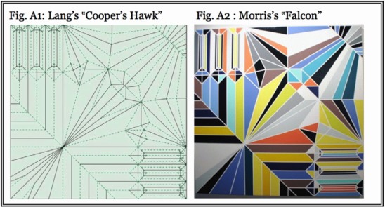
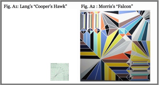
A leading origami artist, Dr. Robert Lang, has filed suit along with several other designers, charging Sarah Morris with copyright infringement for making paintings and prints which use particular crease pattern diagrams without permission or credit.

At issue, just as in Patrick Cariou’s complaint against Richard Prince, is the legal status of Morris’s works, and whether they are derivative, which is infringing, or transformative, which is protected under fair use exemption.
Lang has filed his suit in California, and for some reason a lawyer may be able to explain to me, a great deal of his complaint focuses on the applicability of California as a venue for hearing the case. [The filings, including a sheaf of exhibits, are available for download at Lang’s attorneys’ website. They’re very well-produced, but right now it’s too early to say whether I’d turn them into a book.]

Since I have been exactly 100% [0 for 1] wrong in my predictions for the outcome of such transformative use trials, I’m wary to go too deeply into the facts of this case yet. I will say, though, that basically every difference I see between Morris’s appropriation and practice and Prince’s only intensifies my belief that Morris is and should be in the clear, and that these kinds of lawsuits are a nuisance and a threat. Morris is not an outlier. As an artist she’s operating at the center of the art world, not its margins; her practice and method are widely known, critiqued, supported, and emulated. Within the art world.
She’s also a couple of orders of magnitude less commercially successful, price-wise, than Prince or Koons. As such, she’s more vulnerable than they are, I think, to exactly the kinds of debilitating or chilling effects an expensive, protracted legal fight would entail, especially one fought at an extreme distance. [Morris is based in NYC and London.] Because the stakes for her are non-trivial, they are also more relevant to more artists whose practice includes–I can’t even say appropriation, because I don’t even see Morris’s work within that context. But it’ll be what it’ll be, I guess.

[UPDATE: oh-ho, I may be wrong about this; a couple of people have emailed to point out that Morris is an alumna of Koons’s studio, so this may be exactly the context in which to consider her work. It makes sense, considering the number of people I’ve met who turn out to have worked for Morris at some point. Time to make the donuts.]

Two things, no, three, that stand out, though:
1) These side-by-side exhibits that lawyers for both Patrick Cariou and Lang produced are seductive and deceptive, and they tend to obscure or minimize otherwise potentially important aspects of transformative use.
Lang uses these exhibits to argue that Morris has done nothing but “colorize” [his term] his copyrighted crease pattern. In fact, she has made several substantive changes to its appearance, content, scale, and materials, as well as to its meaning, utility, and context. A crease pattern is not just the geometric form; each type of line–dotted, dashed, or solid–indicates the direction of a fold, and it a crucial, even fundamental element–for making origami. Morris removes all this functional information, a non-trivial transformation.
Another misleading element of these side-by-side comparisons is size. Even if we assume Lang uses the biggest piece of paper mentioned on his site, 20-inch squares, his pattern is still 95% smaller than Morris’s huge painted canvases. A more accurate side-by-side image might look like this:
lang_morris_copyright2.jpg
2) Lang’s filing makes the bold but utterly ridiculous claim that “Morris’s actions have created competition for Plaintiffs by occupying the market for painted versions of their copyrighted artworks.” No such market exists, and I’d argue that Morris’s paintings have created one. If people pay $100,000 or more for Morris’s paintings, it’s not because they look like Robert Lang diagrams; it’s because they look like Sarah Morris paintings. Her realized gain attributable to the origami IP itself is incremental at best.
3) Unlike Prince, who did not profess any particular critical interest in Cariou’s Rasta photos, Morris has publicly discussed and presented her origami paintings as commentary both on origami and its history and its specific meanings and contexts, but also on its contemporary connection to science and systems. Lang the origami expert is famous in a way that Cariou the photographer precisely is not. As such Lang’s work could present a larger, more natural target for someone wishing to make critical new work about origami.
The kicker for all this, is that I’m kind of an origami nerd myself. That my greatest origami accomplishment was winning 2nd prize and $10 at the Utah County Fair one summer when we were visiting my grandparents’ house as a kid pretty much says it all. [I made my origami peacock out of printed wrapping paper.] But I still do it pretty regularly, and I’d say I have an above-average sympathy for these origami masters who feel they’ve been treated unfairly. I still think they’re wrong as hell, though, and that this case is a dangerously unproductive nuisance.

UPDATE: And speaking of my fellow nerds, look who else has spent Friday night picking apart the latest artist copyright infringement case? Joy Garnett has some solid analysis and some biting commentary. I’ll only add that between their blog headline and their PR-chasing email to Newsgrist, the origami folks’ lawyers are really angling aggressively to publicize their claim against Morris.
Lang Origami [langorigami]
Oy: These Origami Artists Won’t Fold [bayoaklaw.com]