
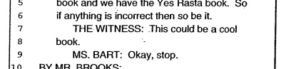
“THE WITNESS: This could be a cool book.”
– Richard Prince Deposition Transcript, p. 328
Dude, Richard Prince just blurbed my book.
Between the lawyers on both sides of Cariou vs. Prince et al, about 275 pages of the transcript of Richard Prince’s 7-hour deposition had been made public as footnotes to various briefs and memos, but there were 101 pages left out.
In the weeks since I compiled the excerpts and exhibits into a book, I’ve been trying to track down the complete transcript. Now I have it, and you can too. After trying multiple sources for obtaining it, a sympathetic party close to the case pointed me to an apparently inadvertent, unmarked exhibit appended to a late court filing, which included the entire 378-page transcript instead of the customary snippets.
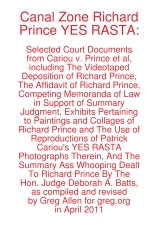 And so I have revised Canal Zone Richard Prince YES RASTA to includ the entire interview, in order, with a handy timestamped topical index, even, and with some additional rounds of legal memos, that give a fuller sense of the give and take that led up to Judge Batts’ royal smackdown of Prince’s transformative use claims.
In addition, to accommodate wholesale requests, I’ve switched printers, so the new, revised edition has slightly smaller page facsimiles, but it is also printed on higher-grade paper. It looks pretty slick.
Because of the additional quality and page count bumps, the cost went up a bit, to $17.99, but it’s still a pretty sweet deal, I think. You can buy Canal Zone Richard Prince YES RASTA directly from Createspace.com, an Amazon print-on-demand subsidiary, of if you like, you can also order it from Amazon. If you’re dying to see it in person first, both Printed Matter and Specific Object have greg.org-stamped copies available.
For folks who have already purchased the book, either in print or electronic format, don’t worry, I’ve got you covered. I made an Appendix which contains all the missing transcript pages, and I’ve been mailing out printed and PDF copies to people who’ve contacted me. Whenever the printed copies run out, I’ll be happy to keep the appendix available via PDF.
Because it really does have some interesting stuff in it, like the quote at the top of the page, which was Prince’s reaction to the exhibit showing the side-by-side comparisons of the Patrick Cariou’s YES RASTA images and the Prince Canal Zone paintings they ended up in. [Obviously, that exhibit is included in the book.]
Now that the whole deposition story can be told, I think I’ll go through and pull out some highlights to share here: some great exchanges, useful insights, or straight-up WTF moments. If you have any favorites, definitely pass them along. And enjoy! The damages hearing is scheduled for May 6, tomorrow!
Buy Canal Zone Richard Prince YES RASTA: Selected Court Documents from Cariou v. Prince et al from Createspace or Amazon.
The book is also available at Printed Matter and Specific Object, both in New York and online.
Tate Something Something Bricks Whatever
I’ve been thinking a lot lately of governments’ relationships to modernism and, by extension, contemporary art, and the controversies that erupt around it.
So I was kind of stoked to see the headline in The Art Newspaper, “Revealed: secrets of the Tate bricks
Newly released documents uncover a heated argument and the search for spares.” The paper apparently filed a Freedom of Information Act request for the documents pertaining to the 1976 outcry over Tate Britain’s acquisition of Carl Andre’s 1966 sculpture, Equivalent VIII, which consists of 120 bricks stacked two high.
Sweet.
But here’s the big get: Tate couldn’t find any extra bricks left to stockpile. Also, “Among the papers is a memo on ‘The Burlington & the Bricks’.”
Seriously, that’s it. Do they publish this long-lost memo or add anything to the Tate curators’ argument in print with Burlington Magazine? No. I guess TAN figures if people really want to know, they can FOIA it for themselves.
Curators Gonna Curate, Politicos Gonna Politick
Tom McCormack’s lengthy look at the contentious, suspicious history of US government support for the arts is worth reading for itself. But it also got me off my butt to write something that’s been bugging me since attending the Smithsonian’s Flashpoints and Faultlines symposium last week.
I had no plans to go to the symposium, primarily because it seemed like such a transparent attempt to ride out the Smithsonian’s “Hide/Seek” censorship mess by throwing up a cloud of bureaucratic, academic dust. While I could be persuaded that Wayne Clough’s resignation over his egregious mistake might have served to embolden entrenched critics and weaken the institution in advance of a difficult budget battle, I didn’t think a pointless symposium designed to corral the most outraged arts administrators into an auditorium and bore the concern out of them doesn’t help either.
But I had a meeting set up with an attendee which got pushed back, so last Wednesday I ended up attending part of the first, museum directors panel, and most of the second, “Exhibitions in National Museums & Public Institutions,” or the political operatives & appointees panel.
From these panels, various references to earlier sessions, and the subsequent, sparse reporting, it seems clear to me that the art world really needs to rethink the paradigm for its relationship with the federal government, or more specifically, with politics.
Frank Hodsoll was President Reagan’s NEA chairman. He was a foreign service officer and lawyer, later an OMB appointee, and now consults. Not an art guy, but a diplomacy-turned-art/culture policy guy. He talked very openly about his charge to vet NEA grant proposals to weed out potentially troublesome, controversial, or poltiical content. He took credit for personally rejecting or spiking a dozen, maybe 20 [I’m paraphrasing, but the video for the panel is archived now. It starts at around 1:40.] proposals that had otherwise passed the NEA’s established panel review process. One example: a Washington Project for the Arts proposal to project images or text or something onto the Capitol Building, which he was sure would anger some Congressmen.
Hodsoll was the Chairman when the exhibition including Andre Serrano’s Piss Christ and Robert Mapplethorpe’s retrospective were both approved for partial or tangential NEA funding. He was very forthright that these projects hadn’t been monitored closely enough, and had he been able to scrutinize them, he would have deemed them “inappropriate” and denied them funding.
I guess I was not so amazed that the chairman of the NEA was advocating actively screening and denying grants based on the ideological or political appropriateness of the artwork, but that the NEA was screening out work that might engender controversy or displeasure from congressional representatives. It was a position and policy that rejects not only the possibility that art might have political content or engagement; but also art’s essence as an expression of speech.
Putting it in terms of whether this or that project is deserving of taxpayer support misses the point, at least when such support exists. Hodsoll pointed out that artistic expressions get rejected all the time, “it’s called selection,” by which he meant the NEA’s grant evaluation processes, but also, I think, curation.
And so the tautological calculus that art may receive public funding if it wholly disassociates itself from politics and/or controversial issues, and if it pleases–or at least doesn’t piss off–someone in the government. And if these terms aren’t acceptable, art, artists, and art institutions can deal with the reality that the government has no responsibility or compelling need to support art anyway.
If this argument wasn’t disheartening enough, Hodsoll was followed by Bill Ivey, who was Bill Clinton’s NEA chairman, the guy left holding the mop–or left holding the bag–after the fiercest Helms-led attacks on the NEA. Ivey spent almost half his time laying out the findings of various polls that showed no matter how you slice it, 30-50% of the population does not support the right to free speech.
Never mind that the right being opposed is always someone else’s, and the speech is something they disagree with. With such tenuous support, an inconsistent and unfriendly legal landscape, and the existence of politicians and/or activists who will exploit this rift, Ivey argued, the last, most important thing is to protect the institutions of art, and their funding. [In a perfect segue, the next panelist was Ford Bell who, as president of the American Association of Museum, is basically the art institutions’ lobbyist.
From the far side of long careers as political operatives and appointees–only Bell seems to have ever run for elected office–these men uniformly decried the politics, and the politicizing of art and museums–by others. Just as propaganda is the other guy’s marketing, playing politics is someone else’s common sense policy. The only winning move, we’re told, is not to play. A strange game indeed.
And Ellen McCulloch-Lovell, the moderator, opened the panel with a lament that I hear so often, it’s like the Washington art world’s Pledge of Allegiance: “I wish there members of Congress could hear to this.” But they never are.
No wonder the official art world wants to see itself apart from politics; to do otherwise only proves how poorly they do, or how superfluous they are. At least in the nakedest political terms of power and money.
As infuriating or disheartening as these political hands’ assessments may be to an art lover’s ears, they are still important to hear. They’re experienced views from the real, political world of Washington, the world in which money and constituents and lobbying and controversies and demagoguery and negotiation and propagandizing exist. Symbolism is there, too, and dissent, and relationships and persuasion.
If art & museum people thing politics seems intimidating, confusing, or potentially embarrassing, maybe it’s worth recognizing that many non museum people, politicians included, feel the same way about art.
The “Hide/Seek” Wojnarowicz crisis was precipitated by a conservative religious and political activist who had no interest in art, but in changing the political micro-climate during the congressional vote to end Don’t Ask/Don’t Tell. Clough reacted to soundbites solicited from political staffers who saw neither the show nor any political downside to criticizing it and the Smithsonian which sponsored it. By so doing, they only raised the political price their opposition would have to pay for their funding levels and priorities.
Throughout the Flashpoints Symposium, speakers referred to Hide/Seek co-curator Jonathan Katz’s rallying cry that Americans would rise up to defend their/our Smithsonian from the threat of budget cuts [or worse.] But that seems as practicable as wishing there were more senators attending your 2-day symposium.
Through the efforts of some combination of, in order of mobilization, directors, boards, curators, artists, educators, marketers, associations, audience and constituents, lobbyists and legislative affairs professionals [that’s everyone, right?] I think the art world needs to make a more compelling political case for itself, and to make it more persistently and productively. I have some sense for how that might happen, but at the moment, it still feels like a major endeavor to accurately understand the problem.
Where is that Leviathan, whom thou hast made to play therein?
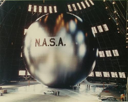
So all this time, I’ve assumed it’s common knowledge that I am planning to recreate a satelloon and exhibit it in the nave of the Grand Palais in Paris. And if the curators of Monumenta, the annual contemporary art installation there, hadn’t called about it yet, it was just because they were busy clearing the older guys [Kiefer, Serra, Boltanski] off the list first. Which is fine, of course. No rush.
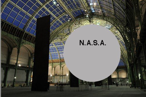
But then I get this tweet about Anish Kapoor’s project, which opens next week, and well:
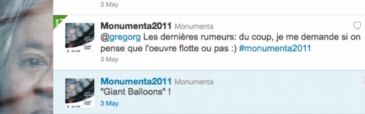
You can understand my concern. So I “c’est quoi ça?” retweeted, and then I started poking around the Monumenta 2011 site more carefully.
And before I figure out if Kapoor’s workin’ my side of the street, I have to say, I’m now slightly fascinated by the mechanism of the teaser, the reveal, and the spectacle.
Monumenta has assembled a range of concepts and images highlighting aspects of Kapoor’s practice which, I assume, they see as relevant to or illuminating of their own commission.
 Artwork become landscape
To see is to imagine
Entropy
Self-generation
The écorché
Fiction and ritual
Concaveness
Light become ghost
Void become shape
The artwork skin
Non-object
Colour
Inhabiting space
Leviathan
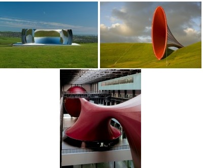
I can’t help but imagine them as a narrative, a presentation, an argument that culminates in the essential, inevitable work. Leviathan: c’est logique!
The work is called Leviathan, and with references to sea serpents and gargantuan invaders and gaping maws, the write-up taps every ominous, apocalyptic Leviathan reference available, from Job to Hobbes.
Which, now that you mention it, does sound a lot like several of the works Kapoor has done before. And there’s this sense of simultaneously wanting something new, that no one’s ever seen before–oh, boy, will they be surprised!–and of wanting more of what works, what you know, what has been before. And then what is the nature of anticipation and experience when the pitch for the project is, “it’s like Marsyas at the Tate, but bigger and spookier”?
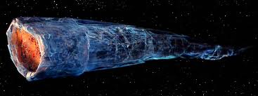
So I’m basically thinking it’s the Doomsday Machine from Star Trek: The Original Series, but in red? Or mirrored? Or mirrored on one side, and red on the other:
And then today, there’s a teaser photo, a detail, on Facebook, which doesn’t quite match up to my image:
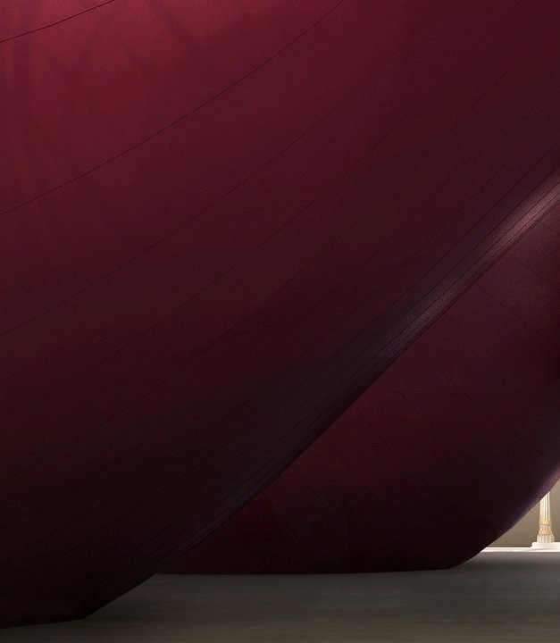
Unless maybe it’s the Doomsday Machine’s nuts. Either way, it’s all good, and totally different. Still, it’s an important lesson learned, and I’ve decided to preserve a bit of the mystery surrounding my Monumenta project. Which is not to say anticipation.
![]()
Monumenta 2011 au Grand Palais, 11 Mai – 23 Juin [monumenta.com via @Monumenta2011]
Sforzian Replay
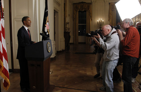
Photographers take pictures of U.S. President Barack Obama after he announced the death of Osama bin Laden live on television from the East Room of the White House on May 1, 2011.
So I was looking at Reuters White House photographer Jason Reed’s side view of a scrum of other photographers getting all up in the President’s grille while he was giving his Osama Bin Laden speech, and thinking, “But I saw him walk away. How the hell did that happen?”
And holy smokes, now we know. The Sforzian Backdrop has been retired in favor of the Obamian Re-enactment:
As President Obama continued his nine-minute address in front of just one main network camera, the photographers were held outside the room by staff and asked to remain completely silent. Once Obama was off the air, we were escorted in front of that teleprompter and the President then re-enacted the walk-out and first 30 seconds of the statement for us.
On the one hand, that’s no more staged a photo than any photo these guys take in the White House; think of those handshake photosprays with visiting leaders. They’re definitely not the kind of photo staging that WH photojournalists complain about, just the opposite, in fact, it’s standard operating procedure.
But if Reed hadn’t pulled back the curtain, I don’t think many people would have understood that from Reuter’s technically-accurate-but-now-somewhat-dodgy caption.
Ready To Record History [blogs.reuters.com via @markdubya, no relation, I assume]
Could Be?
via Eyeteeth | “File under: This could be art”
Can’t tell you how awesome this is. I would pay cash money to see the biennial that shows it.
The US Expo 67 Pavilion Has Seven Fathers
I’m getting pretty comfortable with my love affair/obsession with the US Pavilion at the Expo 67 in Montreal. I mean, it’s got Buckminster Fuller; Alan Solomon curating gigantic paintings; photomurals; and satelloons, what’s not to love, right?
So seeing Design for a Fair, the 1968 promo short film by Peter Chermayeff is awesome just as it is. The vintage footage and photos are some of the crispest I’ve seen, and it really is pretty crazy on a whole bunch of levels that this thing existed at all.
But maybe the greatest thing–even better than the giant graphic designed flags that look like a lost Ellsworth Kelly, as if there wasn’t enough giant, escalator-optimized, actual art already–and even better than the sheer soft power/propaganda play that was so drop-dead awesome it won the future for the day–is the voiceover.
Because the whole thing really sounds like Chermayeff’s idea. Every last bit of it, dome to nuts. It’s fantastic. Chermayeff, of course, is an architect and exhibition designer, and his former firm, Cambridge Seven Associates, or C7A, was contracted by the US Information Agency to produce the US Expo entry.
And so, as Chermayeff tells it, they knew they wanted a 3/4 geodesic dome, so they ordered one. And they wanted some giant art, so they ordered that. And the moon stuff, and the Hollywood and all the happy parts of American culture.
Now I don’t doubt a thing; I’m sure that’s exactly how it all went down. It’s just that that’s not how it’s typically remembered. Architects only remember Fuller; the art world only recognizes Solomon and the artists, not the venue or the show or the implications of it; and everything else is artifact and prop. [And the poor lunar photomural, I’ve hardly found anyone remembering that at all.]
The historical focus is either on the general awesomeness of the spectacle and mood, the political context and propaganda, or on the parts in isolation. What Design for a Fair reminds me of, though, is the visitor’s experience, the carefully orchestrated messaging, and the reality that it was orchestrated by a contractor working to a brief provided by the USIA. It was a government-funded gesamtkunstwerk, a massive piece of installation art before the fact, and probably one of the most cost-effective public diplomacy efforts of the Cold War era. It literally seems unimaginable today.
Pakistani Camo Landscape

These people are not wearing their videoconference faces.
According to the EXIF data, White House photographer Pete Souza took this photo at 4:05 PM, or 1:05 AM Abbottabad Time, five minutes in. They’re watching it as it happened. Which people already know, since it has garnered 455,000 views been blogged and retweeted and facebooked 455,000 times in a matter of hours.
Souza also asks us to “Please note: a classified document seen in this photo has been obscured.” Indeed, there it is. Funny how unobscured it looks at this size.
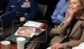
Let’s take a closer look:
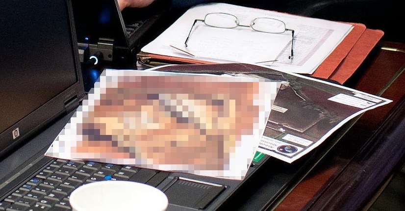
Didn’t I just post something about collecting all the seals and emblems of government agencies?

Because that’s the seal for the National Geospatial Intelligence Agency sticking out from underneath there. As you’d expect.
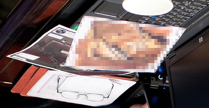
And that corner of landscape does look like the image of left sideyard of OBL’s compound. [image via ogleearth]
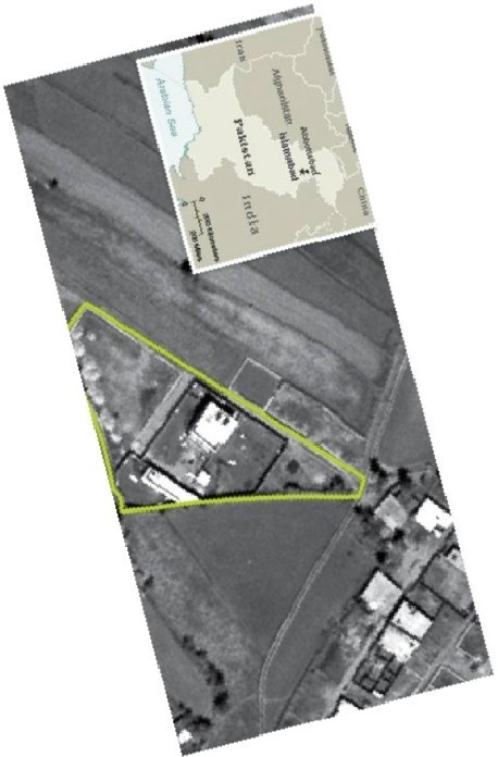
And now that you mention it, the pixelated image does look like the front gate area of the compound, just at an as-yet-unacknowledged high resolution. Of course, from here, it also kind of looks like a painting. I’ll get right on that.
Previously: Google Maps & the everchanging Dutch Camo Landscape
Partly In Jest
NPR interviewed former National Intelligence Director John Negroponte this morning. Steve Inskeep asked a too-long question about the multi-year intelligence work that resulted in yesterday’s attack on Osama bin Laden’s compound in Pakistan:
Did some of this happen while you were National Intelligence Director? Would this be the kind of level of detail that would get to the desk of some of the highest people in the intelligence hierarchy, of someone in the White House, if you just had a bit of information like, we think we might have a courier, would that be the kind of thing that–
Well, let’s put it this way: the President, President Obama said, and certainly President Bush before him, said that this was the, uh, highest, uh, priority. Very often when representatives or leaders of the intelligence or law enforcement community would come in to brief President Bush, one of the first questions he’d always ask, partly in jest, but also deadly serious, “Have you found him yet?”
I mean, this has been a major preoccupation of our leadership ever since 9/11 occurred.
Reminds me of GWB pretending to look for WMDs under the table at the White House Correspondents Dinner.
Also reminds me just how little we actually know of the hunt for OBL between Tora Bora and Abbottabad. The media likes to call itself the first version of history, so we should expect that large chunks of it will be fact-checked, corrected, or thrown out entirely.
Tuymanmatic
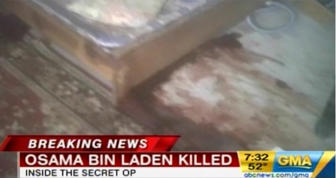
Apparently the first footage released from inside Osama bin Laden’s Abbottabad compound was shot on an iPhone with Hipstamatic’s new Luc Tuymans filter.
Mission Accomplished
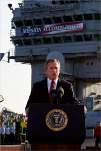
Previously, besides basically everything: Errol Morris talking about the Bush era with Stockholm Syndrome-afflicted WH photo editors.
The Great Letterhead Of The United States
I’ve written before about the “clean and presumptively powerful” design of various government letterheads I’ve come across in my recent archive diving.
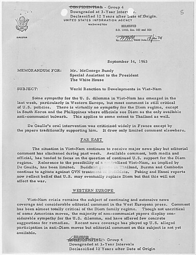
And I must not be doing it right, because my searches for the expansive survey of the history of such official design, and for the comprehensive sourcebook containing the thousands of seals and emblems of various government agencies and offices keep coming up empty.
![]()
I mean, Total Information Awareness, right? Somebody must be keeping a list. Anybody? Bueller?
So I’m reduced at the moment to random click trains through Wikipedia, or to search diving in the digitized collections at the National Archives. Not very productive.
Though it has yielded some nice finds. Nothing spectacular, but then, that’s kind of the point of these designs. Up top, the United States Information Agency, once part of the State Department. That’s the director’s office letterhead there, with the smaller seal.
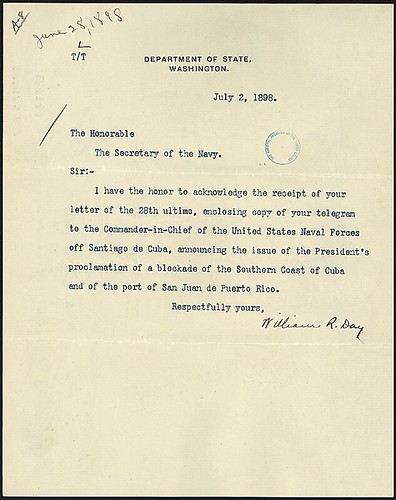
What I really like, in addition to the undesigned design, is how all the rest of the information is handled. Though a zip code does pop up occasionally, there’s almost never a street/mailing address. Or maybe there is; “Department of State comma Washington” would probably get you or your letter there in 2011 as easily as 1898.
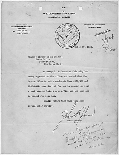
But it’s the way information accretes, the way the document functions, that’s kind of cool, too. The tiny instruction for answering and the reference number on the upper left of this 1922 Dept. of Labor letter, for example. And all the stamps! Check out that received stamp: not just the date, but the time, too.
Anyway, I made a little flickr photoset of a few examples I’ve found. I’m looking forward to having my scattered, amateur enthusiasm swamped by the exhaustive review of government logo and letterhead design that some expert has already compiled. And then we can start talking about what I’m looking at this stuff for.
Previously: The Great Letterpress of The United States
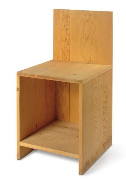
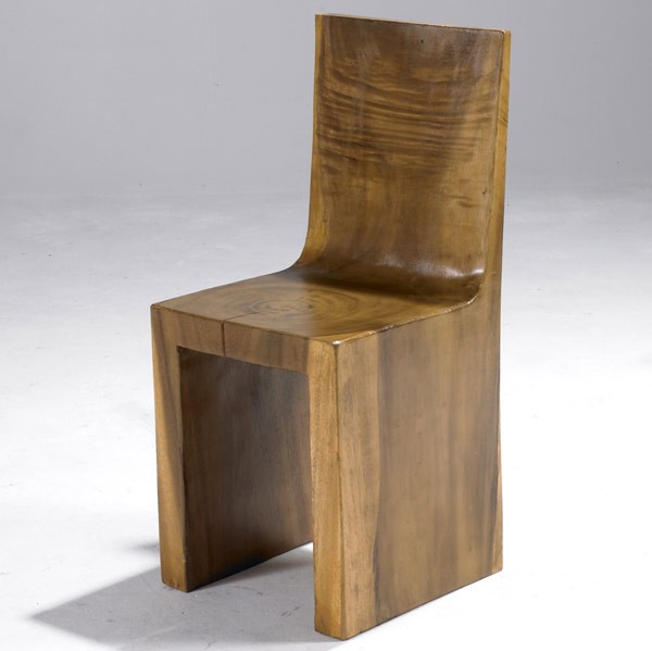
And Furnish It With Love
I want to buy this world of chairs, but this signed, dated, handmade Judd ur-chair, from Flavin’s stash in Marfa, even, sold in 2003 for $60,000–and in 2007 for $29,000. At that rate, I figure by 2012, I’ll be able to just pick it up from the curb.
And then this unsigned, undated, handcarved teak chair from who knows where, the knuckleheads at Rago didn’t call me back about it–twice–and it ended at just $465.
Holy smokes, a Juddy stack of Coke and Pepsi cases? Is this for real, anonymous objects? Anonymous in that we don’t know the name of The Master of the Atlantic City Bottling Co. $300 at Kamelot. That hurts.
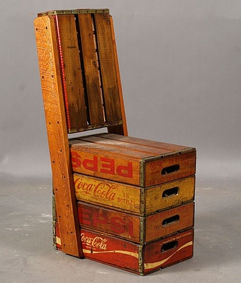
Which, I guess I could make my own for less–five Coke crates at $10-30 each–autoprogettazione x Coke. Sorry, no Pepsi.
I’ve been so focused on generating enough empty plastic Diet Coke bottles to be recycled into a dining roomful of Emeco With Coke 111 Navy Chairs, I haven’t even thought about the crates.
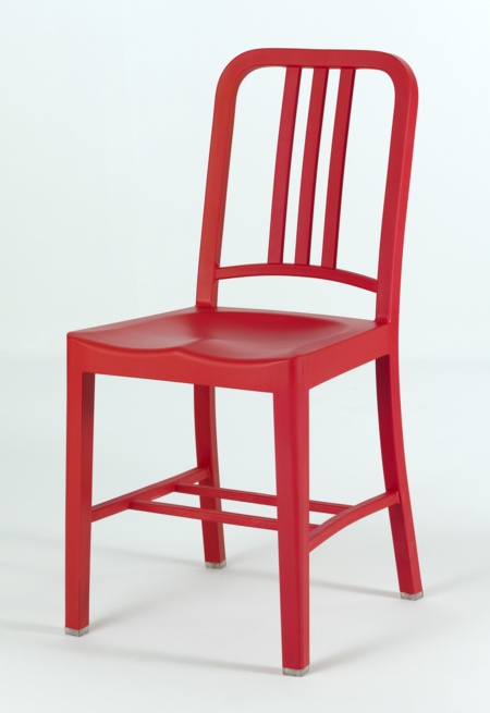
But seriously, I’m kind of kidding. Because as much as I’d like to close the loop and save the planet and all by turning my empties into chairs, the fact that normal Emeco chairs–recycled from cans–last 150 years, and this rPET one has a 5-year structural guarantee makes me a little uneasy. How long would one cast out of recycled glass bottles last?
The greg.org Evening Sale
Flipping through the lots for Christie’s upcoming contemporary sale feels like diving into the greg.org archives. Besides the Rauschenberg combine coming out of the Ganz’s closet, there’s also:
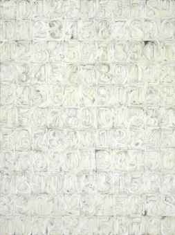
a great Johns White Numbers painting (1991) by Sturtevant. This text is nice, too:
To create her paintings, Sturtevant does not copy. She does not employ grids, squares, tracing paper or cameras. She summons her memory of images to recreate and reinvent them. By obsessively utilizing the identical materials and techniques as those who came before her, Sturtevant asserts her work is not about copying or appropriation, rather, the power and autonomy of originality.
Love that, so Pierre Menard.
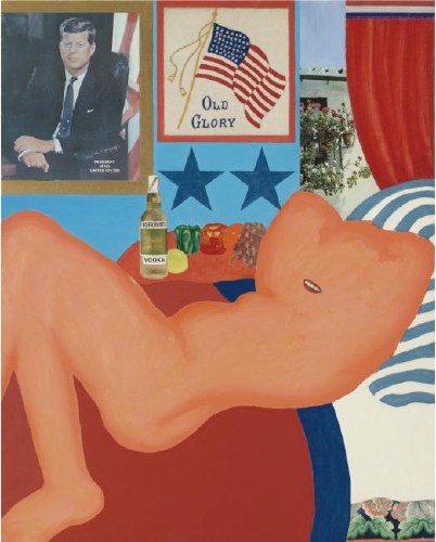
Tom Wesselmann’s Great American Nude #21 (1961) is up for sale again, too. In her biography of DC artist and JFK mistress Mary Pinchot Meyer, author Nina Burleigh mixed up #21 with #44. It was the former, not the latter, which was the subject of some controversy in Washington when it got yanked before the opening of the 1963 Gallery of Modern Art exhibit, “The Popular Image.” Burleigh said Meyer whispered about it to JFK, who laughed and kept it in. The painting in the show. But I looked it up, and no. The painting stayed out, probably because it included a nude next to an image of the sitting president. Or something. Anyway, censorship! Scandal! Sale!
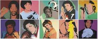
And speaking of scandal and mystery, Los Angeles collector Richard Weisman is apparently selling one of his remaining sets of Warhol Athlete Series paintings, which he commissioned en masse back in the day.
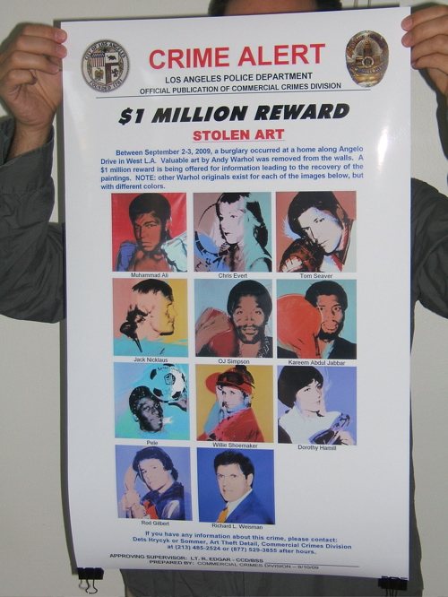
They’re like the set that was reported stolen from his dining room a couple of years ago. The disappearance of which prompted LAPD’s art theft unit to release the awesomest wanted poster ever. Which I tried to Kickstart into production as the Find The Warhols Project, only Kickstarter and I had apparently not developed our audiences sufficiently to accept the idea of a project-as-critique. And the reward for which was discontinued anyway when Weisman decided to drop his insurance claim, because of the investigative hassle. Which art theft experts read as a sign that the theft was an interfamily job, and not the kind of thing that one likes to have reported out in all the papers if one can help it.
But it’s not that set; I checked. Instead, it’s the set Weisman tried to sell in China during the Olympics for $28 million. Now priced to move, with an estimate of just $4-6 million. Also, too bad the Warhols don’t need finding anymore; that poster looks really sweet. Guess I’ll save it for the retrospective.
Mister Rauschenberg’s Neighborhood
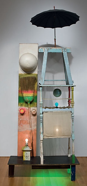 Christie’s is selling The Tower, a 1957 combine by Robert Rauschenberg which Victor and Sally Ganz bought from Betty Parsons in 1976. The work is a double portrait assembled from found, painted objects and light bulbs, and was originally part of the set for a Paul Taylor Dance Company production based on the myth of Adonis. The costumes for the production were designed by Rauschenberg’s partner Jasper Johns.
Did I say partner? I guess I meant neighbor. Here’s Christie’s quoting Paul Schimmel from his 2005 Combines exhibition catalogue:
While Rauschenberg’s work does respond to the painterly traditions of the 1950s, it does so in a manner that isolates the act of painting from the complete composition. For him, painting became a thing, an object treated similarly to Assemblage in which elements were organized on a non-hierarchical surface. Rauschenberg took aspects of Picasso and the Cubist collage, Kurt Schwitters, and the Surrealism of Joseph Cornell and created a three-dimensional, collage-based art. Together with Jasper Johns, Rauschenberg defined the American art of the 1950s; Pop art would have been inconceivable without their respective breakthroughs. Incidentally, many of their most important advancements were devised when they were most closely associated, living as neighbors, during the second half of the 1950s-the period during which The Tower (1957) was created.
[emphasis added for salient points regarding Short Circuit and for WTF, respective? Incidentally? Neighbors??, respectively.]
Schimmel goes on to note that the appearance here of a broom “anticipates Jasper Johns’s use of the broom in Fool’s House (1962), at a time when they were no longer neighbors.” Yet while he notes that “Lights and bulbs,” one of the defining elements of The Tower, “recur in numerous works”–of Rauschenberg–the fact that just months later, while they were still, uh, neighborly, Johns chose a light bulb as the subject of his first sculpture goes completely unmentioned.
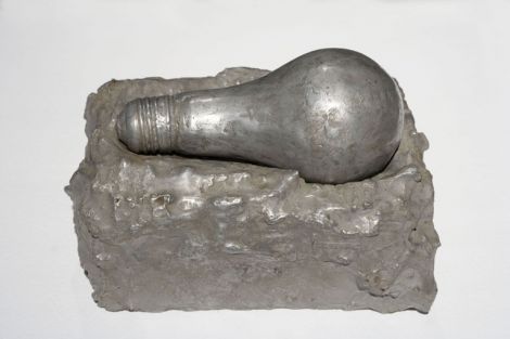
Light Bulb (I), 1958, Jasper Johns, image: mcasd.org
Here is Post-War & Contemporary Deputy Co-Chair Laura Paulson in a gallery talk video,
The Tower is very autobiographical, using found imagery, found objects that would give you clues to aspects of Rauschenberg’s life. Rauschenberg was a gregarious, outgoing, very generous person, but he spoke often in sort of cryptic, very defined ways. And in Tower you have this sort of personage, which to me is just so perfectly Rauschenberg, you really feel this inside/outside aspect of it. And to me, that really defines how his art was: very autobiographical, giving you clues, but not necessarily the full story.
You don’t say.
It’s a little bit funny. One reason I’ve stayed so interested in Short Circuit has been the implications of finding the original Jasper Johns Flag on the creation myth of Flag itself. Because really, what would it mean if Johns’ first flag painting was actually shown inside his boyfriend’s combine? And he didn’t even get credited for it? What if Johns’ idea to paint the flag came from the same place as his idea to paint the map, Rauschenberg?
But what if it goes both ways? The Tower, Schimmel writes, dates from “the middle of Rauschenberg’s Combine period, which extends roughly from 1954 to 1962.” Which is, incidentally, also the period Johns and Rauschenberg were a couple. What if combines came from Johns? Or silk screening?
Or maybe it’s not so simplistic or binary. Maybe “their respective breakthroughs” were collaborative? Maybe they talked through and worked through “their most important advancements” together? How does Target with Plaster Casts relate to the combines of 1955? Or how do the combines relate to Johns’ object-laden paintings of the post-breakup era? What do the famously autobiographical, emotionally-charged-yet-obdurate works of these two artists reveal about each other, their life together, their production, and the culture in which they lived?
For three generations now, the art and art history worlds have been arguing for the separation of these two artists and the distinct, unknowable power of their “respective” achievements. Some day maybe we can tell the full story.
Lot 28, The Tower, 1957, est. $12,000,000-18,000,000 [christies.com]