Honestly, I don’t know why I didn’t see it before. The answer‘s staring me right in the face. And I was so close with the Serra, too.
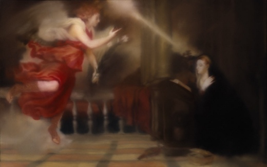
Annunciation After Titian, 343-1, 1973, Gerhard Richter [image via g-r]
This morning I just cracked open my Richter Bible, and started reading a 1974 interview of the bemused Richter by an insistent Gislind Nabakowski, who pressed the artist for his reasons for implicating himself in the “hackneyed language of symbols” of “the power of the hypocritical Renaissance,” and “sexual domination,” of the painting he’d recently copied, Titian’s Annunciation:
With regard to your approach to painting, you seem willing to encumber yourself with the concept of traditional symbolism, but you don’t illustrate it; you seem to be searching for your own symbolic references. Can you elaborate on this ‘illustrative realism’? Does it represent what the painter sees, or does it reveal his ‘reflections on what he has seen’ i.e., are his paintings platforms for the production of reality?
It certainly doesn’t show what one sees, because everyone sees something different, and what one sees isn’t a painting; it can only remind us of a painting. But, on the other hand, I don’t accept the principal difference between ‘pure’ pictures that only represent themselves and others that just illustrate something. If you take Ryman, Palermo or Marden, for example, in a away their paintings are also illusionistic, and you can only just identify the actual paint or the material if you have the eyes of a paint salesman.
Why did you paint over Titian’s motif and dissolve it?
Oh, I’m sure I didn’t initially plan it that way; I wanted to trace him as precisely as possible, maybe because I wanted to own such a beautiful Titian… [laughs].
That can’t be true. Not even the very first painting is a copy; you intended something else.
Sure. I only copied it from a postcard and not from the original as such. Although I must say that it is indeed possible to reproduce a painting from a postcard that is almost as beautiful as the original. Those few little details that would have been different really don’t matter–but that’s another issue.
Maybe for Richter.
Because when it comes to posters, what do people want to see more than beautiful works of art? The art poster has developed into a genre all its own. A genre and, as every museum shop, dorm quad, and Upper West Side laundry room can attest, a market.
Here is a poster I saw yesterday, Lot 270: Jasper Johns Flag I, which LA Modern is auctioning next month, with a description, “Poster based on the print,” a signature [!], a provenance, and an estimate of $1000-1500:
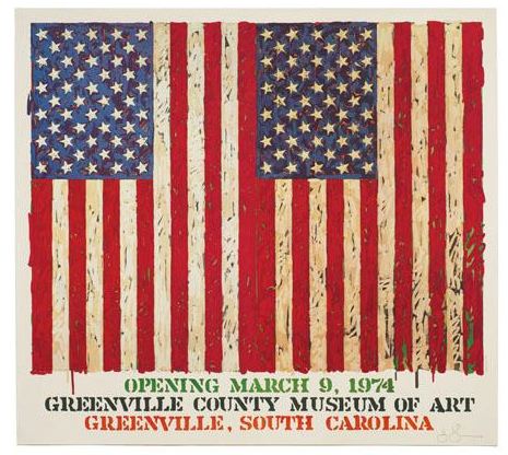
We demand a lot from our art posters. Posters signal our tastes and aesthetic identifications even more purely than the originals, which, by their scarcity, can only be possessed by a few, and thus can’t escape the aura of investment. Posters can also embody a history. You were there in Greenville in 1974, and Jasper signed your poster. That’s how it could look, anyway. We like our posters to faithfully approximate the experience and presence of the original.
And they must also have a significant, authentic presence–poster qua poster–of their own. Which can limit the works available to those that best fit the poster format. So you can blow up Matisse Jazz cutouts, or shrink a Rothko.
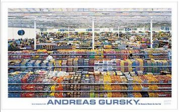
Gursky: 99 Cent, $24.95 [via momastore.org]
Like this powerful work,” Gursky: 99 Cent, a “MoMA Favorite” which pushes up against the dimensional limits of the poster medium [56″ x 34″] just as Gursky’s 207x337cm original tested the most advanced photo printing technology of its day [1999].
But that, as Richter says, is another issue. Just as you can paint a beautiful painting from a postcard, you could use a photo, tiled and transferred to silkscreens at life-size, then taped and folded into a box, to provide the authentic, transformative experience of being in the presence of the original. Assuming you open the box, that is. And that you have enough wallspace. Or maybe that’s what museums and exhibition copies are for. And your copy stays MIB.
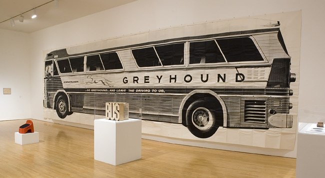
So what’d work at that scale? Gursky, of course. But if you’re gonna do Gursky, do the 99 Cent II Diptychon, which unfurls to a positively Bus-like 207 x 682 cm:
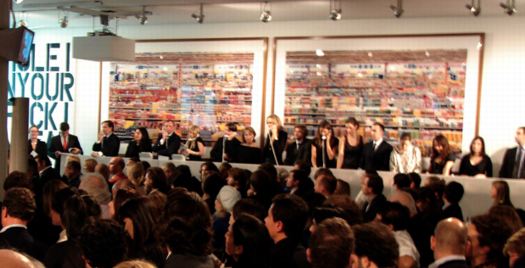
99 Cent II Diptychon, 2001, at Philips de Pury in 2006 [image via thecityreview]
Or:
Continue reading “Art Poster”


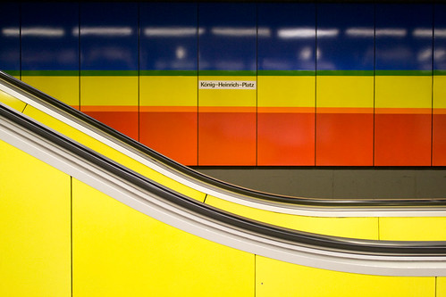
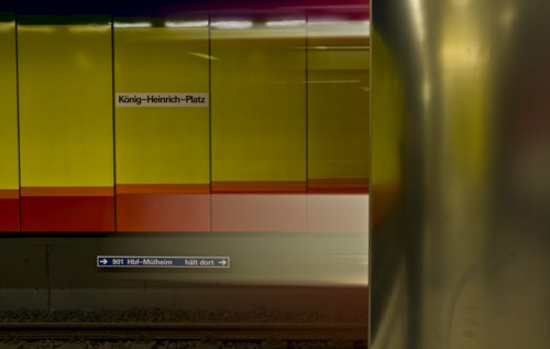 fotocommunity.de
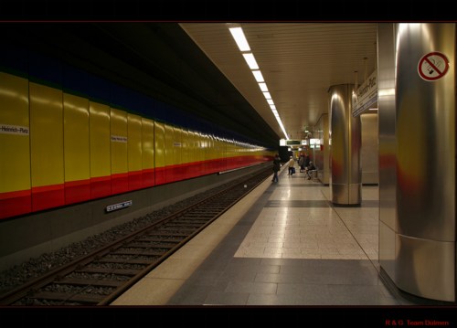
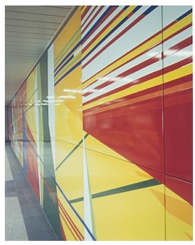
 It’s true, I like
  You can’t go too architectural without treading on

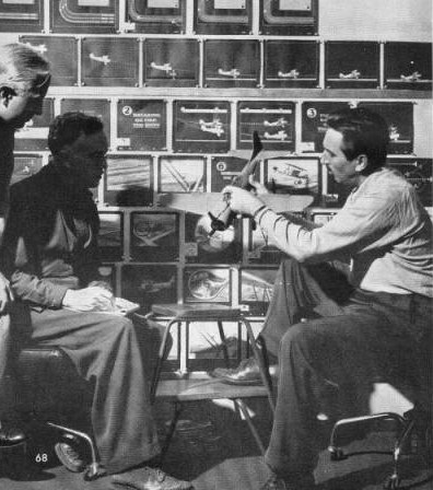
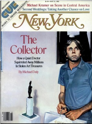 Wow, so I’m just throwing Jasper Johns’ name into the archives of New York Magazine, and up pops