
I’ve been focusing so much time on Johns, I fear I’ve been neglecting Johnson. But I wonder if he’s alright with that. Maybe Ray Johnson’s collage blends so seamlessly into Rauschenberg’s Short Circuit because collaboration, transformation, and subsumption were so central to Johnson’s own highly advanced, collaging practice. It’s enough to make me wonder what, if any, influence Johnson had on Rauschenberg during those early Black Mountain and combine days. Hopefully, there are theses on this already, or at least already in the works.
Meanwhile, I’ve had Johnson’s remarkable 1951 painting, Calm Center, open on my desktop for a couple of weeks now. It’s just beautiful. And the seriality, the grid, the geometry, the pixels, in 1951! I mean, wow. This what he dropped to start his correspondence and pop? Johnson could have been any major artist he wanted to be, and I think he was.
I’m gonna rewatch How To Draw A Bunny right now.
Previously: Ray Johnson on greg.org
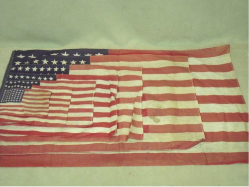
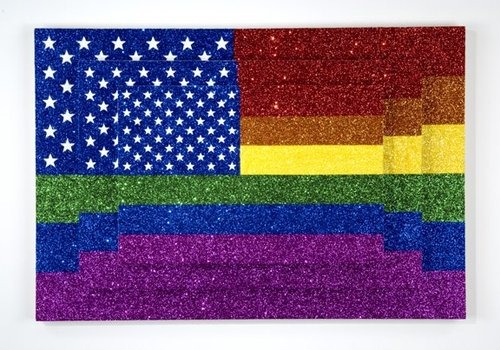
Flags And Flags And Flags
Andy sent along this great ffffffound fffffflag picture, posted today on thekingof.tumblr.
which reminds me of one of my favorite Johns riffs, the 2005 work by Jonathan Horowitz, Three Rainbow American Flags for Jasper in the Style of the Artist’s Boyfriend:
Collages And Constructions, 1958
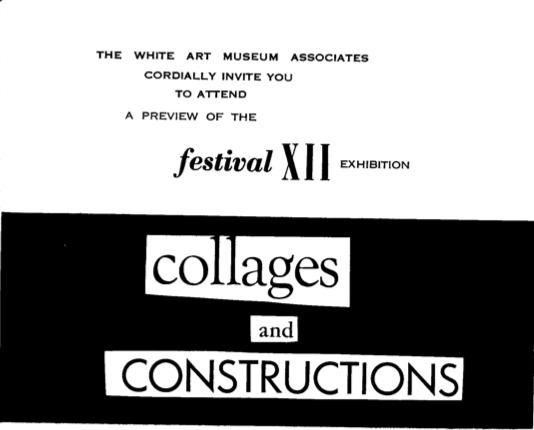
I think Robert Rauschenberg’s Short Circuit was exhibited only twice in its original state: once in the Spring of 1955, in the Stable Gallery annual exhibition for which it was created, and once at the White Art Museum at Cornell University, in 1958.
So far, I haven’t found a mention of the title, Short Circuit before at least 1967, when Rauschenberg exhibited the combine [with the doors nailed shut, to hide the space where the Johns Flag had been, but also hiding his ex-wife Susan Weil’s painting in the process] in a Finch College Museum traveling exhibition.
As mentioned here, Rauschenberg’s earliest registry [which is in the Castelli Gallery archives at the Smithsonian’s Archives of American Art] has the work listed as Construction with Jasper Johns Flag. Which would be an unusual title for the work to be shown with at Stable Gallery, where the whole point was for Bob to smuggle in works by Weil and Ray Johnson as well as Johns.
But thanks to the help of Liz Emrich, curatorial assistant at Cornell’s Johnson Museum, we now know more about the 1958 exhibition, which was curated by Alan Solomon. And though there’s no works list, the list of participating artists makes me wonder if this combine was exhibited as a collaboration, or as a joint/hybrid work.
The show was titled “Collages and Constructions,” and it ran as part of the Festival of Contemporary Arts. Paul Schimmel’s Combines catalogue lists the dates for the show as running from March 13 to May 20th, but it seems that information is from the artist’s registry, and probably pertains to loans of the work. The press release says it ran from April 10 to May 6, 1958. But yet there’s also an invite to hear Rauschenberg speak on April 8, fresh off his Castelli debut. So maybe the show was open sooner.
Anyway, Short Circuit, or Construction with Jasper Johns Flag, as the artist called it, was one of at least three Rauschenbergs in Solomon’s show. According to Schimmel’s Combines, the other two were Gloria and Small Rebus, [both 1956].
The show also included works by: Alberto Burri, Joseph Cornell, Jean Follett, Sue Fuller, Ilse Getz, Robert Goodnough, Grace Hartigan, John Hultberg, Jasper Johns, Allan Kaprow, Alfred Leslie, Corrado Marca-Relli, Anne Ryan, Richard Stankiewicz, “and others.” The press release mentions everyone but Getz and Follett. No word on who those “others” might have been.
I was surprised to find Solomon left his own 1958 show out of Rauschenberg’s exhibition history in his 1963 catalogue. I was not as surprised, though, to see the show not mentioned at all in MoMA’s otherwise definitive-seeming exhibition history for Johns.
‘It’s The First Time In History All These Four Artists Are Gathered Together.’
I cannot believe this has under 1,000 views. I’m only about 8:00 into this YouTube video, and already, Viktor Pinchuk is my hero. While anyone with a yacht or a palazzo could assemble a tranche of the art world powerful on the Grand Canal, only Pinchuk’s inspiring artistic vision can bring them all to Kiev. Well, I’m pretty sure it’s his vision they’re coming for.
Come for the vision, stay for the historic chance to have Jeff Koons, Damien Hirst, Andreas Gursky, and Takashi Murakami together on stage, answering incisive questions from Ryan Seacrest’s Ukrainian doppelganger. And the pitch for free Prada.
Ah, yes, I just got to the end: “Thank you to the thousands, the hundreds of thousands watching online!” It Gets Better!
Cinthia Marcelle receives Main Prize on FGAP Award Ceremony [ThePinchukArtCentre’s YouTube channel, via Gavin Brown’s GBlogÉ, pronounced like the French, Blo-ZHAY]
Friends Of Alan Solomon
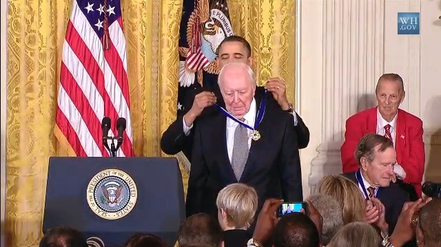
Johns, Flag: “American artist Jasper Johns has produced a distinguished body of work dealing with themes of perception and identity since the mid-1950s.” –whitehouse.gov
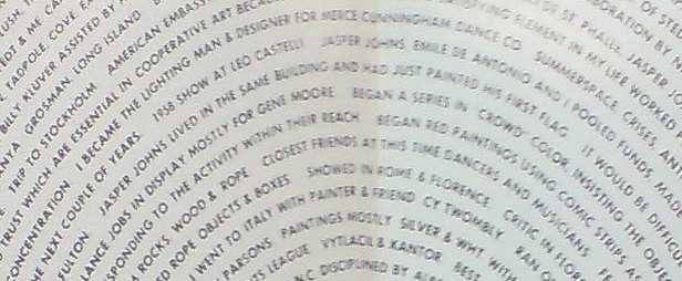
I’ve been trying to get a better sense of the first decade for Rauschenberg’s Short Circuit, from the mid-1950s, when it was made and first shown, until 1965, when the Jasper Johns Flag was removed from the work which had originally been titled, Construction with Jasper Johns Flag. It happens to be the time when both artists’ careers skyrocketed; when their intense personal relationship flourished, then fell apart; and when they were creating arguably their most significant works. And one of the people who was there for all of it was Alan Solomon.
Solomon was a curator and friend of Leo Castelli; he showed both Johns and Rauschenberg–including Short Circuit–in March 1958 at Cornell University’s White Art Museum. More on that later.
After he moved from Ithaca to the big city to run the Jewish Museum, Solomon gave Rauschenberg his first solo museum show in 1963. And he did the same for Johns in 1964. And he curated both artists into the US exhibition at the Venice Biennale in 1964, which erupted into controversy when Rauschenberg won. [The controversy was nominally about the eligibility of the US show, which was mostly installed in the former American consulate next to the Guggenheim, and only partly in the US Pavilion. But basically, it boiled down to Europeans being pissed at the American bad boy winning. I think.]
Long story short, Solomon was a key, early supporter of both artists’ work, and throughout the 1960s, he regularly made the argument that Pop, which he was also instrumental in promoting, was born directly from the work of this pair of “germinal artists” Rauschenberg and Johns.
Which is funny, because reading through Solomon’s texts, speeches, and interviews, you wouldn’t know Johns and Rauschenberg were even dating, much less spawning heirs. Though he showed the collaborative combine painting itself in 1958, Short Circuit is completely absent from Solomon’s exhibitions, texts, and interviews in 1963, ’64, and ’66.
What is present, in catalogue essays for both artists, is Solomon’s repeated and unequivocal rejection of the personal, the emotional, the biographical, the expressive, almost any type of subject or subjectivity at all, in fact, in their revolutionary work.
Looking back at the critical content closet Solomon constructs around these artists and their work–constructed with, you have to assume, their blessing and even active involvement–it’s tempting to take everything he says and simply invert it, and feel like you’re getting a clearer picture of what’s going on.
When Solomon writes of the importance of “other possibilities” to appreciating Johns’ Flags, while explicitly excluding the possibility of any personal associations, it almost seems like an invitation, a demand to consider them in an autobiographical light, as a kind of silent self-portrait. Which becomes very complex very quickly when the germinal Short Circuit re-enters the mix.
But I still have to figure out how, what, or whether to write about that head-on.
For right now, here are a couple of excerpts from Solomon’s catalogues for each artist. Johns first:
The Great Letterpress Of The United States
During some recent archive dives, I’ve come across a ton of different letterheads. Apparently, people used to write letters to each other all the time, can you imagine? Must’ve taken forEVER.
Anyway, one I particularly ilke is the United States Information Agency, which used to organize international tours for art exhibitions. [The USIA also took over sponsorship of the Venice Biennale from MoMA in 1964, the year Alan Solomon curated a group of Pop and abstract painters, including Rauschenberg.] Anyway, there are variations for USIA offices in embassies, but the basic format is the one seen below. This is actually from a 1965 American filmmaker-related memorandum, something to do with the secret plan to enlist Stanley Kubrick to fake the moon landing. Anyway:
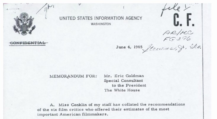
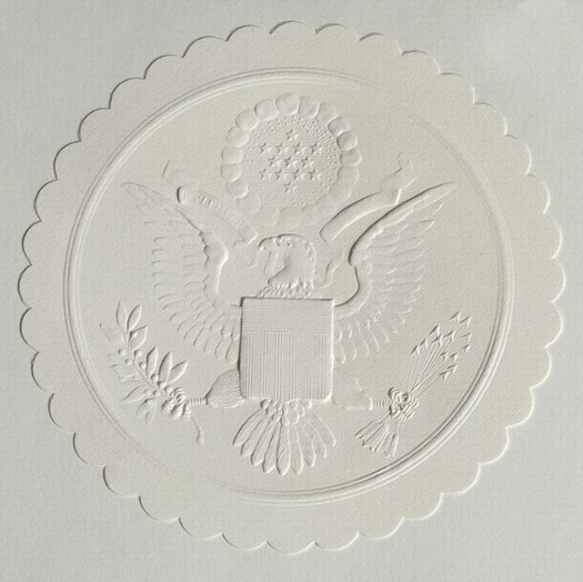
That’s it, just the agency name, and WASHINGTON, with a pared down version of the Great Seal of the United States there on the left. It’s a basic, agency-wide format used by many government agencies. So clean and presumptively powerful.
I had absolutely no idea, though, about the Great Seal, its history, and how it is still used today. Between Wikipedia and the State Department [pdf], though, there’s a fascinating tale. The current die is the fourth version of the original text description–or blazon, to use the heraldic term–approved by the Continental Congress in 1782. It was designed by James Horton Whitehouse of Tiffany & Co. in 1885, and replicated by Bailey Banks & Biddle in 1904. In 1986, the Bureau of Printing & Engraving made a master die from which the current and future operational dies will be created.
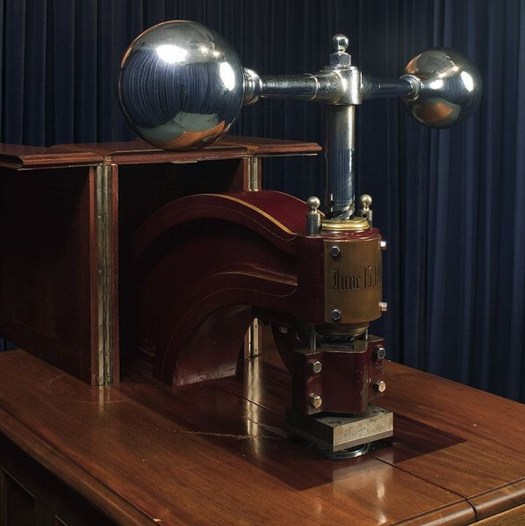
The die is for the front of the Great Seal, the eagle side; there has never been a die made for the back, the pyramid side. The setup since 1904 has the Great Seal affixed to a giant, counter-weighted, brass and mahogany press in the State Department. The Seal is used 2000-3000 times/year, for treaties, ambassadorial appointments, and a bunch of other official, ceremonial communications.
Here’s how it works:
Sealing of Documents
In the Department of State, the term “Great Seal” has come to include not just the die, but the counter-die, the press, and the cover, or cabinet in which it is housed, as well. These stand in the Exhibit Hall of the Department, inside a glass enclosure which is kept locked at all times, even during the sealing of a document. The mahogany cabinet’s doors also are kept locked, and the press is bolted and padlocked in position except when in use. The seal can be affixed only by an officer of the Department of State, under the authority of its custodian, the Secretary of State. When there are documents ready for sealing, one of the officers carries them to the enclosure where the Great Seal is kept and prepares them for impressing.
First, a 3 3/4-inch, scalloped, blank paper wafer of off-white linen stock is glued in the space provided for it to the left of the document’s dating clause. If ribbons are used in binding the document, they are run under the paper wafer and glued fast. Second, the document is inserted between the counter-die, with the wafer carefully lined up between them. Third, the document is held in place with the left hand and the weighted arm of the press is pulled sharply forward with the right hand, from right to left. This drives the die down onto the wafer, document, and counter-die, which impresses the seal in relief. The die is then raised, releasing the document and allowing for its removal. When an envelope containing letters of credence or recall is to be sealed, the wafer is impressed first, and then glued to the sealed envelope, leaving the envelope itself unmarked.
In other words, letterpress.
Great Seal of the United States [wikipedia]
The Great Seal of the United States [state.gov, pdf]
Related/who knew?: Historically, great seals are signs of sovereignty, while seals and the deliberate ritual of making them have had added legal significance.
Richter’s Balls, Regrets
So I’m reading along in my new copy of Gerhard Richter: Writings 1961-2007–which is pretty awesome, and which does appear to supersede the artist’s previous collected writings, The Daily Practice of Painting, which is good to know, but really, what to do with all this information?–and I come across this discussion of glass and mirrors and readymades in a 1993 interview with Hans Ulrich Obrist, and I’m like, holy crap!
When did you first use mirrors?
In 1981, I think, for the Kunsthalle in Dusseldorf. Before that I designed a mirror room for Kasper Koenig’s Westkunst show, but it was never built. All that exists is the design–four mirrors for one room.
The Steel Balls were also declared to be mirrors
It’s strange about those Steel Balls, because I once said that a ball was the most ridiculous sculpture that I could imagine.
If one makes it oneself.
Perhaps even as an object, because a sphere has this idiotic perfection. I don’t know why I now like it.
Richter’s mirror Steel Balls? Whew, never mind, they turn out–I think–to be Kugelobjekt, 1970, these odd, little postcard-sized objects, three steel ball bearings suspended in plexiglass in a shadowboxed photo of a staircase.
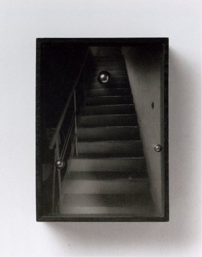
Kugelobjekt I, 1970, image: gerhard-richter.com
And anyway, on the next page, Richter explains how all the work on the dimensions and framing and installation of 4 Panes of Glass meant it’s “not a readymade, any more than Duchamp’s Large Glass is,” when he goes,
At one point I nearly bought a readymade. It was a motor-driven clown doll, about 1.5 metres tall, which stood up and then collapsed into itself. It cost over 600 DM at that time, and I couldn’t afford it. Sometimes I regret not having bought that clown.
You would have exhibited it just like that, as an uncorrected readymade?
Just like that. There are just a few rare cases when one regrets not having done a thing, and that’s one of them. Otherwise, I would have forgotten it long ago.
And I’m like, the clown! the clown! I swear, I’d written about it before, but I can’t find it anywhere. And then I realize I’d written about it for the NY Times in 2005.
Previous most ridiculous sculptures I could imagine: The International Prototype Kilogram or Le Grand K, and the Avogadro Project
UPDATE:, uh, no. Richter has more balls than I thought.
MIchael Wolf Wins World Press Photo Honorable Mention For Google Street View Photos
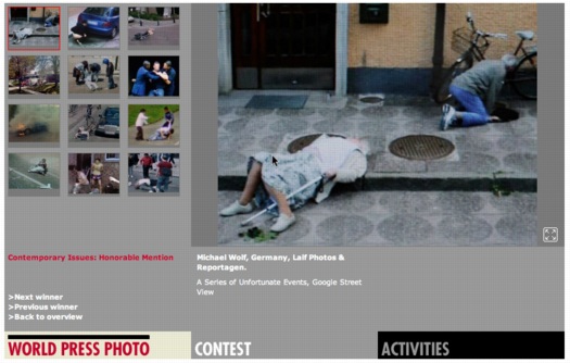
Michael Wolf thought he would be provoking a heated response when he entered four of his series of Google Street View photos in the World Press Photo competition, and he was right. The “A Series of Unfortunate Events” project was awarded honorable mention in the Contemporary Issues category, and some folks are kind of freaking out about it.
At least that’s how the issue is being framed by the British Journal of Photography, who spoke with Wolf:
The work, he tells BJP, is his own. “I use a tripod and mount the camera, photographing a virtual reality that I see on the screen. It’s a real file that I have, I’m not taking a screenshot. I move the camera forward and backward in order to make an exact crop, and that’s what makes it my picture. It doesn’t belong to Google, because I’m interpreting Google; I’m appropriating Google. If you look at the history of art, there’s a long history of appropriation.”
I love that: “The work, he tells BJP, is his own.”
Appropriation’s all well and good, but the art history of rephotography is hardly controversy-free: folks like Sherrie Levine and Richard Prince have both faced the IP wrath of their subjects’ original photographers.
But it’s interesting that Wolf finds his ownership and authenticity in such a contested process as rephotography, though, considering that it was not previously stated or clear.
And when he praises the World Press jury for making “such a conceptual leap,” he’s not referring to this appropriation strategy, but to recognizing “someone that photographs virtually.” Except that he’s so emphatic about not photographing virtually.
I’m sure it’s bold, and I’m sure it is a lot of conceptualism for the photojournalism system to handle, but it sounds like Wolf wants it both ways. He insists his finger on the button preserves his photojournalistic credibility, and there’s no doubt that the Series of Unfortunate Events images he submitted have powerful composition, content, and emotion. As I said before, they look
like archetypal on-the-scene photojournalism, only stripped by any news or context other than place. Though Wolf himself eliminates any place specifics or links, leaving each image to stand on its own.
By completely decoupling these images from their context, from their most basic metadata, even, Wolf is not creating photojournalism, he’s subverting it. He’s finding the images photographers would die to shoot, and then tossing out even the incomplete scraps of geospatial information Google provides for them. Even as he delivers the compelling visual goods, Wolf has obliterated not just the idea that these photographs “mean” something; he’s undermined the photographer’s traditional authoritative role as a witness to the events in his images.
What Wolf is doing is not photojournalism, it is art, art that calls the whole construct of photojournalism into question. No wonder the shutterbugs are pissed.
I’m still surprised to not hear more critical awareness of Google’s role here. If anything, Matt Lutton’s defense of Wolf’s photographic chops seems to wilfully ignore the aesthetic and conceptual implications of Google’s project:
Since everything is photographed in Google Street View, nothing is. It’s a mirror with no intention, art, journalism, or perspective. The photographer, by choosing what he makes a screenshot of (and we’d be fine with this winning if he only made screenshots, by the way) is making the photographs, framing them, choosing what to show. Google did none of those things. Even a screen-grab, if you are composing and choosing a moment, is a photograph.
Anyway, kudos to Wolf, sympathies to the photojournalists, I’ll just be on my way.
World Press Photo: Is Google Street View photojournalism? [bjp-online.com]
Some thoughts on Google Street View and World Press Photo [dvafoto.com via @nancyproctor]
Michael Wolf’s website [photomichaelwolf.com]
my Google Art Project, part 1
Previously: Michael Wolf, Street View Photographer
White House News Photographers Upset At Staged Photos They Don’t Take
From Robert Rauschenberg’s 1968 Autobiography
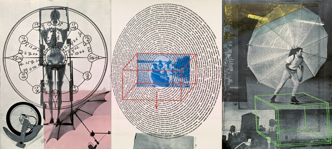
A couple of weeks ago, while stopping by the symposium attached to the National Portrait Gallery’s “Hide/Seek” exhibition, I saw a huge, intriguing Robert Rauschenberg work, Visual Autobiography, in the lobby of the Patent Building auditorium.
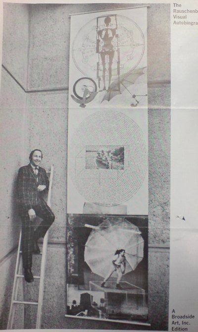
I noticed it immediately because, hello, there was Bob rollerskating with the parachute/umbrella contraption on his back, just like he’d done at the Pop Art Festival in Washington in 1963.
But I’d also recognized the project from mentions in the various Rauschenberg-related archives I’ve been diving into lately; Visual Autobiography was made in 1968 by Broadside Art, Inc., a company the artist co-founded with Marian Javits [wife of Sen. Jacob Javits] to bring big, billboard-sized print technology into the service of artists.
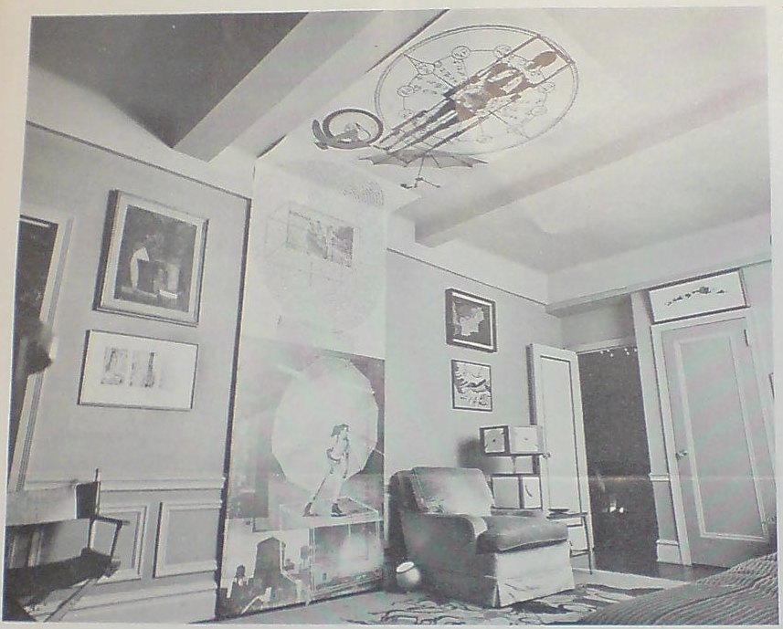
The brochure for Visual Autobiography, which consists of three 4×5′ offset lithographs, shows them installed in various, improbable ways that might have pointed out the limitations of the market: vertically, with Bob, dressed like The Music Man, standing next to them on a ladder; vertically, in a pre-war apartment, where they obviously don’t fit, crawling up the wall and onto the ceiing; and horizontally, likely the only way they’d ever make it out of the tube.
The prints were published in a signed edition of 2000 [!] for just $150/set, $50 more for canvas backing “so it can be hung just as it was at the Whitney Museum,” and sold via direct mail by Rand McNally. [Even today, they provide a lot of Rauschenberg bang for your buck; a full set sold at Christie’s last December for just $5,000.]
Anyway, though it’s called Visual, the center panel consists of a textual bio of the artist, spiraling out from a family snapshot. To read it through requires an odd/amusing bobbing and swaying that must have pleased Bob the Dancer. But right in the center, top of the circle, as easy to read as it’s gonna get, it says, “Jasper Johns lived in the same building and had just painted his first flag.”
UPDATE: The Broadside Art venture’s debut at the Whitney, which is the ladder photo above, was covered in the New York Times; Hilton Kramer hated it. He also predicted that the market-baiting stunt would succeed wildly. As in so many other things, though, Kramer was mistaken. If Broadside ever did another edition, I can’t find it. And Mrs Javits still had copies of the print to give away in 1977, almost a decade later. For all that, though, it turns out Milton Glaser and Clay Felker were also partners in the company. So much light, so little heat.
Here’s a detailed writeup of Autobiography from a 2009 exhibition at Kean University [kean.edu]
Goodbye Janette Laverrière
I’d say, “Adieu” or “Au revoir,” but Janette Laverrière was as fierce an atheist as she was a communist, designer, and artist. So I’ll just say I’m slow and sad to learn that Laverrière died last month at the age of, what, 101?
I first learned of Laverrière’s work way too late, too; I saw some wrought iron furniture she’d designed in the 1930s at auction about six years ago. She was a remarkable, politically committed designer in an antagonistic, elitist French decorating world, where men and the richest clients set the agenda.
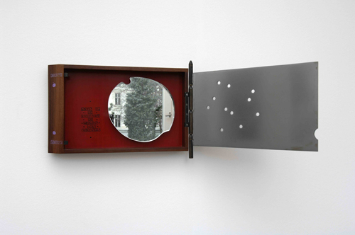
La commune (hommage à Louise Michel), 2001
The 2001 work, La commune (hommage à Louise Michel), includes a cherry-shaped mirror fragment in a rosewood box, with an iron lid peppered with what appear to be bullet holes.
As Laverriere plumbs history for her references, history is catching up, slowly, with her legacy. In 2008, the Iranian artist Nairy Baghramian collaborated with Laverrière on a very subtle exhibition at the 5th Berlin Biennial, where Laverrière’s sculptures were installed in Baghramian’s carefully calibrated architectural space. Baghramanian also included Laverriere’s mirrored sculptural works in a 2008 exhibition at the Kunstverein in Aachen.
Laverrière discussed the switch from design to sculpture in a 2009 interview with Vivian Rehberg in Frieze:
VR Is there a link between utility and uselessness?
JL Of course. It’s useful to have useless things.
VR Precisely – I agree.
JL So, I started anew by thinking about the oldest thing I could remember being inspired by. When I was 17, I really loved Jean Cocteau; I read a lot of his works. In 1989, I wanted to pay homage to him on the centenary of his birthday. So there I was in bed, thinking: I am not going to do anything useful anymore, I do not want to, I cannot, so I will do useless things. All of sudden, a new world opened up for me
And the Pompidou has acquired an interesting piece from 1952, a suspended secretary, made from steel and Formica, which is currently on view in Elles, an exhibition of work in the collection by female artists.
Secretaire suspendue, 1952, image via batir au feminin’s flickr
Bhagramian’s obituary for Laverriere [frieze.com]
Rooms No One Lives In, Katarina Burin’s review of the Biennial show [thehighlights.org]
Use Value | Laverriere talks to Frieze [frieze.com]
short video: Portraits de Femmes Artistes – Janette Laverriere [ina.fr]
Exodus, 1997, Steve McQueen
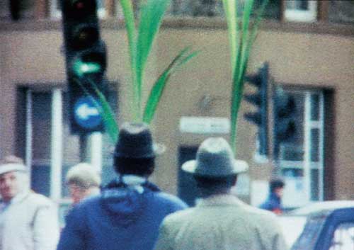
One of my absolute favorite Steve McQueen films is one of the first ones I saw, a one-minute super-8 called Exodus.
But until now, I’d never heard the making of story of this found scene. According to Carol Kino’s profile of the artist last winter, McQueen became interested in film at Goldsmith’s:
On the advice of a teacher he took to carrying around a Super 8 camera. But because film was so expensive, he rarely used it; he only shot a single, three-minute piece, part of which showed two black men carrying potted palms along a crowded East London street.
The Times incorrectly dates the piece to 2007, but it was included in McQueen’s first US show at Marian Goodman in 1997.
Just a beautiful piece of seeing.
Any Ignoramus In The Universe
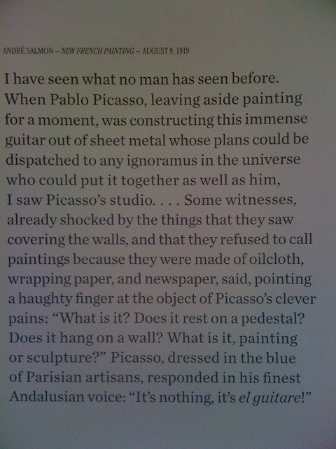
Wall Text from MoMA’s Picasso Guitars show, via @bryanthepainter
I’ve been loving Bryan’s tweets of the various pullquotes in MoMA’s incredible Picasso Guitars show, but none more than this one from Andre Salmon in 1919, where Picasso apparently invented and ignored the kind of instruction-based art that Moholy Nagy’s Telephone Paintings–and Judd’s outsourced fabrications–would later become famous for.
Here’s the full quote:
I have seen what no man has seen before. When Pablo Picasso, leaving aside painting for a moment, was constructing this immense guitar out of sheet metal whose plans could be dispatched to any ignoramus in the universe who could put it together as well as him, I saw PIcasso’s studio. [It was] more chimerical than Faust’s laboratory. This studio, which certain people may claim contained no work of art in the old sense, was furnished with the newest of objects. All the discernible forms surrounding me appeared absolutely new. I had never seen such new things before. [Before that] I did not know what a new subject could be.
Picasso Guitars: 1912-1914 opens this weekend at MoMA [moma.org]
Related: “Idiots can do what I do.” – Gerhard Richter
[2022 update: non-functioning twitter links removed, link to MoMA show archive added.]
Spies Like Us
Demonstration from a STASI disguise workshop, via Simon Menner
If Germany’s a little touchy about Google’s Street View panopticon, maybe it has something to do with how, for the last half of the last century, half the country was obsessively spying on each other.
At Conscientious, Simon Menner writes about his utterly fascinating look at the visual and photographic legacy of the STASI.
Things Magazine on Menner’s project: “The aesthetic appreciation of banality is very much a luxury of free democracy.” Ouch.
Simon Menner | Images from the secret STASI Archives [jmcolberg via c-monster]
Which Flag Story? Which One Do You Know?
Flag, 1954-55, via moma
The creation myth for Jasper Johns’ Flag is well-known, and well-told. Like Leo Castelli’s story of discovering Johns’ groundbreaking oeuvre, fully formed, while he and Rauschenberg were raiding the icebox, and how Johns’ first show in 1958 got on magazine covers, sold out to MoMA, destroyed Abstract Expressionism and ushered in Pop Art. MoMA’s wall text for Flag [which Alfred H. Barr had Philip Johnson purchase from that show] begins:
“One night I dreamed that I painted a large American flag,” Johns said, “and the next morning I got up and I went out and bought the materials to begin it.”
It came in a dream. It’s a protean story, quintessentially American, slightly romantic, and beyond the reach of anyone but [Freudians, Jungians, and] the artist himself. And that’s the key: because unfalsifiable is not the same thing as definitive, or even true.
In the opening of her 1975 dissertation, published in 1985 as Jasper Johns’ Paintings and Sculptures, 1954-1974, Roberta Bernstein takes a researcher’s step back:
When asked about the sources of Flag, 1954-55, Johns answers that he dreamt one night of painting a large American flag and then proceeded to do so. He has said this several times and will offer no other explanation for the appearance of this remarkable painting.
In the footnotes, Bernstein cites Alan R. Solomon’s catalogue for Johns’ 1964 Jewish Museum show, as well as several personal retellings.
But check out this transcript of Solomon interviewing Johns in 1966 for National Educational Television’s USA Artists Series. Then tell me if it doesn’t sound like there could be another story–or several–for the origin of the flags?
Mientras Tanto En Mexico,
While poking around online about Tate Modern’s version of the Gabriel Orozco retrospective, I found this rather incredible letter from 2009, written, apparently by Orozco himself, to his dealer Jose Kuri. The letter is an ostensibily-but-not-really private round in an ongoing, public, critical battle for some kind of primacy within the Mexican art world.
Orozco defends and praises his own success and innovation–to his own dealer–while slamming both other artists [cough, Santiago Sierra, Francis Alys] and their critic/curatorial champions [Cuauhtémoc Medina, who I will be adding to the greg.org art pronunciation list shortly.]
Anyway, this kind of veiled subtexts with an apparent academic impartiality and a deficient documentation, derive from a cheap historicism, where the talent of the individual to understand his/her moment, and to do the things that he feels like it and with it finding new art for life and for the work, will never be the reason for his success. If anything, it can seem incredible to those Mexicans, that a co-national has innovated and influenced other artists in the world, which, although is not mentioned -in the breakdown of the ingredients for my success-, is a measure and perhaps the main reason for the success of my work in this years. Novelty, not exoticism, is what makes fortune. And the one that makes something before the others becomes an essential reference point. Success came after the creation of something new… which was successful.
Wow, OK. I have been a diehard fan of Orozco’s work for almost 20 years now; I still see him as having a formative influence on my eye, and on the whole way I see the world in relation to art. Or to his art. And maybe I just don’t/can’t appreciate the nationalist/politicized context in which this debate is occurring.
But I’m trying to come up with examples of other artists who aren’t Julian Schnabel who take such on the record personal affront. I guess Rob Storr loves to deal out the smackdowns, too. Anyway, the Centre For The Aesthetic Revolution has the whole thing. Definitely check it out.
GABRIEL OROZCO ‘THE SECRET OF HIS MIRACULOUS SUCCESS’ A LETTER TO HIS GALLERIST IN DEFENSE OF SOME OF HIS CRITICS [centrefortheaestheticrevolution]
Also from the Centre For The Aesthetic Revolution, word that the Hotel Palenque has finished the renovations, and is open for business. This apparently happened some time between Robert Smithson’s drunken slide lecture about it in 1972 and the arrival of the Google Street View coche.