

Ah, September 10th, an inadvertently trenchant date for unloading on the trendchasers’ seemingly complete lack of historical self-awareness.
And I’m not talking about that perfect, frivolous Marc Jacobs afterparty on that nearly perfect late summer evening which only acquired its poignancy the next morning when, well.
I just found this incredible wool twill authentic made in USA Ivy prep revival classic trad artisanal manly tweed outdoor ruling class WASP vintage Woolrich shirt jacket, which I’m rocking right now because it’s kind of chilly typing with the windows open.

See, I’d gone up to Connecticut Berkshires Brimfield North Adams Darien New Haven over the weekend. But since I had the car, I also stopped in Long Island City at our storage unit. And pulled a bunch of stuff out of a cedar-filled sweater suitcase I’d packed in 1995. I do believe it was vintage when I bought it in 1989.
It starts to feel like freakin’ Groundhog Day around here sometimes, but fortunately, I’m ready.
last year: authenticity vs. realness
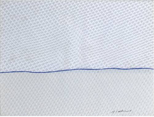
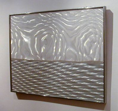
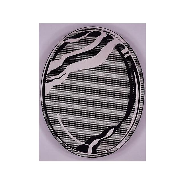
Lichtenstein’s Electric Seascapes

Seascape I, 1964, screenprint on Rowlux, ed. 200, from New York Ten portfolio [via]
You know how you just think you’ll blog about one thing, and then you want to get a little context, so you dig a bit, and then a bit more, and a bit more, and.. anyway, even though I rather obsessively collected out a bunch of his source comic books in the early 1990’s, I haven’t been a close follower of Lichtenstein’s work. Or rather, I think I’ve been lulled into a sense of familiarity by Lichtenstein’s almost immediate recognizability, and I never paid too much attention to when he made what and why or how. It just was.
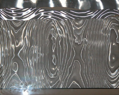
Seascape I, 1964, printer’s proof, Rowlux, different horizon, no Benday [via]
Which is why these early landscapes and seascapes are so fascinating. They’re so odd, so resolutely unfamiliar, almost unrecognizable as Lichtensteins, and yet they’re from 1964-68, a period when Lichtenstein’s career specifically and Pop Art generally were both gaining global recognition. They seem like experiments, avenues of persistent research. They account for some milestones: Lichtenstein’s first use of his own subject matter, inclusion in his first museum show. They have clear–or at least compellingly arguable–influence on later, major work. But they still somehow feel atypical, marginal, minor, dead-ends, even failed. But are they? Could they just be underseen or underappreciated? Undervalued by the market because they don’t “look” like Lichtensteins [yet]?
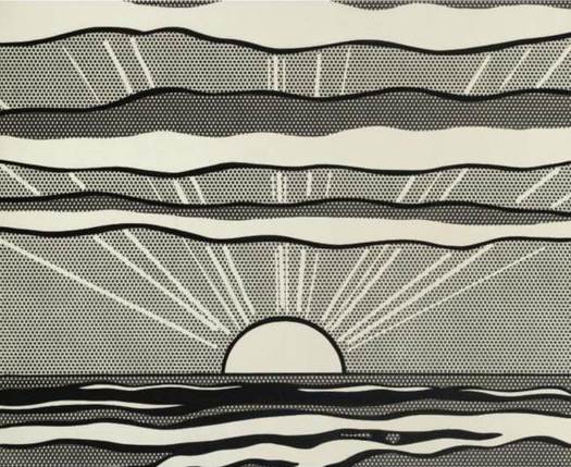
Black and White Sunrise, 1964, oil on magna on canvas [via]
According to the Roy Lichtenstein Foundation’s official chronology, the artist began making landscapes in early 1964. Some were painted rather spectacularly, like the black and white sunrise [above]. And with others:
Begins to incorporate plastic, Plexiglas, and metal into some of his landscapes.
And near the end of ’64, there’s this [images top]:
Rosa Esman begins Tanglewood Press with the portfolio, New York Ten which includes Seascape, 1964, a color screenprint on clear Rowlux by R.L.
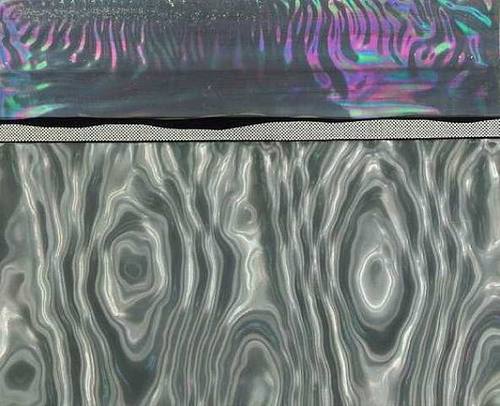
Rowlux is a wavy, prismatic plastic sheeting material which Lichtenstein apparently discovered at a novelty store. Its moire pattern can simulate reflections on water. [Hmm, novelty shop? The Rowland brothers were trying to market Rowlux for use in highway signs, and according to Ron Abbe’s 1976 paper, “Experiment with Rowlux,” Salvador Dali was the first artist to use the material, in 1962. Dali decked some models out in Rowlux collages for a “couture” show in 1965. What a mess.]
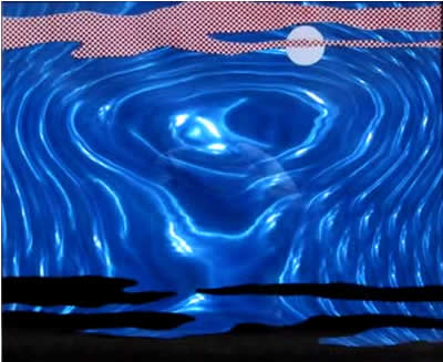
Moonscape, 1965, silkscreen on Rowlux, ed. 200 [image]
In 1965, Lichtenstein made painting collages using Rowlux and other materials. The dealer Mark Borghi, which is selling Littoral [below], lists some more. Littoral was purchased from Castelli by Larry Aldrich and made its way to his museum, which apparently deaccessioned it at some point.
Littoral, 1965, Metalized polyester foil, aluminum and magna on board, [via]
1965 was also when Lichtenstein began experimenting with adding backlights and motors to his Rowlux painting collages, making them a hybrid of kinetic art, light art, and moving picture. Examples of these Electric Seascapes were included in the artist’s one-man show at the Pasadena Art Museum in 1967.
Electric Seascape #1, 1966, Rowlux, paper, light, electric motor, formerly Collection Guggenheim Museum [via]
I think two statements Lichtenstein made about his explosion paintings, which he began around the same time, are also relevant to these landscapes. First, from his interview with John Coplans for the 1967 Pasadena show catalogue, there’s a conscious technical distancing from painting: “I wanted the subject matter to be opposite to the removed and deliberate painting techniques.” And in Aspen No. 3, published in December 1966:
Explosions give me a perfect opportunity to do a completely abstract painting which seems, on the surface to he realistic.
Electric Seascape #2, 1966, Rowlux, wood, light, motor [via]
While Moonscape is pretty strongly representational, many of these landscapes are as abstracted as Rothkos or Sugimoto photographs. Sometimes the only representational element is the hint of a Benday horizon contour–or the light playing on rippling water, which is, of course, an illusion intrinsic to the material itself.
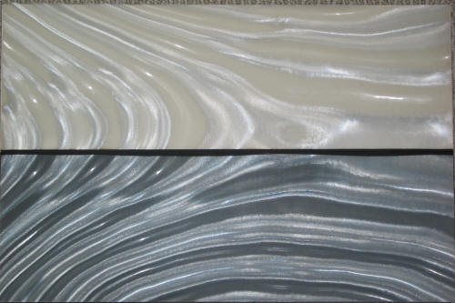
Landscape 2, 1967, silkscreen on Rowlux overlay, ed. 100 [via]
Lichtenstein kept on making these Rowlux collages and editions at least through 1967, when they were reduced to almost nothing but a horizon line. The two 1967 works here were from Ten Landscapes, Lichtenstein’s first solo print portfolio, published by Castelli.
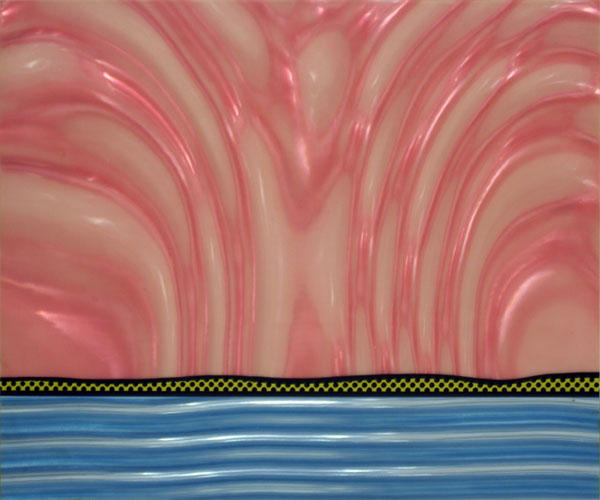
Landscape 5, 1967, silkscreen on Rowlux on board, ed. 100 [via]
When they were made, then, Lichtenstein’s hotness and Castelli’s marketing magic helped these trippy landscapes into major collections like the Guggenheim’s and Larry Aldrich’s. They were what’s available, and they got snapped up. And then at some point, those institutions decided they were expendable, or outside the Lichtenstein narrative, and they ended up back out into the market. Assuming it’s still available, Borghi’s Littoral has been on the market for at least two years.
Besides their intentional distance from the painting process–a major concern of almost all Lichtenstein’s work–these shimmery landscapes and seascapes are almost nakedly direct explorations of the characteristics of light, sight and visual perception. The play of light and reflectivity would become significant subjects for Lichtenstein going forward–his first painting of a mirror [below] was made in 1969. In 2000, an entire show of Lichtenstein’s light-related works, titled “Reflection/Reflessi,” was organized in Rome. The inclusion of Electric Seascape #1 only highlights the extent of Lichtenstein’s investigations.
Mirror #1, 1969, oil on magna on canvas, [via]
But these landscapes also related directly to another series of unusual works, the ones that started me on this whole researching jag: Lichtenstein’s only films. Which are coming soon to a blog near you.
Now That’s A Fire!
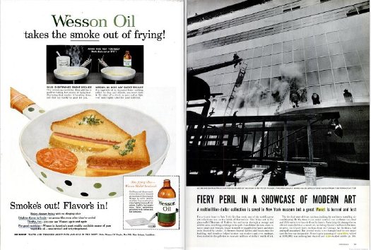
This is why greg.org readers earn the big bucks, people. GF-R spotted this hilarious/sublime juxtaposition of ad and content from the LIFE Magazine report on the 1958 fire at the Museum of Modern Art and asks,:
coincidence? Or the work of the advertising and layout guys at LIFE? I’d love to know. The color image of the grilled cheese sandwich even looks like a proto pop art piece. (although I know there is no way of that being intentional and is only the result of my own retrospective anachronism).
Oh, I don’t know, someone check Claes Oldenburg’s resume for suspiciously ad agency internship-sized gaps. Meanwhile, add whoever designed that frying pan to the list of random cranks suing Damien Hirst for plagiarism.
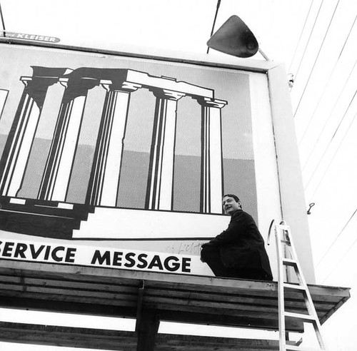
Roy Lichtenstein’s Billboard Excursion, 1967
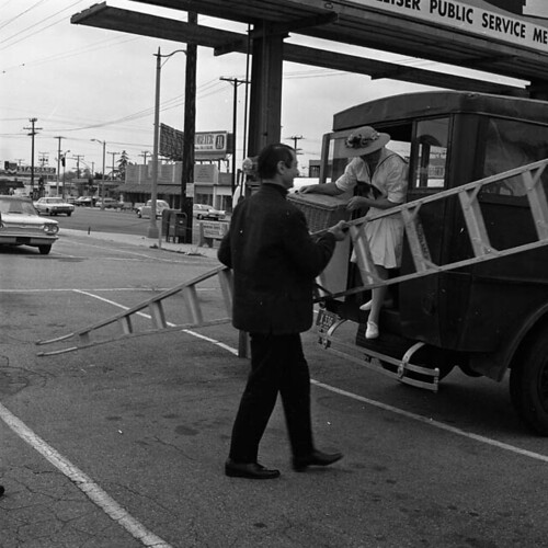
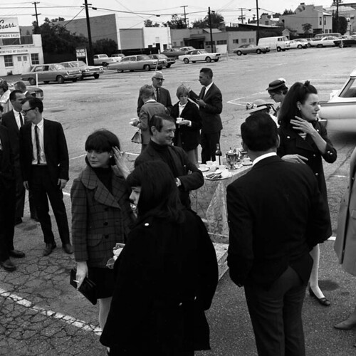
Over the weekend, I hit the road to interview some people I’ve wanted to meet and talk with for months now. I’ll be publishing the results soon here on greg.org. One of the artists whose work I’ve been interested in is Roy Lichtenstein. This wasn’t where I had planned to start my Lichtenstein story, but the beginning just keeps getting pushed back. And the Manitoba Museum of Finds Arts’ archive of Frank J. Thomas’s photos from the Pasadena Art Museum are just too awesome to ignore:
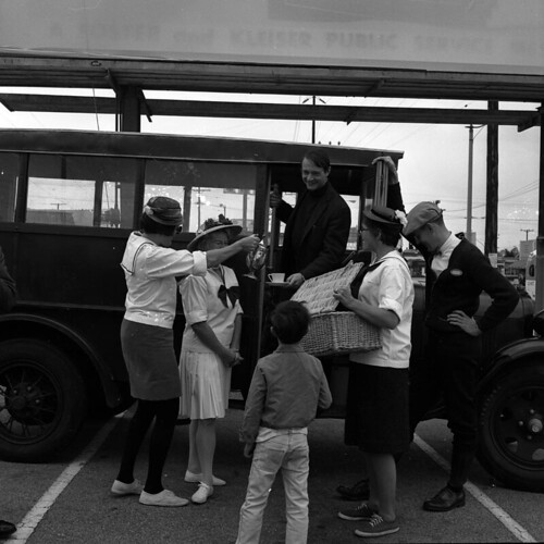
John Coplans gave Lichtenstein his first solo museum show in 1967, and while the artist was in Pasadena, the Museum organized a little excursion, which involved some old-timey outfits, and an old bus. And a ladder.
And a casual yet elegant affair in a Sears parking lot. A Sears promoting the–yes, you read that right–the “Vincent Price Art Collection.”
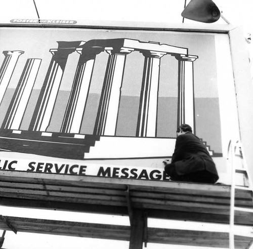
Roy climbed the ladder onto a Foster and Kleiser billboard.
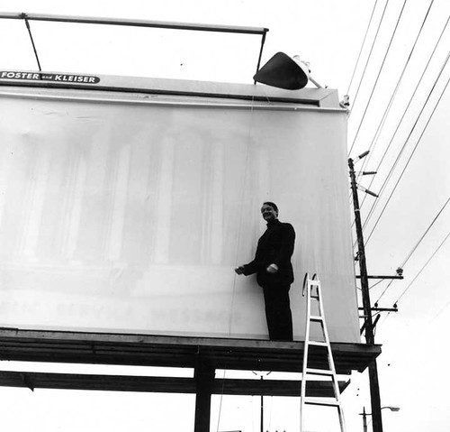
And unveiled a giant billboard for his show, with what looks to be a life-sized reproduction of his 1964 painting, Temple of Apollo.
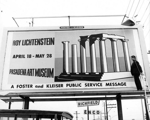
Which he promptly signed.
The Temple of Apollo was [is?] in a local Pasadena collection. The Billboard Temple of Apollo‘s fate and whereabouts are unknown, but I would start looking in either the Foster’s or the Kleiser’s garage.
update: Robert Rowan, a Pasadena trustee, bought the Temple. It’s mistranscribed in Castelli’s AAA interview as “tempo”.
Space Race
And in other Just Cold Stealin’ My Satelloon Idea Before The Fact News:

This has been stuck on my iPad for way too long. At a space flight conference a couple of months ago, the Global Aerospace Corporation announced their GOLD program, the Gossamer Orbit Lowering Device for controlled satellite de-orbiting.
GOLD is a commercial venture designed as a solution for managing the clutter in low-earth orbit [LEO]. It’d be available as an option for future missions, or as its own mission for dealing with space junk that’s already out there.
The idea is to attach a satelloon-style inflatable sphere up to 100 meters [!] in diameter to a satellite, thereby degrading its orbit much more quickly, and letting you steer it to a fiery death in the atmosphere. Though Global only just announced it publicly, they received a patent for the GOLD system it in 2004.
Conceptually, it couldn’t be more different than my satelloon idea; Global Aerospace is pushing hardcore utility and cost-effectiveness, while I’m going for art’s utter uselessness for anything but sheer experiential and aesthetic benefit.
But from the ground, I suspect it’ll be pretty hard to tell the art satelloons from the functional satellite killers. I will need to keep an eye on these people.
Global Aerospace Corporation | GOLD [gaerospace.com]
Balloon device for lowering space object orbits [google patents]
Oh, Ok, Bring It, Charles Gwathmey

So there I am, just driving to the Berkshires for an interview, minding my own business, when suddenly I come around the bend into Springfield, MA, and there’s Charles Gwathmey throwing a 100-foot silver sphere in my face!
And I’m all, fine, you and the Naismith Memorial Basketball Hall of Fame win this round, but I will be bringing my satelloon game in the playoffs, my dearly departed friend.
Naismith Memorial Basketball Hall of Fame (2002) [gwathmey-siegel.com]
Tools And Tactics Aren’t Art’s Alone
I can’t quite figure out how it ties to the rest of the story, but I still think Sean O’Toole just shortlisted himself for arts lede of the year:
For every Joseph Beuys and Yves Klein there is a fascist doppelgänger who also believes in the transformative potential of paint on the human body.
Alright, I am listening:
In 1999, shortly after trespassing onto a white farmer’s property southeast of Johannesburg, Moses Nkosi, 21, was stripped, his naked body painted silver by the landowner and his black assistant. An anomalous brand of vigilantism, this was repeated again a year later when a 14-year-old girl accused of shoplifting underwear was similarly stripped and painted by a white store manager and her black assistant.
Don’t Show That! [frieze.com]
Sedia Veneziana, Chaise Bordelaise
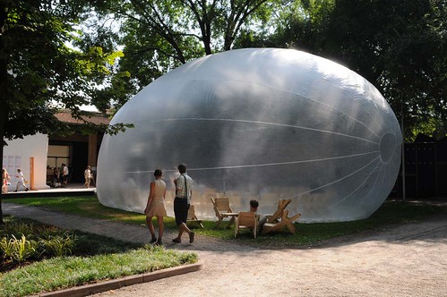
via la_biennale
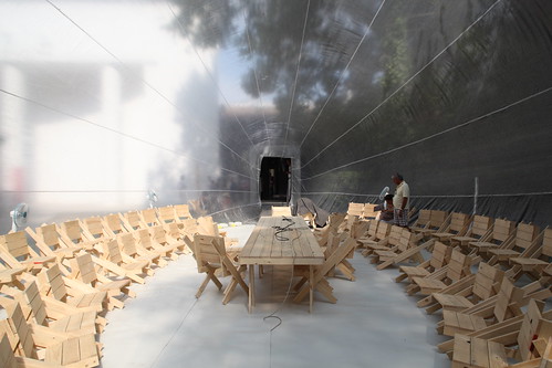
So Venice is not a total bust. Raumlaborberlin have installed their 2006 mobile inflatospace sculpture, „Das Küchenmonument,” in the Giardini.
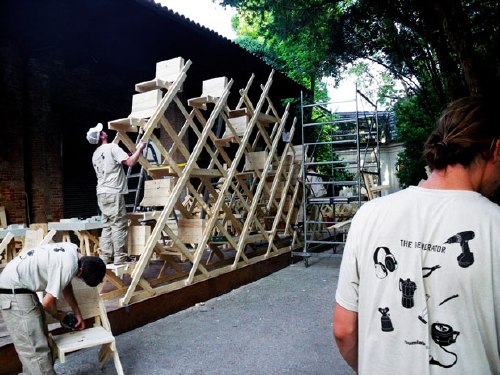
And next to it is The Generator, an on-site workshop for knocking together “sedia veneziana,” which are not just autoprogettazione-style chairs…
via br1dotcom
they’re “future particles of the generator-space-structure,” modular building elements of both social space and structure. autoprogettazione stacking chairs. Awesome.
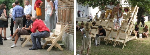
Which, of course, is related to their exhibition for Arc en Reve in Bordeaux last year, “Chaise Bordelaise.”
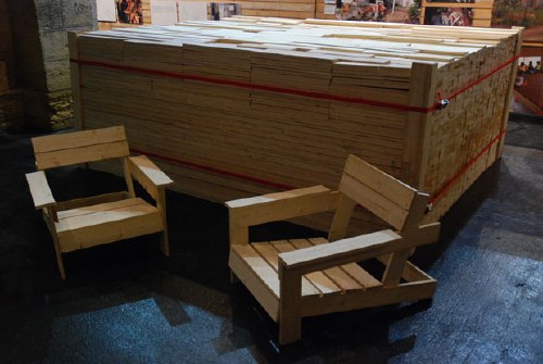
“Chaise Bordelaise” consisted of a 3x3x1m pile of pre-cut, reclaimed lumber, instructions, and some tools. Visitors made some chaises, then took them home.
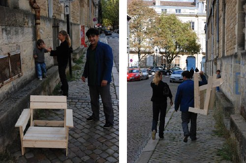
It’s basically an Enzo Mari x Felix Gonzalez-Torres mashup. If greg.org had tags, this post would be giving me a tagasm right now.
Raumlaborberlin: what’s up? exhibitions [raumlabor.net via archinect]
Chaise Bordelaise [raumlabor.net]
related: proposta per un’ auraprogettazione
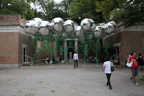
Venetian Mirror
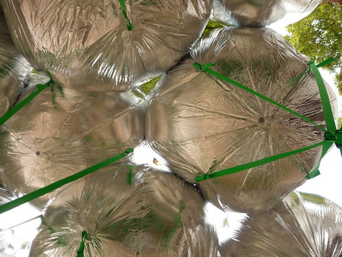
via tsaaby
Yeah, so I’d been poking around flickr for a while, looking to see how MOS’s project for the US Pavilion at the Venice Architecture Biennale turned out. Because well, because.

via Erika-Milite
And hmm. What is it about it? The green straps? Should the weather balloons have been upside-down, so gnarly knots and straps take a backseat, and the smoother, more reflective surface is visible instead of pointing to the sky? Maybe instead of straps, string a net across the courtyard, and attach the balloons from above, or maybe let the balloons float up against it to find their own structure?
via
br1dotcom
Do the balloons just not have enough gas, or enough gores?
Because right now, I’m rethinking my entire satelloony look.
It’s Reagan Men! Hallelujah!
This is where Nightcrawler ‘ports in and shouts, “Ausgezeichnet!”
Here is Joseph Beuys, pop singer, performing his greatest anti-US, anti-nuclear hit from 1982, “Sonne statt Reagan, [Sun not Reagan].” Reagan, remember, is a German homonym for rain [Regen], so it makes perfect sense.
As Ubu explains it, “Beuys tried his luck as a pop singer as part of his political commitment.” Sure.
To throw one more tidbit in there, here’s one section of the lyrics that jumped out at me:
Er sagt als Präsident von USA
Atomkrieg ? – Ja bitte dort und da
ob Polen, Mittler Osten, Nicaragua
er will den Endsieg, das ist doch klar.
He says as President of USA
Nuclear war? – Yes please here and there
whether Poland, Middle East, Nicaragua
he wants the final victory, that much is clear.
Endsieg: perhaps Reagan used a loaded term in German, one that turns out to be associated with Jews in Mein Kampf and inevitable civilian casualties in the Third Reich. But translation can be a bitch that way. Just ask the guy who came up with “enhanced interrogation” [“Verschärfte Vernehmung”].
Thanks greg.org reader frank for the felt hat tip.
MoMA On Fire
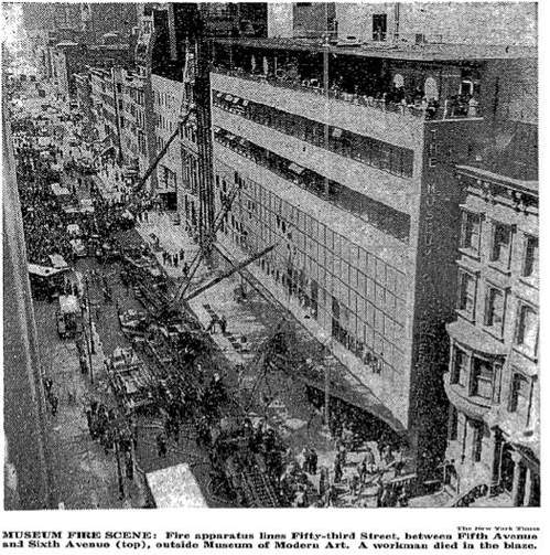
The fire at the Phillips Collection in Washington DC this morning reminded me of the incredible story of another museum fire, at The Museum of Modern Art in 1958. Before my time, I know, but I’d only learned of it last year, when Ann Temkin staged a show of Monet’s Water Lilies [Here’s Roberta Smith’s review, and a tangent I went on about Pollock] and mentioned the fire.
Mentioned the fire because it destroyed a giant, 18-foot-long Water Lilies painting the Museum had acquired just a couple of years before. [The current 3-panel Water Lilies was the replacement.]
UPDATE: LIFE published a 2-page color spread of the painting with the announcement of The Modern’s acquisition in 1957:

So what happened? The New York TImes’ report from the scene [purchase required] is riveting. [one image above] Director Rene d’Harnoncourt “trudging out” onto the street in tears. One worker dead, two visitors injured, and dozens of firefighters treated for smoke inhalation. Visitors and staff trapped on the penthouse terrace being evacuated by Alfred Barr, who throws a chair through a window and catches women and children on the roof of the neighboring townhouse. The fire chief marveling “at how women employees, soaked by dripping water, kept helping save the pictures.”
Like the Phillips fire [apparently], the MoMA fire was triggered by construction. In the Modern’s case, contractors installing air conditioning on the second floor were smoking near open paint cans, sawdust, and a canvas dropcloth. The work meant that except for the largest paintings, all the other art had been cleared from the second floor.
Art on the third and fourth floors was undamaged, and was evacuated to the garden, and to the Whitney Museum, which abutted MoMA on 54th St. Among those works? Hello, Seurat’s Sunday Afternoon on the Island of La Grande Jatte, which was on its one and only loan from the Art Institute of Chicago. Close call.
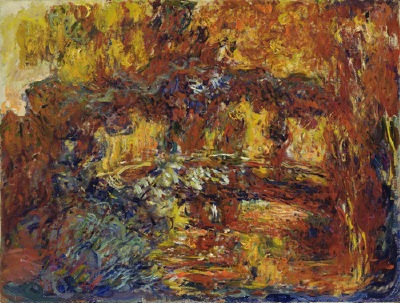
Meanwhile, besides the Monets–the large Water Lilies was apparently hanging on the 53rd St wall and had been “hacked” fighting the fire–the Museum initially reported that four works had been damaged or lost. The other Monet, another, smaller, late work hanging in the Bauhaus Staircase, was supposedly restorable, despite, as the Times put it, having “its oil flowed and blistered,” and “looking like a toasted marshmallow.” I guess I’ll have to check, but the Giverny painting known as The Japanese Footbridge [above] came into the collection in 1956, so unless MoMA had three late Monets at the time, that’s the toasted one.
[UPDATE: They did. Temkin’s essay about the Water Lilies makes it clear that the stairway painting was a smaller, but still big, Water Lilies. The Museum tried for three years to restore it, but in 1961, it was declared to be damaged beyond repair. Jackson Pollock’s No 1A, 1948. was also in the staircase and also damaged, but it was conserved.
Of the fate of the largest Water Lilies, Temkin wrote, “After the fire, Museum officials returned to find the painting buried under a pile of debris on the ground; firefighters had unknowingly destroyed it breaking through the windows into the building.” There’s a photo of the aftermath in LIFE Magazine’s April 28, 1958 issue. It is unreal.]
Boccioni’s The City Rises is still around, as is Pawel Tchelitchew’s Cache-cache [Hide and Seek], which was described as “probably the most popular [painting] in the museum.” [More on that in a second. The controversial original 1953 version of Larry Rivers’ Washington Crossing The Delaware [below] was damaged, though for some reason, it’s not listed in MoMA’s collection. Which means the only other total loss besides Water Lilies was a World’s Fair mural by the Brazilian artist Candido Portinari.
In a Times sidebar on April 16 detailing the art losses, Sanka Knox was reassured by a Museum “spokesman” that “none of the damaged pictures, including the two Monets, are among the most valuable of the museum’s paintings,” and then an unnamed “staff member” said that, “apparently none of the museum’s most valuable holdings” were damaged.” Which begs the question, right? Right:
Among these “most valuable” works, according to a staff ember, are Rousseau’s The Dream, Picasso’s Three Musicians, Van Gogh’s The Starry Night and Gaugin’s Still Life with Three Puppies.”
I’m sure it means nothing, but the only museum official quoted by name in Knox’s piece was Barr himself. Now about that most-popular Tchelitchew.
In 2007 FIT art history professor Richard Turnbull gave a Brown Bag Lecture at the Museum about the divergence of curatorial and popular opinion titled, “From Pavel Tchelitchew’s Hide-and-Seek to Andrew Wyeth’s Christina’s World” [mp3 available]. He said the museum education staff gets asked about Hide-and-Seek all the time by teachers; apparently it’s been in the NYC public school curriculum for decades, and they always want to walk kids through the painting’s cycle of life allegories. [Actually, I just finished listening to the whole lecture; it’s more like Tchelitchew hid so many faces and figures in the painting, you can stare at it for hours. It’s like a psychosurrealist Where’s Waldo?] It hasn’t been on view since around 1999 when the Museum closed for renovations.
Is it just me, or do all these paintings still look burnt? What a palette.
[images: top, nyt; the rest: moma.org]
Thomas Houseago Speaking At The New School
It’s taking me a while to warm to Tom Houseago’s sculptures, but that’s fine. It took me a very long time to come around to Rachel Harrison’s work, and boy, is it worth it, so I’m happy to give it time.
Meanwhile, this long, impassioned, fascinating, and quite awesome speech he gave at The New School in May as part of his Public Art Fund group exhibition, “Statuesque” [which is up right now, and which just got a too-condescending review in the Times, and which Andrew Russeth just posted a nice commentary about] is worth every one of its ninety-plus minutes.
Talking about him leaving his studio in Belgium? His heartfelt shoutout to the Rubells who, really, wow. Give them grief if you want, but they are some of the most dedicated, hardcore lookers and supporters of artists around, and they continue to be. Also, Leeds football hooligans and Star Wars and late Picasso and bongs for babies? Houseago makes a crazy/infectiously compelling case for his work, and for art itself.
Great stuff that should be seen by more than the 338 YouTube viewers and the 250 people in the New School auditorium who’ve seen it so far.
Don’t Hang Up, Just Talk About It!
The Ed-werd Rew-Shay Memorial Art World Pronunciation Guide keeps on growing!
the latest additions include:
Richard Anuszkiewicz
Huma Bhabha
Thomas Houseago
And some great mispronunciations that needed addressing:
Chinati
Laocoon
Modigliani
Also, I just know the Aperture Foundation’s video editors are totally taunting me by leaving the introduction off their 4-part interview between Okwui Enwezor and Zwelethu Mthethwa. [OAK-wee en-WAY-zore and Zweh-LAY-too m’TATE-wah, I know, but it’s such a tantalizing two-fer.]
Have any suggestions, stumpers, or maybe some great mispronunciations you’ve heard? Send them in!
If you see something, say something!
With All Due Respect To Bruno Bischofberger
this is pretty awesome:
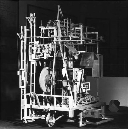
Do Daniel Libeskind’s Awesome Machines Mean I Have To Stop Hating His Work?
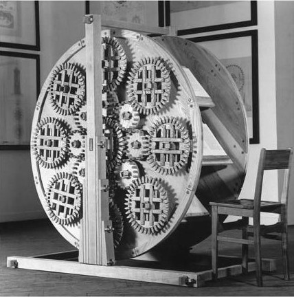
In the 1980s Daniel Libeskind was an increasingly prominent architectural theorist who–I was about to say “who had nevertheless not actually ever built anything,” but the whole thing that’s turning my head upside down is that he did, in fact, build something in the 80s: these machines.
They were exhibited at the 1985 Venice Architecture Biennale as “Three Lessons of Architecture.” There’s The Reading Machine, The Memory Machine, and The Writing Machine, all intended as metaphors concerning the then-hotly debated post-structuralist theory of architecture-as-text.
Because I haven’t sprung for any Libeskind monographs where he discusses the project, for my understanding I rely heavily on Lebbeus Wood’s thoughtful blog post, which also happens to be full of beautiful photos of these incredible machines:
the vogue for a linguistic interpretation of architecture has passed, and the avant-garde has moved on, or at least elsewhere. Libeskind’s machines, inspired by reading and writing and implicitly interpreting texts, as well as memory (treated as text), would be of little interest today if the machines were only didactic illustrations of theory. But they are much more. As objects of design, they have powerful presence, as well as conveying a refined and highly rigorous aesthetic sensibility. As acts of the disciplined imagination of tectonic possibilities–how many parts might be assembled into a compelling whole–they are highly original, exemplary, and instructive. For example, in the diverse, even contrasting ways the same material, such as wood, can be used expressively in the same construction. Or, in the complexity of joints, from fixed to flexible, enabling the total assemblage. Of course, as hand-crafted constructions (a bit too ‘Renaissance’ for comfort, as was Tatlin’s Flying Machine), they are at once nostalgic and visionary, the latter if we believe that technology is not the main issue at stake in architecture
The ‘Renaissance’ feeling is not off the mark, and by design. To make his argument for the end of humanist architectural history and for a reincarnation of sorts for [his] universe of architectural reference points, Libeskind went way back, both in terms of design and technology, using period technique to build important unrealized machines from history.
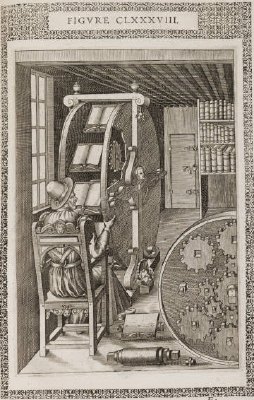
The Reading Machine, for example, is a fabrication of the “Reading Wheel” published in 1588 by Agostino Ramelli in his enormously influential engineering and design folio, Le diverse et artificiose machine del capitano Agostino Ramelli. It was designed to let a scholar keep his place while moving from tome to tome, a giant, creaking set of browser tabs. In a paper on “Three Lessons” presented in 2007, Ersi Iannidou [pdf] describes the making of:
Libeskind, determined to retrieve the experience of constructing such a machine, chooses to recreate not only the object, but also the experience. He works as a craftsman, bearing total faith in the craft of making. He builds it with hand-tools, solely from wood, with glue-less joints, dawn to dusk, in complete silence. When finished, he makes eight books–he writes them, makes the paper, binds them; just one each–and places them on the wheel. Each book contains just one word or phrase repeated anagrammatically: idea, spirit, subject, power, will to power, energia, being, created being…[it represents] ‘the triumph of the spirit over matter, of candlelight over darkness’. It teaches an ‘almost forgotten process of building’, namely, handicraft.
The Memory Machine is Libeskind’s interpretation of Giulio Camillo’s “Memory Theatre,” a 16th-century structure where, upon entering, a person’s mind would be filled and inscribed with a knowledge of the universe. Some historians have argued that Camillo’s idea influenced the construction of Shakespeare’s Globe Theatre, which may or may not have been why Libeskind based his design on a period stage set apparatus.
He makes a leap to modernity with The Reading Machine, which is an interpretation of Raymond Roussel’s “Reading Machine.” 49 square columns were rotated in impossible-to-follow ways by a series of handles, signaling the removal of the human architect from the industrialized city. Libeskind has since waxed, as he does, spiritually about the piece,
…which was designed to generate a new understanding of the ever-living city. This construction, a veritable spiritual experiment, involved reincarnating an experience of a medieval ascetic world, by constructing a machine in a monastic way, using no modern equipment, no electricity, but the discipline of craft, candlelight and the power of faith in the future text of architecture. The machine dealt with the organized chaos in which permutations of names of saints, both true and apocryphal, emblems, reflections and cities were symbolically and physically made mobile by turning the ‘circle into square’. It took twenty eight simultaneous rotations to turn the machine’s faces toward the unexpected image of a reawakened site.
Mhmm. Ioannidou quotes Libeskind as calling The Writing Machine “a quadripartite computer operation,” which begins to hint at at least one reference that I can’t find anybody making: to the difference engines of Charles Babbage, which were the early 19th century, mechanical ancestors of computers. Keep that in mind while reading Libeskind-via-Ioannidou again on the making of:
The Writing Machine is an industrial apparatus; so the architect becomes an industrialist, architecture a nine-to-five job. For the construction of this last machine Libeskind sets up a business, buys a clock, and focuses on the bare minimum of technique. He works hard–nine to five at the start, later overtime–speaks ‘small talk’, smokes cigarettes, does not mingle work with other issues–especially having fun.
I think we are to understand here that Libeskind not only built these things, but that he built them in deeply meaningful, experiential ways. They’re the not just by-products of his Method Architectural Theory, but its literalization. The Architectural Word Made Flesh. Or wood, as the case may be, but still.
As a guy contemplating the historically accurate bricolage-style refabrication of, among other things, a 1960 satelloon, I can appreciate all this seemingly conceptual performativity. Well, some of it. The part that isn’t a Renn Faire version of the Woodwright’s Shoppe. But the bigger problem for me is I’m not sure I like where this is heading.
Read Woods’ description of the seemingly unintended architectural consequences of post-structuralism’s decoupling of form and function and tell me that it doesn’t ft Libeskind’s disastrously clichéd building projects to a T:
What began as a radical concept affecting the very core of architecture, is compromised, we might say reduced, to commercially marketable and client-acceptable styles–a fate much the same as idealistic modernism suffered in its time.
So knowing what we know now, and faced with a worldwide blight of Crystalline Shard™ museum annexes and condos, can we see the warning signs of Libeskind’s epic failure in these machines? Are there other lessons to be learned from “Three Lessons”? Should I not let myself like these fantastical contraptions quite so much?
I don’t know yet. But it reminds me of the takeaway from 1939: The Lost World of the Fair, the book David Gelernter wrote while recovering from being attacked by the Unabomber, how we basically ended up with the future we were promised at the World Fair–including TV and car-based suburban sprawl–and it sucks.
On a more practical note, I’ve tried to find out more about the actual making of Libeskind’s machines, and to figure out where they are now. But since Libeskind’s studio only responds to “credentialed media,” I’m left to assume that all three machines met the fate of The Writing Machine, which Libeskind says was destroyed in a fire at the Palais des Nations Palais Wilson in Geneva in 1987. Too bad, because at the rate he’s going, they were the best things he ever built.