

NPR’s Robert Krulwich had a fascinating story the other day that works even better online. Because there are slideshows and video footage of Starfish Prime, the hydrogen bomb the US detonated in space on July 9, 1962.
The launch occurred on Johnston Island in the South Pacific, and was part of an early test of ICBM technology–and an attempt to understand the weaponizing potential of the earth’s Van Allen radiation belts. Just in case Moscow was up to anything funny.
Scott Hansen pointed to Peter Kuran’s excellent-sounding documentaries about atomic testing, including Nukes in Space: The Rainbow Bombs.
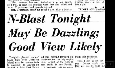
Almost a thousand miles away, Hawaii had been primed for a potentially “dazzling” light show. NPR’s lead-in called it “the single greatest manmade light show America has ever created.”
And Starfish Prime delivered. Cecil Coale, who was involved with the launch and monitoring it from Johnston Island, described the flash that turned night to day and the ionizing rainbow that followed:
“It was like a flashbulb…then the sky turned green for a second.
then yellow and blue, “really vivid, unnatural bright color.”
Then red. “it wasn’t shimmering it was glowing red like a neon sign. Then it slowly disappeared, there wasn’t any sound to this at all, it was entirely visual…i think about this every day of my life.”
Listen to the Bomb Watchers [npr]
DOE library of historical nuclear test films of Operation Dominic, Operation Fishbowl, and Starfish Prime [doe.gov]
Blow
This FT essay by Daphne Guinness about buying Isabella Blow’s estate before it was dispersed at Christie’s is a wonderful, sad, incredible thing. [via @artnetdotcom]
All the way back in 2002, I overwrote a long post about Blow, Walter Benjamin, Bill Cunningham, fashion, and street photography. The occasion was Guy Trebay’s writing about street fashion.
Frankly, I’m surprised at how much of it I’d forgotten. Did Benjamin really call the flaneur “a spy for the capitalists, on assignment in the realm of consumers”?? That is awesome, I could totally use that!
What I’ve never forgotten, though, is Cunningham’s expertly serendipitous street photo of Isabella Blow blowing into a fashion show in Paris:
Your Search For A. James Speyer’s Sunstein House Now Returns Three Google Results
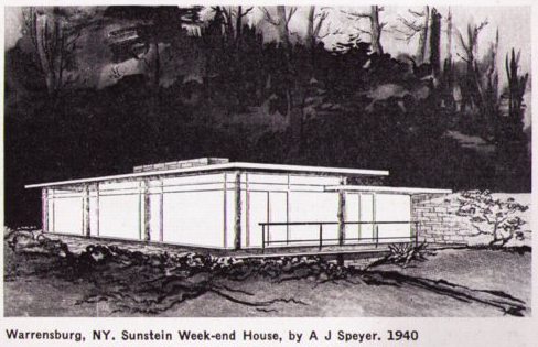
In 2008, I discovered this drawing of A. James Speyer’s Sunstein House, a 1940 modernist pavilion in the Adirondacks made of tree trunks and local stone, in an architecture guidebook published by The Museum of Modern Art. Even though the guidebook gave driving instructions, the lack of photographs, combined with utter online silence about the project or the client, made me wonder if the house actually ever got built at all.
Now, while searching for images of the house Gregory Ain built in MoMA’s garden in 1950, I found that the Museum has since published its archive of press releases. And it seems that Speyer’s Sunstein House was at least real enough to be included in a traveling exhibition the Museum organized in 1941 titled, “The Wooden House in America.” [pdf] So the search is back on.
Speyer is probably best known for his work as a modern curator at the Art Institute of Chicago; Anne d’Harnoncourt cited his influence regularly and his innovations in both curation and exhibition design. But he also practiced architecture, primarily in Chicago and his hometown of Pittsburgh. His 1963 house for his mother Tillie Sunstein Speyer is his most widely praised work, but his most famous work is the Ben Rose house, from 1953, which he designed with David Haid. It was Cameron’s house in Ferris Bueller’s Day Off. [Which is still for sale, btw, asking $1.65m, down from last year’s $2.3m.]
Anyway, Speyer got all International Style like that because he was Mies van der Rohe’s first graduate student in the US, and the Sunstein House dates from the time he was studying directly with Mies. And it’d predate by a decade Mies’ own first realized American buildings. So we’ll keep on it, and see what’s out there.
Previously: Forest for the Mies: A. James Speyer’s Adirondack Mystery Cabin
Decommission Commission: Harrier And Jaguar By Fiona Banner
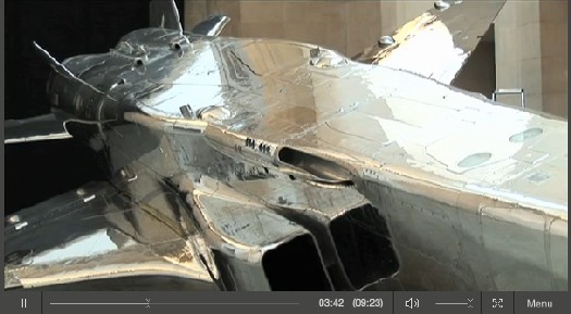
Harrier and Jaguar, Fiona Banner’s commission for Tate Britain’s Duveen Galleries opened this week, and from the making of film and interview with the artist, it looks spectacular.
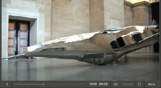
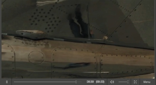
Banner has installed two decommissioned fighter jets–a BAe Sea Harrier XE695 and a SEPECAT Jaguar XZ118–in the grand neoclassical space. By altering each slightly, and by placing them in atypical, non-functional positions, the artist turned them into overwhelming, beautiful objects–sculptures–which nonetheless manage to retain all their original significance and meaning as highly advanced weapons of war.
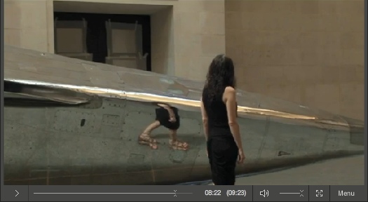
The Harrier was covered with a delicately feathered matte wash and hung, nose down, just off the floor. It barely fits inside the limestone-clad hall. The SEPECAT Jaguar was stripped down to bare metal and polished to a mirror finish. It rests upside down, on its cockpit. Did I mention it looks spectacular?
With those reflections it generates, it’s like a 3D realspace version of Google’s distorted Street View portraits.
Video | Fiona Banner Harrier and Jaguar, 9’23” [tate channel]
Duveens Commission Series | Fiona Banner 2010, through 3 Jan. 2011 [tate.org.uk]
Olafur Street View

One of the simplest, best parts of Innen Stadt Außen [Inner City Out], Olafur Eliasson’s multiple public and museum projects in his adopted hometown of Berlin this year, is now online as a short film.

In what feels like the diametric opposite of Google’s Street View scanning, Olafur and his studio rigged a truck with a giant mirror and drove it around town. Part of me wants to not say what it is, but to let viewers figure it out. But the whole exhibition was promoted with photos of the truck. And I knew what it was, and I still was enthralled by every sequence and cut in the film.
Innen Stadt Aussen, from Studio Olafur Eliasson, 10’31” [vimeo via @grammar_police]
Someone Get Souren Melikian A Blogspot Account
Souren Melikian’s auction analysis for the International Herald Tribune/ New York Times is almost always entertainingly specious, but he is at his best/worst when he writes about contemporary art, about which he obviously knows nothing:
The next lot, “Cristina Passing By,” was the fun figure of a girl realistically painted in tissue paper on stainless steel signed by Michelangelo Pistoletto in 1968. It also far exceeded the high estimate, if at a modest level, when it brought £313,250. Much earlier than the Cattelan, it is more original.
But originality or creativity is hardly what motivates the buyers of contemporary art in its forms now promoted in the auction arena. What triggers a response is an easy, instantly perceived image — and the echo that it receives in the media. Like slogans in politics, the power of words repeated a hundred times generates success. Achievement has little relevance, if any at all.
Seriously, why does the Times keep publishing this untethered nonsense?
What does this even mean?? Novelty Sets Cheerful Tone for Christie’s Contemporary Auction [nyt]
Previously: The Eternal Sunshine of Souren Melikian’s Spotless Mind
Arshile Gorky Was An Expert Camoufleur

I like writing the word camofleur.
In response to the burning question [sic] that arose from Ad Reinhardt’s chronology, what was up with Arshile Gorky wanting to start a camouflage school in 1943?
Because everyone knows that Gorky was already teaching camouflage in 1942. He’d spent at least a year, and possibly longer, trying to get a camouflage class started, partly because he and other artists saw it as an alternative for getting called up in the draft. “Can’t fight, too busy camouflaging!”
This need intensified after Pearl Harbor, and even after Gorky was rejected by the draft board for being too old. But that was also because Gorky needed money, and a class of 20 students paying $15/each a month sounded very appealing.
[Hayden Herrera has a chapter called “Camouflage” in her 2005 biography, Arshile Gorky: Life and Work. Most of this info comes from there.]
In his prospectus, Gorky wrote, “What the enemy would destroy, however, he must first see. To confuse and paralyze this vision is the role of camouflage. Here the artist, and more particularly the modern artist, can fulfill a vital function, for opposed to this vision of destruction is a vision of creation…
“Mr. Gorky plans a studio workshop in which each student becomes a discoverer…” The coursework would include modern theory, scale modeling, and “abstract constructions.”
One of Gorky’s particular concerns was how colorblindness might thwart camouflage. He also, we read, had “a plan to camouflage the whole of New York City,” which he felt should be promoted heavily by the New York Times.
According to one of his most satisfied pupils, the then-future art dealer Betty Parsons, the class ran for from three to six months, and was highly popular. Of course, according to Harry Rand’s book, Gorky’s camo course “fared poorly.” If the goal was to provide a steady source of income, I guess these can both be true.
And that might explain Gorky seeking help from Reinhardt to revive or rework the camo school idea in 1943. In any case, Gorky’s eventual dealer, Julian Levy, said that camouflage was the key to the artist’s character, whatever that means.
Previously: Civilian Camouflage Council
image: Garden in Sochi, 1943, Arshile Gorky, via Tate, and Telegraph UK
A Pixel Is Not A Little Square! [Except When It Is]

Thanks to greg.org reader Fred for sending along a link to a memo computer graphics pioneer Alvy Ray Smith wrote in 1995, soon after his company Altamira [the one he founded after Lucasfilm and Pixar] had been assimilated by Microsoft.
The Title: “A Pixel Is Not A Little Square, A Pixel Is Not A Little Square, A Pixel Is Not A Little Square!” [pdf via alvyray.com, a year later, he added, “(And A Voxel Is Not A Little Cube)”] Two guesses what it’s about.
Alvy’s rant sounds exactly like what I’d expect from circa 1995 Microsoft: brilliant, self-assured, and presumptuously prescriptive. Which is not, alas, the same thing as being entirely right or even aware of its own limitations.
Because it gets a little rambling, and because I am basically arguing pixels with the guy who worked on the Project Genesis sequence in Wrath of Khan, I have moved it all after the jump.
Continue reading “A Pixel Is Not A Little Square! [Except When It Is]”
On Warhol’s Rain Machine[s]
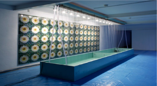
First up, a high five to Andrew Russeth at ArtInfo for highlighting Nicholas Robinson Gallery’s summer installation of Andy Warhol’s unusual Rain Machine (Daisy Waterfall). What a weird, wonderful–but mostly weird–work.
It’s basically a mural of shimmering, lenticular photos of flowers behind an illuminated, recirculating, double wall of simulated rain. Let’s set aside the fact that the raw mechanicality of Rain Machine makes it look like a missing Pop link in the genealogy of Olafur Eliasson’s work. The similarities are both less and more interesting than they first appear.
Begun in 1968, Rain Machine has its origins in two of my favorite pseudo-utopian art/technology events, the Osaka 70 World Expo and LACMA’s sprawling Art & Technology collaboration project, which ran through 1971.
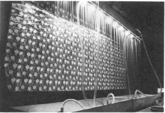
When Warhol was first approached for the A&T Program, which paired artists with cutting edge technology companies to realize a new, innovative work of some kind, he imagined making a wall of 3D holograms that would be barely visible through the mist. But Bruce Nauman had already nabbed RCA’s hologram guy, so Warhol fell back onto decidedly low-tech lenticular imaging.
Then the rain wasn’t working, the prints didn’t line up, the budget was a joke, the US Pavilion exhibition space was cramped, the whole thing was a potential mess. The story is recounted in glorious, play-by-play detail in LACMA’s 1971 Art & Technology Report, which is cheap to buy used, and [brilliantly] available as a free PDF download from LACMA’s online library:
Perhaps the most important decisions determining the work’s final appearance in the U.S. Pavilion at Expo were made not by Warhol but my MT [Maurice Tuchman, LACMA’s A&T curator/organizer], the Expo Design Team members, and some of the other artists in the show. The entire installation operation was characterized by a sense of crisis, and there were moments when the peice seemed simply destined to ignominious failure. In the end, somehow, it worked; many people and particularly the artists who were there installing their own pieces, felt the Warhol to be one of the most compelling works in the exhibition because of its strangely tough and eccentric quality. Robert Whitman commented that “of course Andy’s forcing everyone into the act;” the work istelf, when completed, made that conspicuously evident, and yet it was unmistakably Warhol. When it was rumored at one point just before the opening of Expo that the work might be taken out of the show, as was suggested by several of the Expo Designers and by a visiting critic who was conversant with Warhol’s oeuvre, the American artists who by this time knew the piece intimately objected strenuously.
When Rain Machine came back to LA, it had to be reworked, or debugged, and reconfigured. The most noticeable change is probably the scaled up daisy photos. As Robinson explains, the current installation follows an even newer [remastered?] set of specs developed by the Warhol Museum for its 2002 refabrication of the work.
Update: Interesting, LACMA received a set of nine lenticular daisy photos as a gift in 1999. They’re the larger, single daisy-style, which makes me think they were extras, loosies, or maybe even leftovers from the 1971 Art & Technology reinstallation. A few of these have popped up in the market over the years; they’re not that expensive, though without the rain–hell, even with the rain–they’re a little weird.
Update Update: aha, interesting. according to this auction description, the lenticular photos were commissioned in an edition of 50 for the LACMA show.
Wherein The Inventor Of The Pixel Totally Agrees With Me, Even Though I Don’t Totally Agree With Him
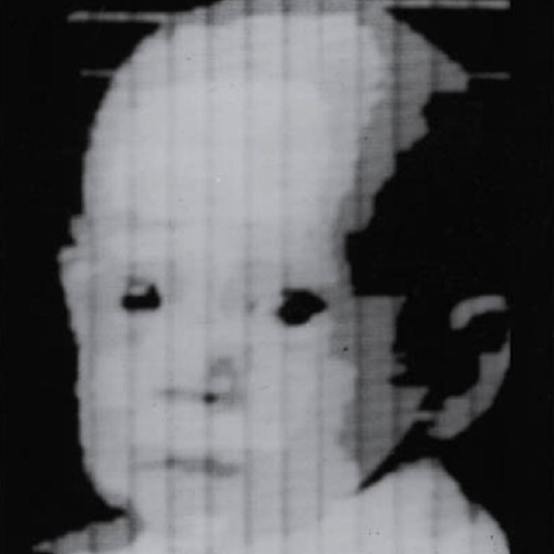
53 years later, the guy who invented the square pixel regrets the error.
In 1957, NIST computer expert Russell Kirsch scanned the world’s first digital image [a photo of his infant son, above] using the country’s first programmable computer. To accommodate the memory and processing capacity of the available equipment, Kirsch had the computer break the image up into a 176×176 grid, and to assign a binary color value, black or white, to each of the resulting 30,976 square pixels.
Apparently, it’s been eating at him ever since, because he has, at age 81, published a suggestion for increasing the “precision and accuracy in scientific imaging” by replacing uniformly square pixels with pixels of variable shapes.
I do not know enough about compression algorithms and data/information loss to know whether Kirsch’s proposed method is either necessary or superior to the state of the art. But it is most fascinating to see one of the inventors of digital imaging remain so engaged and critical of the system he helped bring forth.
And frankly, though I don’t know any of the history or the context, I don’t necessarily agree with him that the grid and the square pixel was an “unfortunate” solution. In the 50+ years since the square pixel became the irreducible unit of visual information, it has acquired its own aesthetic and cultural context.
[Looking through the NIST Museum site, it sounds like the “serious mistake” was using a binary [i.e., b/w] basis for computer scanning in the belief that it was an accurate representation of human neural activity and visual data processing. It also sounds like the NIST folks started trying to correct for it almost immediately.]
When he completely agrees with me and validates my own assumptions, however, I agree with him completely. The man is a genius and a living legend:
…we show that the usual assumption that increased precision is accomplished with higher resolution of square pixel images does not necessarily result in the increased accuracy that can be achieved with the use of variable shape pixels…
PDF: Kirsch, Russell A., “Precision and Accuracy in Scientific Imaging” [nist.gov]
Square Pixel Inventor Tries to Smooth Things Out [wired.com thanks Joerg Colberg, who has been experimenting with cooler-shaped pixels himself lately]
related? coloring the pixels of Mariner 4’s first image of Mars by hand
Chronology For, By Ad Reinhardt
How much of discovery is really just rediscovery? or learning remembering?
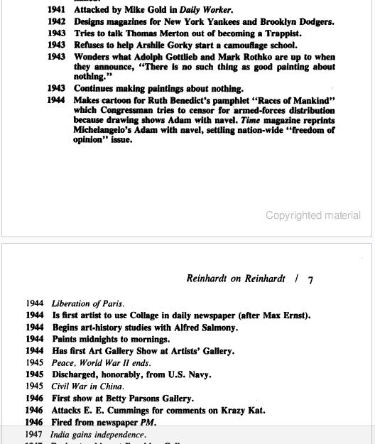
I was waiting to read how editor/art historian Barbara Rose had decided to model the chronology at the opening of her 1991 book, Art-as-Art: The Selected Writings of Ad Reinhardt, after the personal+historical “date” portraits of Felix Gonzalez-Torres:
1943 Refuses to help Arshile Gorky start a camouflage school.
1943 Wonders what Adolph Gottleib and Mark Rothko are up to when they announce, “There is no such thing as good painting about nothing.”
1943 Continues making paintings about nothing.
1944 Liberation of Paris
But then I scroll up and see that Reinhardt’s chronology was his own, and that he was constantly reworking it. The version Rose chose was published in the catalogue for Reinhardt’s 1966 retrospective at the Jewish Museum.
So Rose didn’t get it from Felix, but that means Felix must have gotten it from Reinhardt. And sure enough. I pulled down my special 1994 edition Art & Design, which served as the catalogue for the Camden Arts Center exhibition featuring Reinhardt, Joseph Kosuth, and Felix Gonzalez-Torres. And there is Nancy Spector writing about Reinhardt’s influence, both direct, and refracted through the strategies and theories of the intervening generation of conceptualists:
Reinhard’s parodic biographical exercise was, at the time of its creation, interpreted as mere ‘documentation’, as tangential to his artistic enterprise. But, because of Conceptual art’s deployment of linguistic analysis and its use of language as a medium through which to demonstrate the discursive foundations of art, a younger generation inherited the freedom to use words as a viable alternative to image-making. Therefore, Gonzalez-Torres’ various inventories of disjunctive historical incidents and private moments, followed by the year of their occurrence, can and actually do constitute his art…these ‘date’ works use now conventional Conceptual strategies to mimic the idea of an ‘Artist’s’ chronology. More importantly, however, in the over-arching equivalency of everything listed in these works, Gonzalez-Torres is underscoring a crucial reality in today’s world: that the political cannot be divorced from the personal.
I think Reinhardt makes the same case; and I agree with Spector that Rose’s interpretation is incomplete, and that the extremely politically engaged Reinhardt did not mean for his chronology to reveal art to be “a matter of small consequence” when seen from “a perspective of world affairs.”
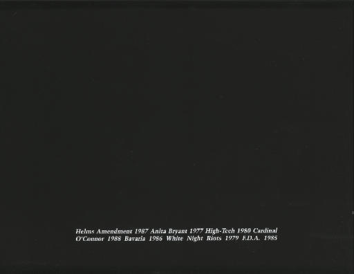
Spector suggests another reading, that “[Reinhardt’s] inclusion of cataclysmic world affairs in an ‘artist’s biography’…bespeaks the impossibility of divorcing cultural endeavours from the social and political context in which they are pursued.” [image: Untitled, 1988]
Now about that Arshile Gorky camouflage school…
Really? Really.
I’ll confess, when I saw the tweets start flying about Mira Schor’s essay on Otto Dix, Greater NY, and Bravo’s Work of Art, I was skeptical. How the hell was she gonna fit any of those, never mind all three–at once–onto a blog called A Year of Positive Thinking?
By gum, she pulled it off.
Reality Show: Otto Dix [a year of positive thinking]
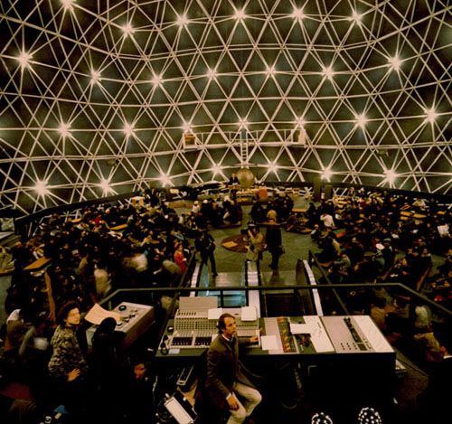
Wilkommen To The German Dome
Corner Reflector, Or Rediscovering An Early Satelloon
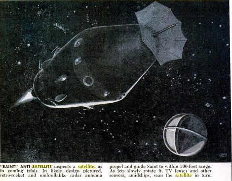
This one’s been sitting on my desktop since April when I posted about that Jan. 1961 Popular Science article about how they made the Project Echo satelloon on a long table with giant clothespins. It was in May, only a couple of months after NASA’s peaceful communications satelloon was made freely available to the world, that Pop Sci informed us of Project Saint, the US Air Force’s program to put the “First Warship In Space.”
That’s Saint on the left up there.
Saint, we read, would disable enemy satellites using one of four techniques: spray paint [for spy cameras’ lenses]; sand [for simulating meteor shower damage]; solar mirrors [for roasting electronics]; or an H-bomb.
Project Saint was canceled in 1962 before any test launches were accomplished.
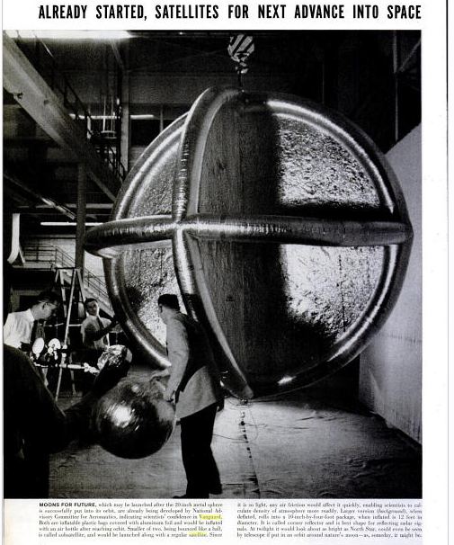
Oh wait, it wasn’t since April; it was since March. That’s right, April was when I recognized the target, the intersecting circular satelloon depicted on the right. It was called a corner reflector, designed to optimize radar wave reflection, and it was included in the https://greg.org/archive/2010/03/23/shiny_space_balls_yes_please_ill_take_two_no_four.htmlincredible LIFE Magazine cover story from June 3, 1957 about Project Vanguard and the race to launch “the first man-made moon,” a race the US would lose a few months later.
See? Here it is, behind the guy bouncing a smaller Mylar satelloon:
US Plans First Warship in Space – Pop Sci, May 1961 [popsci.com]
Project Saint [astronautix.com]
A Man-Made Moon Takes Shape, June 3, 1957 [LIFE/google books]
Bruno Munari’s Original Xerographies, Freshly Copied
After I posted about Sigmar Polke’s photocopied masterpiece Daphne, Mondo-Blogo emailed the great news that Corraini has republished Bruno Munari’s Original Xerographies. I have the original Original Xerographies in a box somewhere; it’s more handbook-ish than I remembered–which is a nice way of saying I’d forgotten about it, but it looks kind of relevant and interesting now:
An original xerography is the result of an image which is moved on the plate of glass of the copier, so that it reproduces both the image and its movement. Therefore, it doesn’t consist in a mere copy, but on the contrary in an original, which is obtained through a process exploiting the whole potential of the copier. Hence it not only reproduces but produces images as well.
From this starting point Munari develops his studies and experiments about working rules of copiers, originally published in the series Quaderni di design curated by Munari himself for Zanichelli (1977).
Each factor of the copying process (with the copiers available in the 70s), from its reading limits to the concentration of the toner, is deeply and systematically examinated and experimented by Munari in every aspect and possibility. The result is a series of samples (“copies”?) that, following his research method both strict and creative at the same time, do not aim towards a specific purpose, but want to collect as many data as possible in order to describe almost every potential of the machine, including its most surprising and unexpected possibilities.
Buy the new edition of Bruno Munari’s Original Xerographies for like $17 [amazon]