Bombardment Periphery, Rotterdam

mothership_brandgrens.jpg

As part of Rotterdam 2007 – City of Architecture, the city commemorated the 15-minute-long German bombing on May 14, 1940 that destroyed the city center, precipitated the Dutch surrender in WWII–and ultimately provided the occasion for all that new architecture. The area destroyed by the bombs and the ensuing firestorm is demarcated by the Brandgrens, or Fire Limits:

The Fire Limits
14.05.2007
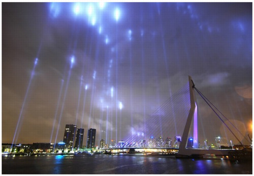
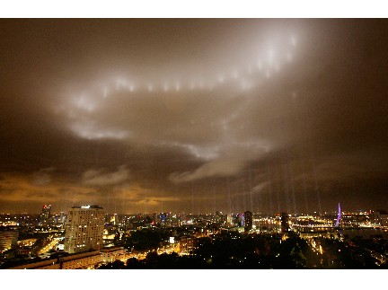
On Monday 14 May, in the evening, Rotterdam 2007 City of Architecture will illuminate the fire limits of Rotterdam’s city centre with over one hundred light beams.
The fire limits mark the areas of the city that were destroyed by the bombing on 14 May 1940 and the ensuing fires that broke out. From 10.45 pm a blaze of light beams on these boundaries will light up the skies, making the true impact of this devastating event visible throughout the entire city.
The bombing ‘only’ lasted fifteen minutes but managed to destroy practically all of Rotterdam’s city centre. Even before the war ended, it was decided not to replicate pre-war Rotterdam when reconstruction began, but to turn the city into a modern, revitalised city. The fire limits highlight the differences between the old and the new in many places in the city centre, which although visible, have never been experienced as a whole before. On 14 May 2007, the art producer Mothership will illuminate the entire fire limits, stretching almost 12 kilometres, turning this historic event into a sight that everyone can see.

Such a prominent spatial use of spotlights as a memorial these days obviously evokes references to the Towers of Light memorial. Like the World Trade Center version, this project, produced by the art collective Mothership, is intended as a temporary, ephemeral precursor to a permanent memorial demarcating the Brandgrens. But that’s actually not the most interesting part of this project for me.

firelimits_mothership.jpg

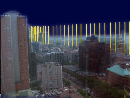
Though the memorial’s official path through the city was only recognized in February, the idea of the Brandgrens has been as integral to the post-war identity of Rotterdam. The Fire Limits [or as Mothership translates with a bit more thesaurian flair, Bombardment Periphery; Babelfish translates Brandgrens as “Fire Boundaries”] is a commemoration of a Nazi attack that uses the Nazis’ own vocabulary of spectacle, specifically Albert Speer‘s 1934 Lichtdom, the Cathedral of Light, at Nuremburg. The rendering [above] reads almost like a direct quote of Lichtdom, in fact.

Lichtdom.jpg

As it turned out, Bombardment Periphery looked uncannily like a re-creation of a nighttime bombing, with evocations of anti-aircraft searchlights, groundlevel glow, and illuminated cloud cover. I’d be very interested to hear what the reaction was to this event [the commemorating, that is, not the attack.]

brandgrens_2.jpg

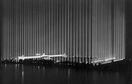
It’s a bit absurd, but the first image that comes up in my search for night-time air raid photos was from Los Angeles.

La_air_raid.gif

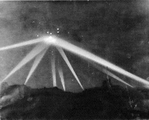
In the early morning of February 25, 1942, unidentified flying objects were spotted over Los Angeles, triggering a massive anti-aircraft barrage that killed three civilians [three more died of heart attacks] and sparked a flood of bitter criticism and controversy. No definitive explanation has ever been made of the objects. The incident was inspiration for Steven Spielberg’s comedy [sic], 1941.
The caption for this photo, which ran on the front page of the LA Times, is incredible:

Scores of searchlights built a wigwam of light beams over Los Angeles early yesterday morning during the alarm. This picture was taken during blackout; shows nine beams converging on an object in sky in Culver City area. The blobs of light which show at apex of beam angles were made by anti-aircraft shells.

The obvious question, of course: Is next February 25th too soon for someone to recreate a wigwam of light beams over Culver City?
Bombardment Periphery Gallery [enterthemothership.com]
Rotterdam2007: The Fire Limits [rotterdam2007.nl]
West Coast Air Raid [wikipedia]

Japanese Mac vs PC Ad

Most of the time we’re never aware of it. But at some level, it’s gotta be deeply disturbing to find out we’re as much a type as a person.

japanese_mac-pc_ad.jpg

And by that, I don’t mean “Mac” or “PC”; I mean John Hodgman and that other guy. Mostly that other guy.
Japanese Get A Mac Commercial [apple.com/jp via notcot]

Sig Heil, Bruder Maciunas

Raimundas Malasauskas: Can we ask him who he was in his past life?
David Magnus: There might be a surprise, but he was an athlete, a preacher. He had something to do with the Mormons. I don’t know what, I am not familiar, but a religious sect. He is showing me Germany… fascism, and I was saying: “That doesn’t look pretty,” and he goes, “They all aren’t all pretty, honey,” … that kind of a thing … don’t think yours are either.
When he talks about being a preacher, you know, he was, or at least he felt connected to dictators. They were fascinating characters, fascinating character studies for him. He saw himself, many times, and he learned a lot. He observed them a lot. He found it so fascinating that he could find a piece of himself in others. And I think it’s very interesting what Mother Teresa said she found Hitler in herslef. Small part, but okay.

In 2002, Raimundas Malasauskas started emailing around asking, “Do you have a question for George Maciunas (1938-1971), artist and the founder of the Fluxus Movement?” Then he sat down with David Magnus, “an experienced psychic,” who relayed the questions to the deceased artist–and channelled back his responses.
Yoko Ono wanted to know if Maciunas was still aware of what was going on in the world, and if so, what did he think about it?
My friend Yasu wanted to know what he really thought of Yoko Ono?
The interview/seance was originally published in 2002, but it was just reproduced in the most recent issue of the design journal Dot Dot Dot [issue 13], put out by Dexter Sinister.

A Rolling Moss Warrants No Throne

Ay caramba, I haven’t even clicked through the article yet, and already my head is going to explode:

Aspiring To The Throne
A growing number of small stores are challenging Murray Moss’s supremacy as the arbiter of design in America.

If the American design world really so feeble that Moss is considered the supreme arbiter, I guess we get what we deserve.
It’s true that through inertia, his fussy, museum-style presentation, and his subsequent expansion, Moss has mitigated to some degree his knockoffish origins. But I can’t forget.
I was traveling to Amsterdam a lot during the mid-90’s, those early, crucial years when Moss was building its own reputation as a design gallery, promoting European designers like the Droog gang. And I came to love a visionary design store on Prinsengracht called Frozen Fountain. Around 1992, when it moved to its current location, Frozen Fountain began curating shows of designers’ work, reaching into the deep bench for Dutch design, and featuring work from around Europe as well.
There was literally nothing at Moss that wasn’t at Frozen Fountain already, and it stung to reconcile the praises for Moss’s incredible innovation with the reality that his entire program was basically bagged up and repotted, like a giant amaryllis bulb, from Amsterdam.
The Times piece buries the lede [I’ve read it by now, yeah. Just in case it was a takedown in disguise], noting how many dynamic developments of the design world Moss’s blinkered incuriousity has missed: American design, sustainable design, furniture under $25,000 design. The most damning quote is from Stefan Lawrence, whose LA store Twentieth dances circles around Moss’s vitrine: “And Mr. Lawrence himself, while quick to say that ‘Murray Moss is a genius,’ added that he had discovered designers that ‘Murray hasn’t even heard of.'” Granted, that’s a mighty long list.

So September 10th

I have no idea what to make of this. Dresden painter Eberhard Havekost’s Kontakt is coming up for auction at Phillips de Pury on May 17th. Its oblique, cropped composition depicts the flat, linear patterns of the facades of the Vista Hotel and the North Tower of the World Trade Center, and a wind-flipped American flag.

havekost_kontakt.jpg

Here is Phillips’ catalogue text for the painting, which is expected to sell for between $80-120,000 [1]:

Vertiginous and fiercely cropped, Eberhard Havekost’s Kontakt reads as taut with the freight of its symbolism, the allotted canvas actually failing to contain the plus-sized reality of its subjects. Although executed prior to the terrorist attacks of September 11, 2001, it is unlikely that contemporary viewers will escape a connection—thematically as well as visually—to the journalistic and sentimental imagery that flooded the United States after those events. The buildings are rendered as flat, surface without depth, with the only indication of shadow in the image serving to slightly dim the stars and backward curl of the flag, arguably drawing more attention to them than the flag itself, boldly outlined in black. This decision on Havekost’s part seems particularly prescient, as it is a simplified graphic image of the ‘stars and bars’ at attention before a towering skyscraper—while pruned entirely of context for anyone not familiar with 9/11’s events—that has arrived as a new unassailable image in the national mindset, much like Joseph Rosenthal’s 1947 photograph at Iwo Jima, which would serve as the model for Felix W. de Weldon’s Marine Corps Memorial in Washington, D.C.

Obviously, the destruction of The World Trade Center is going to factor into any encounter with a work of art which features the buildings. As the text notes, Havekost made this painting long before the September 11th attacks, in 1998. Whatever his idea or intent was for making Kontakt, though, the context around the painting has shifted dramatically.

rosenthal_iwo_jima.jpg

But rather than just make mention of the situation, Phillips is explicitly running with it, pumping up the importance of Havekost’s painting by torquing it into a kind of prophetic artifact. Even more disturbing, they’re marketing, not the painting, but the personal experience of weighty remembrance that comes from seeing it: it isn’t “symbolic”; instead, it “reads as taut with the freight of its symbolism.” It’s unassailable image in the national mindset.”
The Iwo Jima photo-turned-memorial comparison is another extraordinarily explicit claim to historic, iconic status that is belied by the painting’s origins. Rosenthal’s staged photo was immediately seized upon as a homefront propaganda tool to invigorate the war-weary country. If anything, its transformation into three dimensions is a memorial to the lingering echoes of the media’s own rallying cry.

wtc-firefighters-raising-flag.jpg

If a comparable image exists from the WTC, it’s surely of New York City firefighters rigging a flag comandeered from a nearby yacht, a cloying attempt by the media to regain their once-galvanizing reach by re-staging–lamely and literally–Rosenthal’s photo. But whatever, the icon is definitely not Havekost’s depiction of a pop-flat, human-free vacuum. Not that that stops Phillips from trying to sell it as an icon.
Kontakt‘s current owner, Charles Saatchi, is not known for his reticence, but compared to the auction house’s ambitious historical reading, Saatchi’s is pretty subdued:

Predating 9/11, Kontakt contains an almost ominous forbearance, emblematic of an unblemished innocence.

This isn’t the first time Kontakt has come up for sale. It failed to reach the $20-30,000 estimate at Christie’s in 2003. Whether Saatchi bought that innocence at a private discount after the auction, or whether he was left holding onto the work for a few more years, I don’t know.
So which is it, unblemished innocence, unassailable sentimentality, or taut surface? Until I tracked down a review by David Ebony of Havekost’s first US show, in 1998 at Anton Kern, I thought I had an idea. Kontakt wasn’t included in the show, but similar architectural paintings were:

The people and places that Havekost depicts are bathed in a harsh, artificial light that adds to the work’s sense of unease and often implies a scenario of intrigue, terror and murder.
While the images are dazzlingly clear, there is a consistent distortion in the cropping and brush work that conveys a feeling of loss — a loss of the lost moment or, perhaps, lost hope…Havekost proffers an expression of modernist existential angst that is perhaps more gut-wrenching that anything found in the films or videos upon which his paintings are based.

The answer then, was ‘none of the above.’ And yet if the 1998 reading is accurate, Havekost’s painting is actually more prescient and symbolic than ever: it showed a superficiality-obsessed culture, vulnerable and oblivious to the target on its back. Which, on a morning where the headlines were of Lizzy Grubman, Chandra Levy, and getting into Marc Jacobs’ afterparty, sounds about right.
[1] It sold for $90,000, $75,000 final bid, which means only one or two bidders.

The Amazingly Coincidental Spiderman

Under the guise of giving advice for our own screenwriting projects, John August makes some good points about coincidences in the Spiderman 3 script.
He divides coincidences into two basic categories: Fundamental and Minor. The latter are often the result of oversight or slack writing:

My point is not to rip on Spider-Man 3, but to urge readers to look at their own scripts with an eye towards coincidence. If you’ve written a treatment, search for the following phrases: “at the same time,” “accidentally,” “luckily,” “unfortunately,” and “meanwhile.” They’re often a tip-off that you have events happening by coincidence. There’s almost always a better alternative.

Multiple Fundamental Coincidences, meanwhile, are characteristic of the superhero/comic-based genre. [August is writing the script for Shazam.]
If we assume that almost every script has its genesis in a Fundamental Coincidence, then using the $258 million Spiderman 3 budget as a gauge, each additional Fundamental Coincidence in your script increases your required budget by $65 million and decreases the likelihood it will be produced.
Perils of Coincidence [johnaugust.com via tmn]

The Ingredients In The MoMA Artists’ Cookbook

Seriously, where do they find this stuff? In the 25th issue of the inimitable Cabinet Magazine, Jeffrey Kastner has a few tasty excerpts from The Museum of Modern Art Artists’ Cookbook, by Madeleine Conway and Nancy Kirk, published in 1977.
The day I got my magazine, I quickly ordered one of the few copies of the cookbook I found online [Abebooks, the Museum edition is much more expensive, but the spiral bound trade edition seems easier to cook from.]
Definitely read Kastner’s piece for some great quotes about food and meals from various artists, including some who are still household names, and others who are decidedly not. The book is as quaintly provincial as you’d expect, a fascinating time capsule of circa 1970’s culinary sophistication.
Will Barnett enthuses over “a small shop on Spring Street where they make the best bread in the world.” Louise Bourgeouis likes to entertain after the galleries close and before the jazz clubs open, serving foods “that are largely unfamiliar to most Americans but are a delicacy in her native France,” such as endive and fennel. Helen Frankenthaler worries where in the city to get red lettuce from California. Alex and Ada Katz have a thing for fresh chanterelles, “the essence of conspicuous consumption.” So many things that have since been thoroughly absorbed into the mainstream of American food, whether by expansions of taste or distribution.
The other thing that caught my eye is the mix and age of the artists included in the book. It’s unrealistic to judge a museum’s curatorial program by the cookbooks it publishes. If it the list of recipe contributors is indicative of anything, it’s probably the social networks of the authors and who they could get to respond to their solicitation.
Still as I scan the list of recipe contributors, who the subtitle bills as “thirty contemporary painters and sculptors,” I can’t help but think of The Modern’s ongoing relationship with the contemporary art world, which has come under increased criticism the last few years.
There’s a definite New York-centricity to the list. And the youngest artist included, Red Grooms, was 40 years old at the time, born in 1937. [The next youngest is Richard Estes (1936).] Were younger artists in their 30’s–like Nauman, Serra, Marden, Elizabeth Murray, for example–not on MoMA’s speed dial at the time? What about artists not included, Pop artists like Rauschenberg and Johns, or Minimalists Flavin, Judd, or Morris?
Between the middle age and the omissions, I can’t help but wonder if MoMA’s complicated, incomplete, and variably unsatisfactory interactions with the art of the moment isn’t a new phenomenon brought on, supposedly, by corporatization, but something persistent, recurring, endemic? I’ve read interview transcripts of Robert Smithson and Allan Kaprow inveighing against Bill Paley and his CBS friends at the museum.
But isn’t rebelling against authority what the kids in any era do? Just as longing for the good old days is a pasttime for the aging/aged? These kinds of cultural criticisms resist self-awareness. But by comparing snapshots of the past to the present, we can see how and where our cultural constructs have changed. At least 12 of the artists in MoMA’s 1977 cookbook–Indiana, Grooms–have receded from the current art world dialogue; the names of some, like Raphael Soyer, Audrey Flack or Ernest Trova, would draw blank stares from most of the art-engaging world today. Meanwhile, endive and arugula are available at McDonald’s.

This Japanese-American Internment Camp Life

We finally made it to the DeYoung Museum in San Francisco last weekend. I’ll see a Sheeler show any time, any place, but except for a nice population of Diebenkorns and the well-stocked Oceanic galleries–oh, and Gerhard Richter’s disorienting photomural commissioned for the atrium, and a few other little pieces I photographed and may post later–I’m afraid the de Young’s Herzog & de Meuron building left more of an impression on me than their collection.
With two notable exceptions: there was a painting that looked like a charcoal drawing and dated 1944, which appears to have been done in the Japanese American internment camps. I’ve been armchair-fascinated–and since 2002, increasingly outraged–by the camps and how my country managed to incarcerate its own citizens–over half of them children–in the name of defending freedom.
But except for Ansel Adams’ photos of Manzanar and portraits of its internees, I hadn’t seen art that had been created in the camps. And I’ve been stalling for two paragraphs because I can’t remember the artist’s name… Danny…
Anyway, the permanent installation of sculptor Ruth Asawa‘s ethereally minimalist work was great, too, but I wish we’d been able to see the full Asawa retrospective [which left the de Young in January, and is at the Japanese American National Museum in LA until May 27.] I didn’t know but should have that Asawa was interned as a girl; at Santa Anita, the horsetrack-turned-prison camp, Asawa began taking drawing lessons from older artists who had worked at Disney before Pearl Harbor. Black Mountain was a far greater influence on her aesthetic, perhaps, but the experience in the camp is a piece of her puzzle as well. Getting up to speed on her work and career is on my shortlist.
And for another, more surreally quotidian look at life in internment, there’s Densho, the primary source/oral history initiative which has just put online a massive collection of newspapers published within the camps. The LA Times has an article about it today.

“MRS. Arikawa received a wire from Washington saying her son had been killed in action in Italy, but no one in the block knew of it for the whole day. She and Mr. Arikawa ate their meals unobtrusively and as usual at their table in the mess hall, he with his omnipresent cane laid against the bench and she quietly leaning over her plate…. Made homeless and their security jeopardized by the very agency to which they have given their sons, they must wonder what their reward will be.” — Manzanar Free Press, July 29, 1944

A movie about daily life in the camps has been brewing in my head for years now, and I’d always been seduced by the rich tones and contrasts of Ansel Adams’ photos, relying on his outsider’s eye to capture the insidiously banal contradictions of loyal Americans stripped of their rights and property and rounded up into prison camps. But obviously now, that’s because I haven’t read enough of the Manzanar Free Press. Which, despite its title, was one of the more rigorously censored camp papers around.
Previously: I Mean, Just Look At How Happy They Were!

A Ford To Be Gracious

In the pre-opening press for his new shop, Tom Ford was in. sufferable. But it was all worth it, if only as a set up for Horacio Silva’s shopping review in the NYT:

“Sir, this area is for appointments only,” said the security guard at the base of the stairs. I told him that I wanted to arrange a time for a fitting; he told me he did not know to whom to direct me. When I suggested he try the store manager, he replied, “Let me see if he has the time for you.”
You have to laugh. An unintentionally hilarious parody of a pretentious Madison Avenue boutique, the store reeks of arriviste Anglophilic posturing dressed up as aristocratic gentlemanly refinement. For all the preopening ballyhoo about the it’s-all-about-you customization and details like buttons on trouser cuffs so that your butler can brush away the remains of the day — at last! — the reality is more akin to a luxury store in a second-tier market during the mid-’90s.

Silva gets better treatment after making an appointment–under his own byline. Remarkably, service improves. The takeaway: if you have the means to buy Ford’s new products, defintely call ahead. That’ll give Ford’s staff time to look you up and see how rich you are and adjust the simpering accordingly.
The wheel Ford is reinventing here isn’t Savile Row, but Rodeo Drive. He’s just a money- and power-worshipping egofop, a Bijan with Google.

Don’t Pass Food Between Chopsticks.

I’ve always known that you never passed anything from one set of chopsticks to another because it was part of the Japanese funeral service, but I never had any idea…

“Letter from a Japanese Crematorium,”
Marie Mutsuki Mockett’s incredible essay about her grandmother’s funeral, in AGNI is as Maud said, like “eavesdropping on the deepest and most spellbinding of secrets,” a theme which wafts across Mockett’s experience as well:

And the fact is, because I speak Japanese yet remain something of an outsider, I generally end up hearing the things that are considered taboo. A family friend confided that he might be bisexual; then he broke down and confessed he was actually gay (and could he stay with me in New York for three months to experience liberation?). My mother’s cousin, who I’d always been told was adopted, revealed to me in the five minutes it took to walk to the house from the parking lot where we had bidden goodbye to guests that he was actually the illegitimate son of my grandfather’s brother, and therefore my blood relative. When I was twelve, my grandmother showed me an old photo of a handsome young man and told me that he was her “true love.” It was not a photo of my grandfather. With geographical, not to mention cultural distance, secrets mistakenly appear to lose their power.
Despite all this, Takahagi remains unconvinced. “I am sorry. I just wouldn’t feel comfortable taking you for a visit to the crematorium,” says my cousin, driver of the American hearse.

Funerals and weddings and other large family gatherings are often catalysts for secrets to escape, not only in Japan.
Mockett’s experience makes me recall a story my mother told, of attending her great aunt’s funeral in a rural town in Utah. In one eulogy, a relative revealed that now, in death, the woman would finally be reunited with the true love of her life–her cousin, hello, not her husband.
[Though her husband had, in fact, already died, too; I guess the cousin and the husband were just waiting with their “we need to talk, dear” looks on their ghostly faces when the great aunt crossed to the other side.] Also, the cousin shared a name with the woman’s firstborn son, who was sitting there on the chapel dais.
update: Mockett also posted pictures relating to her essay.

Filmmaking In Reverse: Tobias Rehberger’s On Otto

rehberger_on_otto_still.jpg

Tobias Rehberger was interested in how viewers construct a film as they watch it, particularly as they pass through alone what’s nominally intended to be a communal experience.
So he decided to make a film in reverse, starting with the poster, and ending with the screenplay. By handing backwards the “end product”, each specialist collaborator interpolated his or her own element of the production. As April Elizabeth Lamm reported on Artforum’s blog:

Ennio Morricone’s score was based on the film’s credits alone, a sweet series of comiclike bones arranged in a tic-tac-toe grid by French design duo Kuntzel & Deygas [who did Colette’s mascots, Cap & Pep, btw -ed.] This apparently suited him: Morricone had told Rehberger that he never needed to see a film before deploying his trademark, universally lauded sound.

It seems ironic that, given the nature of the production and the process, the finished product sounds best suited to an exhibition, not a theater. But then again, Rehberger is an artist…
On Otto by Tobias Rehberger is on view at the Fondazione Prada through June 6 [fondazioneprada.com]
Read about the On Otto premiere party on Artforum [artforum]
See On Otto stills and installation shots like the one above on Designboom [designboom]

“What Does A Lehi Project And The Guggenheim Museum Have In Common?”

Uh, they both announced giant Frank Gehry showpieces that never made it past the drawing board because there was never any actual money behind them?
Here’s a FOXnews Utah [redundant, I know] report on the 85-acre multi-use development announced by Provo entrepreneur Brandt Anderson last month. Frank Gehry is supposedly onboard to design the complex, though he did not attend the unveiling of the project’s master plan/massing study.
When I was in Utah a couple of weeks ago, I heard from several people in the Utah development and construction communities that the project is all smoke, and that Anderson has essentially none of the multiple billions of dollars of financing in place to actually realize his grand vision.
More and more, this Gehry Lehi project reminds me of the Triad Center. When I was in 8th Grade, we lived in Salt Lake City, and the arms dealer Adnan Khashoggi blew into town with huge, shiny plans to build a new downtown right next to the old one. Khashoggi’s son Mohammed lived around the corner from us, and so we had a front row seat to the starry-eyed reception those jokers got.[1] If there’s any progress to be marked here, it’s that Utah’s monorail salesmen are now homegrown.

guggenheim_east_river.jpg

I’ll be the first to sign up for wakeboarding classes if Gehry’s project ever gets built, but I’ll probably be bungee jumping from his Guggenheim Downtown before that happens.
2002: Guggenheim Drops Plans For East River Museum [nyt via wirednewyork]
MOSLEMS JOIN MORMONS IN UTAH BUILDING BOOM [nyt, 1982]
[1] This all happened before Khashoggi was involved in Iran-Contra and BCCI. I had no idea he was Dodi Fayed’s uncle, though. Nor that Mohammed is now directing films?

Reyner Banham Loves Los Angeles

reyner_banham_car.jpg

First off, what is up with the Seventies? Those folks was funny. This 1972 documentary about what a lovable failure of a city Los Angeles is stars pioneering urban planning theorist Reyner Banham, who fairly bumbles through hippie dippy, go-go dancing California as if he were Lytton Strachey. It’s like Mondo LA, but produced by the BBC.

banham_eames_house.jpg

As a time capsule, the film’s almost quaint. Banham plays everything with bemused befuddlement, eating a pineapple sundae while he interviews “painter and photographer of the local scene” Ed Ruscha in a giant convertible at the drive-in, or innocently engaging the security guard about why he can’t cut through the ur-gated community of Rolling Hills.
It can boggle, too, though. When ruminating on the city’s preference for stand-alone homes to larger multi-story housing estates, Banham actually says about Watts, “even the ghetto people have nice, little houses.”
Some things hold up, some don’t, and in a laugh-so-you-don’t-cry way. There’s a hint of irony that LA’s great sunsets are caused by all that car pollution, but otherwise, the freeways and the car-centric culture are still only amusing.
Banham offhandedly compares the partitioned-off Rolling Hills to “the Balkans before 1914,” not knowing, of course, what would happen to the Balkans of the late 1990’s [or what would happen in the LA riots after the Rodney King verdict, for that matter].
And Banham Loves Los Angeles dovetails very unexpectedly with another outsider’s look at an inscrutable place, Antonioni’s Chung Kuo. The punchline to this narration by Banham’s imaginary 8-track freeway tour guide writes itself:

Coming up now on your right is the world’s biggest toy and game factory.
From here, Matt Mason space toys, Hot Wheels cars, and Barbie dolls go to all parts of the free world.

Antonioni’s film focuses on people, with the city as a backdrop, and ends up revealing a stunning, fascinating country that’s now been utterly transformed, including in its architecture and urban fabric. Banham’s looks at the city down–there are dozens of long helicopter shots–but most of the people we see are the passengers on the star homes bus tour.

Reyner Banham Loves Los Angeles
[google video via landliving]