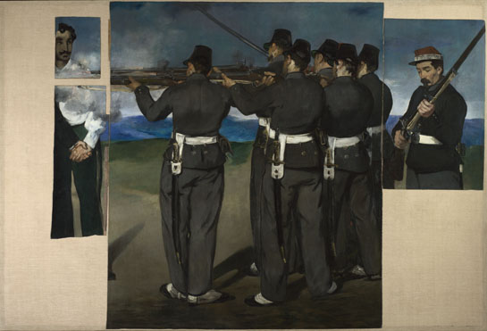
The Execution of Maximilian, Edouard Manet, image via national gallery
Edouard Manet made three large paintings in 1867-8 on The Execution of Maximilian, a subject torn from the day's headlines, but which, because they were critical of Napoleon III's policies, were never exhibited in France in his lifetime. [Maximilian was a Hapsburg who Napoleon had installed as a puppet emperor in Mexico. He was executed when the French army abandoned him and deposed Mexican president Benito Juarez regained power. A lithograph stone Manet was creating on the same subject was apparently confiscated, and only returned after the artist publicly protested.] Their composition all relate to Goya's Third of May, which Manet saw in 1865.
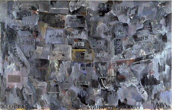
The second painting, above, was cut into pieces after Manet's death in 1883, and sold separately by his heirs. In the 1890s, Degas repurchased the fragments and remounted them on a single canvas the size of the original painting. The National Gallery in London acquired the piece[s] in 1918, and had them disassembled and framed separately until 1992, when they were once again reconstituted on a single canvas.
I'm kind of fascinated by all this history--the history of Manet's painting itself, that is, not just the charged history he depicted. I think I will look into it some more, probably starting with John Elderfield's catalogue for MoMA's 2006 exhibition which brought all of Manet's Execution of Maximilian works together for the first time.
I mention it now because the circumstances of Manet's painting are discussed several times in Jasper Johns Gray, the catalogue of that incredible show at the Met in 2008 [and at the Art Institute before that. Good morning, Chicago!]. Johns had been invited by the National Gallery to make a work "in dialogue" with a work in the collection, and he chose this collaged, fragmented Manet.
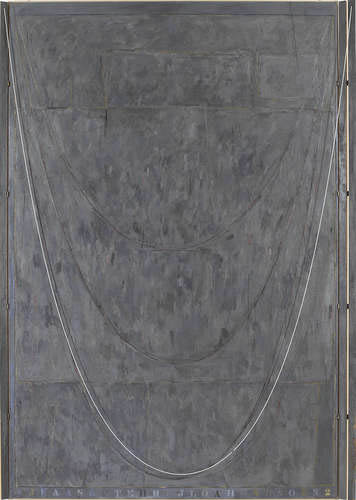
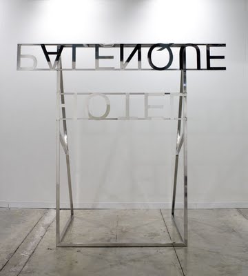
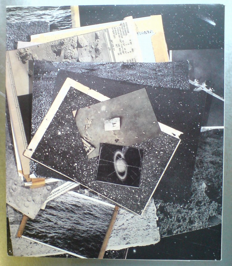
Near The Lagoon via metmuseum
Johns took the composition of the Manet fragments as a formal element in several of his Catenary works, including Near The Lagoon (2002-3). As RIchard Schiff put it,
The "picture," as a collage, is something of an "object." Each fragment maintains a strong material presence, for its external shape is unrelated to (alienated from) the pictorial composition within it. Johns treated the shapes themselves as comprising an abstract image, a composition. He mimicked their placement and proportions with his own collaged pieces, then rotated the entire configuration clockwise 90 degrees so that it assumed a vertical orientation.
Schiff goes on to discuss pictures' freedom from gravity as compared to a catenary's dependence on it.
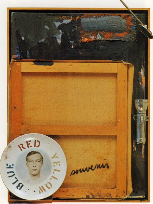
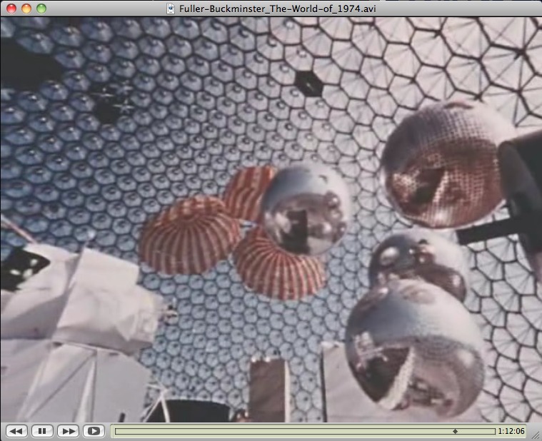
Johns' paintings are interesting for the directness of their engagement with other artists--not just Manet, but Degas, and even Goya. There are other spots in the Gray catalogue where Johns' Catenary paintings are considered to be in dialogue with Rauschenberg's 1955 combine painting Untitled, which has a parachute affixed to the surface. [Johns owned the work for years, having bought it out of Bob's 1963 Castelli show. Which, hmm, complicated? Also, I can't find an image of it online.]
I guess I'm most interested, though, in trying to get a better sense of how collage and this picture/object relationship play out across Johns' work, particularly with regard to canvas. There are examples reaching way back to the Short Circuit era where Johns affixes canvas on canvas, pictures [sic] on pictures [sic], or where he builds up a single work from multiple stretched canvases attached together.
[There are also many works where Johns uses hinges and doors in his work, both of which appear in Short Circuit. So far, I can't find anyone who has taken a look at these elements specifically in Johns' work. One thing I'm finding, though, is how this single, early combine--which has been largely unseen and unstudied since its creation, and never in the context of Johns' work--casts a different light on much of the established critical discussion. It's like a trigger to question the assumptions and the interpretations and inferences which have accreted over the decades.
If Short Circuit is an anomaly, a work wholly isolated from both Rauschenberg's and Johns' other works of the time and since, then it probably doesn't matter; it's just an art historical oddity. I'm kind of testing the hypothesis, though, that Short Circuit and the Flag Johns put in it, have a direct, possibly even foundational, relationship to the artists' work. If that's true, then it seems like it would ripple through their careers and upend much of the received understanding of these two artists. At least that's the theory.


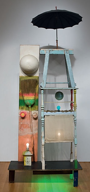 Christie's is selling The Tower, a 1957 combine by Robert Rauschenberg which Victor and Sally Ganz bought from Betty Parsons in 1976. The work is a double portrait assembled from found, painted objects and light bulbs, and was originally part of the set for a Paul Taylor Dance Company production based on the myth of Adonis. The
 Everyone [sic] probably has the story tucked away in their head that science fiction author Arthur C. Clarke was the


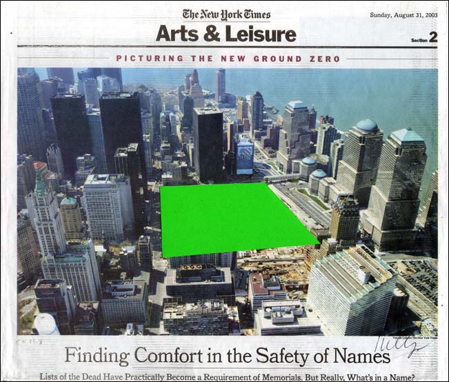
 Dear pwn0,


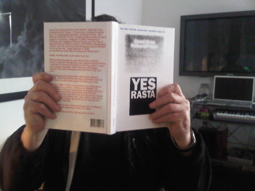
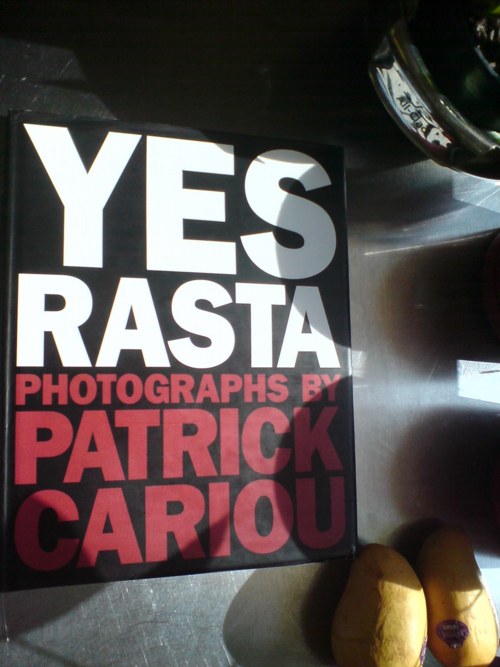

 So I'm slowly making my way through the