Star Wars: The Topher Grace Edit

As part of his study of the art of editing, and to do good for all mankind, the actor Topher Grace recut Star Wars episodes 1-3 into an 85-minute prequel which focuses on the transformation of Anakin into Darth Vader. Paul Sciretta attended a secretive screening of the Grace Edit, and prepared a detailed write-up for Slashfilm. Given what Grace had to work with, the remix sounds pretty good. But then there’s this:

Before the film screened a trailer for another film Topher Grace is remixing — Steven Spielberg’s Close Encounters of a Third Kind. I’m not sure that film needs a remix, or could even benefit from a remix, but am interested to see what the experiment will look like. After that, Grace hopes that other actors, editors and filmmakers will run with the ball, produce and showcase remixed films on a annual basis within this private community.
Jason Reitman has been directing live stage reads of classic film screenplays at LACMA, showing how a filmmaker can make different choices with an interesting cast can completely change a written screenplay. This seems like the next evolution of that, but also an exercise in storytelling with the use of crafty editing. I’m not sure I completely understand Grace’s motives in creating this film, but I enjoyed it regardless.

Close Encounters has already gone through several notable edits, as Spielberg tinkered with it. [The director himself considers the 2001 Collector’s Edition to be the definitive version.]
I’m kind of fascinated with this idea of using commercial films and their inputs as raw material, and especially with seeing people inside the Hollywood bubble, who are likely to be indulged rather than sued, softening up the crowd. I may get around to making my shot-for-shot remake of Gus Van Sant’s Gerry yet.
Topher Grace Edited The ‘Star Wars’ Prequels Into One 85-Minute Movie and We Saw It [slashfilm via umm,

Ladies Love The Mylar


This is fantastic, a 1955 industrial film by E.I. duPont deNemours, Inc. about their miraculous new plastic film, Mylar.
I mean, first off, it’s Mylar, so satelloons and Warhol balloons and everything else about the future.
mylar_dupont_tramp.jpg
But then there’s the film itself. The Mylar trampoline and trapeze–with acrobats. The circus-y knifethrower’s assistant in satin hotpants and beret, doing her ur-Vanna Whitest by turning the painted bullet point signs around.

Continue reading “Ladies Love The Mylar”

Henry Codax At Auction

henry_codax_dk_grey.jpg
Jacob Kassay can’t hide. One of the square monochromes he allegedly1 created allegedly2 with Olivier Mosset for last summer’s Henry Codax show at Carriage Trade is being flipped this week at Christie’s.
Fortunately [sic], it’s the awesomest, i.e., most Richterian-looking, one: Untitled (Dark Grey). I love the lot description too much not to quote it in full:

Henry Codax, a pseudonym created by New York-based artist Jacob Kassay and the Swiss conceptual artist Olivier Mosset, is referenced from a fictional character in the contemporary novel Reena Spaulings published in 2005. Co-authored by the collective Bernadette Corporation, an international conglomerate of artists, critics, dealers, and performers, Codax is described in the novel as a painter that [sic] “devotes his practice to a steady production of expensive, intimidating monochromes.” In the present example, Kassay’s iconic silvery paintings have been replaced by a sleek, anonymous grey surface. Stripping away any obvious authorship, Kassay and Mosset’s Henry Codax joins the company of fictional and psuedonymous artists including Marcel Duchamp’s Rrose Selavy and Richard Prince’s John Dogg.

With a beefy credit line like that, the one thing this work fails at is the stripping away of authorship. And with an estimate of just $10-15,000, Codax is still quite a ways away from expensive. But it’s early.
1 & 2 UPDATE: I can’t imagine that it was designed to, but this Codax Moment turns out to be a crisp snapshot of how rumor becomes reporting, which then calcifies into bankable fact.
Between the time I read Andrew Russeth’s story last year of rumors about Kassay’s and Mosset’s involvement in Henry Codax’s art and this auction, I’d already forgotten that neither artist nor any gallery involved with them or the show had ever commented on or claimed authorship. In fact, the artists’ reps said they knew nothing about it. Andrew even wrote of Kassay’s possible involvement, “Of course, that is all speculation: with no one stepping up to claim authorship of the works, it is impossible to say.”
And yet less than a year later, here is Christie’s, describing both artists’ participation as fact, and selling the painting on that basis. And I, too, basically said, “Sure, that’s how I remember it, I guess.” Except that Christie’s goes even further by linking this gray canvas directly to the shiny auction hotness of Kassay’s silvered paintings. Even though the only real similarity is the color range.
And though the format’s a bit different, if Codax’s work looks like anything, it’s Mosset’s conceptual monochromes. Of course, Mossets are not as frenzied a commodity as Kassays are, so that evidence/resonance, not furthering Christies’ purposes, goes unmentioned. And again, unclaimed and uncommented upon by the artist.
If there’s a question of whether the hyper-speculative Kassay auction market had the theoretical chops to handle the authorial ambiguity associated with Codax’s work, they were dispelled last week, when the painting failed to sell.
UPDATE 3: And failed to sell in a very fascinating way. Kassay insisted that Christie’s read a statement disassociating his name from Codax’s work, which restored the ambiguity surrounding the fictional painter’s factual progenitors to a nice sheen.
Mar 7, 2012, Lot 69: Henry Codax, Untitled (Dark Grey), 84x84in, est. $10-15,000 [christies]
Previously:on Jacob Kassay and collaboration
Related: Piper Marshall’s review of Henry Codax’s Carriage Trade show for Frieze [frieze]

Robert Montgomery: Spectacular Vernacular

robert_montgomery_trafalgar.jpg

I’ve got a few reservations, but I’m really quite smitten with London-based Scottish artist Robert Montgomery’s poetically critical billboard artworks.

The one above was unfurled at a Stop The War protest in Trafalgar Square last October. It reads:

WHEN WE ARE SLEEPING, AEROPLANES CARRY
MEMORIES OF THE HORRORS WE HAVE GIVEN
OUR SILENT CONSENT TO INTO THE NIGHT SKY
OF OUR CITIES, AND LEAVE THEM THERE, TO
GATHER LIKE CLOUDS AND CONDENSE INTO
OUR DREAMS BEFORE MORNING.

If the stark white-on-black text and the clouds and the protest didn’t already remind me of Felix Gonzalez-Torres, this particular photo, which ran on Purple’s blog, even has a bird in flight in the upper right corner.
Montgomery’s standard M.O. is to paste his billboards guerrilla-style, without permission, on top of existing advertisements. But for
an exhibition last month at KK Outlet, the gallery got authorization to install a series of three billboards with something of an Occupy theme. [Occupy had been occupying nearby at Shoreditch, and the artist had a collaborative project planned, but, as he told the Independent, “they got turfed out on 25 January so that didn’t happen.”]
robert_montgomery_dreamed_it.jpg
The deployment of poetry as protest takes its cue, Montgomery readily acknowledges, from the Situationists and Guy Debord, which, baby and bathwater and all, I will accept. My ambivalence, such as it is, really has more to do with Montgomery’s apparent activism on the fashionista front, his day jobs at Dazed and Confused, his carousing with Olivier Zahm, even the galleries that tout their Occupy shows one month, and their design studios working for LVMH the next.
But who’s to complain, seeing as how I followed the linkstream to his work while surfing for extraordinary calf leather shoes myself?
Let he who is without consumerist sin throw the first stone. Is being the global street fashion industrial complex’s social conscience is any more damning than being the art world’s anything?
Montgomery’s disarming, enticing, depressing, enlightening poems are still there, still catching advertising-conditioned passersby, only to release them with an unsettling thought in their heads.
Givin’ me 500 Errors right now, though: Robert Montgomery portfolio site [robertmontgomery.org]
It turned out this way cos you dreamed it this way [kkoutlet.com]
Robert Montgomery opening and installation shots via KK Outlet’s flickr [flickr]
The artist vandalising advertising with poetry [independent.co.uk]

Delirious Ningbo

Iwan_Baan_Wang-Shu-NingboMus.jpg
I’ve been busy as all get out, and only now do I realize I haven’t actually posted here for a few days. I blame Twitter.
Anyway, I’m not a real believer in the Pritzker Prize, except when it’s totally awesome, like right now, when they just announced Shanghai-based Wang Shu as the winner of the 2012 architecture award.
Since last night, when LA Times architecture critic Christopher Hawthorne tweeted the news, and promptly began livetweeting Wang’s lecture at UCLA, I’ve been trying to think where it was that I first discovered what’s probably the architect’s most significant work so far, the Ningbo History Museum.
Wang indeed seems like one of the smartest, most sensitive practitioners of architecture in China right now. I say seems, because I really don’t know what’s going on on the ground, below the Western starchitect marquee projects from CCTV to that awful opera house, to that other awful opera house to that Steven Holl Ground Zero-in-Beijing mess, to that one housing development where everyone was brought in to make a Shigeru Ban house on spec? I remember Alvaro Siza telling about designing a building in Guangzhou back in the day, and visiting it as it neared completion, only to find out when he returned for the ribboncutting that the developer client had hurriedly doubled it without telling him.
And then everything else seems like generic futureschlock, and a wholesale disregard for history that’d do the Cultural Revolution proud. And then there was Koolhaas’s presentation on the Pearl River Delta which envisioned all of Hong Kong as basically the future Lower East Side/Astor Place of a massive, 100-mile-wide New York City on the South China Sea.
So that’s my context, with nothing but raw spectacle with a modernist/internationalist veneer.
And then Wang’s Ningbo History Museum, which is surfaced with several million reused bricks, laid in patterns of the laborers’ devising, literally built from the rubble of the past it displaces–and repackages as museum content.
Wang turns out to have trained on construction and renovation teams, giving him an unusual sensitivity to material and process as they express themselves in form and space. I found myself nodding when Hawthorne compared him to Koolhaas, but then I thought, yeah, well, maybe the Koolhaas of Delirious New York, not CCTV and Put Me On The Cover Of Time Magazine. If anything, after this most recent OMA/AMO Venice show about the threat of History, Wang might be the anti-Koolhaas.
Anyway, I’m just rambling here without a plan, only because Wang Shu seems pretty amazing; his projects and proposals bode well, not just for China, but for the world with a modern China in it; and because I want to post one of Iwan Baan’s many illuminating photos of Wang’s built work. This one is the dramatic, hidden interior courtyard of the Ningbo Museum.
And thanks to Brian Sholis, who points to a nice collection of Wang Shu project images and information on the Pritzker Prize’s own media site [pritzkerprize.com]

‘Collectors Are My Power Base’

It’s well worth looking at the fuller context of that awesome Jeff Koons blurb about abstraction and luxury being the guard dogs of the upper class. [most recently tweeted by @berfrois] It comes from a late 1988 interview with Brooks Adams and Karen Marta, who were then working under the name Burke & Hare, which was published in Parkett 19:

I try to be effective as a leader. I’m very interested in leadership. I think that my own work has been helping to direct a dialogue, and it’s been participating in it for quite some time. I’m anteing up the pressure and trying to increase the stakes continually. I’ve found that collectors are my power base. You know, I’m able to work as a function of thier support of my work. I think that they have to have some interest in debasement and its political possibilities, even for their own use. I mean, it really has to be for their own use. I think that I give them a sense of freedom. I don’t think that I’m debasing them and not leaving them a place to go. I’m creating a whole new area for them once they’re feeling free. I see it as my job to keep the bourgeoisie out of equilibrium letting them form a new aristocracy.
I think it’s necessary that the work be bought, that I have the political power to operate. I enjoy the seduction of the sale. I enjoy the idea that my objectives are being met. I like the idea of the political power base of art, but it’s not just a money thing. It has to be a total coordination of everything, and money is a certain percent of it, maybe 20% of it. Look, abstraction and luxury are the guard dogs of the upper class. The upper class wants people to have ambition and gumption because, if you do, you will participate and you’ll move through society into a different class structure. But eventually, through the tools of abstraction and luxury, they will debase you, and they will get your chips away from you.

1988 was right after his Banality show, the Complete Spot Paintings of its day, which opened, outrageously, in three galleries at once in New York [Sonnabend], Berlin [Max Hetzler], and Chicago [Donald Young]. But it was before Made In Heaven, it was before he basically went bankrupt–and nearly took Deitch with him–making his balloon dogs and whatnot. It was a Koonsianism several orders of magnitude less intense that the Koonsianism we see today.
fgt_parkett_singapore_2010.jpg
Jeff and Felix sittin’ in a tree. P-A-R-K-E-T-T
His political interpretation also resonates with Felix Gonzalez-Torres’ discussion from 1994:

At this point I do not want to be outside the structure of power, I do not want to be the opposition, the alternative. Alternative to what? To power? No. I want to have power. It’s effective in terms of change. I want to be like a virus that belongs to the institution. All the ideological apparatuses are, in other words, replicating themselves, because that’s the way the culture works.

The Grid-Sphere Satellite And The Doomsday Stone

gy_gridsphere.jpg
Last year I picked up this extraordinary photograph, and then didn’t have immediate results researching it, so I put it away until now. Then, wow.
NASA launched the first Project Echo communications satelloon in 1960 to much fanfare, but the 100-foot diameter inflated Mylar sphere’s actual performance as a reflective signal relay fell short of predictions. Echo IA launched in 1960 and stayed aloft and visible from earth until 1966, but it partially deflated within a few weeks, which weakened its reflectivity. And the drag of such a large object decayed its orbital speed in ways that made it an unreliable relay.
Soon after Echo II’s launch in 1964 by NASA and Bell Labs, the US Air Force began pursuing a next-generation technology with one of its leading military contractors, Goodyear Aerospace: the grid sphere.
The grid sphere satellite was designed, near as I can tell, by Goodyear Aerospace engineer Howard Barrett. The 30-food diameter sphere of rigidized, laminated aluminum wire was embedded in a UV-sensitive plastic, which would photolyze, or disintegrate, after inflating in space, leaving the open grid sphere intact. The sphere was calculated to produce a backscatter reflection signal more than 5x as powerful as the Mylar solid sphere three times its diameter, and would be immune to its puncture, deflation, and solar radiation drag effects.
gy_gridsphere_cleve.jpg
image via National Museum of the US Air Force
I’ve found mention of both 2-foot and 14-foot diameter grid sphere models, and another image of this 30-foot test inflation. Good gravy, did they really just inflate it using that tiny, leaf blower thing? I think it goes without saying, but I’ll say it anyway, that when it launched in 1966 from Vandenburg AFB on an Atlas rocket, the grid sphere satellite became the second-most beautiful object ever put into space. Between July 13, 1966 and May 24, 1968, when Echo IA burned up in the atmosphere, there were two satelloons and this open grid sphere, all orbiting the earth together, in Minimalism’s awesomest group show.
Which would be cool enough on its own. And then Andy Beach sends me this.
ed_grothus_doomsday_mangan.jpg
It’s Nicholas Mangan’s 2008 photo of Ed Grothus’s Doomsday Stone. Grothus was the atomic technician-turned-anti-nuclear peace activist-and-retail-icon who ran The Black Hole, the legendary military/scientific surplus store in Los Alamos, New Mexico. Grothus died in 2009 without being able to realize his decades-in-the-making Doomsday Stones memorial, a set of massive black granite obelisks carved with warnings in 15 languages about the destructive power of nuclear weapons.
The obelisks I’d heard about, but not this insanely awesome 1-meter, 1.5-ton, black granite sphere, which rests alongside them in a shipping container in Grothus’s backyard. Mangan:

In late 2007 Ed went to the Art in Public Places board in Los Alamos to offer them his monuments for public display. They rejected them stating that ‘they couldn’t think of anywhere in Los Alamos where they would fit in’. They backed up their rejection by claiming that Ed was not an ‘Artist’ according to their set of definitions and requirements.

There is something about a prophet in his own country here. Grothus’s Doomsday Stones are art in every sense of the word, and his work is an artistic practice of the highest kind, and should be recognized as such.
demaria_sphere_kunstareal.jpg
Large Red Sphere, Walter de Maria, 2010, permanent installation at Kunstareal, Munich, image: e-flux
The self-proclaimed art world ignores Grothus at the peril of its own credibility and relevance. If it’s just a matter of the research not being done, let’s get on it. If we need to inflate the critical balloon to give Grothus’s reputation the structure it is obviously meant to have, let’s start blowing. From his quixotic minimalist megalomania in the desert [Heizer, Turrell, De Maria] to his performative taunts in high Catholic regalia [Klein], to his fantastical historical dumpsterdiving [Dion], Grothus is Los Alamos’ own Simon Rodia. It’s just a question of how long it’ll take everyone to realize it.

Make No Small Plans: Autoprogettazione 2.0

Look, I don’t care if you ARE Domus and you have Paola Antonelli herself as a judge; it is no small thing to call your design competition Autoprogettazione 2.0:

Autoprogettazione 2.0 is an invitation to consider the potential of a diffused, localised manufacturing network combined with the self-build ethos proposed by Mari for the future of furniture design. It is an open-ended process that seeks to leverage the combined intelligence and talent of the design community and collaborative, open-source networks. Selected projects will be exhibited by Domus in an exhibition exploring the future of manufacturing hosted in Palazzo Clerici, one of Milan’s most prestigious palazzi.
The submission deadline is 27 March 2012.

The categories are table, chair, lamp, and storage, and the designs will be judged in part by how awesomely they exploit the fancy CNC and 3-D printing setups in the FabLab.
Frankly, it sounds interesting and on the up and up, but all a bit out of my league. And anyway, I don’t quite get how these new, cutting edge technologies are really the optimum solution for the space’s adaptable, quick & dirty, utilitarian, functional program. Not to be a curmudgeon about it, but my gimmicky meter is redlining right now.
Call for ideas: Autoprogettazione 2.0 [domusweb.it via, uhm, I forget. remind me?]
4/14 UPDATE And we have some winners. Nice stuff. You quiero El Gringo. For all the fab FabLab capabilities, it looks like plywood is still the go-to material for knock-together utilitarian furniture. [via @cityofsound]

Infiltration & Replication, Untitled (for Parkett) – Part 2

felix_parkett_pdp.jpg
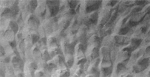
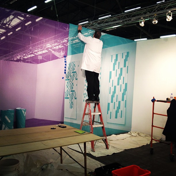
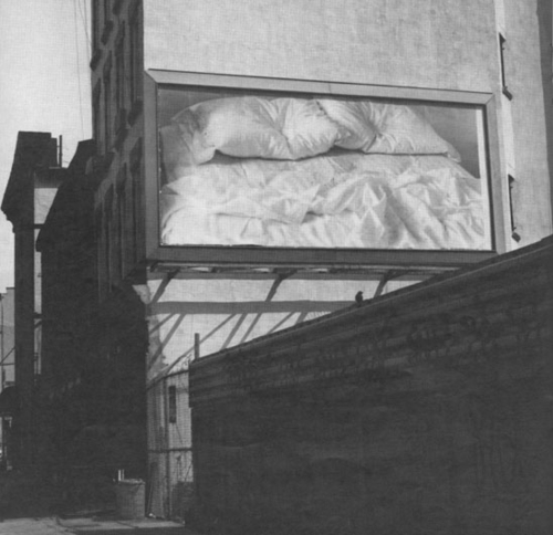
Untitled (for Parkett), 1994 image via phillips de pury
I’ve been wondering how Felix Gonzalez-Torres’ billboard edition, Untitled (for Parkett) was playing out in the real world. How many of the 84+15+? copies still existed? How many had been installed? Installed and destroyed? Have any been installed and preserved after its permanent site traded hands? Or are most/all of them like mine, still sitting in the box, rolled up, and “incomplete,” waiting? Waiting for what? The perfect wall in the house you’ll never leave? The market to rise too high to ignore?
fgt_parkett_christies.jpg
Untitled (for Parkett), 1994 image via christie’s
What I already knew: seven examples of Untitled (for Parkett) have come up for auction, the first in 2000, and at least three of them didn’t sell, including one example that was missing its certificate. The sales prices, $4,000, $10,000, £6,600, are pretty low in the Felixian scheme of things. More importantly, though, they’re low in relation to real estate, even to high-end wallcovering; if someone were to install the billboard, and then sold the space where it resided, the market value alone–or in combination with the reassurance that eh, whatever, there are a hundred more–is not enough to aid its preservation.
fgt_parkett_149books_1994.jpg
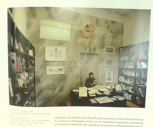
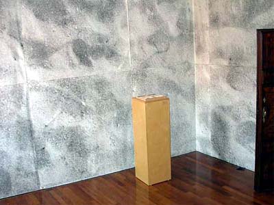
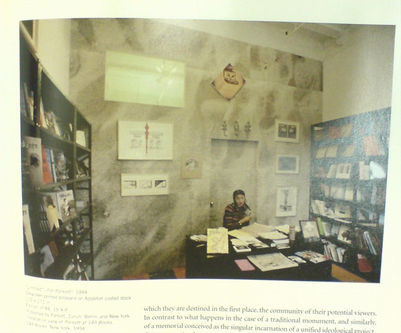
Installation shot, 149 Books, 1994, image via julie ault’s felix gonzalez-torres
Untitled (for Parkett), then is almost doomed by its own nature to exist in a state of fungible incompleteness, or worthless realization, or inevitable destruction. Any billboards that do get installed permanently somewhere will only exist until the paper fades, or the loft is sold, or the kitchen gets remodeled. And then it’ll be gone.
fgt_parkett_london_2001.jpg
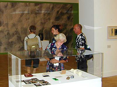
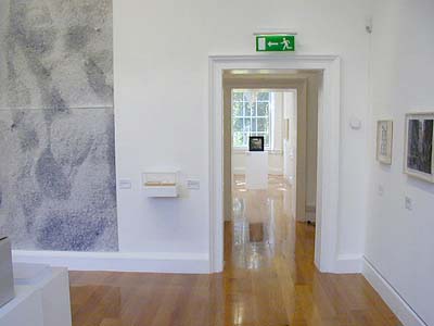
installation view, London, 2001, all images from here on via parkett
I contacted both the Felix Gonzalez-Torres Foundation and Parkett. Allison Hemler, the Foundation’s Director of Archives and Communications did some investigating, and found very little information indeed. There are almost no records of the status of the 84+15 editions, with the exception of #19, which was permanently installedat the Art Gallery of South Australia in Adelaide. [Interestingly, it’s not listed in the collection database, though another Felix piece is. It’s apparently been included in three exhibitions between 1998 and 2009. I’ve emailed the Gallery for any information or images, but haven’t heard back. UPDATE: And a spokesperson told me the work was not in the 2009 show, and is not installed, but is “in the Gallery’s works on paper archive.” So. So I guess there are no known permanent installations of the work right now, despite those being, of course, the only kind.]
fgt_parkett_moma_2001.jpg
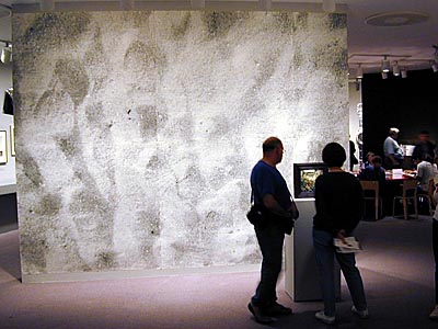
installation view, MoMA, 2001
The “several exhibition copies” mentioned in the catalogue raisonne turns out to be just four. Triumph Productions, the Manhattan outdoor advertising printer which created the original 8-panel silk screen is still going strong, but neither the Foundation nor the Estate before it has ever reprinted Untitled (for Parkett) for exhibition, and there are currently no practices in place for doing so.
fgt_parkett_dublin_2002.jpg
installation view, dublin, 2002
So unlike many, even most, of Gonzalez-Torres’ other works, which are endlessly reproducible and renewable, Untitled (for Parkett) has a finite and dwindling existence. Unless it is installed and preserved in those sites. Which is possible. A billboard preservation network could emerge. These mostly private spaces could become the sites of public pilgrimage. Assuming they were ever private to begin with. From a 1991 interview with Bob Nickas:

Someone’s agenda has been enacted to define “public” and “private.” We’re really talking about private property because there is no private space anymore. Our intimate desires, fantasies, and dreams are ruled and intercepted by the public sphere.

fgt_parkett_venice_2003.jpg
installation view, venice, 2003
Though it has apparently never been written about specifically, Untitled (for Parkett) is mostly seen in reproduction, and in exhibitions. The Foundation’s exhibition history lists 14 shows, including eight exhibitions where it’s not clear if the billboard was shown, or just illustrated: three were at commercial galleries, one was organized by the Sammlung Goetz, and two were at museums. In addition to the three shows in Adelaide which included a single print, the billboard was installed in six exhibitions. I’d add a seventh, the 1997 Whitney Biennial; I remember it installed in the lobby, with the curtain of light strings, Untitled (America), hanging in front of it.
fgt_parkett_singapore_2010.jpg
installation view, 2010, singapore
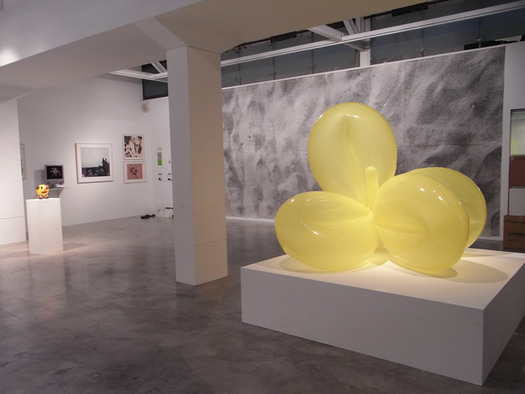
But three of the six shows, including the debut exhibition in 1994, one at MoMA in 2001, and another in 2010 at Singapore’s Tyler Print Institute, are Parkett collection shows. Parkett’s ever-growing collection of artist editions is basically on constant world tour. It’s traveled to at least seven additional venues. Their installation images are interlaced throughout this post in reverse chronological order. They show that billboard at every venue. And why not? Besides the Jeff Koons balloon toy, it’s one of their most ambitious, awesome editions.
Here’s the complete [I think] list: 149 Books, New York (1994); Louisiana Museum, Denmark (1996); MAK Center, Los Angeles (1997); London (2001); MoMA, NY (2001); Dublin (2002); Venice (2003); Kanazawa, Japan (2009); Singapore (2010); Seoul (2011). Ten installations, almost every one with different dimensions and site specific quirks, which should make reinstalling a single exhibition print impossible [as well as unauthorized].
So is Parkett churning through actual numbered editions? The A.P.’s? An undeclared stack of exhibition copies? They haven’t gotten back to me, so I don’t know. But that’s 15 installations total.
Felix did discuss the edition, , or an early conception of it, anyway, with Joseph Kosuth in 1993:

JK: This goes from the earlier idea of the collector as someone who buys knickknacks to the idea of the collector as patron. It’s a certain kind of leap that has more tod o with intellectual engagement and less to do with reducing art to nice little things in the apartment.
FGT: You know, someone once asked me to make an edition of prints. But I thought, why make an edition, why make a print? The world doesn’t need any more prints by artists. So I said no. But then I thought about it, and I said, well, why don’t we push the limits and do a billboard? The conditions are such that you can only show it in public. You have to show it in public.

Obviously, he decided to push the limit in a different direction. When Kosuth lauded his embrace and tweak of a “traditional form” and context, Gonzalez-Torres responded:

Well, my first reaction was a very predictable Leftist reaction which more and more I am questioning and finding very static and self-defeating. At this point I do not want to be outside the structure of power, I do not want to be the opposition, the alternative. Alternative to what? To power? No. I want to have power. It’s effective in terms of change. I want to be like a virus that belongs to the institution. All the ideological apparatuses are, in other words, replicating themselves, because that’s the way the culture works. So if I function as a virus, an imposter, an infiltrator, I will always replicate myself together with those institutions. And I think that maybe I’m embracing those institutions which before I would have rejected. Money and capitalism are powers that are here to stay, at least for the moment. It’s within those structures that change can and will take place. My embrace is a strategy related to my initial rejection.

I can’t tell if the market-based capitalist system is failing to realize Untitled (for Parkett), or succeeding in preserving it, in bulk, unrealized and incomplete, for the future–or both. But it is certain that Felix has successfully infiltrated Parkett, which is busy replicating his work together with their institution.

You Don’t Complete Me, Or Felix Gonzalez-Torres’ Untitled (for Parkett), Part 1

felix_untitled_504w44.jpg
this one. Untitled, 1991, Site #21: 504 W 44th St.
One of the formative artworks in my life is set to re-appear this month. I saw one of the giant black & white billboards of the Felix Gonzalez-Torres’ empty bed in the city in 1992 before I realized it was part of MoMA’s Projects series. Billboards were supposed to promote something, to give you information, I thought, not to leave you wondering. Wondering what the hell is being sold here, what something as private and messy as a bed is doing on a billboard.
When I next walked into MoMA, though, and saw the same billboard, and read curator Anne Umland’s brochure for the show, I realized my encounter was exactly the kind of “illogical meeting” Felix had intended:

Rather than clipping something from the mass media and repositioning it within the clean smooth space of a work of art, he makes the photograph of the bed the informational fragment, and collages it into the broad and varied pattern of the contemporary urban landscape.
The artist has explained that by “taking a little bit of information and displaying this information in absolutely ironic and illogical meetings,” he hopes to reveal the real meaning of issues. The juxtaposition of an image that we are inclined to read as private and a space usually conceived of as public is what Gonzalez-Torres would describe as an “illogical meeting.” When we call something illogical, we are essentially saying that it runs counter to our expectations.

Umland also wrote, “Much of Gonzalez-Torres’ art questions what we mean when we describe something as private or as public.”
This public/private aspect of billboards kicked off a 1993 discussion between Gonzalez-Torres and Joseph Kosuth, both of whom, it turned out, had created billboards that, as Felix put it, “can only be shown in public. They’re privately owned but always publicly shown.”

[Kosuth:] …there were very few people who wanted to spend their money without getting some ‘goods’, you know.
FGT: Well, you opened the way for other artists. People can buy these billboards, but they have to put them in public–they have to rent a public space. It’s like buying edition prints, except that you have to put them up on billboards. It’s also doing a service to the collectors because they don’t have to put the works into storage!

Never mind that fabrication and the monthly cost of renting adspace far outstrips any storage cost. I think Felix’s point with his billboards was that he was fine delivering collectors the “goods”; but to see the goods, they have to print them up and install them in public.
All except one.
felix_parkett_pdp.jpg
For every Felix billboard, the owner gets an image, a certificate, and the right to fabricate and install it in public any time. But for one billboard, Untitled (for Parkett) [above], Felix created his own “illogical meeting,” a work which thwarts the very expectations he set up for the rest of his work.
Felix created Untitled (for Parkett), in 1994 for, as the parenthetical says, Parkett’s editions series. The abstraction-like image is a black & white photo of sand churned up by footprints. It was published in an “edition of 84, 15 a.p., several exhibition copies,” and produced the same way as his other billboards are [or were, anyway], as giant silk screened sheets of Appleton coated paper that get tiled and pasted up like wallpaper.
But when they do, that’s it. They’re permanent, can’t be moved. Can’t be taken down and reinstalled. As the lot description in the Phillips catalogue last month that got me thinking about this in the first place put it,

This piece is not complete until installed. The installation site will be its permanent location until the piece is destroyed.

Now, this is not news to me. As it turns out, I have this edition. I have several, in fact, which I bought hoarded precisely because I knew that they were one-time deals, and that, like most New Yorkers, I was not expecting to be in my apartment forever. I figured I’d move someday, maybe even into a place where I could fit a 3×7-meter billboard. Then who knows, maybe I’d move again, or at least rehang the place, and so I’d need another, and so on, and so on…
But the Phillips language struck a chord in a new way. In 2007, Christie’s explained the piece a little harshly: “This work should be displayed in only one location; removal will destroy the piece.” But that’s easy, just never remove it. And anyway, that’s after it’s installed, in some distant unimaginable future. Phillips, though, pointed out the weird anomaly of Untitled (for Parkett), which is that the work, as it exists, as it’s being sold, as I have it, in fact, is incomplete.
Suddenly, I’m not a steward preserving the work; I’m an obstacle impeding its realization. And so is everyone else who bought the work, only to keep it rolled up. The people who hold it in stasis, retarding its potential, and keeping it viable and exchangeable in the marketplace.
As this description I missed in 2010 shows, Phillips’s language of incompleteness seems to come from Parkett themselves:

According to the publisher, Untitled (For Parkett) employs the materials of industrial advertising which are not meant to last indefinately [sic]. The Billboard is not water-proof. Marks and imperfections in the printing are a natural result of the printing process and are part of the image. Bubbles or wrinkles remaining in the paper after installation are an expected and acceptable part of the finished work. The billboard is designed to be installed either indoors or outdoors. Like most of the artist’s works installation is an integral conceptual part of the work, and is considered incomplete until then.

Not only are you depriving the work of its destiny by not installing it, it’s not going to last anyway.
And that auction catalogue blurb turns out to be just about the longest thing anyone’s ever published on Untitled (for Parkett) before. So I started poking around a bit. [to be continued]

Verner Panton X IKEA Chairs: Almost A Set

panton_vilbert_ragoarts.jpg
image: ragoarts
A couple–wow, almost three–years ago, when I was deep in my IKEA colabo phase, I posted a roundup of explanations for why Verner Panton’s melamine-on-MDF Vilbert chair didn’t sell that well when Ikea launched it in 1993-4.
Now, on the occasion of Rago’s upcoming auction of five Vilbert chairs, with an estimate of $3-4,000, another version of the chair’s origins has come to my attention: that the Vilbert was a limited edition, a low-production collaboration with a high-profile designer, dreamed up by Ingvar Kamprad as a brand enhancer, like Karl Lagerfeld’s H&M collection. In this scenario, selling only “about 3,000” Vilbert chairs worldwide was not a failure, but part of the plan.
panton_vilbert_quittenbaum.jpg
In any case, despite a lot of onesies selling–or not–for far less, I will guess that Rago hopes its set of five is worth twice the EUR 1600 Quittenbaum got for six Vilbert chairs in 2006. Perhaps someone with a chairless Guyton/Walker breakfast nook will prove them right.
UPDATE: the chairs sold for $2,875.