First, Happy Birthday, Mr. Richter.
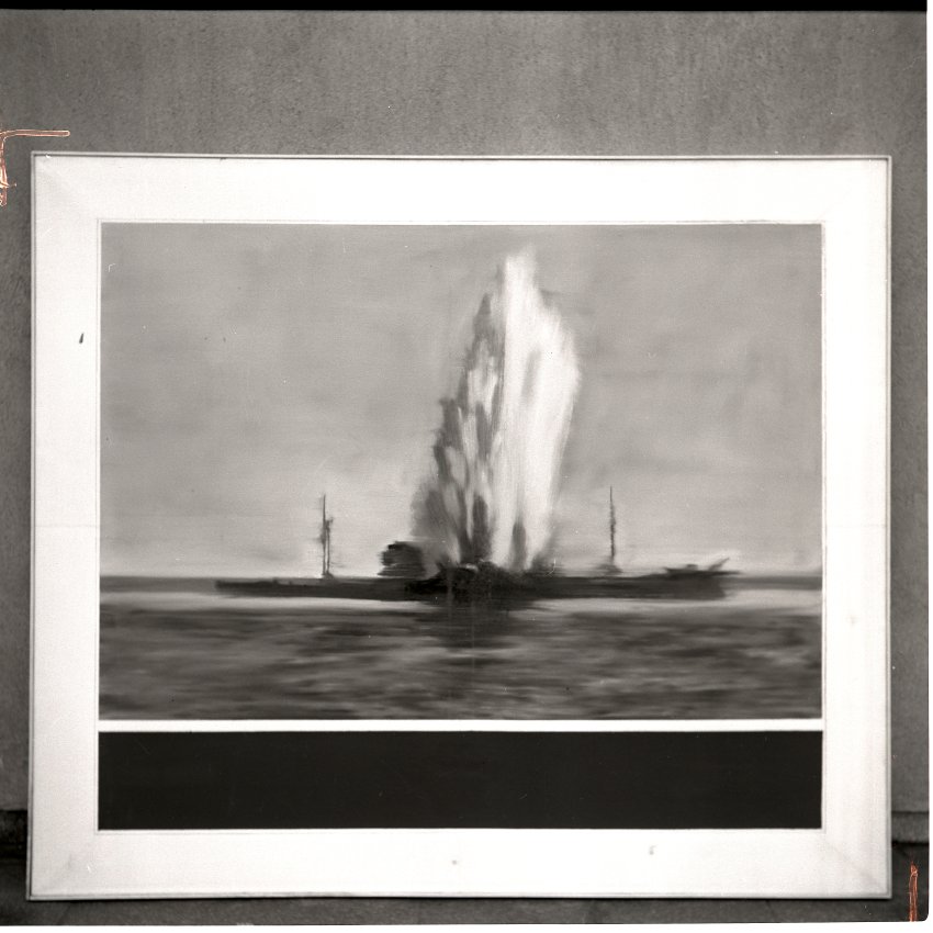
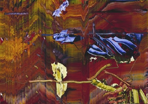
Destroyed 1964 Richter painting, image from Gerhard Richter Archkiv via Spiegel
I don’t know if Joerg knew at the time he first tweeted about it–he is plugged in and German, so who knows?–but I certainly had no idea when I picked up on the topic of Gerhard Richter “destroying” paintings by painting over them. But it turns out that the 74 paintings listed as “[DESTROYED]” on Richter’s website are only a fraction, barely half, of the paintings he’s actually destroyed so far. In an interview with Ulrike Knöfel for Spiegel, Richter talks about the 60 or so photo-based paintings he destroyed in the 1960s during a very self-critical period of his career. Not to worry, though, because, being Gerhard Richter, he photographed them first
These photos, most of which were never published, are now either in the Gerhard Richter Archive in the eastern German city of Dresden, where the painter was born, or in a box in his studio in the western city of Cologne. They are testaments to his refusal to compromise.
Mhmm. Though the ambivalence/regret/equivocation Richter expresses in the interview reveal that a refusal to compromise is not automatically a win. Couldn’t he have just put them away and not looked at them for a while instead?
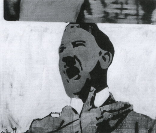
None were apparently included in Richter’s first catalogue raisonne, the source for his website’s “[DESTROYED]” list. And many appear to date from the earliest phase of his recognized work, 1962-4. Oh but wait, his much-discussed 1962 Hitler IS online, described as “believed to have been destroyed.” Hitler, 1962, image via gerhard-richter.com
That seems like a new category, loaded with ambiguity. I like it much better than “[DESTROYED]” or even “Richter painted over this work in ___. The painting is now entitled ____.” Which, it turns out, has another example:
Today, Richter says he’s surprised at how many works he continued to destroy after the 1960s. Perhaps he will return to one motif or another, he adds, noting that “otherwise it would be a shame.” One painting, in particular, comes to mind. It was painted in 1990 and shows two young people standing in front of Madrid’s Museo del Prado, Spain’s national art museum. However, two years later, he painted over this work, turning “Prado, Madrid” into “Abstract Painting, 1992.”
Which, yeah, there is no Prado, Madrid in the CR, and there are at least 279 Abstraktes Bild done in 1992, so, this’ll take a bit of digging. I’ll update the post when/if I find it. [I’ll have to do an update post anyway, because I’ve already found at least two other overpainted paintings.]
This painting over thing is one thing. The other, which I’m kind of fascinated by now, is the relationship between painting and photography as it plays out in these destroyed paintings. Which, of course, still exist as the artist’s photographs. It’s like Barthes’ Camera Lucida; they’re gone, but not. I can’t tell if this is Spiegel’s interpretation or reportage:
Still, since his urge to destroy some of his paintings also made him feel uneasy, he photographed them before doing so.
But someone has to have already looked at this backup, insurance, documentary, archival, post-mortem, forensic, ghost aspect of the way these two mediums intertwine. Right? Photo of destroyed Gerhard Richter painting, 1960s, by Gerhard Richter, image: Gerhard Richter Archiv Dresden via Spiegel
Meanwhile, the obvious thing–and isn’t that what I’m here to point out?–is to recreate these destroyed Richters. Whether you paint the archival photo, crop marks and background and all, in a meta-Richterian gesture, or just try your darnedest to bring their destroyed, painted subjects back to life, I’ll have to figure out. But paintings based on a painter’s photographs of paintings based on photographs? What’s not to love?
It’d be trivial to the point of meaninglessness to just print the Spiegel jpgs on canvas, or to order them up from Chinese paint mills. But I’d be interested to see just how much more meaning could be gleaned by painstakingly copying them by hand. Even if the answer is very little, that’s still an important datapoint. His Own Harshest Critic | A New Look at Works Destroyed by Gerhard Richter [spiegel.de via bigthink]
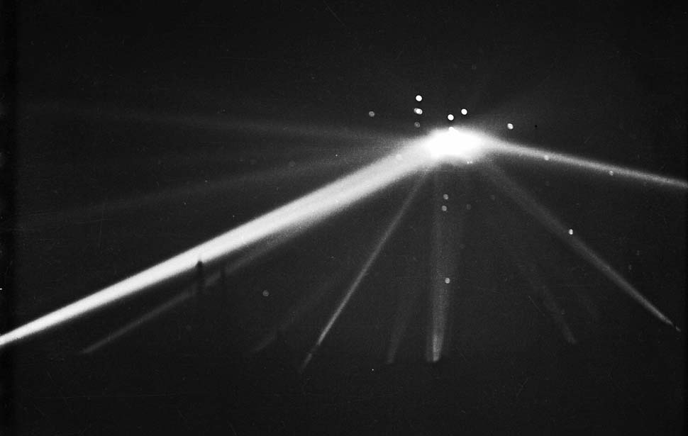
image of the front page of the Feb. 26, 1942 LA Times, via framework.latimes.com
Back in 2007, this blog experienced a notable conceptual shift, when I found myself writing about things, works of art, I guess, that I wanted to exist, not those that actually existed.
An early example: a historically accurate re-enactment of the “wigwam” of searchlights photographed by the LA Times on the night of Feb. 23, 1942, the infamously hapless false alarm/gun battle/freakout known as the Battle of Los Angeles.
Researching along those searchlight lines led to the discovery of other awesome but implausible subjects for artistic reincarnation, such as the fantastical “dazzle lights” camo apparatus of legendary British camo officer/magician/bullshitter Jasper Maskelyne. And of course, Frosty Myers’ great arc light pyramids, first assembled in the four corners of Tompkins Square Park.
Yes, well, I guess we can move the Wigwam from the list of things I have to re-create someday to the list of things that have, in some way, at least, been re-created.
Last year, some guys from SyFy replicated the searchlight Wigwam in the desert for a bogus investigative show called, “Fact or Faked: Paranormal Files.” They were apparently trying to reproduce the flying saucer-shaped object caught in the apex of the beams in LA Times’ photo, which has apparently been cited as evidence of a military UFO coverup. Really. The Times’ TV critic Ed Stockly had all the details. Including the show’s complete lack of interest in checking the actual photo, or the negative, both of which are in the Times Archive at UCLA. And which show clear evidence of being altered. The UFO is Whiteout. The beams are painted, the skyline is inked. The whole thing was retouched to make it reproducible for the printing presses of the day.
In the Times’ LA history blog, Larry Harnisch gets all Errol Morris on that photo’s ass, posting seven long times about it. [Take it from one who’s learned the hard way, Larry, strings of minutiae-filled posts are not enough to make a blogger Errol Morris.]
Meanwhile, Scott Harrison’s examination of the Battle of LA and the negative issue at the LAT’s photoblog, Framework is plenty for me. Plus it has better images. The original negative, above, is quite beautiful as is, and it is now on my list of negatives to visit in Los Angeles. And I think I will add printing it old school to my list of projects. Original post mentioning the wigwam of lights
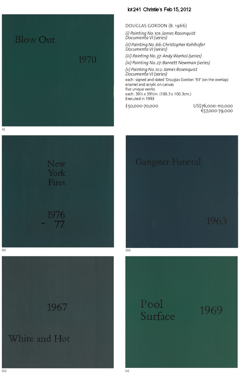
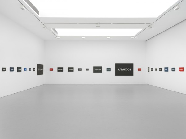
Got posts stacked up like flights at LaGuardia, but I can’t get past these paintings by Douglas Gordon [right?] coming up at Christie’s London sale next week.
They’re 1-m square monochromes of acrylic housepaint with a text and date that’s a reference to a work by another artist. Gordon did these particular paintings around 1993, the same time he was working on his awesome, breakthrough film installation, 24 Hour Psycho. Which, in retrospect, makes it a tough year for a Douglas painting to get much attention. But yet they kind of nagged at me.
And then as I found one of the only discussions of Gordon’s paintings, in a 1993 interview with Thomas Lawson for Frieze, it sounded slightly familiar. But of course, I’d not noticed it much, if at all, at the time. Here’s part of that discussion, which segues so nicely from the one project to the other:
DG: The idea is that these paintings, the way I imagine them, do have a ‘transcendental’ aspect, although I hate that word. Part of the background here is the whole range of ‘endgame’ painting theories, you know, like the Peter Halley/Sigmar Polke/Gerhard Richter positions, and also the Last Exit stuff that you wrote. These ‘thinking’ painters were important to me, partly because of the whole fuss about ‘Glasgow Painting’ in the 80s.
The paintings that you have seen have come about as a result of the attitudes and strategies that I had developed through working outside of a studio; you become steeped in a research, which isn’t based on physical materials.
I was in a show in New York a while ago, and it turned out that the space was the old Betty Parsons Gallery. So I did some research on the place and started making lists of the paintings that had hung on those walls during the 40s and 50s. I ended up making a series of paintings that related directly to these works by people like Ad Reinhardt and Ellsworth Kelly. But although this series came out of a response to a situation, the thing about painting in general is that it satisfies a desire to make work free of a specific context.
TL: I think I’m hearing you admit that you actually make paintings on spec, just like a studio painter would?
DG: Yes. You’ve found me out. But my premise is to take the field of painting as a context in itself – you know, you say the word ‘painting’ and hundreds of expectations or prejudices come to mind. It’s obvious that my interest in painting is not so much in the practical, physical side, as in the idea of it.
I’m interested in the fine line between my intentions and the perceptions of others; that moment when someone encounters something and realises that there is more to it than meets the eye. I’m interested in the moment when someone opens the letter, recognises that it is for them, and starts to wonder why they got it, and what it really means. The same can happen with these paintings: someone sees the piece that uses the title of a Baldessari book and thinks, well, yes Brutus did kill Caesar. But in 1976? And isn’t this the title of another artwork, by someone else, somewhere else, and so on? I would say that all of the work plays with recognition and expectation in this way.
TL: Is there a particular pay-off with the paintings if you crack the code, or is it enough to know generally that these texts refer to works by other artists not on show here? Is it enough to know that there is a clue, without needing to know what the clue is?
DG: I don’t think there’s a particular pay-off. People who don’t recognize the text as a title to a specific piece of art can still have a certain intrigue to play with. If you didn’t know that Slow Motion 1969 refers to a piece by Robert Morris, I think you can still find something that will resonate. Maybe people who aren’t trapped in an art history background can find more.
TL: Do you fetishise your material? Are they well made stretchers, well prepared linen grounds, and all that?
DG: I don’t make a big deal of production values. The paintings simply have to be clean and pragmatic so that there is nothing about them to distract from the ideas they contain. I use available materials and choose colour from a standard household paint chart. I just want the paintings to appear as neutral grounds, no drips, no spots.
TL: I don’t know. By the time you get done they’ll be agitated with blobs and cross hatches, and you’ll be talking up a storm about expressivity.
DG: Probably. Working with shaped canvases, and everything. The paintings are an important project for me, alongside the other things. I’m interested in the ‘big’ media. All those traditions with too much baggage. For instance, I’ve been interested in film for a long time. I always wanted to make an epic as my first film – a real movie, not Super 8 or anything. I thought it might be interesting to take an existing film and re-make it. I wanted a picture with a story which was very familiar to a broad audience; so I started to work with Psycho. What I decided to do was alter the narrative of the original by making it 24 hours long, and without sound.
R-M-O Oh my heck! N-E-Y
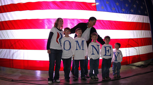
This awesomely remixed version of this AP photo [by Gerald Herbert, below] from a campaign event in Elko, Nevada last Friday makes me marvel at the many lost opportunities for Sforzian hacks in the past.
I mean, why should wire service photographers have all the fun? But then I read all the way through the Democratic Underground forum thread where the Photoshopped version first appeared, and where dozens of armchair politicos oneupped each other with their media acumen:
Mark D.
63. Romney is an anagram for R Money
As this photo made me realize that.
Tweet what I’d said-go viral with it.
JI7
43. a quick or even long Glance still looks like “money”
if i was adivising them and saw this i would have recommended against it.
illinoismike
59. Something else
What bothers me more about this picture is that all the participants are male and white. That doesn’t seem to bother Mitt at all!
silverweb
3. Is that real?
Ohhhh, please-please-please-please let it be real so we can bury him with it!!!
MrScorpio
74. R. Money, Mitt’s new rap name. nt
SemperEadem
19. :: very slow golf clap ::
you couldn’t make this shit up.
“r” “money” our money… yep.. can’t make this shit up.
[barrage of slow clap animated gifs deleted]
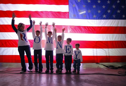
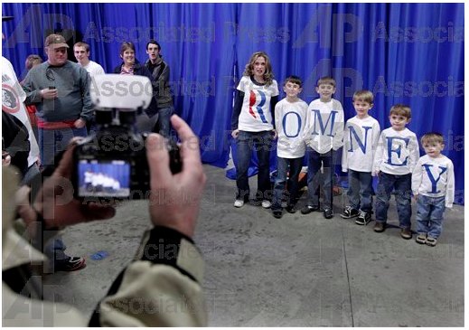
And then while trying to find the source info for the original photo, I came across Bryan Snyder’s shot for Reuters of the Fisher family waiting to meet The Man behind the curtain, and doing the wave or something.
And then there was another shot, by another AP photographer, Ted Warren, of the Fishers meeting Romney again. Or for the first time. This is from the front of the flag, where the Fishers had been waiting from the get go–and photographing themselves. And being photographed by Warren in turn.
And so somewhere in between these photos, after the event, Mitt put his bomber jacket on, the Fishers got invited backstage, and they got a private [sic] photo-op.
Y? Because we like you!
And then Snyder–and Proud Mom–both snapped a photo of Romney autographing the shirt of the most disinterested little Fisher of them all. Actually, look at “E”; his shirt’s signed, too.
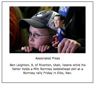
And then there’s the kid whose dad–given the BYU hat, I’m gonna guess he’s a supporter–drove two hours to the event with a Romney bobblehead [above]. And the shot of Mitt reflected in a thickset supporter’s aviator glasses, and the soft focus cowboy hats in the foreground signalling The West.
via apimages.com
And I realized all these images exist on a hacking continuum between real and faked, homebrewed and happenstance. Whether it’s the inkjetting family, the pack of weary photojournalists, the local handlers, or the messageboard trolls, people are just trying to do the best with what they’re given. Given all the stars that have to align, and all the fingers in the pie, I guess we should be lucky to get any shots at all. Pic of the moment [democraticunderground.com via @akaczynski]
Everything else from AP & Reuters via Yahoo News.
I think part of my fascination with Google is the way it is reprocessing the way we see the world. It has its own way of looking, and that, it turns out, is what we see. Timo Arnall‘s Robot Readable World goes wide and deep, documenting the “robot eye aesthetic” through an awesome collection of “found machine-vision footage.” Robot Readable World, (5’09”) by Timo Arnall [vimeo via city of sound]
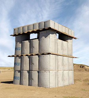
Maybe it’s because I was reading about Jean-Pierre Reynaud and Superstudio’s Quaderna furniture last night, but for the first time, I suddenly noticed the incredible, grid-like mesh gabion fortification and construction system that defines the forward operating bases in Afghanistan: HESCO.
The HESCO Bastion Concertainer, obviously just called Hesco, is a galvanized steel mesh cage lined with non-woven polypropylene geotextile, which can be deployed with local fill ten time more quickly than sandbags, and with 90% less manpower.
It’s light enough to deploy by hand. It folds flat for easy transport. A shipping containerized system called RAID [Rapid In-Theatre Deployment] can be rolled out 1000 feet at a time from the back of a moving truck.
It protects against bullets, car bombs, and artillery fire, and it’s structural, so you can build with it. It’s water- and erosion-resistant, so you can do flood control with it. It’s ubiquitous in Afghanistan to the point of invisibility.
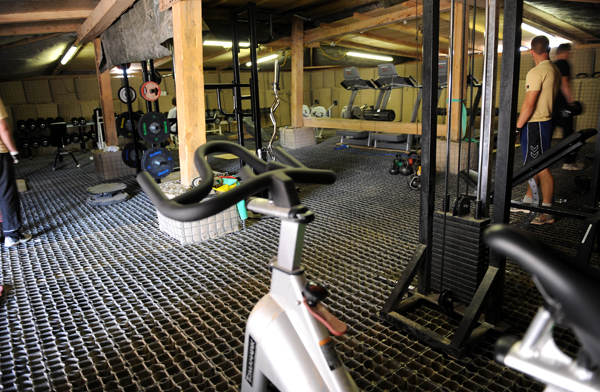
Which is where it starts getting really interesting. Here is a gym, constructed with Hesco pilings and a flattened out Hesco floor, built at a Hesco’d-out Australian forward gunnery base in Helmand last February.
When Hesco meets the ingenuity that produces awesome, homebrewed field furniture knocked together from shipping pallets [above, below]
You end up with an entire Hesco living room set, including sofas, a TV stand and side table,
and club chairs and even a garbage can–all apparently noteworthy enough for a visiting commander to photograph and explain in 2010.
It’s like the Amerafghan love child of Staff Sergeant Frank Gehry. Admit it, wouldn’t you have paid more attention to the war if you’d known the troops were hacking such awesome design all this time? Please send more pics! HESCO Bastions [hesco.com] Field Furniture, from the Iraq & Afhanistan theaters [pallet images via militaryphotos.net] 12 February 2010 | Commander Joint Task Force visits Aussie gunners in Helmand Province Afghanistan [defence.gov.au]
OK, this sanding thing is completely new now.
Before, when I was using the brush, I’d be sanding down drips and bulges around the edges of the panels, and hoping to even out ridges in the brush strokes.
Now that I’ve sanded my first coat of enamel laid down with the roller, though, it feels totally different. The amount of paint that goes on seems like much less–there are certainly no excess drips over the edges. And the slightly eggshell-y, all-over surface levels out a bit, but not completely when it’s dry.
But the big difference are these tiny bubbles, which end up sanding right out, giving the whole surface a pretty smooth touch.
It’d be easier if there were no bubbles, of course. I’d love to paint a coat, have it dry, and see that it’s finally the perfect, featureless, skin-like smoothness I want. But the bubbles showed up again in the new coat [above]. Maybe I’m shaking the paint too much, or not letting it sit long enough, when I open it? But such bubbles couldn’t transfer from the can to the sponge. I suspect they’re coming from the roller, which is probably not saturated enough.
Anyway, it’s working. Which is nice.
This is utterly fantastic. It’s Quebecois pianist/composer Marc-André Hamelin’s 1991-4 work for two player pianos, “Circus Galop,” and because it occasionally hits all 12 staves or 21 notes simultaneously, it is unplayable by humans.
The boingboing headline is a bit misleading, because though it is being used by the restorer who shot this YouTube video to stress test a player piano, that was not, I think, the composer’s intentions for the piece.
Hamelin wrote two other pieces for player piano; all three are included on Player Piano, Vol. 6: Original Compositions in the Tradition of Nancarrow, a 2008 recording released by the obvious leader in documenting the player piano repertoire, the German label MDG.
Nancarrow turns out to be Conlon Nancarrow, an American-Mexican composer who pioneered the avant-garde player piano genre. Having moved to Mexico City after WWII to avoid anti-Communist harrassment in the US, Nancarrow had difficulty finding performers willing or able to tackle his complex compositions. He worked largely in obscurity until the late 1970s, and in 1982, he was the first composer to receive a MacArthur Fellowship.
Eastern German player piano composer Wolfgang Heisig and Jürgen Hocker have been working to publish and perform Nancarrow’s works. By threading divergent tempi through his pieces, Nancarrow definitely cleared the unplayability bar, though people have successfully made arrangements of his pieces for live performance by groups of musicians.
So in one sense, unplayable-for-humans is just a side effect, a negative characteristic of composed-for-player-piano music that explores and exploits the mechanistic, analogue medium itself. As Hocker wrote on the YouTube video description of Igor Stravinsky’s “Etude for Pianola,”
Original Compositions for Player Piano between 1915 and 1930. In this period composers discovered the superhuman possibilities of the Player Piano. Strawinsky, Hindemith, Toch, Antheil, Münch, Haass and Casella used this new medium, decades before Conlon Nancarrow discovered it again for his ingenious Studies for Player Piano.
Though it’s the impossible trance-like fugue passages that blow your mind, Hamelin’s piece also evokes the ragtime history of player piano music. Nancarrow’s “Study No. 11” above, meanwhile, is clearly in the Schoenbergian, avant-garde tradition.
But it was watching that first stress test video, and realizing it’s not technically a stress test, that got me thinking: what would an actual stress-test composition sound like? Are there such things? Compositions driven by functionality, or at least something other than aesthetic or listener experience?
It occurred to me when I kept hearing Hamelin’s little ragtime melody over and over, and realized that the keys on that nickelodeon were not, in fact, being tested equally. But maybe they’re being tested based on the algorithmically calculated frequency of their use? Would a stress test composition necessarily just bang on all the keys a thousand times, or run scales up and down, or would it proceed in some other optimized fashion? I’m sure these are all parameters that could be fed into a composing program. Not only would the output be unplayable by humans, it’d be uncomposable by them as well. Circus Galop [wikipedia] the 22-page score for Hamelin’s “Circus Galop” is available at Sorabji [sorabji-archive.co.uk] Juergen Hocker’s YouTube channel is full of excellent player piano performances by Nancarrow and others [youtube]
I don’t think Hirst’s assistants would agree that spots aren’t about time, but Karen Rosenberg’s line in her On Kawara review is nice:
Speaking broadly, you could say that one is about time and the other is about money. (Though, as the adage goes, the two aren’t all that different.)
Also, I just wanted to post something short for a change.
I also disagree with her kicker, or feel the opposite, rather:
But it’s hard to come away from this show without confronting the existentialism — and fear — behind these one-day-at-a-time paintings. They remain powerfully connected to Mr. Kawara’s other well-known body of work, a series of telegrams sent to his dealer that bore the message “I am still alive.” One never worries, with Mr. Kawara, that the art will expire before he does.
On the one hand, the end of Kawara’s art is exactly what concerns me, especially this week when artists old and too-young have died. Part of me wants Kawara’s Today Series to continue after his death. Why can’t someone take it up seamlessly, invisibly, anonymously? Why couldn’t a collective or collaborative step right into his shoes without missing a beat?
Didn’t Christina Ruiz suggest exactly that for the supposedly endless Spot paintings?
After all, [Hirst] could easily approve the method of production for posthumous spot making so that his heirs can continue to make them until the end of recorded time.
The end of recorded time sure sounds like Kawara territory to me.
I mean, I guess some people know, but what if it turns out Kawara had actually died in like 1985?
Also, I can’t believe I didn’t make the connection sooner–not that there is one, but why can’t there be?–but I’ve had Jonathan Coulton’s song from the end credits of Portal stuck in my head for a couple of weeks now. I’m singing it right now, in fact.
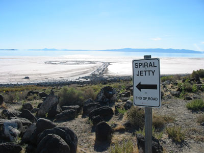
I’ve kept quiet and hopeful for six months, but now I think it’s time to congratulate Dia Foundation, the Utah Department of Natural Resources, the Utah Museum of Fine Arts, and the Great Salt Lake Institute at Westminster College on the renewal of Dia’s lease for the Spiral Jetty site; and on the newly announced, three-way collaboration managing stewardship of the artwork. I think it’s fantastic, reassuring for those who know and care about Smithson’s work already, and encouraging for the many people in Utah and beyond who will discover it going forward.
When I founded The Jetty Foundation in Salt Lake last summer and submitted an application to DNR to lease the state land under Spiral Jetty, I proposed a similar partnership, where local stakeholders would support Dia’s stewardship of the work by engaging on the crucial environmental, development, educational, and political issues that impact the Jetty. The Foundation also very explicitly affirmed the importance of Dia’s undisputed role as owner of the artwork and the designated steward of Smithson’s estate.
I don’t mean to claim any credit for creating the solution that DNR developed in its negotiations with Dia. On the contrary, I think the concept of local institutional engagement on the Jetty’s behalf has been gaining traction in Utah in the years years since the artwork re-emerged. If the Foundation’s proposal encouraged Utahns’ vision for a stronger, more engaged future for the Jetty, then the weeks I spent basically lobbying with local politicians, government officials, and other community leaders was well worth it.
I haven’t yet decided whether to more proactively engage the growing numbers of people who use Google as medium or subject for their artmaking, or to forge ahead alone, buoyed up by the certainty of my own unequaled, Googly aesthetic and conceptual brilliance.
detail of Reconciliation (after @gregorg after thompson after allen [maybe])…
CanvasPeople® probably non-archival inkjet print on canvas
11″ x 14″
2012
Signed Edition of 1 (+ infinite unsigned APs), POR
But then Man Bartlett comes up with a sharp, funny project that turns out to relate directly to my lingering anxiety over what I think of, what I make, what I try to get out there, and how well [or not] I do it.
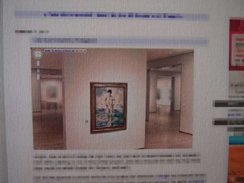
study for Untitled (After Google Art Project, les Demoiselled d’Avignon), 2011
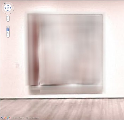
So last year–a year ago today, in fact–my immediate reaction to the launch of the Google Art Project was to zoom in on the blurred out paintings that MoMA hadn’t gotten copyright clearance for–including les Demoiselles d’Avignon and several other iconic Picassos–and to suggest they must now be painted as Google had–there’s no other word–overpainted them.
And then last month, I see that an artist named Phil Thompson had sent screengrabs of the blurred paintings to one of those Chinese painting factories, and has now unveiled the work as his Copyrights project. Which is fine, if not at all how it should be done I’d do it.
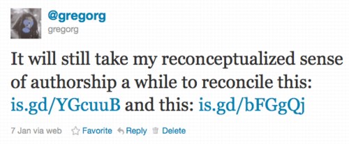
But which nonetheless made me tweet about the twinges of annoyance caused by my no-doubt outmoded sense of authorship and originality:
Which prompted Man to take a screenshot of my blog post, pixel-blur everything but the blurred Google Art Project image, and order a print-on-canvas of it. AND a Chinese painting mill cover version. All of which are for sale, and which are hilarious. Though I will let him reveal the Chinese copy in his own good time. It really is awesome. Reconciliation (after @gregorg after thompson after…) [manbartlett.tumblr.com]
Previously, painfully related, feb 2011: les Blurmoiselles d’Avignon
nov 2010, because it really does come back to Richter, it seems: Blurmany and the pixelated sublime
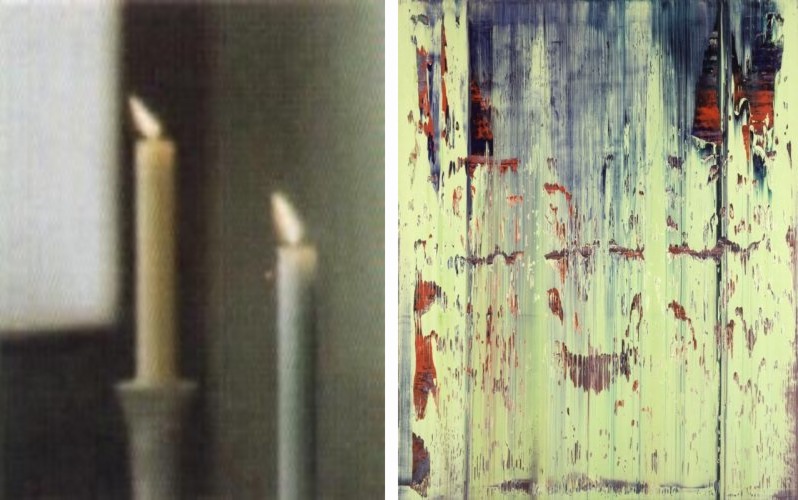
Joerg tweeted last night about a “[DESTROYED]” 1982 Gerhard Richter candle painting, and heeyeahsure, I’ll look at that.
It turns out though, that the artist’s own term is not entirely accurate. Because according to his website, the painting, 2 Candles 1982, (CR 499-3), still exists: “Richter painted over this work in 1996. The painting is now entitled Abstract Painting (CR 837-4).”
l: 2 Candles, 1982-96 state; r: Abstract Painting 837-4, 1996-, images via gerhard-richter.com
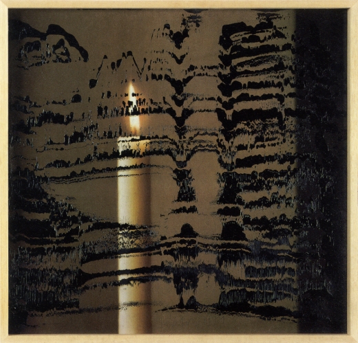
Which would be interesting enough if it were a one-off thing. And no, it appears that Richter has not painted over any of the 73 other paintings listed as “[DESTROYED]”. But by 1996, he had already been painting on photographs for a decade. In 1989, in fact, he produced two editions of candle images overpainted with squeegees. Candle III, 1989, ed. of 30+10, image: gerhard-richter
There are at least a dozen other such editions since then which combine photos or photoreproductions and squeegeed abstract overpainting. They constitute a persistent connection between the two seemingly diametrically opposed bodies of Richters’ work: photo-based representation and so-called aleatoric, or mechanized, gestureless abstraction. It’s a dichotomy that continues to stump even the illustrious Benjamin Buchloh, who laments while writing, at great length, in the latest Artforum: “The question posed over and over again (and which has basically remained unanswered) was how these photographic images could be related to the emerging works of abstraction.”
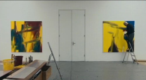
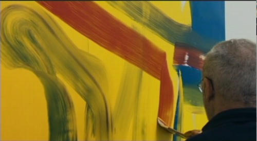
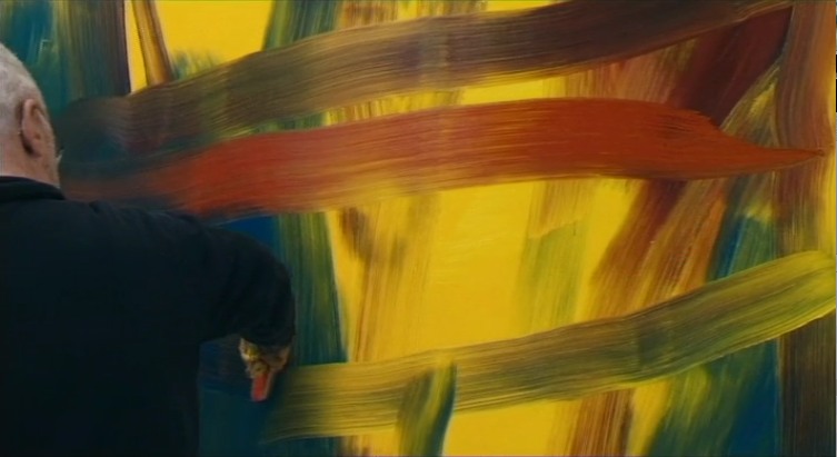
But my bigger point here, which Buchloh also cursorily notes, as does anyone who’s seen Corinna Belz’s film Gerhard Richter Painting, is that overpainting is central to Richter’s abstract practice. In these stills from the scene that appears in Belz’s original trailer, Richter very thoughtfully creates classical gestural abstractions:
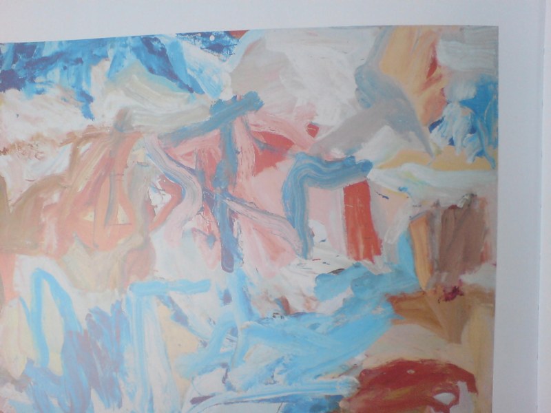
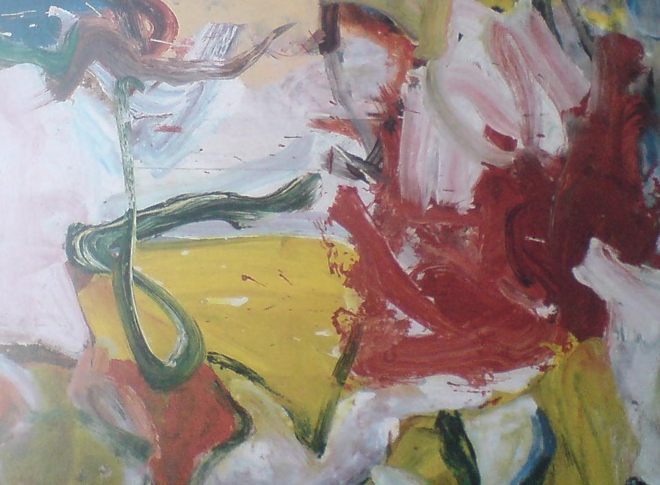
Which remind me of nothing so much as the great, underappreciated-until-just-now, large-scale paintings of Willem de Kooning from the mid-1970s.
It’s one of the main reasons I hustled back to MoMA to see the de Kooning show on the last day, after seeing Belz’s film, and after getting both the Richter and de Kooning catalogues for Christmas. Because these amazing wet-on-wet structures that Richter laid down
felt almost like reincarnations of some of the virtuoso brushstrokes de Kooning made in 1975 paintings like Screams of Children Come from Seagulls [check out this dark blue, sideways L from the upper right quadrant, for example]
or the single, epic loop at the center of the Art Institute of Chicago’s Untitled XI (1975):
And then when they’re just right, Richter takes his squeegee to them. As if getting erased by Rauschenberg wasn’t enough.
But–oh man, I really did just mean to do a quick, “ooh, look, overpainted Richter!” post here–but this is the thing that bugged me so bad about Buchloh’s reading: his extraordinarily limited range of references in discussing Richter’s work. I mean, it’s basically Johns and Stella [Stella!]. And he dismisses Johns on false pretenses. And doesn’t mention de Kooning once.
Here’s what Buchloh got from Belz’s film–WHICH HE WAS IN: some kind of Surrealist theatrical something or other:
Starting the production of each canvas with strange rehearsals of various forms of gestural abstraction, as though moving through recitals of its legacies, in the final phases Richter seems literally to execute the painting with a massive device that rakes paint across an apparently carefully planned and painted surface. Crisscrossing the canvas horizontally and vertically with this rather crude tool the artist accedes to a radical diminishment of tactile control and manual dexterity, suggesting that the erasure of painterly detail is as essential to the work’s production as the inscription of procedural traces. Thus an uncanny and deeply discomforting dialectic between enunciation and erasure occurs at the very core of the pictorial production process itself, opening up the insight that we might be witnessing a chasm of negation and destruction as much as the emergence of enchanting coloristic and structural vistas.
Alright, so maybe it’s not that wrong. No, it is, because after 20 years working on layers and layers of paint with that “crude tool,” Richter has proved, I think, that he has all the control he needs.
Just as Rauschenberg’s erasing were not negation, but creation through another type of mark, I think Richter’s squeegee strokes are generative additions to, not killers of, the rich repertoire of markmaking techniques he inherited. Maybe it took Belz’s film to show how tightly the squeegee marks are linked to Richter’s body and movement. They don’t diminish, but magnify; they’re full-body gestural abstraction.
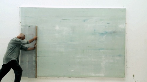
For a great illumination of the specifics of Richter’s abstract production, I keep going back to Tate Modern conservator Rachel Parker’s discussion with blogger Mark Godfrey during the Panorama show:
If we think about the very large scale of Wald 3, we must consider the logistics of one man making this painting. Although Richter probably dragged the squeegee across the wet surface in two separate applications this process must have demanded enormous physical energy. The two resulting squeegee tracks are obvious: one track extends from the top to about 5/8 of the way down the painting surface and the other starts just below this. It would appear that Richter applies the squeegee first to the left side of the work and then drags it from left to right: with both tracks he appears to stop ¾ of the way across for a rest before completion. You can also tell exactly when the momentum of dragging the squeegee across the very tacky surface began to slow down as the drag marks become more shallow. The upper track is characterised by the squeegee having embedded itself more deeply into the paint resulting in slightly sharper surface disturbances and deeper excavations. The lower track has glided more fluidly across the surface creating lighter disturbances. There is undoubtedly an element of chance in the results of this technique: the first track will bear most influence on the final composition whereas with the second track, Richter tries to replicate the same direction, speed and weight behind the squeegee to re-create the same marks in the paint. The compositional balance between track 1 and track 2 in Wald 3 exposes Richter’s trust in his materials and intuitive craftsmanship.
I’ve got more bone to pick with Buchloh’s analysis, which ultimately fails to convince because it seems so disengaged, so cut off within the hermetic, Richterworld bubble. But maybe later.
Because Parker and Godfrey make a very persuasive case, I think, for some of the implications of Richter’s overpainting,. In this case, they discussed SFMOMA’s 1999 Abstract Painting (CR 858-6) [above] on aludibond panel:
Richter has applied his paint in a similar manner as before, manipulating the paint with a squeegee when the paint is very newly applied, hence its fluid character…Once the paint has dried Richter has taken a sharp wide-head palette knife and gouged and scraped features out of the paint layer, exposing the paint-stained white preparatory layer beneath. The technique creates a hallucinatory effect (are the shapes portals or are they solid elements floating in a multi-dimensional composition?).
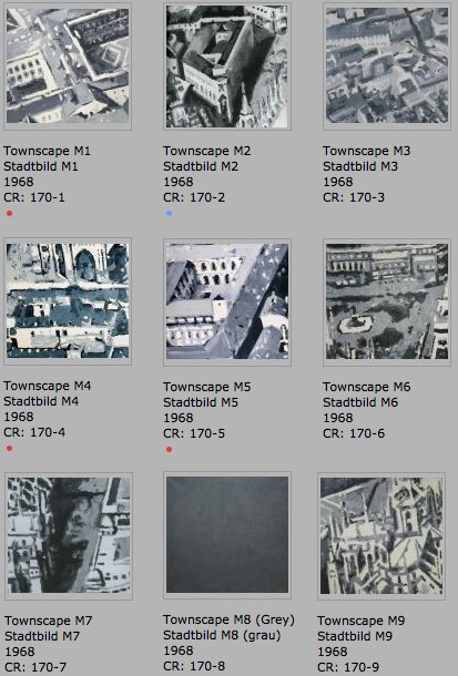
These underlying paintings aren’t destroyed; they just become something else. UPDATE: Alright, I’m righter than I knew. There are at least three more overpainted paintings. Stadtbild M1-M9, 1968, rearranged into a 3×3 grid, image: gerhard-richter.com
The earliest known example is from the Stadtbild/Townscape series, from 1968. Richter first created a large, 2.7m x 2.7m painting based on an aerial photograph of the center of Milan, which he then cut into nine nearly square paintings, numbered M1-M9. Townscape M8, however, he painted over with grey [above]. Joe Hage, the collector/technologist/uber-groupie behind Richter’s website notes:
Townscape M8 depicted what was presumably a detail taken from the same source photograph and was painted over with grey paint later.
…
The series Townscapes M1 up to M9 illustrates Gerhard Richter’s engagement in the process of abstraction: starting from a concrete depiction, which was enlarged at first and then cropped, the final image can barely be traced back to the source photograph. The numbering of the single parts of the painting, which do not relate in any way to their initial positions in the original large format, also suggests that any kind of identification is less important to Richter than the painterly process of abstraction.
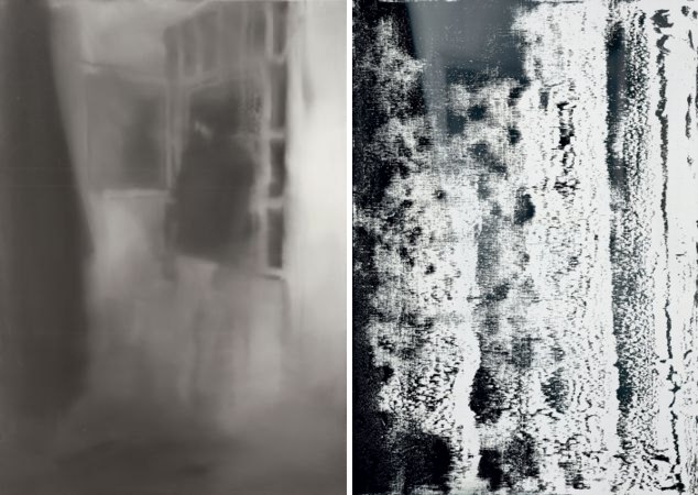
So in this case, at least, there is currently only the presumption of underpainting, based on the series, the title, and the procedure of its making. Hanged and Blanket, both 1988, via gerhard-richter.com
The next example, though, is the opposite. While painting his October 18, 1977 series in 1988, Richter made two identically sized versions of Hanged [above, left], only to partially paint over one and retitle it, Blanket, after the blurred photo-based image that remains visible under the squeegee. The CR numbers show that Blanket [680-3] was completed some time after Hanged [668], with at least two dozen squeegee paintings in between [including two “[Destroyed]” works]. After evoking the “function of a curtain in art history: a painted curtain indicates that a glance is allowed at something that should not necessarily be seen,” Hage’s note offers an interpretation of this overpainting: “It appears almost as if Richter wanted to shield the events from view, by painting over the second version of the painting almost completely.” Which would be true enough in isolation, but which seems to mean not considering the existence of the un-squeegeed version. Which is nevertheless blurred, as if there’s a continuum of obscuring and revelation.
The third example comes from the Spiegel story on Richter’s destroyed paintings. Ulrike Knöfel writes of a work
painted in 1990 [which] shows two young people standing in front of Madrid’s Museo del Prado, Spain’s national art museum. However, two years later, he painted over this work, turning “Prado, Madrid” into “Abstract Painting, 1992.”
There’s no Prado related work mentioned on the side, but there are two Atlas pages of photos from Madrid. I’m still looking through the 279 108 abstract paintings from 1992 to see if I can figure out which one it is. update from a few minutes later: no idea.
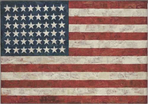
The stories of Jasper Johns’ Flag is almost as famous as the artwork itself. In 1957, Leo Castelli had come for a studio visit with Robert Rauschenberg, only to find Jasper Johns’ work there, and offer the younger, unknown artist a solo show on the spot. That 1958 show, Johns’ first, ended up on the cover of Art News. Alfred Barr bought three works out of it for MoMA. When more conservative trustees balked at the possibility that the till-then-unknown artist might have unpatriotic intentions, Barr leaned on Philip Johnson to buy a fourth, Flag.
And of course, there’s the story of how Johns made it, which MoMA lays out succinctly:
“One night I dreamed that I painted a large American flag,” Johns has said of this work, “and the next morning I got up and I went out and bought the materials to begin it.” Those materials included three canvases that he mounted on plywood, strips of newspaper, and encaustic paint–a mixture of pigment and molten wax that has formed a surface of lumps and smears. The newspaper scraps visible beneath the stripes and forty-eight stars lend this icon historical specificity. The American flag is something “the mind already knows,” Johns has said, but its execution complicates the representation and invites close inspection. A critic of the time encapsulated this painting’s ambivalence, asking, “Is this a flag or a painting?”
But what’s not exactly so clear is when Johns actually made Flag. It became so famous and influential so quickly, and its story is so fantastic–a dream! a flag! a magazine cover! MoMA!–that the pre-1958 history gets compressed into a largely uninvestigated corner.
MoMA’s listing officially, and oddly, notes the date for Flag as “1954-55 (dated on reverse 1954).” So 1954-55. But perhaps 1954. Not an idle difference, I think. But there’s more.
From an awesome footnote in Michael Crichton’s awesome 1977 Whitney catalogue:
Occasionally his working methods cause curatorial problems. One long-standing question concerns the date of his first Flag painting, originally purchased by Philip Johnson in 1958, and now in the collection fo the Museum of Modern Art. The painting was dated 1954, but Johns argued that it was done in 1955. Recently someone noticed that the collage included newsprint from 1956, and the museum wanted to change the date accordingly. Johns stated that the picture was damaged in his studio in 1956, and that he repaired it that year, but that the painting was still properly dated 1955. He also points out that certain early works include collage elements that are old–much older than the paintings themselves–thus obviating entirely such direct methods of dating. [p. 65]
So this painting, “his first Flag painting,” has 1954 written on the back. The artist argues for 1955. Some collage material visibly dates from 1956. And then the artist warns against attempting to date a work by the date of the collage elements. But isn’t the issue here not that it could appear to be earlier than it is, but that it’s actually later than the artist claimed? Twice?
I would think that contemporary analytical tools exist that can test whether Flag was repaired as Johns claimed. Or maybe close looking is sufficient. Crichton set up this curatorial dating problem with one of my favorite quotes from the catalogue:
A note of caution: Often John’s [sic] “laborious efforts” to cover actually draw attention to what has happened. One may speculate that the layered meanings in a Johns work have their analogue in the layers of paint and wax that sometimes conceal, sometimes reveal, what lies beneath. That is one way to look at it. Another way is to recognize that he is a painter whose interest in process leads him to reveal the process–as an action over time–to the viewer. That is, a series of events and decisions led to the final picture; Johns often seems as interested in the sequence of steps as he is in the final result–at least, he often tries to show “what happened” along the way. It may be exaggerated to say that a Johns painting contains its own biography, but that kind of idea is present in many pictures.
Maybe it’s the artwork’s instant iconic status, or maybe it’s the power of the alluringly iconic image it depicts, but lately, it feels like I’ve begun taking closer looks at Flag for the first time. And it’s pretty surprising.
One thing’s for certain, though: Flag is not Johns’ first flag painting. [cont’d] Jasper Johns, Flag, “1954-55 (dated on reverse 1954)” [moma.org] Fred Orton’s 1996 book Figuring Jasper Johns is one of the few in-depth analyses I’ve found of Flag. [amazon]
Alright, the mourning process seems to be ending, but the Guggenheim still hasn’t posted video of the crazy/awesome/all over the place speeches from “The Last Word,” the TED-like symposium marathon organized last weekend for the end of Maurizio Cattelan’s “All.” And for his supposedly looming retirement from artmaking.
So I’ve gone ahead and posted a Storify recap of the livetweet commentary I did, almost involuntarily, when I stumbled across the webcast, about mid-way through Francis Naumann’s discussion of Duchamp’s supposed retirement.
Let’s see if this works:
This 1963 episode of I’ve Got A Secret pops up periodically. From this week on Boing Boing to Alex Ross’s 2007 blog post searching for Karl Schenzer.
And it is, indeed, pretty interesting. John Cale was recently arrived in New York City–Ross notes that he got a ride down from Tanglewood in Iannis Xenakis’s car–and still a couple of years away and a stint under LaMonte Young’s sway from forming the Velvet Underground. John Cage enlisted him and some other sympathetic pianists to perform Vexations, an epic 1949 composition by Erik Satie, for the first time. That was Cale’s secret. Schenzer’s was that he alone stayed for the entire 18-hour performance.
Of course, Cage himself had appeared on I’ve Got A Secret in 1960, giving a raucous rendition of his composition, Water Walk, while dressed, typically, like a Methodist minister.
Three years later, Cale and Schenzer also exude a buttoned-up, Cageian seriousness, but what caught my attention was Schenzer’s namecheck of the concert’s sponsor, the Foundation for Contemporary Performance Arts, which Cage and Jasper Johns had just launched.
By 1963, I guess these folks were becoming better known, and certain of them, particularly Johns and Rauschenberg, were selling a fair amount of artwork. Yet as soon as they had two nickels to rub together, these artists were using the money to support and propagate the work of their fellow artists.
And it really amazes me to think that the cultural factions of the time were still so close together that this avant garde crew could turn up on a network TV game show. John Cage may have turned up at some point in the intervening 30 years, but it’s very easy for me to imagine that the first mention of Erik Satie on CBS was also his last.