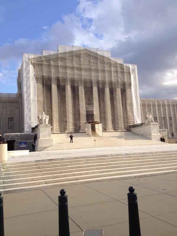
Just got back from a 2-week trip to Japan. Though we spent a lot of time in familiar places in Tokyo and Kyoto, we also took a 2-day trip to Takayama, a small city in the mountains of Gifu-ken, an extraordinary 2.5-hr train ride north of Nagoya.
Takayama retains many Edo-era buildings and streetscapes, which were really great to visit. The Kusakabe Mingei-kan is a large minka, in this case a merchant house in town, originally built in the early 19th century, and then reconstructed after a fire in 1896, is one of the best in town.
While visiting Takayama and neighboring Hida and Shirakawa during a summer break from college, the late great architecture photographer Yukio Futagawa was inspired by the anonymous, vernacular architecture of minka. In the mid-50s, he set off on a multi-year, cross-country trip to study and document these Japanese homes which were rapidly disappearing in the postwar reconstruction boom.
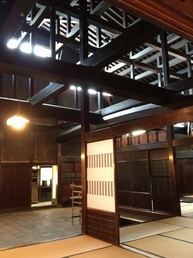
Kusakabe House was turned into a house museum in 1966. The large public area of the house [above] was for conducting business and receiving guests. Those beams are sick.
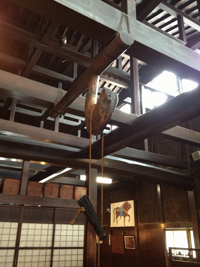
The kitchen is in the rear of this public-facing area. A fire was constantly maintained in the sunken hearth, or irori; the heat and smoke helped preserve the wood from insects and moisture damage. That crazy, gnarled hook is called a jizaikagi.
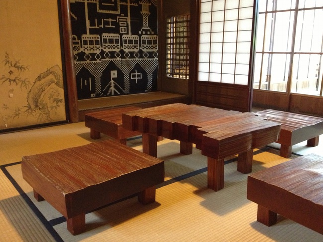
Pivoting 180 degreess from the top photo are the more private rooms of the house, including this amazing block table and chair set.
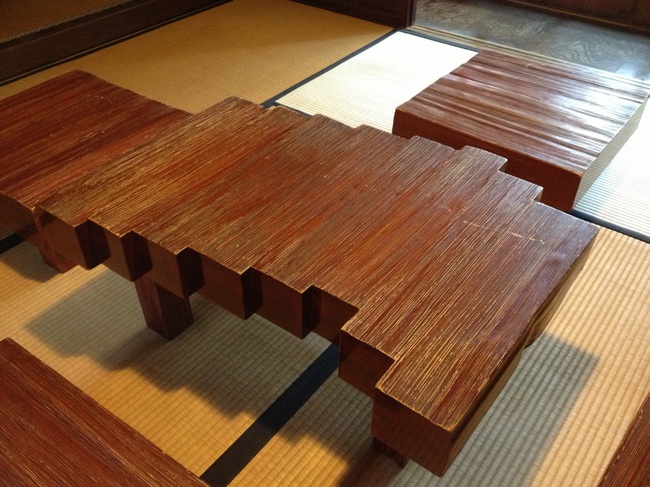
Do want. Or do want to make.
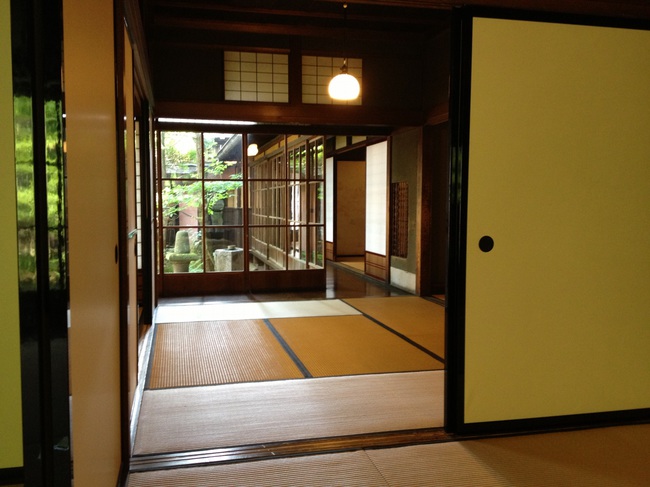
There are a couple of small gardens and these corridors. I took this looking back toward the streetside of the house.
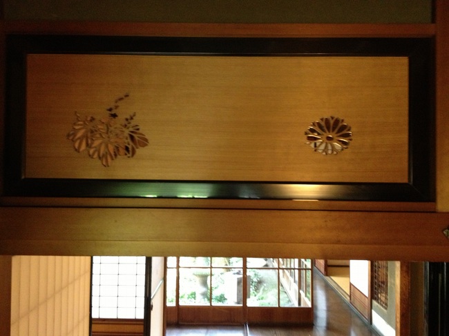
Above the fusuma sliding doors, where I’d call it a transom, are these thick hinoki boards with flower and leaf motifs sawed out. They had to have been done by hand. Aha, they’re called ranma, which means the space between columns. These turn out to be pretty simple designs, as far as ranma carvings go.
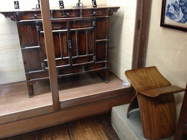
The second floor and the 2-story storehouse in back have collections of mingei: lacquerware, basketry, tansu–and Sori Yanagi’s Butterfly Stool.
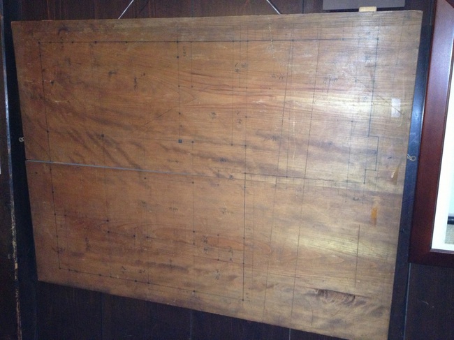
On the way out I noticed this panel, which I thought was blank, but which turns out to be the builder’s blueprint for the house. It’s also visible in the background of the irori picture, under the horse.
Category: architecture
Called It: Facebook For Google Maps, By Frank Gehry
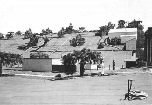
From 2009, The Roof as nth Facade, about Google Maps-optimized architecture:
Maybe the next Bilbao Effect, sure to appeal to striving cities in these difficult budgetary times, will be to commission grand architectural designs purely for the benefit of the Google Maps audience. Like the rural streetscape camouflage which was applied to the roof of the Lockheed airplane factory in Burbank to thwart Japanese bombers during WWII, cheap, easy, flexible Potemkin roof structures could really put a town on the map, so to speak.
It seems so long ago, but in architecture terms, I guess four years is pretty quick. I just didn’t think it’d be Mr Bilbao Effect himself, Frank Gehry doing the camouflaging. And of course, it’s not the city, but a giant corporation, Facebook, the Lockheed of identity, that’s doing the hiding.
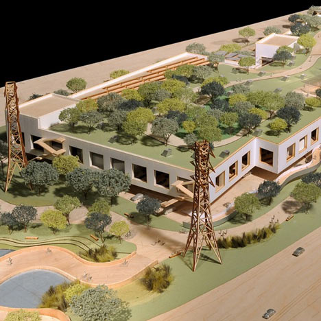
Here is a detail of a model of the Menlo Park building Facebook asked Gehry to design. From Dezeen in April:
Early proposals for the campus, which was given the go-ahead by Menlo Park City Council last week, envisioned a bold, curving facade reminiscent of well-known Gehry buildings such as the Guggenheim Museum in Bilbao.
“They felt some of those things were too flashy and not in keeping with the kind of the culture of Facebook, so they asked us to make it more anonymous,” said Craig Webb, a partner at Gehry’s practice.
“Frank was quite willing to tone down some of the expression of architecture in the building,” he told the Mercury News, explaining that they plan to disguise the white stucco building with a rooftop garden: “Our intent is that it almost becomes like a hillside, with the landscape really taking the forefront.”
Or at least the appearance of landscape, on the roof of your 400,000-sq ft. relationship processing facility.

It’s worth noting that this green-roof-as-park approach is being used by NBBJ for their new office complex–for Google. Google is hiding from Google Maps, too. As Sam Jacob writes at Dezeen, “Though its appearance is closer to an average business park, it too has its roofs littered with green stuff.”
There are obviously many environmental and energy-use-related benefits to a green roof. But they also serve to mitigate the appearance gap between the “average business park” and the powerful technology companies inhabiting them. Invisibility through greenery, melting into the landscape, these are time-tested tools for managing an architectural first impression, as in bucolic renderings designed to mollify local land use and governmental constituents, or the landscaped, sculpture-filled approaches to the corporate HQs of the 1960s. Now every visitor’s first encounter with the buildings is when they look them up on Google Maps. And now they’ve got those covered.
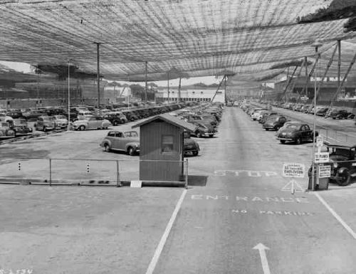
And though I didn’t grasp it at the time, it’s no surprise that these particular companies are the clients trying to become “more anonymous through these hillside camo roofs:
On the one hand, it seems obvious that this vast, global audience [on Google Maps] should be factored into the creation of architecture. But on the other, it seems absolutely insane to design a structure, a space, for people who won’t be anywhere near it, but sitting in front of some screen on the other side of the world.
Because the target of their disappearing act is their own users. Just as malls hide acres of parking lots behind roadside shrubbery, Google and Facebook are hoping their park-like roof facades will keep us from noticing the extent of their corporate footprint, and their relentless sprawl across our online landscape.
Previously: Heads Up: Roof as nth Facade [greg.org]
images via Sam Jacob’s Dezeen op-ed, ‘Cities are being redrawn according to Google’s world view,’ which, right? you’d think, but ends up going in a completely different direction. [dezeen]
Hot Favela Messe: Basel Riot Police Raid Protest Party In Tadashi Kawamata Cafe
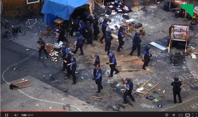
How is Tadashi Kawamata’s Art Basel Favela like a real favela? It’s built on public land, gets inhabited by people who don’t have legal permission to be there, who are tolerated or ignored for a while, and who then get attacked and dispersed by riot police when someone with power decides it’s time for them to go.
The details are still not clear to me, but Tages Woche reports that on Friday night, Basel police raided an outlaw party that had occupied Kawamata’s Favela cafe, firing tear gas and rubber bullets into the small crowd.
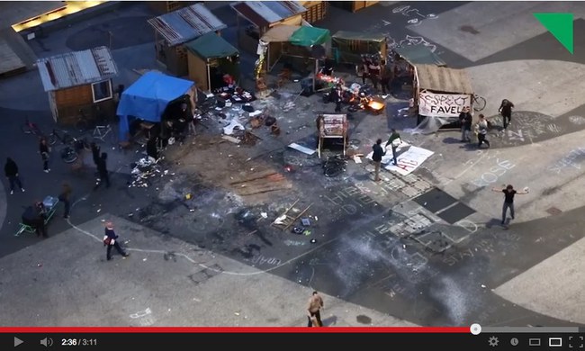
It appears that an event organizer had erected a favela DJ booth of their own, and were presumably protesting Kawamata’s use of favelas to serve luxury falafel [at “reassuringly exclusive prices”] to visitors at Art Basel last week.
The event, or happening, or protest, seems to have been low-key. According to Tages Woche, Kawamata’s collaborating architect Christophe Scheidegger met with the protestors, and they were allowed to stay for a while. Police and Art Basel officials decided to clear them out at 10pm, declaring the noise levels illegal, and that continued occupation of the favela–in the public platz, which had been rented by Art Basel–would be considered trespassing.
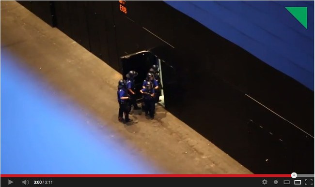
And that’s when, holy shit, it looks like they sent an assault force straight to the DJ favela to end the music and scatter the crowds with pepper spray and rubber bullets. Police established a perimeter, ended the party, kicked a few people on the ground, and then retreated back into the new Herzog & deMeuron Messe [above].
Tages Woche has a video of the attack shot from the parking garage [The embed above is from LiveLeak, but it’s on Vimeo, which won’t embed, and on YouTube, which, honestly, someone put an age-related content warning on? Is this an anti-viral video tactic?], though it’s edited in a way that does not make it so clear what exactly preceded, and may have precipitated, the use of violent crowd control tactics. [The editors and reporters wrote a followup post addressing the circumstances of shooting the video.]
But this unedited YouTube video posted by Gab Kae tracks around the entire platz, and captures the police raid from within Kawamata’s own favela. [It comes at around 2:20.] If there’s anything at all that justifies such an attack, I can’t see it. For these people hanging out in front of Art Basel, abuse of power came as a baffling surprise.
UPDATE greg.org reader Arthur points to another Tages Woche video, uploaded yesterday, which was taken on the ground, right next to the police, and which shows preparations for their assault on the party/protest.
In addition to the donkey, which had been part of the initial protest, the video features this nice, white-haired lady drinking a tallboy who, upon consultation with the officers, decides it best to move her chair out of the way.
After literally receiving their marching orders the Basel police head straight for their target. Which, this video makes clear, is the thumping sound system. Just watch that amp skittering out across the platz at 1:40. Obviously, the music demanded a forceful response, and any human casualties, injuries, or abuses, must be considered collateral damage and entirely unintentional. You know how it can be when techno dirtbags crash your party and won’t leave.
Video: Gewaltsame Polizeiräumung am Messeplatz [tageswoche.ch]
Basel Favela Occupation [artreview]
G8 Pop-Up Prison

Here I am thinking that 12 years into this blogging thing, there’s really no reason to keep shipping containers as their own category anymore, when BAM, up pops a sweet, containerized pop-up prison for G8 protestors in Ireland.
You may remember, or maybe you don’t, that in 2002 Camp Delta, the prison annex to Camp X-Ray at Guantanamo, was quickly built from shipping containers to handle the influx of prisoners from the GWOT.
If there’s a difference between the GTMO container cells and the Irish ones, it’s that the G8 cells are reportedly highly temporary, and that the police are promising that protestors will be arrested, processed, charged, and properly incarcerated in record time, just “a matter of hours.” Europe. It really is the little differences.
G8: Courts ‘can deal with 260 protest arrests a day’ [bbc]
This Scaffolding Has No Title Yet

Here’s a shot I took today of the scaffolding around the Washington Monument for its post-earthquake restoration.
Every time I go by I think how awesome it would be, and until I hear or see otherwise, I’ll just keep hoping and assuming it’s the case that, instead of Michael Graves’ tired, pomo cartoon scrim, the National Park Service is actually encasing it Budweiser cans, installing a massive adaptation of the 1989 work, This Piece Has No Title Yet, by DC’s own Cady Noland.
What? I’m sure Don and Mera could totally make it happen!
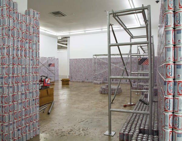
This Piece Has No Title Yet, 1989, Dimensions variable, you guys! [rfc.museum]
The Hirshhorn Is A Special Venue In Search Of Events
DAY AFTER UPDATE: Whoa, well, then. The Hirshhorn board split and Koshalek announced his resignation by year-end. What a way to go.
While designer Liz Diller made her politico-architectural case for The Hirshhorn Bubble in her 2012 TED talk, the Museum’s own justification for the project has been unclear and uncompelling.
Explanations center on making the Hirshhorn “an agent for cultural diplomacy.” In February director Richard Koshalek told Kriston Capps, “This institution should be the leader in terms of setting arts and cultural dialogue. Cultural policy is set in Washington, D.C.” This is debatable enough, as both mission and content.
The programming that’s always discussed, though, a “Center for Creative Dialogue,” involves conferences and discussions created by the Council on Foreign Relations and outside staff, not the Hirshhorn itself, or even the Smithsonian. Critics of the Bubble vision like Tyler Green note this disconnect, and that the Museum doesn’t need a bubble to host such policy-flavored forums and events; they could do it right now, in the existing auditorium. And in fact, they did just that last Fall, where a capacity crowd watched TV journalist Judy Woodruff moderate a panel on “Art and Social Change” during to the Ai Weiwei exhibition.
No, The Bubble is a thing apart, apparently, from the programming that would inhabit it. Its absurdist form on this symbolic site, and the transgressive gesture towards Gordon Bunshaft’s concrete donut, are meant to be self-justifying. Capps calls it “a public art stunt,” and the Washington Post suggests it could “break DC from stagnation.” It’s starchitecture as spectacle and a catalyst for attention and, eventually, one hopes, the holy grail of Washington existence: relevance.
Meanwhile, it’s amazing that until Capps’ reconsideration of the project last winter in the City Paper, there was no mention of what would be, for lack of a better term, the business model: The Bubble would be a for-hire event space.
Koshalek swears the Inflatable will engage the Hirshhorn’s curators, too. When the Bubble is inflated, part of its programming will correspond with whatever’s lining the gallery walls of the museum. The rest of the timeshare will go to whichever universities, think tanks, and corporations rent it out–a money-making proposition for the Hirshhorn which could lead to exclusive uses not quite in keeping with Diller’s civic scheme. (And certainly not with the museum’s artistic mission.)
Continue reading “The Hirshhorn Is A Special Venue In Search Of Events”
Big Swingin’ D[iller]
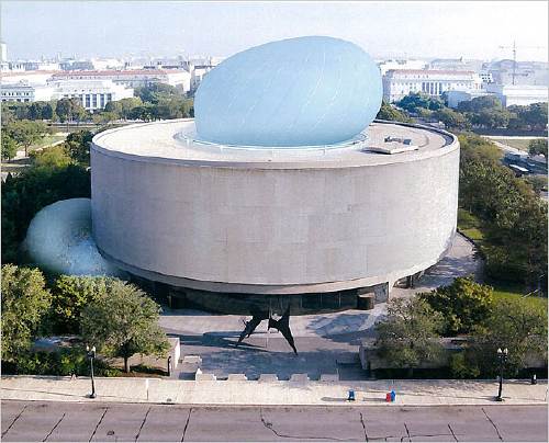
The Hirshhorn’s board is scheduled to vote on whether to proceed with The Bubble, the most prominent initiative of director Richard Koshalek since he arrived at the museum in 2009.
Even though The Bubble was the subject of one of my all-time favorite posts, I have not written much about it since. I have reservations about it, but I have only wished the museum’s success, and so have been willing to give the current regime the benefit of the doubt as they pursue their vision.
But that has been a vague slog, and far from a sure thing. It’s remarkable that the board which hired Koshalek is apparently reluctant to support his efforts to do what they presumably hired him for: raising the profile of the Hirshhorn, and raising money for the Hirshhorn and its exhibitions, acquisitions, and educational programs.
Maybe that is because there are persistent and unaddressed issues with The Bubble and its ostensible purpose. It is true that Koshalek’s stated vision for The Bubble–to host some kind of cross-disciplinary cultural forum, with content generated not by the Museum, or even the Smithsonian, but by the Council on Foreign Relations–still comes across as squishy and alarmingly unconcerned with actual art and artists. That disconnect is even more inexplicable for being unnecessary.
About The Bubble itself, though: I didn’t care much either way before, but after watching Liz Diller’s TED talk from March 2012, I am really starting to sour on Diller Scofidio + Renfro’s design and their entire approach. Titled “A Giant Bubble for Debate,” Diller’s speech is the rare, unmediated, extended discussion of The Bubble by a principal. As such, it’s worth a closer read.
For Diller and her client, who wants to take advantage of the Museum’s unique and symbolic site “at the seat of power in America,” the National Mall, “the question is, ‘Is it possible, ultimately, for art to insert itself into the dialogue of national and world affairs?’ and ‘Could the Museum be an agent of cultural diplomacy?'” Technically that’s two questions, which not only are not answered, but which beg more questions–insert itself to what end, and agent for whom?

“I blush whenever I show this,” says Diller of the slide above, to laughter. “It is yours to interpret.” Wait, what? So I guess she interprets this insertion into the Hirshhorn’s hole as a phallus? Or given the material, I guess it could be a sex toy, or a condom? Or at least some flavor of kink, given the “study of some bondage techniques” that went into the tension cable design on the next slide?
Diller continues: “We were asked by the bureaucracy at the Mall, ‘How long would it take to install?’ And we said, ‘The first erection will take one week.'” And if it lasts longer than that, I guess, call your architect.
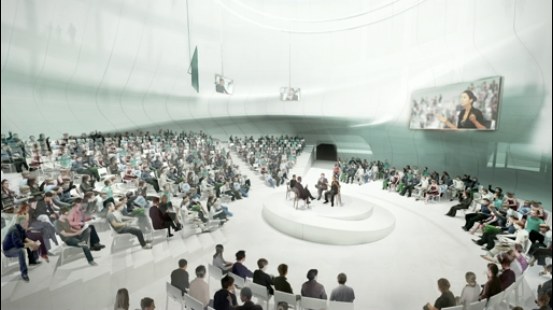
Diller shows the interior space of The Bubble in use, with renderings of a panel discussion in the round; a spotlit performer; a movie screening; and a Barbara Kruger-style text projection. In every instance, the activity is the same: an audience sits and watches something happen. This “breath of democracy” turns out to be just more entertainment and spectacle. And this purportedly transgressive, iconoclastic structure does absolutely nothing to change or challenge the programs of the Mall’s museums Diller just criticized, or by extension, the structures of power she pretends to subvert.
Diller’s claim that her structure, built to house extravagantly ticketed events like TED, the WEF, and CFR fora, will somehow embody “the ideals of participatory democracy” is obviously nothing but hot air.
Which is still just part of the problem, seeing as how the ideals The Bubble is embodying are those of pay-to-play capitalism. More on that in the next post.
You Can Buy The Liston Range Rear Light
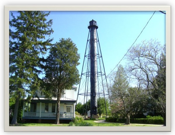
I know the US Government is selling off lighthouses all the time, but the Liston Range Rear Light in Delaware strikes me as exceptional.
It is a 120-ft tall, braced iron tube built in 1876 that sits, unusually for a light house, three miles inland from the mouth of the Delaware River. It stands on around half an acre of land. It’s a few miles south of 95; I think that’s the exit where the Denny’s is. There’s a 100sf building at the base that’s included, but the adjacent keeper’s house and assistant keeper’s house were sold quite some time ago. The cylindrical tower is lined with wood, and the steel spiral staircase has five landings, in case you need to rest on the way up.
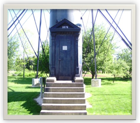
As a range light, it is twinned with a front light which is lower and closer to the water’s edge. Ships navigate by aligning the two lights in a range light.
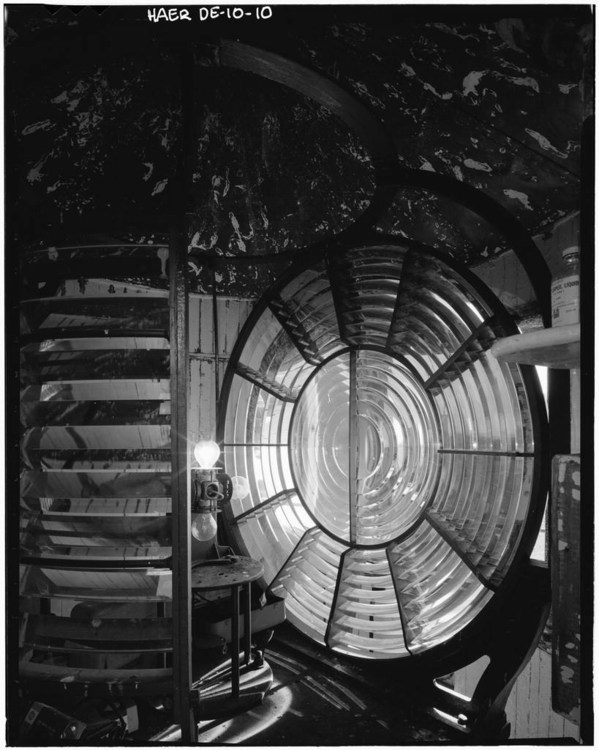
The Liston Range Rear Light still contains its 2nd-order Fresnel lens, which is unusual.
It is now being sold by the US Coast Guard. The current bid is $10,000. I repeat, $10,000.
One catch, and it’s a big one, is that the Coast Guard retains title to the Fresnel lens unless and until it decides it doesn’t need to be in the range light aid to navigation business anymore. At which point, it may decide to give the lens to the lighthouse’s owner. Who must agree “to display the Fresnel Lens if and when it is discontinued in accordance with the standards set forth in the Guidelines on the Care and Maintenance of Historic Classical Fresnel Lenses.”
It’s a bummer about the Fresnel Lens, but until I can get my hands on one of those late 19th century War Dept. Gettysburg observation towers, this range light might have to do.
Liston Light Tower [gsaauctions.gov]
Liston Rear Range, DE [lighthousefriends.com, bottom image of Fresnel Lens, LOC via LHF]
Liston Rear Range Light [wikipedia]
On The Restoration Of 101 Spring Street
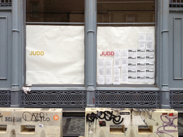
I don’t know how they knew, but I was asked to write about ARO’s restoration of 101 Spring Street for Architect Magazine. I’ve been a huge fan of Donald Judd’s architecture since I first visited his spaces almost 20 years ago, so I was somewhere between concerned, wary, and freaking out over what was going to happen to the artist’s works.
So I attended the Judd Foundation‘s preview last week [EXCLUSIVE GREG.ORG IMAGES ABOVE, BELOW]. Basically what happened was, after 19 years of life-consuming effort and stress, a shit-ton of money, and a near-fanatical approach to conservation, 101 Spring Street is done and saved. [Well, technically, it’s almost done. Like 99% done.]

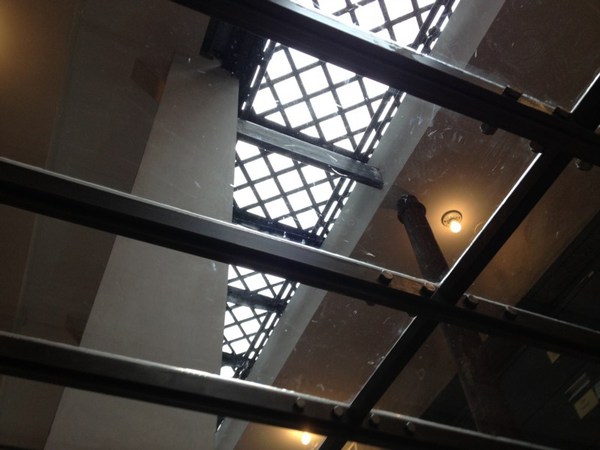
The second biggest surprise was ARO’s absolutely amazing transformation of the subterranean levels at 101 Spring into the beautiful, light-filled offices of the Judd Foundation. I’d been in the basement once before, way back when, and it was a dingy, dark, leaky mess. Now the original 19th century sidewalk vaults and floorlights [below] work and look fantastic. Even as they go to extraordinary lengths to preserve their dad’s spaces, Judd’s kids also managed to create something for themselves as well.
Meanwhile, I tried to write about Judd in the empiricist style of Judd. It turned out to be very difficult. And if no one noticed or said anything about it, Ima guess that I was only partly successful at it. Still, a very nice thing to write about.
101 Spring Street by Donald Judd (and ARO) [architectmagazine]
The Judd Foundation will start guided visits of 101 Spring Street in June 2013. [juddfoundation.org]
Albert Frey’s Canvas Weekend House And Other Pilotis, By Bruno Munari
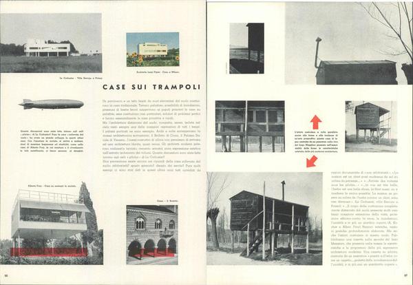
I’ve had this spread from Domus 195 on my desktop so long, I’ve forgotten who or where it came from, but the issue, from 1944, was designed by Bruno Munari.
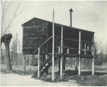
“Case su Trampoli,” or “Houses on Stilts” juxtaposes an awesome fisherman’s shack on Lago Maggiore with early modernist designs by architects from Le Corbusier to Albert Frey. Who had worked for Le Corbusier, on the Villa Savoye, in fact.
But it’s really the combination of the shack and Frey’s Canvas Weekend House on the lower left which gets me. Frey built it for and/or with Lawrence Kocher in 1933-4 at Fort Salonga, in Northport, LI, which turned into a little modernist enclave.
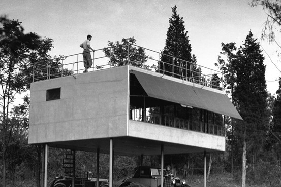
Did I mention it was made of canvas? After the critical success of their Aluminaire House, Frey & Kocher experimented with designs with the backing of cotton and textile manufacturers, but the only one to actually get built was Kocher’s own house.
Marine canvas was stretched horizontally over a redwood frame, insulated with aluminum foil, and nailed, painted & sealed. Joseph Rose’s Frey monograph says it had to be resealed every three years, but I can’t see how long the canvas house actually stood.
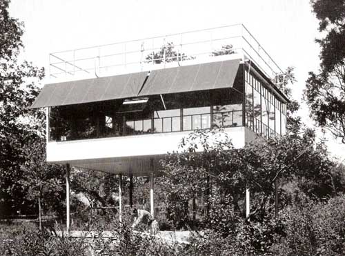
The most detail I’ve seen online comes from Tania Gonzales Gonzales’ series of blog posts, an assignment to analyze the house’s structure and propose an addition to it.
Bob Rubin Has Huge Bucky Ball
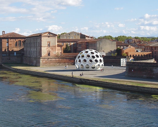
Well there we are, then. Bob Rubin got the prize, the 50-foot prototype of Buckminster Fuller’s Fly’s Eye Dome, which he’s now restored and will unveil to the world in May-June at the Festival International d’Art in Toulouse, which used to be Printemps de Septembre, but is now actually in the Spring, and Printemps de Printemps was obviously not going to work, so. Whatever they call it, and whenever it is, this is a junket I will accept.
Anyway, The Architect’s Newspaper has the story, which Phaidon’s hype-y account distorted beyond recognition.
Max Protetch had been working these domes since at least 2008, and the Buckminster Fuller Institute sold the 10-ft prototype to Norman Foster, and the 24-ft version to Miami developer Craig Robins, who Miami’d the hell out of that thing in 2011.
With architectural expertise and sympathy running as deep as his pockets, Rubin is probably the best guy to take this on. And though Fuller’s original engineering consultants Daniel Reiser and John Warren are involved, there’s no luxury yachtmaker mentioned. So maybe Rubin’s restoration will have some historical sensitivity.
Meanwhile, I will console myself with the knowledge that since the 50-foot dome is the only one you could conceivably live in, if I’d bought it, I would have been tempted to make unconscionable ahistorical modifications to it. Like windows. And a door. So I’m better off with a repro.
Robert Rubin restoring a monumental Buckminster Fuller dome. [archpaper via bfi via phaidon wtf via @wefindwildness]
Previously:
2011 Fuller’s Fly’s Eye Dome Gets Miami Makeover
2008 Welcome to the Fly’s Eye Dome
Levi’s Street View
Whether the uncanny valley is the right metaphor, or seeing a dog walking, something still feels weird about seeing store interiors on Google Street View. I’m sure that’ll change, and one day we’ll all be holoshopping without ever leaving our pods, our purchases delivered by robot Google vans, and people will struggle to remember the last time they even looked at the Street View part of Street View, much less actually went anywhere.
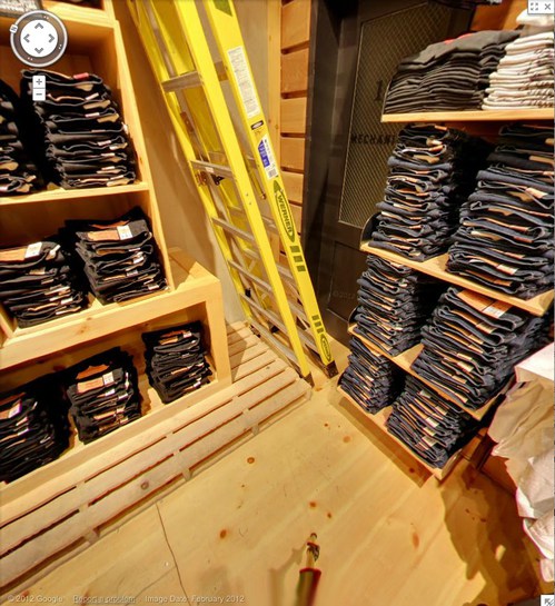
But that day is not yet. And the workings of Store View are still odd and/or unknown, and thus interesting. For example, here is the Levi’s store on West 34th St, tweeted by @ManBartlett.
Maybe the making of is interesting only in contrast to the entire concept of a surfable depopulated chain store filled with mountains of indistinguishable jeans. Or is it just me? Can you barely contain your excitement for the day when you can virtually fall into all 5,000 Gaps?
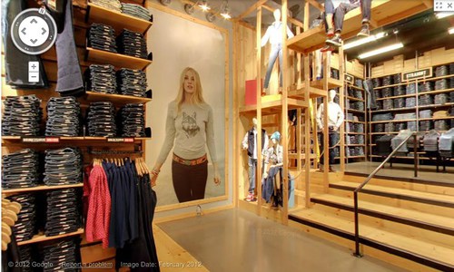
Anyway, let’s look around. They have image date now [Feb. 2012]. Is that new? Obviously, with high merchandise turnover, you’d want to keep that relatively fresh. Store View will become just one more monthly/seasonal expense for a retailer. I see they don’t blur the faces of either the models or the mannequins. It’d be kind of cooler if they did. Even ironically?
Or better if the Street View blur turned up in someone’s IRL in-store/ad campaign. Oh, damn, there’s your pitch right there, creative director: some street style photoblogger is “captured” at work by the GSV car. A Street [View] style blog. BAM. Embed those shoots all over town. A viral bonanza.
Look at me, revolutionizing advertising when I’m supposed to be reviewing pano stitching algorithms. These panos sure are distortion-free. A major advance? The benefit of shooting undisturbed in ideal conditions? Hey, what’s that at the bottom of the picture up there? A tripod leg.
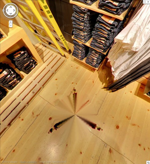
And here’s the whole, stitched thing. That is very nice. Here it is again, this time with a shadow.
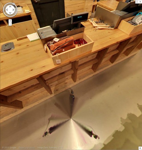
This is not a camera on wheels. It’s on the tripod, single vantage point for every pano, operator out of the way. That’s why there are no distortions. And the only evidence of the process is the legs.
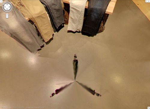
Which, again, are rather nice. Kind of kaleidoscopic, with a blend of in-focus tips and blurry legs. Soon enough, these Matrix deja vu cat-level distortions will disappear, and the differences between real and virtual will be mistaken for mist, or heat waves rising from the sidewalk.
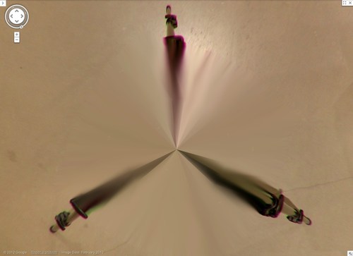
Zooming right into Grotjahn country here. This is sweet. Looks like this pano sphere has maybe 48 slices, each 7.5 degrees? In satelloonmaking, they’re called gores. What do they call them in panoramic photos?

Brought A Trailer
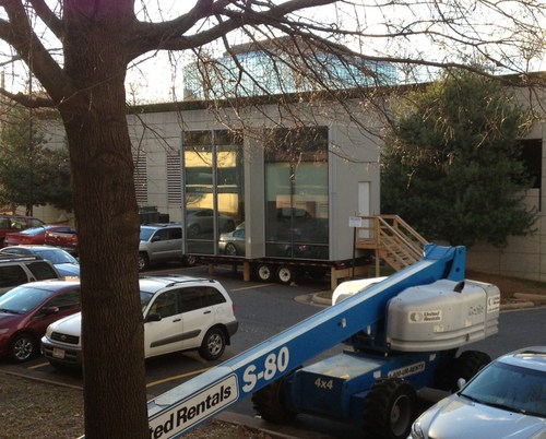
I hate malls in general, Tyson’s in particular, and Tyson’s at Christmas most of all. So I was beyond annoyed that it was the nearest/soonest Genius Bar appointment when the foot came off my laptop.
All was forgiven, though, when I saw this slightly amazing portable building. An office module on a trailer.

I do not know what it was for–I didn’t notice that now-obvious sign by the steps. And I don’t know whether to put it in the tiny home, prefab, shipping container, or cabin porn category.
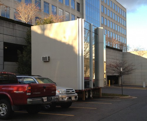
It’s really one space on the inside. With a window unit A/C, a little bit of a hack. It looked a little shabby, i.e., used, broken in, so it presumably wasn’t [just?] a materials/color mockup for reskinning a nearby office building.
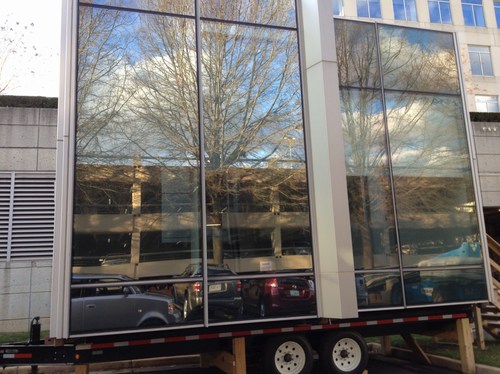
If it’s a temporary building, though, such as one might find on a giant construction site like the one enveloping the entire Tyson’s Corner area, we should definitely give credit where it’s due; this thing is far sweeter than the standard issue site office.
The sad part is, now that I’ve insulted their mall, I feel bad about calling and asking what it’s for. Maybe someone else can be the citizen journalist here and cold call the mall with a, “What’s this awesome thing I saw on the internet?? You guys are so awesome!”
Supreme Sforza

image: protestor in front of the US Supreme Court on Jan. 8, 2013, the 11th anniversary of the opening of the Guantanamo prison. by Saul Loeb for AFP/Getty
I’ve been meaning for a couple of weeks now to post a photo of the extraordinary construction scrim on the front of the US Supreme Court, which has a full-scale photo reproduction of the actual building. Here we go, since this tweet:
This is art RT @wayneandwax: whoa RT @matthewstoller: The Supreme Court is covered with a Supreme Court themed tarp.
— John Pyper (@johnpyper) December 19, 2012
I had no idea. So I looked it up. And was troubled by the fact that I had no idea it had been in place since last May. During the 21-month west facade stone restoration project, “The scaffolding and ongoing conservation work will be concealed by a scrim that will mimic the Court’s architecture.”
The Supreme Court building was designed by Cass Gilbert with John Rockart, and completed only in 1935. From its overall classical Greek temple design to the sculptures on the facades to the smallest ornamentations of the bronze flagpoles and handrails, is highly symbolic. As Chief Justice Charles Evans Hughes said at the laying of the cornerstone in 1932, its very creation and existence are symbolic:
The Republic endures and this is the symbol of its faith…the national ideal of justice in the highest sphere of activity.
So it is entirely appropriate, then, to take a symbolic view of the scrim as well, and its illusionistic simulation of Equal Justice Under Law. As symbolic curtains go, it’s the most inadvertently damning drapery since Colin Powell covered up the UN Security Council’s Guernica tapestry in 2003.
The anniversary of Guantanamo coincided with the unreleased ruling in the hearing on Pvt. Bradley Manning’s illegal and abusive detention without charge. The cancer of vengeance and torture that the US government first directed only toward foreign others has spread to its treatment of our country’s citizens.
And so the thing that gets me about Saul Loeb’s photo above is not the hooded Abu Ghraib/GTMO/Fort Meade protestor, or the Court’s photogenic tarp, but the police officers spread long the steps between them.
Interesting, related, and surprisingly full of scare quotes for a 2009 show: Ben Street’s review of Goshka Macuga’s Whitechapel installation about Guernica, which included the UN tapestry.
Driving Taxis Through Heavy Neighborhoods To Look At The Paintings
Via the Hirshhorn via Art21 comes a nice two-way interview between Barbara Kruger and Richard Prince, originally published in BOMB Magazine in 1982, that ends:
RP I’m misinformed about style. I always thought it had to do with being able to wear the same kind of a jacket for ten years. I don’t know. What I wonder is . . . is it possible to have style and be unreasonable at the same time?
BK I think unreasonableness can mean any number of possible locations nearer or further away from the idea of reason. Because many of these positions are already coded, their shock value is tempered by style. A lot of times the idea of transgression really turns on a romantic conception of otherness; of a rebellion already tolerated. You know, the charming rogue, the picaresque cuteness of the bull in the china shop and in the art world, badness invades the atelier. Driving limos through heavy neighborhoods to look at the graffiti. Unstylish unreasonableness may be limited to the categories of the insane and the unpleasant (the poor, the unbeautiful, the unempowered). The non-romanticism of these kinds of otherness makes them unsightly and “vulgar” considerations for the polite company of international bohemia.
This image of limos driving “through heavy neighborhoods to look at the graffiti” is great in itself, but it also reminded me of an anecdote from, of all people, Jasper Johns.
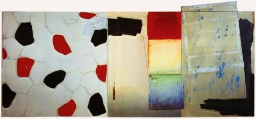
Jasper Johns, Harlem Light, 1967, image “taken. It’s not mine.”
It’s about the genesis of a motif that first appears in a 1967 painting, Harlem Light [above]. Here’s the version from Michael Crichton’s 1977 catalogue for Johns’ Whitney retrospective, which is still the most engrossing Johns book I’ve seen. And I’ve seen a lot:
Johns was taking a taxi to the airport, traveling through Harlem, when he passed a small store which had a wall painted to resemble flagstones. He decided it would appear in his next painting. Some weeks later when he began the painting, he asked David Whitney to find the flagstone wall, and photograph it. Whitney returned to say he could not find the wall anywhere. Johns himself then looked for the wall, driving back and forth across Harlem, searching for what he had briefly seen. He never found it, and finally had to conclude that it had been painted over or demolished. Thus he was obliged to re-create the flagstone wall from memory. This distressed him. “What I had hoped to do was an exact copy of the wall. It was red, black, and gray, but I’m sure that it didn’t look like what I did. But I did my best.”
Explaining further, he said: “Whatever I do seems artificial and false, to me. They–whoever painted the wall–had an idea; I doubt that whatever they did had to conform to anything except their own pleasure. I wanted to use that design. The trouble is that when you start to work, you can’t eliminate your own sophistication. If I could have traced it, I would have felt secure that I had it right. Because what’s interesting to e is the fact that it isn’t designed, but taken. It’s not mine.”
Crichton goes on to discuss the “small differences” that go unnoticed, and which are lost in creating from scratch. And of flagstones, like flags, an ideal Johnsian image,” which are found and known and abstract and concrete. Seriously, I could just keep quoting from that book all day.
But instead, I’m going to try to make sense of Kruger’s next sentence, “Unstylish unreasonableness may be limited to the categories of the insane and the unpleasant (the poor, the unbeautiful, the unempowered).”

