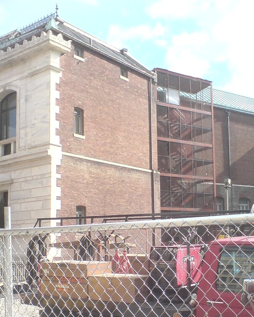
Last fall, right after posting a 1958 press photo of a temporary fire escape stair set up in MoMA’s Sculpture Garden, I went to the Corcoran in DC.
And look at that, they have a nearly identical fire escape tucked right in back there, by the vacant lot that once held their future. I suspect this is the staircase Sanity used when she fled the Corcoran board room several years ago.
Previously, slightly related: “epic-scale scaffolding” at the NGA
Category: architecture
On Gunter Sachs’ Roy Lichtenstein Bathroom

Roy Lichtenstein, Composition, 1969, image via sothebys.com
With the confluence this week of an incredible-sounding retrospective in Chicago and a bonkers-sounding sale at Sotheby’s, I was reminded of one of the weirder things I stumbled across during a dive into Leo Castelli’s papers at the Archives of American Art: the bathtub Roy Lichtenstein was commissioned to make for the St. Moritz penthouse of awesome playboy industrialist collector photographer wackjob Gunter Sachs.
According to a letter Sachs sent to Lichtenstein from Paris on October 3rd, 1968, the two had met in Southampton that summer, and they’d already discussed commissioning some paintings for the soon-to-be-legendary Pop Art penthouse Sachs was constructing in the tower of the Palace Hotel. While Avedon and Warhol were creating portraits of Sachs’ 2nd wife, the then still-smokin’ hot Brigitte Bardot, Lichtenstein was given the bathroom.
Specifically, Sachs wanted him to make some enamel painted panels to go around the tub and sink in the master bath. And he had put together some ideas:
If you permit I would propose that the painting on the large side of the bathing-tub (60×200 cm) should show a girl’s face, perhaps with tears in her eyes, looking at a lake with a swan – a kind of modern Leda. On the little side of the bath (60 x 110 cm) I could very well imagine, e.g., a sunset or a moonset over a calm lake. The painting under the lavatory (60 x 200 cm) could figure a landscape in a thunder-shower. In all these paintings, however, it is very important that you respect accurately the dimensions indicated below in centimeters and inches.
OK, then! Anything else?

Crying Girl, 1964, enamel on steel, via milwaukee art museum
At first I was kind of blown away by Sachs’ audacity to dictate the contents of the images, but then I figured that these were all close enough to subjects Lichtenstein was already doing at the time that it might not be so WTF-ish. [One of the artist’s first attempts at enamel-on-steel production was Crying Girl, a painting produced in a multiple of 5, in 1964.]
Oh, and also, there was this: “As I am obliged to finish the apartment before Christmas, it is very important that I get your paintings till November 2nd, 1968.” And he’d run the deal through Ileana Sonnabend in Paris.
Apparently Castelli, Lichtenstein, and their lawyer all jumped to work, because a contract went back to Paris within the week agreeing to sell one set of drawings and authorizing Sachs to fabricate one single set of enamel panels at his own expense, with payment due in full upon receipt of the drawings.
And then they hustled the drawings to Sachs’ Paris secretary, even though the contract hadn’t come back. And Sachs wasn’t replying to anything at all, and then in December there’s this increasingly testy series of letters demanding payment and signed contracts, which have not been forthcoming, even though the drawings were hurriedly finished and delivered.
“I must tell you that Roy is personally offended by your failure to act,” wrote Lichtenstein’s lawyer Jerald Ordover. A lawsuit was threatened, even though both Leo and Roy found it “most distasteful.”

Leda and the Swan, 1969, enamel, 61x311cm, image: roylichtenstein.org
It’s not clear how, but things must have worked out, because the works exist. And they turned out pretty much just as Sachs ordered them. Leda and the Swan [above] is two steel panels that could fit around a tub. And the sink piece, Composition [top], was actually in the Sotheby’s sale Sachs’ family held this week, a year after Gunter took his own life rather than succumb to what’s believed to have been Alzheimer’s. [It sold for 541,000 GBP.]
UPDATE: Oh, this is interesting. Here’s part of the Sotheby’s catalogue description for Composition:
Lichtenstein, alongside Warhol, sought a pictorial vocabulary embedded in modes of mechanical reproduction. However, unlike Warhol, who pioneered the silkscreen process to transfer his images to canvas, Lichtenstein set out by magnifying and transferring his sketches by hand in a painstaking process that insistently removed all the expressionistic detail of brushwork, further divesting the image of naturalistic representation. Composition, based on Collage for Leda and the Swan, 1968, is a consummate example of Lichtenstein’s Modern Paintings series and of this technique of reproduction.
…
As Lichtenstein played down the idiosyncrasy of the artist’s hand in favour of uninflected surfaces that replicate the look of the machine-made, we are compelled to venerate the movement and melody within this picture’s unique composition. [emphasis added on the parts that are not applicable to this artwork.]
Ah, no. These panels were authorized by Lichtenstein, but fabricated by Sachs. Here’s Gunter: “For the technical execution of your design in enamel I found an excellent German manfuacturer who will be able to transform your painting in a congenial work of Modern Art.”
And here’s the artist’s attorney, Jerald Ordover, writing:
to set forth [Lichtenstein’s] understanding of the terms of your commission to him to create the designs, in the form of working drawings, for the fabrication of three (3) enamel plaques…
…You are to have the plaques made from the drawings at your sole expense.
Which, yes, having them fabricated sight unseen in a German factory from drawings is certainly a process for insistently removing the expressionistic detail of the brushwork that plays down the idiosyncrasy of the artist’s hand. And almost as interesting as the painstaking process by which the auctioneer insistently claims the artist’s hand as a selling point, especially on work where the reason it looks invisible is because it was explicitly absent.
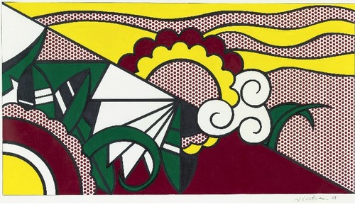
Nov 10, 2011, Lot 225: Collage [sic] for Leda and the Swan, image: sothebys
And the market seems to notice. Last fall Sotheby’s actually sold Collage for Leda and the Swan, a full-scale work on paper for the short end of the tub [60x110cm]. Sachs had apparently gotten rid of it early, because its provenance shows it floated through several dealers’ hands before settling down in 1989. Though called a collage, it looks to me like a straight-up drawing, overflowing with artist’s hand. Which drew pencil lines, then traced them with marker and filled in the rest with acrylic. And it’s signed. So it sold for $446,000.
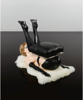
Lot 14: Allen Jones, Chair, ed. 6, est. 30-40,000 GBP, sold for 836,450 GBP [!!]
And though I haven’t been able to find installation shots wacked out bondage furniture artist Allen Jones tells Sotheby’s that he saw them in situ:
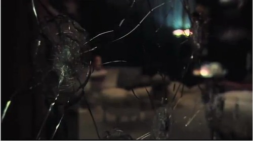
Gunther Sachs invited my wife and me to stay in his penthouse at the Palace Hotel, St Moritz, soon after he had acquired my sculptures. It was the most ritzy place I had ever been in. One wall of the apartment seemed to be entirely glass, with a breathtaking view of the Alps. There were Lichtenstein panels round the bathroom, a flock of Lalanne sheep on the carpet and the set of my sculptures. Giovanni Agnelli was at the party and wanted to stay in the penthouse, but Gunther had said that the Joneses were there. Agnelli, thinking that he meant my sculptures, said “don’t worry, I won’t touch them!” Prominent in the apartment was a large, bullet-proof glass panel with one side splintered in several places. Gunther used to stand behind the glass and invite close friends to shoot him. Their names were inscribed on a plaque next to the glass.
Hahwwhawaitwhaa? Are you kidding me? Where is this bulletproof glass panel and plaque now? Because THAT is what I want to buy.
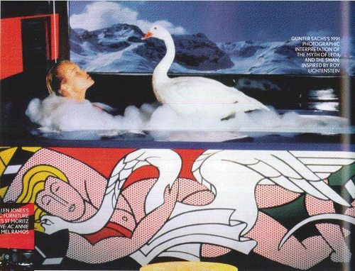
UPDATE UPDATE: OK, maybe my problem is I gave up searching for photos before the Sachs auction. Because in a preview article for the sale, British Vogue ran a 1991 photo by Sachs, of a Leda and a swan in the tub. I didn’t realize the Lichtenstein panels went around the base of the tub; I thought they were backsplash-type deals. But with those views, well.
Also, Vogue gushes about “Roy Lichtenstein kitchen-unit fascias and bath panels,” which what? I guess the delay in payment wasn’t a fatal blow to their friendship, or maybe Sachs commissioned a kitchen from the artist as a make-up. Or maybe a bar, because who needs a kitchen, it’s the Palace Hotel, and this bar in the S&M living room looks very Deco-era Roy to me.
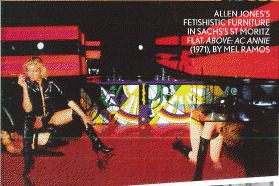
And finally, Vogue doesn’t mention a plaque, but does say that guests who shot at Sachs would autograph their bullet hole. And if these aren’t bullet holes made by the glitterati of Cold War Europe, then why are they in Sotheby’s promo video?
‘Where Their Fakeness Is Self-Evident And Salable’
While trying not to steal his thunder, let me just post the awesomely vivid ending to LA Times architecture critic Christopher Hawthorne’s review of Williams + Tsien’s unavoidably flawed Philadelphia museum building now housing the art-centered educational institution known as The Barnes Foundation:
Imagine if the Barnes trustees, in the name of improved access to a supremely great but historically cloistered collection, had declared they were going to produce replicas of its paintings by Matisse, Picasso, Modigliani and Van Gogh and hang those in a new building on the parkway.
The howls of protest would have been loud and immediate. The idea wouldn’t have lasted five minutes.
And yet the notion persists that re-creating buildings is somehow more reasonable or at least less obvious and that new rooms can be made to impersonate old ones without much aesthetic risk. That copies of paintings belong in gift shops and on refrigerators, where their fakeness is self-evident and salable, while copies of buildings can go blithely along pretending to be real. That architecture somehow is different.
Memo from Philadelphia: It’s not. [Emphasis added for awesomeness.]
I got a million and 99 problems with The Barnes Foundation, but copying ain’t one. Barnes’s spaces and installations are geared entirely around the pedagogical system of close looking and cross-referencing which he oversaw. Which makes for a suboptimal museum because it was supposed to be a non-museum by design.
Meanwhile, I love that this fakeness all happens next door to the Rodin Museum, which is full of copies, thereby blithely refuting Hawthorne’s analogy without making it any less valid.
Architecture review: A poor replica of Barnes Foundation museum [latimes]
The Maze (1967/XXXX), Tony Smith
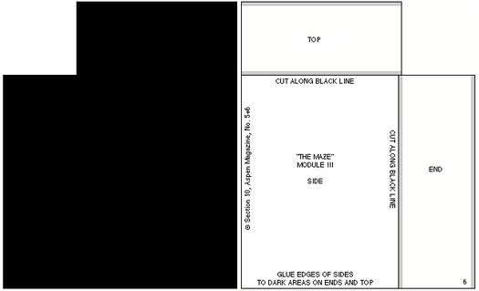
For issue 5+6 of Aspen: The Magazine in a Box (1967), guest editor/curator Brian O’Doherty conceived of a conceptual art exhibition in a box. [Which really should be staged in real space somewhere. Has it ever been?]
One of the first things you notice when you open the box is the little stack of cut and scored black matteboard, which is a make-it-yourself scale model of Tony Smith’s The Maze (1957 1967).1 When assembled, if any ever were, the pieces formed four monolith-like blocks, which were to be placed in an open rectangle:

As is clear from the drawings, “The Maze” was originally designed for a particular space. Thus the pathways around the pieces as well as through it are an integral part of the design. For this reason it is a labyrinth rather than a monument.
I did not think of the symmetry of the piece as I was doing it, but I happened to notice when making the drawing that the central part is a five-foot square; the part including all the passages is a ten-foot square; then if you take the extension along the room, it is a fifteen-foot square. So it is a lot of expanding squares.
On the other hand if you take different divisions, for instance if you take all these squares and carry them through, they make a grid which interpenetrates– the two sets of grids interpenetrate one another. In a certain sense it is a labyrinth of the mind. You can see that it becomes quite complex, but at the same time everything falls in very, very simply.
–Tony Smith
The Maze was designed for the exhibition Schemata 7, at Finch College Museum, May19571967. The above statement has been adapted from the catalogue.
The actual dimensions of the modules were 6’8″ by 10′ by 30″ (two modules) and 6’8″by 5’by 30″ (two modules). The models have been scaled down to fit in this box. The models may be set up standing free on neutral ground. They should be set up in accordance with the plan indicated in the drawing. Those who wish to reproduce the work in its original dimensions (in metal or wood) may do so.
The individual pieces may be cut from the enclosed cardboards by a matte-knife (e.g. the General 850 available at any art supply store) guided by a metal ruler.
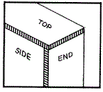
The parts should be attached as indicated i.e. the appropriate edges should be opposed to the grey areas. (Elmer’s Glue All may be used). “White” edges should be darkened with ink or water color.
The drawing below may serve as a guide.
It’s been more than 14 years since I discovered Aspen; 5+6 was the first, and for a long time the only, issue I could find. And it’s almost ten years since I found the entire run of Aspen reproduced on Ubu.com, a move which brought Aspen out of unciteable obscurity. And now it’s more than two years since I cooked up auraprogettazione, a comprehensive [sic] exhibition of the rare examples of instruction-based art work that the artist actually gave permission to make. And yet I only just now noticed that Smith authorized reproduction of The Maze. Has anyone ever done so? Before me, I mean, because I just added it to the list.
1: UPDATE So yeah, I thought 1957 was an extraordinarily early year for Smith to have exhibited an installation of four matte black minimalist sculptures, and at Finch College or anywhere. So Ubu’s text is incorrect, and Smith’s Maze was shown in Schemata 7 at Finch in May 1967, right around the time Aspen was published.
ANOTHER UPDATE Grace Glueck’s May 14, 1967 review of the opening of Schemata 7 says the show’s working title was “Walk-In Sculpture,” and gave each of seven artists a chance to show their attitude “to scale and enspheric space.” Of The Maze, Glueck wrote:
The room is kept in a subdued light and, though the scheme is simple, a walk among these gloomy, primeval presences evokes the feeling of an endless forest.
Sounds like a wildly different experience from the toy-sized cardboard model.
In addition to Smith, Schemata 7 featured work by Les Levine, Ursula Meyer, Brian O’Doherty, Will Insley, Michael Kirby and Charles Ross. So far, I can’t find any installation shots of the original Finch version, but I’m on it.
UPDATE 3 And here’s John Perreault’s review of Schemata 7 for the Village Voice. He puts it in the context of pioneering minimalism shows like Primary Structures, which had just happened a few months earlier in 1966. Still no pics, though.
Awesome Marijuana Plantation/Land Art
Reuters’ Jorge Duenes’ cropped aerial shot of a 300-acre marijuana plantation “discovered” in Mexico last July that The Atlantic’s InFocus photoblog ran today was dramatic and awesome enough to make me want to see the full thing.
Here it is:
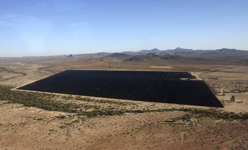
Stunning, right? Ellsworth Kelly himself couldn’t have done better. But the full caption bears analyzing a little more closely:
An aerial view shows parts of the biggest marijuana plantation ever found in Mexico, in San Quintin, about 350 km (220 mi) away from Tijuana, on July 13, 2011. Mexican soldiers discovered the plantation in a remote desert, a top army officer said on Thursday. Soldiers patrolling the area found 300 acres (120 hectares) of pot plants being tended by dozens of men.
Because I have a hard time seeing how parts of it can be simultaneously true. For the plantation to be in the “remote desert” and in “San Quintin,” for example. Or for it to be in “San Quintin” and “discovered.”
350km from Tijuana does sound remote. But San Quintin turns out to be on the northern part of the Baja Peninsula, the part where the highway runs between the mountains and the sea. On Google Maps, it’s clear the landscape is characterized by agriculture–and airstrips. To still be in San Quintin, the terrain in Duenes’ photos almost certainly has to be just off the main highway, and one of the largest crops of any kind in town. Saying it was discovered, then, implies that its existence was not known beforehand, which, holding other factors constant, seems impossible.
Still, the important thing is, it does look awesome.
This Is Not The White Cube You Are Looking For.
Well that’s an unexpectedly awkward situation I just stumbled into.

greycu.be: what, you mean your car doesn’t have a domain name?
A week or so ago, I decided my new car needed a domain name. So I registered greycu.be. Partly because the tweeters these days are all hot for the short URLs. But mostly because my car, a little art hauler and storage unit runner, is a Scion xB. Which is the perfect canvas upon which to realize my previously all-talk idea of commissioning artists to do vinyl wrap art cars. [additional posts here, here, and unfortunately, here.]
Needless to say, greycu.be was available. But it did get me to thinking, so I threw whitecu.be into the whois search for the Belgian DNS operator. And it wasn’t registered, per se, but “quarantined.” A 40-day limbo following the non-renewal of a domain name on dns.be. Which went until April 1. And sure enough, when I checked in this evening, whitecu.be had been released. So I registered it.
 I confess I have no plans for it at this point. And also that buying it was motivated partly by the sheer novelty of being able to buy a domain name again after it has expired, something the shady/annoying backorder/resale adsquatting “services” in the US domainspace have made basically impossible. [I happen to be at least the second owner of greg.org; the first, an outfit called Global Real Estate Group, had let it expire in 1997.]
But even in this somewhat oddly punctuated, awkwardly unpronounceable incarnation [whitecu dot be? whitecu point be? whitecu pwahn be? It just doesn’t work, except as web text], a chance to connect with one of the foundational paradigms of contemporary art theory was too awesome to pass up.
Since they first appeared in Artforum in 1976, Brian O’Doherty’s essays, Inside the White Cube: The Ideology of the Gallery Space have provided a powerful critical framework for examining the impact of the commercial art market on the creation and exhibition of art. Even 35 years on, artists grapple every day with the political and financial implications of the white cube, which persists as the central site of art’s instantiation as a commoditized luxury good.
Which has been deeply influential on my own education and experience with art, and with my history as a collector, and more recently as a writer and maker.
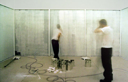
Powerless Structures No. 15/12 Hours of White Paint, 1997, Elmgreen & Dragset
Which is presumably why, in 1993, Jay Jopling chose to name his London gallery White Cube. Now he has three, and they’re among the most important and well-known in town. Their website is whitecube.com.
Which would seem plenty clear, distinct, and obvious, unlike, say, whitecu.be. Yet it turns out that Jay did not think so. Or at least he thought that the artist and gallery portfolio hosting service that went up on whitecu.be last year looked a little too similar to his gallery’s web presence. Or that any reference to a white cube was de facto confusing to his 2008 [!] trademark on the term. Because he filed a trademark infringement claim with dns.be against the service’s creators attempting to have the domain name canceled.
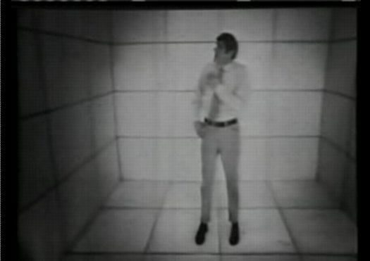
Still from The Cube, a 1969 NBC teleplay by Jim Henson about a guy who finds himself stuck in a white cube.
The site’s creators, a pair of young designers in Florida, prepared a lengthy response to Jopling’s claim, but apparently they did not formally respond to it. And so the third-party arbitrator appointed by dns.be issued an extraordinary ruling in Jopling’s favor. The findings for which seem to ignore the entire basis of the domain name and TLD system:
The mere fact that the Licensee inserted a full stop between the letters “cu” and “be” is not likely to outweigh the massive similarities and the replications of all the letters contained in the Complainant’s trademark, in the same order, with the same meaning.
And which also ignores the highly significant, and widespread common use of the term “white cube” in an art context and its history which predates Jopling’s commercial use and [very recent] trademark claim for the term. And which ubiquity was, in fact, the reason Jopling chose it.
The existence of legitimate interests in the litigious domain name appears quite dubious…
And then there’s a remarkable finding of bad faith:
It is obvious from the record that the intention of the Licensee was to divert internet users from the domain name by creating a likelihood of confusion with the Complainant’s trademark.
It is the opinion of the Third party decider that this clearly constitutes a case of typo squatting, with the intent of commercial gain and potential damage for the distinctive character or the reputation of the Complainant’s trademark.
Well, I still don’t know how to say it, or what it’ll be used for, but the new owners of whitecu.be can assure you that it will not be in the business of being mistaken for Jay Jopling’s fine and reputable establishment. Which is at the obvious, widely known, and easily pronounced whitecube.com.
Mass, Grass & Claes

Yes, we now have Doug Aitken, which might help, and there’s an After Hours party every quarter, but the Hirshhorn’s outdoor space has always struck me as one of the most potentially interesting and under-utilized public spaces for contemporary art in Washington.
But just when I think nothing ever gets moved around here, I stumble across this interesting pattern burned into the lawn behind Claes Oldenburg’s Geometric Mouse. It looks like it could be a Paul Chan floor projection or something but it’s just the bleached out footprint of whatever zig-zag sculpture used to be there. I’m trying to remember what was…
Less Filling, Looks Great: Doug Aitken’s Song1 On The Hirshhorn
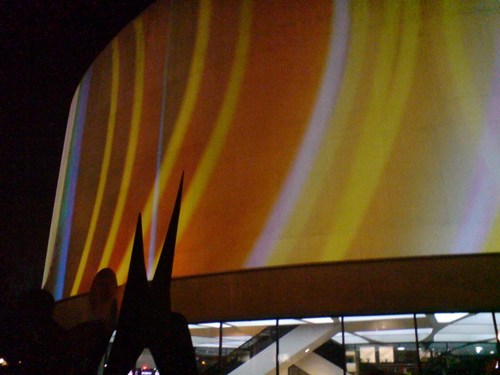
We came out of the Hirshhorn tonight after the surprise [to me] screening of Space is Process, a 2010 documentary about Olafur Eliasson, only to find they were testing Doug Aitken’s Song1, a 360-degree projection on the barrel of the museum.
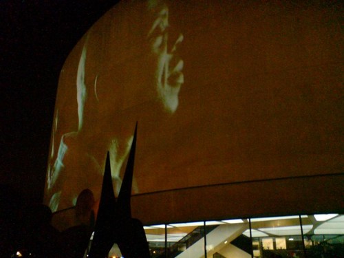
I had been worried about how well buff-colored aggregate would hold up as a projection surface, but I tell you, it looked pretty great. Amazing, even.
And seeing it suddenly makes you wonder–and by you, I mean me–why doesn’t the Hirshhorn project things on the surfaces of the buildings more often? You know what, why not all the time?
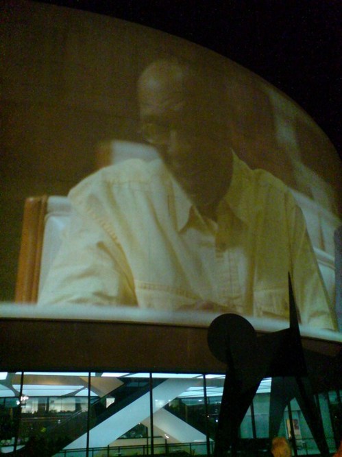
And that leads to the next logical question: what should be projected on the Hirshhorn?
Song1 is a hypnotic, laconic, melancholic sequence of closeups of an LA Basinful of people singing “I Only Have Eyes For You,” intercut with abstract CG motion graphics. Its narrative doesn’t seem anywhere as complex as the multi-screen Sleepwalker, projected on MoMA, but it seems thoughtful, and definitely works as a beautiful proof-of-concept.
But. So.
What else is going on the Hirshhorn Channel? The potential [or maybe the temptation] for agitprop and politically charged artworks seems either irresistible or anathema, depending no how involved one is in wooing Congress. The Hirshhorn and the Smithsonian at large are likely not interested in actually biting any hands that feed them.
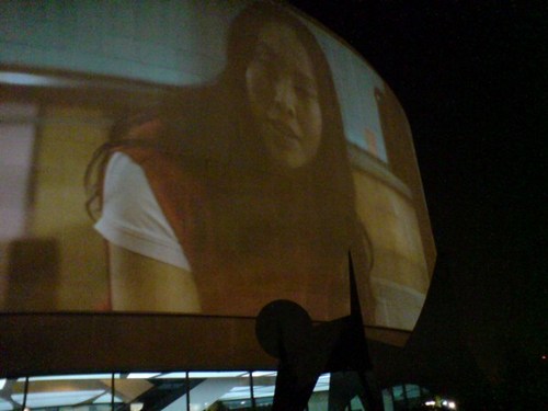
And starting Thursday night at 8pm, that strategic non-engagement pact will be on view from the Mall in full, dazzling force.
Leonardo Photomural
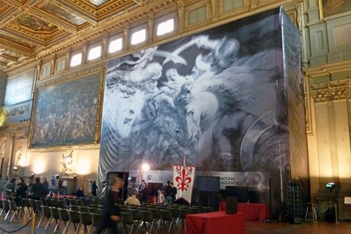
image: DARIO THUBURN – AFP/GETTY IMAGES, see washpost for fullsize
There has been much talk among such circles about the possibility of a lost, unfinished mural by Leonardo da Vinci hidden behind a fresco by Giorgio Vasari, in the Palazzo Vecchio in Florence.
Leonardo’s original work, The Battle of Anghiari, executed in 1504, was replaced in 1564 by Vasari’s 5-fresco cycle. But art historians following an interpretation of a clue in one mural discovered it was painted on a false brick wall, and there was an airspace behind it.
And now there is also paint. National Geographic, which purchased the exclusive first rights to the controversial investigation, today announced the discovery of Leonardo-era pigments in the hidden airspace.
The press conference was held in front of the mural[s], which were covered by a giant, digitally printed photomural, actually a detail of a Rubens drawing of the Leonardo original.
If there is, in fact, a Leonardo back there, which has been hidden, or even lost, for nearly 500 years, I honestly don’t see the hurry to uncover it now. Critics of the project are right to protest the possible damage or destruction of the Vasari the search–or worse, the discovery–may inflict. But if we have, in just the last few years, developed the tools to detect the space and the Leonardo, isn’t it best to sit tight, and wait for technology that can preserve both artworks intact?
At least just wait like a hundred years or so, for the current crop of Da Vinci Code knuckleheads to die off. And in the mean time, why not just put up a giant photomural version of Rubens’ copy? 99.9% of the 8 million visitors who’d see it each year wouldn’t mind–or even notice.
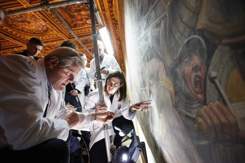
Sen. John Kerry and team use a probe to look for what they believe may be Leonardo’s Battle of Anghiari behind a fresco at Florence’s town hall. Photograph: Dave Yoder/AFP/Getty Images
Art historians say they have found evidence of ‘hidden’ Leonardo da Vinci [guardian via galbraith’s twitter]
Google Street View, Wide-Eyed
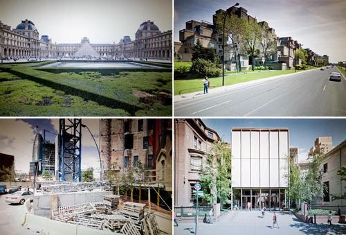
Jon Rafman’s got his 9 Eyes, but maybe what we really need is a 5 Stages of Google Street View, something to account for the process by which people awaken to the aesthetic, social, conceptual, and ultimately, political implications of Google’s worldmapping project.
Urban architecture photographer Andrea Bosio has passed Stage 1: Looking up your own house on GSV, and has managed to turn Stage 2: Visiting famous places–in his case, name brand architecture–into a photo essay for Domus:
I have always used Google’s Satellite and Street View system to view cities and principally to identify the urban drift areas featured in some of my photographic projects. In these cases, I use software as if it were a map made of pictures to find my way through the reality at times of direct experience. This is also the approach I adopted for the photographic project presented here although, on this occasion, the subject of my shots was the representation of the city supplied by Google Street View on my computer screen. I treated this new pixelated reality as a territory up for exploration and managed to compile a true photographic record of it by selecting different points of observation in this virtual space. I photographed the city without ever actually being there.
Which, shooting screens, hmm. Also: “We are able to experience the reality in an objective and non-interpretative portrayal.” Which, hmm.
At least Bosio demonstrates the potential of GSV for creating postcard views.
I’ve never been there, by Andrea Bosio [domusweb.it]
Here Is A Giant, Awesome NASA Test Chamber From Fashioning Apollo
John Powers has been on me for months to read “>Nicholas de Monchaux’s Fashioning Apollo, the incredible and unlikely history of the development of the Apollo spacesuits.
And I have been meaning to, I swear, but this insane photo may be just the thing to push me over the edge. Because in his otherwise heady interview with de Monchaux, Geoff Manaugh only captions the images as being from the book.
Which I will have to buy, to find out what this three-story dolly was doing in this massive, origami-ended space lined with sound-deadening foam pyramids. Because seriously, holy smokes.
Spacesuit Interview with Nicholas de Monchaux [bldgblog]
Michael Riedel Photomural
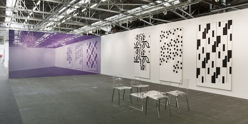
[image via artinfo]
A little Anastasi, a little Lawler, a little Shore, a little Fischer, a little Albenda. I wonder what color Michael Riedel’s awesome photomural in Zwirner’s booth will be by the time I get to the Armory show?
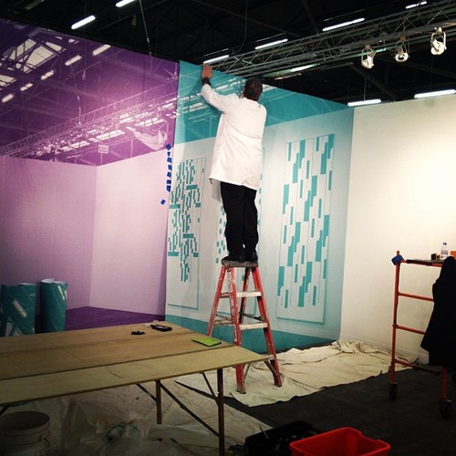
[image via @artnet]
Delirious Ningbo
I’ve been busy as all get out, and only now do I realize I haven’t actually posted here for a few days. I blame Twitter.
Anyway, I’m not a real believer in the Pritzker Prize, except when it’s totally awesome, like right now, when they just announced Shanghai-based Wang Shu as the winner of the 2012 architecture award.
Since last night, when LA Times architecture critic Christopher Hawthorne tweeted the news, and promptly began livetweeting Wang’s lecture at UCLA, I’ve been trying to think where it was that I first discovered what’s probably the architect’s most significant work so far, the Ningbo History Museum.
Wang indeed seems like one of the smartest, most sensitive practitioners of architecture in China right now. I say seems, because I really don’t know what’s going on on the ground, below the Western starchitect marquee projects from CCTV to that awful opera house, to that other awful opera house to that Steven Holl Ground Zero-in-Beijing mess, to that one housing development where everyone was brought in to make a Shigeru Ban house on spec? I remember Alvaro Siza telling about designing a building in Guangzhou back in the day, and visiting it as it neared completion, only to find out when he returned for the ribboncutting that the developer client had hurriedly doubled it without telling him.
And then everything else seems like generic futureschlock, and a wholesale disregard for history that’d do the Cultural Revolution proud. And then there was Koolhaas’s presentation on the Pearl River Delta which envisioned all of Hong Kong as basically the future Lower East Side/Astor Place of a massive, 100-mile-wide New York City on the South China Sea.
So that’s my context, with nothing but raw spectacle with a modernist/internationalist veneer.
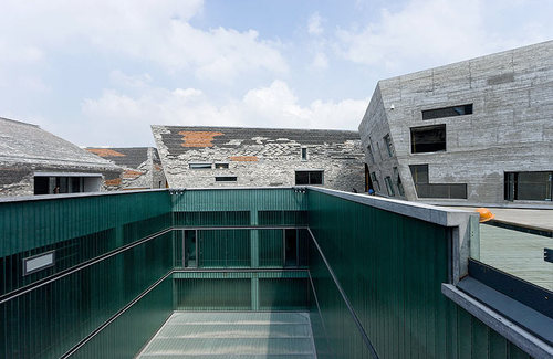
And then Wang’s Ningbo History Museum, which is surfaced with several million reused bricks, laid in patterns of the laborers’ devising, literally built from the rubble of the past it displaces–and repackages as museum content.
Wang turns out to have trained on construction and renovation teams, giving him an unusual sensitivity to material and process as they express themselves in form and space. I found myself nodding when Hawthorne compared him to Koolhaas, but then I thought, yeah, well, maybe the Koolhaas of Delirious New York, not CCTV and Put Me On The Cover Of Time Magazine. If anything, after this most recent OMA/AMO Venice show about the threat of History, Wang might be the anti-Koolhaas.
Anyway, I’m just rambling here without a plan, only because Wang Shu seems pretty amazing; his projects and proposals bode well, not just for China, but for the world with a modern China in it; and because I want to post one of Iwan Baan’s many illuminating photos of Wang’s built work. This one is the dramatic, hidden interior courtyard of the Ningbo Museum.
And thanks to Brian Sholis, who points to a nice collection of Wang Shu project images and information on the Pritzker Prize’s own media site [pritzkerprize.com]
Make No Small Plans: Autoprogettazione 2.0
Look, I don’t care if you ARE Domus and you have Paola Antonelli herself as a judge; it is no small thing to call your design competition Autoprogettazione 2.0:
Autoprogettazione 2.0 is an invitation to consider the potential of a diffused, localised manufacturing network combined with the self-build ethos proposed by Mari for the future of furniture design. It is an open-ended process that seeks to leverage the combined intelligence and talent of the design community and collaborative, open-source networks. Selected projects will be exhibited by Domus in an exhibition exploring the future of manufacturing hosted in Palazzo Clerici, one of Milan’s most prestigious palazzi.
The submission deadline is 27 March 2012.
The categories are table, chair, lamp, and storage, and the designs will be judged in part by how awesomely they exploit the fancy CNC and 3-D printing setups in the FabLab.
Frankly, it sounds interesting and on the up and up, but all a bit out of my league. And anyway, I don’t quite get how these new, cutting edge technologies are really the optimum solution for the space’s adaptable, quick & dirty, utilitarian, functional program. Not to be a curmudgeon about it, but my gimmicky meter is redlining right now.
Call for ideas: Autoprogettazione 2.0 [domusweb.it via, uhm, I forget. remind me?]
4/14 UPDATE And we have some winners. Nice stuff. You quiero El Gringo. For all the fab FabLab capabilities, it looks like plywood is still the go-to material for knock-together utilitarian furniture. [via @cityofsound]
Verner Panton X IKEA Chairs: Almost A Set
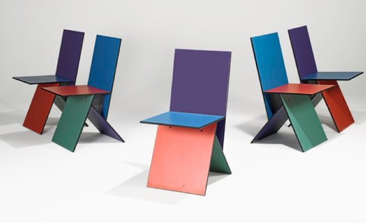
image: ragoarts
A couple–wow, almost three–years ago, when I was deep in my IKEA colabo phase, I posted a roundup of explanations for why Verner Panton’s melamine-on-MDF Vilbert chair didn’t sell that well when Ikea launched it in 1993-4.
Now, on the occasion of Rago’s upcoming auction of five Vilbert chairs, with an estimate of $3-4,000, another version of the chair’s origins has come to my attention: that the Vilbert was a limited edition, a low-production collaboration with a high-profile designer, dreamed up by Ingvar Kamprad as a brand enhancer, like Karl Lagerfeld’s H&M collection. In this scenario, selling only “about 3,000” Vilbert chairs worldwide was not a failure, but part of the plan.
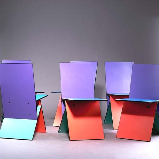
In any case, despite a lot of onesies selling–or not–for far less, I will guess that Rago hopes its set of five is worth twice the EUR 1600 Quittenbaum got for six Vilbert chairs in 2006. Perhaps someone with a chairless Guyton/Walker breakfast nook will prove them right.
UPDATE: the chairs sold for $2,875.
