
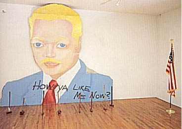
How Ya Like Me Now?, a large painting of a white Jesse Jackson by David Hammons, was one of seven outdoor works in “The Blues Aesthetic: Black Culture and Modernism,” an ambitious exhibition organized in the Fall of 1989 by Richard Powell at the Washington Project for the Arts.
The other six outdoor artworks were installed without a hitch, but approval for Hammons’ painting to be erected on a DC city-owned parking lot dragged on for six months, three months after the show opened. When the OK was suddenly given [with no explanation of either the delay or the decision], WPA staffers hurriedly erected How Ya Like Me Now? on the lot at 7th & G Streets [where the Verizon Center currently sits], across the street from one of the intended target audiences for its questioning title, the National Portrait Gallery.
The NPG had no portraits of blacks on display at the time. And Hammons suggested that a portrait of Jackson, arguably the most prominent African American in the US in 1988, would already be in the museum if he’d been white. Jackson had lost the Democratic Party’s nomination for president to Michael Dukakis after hitting a wall of white voter resistance in Wisconsin, a phenomenon of racist reluctance pundits called “the Bradley Effect.”
But a billboard-size portrait of a pink-cheeked Jackson suddenly appearing on the streets of DC with no explanation and a Kool Mo Dee lyric for a title was bound to arouse controversy. And when WPA curator Powell, who is black, left three white staffers to finish installing the piece, a crowd of young black men formed, voiced their protest against the artwork–and then took a sledgehammer to it and tore it down.
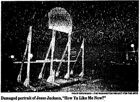
The Washington Post showed a photo of the only piece left standing on 7th Street, Jackson’s blonde afro and part of his blue eyes. After some back and forth in which Hammons kind of complained that the WPA did not install the work as high off the ground as had originally been called for, and the WPA complained about the city’s footdragging delays and said it was going to send the scalped Jackson back to Hammons for repair, the damaged tin painting went back on view, encircled by hammers, for the remainder of the exhibition.
All of which makes me very interested to know when and how How Ya Like Me Know? ended up in its current home in a private DC collection.
The most complete account of this story I can find online is this 1998 Duke Alumni Magazine article on RIchard Powell, who went on to become a very prominent art historian and author [duke.edu]
Category: art
On Things Other Than David Hammons’ Work
These two quotes from Coco Fusco and Christian Haye’s 1995 Frieze essays on David Hammons reminded me briefly of, say, gala artists and, say, Jacob Kassay, respectively:
‘Visual art may be the obdurately white and upper-middle class field of our culture. I have a notion why. Art objects are tailored for physical spaces owned or controlled by the social elite. To make appropriate objects for or even (or especially) against the spaces takes even more than talent and more than technical know-how. It takes intimate familiarity with those rooms where art enters history.’ Of course, critics also have a role to play as gatekeepers of history, and Schjeldahl is sly to entirely shift this responsibility to the museum.
…
During the 80s the road taken by many artists was to become known for creating a visual style and milking it for a lot more than it was worth. The road less travelled is to develop that autograph and then drop it in order to invent an entire new language.
For what it’s worth, I also want to see if anyone’s discussed Alma Thomas’s Watusi (Hard Edge) in terms of Henry Louis Gates’ theory of Signifyin’. Will look. Also, Christian Haye, where are you these days?
[frieze via hans ulrich obrist’s top 20 list]
Let Them Eat Cake
OOPS! Never mind!
In my dead-serious indignation, I had completely overlooked the potential of Marina Abramovic’s MoCA Gala for pathetic comedy. Fortunately, we have Ryan Trecartin, who speaks diva absurdity fluently. Trecartin’s livetweeted photo report from inside the tent is hilarious.
First, of course, the page of “INSTRUCTIONS FOR BEHAVIOR WITH THE CENTERPIECE,” which, yes, but. The second you read the instructions, you know the piece has already failed, or has at least missed an opportunity.
In 1974, Abramovic executed a piece called Rhythm 0, in which she sat completely impassive next to a table full of objects, including a gun and a knife. A sign informed the audience they could use anything they wanted on the artist’s body. It got kind of aggressive, and contested, and Marina says later she “felt really violated.” Surely the norms of gala culture would have tempered any actual violence, but would it not have been more illuminating to not tell the gala crowd to behave with basic human decency toward the human performer–and then see what happens?
But that’s not what was on the menu for this piece. Oh, the menu. “THE SURVIVAL MOCA DINNER” featured “Super Human Cocktails: Purity MoCA Martini, The Minimalist, The Conceptualist” and “John Cage Symphony,” which was a frisee salad with crostini and a fruit-nut loaf. Rauschenberg, de Kooning and Warhol were the other artists with courses named after them. I have no idea.
Holy moley, what is this extraordinary thing where people chant Marina’s artist manifesto at the audience? And Debbie Harry gets carried out by four Hollister doormen? A runway-like stage seems to be a trademark of the MoCA gala medium. Vezzoli had it. Aitken had it. Now Marina had it.

As Marina says, you can’t judge a work unless you’ve experienced it. Fortunately, Trecartin and his intrepid entourage stayed until after the bitter end, after the body part cakes in the form of Miss Thang and Ms. Harry were reduced to roadkill, and they investigated the underside of the table and then popped their own heads up. This is close looking and arts journalism, right here folks.
And in the service of art. For then our man in Los Angeles headed [sic] back to his hotel room with the greatest gift bags imaginable, containing kits to make centerpieces at home. So. Awesome.

Off with their heads!
All images via Ryan Trecartin’s Twitter
Marina Knows What She Is Doing.
At the invitation of Jeffrey Deitch, Yvonne Rainer has seen a rehearsal of Marina Abramovic’s performance art project for this year’s MoCA Los Angeles gala. And in a new letter to Deitch, she has refined and reiterated her condemnation of it as an exploitative and “grotesque spectacle [that] promises to be truly embarrassing.”
Would that it were actually embarrassing to the people involved, and to Marina herself. Rainer goes to great, cordial lengths in her open letter to Deitch [reproduced below] to separate her criticism of the gala from Abramovic’s work. While generous, I believe this is incorrect; the only context in which a revolving human head centerpiece on a $100,000 table could be realized is as an artwork. I mean, Abramovic’s certainly not claiming this is just edgy party decoration, is she?
If that were so, the case for embarrassment would be easily made. No, I think the reason this rankles so much is precisely because the gala does take on the mantle of art–and the stamp and stature of the artist. It’s not possible to say that this gala is not art; it is art you cannot afford to experience. It is art that you find humanly, ethically, and socially objectionable. And it is being produced and shown for money in one of our [sic] most reputable museums, by an artist who shows and is celebrated in similar institutions.
That’s a reality of the art world as it’s currently constructed.
Last year between the blog post where I declared the Gala as Art Movement and my presentation on it at #rank, I found two things: 1) Abramovic was deeply engaged in the luxury/sensual/sensory spectacle that is the gala experience’s stock in trade. And 2) Doug Aitken’s MoCA gala Happening was, on one level, a critique of the real estate and cultural forces which used art and museums to shape Los Angeles to serve their own needs. And that critique was utterly and completely subsumed by those very forces, probably without Aitken realizing it.
The Gala is bigger than any artist’s attempt to subvert it from inside the party tent. Aitken tried and failed, but I think Abramovic is just fine with it.
Yvonne Rainer Blasts Marina Abramović and MOCA LA [theperformanceclub.org]
Previously: An Incomplete History of The Gala-as-Art Movement [greg.org]
“Relational Aesthetics for the Rich, or A Brief History of the Gala as Art” [vimeo]
Yvonne Rainer’s revised letter to Jeffrey Deitch, along with its growing list of signatories, is after the jump.
What I Looked At Today: Anne Truitt
Insurrection, 1962, image: corcoran.org
I needed to see some hard-to-find Chris Burden catalogues–more on that later, but soon–and the quickest place I could find them was the Corcoran School’s library. I called ahead, and they had them waiting for me, so I was in and out of the library in no time.
Which left me with a little time to wander. And there is a very nice gallery with a nice, old Ellsworth Kelly diptych, and this wonderful Anne Truitt sculpture in the center of the room.
Insurrection was installed very dramatically with Hardcastle, another 1962 work, in Kristen Hileman’s Truitt retrospective at the Hirshhorn. Hardcastle confronted you head-on through the doorway, while Insurrection was turned sideways; on edge, with only the slab’s thinness and wooden brackets visible. It was only as you moved around it–following the contours of those unfortunate Karim Rashidian raised platforms–that they switched out: Hardcastle’s heft gave way, and Insurrection widened, revealing that they shared the same structure.
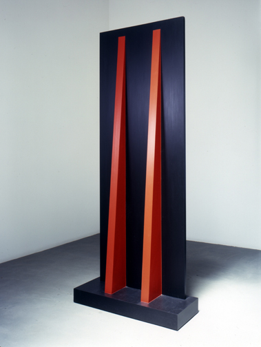
Hardcastle, 1962, via annetruitt.org
The install of Insurrection at the Corcoran, meanwhile, is much less enigmatic. There are off-center approaches from three different sides, so the sculpture is what it is when you see it. Moving around it is an experience, not a discovery. [The full frontal orientation faces the Kelly, Yellow with Red Triangle, from 1973.]
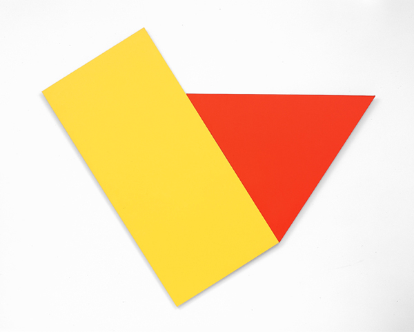
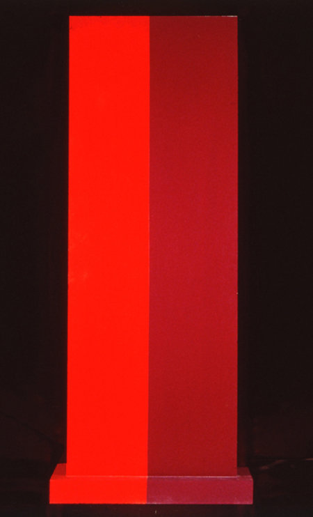
Yellow with Red Triangle, 1973, image corcoran.org
Even though they’re the same shape/structure, I remember Hardcastle‘s monochrome face felt more massive–and then artificial, as its red brackets popped into view. Insurrection’s two-tone reds make it feel more like two volumes immediately, which turn out to be one.
Back down on the floor where they belong, Truitt’s larger sculptures always feel like a presence, in space, and yet they’re paint[ings?] [ed?] And yet there is paint. Maybe 1962 was before her reportedly vigorous sanding and multiple coats kicked in, because Truitt’s surface is most definitely painted with a brush. Kelly’s surface, meanwhile, is only disturbed by the weave of his canvas; I’m going to assume he used a roller. But wow, there’s a brush going around the edges. And how. Just slapped right on there.
I’m trying to better understand the sense of paintings as objects, of the picture plane as nothing of the sort. I didn’t plan today to see these two artists’ works–Truitt’s and Kelly’s–which explore this very idea, in the form of painting/sculpture, but here they were. I still have to look some more, but basically, I came away thinking I might be really knocking myself out too much over my smoothly brushed-on painting surfaces.
previously: many Anne Truitt posts on greg.org
and a little on looking at Ellsworth Kelly
MoMA Sculpture Garden Fire Escape
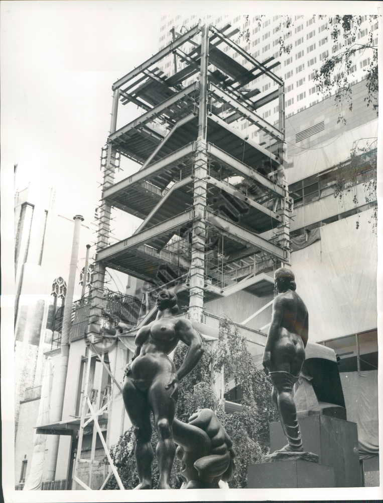
You’d think I’d learn the importance of clearing browser tabs by now. I’ve had this eBay listing open for a couple of weeks now, thinking I’d buy it. And then last night I decided to pull the trigger. And then to just do it in the morning. And it was gone.
It’s a rather awesome press photo from September 1958 of a temporary staircase erected in the Museum of Modern Art’s Sculpture Garden after the fire that destroyed a couple of Monet’s Water Lilies paintings.
The Tribune Company was selling the print, liquidating the photo morgues of various of its venerable newspapers at $15 a pop, while stamping its watermark across the digital version “to deter image theft [sic].” Mhmm.
This kind of provisory structure, something more than a scaffold but less than an actual building, is awesome to me. It’s a type of architecture that doesn’t often get documented, much less studied, and almost never preserved. The related exception, though, are 19th century Army-issue observation towers at Gettysburg, but even those seem to have been designed, not just built.
Previously: MoMA on Fire
‘The Gate’ By BHQF, Curated At Sotheby’s By Vito Schnabel
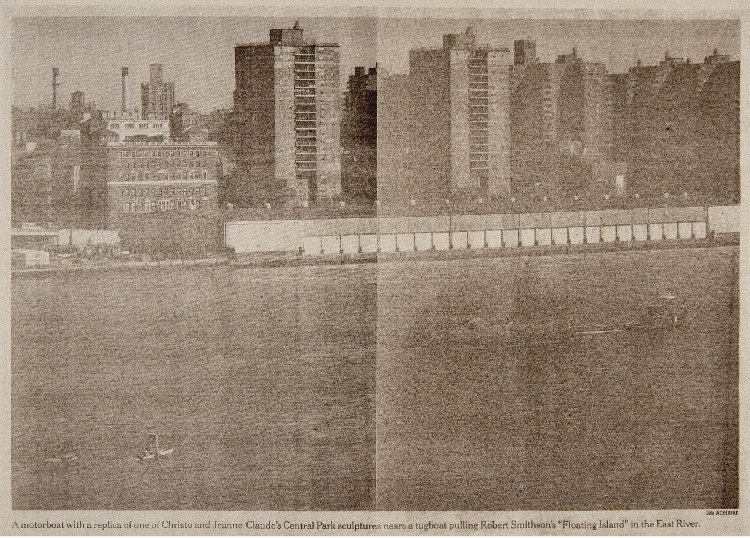
In 2005, designer Ian Adelman and his colleagues spotted The Gate chasing Robert Smithson’s posthumously realized Floating Island. Adelman snapped a photo, which ended up on the front page of the New York Times. It was only revealed some years later, after several arch, art world stunts established their reputation, that the pseudonymous collective Bruce High Quality Foundation acknowledged The Gate had been their inaugural project. Meanwhile, they have developed an irreverent, thoughtful, often amusing practice that remained admirably critical of the market fetishization of authorship, originality and young talent.
Until now, I guess, when they printed a big-ass version of Adelman’s photo as it ran in the Times onto a canvas and put it into a “selling exhibition” at Sotheby’s “curated by Vito Schnabel.”
Looks pretty sexy. I hope it’s an edition, so they can give Adelman an A/P.
The Gate: signed and dated 2011 on the overlap
silkscreen and acrylic on canvas
47 1/2 x 67 1/2 in. [sothebys.com]
2005: Water Gate
2009: Things we did not know in 2009: BHQF did The Gate
2009, a week later: Never Mind! Bruce High Quality Foundation made The Gate, but not The Article
Paul Thek’s Tatlin’s Monument
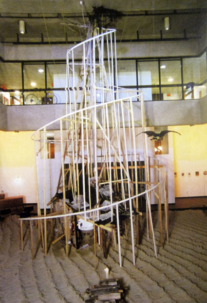
Paul Thek’s birthday was last week, so I probably should have posted this photo of his re-creation of Tatlin’s Monument to the Third International then.
Thek installed this version of his Tower of Babel at his only US museum show in his lifetime, at the ICA Philadelphia in 1977. That’s Uncle Tom’s Cabin and a bathtub full of water inside it there.
Whatever points it loses for verisimilitude Thek’s Tatlin’s Monument makes up for being ahead of the game. The only widely known Tatlin replica at the time in the West was Pontus Hulten’s first version, built in 1968 for the Moderna Museet [where Thek had a show in 1971.] Hulten had made that one with T.M. Shapiro, Tatlin’s collaborator in the “Creative Collective.” Then in 1975, Shapiro went on to make another, more accurate version himself in Moscow, after gaining access to more original notes and documentation.
But then, I don’t get the sense that historical accuracy was ever Thek’s goal.
Previously: On The 2nd Through 8th Tatlin’s Monuments To The Third International
John Pearrault’s 2010 look back at Thek’s work and non-career
The Terracotta Army Of The Internet Archive
Not sure what’s cooler about JWZ’s post about visiting the repurposed Christian Science church that is now The Internet Archive’s San Franscisco Mothership:
their slick and simple book digitizing station setup, or the “terracotta army of avatars of their long-term employees” which are gradually filling the pews.
The Internet Archive [jwz.org]
Luminous Canvas, Sham Paris

Sweet, near the end of World War I, Paris planned and began construction on a “Sham Paris,” decoy trains, stations, avenues and factories, to confuse German aerial bombers.
Above, a detail from the photo, “Luminous canvas on the ground to represent, to German airmen at night, oneof the great Paris railway stations: The Camouflage Gare de l’Est.”
Like the 1920 editors of The Illustrated London News, I would have liked some aerial photos of the deception.
A Paris Made to be Destroyed–Sham Paris, 1917/18 [ptak science books]
Suspiciously related: Maskelyne’s Sham Alexandria, or The Greatest Camo Story Ever Told
Same But Different: Charles Ray And Le Grand K

I count it as a matter of pride and oddly satisfying accomplishment to learn I’d been thinking some of the same things about the International Prototype Kilogram that Charles Ray was thinking about the International Prototype Kilogram.
Picture Piece: Same but different, the many ur-Kilos [frieze, jan-feb 2000]
Previously: The International Prototype Kilogram, or le Grand K
Here is the International Prototype Kilogram again
There’s No Such Thing As A Free Lunch

The classic saying, so closely associated with the conservative icon economist Milton Friedman, just sort of came out last night during a brief Twitter discussion with Bill Powhida and Magda Sawon about what, exactly, my point is on Rirkrit Tiravanija’s gorgeous, mirrored objects.
And basically, I think it comes down to my dissatisfaction with what feels like the persistence of a critical adulation of Rirkrit’s socially oriented practice–and, by extension, Relational Aesthetics generally–as anti-market, anti-commodity, gifty experientialism, which does not acknowledge, must less seek to understand and account for, the beautiful luxury goods at the center of so many of these projects.
This seeming contradiction or paradox–I will not call it hypocrisy, at least not on the artist’s part–should be adding a level of complication and contestation to Rirkrit’s work. Instead, it’s reduced to the critical comfort food of free soup and socializing.
I think Rirkrit knows about the “there’s no free lunch” concept, at least on some level. Thanks to Friedman and to Robert Heinlen before him, who popularized the acronym, TANSTAAFL [There Ain’t No Such Thing As A Free Lunch] in a 1966 sci-fi story about lunar colonists rebelling against their earthly overlords, the saying is pretty deeply embedded in the history of postwar liberalism and globalization, the very political and philosophical context Rirkrit’s work engages [and from which he appropriates so many of his forms.]
So now, against my better judgment, perhaps, I think I want to take a closer look at Rirkrit’s practice and the Relational Aesthetics construct from the perspective of Friedman’s foundational libertarianism. It’ll be like opposition research as art criticism. Or maybe it won’t be. To ignore the highly market-oriented aspects of Rirkrit’s work, and focus solely on the dinner parties and sleepovers is to almost perfectly miss Friedman’s point: nothing comes without a cost; it’s just a matter of identifying it and figuring out who’s going to pay.
While no one seems to be paying much critical attention to Rirkrit’s objects specifically, Relational Aesthetics and its evangelist Nicolas Bourriaud have been worked over repeatedly by other critics in ways that can implicate and/or illuminate these shiny baubles. Claire Bishop, Miwon Kwon, and Stewart Martin are just three prominent voices in the debate, which takes RA to task for both feeble anti-aestheticism [Bishop], and for neutralizing and commodifying social practice within the institutional apparatus [Martin]. I really don’t have the chops or the stamina to lay all this out right now [or maybe ever, who knows?] But the Radical Cultural Research Collective’s RA critique critique provides a handy reference point, as does Dave Beech’s horribly formatted analysis of participation.
What I can do right now, though, is ogle this awesome book cover from 1949, which just became a study for a painting I will have to make. This slim book, TANSTAAFL: A Plan For A New Economic World Order by the hard-to-research Pierre Dos Utt, is one of the earliest published references to “ain’t no free lunch.”

The phrase has its own Wikipedia page, of course.
There ain’t no such thing as a free lunch. [wikipedia]
thanks to Brent for help in approximating Rirkrit’s font for the mockup up top.
Sachs X Ikea X Judd: Great Minds Think Ikea
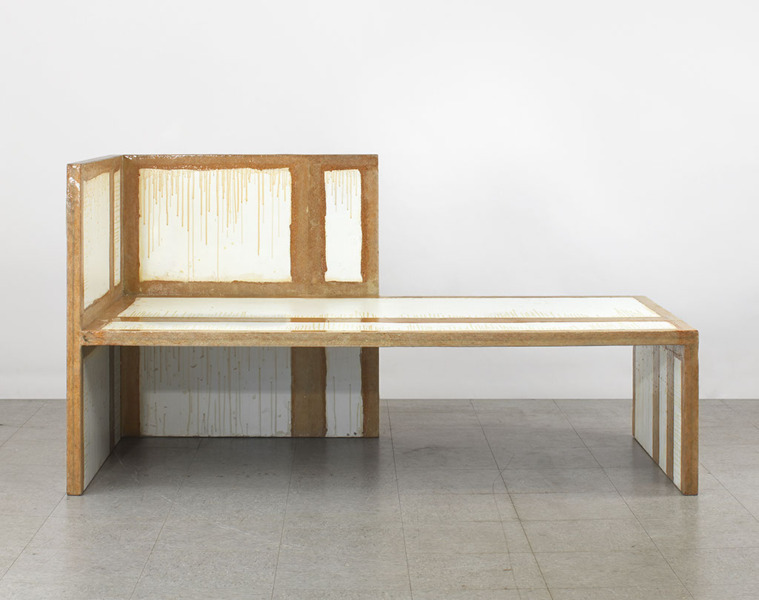
For he that hath eyes and was paying attention last year, The Selby let him see. For the rest of us, the show at Sperone Westwater is the first time to see Tom Sachs’ awesome Donald Judd furniture hacked together from particleboard scraps from the IKEA AS-IS department.
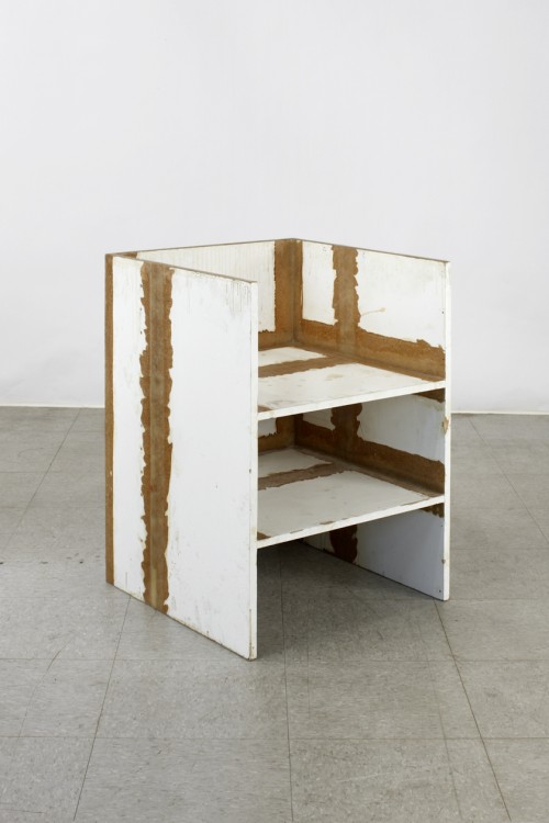
Hacked is, of course, not the right word. The chairs are constructed with Sachs’ characteristic attention to craft and process: they show every drip of resin, every bubble and lump in the fiberglass joinery.
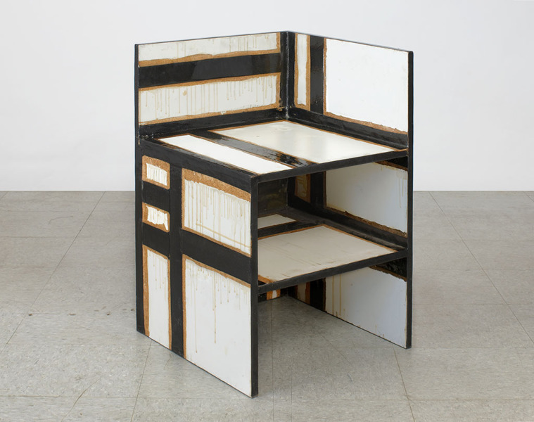
For me, the best part is that the pieces date from 2009. And in November 2009, the first issue of Bricolage Magazine, Tom’s zine, included a feature titled, “Ikea vs Judd.” Because as awesome as they are on their own, they’re even better for not being Enzo Mari furniture.
Tom Sachs: WORKS, Nov 4 – Dec 17, 2011 [speronewestwater.com]
Tom Sachs site [tomsachs.org]
6.14.10 Tom Sachs in his studio [theselby]
Tom Sachs studio film, by The Selby [vimeo]
Previously, resonant, not related: Enzo Mari X Ikea mashup
howtospendit.com +rirkrit
Thanks to Awl for reminding me that not everyone is not talking about Rirkrit Tiravanija’s sexy, blingy objects. I’d found this last week, but it was crashing my browser, and it may do the same to yours, probably because it’s designed for folks who trade up their computers with the same frequency Steve Jobs traded his AMG SL65.
The Financial Times’ luxury lifestyle magazine supplement How To Spend It loves Rirkrit’s work.
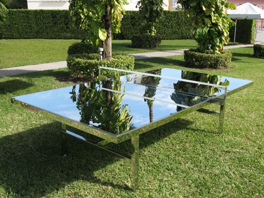
In “Art Works: Spectacular Sculptures – with a purpose,” Helen Chislet delivers servicey with a smile by revealing the “spectacular and tremendous fun” that can result “when artists are asked to design functional outdoor objects.” Objects like Rirkrit’s “ping-pong table of flawless mirror-polished stainless steel in an edition of ten–a piece of perfectly executed workmanship that carries a price tag of $55,000.” [no correction to my original price mention; if you want to pay 10% more that’s your business -ed.] Objects which are still likely to appeal to the FT’s ideal UK-centered international demo, typified by one garden folly maker’s client base as “City workers relocating to the country, but now includes European royalty and “extraordinary people.”
And the Palm Pavilion at Inhotim gets a starring role in “Artward Bound,” Pernilla Holmes’s round-up of far-flung private art parks, which, I love this:
“So much contemporary art is commodified,” says [Doug] Aitken. “A place such as Inhotim works against that. It empowers the artist rather than curating the artist. It’s a phenomenal template for a modern museum.” Unlimited by budget constraints, bureaucracy, timescales and space, such privately owned modern museums are popping up in spectacular, middle-of-dowhere locations around the globe as moneyed art collectros turn the traditional museum model on its head. Each is as unique as the personality of the person who dreamt it up.
Aitken really does have his finger on the pulse of these things.
previously: relational aesthetics for the rich
the gala-as-art movement [vimeo]
Richard Prince And Friends
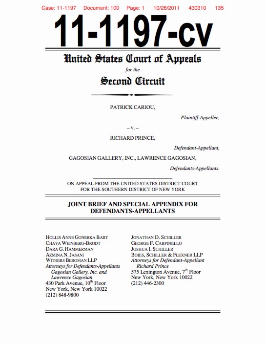
I’ve tweeted on this a bit already, but it’s really worth repeating: Richard Prince’s appeal of the Patrick Cariou copyright infringement decision is a really great read. The brief was filed last week, and I finally got around to reading on Halloween night. I find it makes a very clear and persuasive argument for throwing out Judge Batts’ sweeping ruling, and it’s a nice, not too esoteric discussion of appropriation and fair use as well.
Basically, Prince, his new lawyers, and Larry Gagosian argue that Judge Batts wrongly applied the prevailing legal standards for fair use, especially the most recent, relevant case which had been before the same court, Blanch v. Koons.
I think I’ve written before that Prince’s work, and his first-round defense, relied very heavily on Koons’s winning argument that an artist’s transformations of size, scale, material, and context were sufficient for fair use. But their briefs almost never cited Blanch and did not make that transformative use argument clearly or well. That has changed.
Prince’s lawyers also argue that Batts overreached and erred by finding all 30 of Prince’s Canal Zone works to be infringing, regardless of what, how, or how much of Cariou’s imagery they contained. And that it’s wrong to force Prince to hand over all the artworks to Cariou when the settled precedent of monetary compensation exists.
I think that, at the very least, the court will find that each painting must be evaluated, and that the court will have to decide Prince’s transformative efforts. While I would love to publish such a document, because it would just be the best kind of worlds-colliding art criticism around, I suspect a check will be cut before the judges take out their rulers.
I could rattle on about this all day, but why not just read it yourself? Here is a copy of Prince’s filing, which I’ll host on my Dropbox own site for a while. The 135-page ruling has a lot of very nice, full color illustrations and clocks in at around 7mb.
[OBVIOUS DISCLOSURE ABOUT GREG.ORG AND THE CREATIVE CAPITAL | WARHOL FOUNDATION ARTS WRITERS PROGRAM, WHICH IS COMPLETELY UNRELATED TO THE FOLLOWING PARAGRAPH, HERE.]
And in even more interesting news, Joy Garnett just gave me a heads up that the Warhol Foundation has actually filed an amicus brief in Cariou v. Prince, warning the courts that if Judge Batts’ ruling were to stand, it would put works by other artists in jeopardy, and would cause “such uncertainty in the field as to cause a chilling effect on the creation of new works.” I expect I’ll come back to this after I read it all, but the Foundation’s brief defends Prince’s work as part of a broad, artistic history of appropriation, quoting, and collage. Should be interesting. The Foundation’s 57-pg brief [pdf] is linked directly here.
Previously: the five most ridiculous things about the Richard Prince copyright decision
The Richard Prince decision? You’re soaking in it!
Richard Prince’s Spiritual America
Size Matters?
“THE WITNESS: This could be a cool book.”
“The Movie is called ‘Eden Rock'”