The View Of Punishment Park From Zuccotti Park

punishment_park_interro.jpg
Punishment Park? How did I not know about Peter Watkins’ incendiary 1971, anti-war, anti-fascist, faux-news documentary? I mean, it was the movie Rirkrit chose to broadcast on his unlicensed TV station in the Guggenheim. I sat in Anthology’s rickety seats for the entire 5+ hours of The Commune (Paris, 1871). Is it one of those things that just looks so completely, unrecognizably different in the light of Occupy Wall Street, that–no.
When Punishment Park was finally released on DVD in 2005, it was the peak of a globally unpopular war, which was tainted by torture, unlawful detainment and military tribunals, violations of basic constitutional and human rights, and polarized rhetoric within American culture. So no, I don’t think I registered what Watkins had done.
punishment_park_zp.jpg
Which, holy smokes. Here’s how Holland Cotter describes Punishment Park in his 2005 review of Rirkrit’s show:

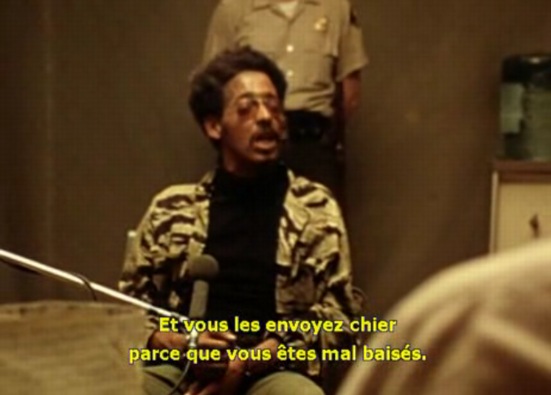
it is a docudrama about the brutal silencing of antiwar protesters during the Vietnam period. Many of the actors were amateurs. The people cast as activists were, in fact, real-life activists; the police were played by former police officers.
Their lack of theatrical training gives the film a curious tension, making it seem both authentically documentary and stagy. It feels something like that era’s political street theater, which was cropping up all over the United States and Europe at a moment when anger and paranoia were at flood tide. This aesthetic certainly suits the low-tech character of the broadcast facilities, which are pretty rudimentary.

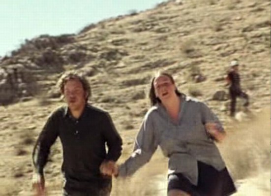
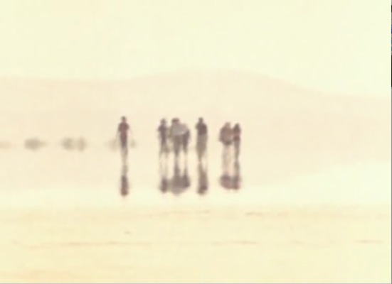
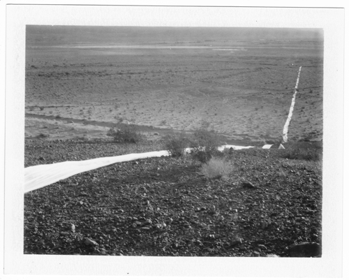
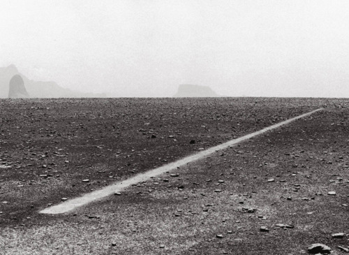
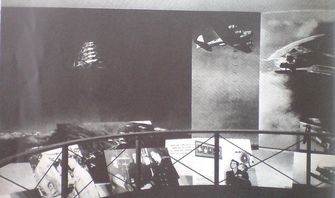
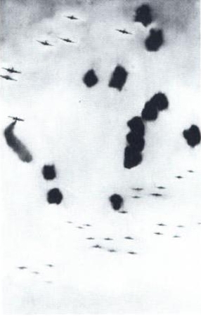
Shooting in an army tent and the Mojave Desert, a British news crew follows two groups of activists/protestors as they are run through a sham tribunal and are given the choice between excessive federal prison sentences and an impossibly brutal three-day race across a vast desert reservation, aka “Punishment Park,” where they are hunted down by National Guardsmen training for the next Kent State.
punishment_park_haze.jpg
It’s like Predator and The Tenth Victim gave birth to the sequel of Zabriskie Point, starring the Chicago Seven. It is not pretty.
Punishment Park may not be a great movie, but it is definitely a fascinating one, one which is difficult to watch, and apparently difficult to like. I think that’s by design, though; it seems calculated to antagonize and/or enrage basically anyone with a political opinion and a stake in the outcome of the American experiment. It deserved a little more credit than it got, though, and certainly better consideration than Vincent Canby was capable of:

Because all literature, including futuristic nonsense like this, represents someone’s wish-fulfilling dream, I can’t help but suspect that Watkins’s cautionary fable is really a wildly sincere desire to find his own ultimate punishment.

Yow.
The freaky thing, I guess, is the way Punishment Park manages to both over- and under-predict the cultural rifts and abuses of power in American politicized culture over the intervening 40 years. I think had I seen Punishment Park in 2005, I would have distanced it as a historic, histrionic artifact. But given the last few years/months/weeks, I can’t help but see parallels and hear echoes between the film, its time, and today.
The other, less uncomfortable thing–I mentioned Zabriskie Point for a reason–is how Punishment Park alters the context of the 60s and 70s for me. I can’t help but see the counterculture and the desert, the military and the desert, war and the desert, art and filmmakers in the desert, quite differently now.
The New Yorker Films DVD release of Punishment Park is available on Amazon and Netflix.

Sarah Sze Street View

Just this morning, while I was watching Sarah Sze’s 2010 lecture at the Smtihsonian American Art Museum, and she was showing videos of her installations for the first time [borrowed, with permission, she said, from various YouTube users, which is nice]. And I found myself thinking, “Hah, try running the Google Street View Trike through that!”
But of course, Google already did.
sarah_sze_street_view1a.jpg
Street View just announced the release of imagery from The High Line, which was apparently captured by the Trike this spring, just before the second, Northern section opened.
sarah_sze_street_view2.jpg
And whaddyaknow, there’s Sarah Sze and her crew, installing her bird city, Still Life with Landscape (Model for a Habitat). That’s Sze and her updo on the left. On the LEFT. Focus, people, focus.
And I do believe that is dearly departed High Line curator Lauren Ross with the lanyard, checking in on things. [Happily, Ross isn’t dead; she just moved to Tulsa.]
These photos are actually in reverse order; the Trike was driving south. I haven’t spotted any traces of a Google Guide yet. But I do notice that with this early morning shoot, the Street View pano stitching algorithm erases the Trike’s shadow. Leave no trace.

Dazzle Camo Colour Chart

Britannica_Color_Chart_camo.jpg
Razzle dazzle camouflage painting was not, as the photographs would have you believe, entirely black and white. [For that matter, neither was WWI itself, but that is a matter for another day.]
In any case, British camoufleur Norman Wilkinson published a camo color chart [sorry, colour chart] in the 1922 edition of the Encyclopedia Britannica, which the esteemed camoölogist Roy Behrens re-created using Pantone colors. Sorry, colours.
We had some hints, and Dakis and Jeff already knew about this, of course, but for the rest of us, it’s useful to review.
Roy Behrens’ Camoupedia blog [camoupedia]
Previously: Bedazzled; Dazzle camo design lithos at RISD

Blue Room And Love Seat, By Jason Rhoades

I love a lot of Jason Rhoades’ work, but only have a little. I wish I’d known about this sooner:
Jason_Rhoades_Love_Seat.jpg
Blue Room and Love Seat is an edition produced with 1301PE’s Brian Butler in 1995, maybe when it was still only 1301.
Anyway, it’s a steel trunk with a cushion on top, for sitting, which contains an inflatable room made from blue tarps. Which sounds delightful, except that it’s inflated by a leafblower, so it’s noisy. And it’s actually inflated by the blower exhaust, so it also pumps noxious fumes into the blue room. Which sort of makes it a portable gas chamber. Which is now kind of depressing.
1301pe_blue_room_inflating.jpg
On the other hand, there must be at least one left in the edition, because the gallery inflated it last year for a show.
Blue Room and Love Seat, 1995, Jason Rhoades [1301pe.com]
“Musée Los Angeles, Blue Room and Love Seat [1301pe blog]

TV Power To The We, The People

rirkrit_tv_transmitter_gugg.jpg
A piece I left out of my Rirkrit’s blingy objects post yesterday may be more important than I originally thought, and for more reasons than its shininess.
Untitled 2005 (the air between the chain-link fence and the broken bicycle wheel) was the Guggenheim installation Rirkrit got to do for winning the Hugo Boss prize. It was a low-power, unlicensed TV transmitter, the blueprints for building your own, and wallpaper full of texts about freedom of speech, the revolutionary power of media, and the political and economic contradictions of the FCC.
I was thinking of mentioning it because it atypically included structures made of both plywood and of mirror-finished steel. The glass and steel vitrine held the TV transmitter, the source of media power, while the similarly sized plywood shed contained the antenna and a TV. The steel cube was closed off; the ply cube had a door, windows, and 2×4 furniture. Oh, and an antenna made in the form of Marcel Duchamp’s bicycle wheel.
rirkrit_tv_receiver_gugg.jpg
The instructions for making your own TV station were printed on posters, made available on the floor in a Felix-style stack. If there were a more explicit evocation possible of contemporary art and the political clashes of the 60s, 70s, 80s, and 90s, I guess I can’t think of what it was. Except maybe for Rirkrit’s collaboration the next year with Mark di Suvero to create an Iraq War-era version The Peace Tower.
rirkrit_tv_stack_gugg.jpg
Untitled 2005 (the air between the chain-link fence and the broken bicycle wheel), detail, via
And then I found Holland Cotter’s unexpectedly extraordinary-in-parts review of Rirkrit’s 2005 Guggenheim show:

The installation is basically a bare-bones statement of the practical fact that anyone who wants to participate in shaping the communications media that are shaping the world at large can do so. “Everyone is an artist” was Joseph Beuys’s potent rallying cry in the 1960’s and 70’s, which made artists and “the people” one. Mr. Tiravanija, who has learned much from Beuys, adds his own variation: “Everyone is a broadcaster. Make this transmitter at home.”
rirkrit_tv_interior_gugg.jpg
Hmm, mirrored TV: Untitled 2005 (the air between the chain-link fence and the broken bicycle wheel), detail, via
At the same time, he has customized his own version with a couple of features that are not necessarily meant for replication. One is the glass box encasing the transmitter. Its presence is symbolic, a reminder of how resources that should be available free to everyone become the closely guarded valuables of a privileged few.

Yow, that suddenly puts a polemical shine on Rirkrit’s deployment of chrome; makes me not want to get caught with a shiny ping-pong table when The Revolution comes.
But then, in one sense, it’s already here.
The complicated connection between politically charged art of the 00s and today’s Occupy Wall Street protests grew starker as I read Martha Schwendener’s sharp piece in the Voice [thanks, Tyler] about the implications of #OWS for art, and vice versa:

Art was, for a long time, a utopian model. But with bohemianism eroded by gentrification and the 1 percent end of the art spectrum devoted primarily to vapid, overfunded gestures, you wonder if a recent Columbia University symposium, which described art as “a catalyst and platform heralding justice, solidarity, and a peaceful future” is nostalgia–or just wishful thinking.

Schwendener’s piece read to me like a wakeup call for artists: “Practice [sic] is over. This is not a drill.”
Which made me think right back to Cotter’s opening, clear-eyed for a child of the 60s, a reflection on the very idea of “Power to the people”:

Who were “the people,” anyway? Blue-collar workers, African-Americans in the civil rights movement, immigrant laborers. Students? Some, though even engaged young people tended to want to help the people rather than be the people.

There’s a Rirkrit t-shirt in there somewhere, I can just feel it.
Art Review | Rirkrit Tiravanija: Work Whose Medium Is Indeed Its Message [nyt]
What does Occupy Wall Street mean for art? [villagevoice]

Transactional Aesthetics, Or The Highly Collectable Rirkrit Tiravanija

I’ve been writing this post in my head for months, years, even, but so many pieces have piled up in my browser tabs, it’s slowing my computer down. And plus, this weekend MoMA announced that they acquired and will exhibit Untitled (Free/Still), the original [sic] free-Thai-curry-in-a-gallery work, so it’s time to step back and look more closely at Rirkrit Tiravanija’s art practice. First, by starting with what we are fed. Here is a small sampling platter of familiar statements by and about the artist and his work:

“It’s part of what has been called ‘relational aesthetics,’ ” said Ann Temkin, chief curator in MoMA’s department of painting and sculpture. “Joseph Beuys created social sculpture; it’s the act of doing things together, where you, the viewer, can be part of the experience.”

That’s from MoMA’s press release in the NY Times.

You could say his art is all about building “chaotic structures.” Then again, it’s about lots of things; his work is so open-ended and departs so radically from the art market’s orientation toward precious objects, that it’s earned many labels, many – like utopian or chaotic – that only tell part of the story. But one that’s stuck, for better or worse, is French theorist-critic Nicholas Bourriaud’s “relational aesthetics,” the idea of judging the social relationships sparked by an artwork instead of merely considering the object.

That’s Paul Schmelzer, now/again of the Walker Art Center, an early and frequent supporter of Rikrit’s work, writing in 2006.
rirkrit_caravan_musac.jpg

Tiravanija’s art is free. You only need the experience. In fact, the essence of his work resides in the community, their interrelationships, and chance. Make art without objects, their purpose is a complaint against the possession and accumulation.

The Museo de Arte Contemporáneo de Castilla y León, which owns Untitled (Caravan), a 1999 plywood model of a camping trailer, with kitchen, above.
Rirkrit as quoted by Bruce Hainley in Artforum, 1996:

“Basically I started to make things so that people would have to use them,” he has said, “which means if you [collectors, museum curators, anyone in these roles] want to buy something then you have to use it. . . . It’s not meant to be put out with other sculpture or like another relic and looked at, but you have to use it. I found that was the best solution to my contradiction in terms of making things and not making things. Or trying to make less things, but more useful things or more useful relationships. My feeling has always been that everyone makes a work – including the people who . . . re-use it. When I say re-use it, I just mean use it. You don’t have to make it look exactly how it was. It’s more a matter of spirit.”

rirkrit_print_aia.jpg
And here’s Faye Hirsch in Art in America this summer, perfectly teeing up her making-of story for Untitled (the map of the land of feeling), [above] an extraordinary 84-foot-long print edition Rirkrit has worked on for the last three years with students and staff at Columbia’s Leroy Neiman Center for Print Studies:

Rirkrit Tiravanija has never been known as a maker of elaborate objects. In a market-riven art world, he has remained, since the early ’90s, a steadfast conceptualist whose immaterial projects, enmeshing daily life and creative practice, have earned him a key role in the development of relational art. At galleries and museums around the world, he has prepared meals and fed visitors, broadcast live radio programs, installed social spaces for instruction and discussion, set up apartments–where he or visitors might live for the duration of a show–and dismantled doors and windows, leaning them against walls. At two of the three venues for his 2004 retrospective, the “display” consisted of a sequence of empty rooms referencing (in their proportions and an accompanying audio) his selected exhibitions over the years.
When Tiravanija does make objects, they are generally of a modest nature–most often multiples and ephemera connected with exhibitions. At his show this spring at Gavin Brown’s Enterprise in New York, for example, he set up a room where an assistant screenprinted white T-shirts with his signature terse, block-print headlines, ranging in tone from vaguely political (LESS OIL MORE COURAGE) to hospitably absurd (I HAVE DOUGHNUTS AT HOME). They cost $20 apiece.

Ah yes, the t-shirts. Not sure if I ended up being the only one, but I was apparently the first to order a complete set of all 24 shirts. So there’s that.
rirkrit_playtime_gavin-thumb.jpg
I have been an admirer and follower of Rirkrit’s work since his earliest shows at Gavin’s, and Untitled (Playtime), the awesome, ply&plexi, kid-sized replica of Philip Johnson’s Glass House he built in MoMA’s sculpture garden in 1997 [above] bought him at least a decade of good karma in my book.
And so it’s only very recently that I’ve started to watch and wonder if I’m the only one who– See, this is why Faye Hirsch’s quote is so perfect: because it encapsulates exactly how people talk and write and think about Rirkrit’s work, and it’s perfectly and exactly wrong.
I’m sorry, that’s the overdramatic hook in this post. What I really mean is, as his social, experiential, ephemeral practice, his “art without objects” has taken off, Rirkrit has also been making some of the blingiest, sexy-shiniest, most ridiculously commodified luxury objects around. I love them. Why can we not talk about them more?

Continue reading “Transactional Aesthetics, Or The Highly Collectable Rirkrit Tiravanija”

Here There, There Here, And Everywhere

here_there_rolu.jpg
I’m so blown away by this. RO/LU‘s and welcomeprojects‘ project for this year’s High Desert Test Sites was called Here There, There Here. To call it a contemporary nod to earthworks almost feels backward; it’s like the earthworks movement was building to this.
It’s a two mile [!] strip of white felt run across the open desert outside Joshua Tree. While I was waiting for more photos to turn up, I kept seeing Here There, There Here everywhere:
richard_long_line_walking.jpg
Richard Long’s 1967 work A Line Made By Walking [spotted on It’s Never Summer, Wayne Bremser’s tumblr]
contrails_noaa.jpg
And then whenever I’d see a contrail across the sky. High fives all around, what a stunning project.

Queen Victoria Silk Newspaper

Well that’s kind of fantastic, like Victorian- era Rauschenberg.
queen_victoria_silk_newspaper.jpg
Apparently, to commemorate Her Majesty the Queen’s to the Isle of Jersey, The Jersey Herald printed copies of the September 11, 1846 edition of the newspaper on silk panels, which were then stitched together with beaded pearls. Here’s a detail shot:
victoria_silk_paper_detail.jpg
Did they only make the one copy? Is this the only printed silk newspaper facsimile out there? Can I find these in any boot sale of dead queen paraphernalia, or only Malcolm Forbes’s?
UPDATE AFTER TEN MINUTES OF GOOGLING So printing newspapers on silk is/was a commemorative thing. The first copy of the first issue of the Grand Rapids Times was printed on silk in 1837 and presented to its largest subscriber/investor, while additional souvenir copies were printed on cloth. A silk copy of an 1852 edition of the San Francisco Daily Whig came across book conservator Nicole Wolfersberger’s desk [and into her flickr stream] a couple of years ago. The Upper Hunter Courier made a silk presentation copy of their paper for Lord Belmore after he came to open a section of railway in Scone in 1871. It was not nearly as nice as Queen Victoria’s.
scone_silk_newspaper.jpg
And in 2007, the Jiefang Daily Press Group gave the V&A a copy of the 2005 silk front page which was carried into orbit on China’s second manned space flight.
The Forbes Collection at Old Battersea House – Sale 338 – Lot 415
TWO PRINTED COMMEMORATIVE SILK FACSIMILE NEWSPAPER SHEETS
Est. £500-800
[lyonandturnbull.com]
Previously: Rauschenberg Currents Event

Artforum Reviews Jacob Kassay Press Release

kassay_lm_angle.jpg
Huh. I guess Artforum’s back-of-the-book review section does not purport to ignore the art market’s overdetermining forces any more.
Ben Carlson’s review of Jacob Kassay’s show this summer at L&M Arts in Los Angeles is framed around the burning question, “Does Kassay’s work properly account for the auction hype and thus, its own presence in this high-end gallery?”

But L &M Arts’ interest in this young painter is no mystery: Regardless of their merit, Jassay’s silvery-reflective monochromes made a splash at auction last fall. Anticipating the cynics, the staff penned a press release that was quick to distance Kassay’s older output from the new work he made for this show. Calling attention tot the differences in surface treatment, it announced that his most recent paintings would feature a “surprising yet deliberate lack of reflection.”
[part where 29-yo Kassay is chided for not taking better hold of his secondary market and is as yet found to be no Ryman or Kelly omitted]
Offered a chair at the high rollers’ table, Kassay could have made only one compelling move–a wager with the potential to break the bank. Of note: His Paris dealer, Art: Concept, has already offered public assurances that the artist is not about to meet the market’s demand for more of the same. In fact, had Kassay overperformed (or overproduced) this summer, he might have presented a distance from these overdetermining forces or even productively embraced them…It appears, however, he’s chosen to ignore them altogether. [ellipsis original]

Some day, maybe the discussion of what we see when we look at Kassay’s distorted, mirror-like work will not be characterized by such a surprising yet deliberate lack of reflection. But that day is not yet.
Previously: On Jacob Kassay and collaboration

#OccupyMarkdiSuvero

disuvero_zucotti_ourtravpix.jpg
Joie de Vivre, Mark di Suvero, Zuccotti Park, detail of image via ourtravelpics.com
Or maybe #OccupyJoiedeVivre, then? Either way, please tell me I’m not the first or only one to think of this. Actually, please tell me someone’s already working on it.
Mark di Suvero’s giant steel sculpture, Joie de Vivre was built in 1997 and stood for several years in the exit plaza for the Holland Tunnel, then at Storm King, and in 2006 it was installed in its new home, Zuccotti Park. Whether its art historical significance is fully appreciated, or whether it’s called “The Big Red Thing,” di Suvero’s sculpture has become an icon of the Occupy Wall Street protests.
disuvero_peace_tower.jpg
The Peace Tower, 1966, image via newsgrist
Which is good, because di Suvero himself is an icon of artistic involvement in political action, activism, and social justice. In 1966, along with Irving Petlin and others, di Suvero designed The Artists’ Tower of Protest, also known as The Peace Tower, one of the earliest and largest artist-organized protests against the Vietnam War.
The Peace Tower stood on a vacant lot on the corner of Sunset and La Cienega Boulevards in Los Angeles, which Petlin’s Artists Protest Committee rented for three months. They solicited 2×2 art objects from 400 artists, which were installed onsite. Documentation of The Peace Tower is currently included in Pacific Standard Time at the Getty.
whitney_peacetwower_wjff.jpg
Peace Tower @Whitney Biennial, 2006, image via wjff
In 2006, Rirkrit Tiravanija worked with di Suvero and Petlin to re-create The Peace Tower as a protest to the Iraq War as part of the Whitney Biennial. The new tower was festooned with 180 2×2 panels created by invited artists, including many artists from the LA original. [And Joy Garnett, hello!]
So it would seem to me, that when you’re organizing a global protest against injustice at the foot of a Mark di Suvero sculpture, shouldn’t you organize it on the Mark i Suvero sculpture? And shouldn’t you do that, NOT by climbing the sculpture and demanding cigarettes be delivered to you by police cherrypicker, thereby precipitating the fencing off of said sculpture and the park space around it, but by tracking down the artist himself and enlisting him in a call for artists to create 2×2 panels that will be installed on Joie de Vivre itself?
And though it might be hard to measure–or identify, for that matter–the impacts on policy of the war protests in 1966 and 2006, circumstances almost seem to demand an incarnation of a protest tower in 2011-12. And at the very least, art people, doesn’t this make 10000x more sense than marching on the Frick?
Related: Jeffrey Kastner’s remarkable interview with Irving Petlin, Mark di Suvero and Rirkrit in the March 2006 Artforum [artforum via findarticles]

On Gerhard Richter And Comdr. Edward Steichen

road_victory_cutout.jpg
See, this is why I wonder about whether Gerhard Richter, “shocked” by seeing Edward Steichen’s MoMA exhibit Family of Man in West Berlin in 1955 while he was a student, ever went on to research Steichen’s earlier photography exhibitions, such as the 1942 Road To Victory.
Because all around the life-size photo cutout of a GI on Corregidor is a whole series of giant aerial photos of US bombers and fighter planes at work. Over the skies of Germany.
road_to_victory_planes.jpg
And though Atlas shows Richter took a specific image from a newspaper for his first airplane painting, it does look very much of a type–and of a scale–that Steichen was using, too.
richter_bombers_2439.jpg
Bombers, 1963, image: gerhard-richter.com
And then this one which, like the one behind the cutout, is clearly taken from the ground–and, just as clearly, from the business end of a bombing run:
richter_airplanes_2445.jpg
Airplanes, 1963, image: gerhard-richter.com

Loads of death, tons on tons of annihilation, out of
the sky and down down down on the enemies of
the free world–killers with wings–dropping
polished cylinders to let loose tornadoes of hell
and ashes on the hideouts of the “New Order.”

Carl Sandburg’s rather plush poem/captions for Road To Victory sound a little different in this context.
In comparing photography’s postwar cultural positioning to the prewar modernist era in relation to the work of Bernd and Hilla Becher, Blake Stimson wrote,

Photographers once again assumed a special role for this reconstruction, this production of a new, new vision and new, new man. Such was the mission adopted programmatically by Edward Steichen for The Family of Man, for example,

So whatever Family of Man‘s photographs may have told Richter “about modern life, my life,” once he came West and started painting, I’m not so sure he was still buying it.

Gerhard Richter On The Family Of Man

richter_serota_1.jpg
The Tate video of Nic Serota and his team in Gerhard Richter’s studio is nice for many reasons: it includes some squeegee action scenes from Corrina Belz’s Gerhard Richter Painting [which I’m trying to get a copy of; Is there anyone in London who can pick up a DVD for me? Or in the UK anywhere who can accept a shipment and forward it onto me?]
richter_serota_.jpg
For filming, they moved the model of Tate Modern’s galleries into the main studio room, which was full of strips of the Strips series [and hey-ho, a bent strip too, what’s up with that?]
richter_serota_2.jpg
But the most interesting thing to me, anyway, is this exchange from Serota’s interview of Richter, about leaving East Germany:

GR: We had also the possibility to go every a year at least twice to West Berlin, to saw movies and exhibitions. It was the first time I saw the wonderful Family of Man
it was a famous exhibition.
NS: This was the exhibition made by Edward Steichen
GR: Uh-huh, and this was a real shock for me, this show.
NS: Why?
GR: Yeah, so, to see these *pictures,* and I only knew paintings, I was very interested. And they showed so much, and they told so much, these pictures, these photographs. They told so much about modern life. my life.
NS: So was this the moment when you discovered photography? Or the power of photography?
GR: Let’s say the power, yeah, of what photography can do.

steichen_berlin_family_moma.jpgSerota delivers that question with an intensity that makes it feel like a scoop, and I don’t think his reaction is [just] for the camera. I haven’t found any previous mention of Family of Man either by Richter or in relation to his work. Steichen isn’t in the index for the collected writings. There’s no mention of it in Christine Mehring’s study of Early Richter. And though Elger’s bio for the period in question–Family of Man opened 17 September-9 October 1955 at the Hochschule für Bildende Künste–mentions Richter’s trips to West Germany during what was his last year studying mural painting at the Academie in Dresden, there’s no mention of the photo exhibit itself.
As for Richter’s nascent interest in photography, the artist did tell Rob Storr that he received copies of Magnum magazine from an aunt in the West. And Elger notes that his family photo album was “one of the few belongings Richter would take with him when he fled to the West.” But the artist now adds Family of Man to the list of his early photographic influences. It makes me wonder what the show actually showed Richter about photography’s power, and whether the artist went on to study Steichen’s other MoMA photo exhibits, the ones that didn’t travel to Berlin.
Image above: Edward Steichen in the Berlin installation of Family of Man, 1955, via moma.org
Tate Channel | Gerhard Richter (21:58) [tate.org.uk via @aodt]
Previously: The Family of the Family of Man: Steichen, Miller, Rudolph, Stoller

How To Make An Ansel Adams-Style Photomural / Folding Screen

I’m sure photomural historians out there are chuckling, wondering when I was finally going to catch up on this, but
HOLY CRAP, PEOPLE! ANSEL ADAMS PHOTO MURALS!
Alright, it’s not quite so unknown. The Polaroid ransacking auction last year at Sotheby’s included a very large print, what Adams called “mural-size,” of the photographer’s iconic image, Moonrise, Hernandez, New Mexico.
adams_moonrise_polaroid.jpg
But The Mural Project was actually an Adams thing, a series of images commissioned by the Department of the Interior. Adams traveled around the US, shooting–he took Moonrise on the same trip, and because he hadn’t expensed that day, the photo was his, not the government’s. World War II derailed the project, though, and it was sort of forgotten. Until last year, apparently. When Adams’ original prints were rediscovered in a file somewhere [really?? looking into it. Hmm, this book of the images, which are now in the public domain, was published in 1989.], Interior Secretary Ken Salazar gave the OK in 2010 to install full-scale versions of The Mural Project for the first time. They’re still there, at the Interior Dept Museum. Viewing them requires a reservation.
Adams wrote an essay/letter titled “Photo-Murals” for the November 1940 issue of U.S. Camera [looking into it] in which he argued for large-scale prints, permanently mounted on panels, over wallpaper-style murals. He made such “mural-size” prints for the lodge at Yosemite, and for various exhibitions, but he also took orders for large prints. Most were smaller, around 40×60, but they did get bigger, up to 6×9 feet. The 2003 show of monumental Adams photos Andrew Smith Gallery spent ten years assembling included one such 6×9 print.
But not a screen. Because apparently Adams would occasionally make photo screens, giant prints on multi-panel, folding screens. Which, what?
adams_sonoma_screen.jpg
Clearing Storm, Sonoma County Hills, image via christies.com
He didn’t make very many, though; when they sold a big, awesome 1951 screen a couple of weeks ago, Christie’s said there were between 12 and 15, mostly in museums and the Adams Estate. Apparently, he sold one to Interior Secretary Harold Ickes in 1935, though, a deal which according to biographer Jonathan Spaulding, led to the Mural Project commission.
The screen he made for the Skirballs originally had an image on each side; the lot description says how when Jack Skirball invited Adams to come visit in 1981, they were “most anxious to have your opinion on what Audrey has done with the panels of the screen. I don’t want to tell you more until you see them.” It sounds like she remade them into a set of five one-sided panels. No word on what she did with the other image–or what Adams’ reaction was. Even so, the ex-screen sold for $242,500.
Though Adams was always very cognizant of the particular physical qualities of his prints, these screens seem to pose an entirely different argument for the concept of photo-as-object. If murals are related to frescoes, and “mural-size prints” evoke paintings, then Adams’ photo screens–printed to human scale, mounted in angled strips, freestanding in space, where they are intended to be viewed and experienced by moving around them–are akin to sculpture. Photographic sculpture.
Or maybe they’re also sculpture. Because check out this one, Grass and Pool, a three-panel landscape photo and abstract action painting and freestanding object, all in one, and made in 1935. Oh wait, never mind. The image is from 1935, the screen is from the mid-50s. No need to rewrite the history of abstraction today. It was made for David McAlpin, a banker and collector who, as a trustee at MoMA, helped found the photography department in 1940.
adams_grass_pool_screen.jpg
Grass and Pool, sold in 2001 at Christie’s
Adams talked at length with Ruth Teiser about his photomurals and screens–actually, he talked at length with Teiser about everything; she recorded and edited 24 interviews with Adams between 1972-4 for UC Berkeley’s Regional Oral History Project, and later published the 818-page transcript as Conversations with Ansel Adams.
I transcribed some excerpts about photomurals from the Internet Archive after the jump. Adams’ main concern was the quality and character of large-scale prints, a topic which regularly veers into details of what an expensive, annoying, labor- and material-intensive pain in the ass it was to make good, big work.

Continue reading “How To Make An Ansel Adams-Style Photomural / Folding Screen”

Doug Rickard At Pier 24


Via Wayne Bremser comes this nice interview with Doug Rickard, who talks about his Google Street View photo project, A New American Picture. Rickard is in HERE, an exhibit of at Pier 24 Photography in San Francisco. [Bremser’s notes on HERE are here.]
UPDATE Rickard also led Ken Johnson’s NYT review of New Photograpyh 2011, where his GSV photos are called “the most intriguing conceptually” in the vein “revolv[ing] around photography’s relationship to truth.” Johnson’s read of Rickard’s “strangely blurry and bleached, high-angle pictures of decrepit urban and suburban neighborhoods identified with high poverty and crime rates” make you wonder if he actually got the concept:

Resembling stills from surveillance videos, the images speak to the kind of forensic truth that concerns law-enforcement personnel.

Previously: On Bremser’s notes on Street View
on Doug Rickard at MoMA’s New Photography 2011

Blowing Up Tanks: Ellsworth Kelly And The Camouflage Secret Army

ellsworth_kelly_meschers_moma.jpg
ce ci n’est pas un Razzle Dazzle? Ellsworth Kelly, Study for Meschers, 1951, moma
When tiny scans of Gwyneth Paltrow’s Interview interview with Ellsworth Kelly first appeared on tumblr, the only thing you could read was his pullquote about his tour of duty in World War II:

I was in what they called the camouflage secret army. The people at Fort Meade got the idea to make rubber dummies of tanks, which we inflated on the spot and waited for Germans to see.

Which, nuts, right? I guess I’d heard of Kelly’s camouflage involvement before, and I remembered somewhere that Bill Blass had also been in a camouflage division, but I’d never put it all together that these guys were in the Ghost Army, whose operations remained largely classified and unknown until the mid-1990s.
Here is Kelly’s fuller quote, and his photo of himself standing next to a burlap jeep:

ellsworth_kelly_burlap_jeep.jpgPALTROW: Did you design camouflage while in the army?
KELLY: I did posters. I was in what they called the camouflage secret army. This was in 1943. The people at Fort Meade got the idea to make rubber dummies of tanks, which we inflated on the spot and waited for Germans to see through their night photography or spies. We were in Normandy, for example, pretending to be a big, strong armored division which, in fact, was still in England. That way, even though the tanks were only inflated, the Germans would think there were a lot of them there, a lot of guns, a whole big infantry. We just blew them up and put them in a field. Then all of the German forces would move toward us, and we’d get the call to get out quick. So we had to whsssh [sound of deflating] package them up and get out of there in 20 minutes. Then our real forces, which were waiting, would attack from the rear.
PALTROW: So in a way, it was just like an art installation! That’s amazing.
KELLY: One time, we didn’t get the call and our troops went right by us and met the Germans head on. Then they retreated, and they saw our blow-up tanks and thought they were real and said, “Why didn’t you join us?” So, you see, we really did make-believe.
PALTROW: It’s the perfect job for an artist in combat.
KELLY: We even had the tank sounds magnified because tanks would go all night long.

It sounds like Kelly was actually in the 603rd Engineer Camouflage Battalion, one of four units in the 23rd HQ Special Troops, which entered France just after D-Day and ended up seeing quite a bit of action, all with balloons and loudspeakers instead of actual weapons.
23rd_inflatable_tank.jpg
As Edwards Park explains in a fairly detailed history, the 23rd’s main objective was to impersonate various active divisions in order to cover or obscure troop movements. The inflatable weaponry was designed to fool aerial reconnaissance, but the 23rd also acted out the operations of the units they were impersonating/replacing, visiting fake garbage dumps, and laying fake tank tracks at night under the cover of pre-recorded troop sounds and fake radio broadcasts. And they created fake badges and mingled with local civilian populations, passing along disinformation. As Park puts it, “It wasn’t long, in fact, before the 23rd had a voluminous file on visual identifications and the men suffered many a bloody finger sewing bogus shoulder patches on their uniforms before going into action.”
It’s one of many not-too-thinly veiled references to the 23rd’s apparently fruity reputation. I’m sure there’s at least one queer studies dissertation out there on masculinity, war, and the confluence of camouflage, artsiness, and passing for “real” soldiers.
As NPR reported in 2007, most camo/deception soldiers were apparently ordered never to discuss their wartime efforts. But Jack Masey was never told to keep quiet–waitaminnit, Jack Masey? The USIA design director and serial Expo geodesic dome commissioner? Holy smokes! It all makes filmmaker Rick Beyer’s documentary Ghost Army feel like a race against time. I hope he got some good stuff.
23rd_deceive_defeat.jpg
Meanwhile, I guess I’m on the hunt for some 23rd material myself. In 2004, Sasha Archibald wrote in Cabinet about the Ghost Army’s unauthorized insignia for itself, which featured the three-legged triskelion and the motto, DECEIVE TO DEFEAT. [Christoph Cox’s excellent history of sonic deception in the military leads me to believe that everything I knew about the 23rd I learned in Cabinet Magazine.]
And I guess it’s too optimistic to imagine any rubber tanks or vintage camo have survived all these years; I can’t imagine if the top secret thing preserved such artifacts or doomed them. But at the least I could start tracking down some of those Ellsworth Kelly posters.
OK, Meyers’ site points to this 1992 video by/about the WWII paintings of Harold Laynor, who describes himself as part of the “famous Ghost Army,” and says its activities were “unknown to the general public until well after 1980.” Hmm. Laynor also says there was an initial plan in 1942-3 for the 603rd to focus on domestic camouflage. But that the British successes with battlefield camo in North Africa inspired the US to deploy the deception unit in combat.
Related: British WWII bullshit camo stories
The Civilian Camouflage Council, included a lot of folks at Kelly’s school, Pratt
Sounds so-so, but full of facts/details: military historian Jonathan Gawne’s 2002 book, GHOSTS OF THE ETO: American Tactical Deception Units in the European Theater, 1944 – 1945