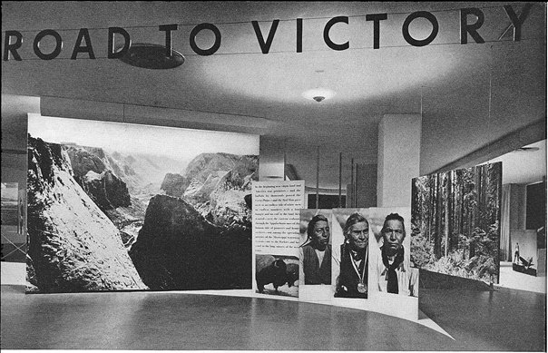
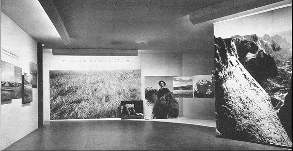
Yeah, there’s photomurals, but anyone who’s spent some time poking around greg.org might have found my even longer-lasting photo obsession: the Palomar Observatory Sky Survey [see background and making of info here and here.] The idea is to take he 1,870 pairs of photos that resulted from this ambitious, 9-year project to systematically document the universe, into the art context. Where it had not, to my knowledge, ever been. [Thomas Ruff comes the closest, obviously.]
And so one would understand the excitement at finding this entry–right after Moholy Nagy and Wright Morris, and above Muybridge and Nadar–in the checklist [pdf] for the 1964 inaugural show in the Edward Steichen Photography Center, MoMA’s first dedicated photography galleries:
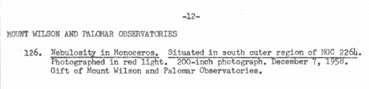
Mount Wilson and Palomar Observatories
Nebulosity in Monoceros. Situated in south outer region of NGC 2264.
Photographed in red light. 200-inch photograph. December 7, 1958.
Gift of Mount Wilson and Palomar Observatories.
Dude, not only was the Palomar Sky Survey IN an art context; it launched the art context. Dude, with a 200-inch photograph, it owned the art context.
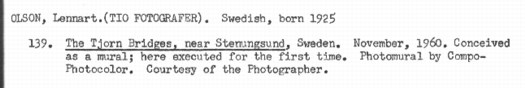
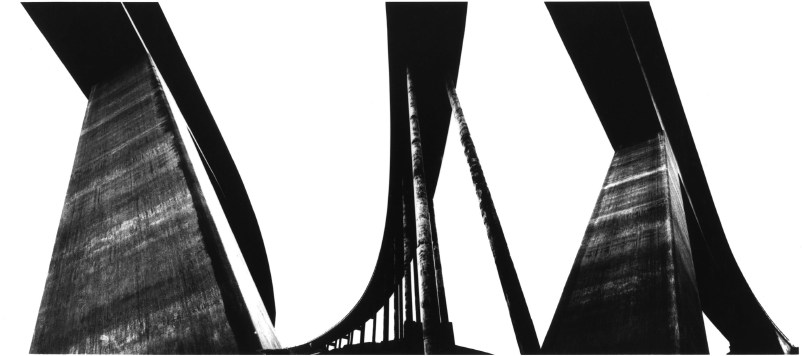
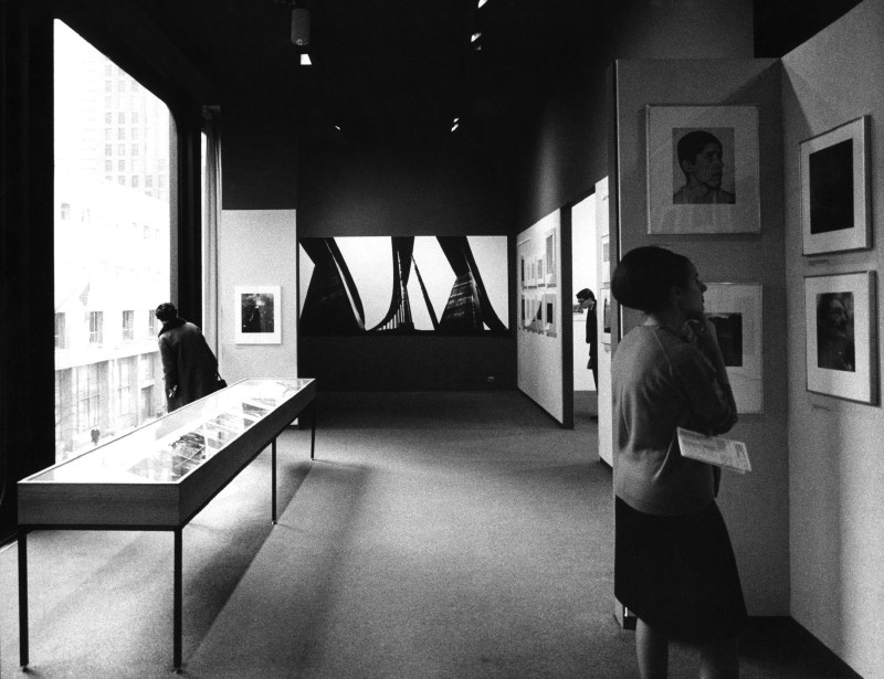
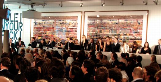
So what did this look like? It must have been spectacular. But I can’t find any installation photos, or any reproduction of the work, or any writeups at all for what had to have been the biggest of the 239 photos on view in that first show, bigger, even, than Lennart Olson’s mural.
No problem, I can find the image from the artist’s [sic] side. Though it has been superseded by several far more advanced surveys, imagery from the 1950s-era POSS-1 is still available in the Space Telescope Science Institute’s Digitized Sky Survey. Here’s the red plate showing nebulosity in the constellation Monoceros on the south outer region of NGC 2264:
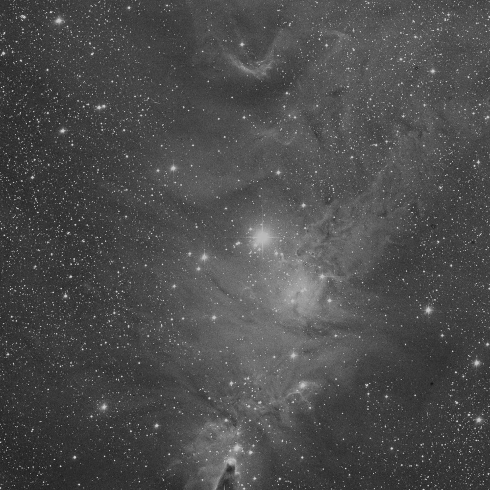
That’s the Cone Nebula down there at the bottom, just on the edge of the plate. Now imagine this photo printed nearly 17 feet tall, striking visitors to the newly reopened Modern with awe as they see how far photography has come.
And you’d have to imagine it, because it didn’t happen. There wasn’t a 17-foot tall photo gallery in the Museum in 1964. In fact, I’d wonder if the ceilings in the then-new Philip Johnson annex were even 16 feet.
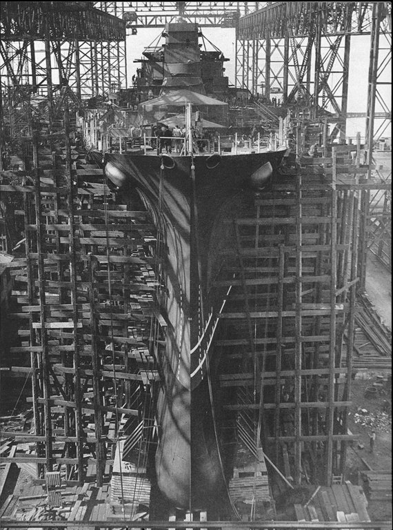
Also, it turns out that the POSS-1 image of NGC 2264 was made on Nov. 30, 1951, not Dec. 7, 1958. So the 200-inch photograph does not refer to the print size. It is likely a reference to the telescope that took it, Palomar’s Hale Telescope, which was the largest in the world from 1948 to 1993. It was conceived by George Ellery Hale, who secured $6 million for the project in 1928 from the Rockefeller Foundation.
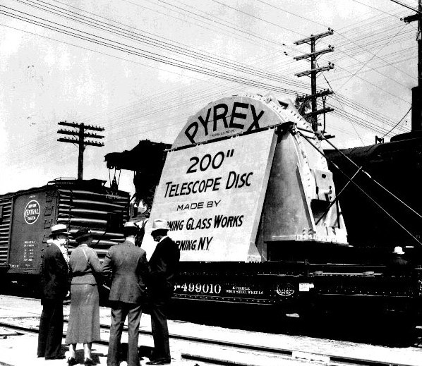
Corning cast the 200-inch mirror from Pyrex in 1934-36, and it was transported across the country by train to Pasadena where, after eleven years of polishing and shaping, the 40-ton mirror was hauled to the top of Mount Palomar and installed in the 1000-ton, Pantheon-sized rotating observatory. Edwin Hubble took the first photograph with the 200-inch telescope in January 1949.
I still haven’t found the details of the photo MoMA exhibited, but the mirror story makes up for it a little. And I thought artists were crazy.

 It’s true, I like
  You can’t go too architectural without treading on