
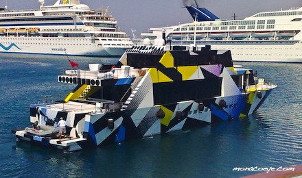
Last year Jeff Koons covered Dakis Joannou’s angular yacht Guilty [designed by Ivana Porfiri] with a pattern inspired by WWI naval camouflague. The technique, known in the US as Razzle Dazzle and in the UK as just Dazzle Painting, was created by the British artist Norman Wilkinson.
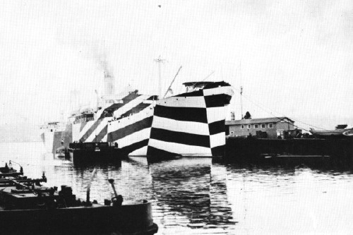
Dazzle deployed Cubism’s multiple perspective and fragmentation to thwart the aim of German U-boat attacks by obscuring the ships’ dimensions and traveling directions. The advent of sonar eliminated the need for visual targetting–and the utility of Dazzle Painting.
Ironically, Koons camo design made it exponentially easier for the yachtspotters at Monaco Eye to shoot Guilty in port last summer.
Dazzle Painting history and images [gotouring.com]
The US Navy apparently kept using Razzle Dazzle techniques through WWII. A large collection of 455 lithographs of camouflage designs was discovered in 2008 at RISD, the 1919 donation of an alumnus, Maurice Freedman, who was a camouflage painter during the war. They were exhibited for the first time last spring. [Dazzle Camouflage on Wikipedia]
Category: art
Gerhard Street View
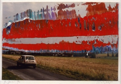
A Google Street View image of a French radar-jamming installation obscured by order of the Ministry of Defense or an overpainted photograph by Gerhard Richter? You decide.
Houses Of Orange
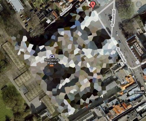
NL Architects thinks it might make a good Herzog & deMeuron project, but I think Google Maps’ security pixelization of the Dutch Royal House’s Noordeinde Palace in Den Haag would make an absolutely fantastic series of landscape paintings.
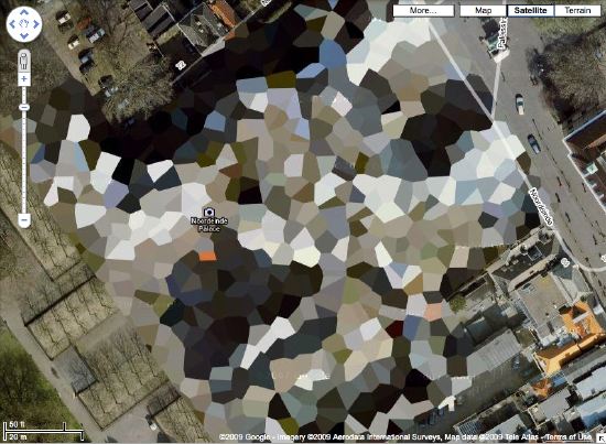
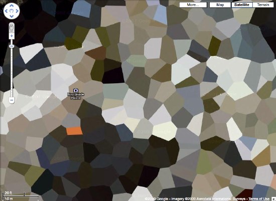
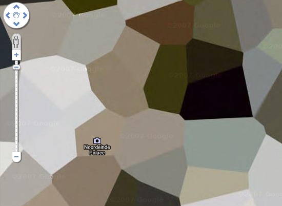
Where else in the world are such things? The DRH’s summer palace at Huis ten Bosch; an AZF chemical weapons factory in Toulouse…
There’s a surely incomplete list of obscured satellite images on Wikipedia, and a map. Which includes Mastercard’s corporate headquarters in Westchester, which actually looks like it was painted over. They call it “watercolored.” Perfect.
here’s the list of camo’d Dutch sites I’ve been working with.
Previously:
architecture for the aerial view, including WWII factory roof camouflage: the roof as nth facade
art for the aerial view: Calder on the roof
If You Don’t Make It Here, You’ll Make It Anywhere
Sheesh, build an Empire State Building out of Erector Sets at Rockefeller Center and the NY Times still thinks you’re dead:
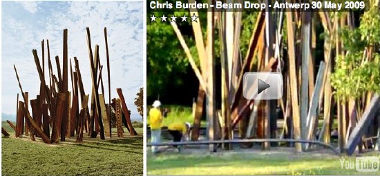
The greatest enchantments at Inhotim are produced by works that not only draw on powerful subconscious currents but that also could only have come into being in this place, in Brazil. I am thinking, for instance, about Chris Burden’s ”Beam Drop,” a sculpture that — like a lot of work by this artist, who is so steeped in art-world legend it sometimes seems surprising that he exists and is still at work — was realized only once before, in 1984, in a version that has disappeared.
Never mind that Burden made another “Beam Drop” in Antwerp. Or that the original “Beam Drop” was made in New York, too.
Meanwhile, this is as good a time as any to hate on the insanely intrusive ads that pop over Every. Single. #$)(%*ing. Page of T Magazine? It’s like walking into Saks and getting spritzed by a hundred perfume salespeople desperate not to lose their jobs.
Have You Seen Me? The Find The Warhols Project
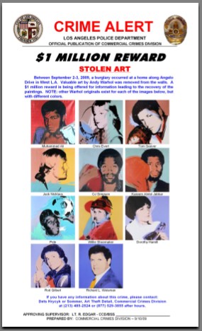
Earlier this month eleven portrait paintings by Andy Warhol were reported stolen from the home of Los Angeles collector Richard Weisman. The paintings, known the Athletes Series, depict some of the greatest athletes in the world in 1977, plus Weisman. There is a $1 million reward for information leading to their return.
When one man’s Warhols are stolen, all our Warhols are stolen, because no matter how many Warhols you technically own, Warhol belongs to all of us. It’s imperative that we band together to help these Warhols return to their rightful home [so they can be sold]. Which is why greg.org is announcing The Find The Warhols Project.
MISSION
The Find The Warhols Project seeks to facilitate the safe return of the Weisman Warhols by assisting in the dissemination of crucial identifying information where it is needed most: on the front lines of the art world.
FTW will educate and empower an ever-vigilant grass roots army of Warhol Watchers who will be able to quickly spot the stolen Warhols from among the thousands of Warhols streaming through the art world every day.
THE PROJECT
Many, many Warhols look the same, especially the 40×40-in. square silkscreened portraits of seemingly random people who were rich and/or famous in the 70’s and 80s. This can make it hard to tell if a Warhol is hot or not.
For example, just look at these three seemingly identical Muhammad Ali portraits. Can you tell which one is stolen, which one sold for triple its high estimate, and which one was still available last summer in Beijing?

Fortunately, on September 10th, 2009, The Los Angeles Police Department’s Art Theft Detail released a one-page, notepad-sized Crime Alert [top] with reproductions of the exact eleven stolen paintings and a critical detail: “NOTE: other Warhol originals exist for each of the images below, but with different colors.”
This is an invaluable crimebusting tool that needs to be distributed as widely as possible and studied regularly whenever you buy, sell, see, hang, ship, frame, conserve, appraise, authenticate, license for marketing, or critique a Warhol.
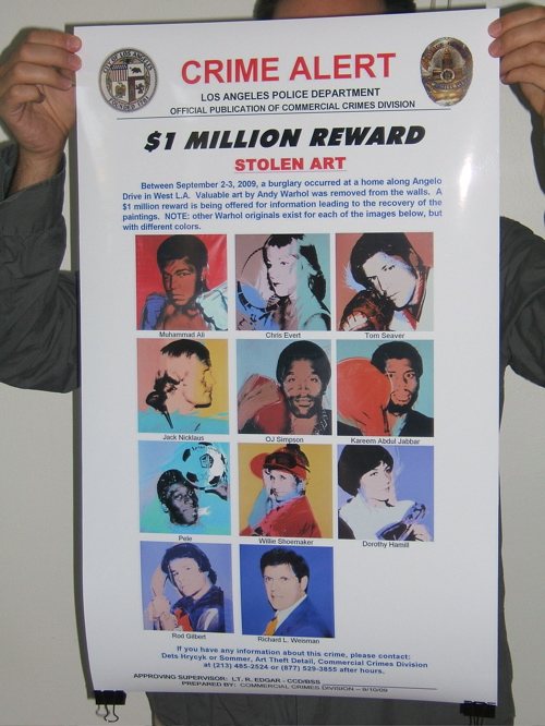
To that end, FTW will take this crucial-but-small Crime Alert and make larger versions which will enable quick and certain detection at a glance. These giant, poster-sized versions will be offset print in full color on 100-lb glossy paper, and will be suitable for hanging by Warhol Watchers at key art world locations with high Warhol traffic, including:
- Art gallery backrooms
- Private dealers’ showrooms
- Hedge fund conference rooms
- Park Avenue cosmetic surgeons’ waiting rooms
- West Village real estate developers’ conference rooms
- West Village townhouse stagers’ conference rooms
- Collectors’ offices
- Private curators’ offices
- Museum curators’ offices or cubicles
- Independent curators’ hallways, since it is unlikely they have offices
- Curatorial studies graduate program student lounges
- Auction house cube farms
- Art magazine offices
- Art magazine freelance writers’ walls above the beds where they write because they can poach the neighbor’s wi-fi from there
- Art organization benefit auction organizers’ conference rooms
- Art fair booth backrooms
- Art fair concierge desks
- Art fair VIP lounges
- Art fair sponsor VIP lounges
- Fractional ownership jet terminals
- Museum development directors’ assistants’ offices
- Museum registrars’ offices
- Museum freight elevators
- Crate fabricators’ workshop offices
- Framers
- &c., &c.
HOW YOU CAN HELP
- Get some FTW Crime Alert posters.
- Put them up in your own corners of the art world.
- Study the details of the Stolen Warhols frequently to keep them fresh in your mind.
- Whenever you buy, sell, or otherwise encounter a Warhol, check it against the Crime Alert poster to see if yours is one of the Stolen Warhols.
- Encourage others to do the same by writing about the FTW Project on your blogs, by giving posters to other collectors and dealers and art world friends, by holding FTW Happenings in your lofts to build awareness and learn the paintings, &c.
FTW Crime Alert posters are available for pre-order through Kickstarter starting at $10 for two, to cover the cost of printing [$883] and shipping [$3.62/order]. Orders will only be processed and the posters will only be printed and shipped as soon as 141 pre-orders are received. If the Stolen Warhols are found before FTW reaches 141 pre-orders, the Project will cease, no posters will be printed, and no orders will be charged or fulfilled. The FTW Project Kickstarter page has more information, including details of how Kickstarter pledges work, as well as options for ordering multiple posters, for international shipping, and for collectors who own more than 11 Warhols.
BACKGROUND
The Warhols, known as the Athlete Series were commissioned by Richard Weisman in 1977 for the purpose of bringing the world’s two greatest leisure pastimes–sport and art–together. They are all portraits of famous athletes posing with the primary implement of their chosen sport next to their heads. Plus a headshot of Weisman himself, whose mother co-founded the Museum of Contemporary Art in Los Angeles, and whose uncle Norton Simon founded the Norton Simon Museum.
Warhol produced eight complete sets of the paintings for Weisman, plus an unidentified number of additional individual paintings. Two sets were broken up and given to each athlete and his or her sports governing body. Weisman donated two sets to university collections. Weisman’s three kids each got a set. And he kept one for himself. Total price tag for the project: a reported $800,000.
All the works are 40×40 inches, silkscreen and polymer paint on canvas. Warhol also created other, differently sized versions of some images. Except for the Muhammad Ali paintings, all the canvases were signed by the athletes at the time of their completion. For Ali, Weisman had Ali sign five paintings [presumably the non-donated ones: his own, his kids’ and one extra, see below] during a visit to Los Angeles in 1991. Each silkscreened canvas was painted in a unique color combination.
Weisman began marketing his set several years ago. He loaned it to the Warhol Museum in 2005. In 2007, it was offered for sale in London by the dealer Martin Summers for $28 million, along with several individual paintings. It was still for sale in 2008, when he showed it in Beijing during the Olympics.
The 2007 show also included a loosie Ali portrait with a purple ground, above right.] A couple of months later, Ali’s own red & green painting [above middle], which had been given to his ex-wife, sold at Christie’s for $9.2 million.
So you can see how vitally important these Warhols are, especially to Weisman. They’re practically his children. Children he can sell for an eight-figure price. And children whose safe return could bring a million dollars to the one who makes it happen. Won’t you help?
Ai Weiwei Undergoes Emergency Surgery In Munich
For a month after being beaten and detained by Chinese police, artist Ai Weiwei had complained of constant headaches. While in Munich to install a show, he went to a doctor, who sent him into emergency surgery to alleviate a cerebral hemorrhage. The news was reported, of all places, by the editor’s blog at Frieze magazine, which published accounts from his assistant and one of the artist’s fellow activists involved in publicizing the names of 5,000 children killed in school collapses in the Sichuan earthquake.
Ai has been publishing photos and updates [in Chinese] on Twitter.
Ai Weiwei in hospital after police brutality [frieze.com]
Ai Weiwei erhebt schwere Vorwürfe gegen Peking [sueddeutsche zeitung]
The Sentence As Earthwork
Not that it doesn’t sound fascinating, but a diagram of this sentence would be as big as the Lightning Field itself:
In this lecture Chris Taylor will present Land Arts of the American West as a work that makes other works through a field program that investigates the intersection of geomorphology and human construction beginning with the land and extending through the complex social and ecological processes that produce contemporary landscapes.
From the description of “Measures of Time, Travel, and Space: exploring Land Arts of the American West,” presented last April at Yale. [land arts via tyler]
Much Is Published, But Little Printed
From Henry David Thoreau’s Walden, quoted by Mark Noonan in the Columbia Journal of American Studies
But while we are confined to books, though the most select and classic, and read only particular written languages, which are themselves but dialects and provincial, we are in danger of forgetting the language which all things and events speak without metaphor, which alone is copious and standard. Much is published, but little printed. The rays which stream through the shutter will be no longer remembered when the shutter is wholly removed. No method nor discipline can supersede the necessity of being forever on the alert. What is a course of history, or philosophy, or poetry, no matter how well selected, or the best society, or the most admirable routine of life, compared with the discipline of looking always at what is to be seen? Will you be a reader, a student merely, or a seer?
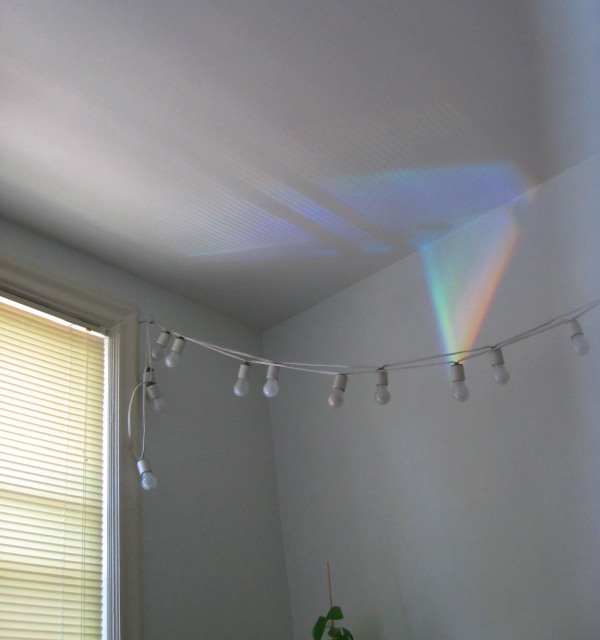
For a long time we had construction on our street. The crew would store their portable signs in such a way that, on many mornings, they would reflect a rainbow in our window and across our living room ceiling. The kid took on the job of spotting them, which led to her taking pictures of them. This is one of the earliest examples. I suspect the memory of the rays will far outlast our shutters which, frankly, are nothing special and which I can’t wait to remove.
On The Public-Sculpture Gravy Train
It’s got shiny spheres, and science re-creations, and DC artists and quotes from curator and museum director friends. But it’s been a few weeks now, and the only thing I can say about Blake Gopnik’s mind-numbing/blowing article on Jim Sanborn is that this passage on public art is pretty damn funny:
The fame of the CIA commission “funded me for all the years since,” Sanborn says. It put him on the public-sculpture gravy train. He stopped living in his scruffy studio building in Northeast Washington (it’s where he met his wife, Jae Ko, a well-known local sculptor), bought a house in Georgetown, designed a home in the Shenandoahs and continued to fund his more “serious” art, such as “Atomic Time.”
But lately, the commissions have dried up. Today’s selection panels, he complains, go for “decorative embellishments.”
Damn those panels. If only noted art historian/author Dan Brown would write a book about Washington, he could include another mention of Sanborn’s work.
??!!??: Sparking Interest Within the Sphere of Art | ‘Physics’ May Be Most Substantive D.C. Piece in Half-Century [washingtonpost via man]
LLC Tuymans
16 Miles found the money quote [heh] about his upcoming US retrospective in Luc Tuymans’ TAN interview : “The US tour should lead to steady sales.”
But wait, there’s more! That guy has had it up to _here_ with American slowness in gettin’ on board the Tuymans train:
TAN: Are you happy with the selection of works for your US tour?
LT: Yes, it’s taken a long time for a US institution to ask me to do a show. There are 76 works. [Ed.: Exactly how long is a long time, Luc?] I’ve installed all 80 of my solo shows myself. This is the first time I can trust other curators to install my art. They’ve decided to re-create three exhibitions as they were shown in commercial galleries [“At Random”, Zeno X gallery, Antwerp, 2004; “Der Architekt”, Galerie Gebauer, Berlin, 1998; “Mwana Kitoko”, David Zwirner, New York, 2000] and then will work around this chronologically. It’s interesting as they’re not the most iconic works.
TAN: How do you think US audiences will respond to your work?
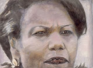
LT: The Demolition painting (2005) will be shown which has 9/11 connotations along with the Condoleezza Rice portrait (The Secretary of State, 2005). [1] Museum people didn’t buy it at the time because it was too topical. But then Glenn Lowry, MoMA director, decided to acquire it because she’s a public figure [Tuymans’s US dealer David Zwirner gave the painting to MoMA as a fractional gift in 2006]. It had been misunderstood in a private collection, it was out of place. The fact that it’s been acquired by a public collection is an interesting insight into how the American people think.
Belly up to the Tuymans bar, you molasses-assed American museum-curating bitches! Waitlist forms to the right, er, left!
Update/Note [1] Wait, a fractional gift? You mean David gave the Modern a great discount on his cut, or he bought it himself? Does your dealer still count as a private collection? Because Paul Schimmel told Tyler Green that “a lot of people wanted to buy the Condi,” and that Tuymans saw it as a diptych with Demolition. Both are now in MoMA’s collection. Demolition is listed as a 2006 fractional gift of Leonard and Susan Feinstein [of the Bed Bath & Beyond Feinsteins]. Ah, here it is: “The Secretary of State, Fractional and promised gift of David and Monica Zwirner,” with an accession number consecutive to Demolition. Sounds very smoothly orchestrated.
FWIW, MoMA’s description of Demolition directly contradicts Schimmel’s [or Green’s] statement that the painting “was not painted from photographs or video of the collapse of the World Trade Center, but it certainly recalls countless images from that day.”
Floating Cloud Structures, Or We All Live In A Fuller Satelloon
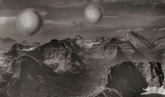
Just like how, once you’ve learned it, you start hearing a word all the time, now I see satelloons everywhere. Including at the Buckminster Fuller retrospective last year at the Whitney [which went on to Chicago this summer.]
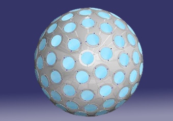
Buckminster Fuller and his architecture partner Shoji Sadao mocked up this photo of a photocollage, Project for Floating Cloud Structures (Cloud Nine) , around 1960. Cloud Nines are self-contained communities of several thousand people living inside enclosed geodesic spheres a mile wide, which float over the earth’s surface.
Because the geodesic structure increases in strength as it gets bigger, and its surface increases at a power of two, while its volume increases at a power of three, Fuller hypothesized that heating the interior air even one degree will set the Cloud Nines aloft.
Obviously, as a sexy, futuristic utopian image, Cloud Nine is hard to pass up, but holy crap, Bucky, did you think for two seconds about the urban fabric and the social experience of living trapped in a floating dome? I’d love to see someone write an SF story about it. Because I think it might be a fantastically totalitarian disaster.
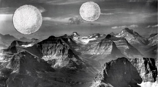
There are two versions of the Cloud Nine image: [the earlier?] one has smooth, silvery, featureless spheres. I’d call them satelloons, even. The other [above] has line drawings of the geodesic structure collaged onto it.
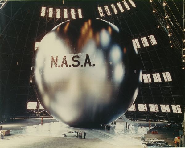
It was only now, as I get around to finally posting about them, that the relationship between Cloud Nines and satelloons might be more than formalistic. The original satelloon, Project Echo launched in 1960, the same year Fuller and Sadao designed their giant floating spheres. Could there have been a connection?
The easiest, most obvious thing to do might be to ring up Shoji Sadao. What is he up to these days, anyway? You’d think that given the recent interest in Fuller’s work, a guy who worked so closely with Fuller on so many major projects–he’s credited with the dome at the 1967 World Expo in Montreal, arguably the most spectacular Fuller structure ever realized–would be all over the place. I mean, it was only a few years ago that he gave up his position as executive director of the Noguchi Foundation in Long Island City. And then he curated that great Fuller-Noguchi show in 2006. [Sadao was also a longtime collaborator with Noguchi and the chief overseer of his legacy.] Anyone spoken with him lately?
A Small Compendium Of Shiny Orbiting Balls
In a 1970 paper, two Harvard/Smithsonian scientists proposed A Passive Stable Satellite for Accurate Laser Ranging. Dubbed project Cannonball, the 38-cm spherical satellite would be covered with triangular reflectors and would weigh–did someone drop a decimal?–a prodigious 8000 pounds. Cannonball would be a stable laser target which would allow surface mapping of the earth with 10cm accuracy by reflecting laser light between earth base stations. It was designed to be launched using an extra Saturn rocket left over from the Apollo program, but it didn’t happen.
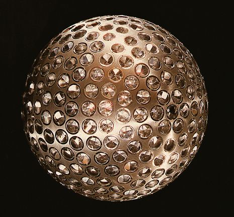
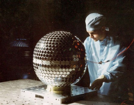
The passive laser reflector disco ball-lookin’ satellite trend didn’t really kick in until 1976, when NASA launched LAGEOS I [LAser GEO-something Satellite, above], which was built by ASI, the Italian Space Agency, from a NASA design. The 60cm-diameter aluminum-coated brass sphere is set with 426 cube-cornered retro-reflectors–4 are germanium, the rest are glass.
ASI built another, identical satellite, LAGEOS II [below], which was launched in 1992.
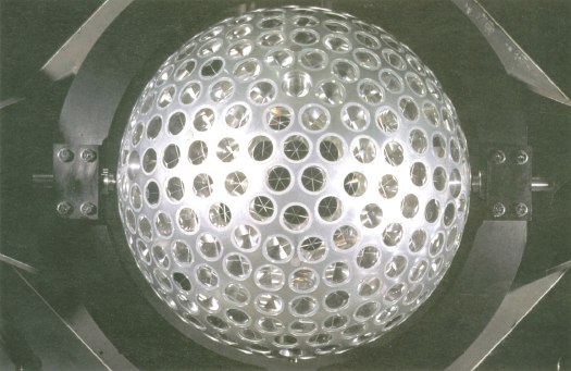
A third passive retro-reflector satellite, called LARES, was designed as an all-Italy project, and is set to launch in 2009 on an ESA rocket. LARES is smaller [36cm], made of solid tungsten, and contains 92 retroreflectors.
In 1989, Russia launched two Etalon satellites [below], which are each 1.3m in diameter and contain 2,145 retro-reflectors.
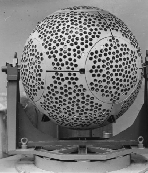
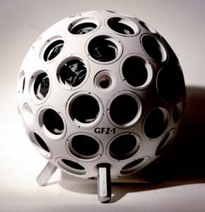
NASA launched Larets, a tiny 21cm sphere with 60 prismatic reflectors into low-earth orbit in 2003. It is very similar in design to the German GFZ-1 [below], which was launched in 1995 and burned up in 1999. They also look llike Buckminster Fuller Fly’s-Eye Domes.
The most disco ball-looking of all, though is Project Starshine, a series of three student project satellites [??] which launched between 1999 and 2003. Built from spare hardware, each Starshine sphere was covered with almost 900-1500 mirrors polished by students around the world. The satellites reflected sunlight, enabling a network of schools to track their movement. They all burned up as they re-entered the atmosphere, and Starshines 4 & 5 have been waiting for a ride into space since 2004.
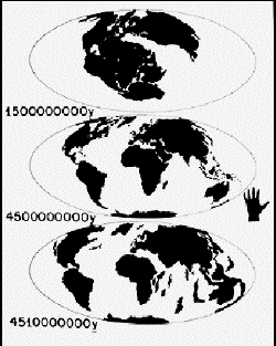
LAGEOS I also contains a plaque [below] designed by Carl Sagan and drawn by Jon Lomberg. It consists of three maps showing the position of the continents in the distant past, the present, and 10 million years from now, when the satellite is expected to re-enter earth’s atmosphere. The idea being, I assume, to let whoever retrieves the beautiful, shiny artifact from space some time before that happens know that we totally knew they were going to do that.
Share Your Bed
I’ve steered way clear of architect’s Michael Jackson Monument Competition because–hello, in what universe does that decision actually require any explanation? Because.
Anyway, after seeing the winners, I just have to raise a single, ungloved–and as yet unmittened, hold that thought–hand in apology and salute. They’re kind of hilariously fantastic. Kottke is all tight between the winner [a nice copyright play] and second place [the perpetual desert disco dance floor powered by a gold-plated windmill].
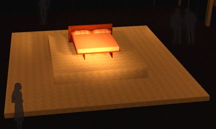
Me, I find the third place entry, by an architecture student named James at the University of Utah, to be borderline brilliant. Its title, “Share Your Bed,” comes from testimony Jackson gave during his trial for child molestation: “Why can’t you share your bed? The most loving thing to do is to share your bed with someone. It’s very charming. It’s very sweet. It’s what the whole world should do.”
The jurors liked the “almost cheeky minimalism” and transformation of “an ordinary domestic object,” apparently forgetting that these are both now standard-issue for memorials [c.f Oklahoma City bombing=chairs, Pentagon = benches]. For his part, James cites the “dialectic manner Michael lived life by,” where “Innocence clashes with social ideals.” I’d rank not molesting children a bit higher than an “ideal,” but he’s right that the bed is a potent site and symbol of personal/political, private/public paradox.
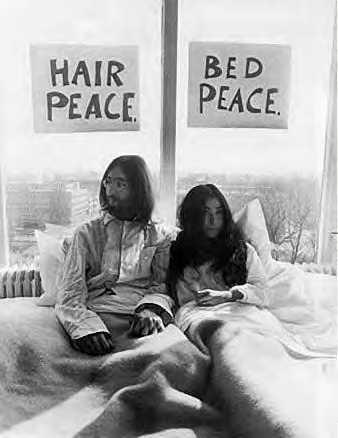
Beginning in April and running through the end of 1969, Yoko Ono and John Lennon conducted bed-ins as peace protests in hotels around the world. First was their honeymoon bed in Amsterdam, where the press converged, expecting to see the couple have sex. Instead, they were talking about peace all day. In bed. “Give Peace A Chance” was recorded in bed at the Queen Elizabeth Hotel in Montreal that June.
And of course, there’s Felix Gonzalez-Torres’ classic billboards showing a couple’s–his and his partner Ross’s–unmade bed, which were installed across New York City in 1991. Either way, not artists or works I’d have ever thought to associate with Michael Jackson.
Whoops, I almost forgot. Huge shoutouts to etoile’s King of Pop In Orbit, the plan to launch Jackson’s shiny, gold coffin into space, which I have to love for obvious shiny-objects-in-space reasons–and to CUP’s The Michael Jackson Mitten Jamboree, for which the whole world knits themselves a pair of MJ mittens. Again, explanation is neither needed or possible.
Show Me The Monet
The [Modern] bought its first large waterlily painting — at 18 feet across, the widest painting to enter the collection up to that point — in 1955, for the equivalent of $11,500. A mere three years later it paid the equivalent of $150,000 for the triptych, acquiring it as a replacement for the first work, which was destroyed in a fire at the museum.
Arriving at the museum in poor condition, the triptych was extensively restored and put on new stretchers. Dorothy Miller, one of the museum’s early curators, gave Monet’s original stretchers to three young New York painters: Ellsworth Kelly, Jack Youngerman and Fred Mitchell. Those were the days.
Roberta Smith, referencing Ann Temkin’s essay on Monet’s waterlily paintings, which are now on exhibit together at MoMA.
I just checked back to the quick acquisition history I wrote two years ago of the Met’s and Modern’s giant Pollocks. 1955 was also the year Barr first attempted to drum up acquisition funds ($8,000) to buy a Pollock, Autumn Rhythm (1950), from his own trustee, the dealer Sidney Janis. He couldn’t shake the money loose, and the work went to the Met in 1958 for $30,000. Also taking place in the middle of the Modern’s Monet purchases: Frank O’Hara’s 1957 Pollock show, which the artist did not live to see.
Whether it’s out of fashion for art historians to read premonitions of postwar New York School action painting in Monet’s waterlilies, those histories from the 50’s onward were together at MoMA.
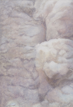
Malibu Air: Lens Color Cast Corrections

House exterior (test)
Malibu, CA

Kitchen
Malibu, CA
Ian James is a recent CalArts graduate. He posted a series of images–photos–of Lens color cast correction on his blog. which are kind of fantastic:
Lens Color Cast is an dilemma specific to digital photography. Digital sensors are incredibly flat and are designed to receive light straight on. In the case of ultra wide angle lenses, light reaches the sensor diagonally and creates wild color casts and flares which are incredibly difficult to fix in Photoshop. Thus to the only way to correct is at the time of shooting by utilizing a particular lens filter that is a combination of diffusion and a translucent diamond pattern that evens out the light coming hitting the sensor. This image is saved in capture software as an adjustment setting and then applied to all related images as a set. A new LCC image must be made everytime the camera is moved into a new lighting scenario.
The images generated for the LCC are thus abstract functionaries of a larger endeavor. The LCC images in this set were all generated from an architecture shoot of the ins and outs of a Malibu beachfront home. Each image relates to one particular setup, such as master bedroom, guest bedroom, office, kitchen, outside patio, front exterior, etc.
They remind me a bit of Bruce Nauman’s monochrome photographs of the Los Angeles sky, which he published in a couple of artist books: CLEA RSKY (1968-9) is all blue skies. Which is fine.
But I like L A AIR (1970) better. The point/joke is that the smog-filled air of Los Angeles produced a much more varied and interesting range of colors. Both were included in “Elements and Unknowns,” a beautiful little show of enigmatic artist books organized last fall by May Castleberry, the contemporary editions editor at MoMA’s Library Council.
Lens Color Cast Correction [ian james eats photographs]