LACMA director Michael Govan and photographer Terry Richardson–who looks great, by the way, has he had work done?–at the opening of the Broad Contemporary Art Museum last week.
Broad and Butter [artforum]
Category: art
Meanwhile, In The American Pavilion…
Here’s a description of the American Pavilion at the Osaka ’70 Expo from an online exhibit at Columbia called, “Housing The Spectacle: The Emergence of America’s Domed Stadiums”:
Trying to best R. Buckminister Fuller’s Geodesic Dome built for the U.S. Pavilion at Expo 67 in Montreal, the architects of the Expo 70 Pavilion first envisioned it as a huge floating sphere, inspired by NASA’s Apollo 11 mission that put the first man on the moon. This spherical scheme was the winning entry (submitted by Davis – Brody Architects and deHarak, Chermayeff & Geismar, Designers) in a competition sponsored by its future owner, the United States Information Agency (USIA). The competition scheme would have included exhibition space inside the sphere, and used its inner surface as a giant projection screen for continuously played film clips. The Pavilion ultimately erected at Osaka marked the birth of a new structural building type — the longspan, cable stiffened pneumatic dome — which would for a time become the predominant roof system over America’s emerging sports palaces. Remarkably, the U.S. Pavilion’s pneumatically supported 465 foot by 265 foot clear span dome was developed largely in response to Congress’ 50% reduction in the project’s budget. The completed Pavilion cost $450,000, which was about half the cost of the Montreal dome.
Those budget cuts meant The Great Balloon was replaced by a flat, quilted dome derided as “the world’s largest bunion pad.”
“Space balloons” were a prominent element in another of designs invited by the US Information Agency. According to an exasperated-sounding 1968 Architectural Forum review of ten of the eleven invitees, Isamu Noguchi proposed an underground exhibition space topped by a “vividly colored” and contoured playground landscape, comfortably shaded by a giant balloon. A space balloon.
Davis Brody’s winning plan for the Great Balloon originally included a spiral exhibition-filled ramp leading up to a panoramic platform where films would be projected on the entire upper half of the dome.
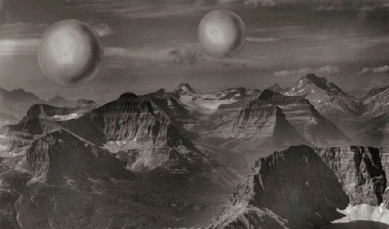
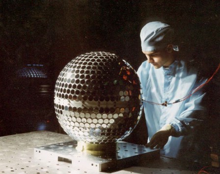
When that didn’t work out, the quest for giant, space exploration-evoking spheres, though, seems to have been moved inside. I can’t make much sense of the exhibition design or its purpose from photographs [the clearest picture I’ve seen so far is a tourist’s snapshot], but there were certainly some Project Echo-esque Mylar spheres floating in there.
Also, the entire surface of the earth berm walls were covered in silver Mylar.
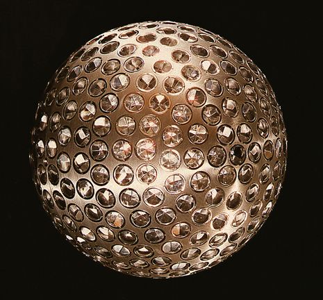
Especially with the dot-covered spheres, you see how short a trip it is from the Triumph of the Cold War and the Space Race to the Age of Disco.
There are more and larger images at the Columbia site. [columbia.edu]
The US at Osaka, Arch Forum, Oct. 1968 [hosted at columbia.edu]
Previously considered unrelated. Now? Helmut Lang’s self-portrait, a scavenged, battered disco ball
Q: Was The Pepsi Pavilion Art?
Of course, I’d only need to recreate The Pepsi Pavilion from Osaka 70 if it didn’t exist anymore. Does it? No. As relations between Pepsi and Billy Kluver, the engineer founder of E.A.T., deteriorated over issues of budget and esoteric programming [Pepsi had originally envisioned their dome-shaped pavilion as a site of a string of rock concerts to entertain The Pepsi Generation coming to the Expo], Kluver argued that the entire Pavilion was a work of art and thus, a success, and thus, worthy of continued expenditure and preservation. Pepsi, literally, wasn’t buying:
As an artistic experiment, though, it can be considered a success, and according to Klüver deserved to be treated as an art work.
In the case of the Pavilion, he therefore suggested to Pepsi-Cola to officially recognize the total work as an art work, in order to give it a legal structure. In a letter to Donald Kendall, President of Pepsi-Cola, Inc., he wrote “Our legal relationship to Pepsi Cola has developed so that the artists are put in the category of commercial artists designing a commercial product. One consequence of this is that we must obtain rights from all artists and engineers and others involved, particularly with regard to use of the Pavilion after Expo ’70. Of course, there is no question of Pepsi’s ownership and right to use and exhibit the Pavilion. Our dilemma is whether the artists have created a work of art or a work of commercial art to which there are rights which must be guaranteed… A decision to recognize the Pepsi Pavilion as a work of art and to treat it as such will set a much needed precedent in this area.” Pepsi-Cola never took this step and eventually the Pavilion was left in a state of gradual desolation and decay. This was certainly due to the fact that the relationship between E.A.T. and Pepsi-Cola had considerably cooled down, to the point that the company, the sole sponsor of the project, withdrew its support when E.A.T. presented a maintenance contract for $405,000, instead of the proposed sum of $185,000.
Too bad the strategy didn’t work; art seemed to be the only ticket to surviving the end of Expo 70. Today, almost all that’s left of Expo ’70 are Taro Okamoto’s massive sculpture, Tower of The Sun, and Kiyoshi Kawasaki’s International Art Pavilion, which until four years ago, housed the National Museum of Art, Osaka. Whoops, never mind: “The old museum was demolished and turned into a car park.”
From Ch. 2, “The Nine Evenings,” of M.J.M Bijvoets’ Art As Inquiry [stichting-mai.de]
No museums, but m-louis’s Expo70 photos do have sweet pavilions and the Tower of The Sun [flickr]
E.A.T. It Up: The Pepsi Pavilion
Let’s get one thing out of the way first: I’m a Diet Coke guy. The very fact that The Pepsi Generation existed in 1970 should blow a hole in their brand’s supposed youthy credibility big enough to drive a 90-foot mirrored dome though. Oh, and what do we have here?
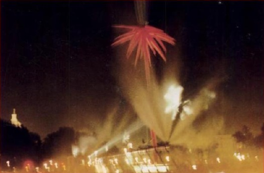
Holy freakin’ crap, why has no one told me The Pepsi Pavilion at the 1970 World Expo in Osaka was an origami rendition of a geodesic dome; obscured in a giant mist cloud produced by an all-encompassing capillary net; surrounded by Robert Breer’s motorized, minimalist pod sculptures; entered through an audio-responsive, 4-color laser show–yes, using actual, frickin’ lasers– and culminating in a 90-foot mirrored mylar dome, which hosted concerts, happenings, and some 2 million slightly disoriented Japanese visitors?
And that large chunks of it were conceived, developed, and programmed by E.A.T., Experiments in Art and Technology, the pioneering art/engineering collaborate founded by [among others] Robert Rauschenberg and Bell Labs’ Billy Kluver? And that the four artists working with Kluver–Breer, Frosty Myers, Robert Whitman, and David Tudor–had planned months of even freakier happenings for the Pavilion, but the Pepsi gave them the boot for being too freaky–and for going significantly over budget? Still.
The least you could’ve done is tell me that Raven Industries made a full-size replica of the Pavilion out of Mylar and test-inflated it in a disused blimp hangar in Santa Ana, CA? Apparently, all it took was a 1/1,000th of an atmosphere difference in air pressure to keep the mirror inflated within the outer structure.
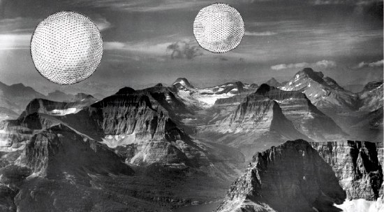
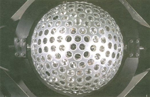
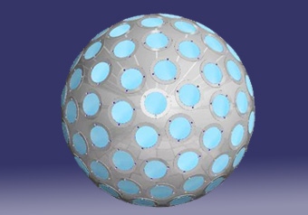
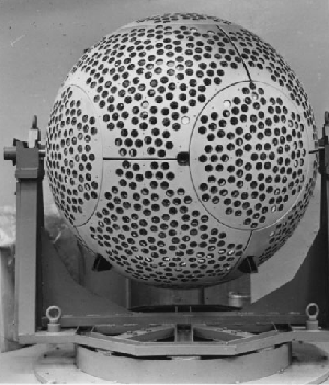
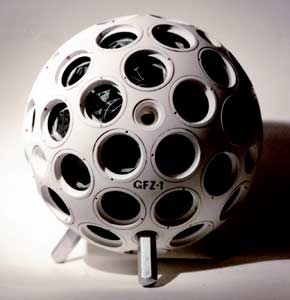
Because, of course, you know that Kluver was the guy at Bell Labs who helped Warhol with his seminal “Silver Flotations” exhibit in 1966 [seen here in Willard Maas’s film poem on Ubu]. And Bell Labs was involved in Project Echo, which launched and tracked two gigantic mylar spheres, satelloons, a couple of years earlier. Which makes the Pavilion’s similarities to the satellite below purely non-coincidental.
Which means that after recreating these two, earliest NASA missions as art projects, I’ll have to recreate the Pepsi Pavilion, too.
I’ve ordered by copy of Kluver et al’s dense-sounding 1972 catalogue, Pavilion and expect to be revisiting this topic in some depth within 5-7 business days. Meanwhile, if there are any other giant, mylar spheres of tremendous-yet-overlooked artistic and historical importance lurking out there, now’s your chance to come clean.
E.A.T. – Experiments in Art and Technology «Pepsi Pavilion for the Expo ’70» [mediaartnet.org]
Previously: Must. Find. The Satelloons Of Project Echo
D’oh, or else I must make the satelloons of Project Echo, which would mean I’m an artist, freak, or both
Best Gallery Press Release Of The Year, And It’s Only February
Now I’m probably biased because we’ve been longtime fans and collectors of Ruth Root’s work, but damned if this isn’t the most incredible press release for a gallery exhibition that you will see this year, last year, or next year:
Click through to Kreps’ for the full size version.
Ruth Root, Feb 7 – Mar. 16 at Andrew Kreps Gallery [andrewkreps.com]
On Tomason, Or The Flipside Of Dame Architecture
Atelier Bow Wow is my favorite Japanese architecture firm. Rather than by building or proposing some kind of Roarkian vision, they first made a name for themselves [besides the catchy name they made for themselves, I mean] by observing and reporting architecture as it was inadvertently happening in Tokyo.
They put out exhaustively researched but in no way comprehensive books: Pet Architecture documented the ways structure took shape in the impossibly narrow spaces of a city where no scrap of land goes unused. Made in Toyko was about ridiculous hybrids: a department store with a driving school on the roof; a cement factory integrated with the workers’ dorms. They called these ridiculous, pragmatic spatial phenomena dame [dah-may] architecture, using the Japanese term for “no good.”
Such ad hoc, aggressively undesigned accidents stick in my mind as I read about Tomason [also spelled Thomason and Thomasson in English]. If dame architecture is the awkward result of relentless functionality, Tomason are the useless, abandoned leftovers. Stairs to nowhere are a favorite. Bricked up windows are a close second. Tomason are the flashings and detritus of the incessant churn of building, destruction, and redevelopment that characterizes the Japanese city. No clean slates here, no way.
The term comes from the art & architecture collective formed in 1986 known as Rojo Kansatsu [Roadside Observation], which counted the author/artist Akasegawa Genpei as a founding member. Rojo’s inspiration was Gary Thomasson, who was given the biggest contract ever in Japanese baseball in 1981-2, only it turned out he couldn’t hit; then he blew out his knee. He was a giant, useless lump on the bench.
Rojo exhibited at the Japanese pavilion at the Venice Biennale in 2006 [i.e., the architecture biennale, not the real one. heh], but I found out about Tomason from an essay on neojaponisme. Like everything there, it’s too long by design. The image below from neojaponisme, of a store shutter without a storefront, is from one of Akasegawa’s original books. It reminds me of some of the Powerless Structures sculptures by Elmgreen & Dragset.
There’s also a rather nice photopool on flickr. here’s the japanese tomason tag and here’s the thomason group.
Roadside Observation [neojaponisme.com]
Copyright Murakami, Not A Derivative Work
Augur & Revok tagged a Takashi Murakami billboard in December. LA Weekly now reports that Murakami took the billboard down for his own collection.
Lemme Tell You A Story ‘Bout A Man Named Smithson
Score one for the bloggers. In the face of an instant, last-minute, blog-fueled burst of attention, the Utah Department of Oil, Gas & Mines has extended the public comment period until Feb. 13 for Application to Permit Drilling #08-8853, which seeks to conduct test drilling for oil in the West Rozel Field, an underwater oil deposit in Great Salt Lake.
The proposed drill sites are a couple of miles away from Rozel Point, the site of Robert Smithson’s Spiral Jetty. After a heads up from the Friends of The Great Salt Lake, Smithson’s widow and the executor of his estate, Nancy Holt, fired off email alerts to the art and media worlds, urging them to act “to save the beautiful, natural Utah environment around the Spiral Jetty from oil drilling.”
I dutifully fired off my letter, expressing my grave concern for the fate of “the single most important work of art in the state.” Apparently, at least a thousand other people around the world did, too, and in one day.
But something seems odd to me. What’s the actual threat, where does it come from, what’s the logical–and realistic–solution, and what do we know about what the artist himself would think about oil production nearby his masterpiece? Holt’s calling for protection of the Jetty’s “beautiful, natural” surroundings doesn’t exactly reflect the reality of the work. Likewise, Lynne deFreitag, the FOGSL chairwoman who raises the specter of “offshore equipment [that] could cause noise and visual impairment in a relatively pristine area.”
Now the National Trust of Historical Preservation has weighed in, calling the Spiral Jetty “a significant cultural site from the recent past, merging art, the environment, and the landscape.”
Rozel Point may be beautiful, but it is not pristine, and it’s not natural. And oil drilling is no stranger to the area, either. By ignoring the specific industrial history of the Spiral Jetty and its site, these defenses, however well-meaning or much-needed, are incomplete and inaccurate at best, and misleading at worst.
According to Smithson’s own accounts of the project, oil and oil production are inextricably linked to the Spiral Jettyand the reasons Smithson chose to build it at Rozel Point. A choice based on, among other resources, his consultation of his copy of the 1963 Utah Geological & Mineral Survey map titled, “Oil Seeps of Rozel Point.” [image: via Ron Graziani’s 2004 book, Robert Smithson and the American Landscape]
As he explained in a 1972 interview with Paul Cummings:
You might say my early preoccupation with the early civilizations of the West was a kind of a fascination with the coming and going of things…. And I became interested in kind of low profile landscapes, the quarry or the mining area which we call an entropic landscape, a kind of backwater or fringe area…
He continued, rather romantically, explaining the landscape of debris from decades of failed oil expeditions:
An expanse of salt flats bordered the lake, and caught in its sediment were countless bits of wreckage. The mere sight of the trapped fragments of junk and waste transported one into a world of modern pre-history…
Two dilapidated shacks looked over a tired group of oil rigs. A series of seeps of heavy black oil more like asphalt occur just south or Rozel Point. For forty or more years people have tried to get oil out of this natural tar pool. Pumps coated with black stickiness ruted in the corrosive salt air. A hut mounted on pilings could have been the habitation of “the missing link.” A great pleasure arose from seeing all those incoherent structures. This site gave evidence of a succession of man-made systems mired in abandoned hopes.
About one mile north of the oil seeps I selected my site.
[In 2005, the state decided to clear out all these ruins and debris using money from the Division of Oil, Gas & Mining’s “orphan well” fund. “Within 16 days,” brags the Utah Geological Survey website, “a total of eighteen 40- cubic-yard dumpsters full of junk were hauled away! Only some old wood pilings and historic stone building foundations were left behind…So, if you have ventured to the area before, either to see Rozel Point or Spiral Jetty, you may not recognize it when you return!” [emphasis added]
Interesting that to the state, wood pilings and stone foundations are “historic,” but the metal/industrial elements were “junk.” It’s a diametrically opposite view from the artist’s own.
Even though the “Diluvian” ruins of failed oil drilling were central to the choice of Rozel Point, and even though he built his own Jetty right next to an abandoned oil drilling jetty, the industrial nature of the site was largely omitted from critical discussion of the Spiral Jetty for decades while it lay submerged and unvisited.
During the 2004 retrospective at the Whitney, Todd Gibson noticed how Smithson largely excluded the surroundings from the Spiral Jetty film:
This is interesting because Smithson could just as easily have chosen to place Spiral Jetty within the context of the industrial landscape in which he built it. At two points during the film, viewers get a passing, background glimpse of the oil-drilling jetty situated less than half a mile to the east. You have to be watching for it to see it, the shots are so quick. (See the satellite photo at right for an indication of how close these two jetties are–and by how much the industrial jetty dwarfs Smithson’s work.)
I was surprised by these two shots in the film because they both show not just the oil drilling jetty that remains at the site today, but they also clearly show a giant drilling derrick at the end of the jetty that is no longer there. The site was even more clearly a working industrial landscape at the time Smithson built his piece than it is today, but Smithson chose not to highlight that fact in the film–even though his Non-site works had explored the concept of the industrial, entropic landscape a few years before.
It’s only been in the last few years, since Spiral Jetty reemerged from the water and people started visiting the site again, that discussion of this aspect of the work has arisen.
It’s too late, and this is too long already, so I’ll have to look into the questions of the current oil drilling situation in another post. Meanwhile, don’t forget to write your letter of support for the Jetty! Demand that the state restore the 18 trailerloads of pumps and junk immediately!
And In Further Platinum Rhomboid Tessellation News…
At the risk of devolving into an Olafur fanboi site, I’ll mention that I was flipping through Take Your Time, the photodocumentary magazine published by the studio in November. Turns out there are multiple shots of the making of for the quasi-brick tile installation in Tadao Ando’s Yu-un house project for Japanese collector Takeo Obayashi.
Here are some much-reduced screenshots from the PDF version. It’s one of the remarkable things of Take Your Time, glimpsing the extent and diversity of the indsutrial/production processes which generate Eliasson’s art objects. Outsourcing fabrication is so commonplace these days in the art world, but Olafur’s approach is the diametric opposite. He develops these highly specialized production capabilities for what’s essentially a very-low volume factory. The R&D’ll kill you, but the gross margins on those tiles has to be phenomenal.
Above: In-house production and packing of the tiles.
The installation template described by one of Eliasson Studio’s architects, which incorporates randomly generated position instructions applied to the AutoCAD diagram:
Construction crews installing the tiles in Tokyo [l] and the finished wall [r]
Previously: And what do you do, Mr. Ando?
Olafur: the Magazine??
And What Do You Do, Mr. Ando?
He’s a tough guy and a really wonderful architect whose work has sent me on more than one pilgrimage in my life. But even so, I can’t help but feel a little sorry for Tadao Ando. The most dazzling, sophisticated and successful spatial element of Yu-un, the guest house he built for a longtime friend, is not by the architect; it’s an art installation by Olafur Eliasson. [The serial Ando client, Takeo Obayashi, is the head of one of Japan’s leading contractors and a contemporary art collector.]
Ando sounds kind of testy and defensive in the Architectural Digest profile of the project, and he seems to get far more credit for Eliasson’s work than he should:
Yu-un’s courtyard, however, is different from any Ando has designed before, and it created challenges demanding the delicacy of a diplomat. “We had some struggles with so many designers and artists on board,” says Ando. “We had many discussions with them, and it took time to find good solutions without compromising my design.”
Despite its name, Architectural Digest has always taken an extremely circumscribed view of architecture. In the magazine’s relentlessly tasteful, decorative hierarchy, every service industry employee has his place: architects define space and structure; interior designers transform, synthesize and finish; artists and tradespeople provide the raw materials for the realization of the designer’s vision; and when the client is a collector, art serves as the appropriate symbol of his wealth and taste.
The subtitle of the article–“A Surprising Modern Design Blends Ornament and Restraint”–and this awesome quote from Ando are a one-two punch for art’s function:
Of course, I work with a lot of artists. In Los Angeles, I’m making a guesthouse and exhibition space sort of like Yu-un, and we’re doing things with Damien Hirst and other people with installations on the surfaces. So it may become common with this kind of project where one installs treatments on certain surfaces.
ornament. surface. treatment. Brunschwig & Fils, meet Fischli & Weiss. Scalamandre, Carl Andre. Uh, and please use the service elevator next time.
Which goes a long way in explaining why there’s next to no information or context at all about the 7,000 oddly shaped, platinum-glazed tiles that were the source of so much Ando consternation.
So until there’s an Artistical Digest that’s at all interested in art beyond its merely sublime decorative function, here’s some background on those tiles:
The complex shape–technically a rhomboid dodecahedron, I think, and so more brick than tile, really–was dubbed a quasi brick. It emerged from Olafur’s ongoing collaboration with the Icelandic architect and former Frei Otto student and Buckminster Fuller disciple Einar Thorsteinn. Rhomboid dodecahedrons are one of five space-filling polyhedrons, shapes that can stack on themselves and fill a solid space. Like a cube, but without the regularity.
Eliasson has been interested in the form’s dualities–raw/manufactured, manmade/natural, random/ordered, mathematical/elemental–for several years and has shown it often. The artist used black, double-fired tiles for Soil Quasi Bricks inBlind Pavilion at the 2003 Venice Biennale, they were, among other things, an evocation of the crystalline forms of Icelandic basalt columns, which are created when molten lava collided with ice. [Check out Gitte Orskou’s “Inside the Spectacle” (pdf) for more discussion of the Pavilion and a related 2-D floor installation in 2004 in Reykjavik, Frost Activity.]
There were fired quasi bricks on the shelf in the Model Room, the fantastical math toy-filled installation of Thorsteinn’s form-making activities which they first showed in New York in early 2003. [It’s in the SFMoMA show.] And even before that, in 2002, Eliasson showed a wall of the quasi brick forms of bent steel at Basel. Let that one get away, unfortunately. It seems so cheap in retrospect…
Anyway, Googling around, I found an account of an architect who worked in Eliasson’s studio who was involved in the Obayashi commission. It’s an enlightening look at the artist’s process, but the architect, Andreas Eggertsen, also makes a lot of interesting observations on the experience of working with an artist and incorporating science into the design process.
There’s even a description of the studio team’s struggles with Ando and the construction crew in Japan. Turns out the quasi-bricks’ apparent randomness was the problem:
The idea of the quasi brick is that it is an expression of high complexity. The quasi brick is a space filling geometry based on “fivefold symmetry”, a mathematical description of a quasi-chaotic geometry, which was found by a physicist in the 80´s.
The bricks can be rotated into 6 different positions, and put together randomly they create a very complex pattern. As the Japanese are a very thorough people they were not pleased when the construction had started and we had not supplied them with a list of how each brick should be rotated. As there were thousands of bricks, we had not figured out a way to indicate the exact rotation of each and every brick and thought that it would be easier for the construction workers to rotate the bricks themselves on site.
We did not realize that the Japanese were going to be so confused by this. They could simply not work without a drawing that showed them exactly what to do. So when we received this e-mail we got a bit frustrated. The construction had already started and in order not to delay the entire project we had to supply them with new and accurate drawings the following day.
To draw the rotation of each brick in Autocad would take us a week of work, so we had to figure out something else. We were getting a bit stressed, trying out different ideas to create a diagram that could illustrate the rotation of each brick, when the idea to use Matlab appeared to generate a random series of numbers from 1-6 dispersed over as many rows and columns as intended in the design. The numbers were then pasted into the Autocad file and soon the diagram was drawn and we could send the drawings before dawn.
Well if you put it that way… The construction workers on the boxer-turned-starchitect’s project for their boss’s boss’s boss’s house didn’t want to be the ones deciding which way the artist’s tiles faced? No freakin’ duh.
It’s all fascinating stuff, but I can’t imagine any of it ever showing up in the pages of Architectural Digest. Nor can I picture it working its way into Ando’s own practice. Though he and Eliasson share an obsession with the spatial characteristics of light, Ando’s method seems positively atavistic and instinctual compared to Eliasson’s. The sight of Ando scrawling his name and a sketch with a fat, black crayon on the wall at the opening of his 1991 MoMA exhibition was a formative experience for me. I’m fine to cut AD loose; they’re a hopeless cause. But it’s too bad that even after working with him, Ando apparently can’t see the depth behind Eliasson’s work which, while created in a totally different way, shares so many ideas with his own. But you know how temperamental these artists can be.
Tokyo Jewel Box: A Surprising Modern Design Blends Ornament and Restraint [architecturaldigest.com via tropolism]
Putting Science to Work in Art [nic’s a&d blog]
In 2005, Thorsteinn exhibited his own work on five-fold symmetry space and form in Copenhagen. Heady stuff. [einarthorsteinn.com]
[images except top, via olafureliasson.net]
Lady Madonna, Children At Her Teat
From the Great Opening Paragraphs Department, Matthew Placek interviewed NZ documentary filmmaker Pietra Brettkelly for V Magazine:
In March of 2006 I traveled with Vanessa Beecroft to Rumbek in South Sudan on two separate occasions to produce an image for her latest project, VBSS. Vanessa asked me to produce a painterly, Madonna-esque image of her wearing a custom-made dress by Maison Martin Margiela burned at the hem. There were two slit openings for her breasts in order to nurse two orphaned Sudanese twins. Vanessa was and is trying to adopt the children legally.
The vapid, superficial, self-absorbed aesthetic fetishist in Brettkelly’s new film, The Art Star and the Sudanese Twins, will be instantly familiar to anyone familiar with Beecroft’s perennially hackneyed work, which has been a lowpoint of at least two Venice Biennales [the most recent one is in the film].
NY Magazine has a nice takedown recap. It puts the interview in fashion-friendly V into interesting perspective; Beecroft’s collaborator and the outsider director make what are rather contorted attempts to be nice and non-judgmental about what is a transparently repulsive, self-damning project. Good stuff.
Filmmaker Pietra Brettkelly on artist Vanessa Beecroft’s new quest in the Sudan [vmagazine.com]
‘Art Star’ Vanessa Beecroft: Slammed at Sundance [nymag]
“Display Of Paintings, None Less Than Six Feet In Length”
Choire’s got me hooked on the NY Times archives. Here’s the headline of an April 2, 1947 review of a MoMA show that contains an early mention of Jackson Pollock:
UNUSUAL ART SHOW OPENS AT MUSEUM; Display of Paintings, None Less Than Six Feet in Length, Is Offered at Modern Art
That the show was titled, “Large-Scale Modern Paintings” makes it only slightly less interesting.
Gerhard Richter’s Cologne Cathedral Window Up-Close
Seriously, the Cologne Cathedral is so on my list of places to visit, once the sunlight returns. I love this photo.
Undoing The Ongoing Web-based Invisibility Of Triple Candie’s Jacob Lawrence Show
installation shots via triplecandie.org/archive.org
Yesterday Holland Cotter wrote a glowing review of Triple Candie’s current exhibition of the largely white art world’s history of misrepresenting the work of Jacob Lawrence. The show consists of full-size reproductions of all 60 panels of Lawrence’s masterpiece, The Migration of the Negro, which the artist painted in Harlem when he was just 24.
Lawrence was sort of the Jackie Robinson of the white art world, the first African American artist to have a show at a major gallery, and as any young artist, he was expected to be thrilled when the Museum of Modern Art expressed interest in buying his work. Or half of it, anyway.
I don’t know anything about it, but now I have to find out, because it seems that the responsibility for the breakup of The Migration Series–the first instance of what Triple Candie calls the work’s “Ongoing Bastardization”–rests squarely with the Modern’s offer to buy only half the panels.
Triple Candie’s press release for the show has some tantalizing information, but it’s all embedded in a giant, un-indexable web graphic. So I’ve retyped it below, as it appears on the TC site, just to get it out there more. Hope that’s alright.
[2013 update: TC’s website looks to have gone offline this year, though it’s still in the Internet Archive. Glad I got this when I did.
2020 update: Triple Candie lives on, in various project forms and online, cf., a page about this show.]
Last Days Of Disco Balls
Rhonda Lieberman on the opening of Helmut Lang’s exhibition, “Next Ever After,” at the Journal Gallery in Williamsburg:
If a New Yorker cartoon had to sketch a perfectly “hip” awkward situation, they couldn’t have done a better job: a bunch of not particularly friendly people lurking around a fallen disco ball in a space too small for them not to feel conspicuous. It was fabulous.
Nearly two weeks ago, the Times’ Horacio Silva had described the disco ball as “found,” which has had me envisioning a world of perpetual morning-after, littered with disco balls, where the main activity consisted of squinting at the unexpected sunlight and picking glitter out of each other’s hair like a troop of overdressed baboons.
Or not. It turns out the ball was from Lang’s boutique, which makes it as “found” as one’s car. And it had been left outside “on Long Island,” the slightly too self-conscious, “a little school in Boston” way of saying “the Hamptons.”
Which completely changes the question of the disco ball from, “Where the hell’d he find it?” to “why the hell’d he keep it?” A dazzling symbol sentimentally yet unceremoniously hauled out and dumped on an 18-acre beachfront estate in East Hampton and left to weather away in over-fabulous isolation. With a 4-foot disco ball in tow. [ba dum bum.]
Lang didn’t make the Brooklyn opening. As his assistant told Lieberman, the artist was “on Long Island.” Just like, Lieberman did not add, Brooklyn itself.
Ball Drop [artforum]
Now Hanging [sic]: Helmut Lang’s Artwork [nyt]
The Journal No. 21 contains an interview with Lang by Neville Wakefield [thejrnl.com]
Previously: Miuccia Pravda