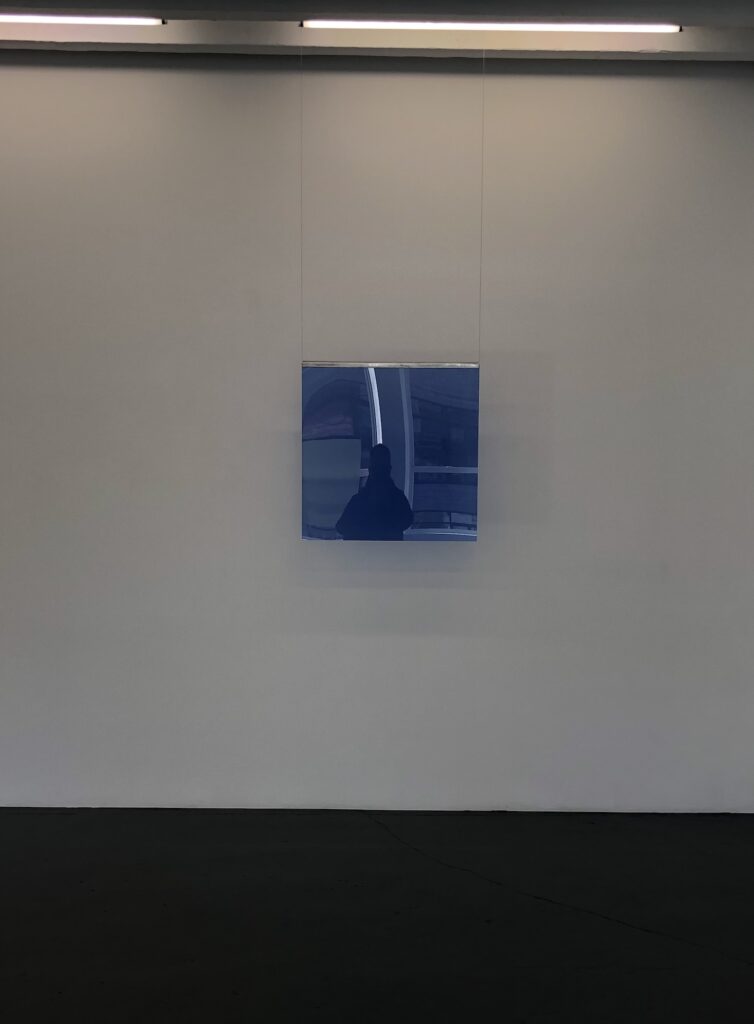
self-portrait in Liz Deschenes’ Untitled (Gorilla Glass Indigo 100), 2023 at Miguel Abreu
I had a speedrun through Manhattan to pick up some gifts and see some shows, starting with Gravity Pull, Liz Deschenes’ beautiful show of monochromes on Gorilla Glass in the morning light, plus some handblown Claude Glass-inspired pictures? Objects? Optical devices? Transfixing.
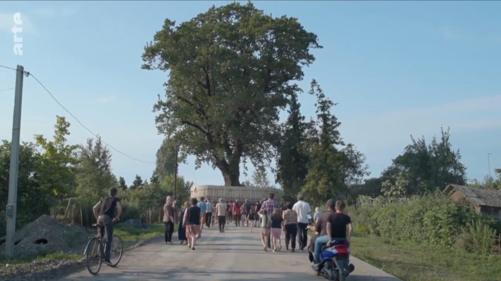
Still from Salomé Jashi’s Taming The Garden, 2021, showing a giant tree on the Black Sea en route to Ivanishvili’s private tree zoo. images via a German-titled arte broadcast uploaded to YouTube
In 2021 Georgian filmmaker Salomé Jashi released Taming The Garden, a documentary about the creation of the Shekvetili Dendrological Park. Bidzina Ivanishvili, a Georgian oligarch-turned-politician who minted his $6 billion fortune in Russia, spent five years collecting over 200 old-growth trees from around the country, which he had transplanted in a park of his own design next to his estate on the Black Sea. The park opened to the public in 2020.
Residents of a Georgian village follow their tree as it drives out of town in Taming The Garden, along a route with probably 90% fewer infrastructure hassles or regulatory hoops to jump through than that rock had to face on its way to LACMA
In her film, Jashi follows several trees as they are removed from the village s, farms, and forests where they’ve been for centuries. She records the resignation and loss of the locals, as well as the surreal transport of the uprooted trees along rural roads, and on barges. The filmmaking is quietly powerful, with dramatic images that only reveal the project’s traumas and absurdities and slowly.
NO SPOILERS but Jashi’s quiet revelations of the sheer artificiality of this ostensibly idyllic natural landscape are amazing
A 2022 dispatch from Ivan Nechepurenko in the New York Times, with striking photos by Daro Sulaukari, reports that around half the trees arrived by sea, and half by truck. The entire project cost Ivanishvili “tens of millions” of dollars, which seems like a pittance for what he did and what he got.
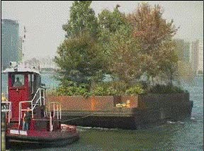
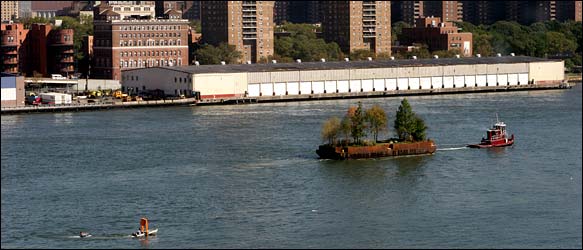
Robert Smithson’s Floating Island, 2005, image via NYT
Why, in 2005, when Nancy Holt authorized Floating Island, a previously unrealized project of her late husband, Robert Smithson, it cost $250,000 to drive a single barge around lower Manhattan for a week.
A miniature version of The Gates chasing a miniature version of Central Park, by, as it turned out, Bruce High Quality Foundation and Robert Smithson, respectively, as captured by Ian Adelman in 2005 in the NYT
I guess I should be more shocked, surprised, dismayed, whatever that Land Art, created in opposition to the collector-pandering commodification of the gallery system, has been so thoroughly subsumed by the billionaire class. But then again, Double Negative was produced and owned by a 3M heiress who donated the first version of Lightning Field, realized on her New Mexico ranch, to the foundation started by the oil heiress which built the permanent version. And which now manages Spiral Jetty. And of course, it was New York’s own oligarch-turned-politician Michael Bloomberg who made Christo & Jeanne Claude’s Gates happen. And the industrialist with the private museum has taken on the care and funding of City. Is Land Art actually about real estate and power? Always was.
“For me, a floating tree was a symbol of power, of desire, of wanting something at any cost,” Ms. Jashi told the NYT. If Land Art can accommodate the Department of Defense’s creations at Dugway Proving Grounds, the cost-be-damned symbolic gestures of a tree-obsessed oligarch should fit right in.
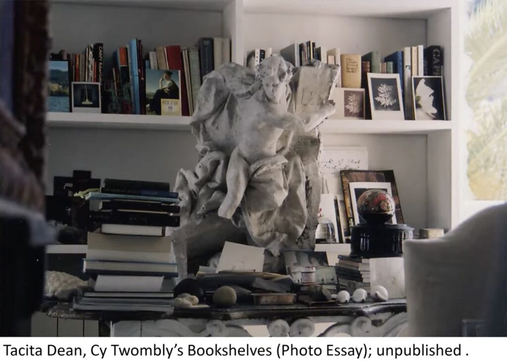
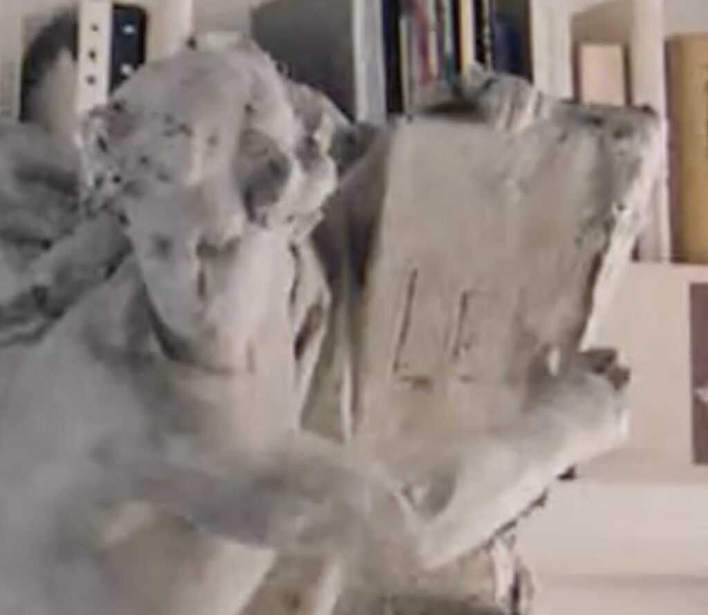
Didn’t think anything of it the first time, but this summer when I watched Mary Jacobus’ 2016 talk at Cornell’s Olin Library about her then-new book, Reading Cy Twombly: Poetry in Paint, I was intrigued by this Tacita Dean photo of Twombly’s library, and wanted to know what this sculpture is.
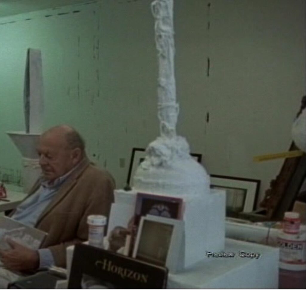
Maybe I noticed it because Dean’s 2008 photos of Gaeta had since been exhibited publicly, at the Fondazione Nicola Del Roscio in 2021-22. [Frith Street Gallery has the writeup in English.] Dean had asked Twombly to help select 50 pictures for a photo essay in the catalogue for his 2009 show at MUMOK in Vienna. Prints of these 50, plus one more (a detail of Giorgio Morandi’s workspace), were shown alongside Edwin Parker (2011), Dean’s quietly observant film portrait of Twombly, shot in Lexington, Virginia in late 2010, not long before his death.
detail of a screenshot from somewhere of Tacita Dean’s Edwin Parker (2011), with Twombly’s meds and mail on Twombly’s sculpture
I’ve always loved how Dean captured how Twombly’s sculptures existed in his cramped, storefront studio, thoroughly embedded in life, arrayed with meds, mail, and bulldog clips. Which is exactly how Twombly installed [sic] the classical figure on the console table in his library.
Or as Jacobus described it, “the so-called library,” which was also (?) “the room where Twombly slept. Three walls were covered with art books, and this one, the fourth, with literature and poetry. She explained that Dean didn’t publish this image because it had a blurry spot on the side. Dean is fluent in blur, so we must defer. But about the sculpture:
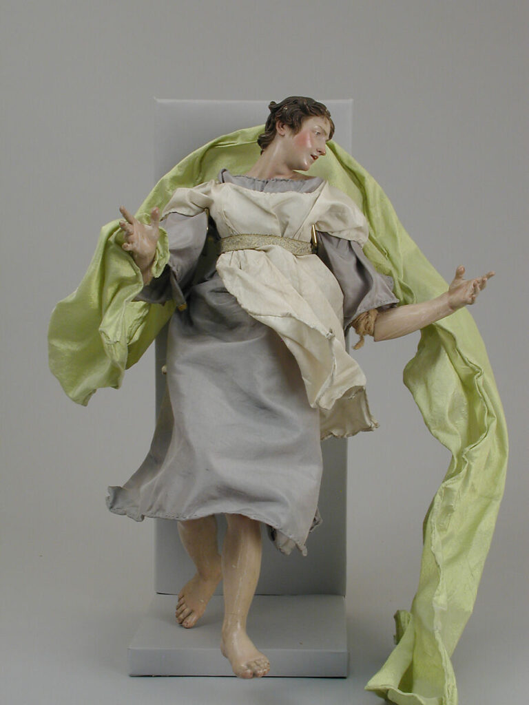
Angel, Neapolitan, 2nd half of the 18th century, terra cotta, wood, fabric and wire, via MetMuseum
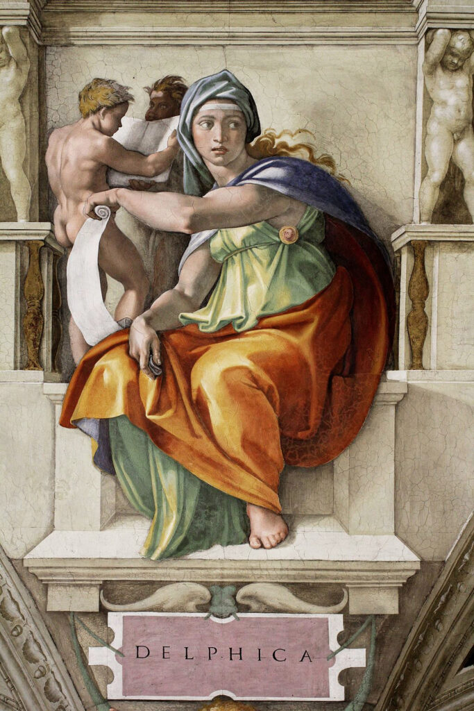
Jacobus called it a “flying sculpture,” which, yes and no. What might look like angelic wings are actually very exuberant drapery, which the twisted, nude figure with a tablet is just about to escape completely. I’ve come back to this sculpture several times this year, trying to identify it, and it’s only now, at Christmas, that I see drapery that wild. Except it’s actually fabric, on the 18th century Baroque Neapolitan crèche figures on the Christmas Tree at the Met. The pose, meanwhile, feels like someone knew the Sibyls on Michelangelo’s Sistine Ceiling.
Michelangelo, The Delphic Sybil, Sistine Ceiling
So I’ve been rummaging around in Italian sculpture fragments, plaster ornaments, pediment sculptures, it says LE[X?] on that plaque, is he an allegorical figure bringing the law? But does it, though?
Cy Twomb-LEX or Cy Twomb-LEE? I think this is painted terra cotta? And what’s up with that left hand?
Because now I think it says “LEE.” Is that somehow related to the former president of the college Twombly attended, in the Virginia town he grew up in, and to which he returned later in his life? Because that would be Robert E. Lee, who is indeed buried along with much of his family and his horse on the grounds of what became Washington & Lee University. These are the Lees I’ve found so far; I would very much love to find others, and to learn that Twombly rescued this statue from their home renovation, or even their gravestone toppling, rather than that he schlepped a melodramatic Lost Cause beefcake statue to Italy to put over his library bed.
[Day Later Update: Of course, maybe the answer lies in the 2019 book, Cy Twombly: Homes & Studios, which contains 136 images compiled and edited by Lothar Schirmer, and an account of the featured locations by Twombly’s longtime collaborator Nicola Del Roscio, in which the pictured locations are revealed as unique repositories of art, antiques, and furniture, and as sanctuaries for their late resident’s creative expression. Re-read this description and buy the book at Gagosian Shop.]
[2025 update: Luxurious as it is, the answer does not lie in this book.]
Lee Ranaldo, Four Organs (Tom), aka Torn Photograph (for SR & RS) (maquette version), 2000? 7 x 7 inches, ed. 25 at Paul + Wendy Projects
In 2000 Lee Ranaldo made a torn photo artwork for a limited edition Sonic Youth box set. It was a photo taken in the basement of his building, of the four organs minimalist composer Steve Reich used for his groundbreaking 1970 work, Four Organs.
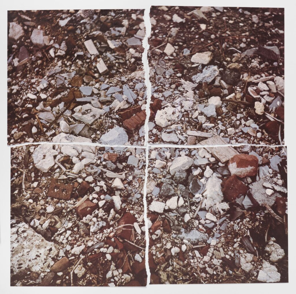
Robert Smithson, Torn Photograph, &c., 21 1/2 x 21 1/2 in., offset lithograph torn in quarters, via Marian Goodman
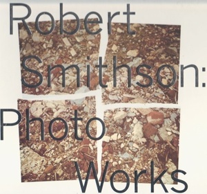
The idea of tearing a photo into quarters came from Robert Smithson, whose Torn Photograph from the 2nd Stop (Rubble) (2nd Mountain of Six Stops on a Section) was included in the Artists & Photographs box set published in 1970 by Multiples, Inc. [It was also on the cover of the catalogue for LACMA’s 1993 exhibition, Robert Smithson Photo Works.]
the 1993 exhibition catalogue for Robert Smithson: Photo Works, as once for sale Arcana Books
This was a Smithson I bought for some friends back in the day, when Marian Goodman was clearing out a bunch of loosies from the Multiples, Inc. warehouse. They were supercheap and perfect. But I just saw the Lee Ranaldo edition again while looking for art edition gifts at Paul + Wendy Projects, and I wanted to find out more.
Fortunately, Dave Dyment’s blog, Artists’ Books & Multiples, has a writeup of the whole thing, including the hilarious detail from a 2011 interview with Ranaldo, that the dimensions of digital file sent to Paul + Wendy were off, resulting in a tiny “Spinal Tap ‘Stonehenge’ version” of the print. Which explains the “(maquette version).” I love it.
Related: In 1998, Lee Ranaldo released an album, Amarillo Ramp (for Robert Smithson), with a 32-minute sound portrait of Smithson’s last work as its title track.
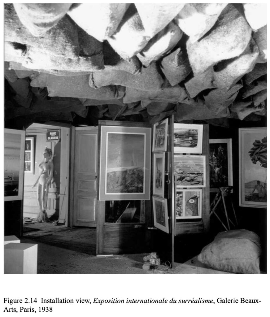
an unidentified photo of Duchamp’s 1938 installation, with paintings hung on one of two revolving doors he put on either side of the perforated iron brazier that provided most of the light. ganked from Elena Filipovic’s dissertation
Specifically, I never really noticed or heard that much about the revolving doors Marcel Duchamp used as exhibition devices in the 1938 Exposition internationale du surréalisme he designed/curated at the Beaux-Arts in Paris. As Murtha pointed out, Duchamp later considered other elements from the show to be artworks—1200 Coal Bags Suspended From The Ceiling Over a Stove, for example—but the doors didn’t get the same treatment. Despite, as I see below, Duchamp’s well-documented interest in doors—and Large Glass works that, you must admit, look rather doorish.
Happy Joan Mitchell Season, 2023, screenprint on cotton and inkjet, pen, and offset on paper
Glad to hear the Joan Mitchell Season shirts are arriving. They took a little longer than expected, and the COA did, too, so apologies if you didn’t get yours in time to wear in Miami. Anyway, I thought we were boycotting Florida atm.
You know how in 2017, the White House reporter was like, “I’ve been working on this investigation for a year, and he…just…tweeted it out”? This is the diametric opposite on every vector: I was noodling for a couple of hours on a blog post about an auction lot, and he…just…wrote a masters thesis on it.
After posting some thoughts Friday about the Sturtevant repeats of Marcel Duchamp’s photographs of Readymades, I heard from Hunter professor and Sturtevant whisperer Michael Lobel, who shared the fascinating research one of his former students had done on these very artworks, and much more.
Chris Murtha’s 2021 thesis, Double Documents: Imaging and Installation in Sturtevant’s “Duchamps” is the first close look at Sturtevant’s use of photography and installation. These mediums are inextricable from the artist’s decades-long engagement with Duchamp’s work, and Murtha traces how they function both as aspects of art production, and as modes of exhibition and distribution.
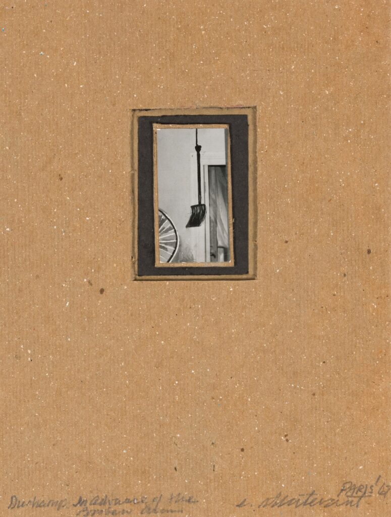
Lot 92: Sturtevant, Duchamp’s In Advance of the Broken Arm, 1967, gouache on photo on cardboard, I think, 20.5 x 15.2 cm, selling at Bonham’s Cornette de St Cyr on 10 Dec 2023 [update: sold for €10,240]
In 1967, Sturtevant restaged Duchamp’s photos of his Readymades in his studio, in her Parisian apartment. And then she repeated Duchamp’s reworking and retouching of the photos for his Boîte-en-valise. And she mounted them on cardboard and added captions & titles.
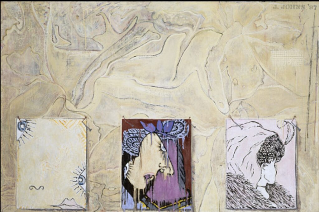
Jasper Johns, After Picasso, 1998, collection of the artist, currently on view at Skarstedt
I’m still kind of marveling at them being in the same show, but if Richard Prince and Jasper Johns are going to cross paths, it makes sense that it’s at the corner of Picasso reproductions and painting.
a spread from the exhibition catalogue for Prince/Pablo Picasso, where Richard Prince collaged his own early drawings over pictures of Picasso paintings
In 1998, Johns decided to paint himself a copy of a Picasso reclining nude that had been printed upside-down in an ARTnews article. And in 2011-12, Prince overpainted, drew, collaged, and inkjetted his way through a Picasso exhibition catalogue to the point where he had a two-artist show at the Picasso Museum in Malaga, Spain.
At the moment he made his Picasso works, Prince was being sued over images he’d used in his Canal Zone series. Yet for each series, and the deKooning Paintings he’d made beforehand, Prince used a very similar book/painting/collage/inkjet process.
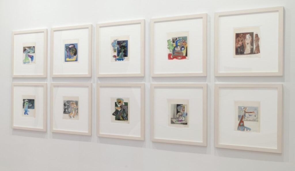
Richard Prince, Picasso works, painting, drawing, and collage on lithograph, as installed at Skarstedt
In the show, “In Dialogue with Picasso,” at Skarstedt, Joachim Pissaro included ten of Prince’s book-sized painting collages. Which are interesting enough on their own, but it is unexpected to find them alongside Jasper Johns, even if both artists are, as Pissaro points out, interested in both appropriation and painting. [And in appropriating Picasso’s paintings.]
Untitled, 2017, 50x60cm, acrylic over etching with collage on canvas, via Matthew Marks
What I really did not expect while considering these two artists together, was that they both also work with collage, and with combining multiple mediums into one. Now that you mention it, Johns has been painting trompe l’oeil collages for decades, but the untitled 2017 work above was just one of many to come that incorporated an actual print, photo, or paper element.
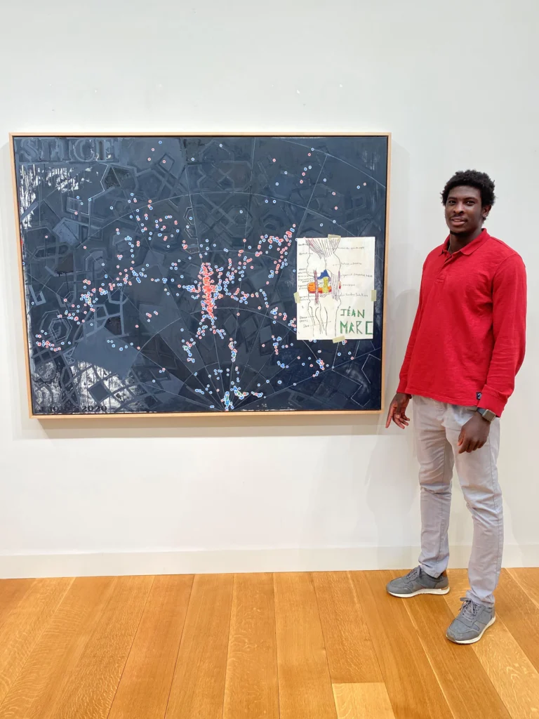
Jéan-Marc Togodgue posing with Jasper Johns’ Slice (2020) while visiting the (older) artist’s studio, as photographed by the retired basketball coach at the (younger) artist’s local boarding school, Jeff Ruskin
For his show of new works at Matthew Marks in 2021, Johns’s collaging and appropriating even got him called out for using another artist’s work without permission. Though the artist was a high school student, and the work was a copy of a wikipedia diagram of a knee he’d made for his ortho, and the ones doing the calling out were the slightly weird handlers who’d recruited the kid from Africa to play basketball at their rural Connecticut boarding school. We’ll all be Patrick Cariou for fifteen minutes.
Jasper Johns, After Picasso, 1998, 34 1/2 x 28 1/2 in., collection of the artist, via Skarstedt
So Cy Twombly wasn’t the only onemaking his own Picassos. In late 1998, while in St Maarten and in the middle of his Catenary series, Jasper Johns decided to make a copy of Picasso’s Reclining Nude (1938), which he’d seen in ARTnews.
Pablo Picasso, [Actually] Reclining Nude, 1938, ex-collection Marina Picasso/Jan Krugier
The painting belonged to Picasso’s granddaughter Marina, and illustrated an April 1998 profile of Jan Krugier, the Geneva dealer with exclusive rights to sell her collection. It was apparently printed upsidedown. Unless Johns took his year’s worth of unread ARTnewses to the beach with him, maybe it was the correction in a later issue that caught his interest.
Johns lives with the work and loves it, he told interviewer Marco Livingstone in 2000: “I love to look at it, and I’m very happy that I have it to look at. In a sense I have the feeling that much of what’s interesting about it is not willed, but is innate to the structure of the man who made it, and there’s no way to replicate it in oneself. One can only admire it in the other person, or hate it if you happen to hate it!”
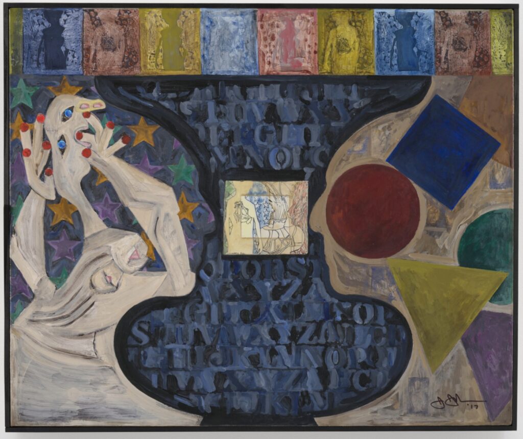
Untitled, 2017, 50x60cm, acrylic over etching with collage on canvas, via Matthew Marks
And when it came home, it found its way into the thick of Johns’ work. An untitled 2017 painting and etching collaged on canvas rotates and adapts the reclining nude to the contour of Johns’ profile/vase motif. It seems clear from the figure’s amorphous lower half that Johns was looking at, or referring to, his own cropped copy, and not Picasso’s original [or a reproduction of it.]
Silhouette of Picasso and a Young Girl Crying, 1928-29, Collection Musée Picasso
This 1928-29 painting of Picasso’s silhouette and a young girl crying was published on the facing page of a 2008 coffee table art book by Michele Dantini. Which is not a source I’d imagine Johns using, of course, but the painting IS in the Musée Picasso. And that crying woman’s biomorphic head does look a lot like the late Picasso Tête de Femme Johns was quoting in his Stony Point works in the late 1980s, like the one the Hirshhorn acquired in 1988.
The nurse who got a 2011 World Receiver as a present from Isa Genzken can keep it, said a judge in Bonn this week. Except of course, he can’t because he sold it last spring to an antiques circus clown on German TV. The decision was first reported by Rundschau Online. [shoutout greg.org hero Michael Seiwert for the tip.]
When the deal became public in September, Genzken’s legal advisers claimed they should have approved the gift, as custodians of her resources while she was undergoing mental health care. The judge said no, it’s been more than ten years, and the nurse accepted the gift in good faith. Genzken opted to drop her claim rather than appeal.
So I guess the TV collector who paid the nurse a piddly EUR16,000 for a EUR50,000 sculpture is free to flip it again at Sotheby’s.
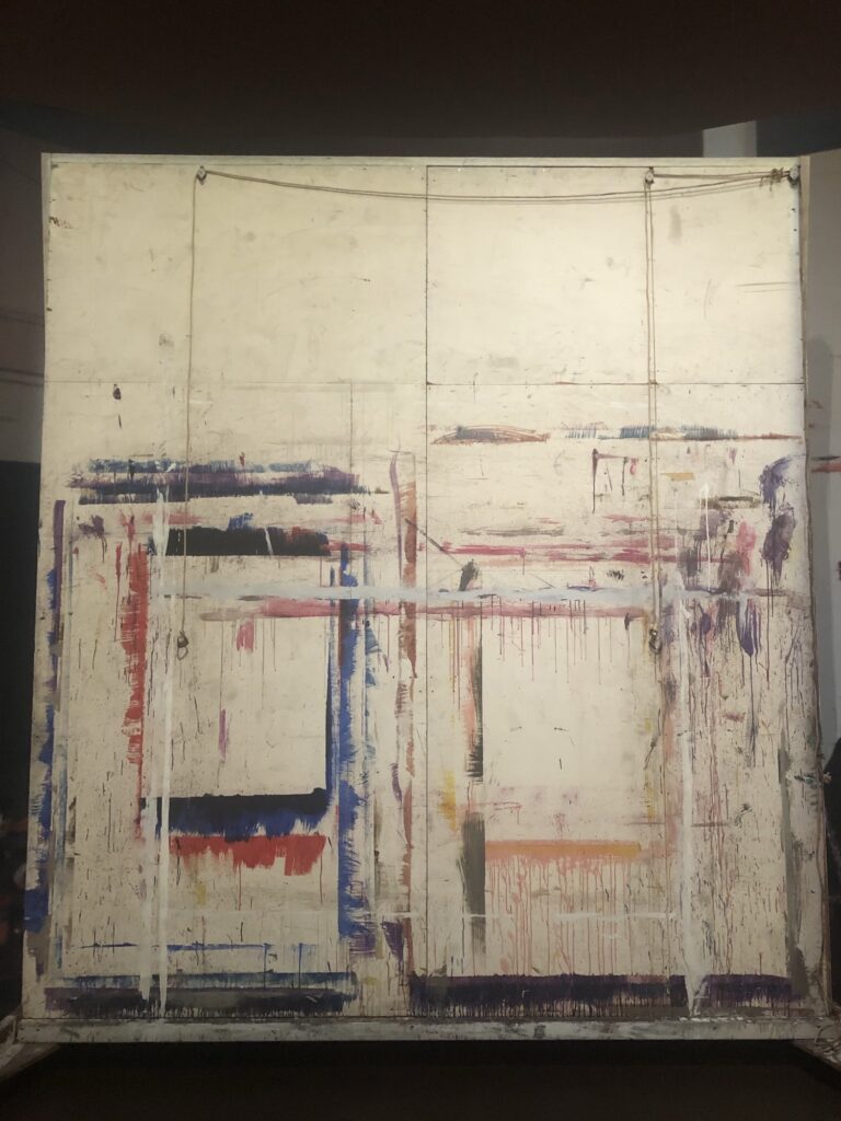
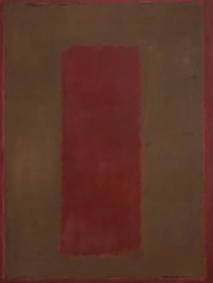
I did not realize the full extent of Mark Rothko’s painting on paper. I remember seeing a works on paper show at Pace in the 1990s and feeling—wrongly, as it turns out—that it was just a second-tier project, and what was left in the estate.
Instead it is clear from the National Gallery’s show that Rothko was very engaged with painting on paper at specific points of his career, including windows of what is now called his classical phase. He took great care to paint and finish them, experimenting with composition, materials, borders, and mounting. [NGL, some acrylics look weird.]
But to make them he developed a practice of taping a sheet of paper to the movable, large-scale, plywood walls that he used as easels. One is on view at the end of the exhibition, built up with the overpainted palimpsests of various works.
Emily Fisher Landau’s Seagram Rothko, Untitled, 1958, via Sotheby’s
The way they kind of resemble the inverted composition of the Seagram paintings, made years earlier, is a coincidence. But that body of work does show Rothko’s search for something new didn’t suddenly appear in the 60s.
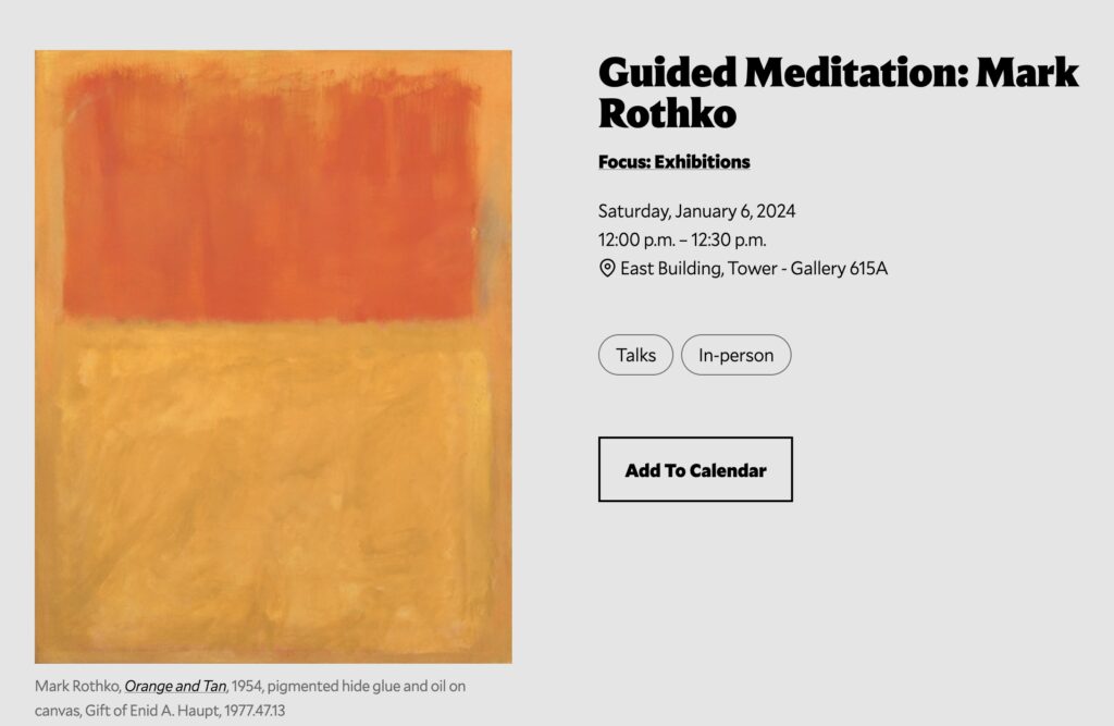
The Mark Rothko Works On Paper show just opened in the East Building of the National Gallery of Art on the National Mall next to the US Capitol Building in Washington, D.C. There will be a guided meditation in the Tower Gallery at noon on Saturday, January 6th, 2024.