
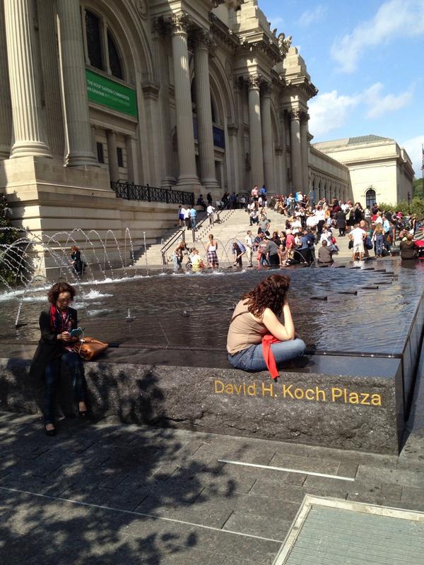
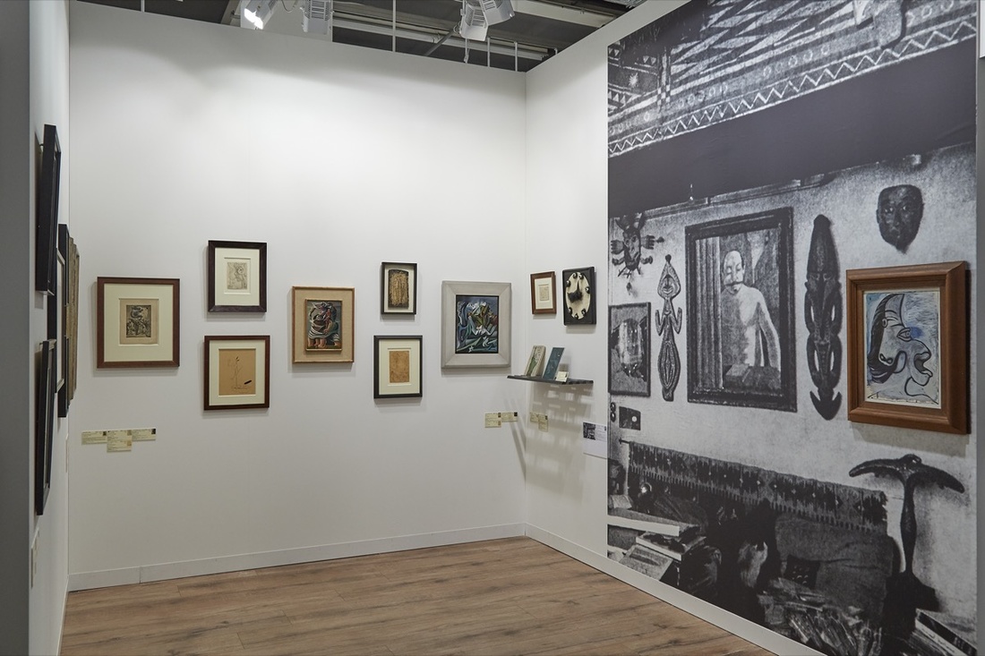
Close, but not quite: Study for Untitled (Koch Block), image by @sailingfanblues
First conceived in September 2014 in response to a tweet by Zachary Kaplan, Untitled (Koch Block) is a collaborative public artwork situated permanently at the Metropolitan Museum of Art in New York.
It comprises an endless succession of volunteers who sit on the edges of the fountains in front of the museum in a manner that obscures the engraved name of the museum trustee, David Koch. The work includes the engravings on both fountains, and so is ideally performed by two or more individuals at any time. While a sitter’s personal items such as a stroller, wheelchair, shopping cart, or backpack might be placed in front of the engraving for extra-wide impact, no permanent alteration, damage, or obscuring of any kind should take place, at least not as part of this artwork.
Any one individual or group should feel free to sit and block public view of the name for as long as they wish, but all should be mindful of others who might also wish to participate. The Artist Is Present-style marathons are discouraged. Instead, try taking turns, coordinating, and/or making arrangements onsite to continue the work. Formalized schedules or shifts should also be avoided, even if this means the work is not persistently instantiated.
It’s true that awareness of the work could be facilitated by people posting photos on social media using a hashtag like #KochBlock. My concern, though, is that viral messaging might run counter to the essential nature of the work, which is to deplete the mindshare and social capital that typically accrue from such purportedly eleemosynary naming opportunities. Still, such efforts are obviously beyond my control, and if the 7 million visitors to the Met each year decide they all have to post #KochBlock selfies, well, we’ll re-evaluate.
The ideal state of the work is for the names to be permanently blocked from view through uncoordinated but widespread acculturation. At any moment in which a sitter finishes blocking and rises from her spot, another individual naturally and un-self-consciously takes her place. Some folks will undoubtedly make a point of visiting the fountains to participate. Some might make it a routine. People might come to recognize the faces of other regulars. Eventually, Koch blocking should become an ingrained behavior common to sharing civil, public space, as obvious and natural as dodging slow-moving tourists or jaywalking. [s/o @man for reminding me this needed to be formally auraticized.]
UPDATE: Just realized this is my third piece at the Met. Thanks for the support!
Category: art
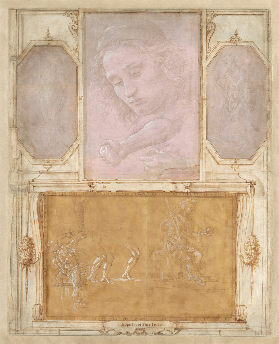
From Giorgio Vasari’s Libro de’ Disegni
Well, after 4 years of occasional rumination, my eternally unsolvable mystery of people drawing frames around Old Master drawings has been flipped on its head. And now I wonder how any drawing could have survived the centuries undoodled.
Reader/artist/hero Peter Huestis pointed me to this full page from Giorgio Vasari’s Libro de Disegni (Book of Drawings), which is in the National Gallery.
As I mentioned last night, Vasari drew the architectural elements around the Getty’s newly acquired del Sarto when the sketch was part of the Libro. The book contained at least 536 drawings, collected by Vasari either as reference material or a supplement for his biographies of great artists, or as significant examples of art in their own right. Most are mounted on larger sheets and are surrounded by frames and plaques and architectural elements in ink and gouache.
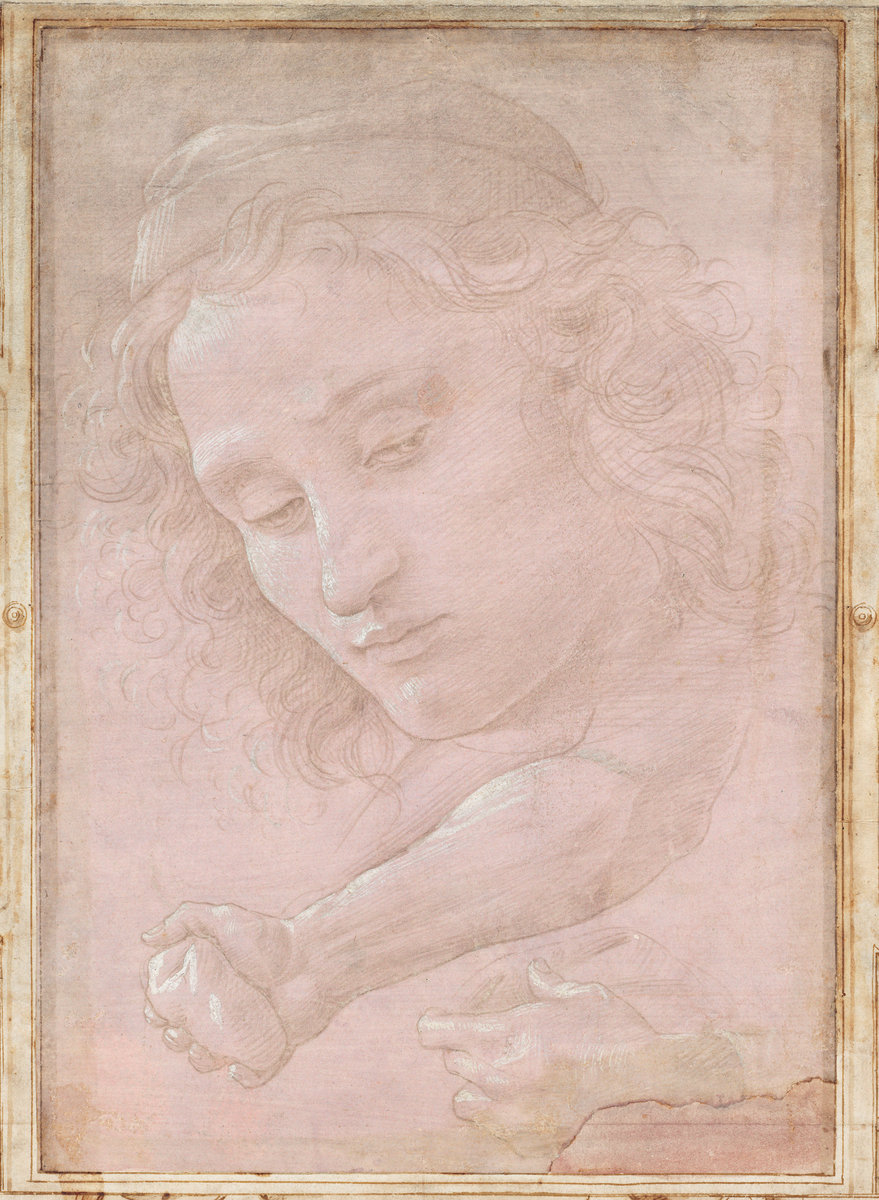
Study for Vasari’s Botticelli, 2017- , 200x146cm, ink and gouache on oil on linen? inkjet on aluminum? I have no idea rn [image: nga.gov]
The NGA’s example is one of a very few intact pages: 10 drawings attributed to three artists, some trimmed to shape almost like paper dolls, and collaged into imagined spaces. Vasari places these sketches in the same privileged architectural contexts as paintings. Except the scale is so wild, the drawings become a startlingly contemporary genre of their own. Can you imagine Botticelli painting a 6-by-4 foot mauve head floating above two unmatched, disembodied hands? Hanging over a fireplace or, as he envisioned it here, above a ghostly parade of phantom limbs by Filippino Lippi? You’d have to print it [Or I would, anyway. Could you imagine making these marks at that scale?] Has no one created these installations before?
[Practical but somehow disheartening update: The existence of a Vasari X Botticelli colabo bib on Zazzle makes me think, the whole sheet’s just going to end up as a 3×2.5m vinyl photomural.]
Giorgio Vasari with drawings by Filippino Lippi, Botticelli, and Raffaellino del Garbo, Page from “Libro de’ Disegni” (1480-1504, mounted after 1524) [nga, thanks peter]
Libro de’ Disegni [fr.wikipedia.org]
Previously, related: A proposal for a Prina-style series of monochrome Dürer frame drawings (2013)
A proposal to re-create at scale the six or so historical installation situations of Leonardo’s Mona Lisa (2009)
Frame Part Of Drawing
When the Albertina’s Dürer show came to the National Gallery a few years ago, I got very interested in the way the drawings were framed. Inside their matting, each work on paper also featured an outline, one or two lines, drawn right on the sheet. Who did these and why, no one at the NGA could say. [UPDATE I HAVE BEEN FOUND OUT I DID NOT ASK THE CURATORS STAY TUNED] The accompanying catalogue had zero mentions, and reproductions all excluded these drawn frames. Photography was prohibited in the show, and the Albertina’s website images are worse than anything, so these marks made right on the face of these important artworks are treated as invisible or irrelevant.
[UPDATE: Oh hey, I found a bunch of photos I took anyway. Since the statute of limitations for not taking photos of 400-yo artworks is 3 years, and the rule of law is crumbling around us anyway, they’re after the jump.]
Obviously, drawings have been handled differently as art objects across the centuries. There’s probably at least one dissertation to be written about collectors and dealers and institutions marking up old drawings. Maybe it already has been, and just need to be unearthed.
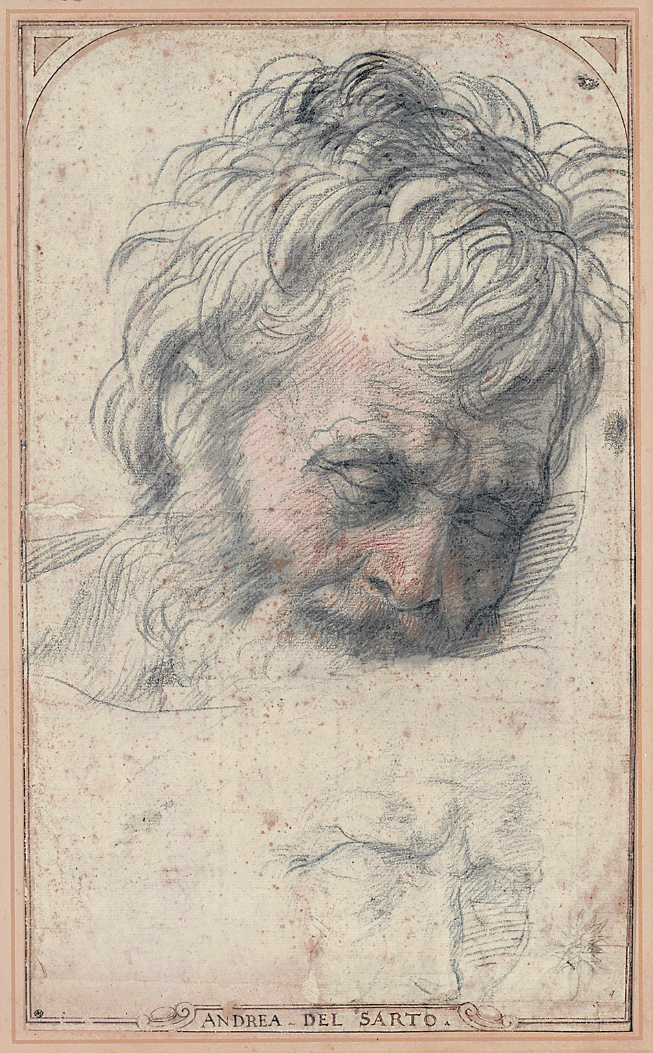
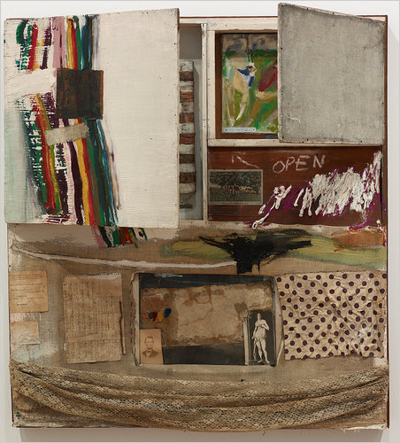
Anyway, I thought of this practice when I saw William Poundstone’s report of the Getty Museum’s acquisition of a major collection of Old Master drawings. The haul includes a Michelangelo, and this Head of St. Joseph (1526-27) by Andrea del Sarto. Which is great, but check out the double-line frame drawn around it, the spandrels to hint at a round arch, and the nameplate added to the bottom.
When this drawing traveled to the Getty and Frick as part of a 2015-16 del Sarto show, the careful framing was attributed to none other than Giorgio Vasari, who had collected this work by his former teacher into Libro de’ Disegni, a drawings album. As Ingrid Rowland wrote:
In part because of his connection with Michelangelo, and in part because of his own ravenous curiosity, Giorgio Vasari was one of the first collectors to value drawings as legitimate works of art. He had taken to studying old master drawings as an aspiring artist, and when he gathered information about colleagues as an aspiring biographer for his Lives, he also sought out their drawings, binding them into a series of books. The books, unfortunately, have been lost, though isolated pieces survive.
So maybe there is something to be learned from these invisible framing devices after all.
The Getty’s Big Buy [lacmaonfire]
Sublime, Exhilarating del Sarto, review by Ingrid Rowland [nybooks]
Previously, related: Borderline
Albrecht Dürer Making Copies
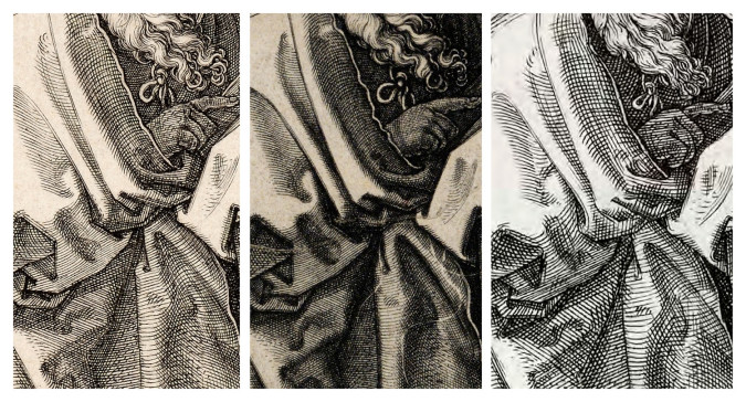
details of Albrecht Dürer St. Pauls by [l. to r.] Albrecht Dürer (1514), Johannes Wierix (c.1566), and Andrew Rafferty (2012), image: artinprint
My tabs are srsly a mess. I’ve had this 2012 Art in Print account of replicating Albrecht Dürer’s engraving plates in there for months, ever since seeing a copy of one of Dürer’s greatest prints, Melencolia I (1514). Conservator Angela Campbell and contemporary engraver Andrew Raftery were studying how Dürer made his plates and his prints, and how they changed over the life of an edition. Rafferty made a copy of St. Paul [above, right], and geeks out on the differences of wiping, crosshatching, and hammered vs. rolled copperplate. For her part, Campbell’s larger goal is to put the world’s existing impressions into chronological order by tracking changes in micro marks and surface scratches. Which, more power to them.
What redlines my geekmeter, though, is learning that of the 105 he made, there is only one Dürer plate left in existence. It is in Gotha, Germany, and it is a 1526 portrait of reformist theologian Philip Melancthon.
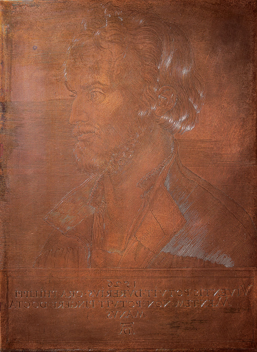
The Schloss Friedenstein Foundation was understandably excited to add a deep, high quality print taken from their plate. I wonder when the last impression was taken from this plate, and if the Stiftungvolk would ever entertain printing another one.
[Related: Woodblocks are more durable, and so more survive. The Met has two of five that Junius S. Morgan acquired, including: Samson Rending the Lion (1497-98), and The Martyrdom of St. Catherine (c. 1498), which, amusingly, is catalogued as “Black ink on pearwood”.]
Remaking Dürer: Investigating the Master Engravings by Masterful Engraving [artinprint.org]
Bild und Gegenbild [kulturestiftung.de]
The Richard Serras Of Friendship Heights
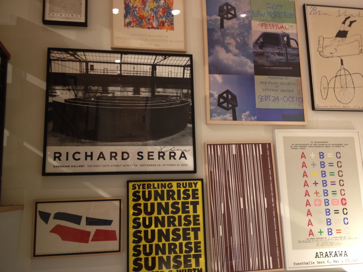
If you’re wondering who the one person was who went to the mall in Chevy Chase, to the J. Crew store Monday, it was me. And I was only picking up a catalogue order.
And marveling at the giant [signed!] Richard Serra Torqued Spirals exhibition poster from Gagosian, c. 2003, one of two constellations of highly curated posters and prints lining the staircase.
I contemplated the state of the brick&mortar retail industry, making a note to watch the liquidation auctions for a deluge of contemporary art ephemera when the reaper comes for J. Crew. And figuring if the swag doesn’t turn up, we’ll know the store designers who fantasy-shopped it all together have absconded with it in lieu of severance.
Just as I was thinking, this poster was my most unexpected Serra sighting ever, I stepped outside, and found this, in the garden of the condos across the street.
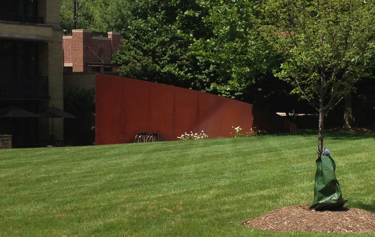
I approached to take a photo, and the carefully calculated elevations of the lawn revealed the bottom quarter of the Cor-Ten slab. If only he’d added a water feature, I bet Tilted Arc would still be standing.
John Cage Film Poster
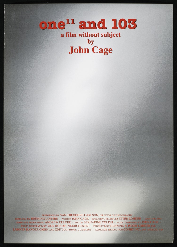
For a long time I’ve been a fan of One11 and 103, the film John Cage made with Henning Lohner in 1992.
But I’ve never seen this poster for the film, which was originally made for German public TV broadcaster ZDF. And which ended up in th Merce Cunningham Dance Company collection at the Walker Art Center. Now I must find one.
Also, I wonder what it means that Cage is credited as the author of the film, while Lohner is the director. In this case more than any other, I’d say the director is a performer of the composer/author’s score. Which also happens to have been generated by a software program written and executed by Andrew Culver.
Also, I must remake this film. So much on the plate.
poster for One”and 103: a film without subject by John Cage, 1992 [walkerart.org]
Previously, related: John Cage’s One11: The Making Of, now in English
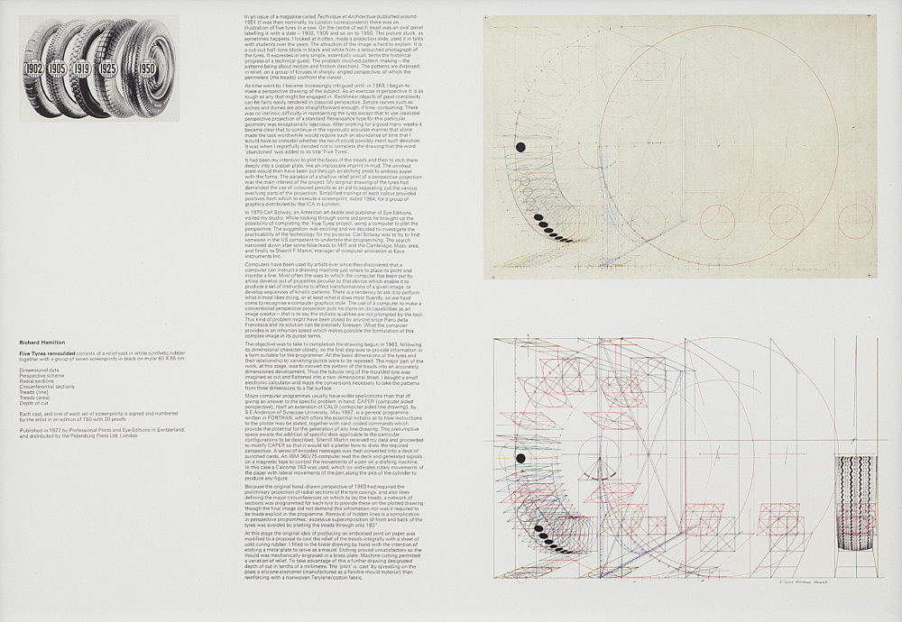
Better Read #014: Richard Hamilton, Five Tyres Remoulded (1972)
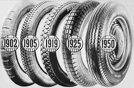
Richard Hamilton invitation with 1951 Technique et Architecture illustration used for Five Tyres – abandoned (1964) and Five Tyres remoulded (1972)
Sometimes I hit a wall while writing, and retyping someone else’s text helps get me going again.
So here is another installment of Better Read, a series of mp3 files from greg.org in which an interesting, under-known, or hard-to-find art-related text is read by a computer.
This text by Richard Hamilton accompanies Five Tyres remoulded, 1972 relief and print edition created with Carl Solway and EYE Editions. Hamilton describes his attempt to replicate by hand a complicated photo illustration he’d clipped from a trade magazine. The image was from the 50s, the project began and was abandoned in 1963, then reinitiated in 1970 with the help of a computer. Besides the obviously interesting insights onto his own process, Hamilton’s text resonates with the history of early Pop, conceptual art, and even appropriation, as well as the inter-relation of art and technology.
Unless you had the portfolio itself, the text was only available in print in Studio International (1972, vol. 183, p. 276). Images of a first draft of the text were also included in a 2014 blog post by Carl Solway about his correspondence with Hamilton. So I’m sure having a computer-generated voice recording of it expands its availability tremendously.
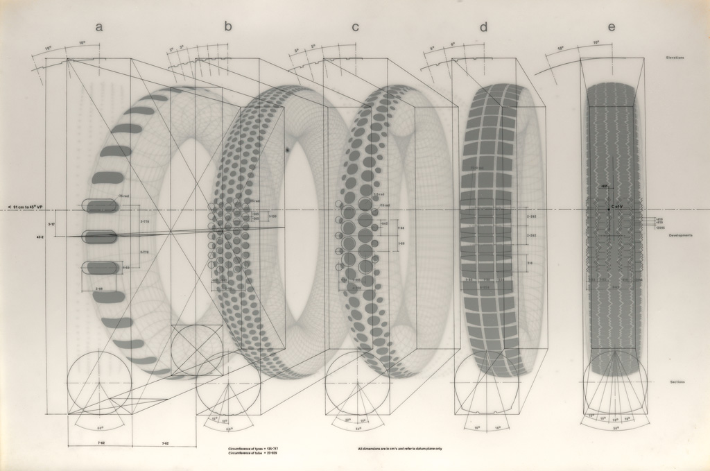
Richard Hamilton, Dimensional Data, screen print on mylar, 60x85cm, from Five Tyres remoulded (1972), via swann
[2022 UPDATE: In September and October 2022, Galerie Buchholz included a Five Tyres remoulded portfolio in an exhibition of Hamilton’s work. The single text included in this work differs from the longer, two-part version from Solway’s archive. An image of the portfolio version is below.]
play or dl Better_Read_014_Richard_Hamilton_Five_Tyres_Remoulded_20170624.mp3 [dropbox greg.org, mp3 9:55, 14.3mb]
Related: Digging in the Archives: Richard Hamilton [solwaygallery.com]
Five Tyres remoulded (1972) [tate.org.uk]
Podcast: Play in new window | Download
Subscribe: RSS
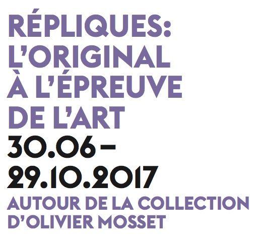
Répliques at the Musée des beaux-arts, La Chaux-de-Fonds, 30 June 2017
Just when you thought The Grand Tour couldn’t get any grander.
I am psyched, though no longer quite as surprised as you might be right now, to announce that Our Guernica Cycle – Ivanka / Merkel 2017.03.17 will be included in an exhibition at Musée des beaux-arts, La Chaux-de-Fonds, Switzerland. Titled “Répliques : l’original à l’épreuve de l’art”, the show explores the history, distribution, and appreciation of art through replicas, duplication, and appropriation. It includes post-war works from the collection of Olivier Mosset, which the artist donated to the Musée in 2007, as well as other historical and contemporary works from the permanent collection. The show is organized by Gabriel Umstätter.
When the Musée folks emerged to identify themselves from the Kickstarter campaign, there were a few harried weeks to get the concept, the image, the object, and the logistics all pinned down in time for the opening. I must say I’m impressed by the cool confidence, precision and thoughtfulness, and I’m relieved that what was essentially a wild test of a print turned out great. [Did I bury the lede here? Has a museum ever acquired a work straight out of a Kickstarter campaign before?]
The Musée will feature a full-scale, Renaissance Edition print of the Ivanka/Merkel painting. I imagine the conceptual disaster-in-the-making of an outsourced painting of a crucial historical instant made in the style of a disgraced, redemption-seeking politician and reproduced following the modified pyramid schema of America’s most mindlessly popular painter offers many, many entry points for a discourse on the moment. But then again, from this artist list, I’m sure there’s no shortage of eye-popping insights:
Greg Allen, Carl Andre [! -ed.], Ian Anüll, John Armleder, Olivier Babin, Robert Ballagh, Aimé Barraud, Francis Baudevin, René Bauermeister, Ben, Mike Bidlo, Julius von Bismarck, Nicolas Boissonnas, Bryan Cera, Jerome Cavaliere, César, John Dogg (Colin de Land & Richard Prince), Gérard Collin-Thiébaut, le Dessinateur (automate Jaquet-Droz), Marcel Duchamp, Gretchen Faust, Hans-Peter Feldmann, Sylvie Fleury, Christian Floquet, Camille Graeser, Peter Halley, Charles Humbert, Donald Judd, Jean-Blaise Junod, Edouard Kaiser, Scott Kildall, Frank Kozik, Joseph Kosuth, L/B (Sabina Lang & Daniel Baumann), Alix Lambert, Bertrand Lavier, Louise Lawler, Jørgen Leth, Sherrie Levine, Claude Loewer, Michael Mandiberg, Jean-Luc Manz, Allan Mc Collum, Claude Mellan, Ana Mendieta [No? I guess I added that one. -ed.]Mathieu Mercier, Olivier Mosset, John Nixon, Richard Pettibone, Raoul Pictor (Hervé Graumann & Mathieu Cherubini), Bernard Piffaretti, André Ramseyer, Martial Raysse, Léopold Robert, Walter Robinson, Norman Rockwell, Bob Ross, Claude Rutault, Yara Said, le Tampographe Sardon, Lily van der Stokker, Elaine Sturtevant, Peter Tillessen, Corinne Vionnet, Wallace & Donohue, Joan Waltemath, Andy Warhol, Lawrence Weiner, Dick Whyte, Ian Wilson, Madeleine Woog.
I am as humbled as I am mystified by the sense of accomplishment this situation gives me right now.
Répliques : l’original à l’épreuve de l’art, Musée des beaux-arts, La Chaux-de-Fonds, 30 June – 29 Oct 2017 [chaux-de-fonds.ch]
Related: Our Guernica, After Our PIcasso Kickstarter campaign page [kickstarter]
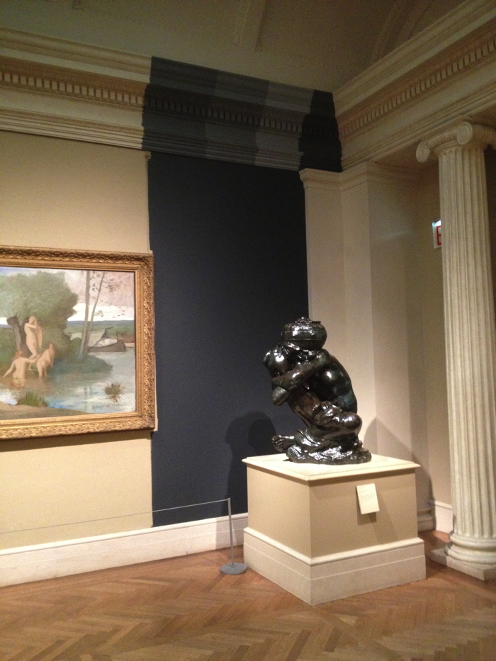
Proposte monocrome, gris, 2017, as photographed by @bshaykin
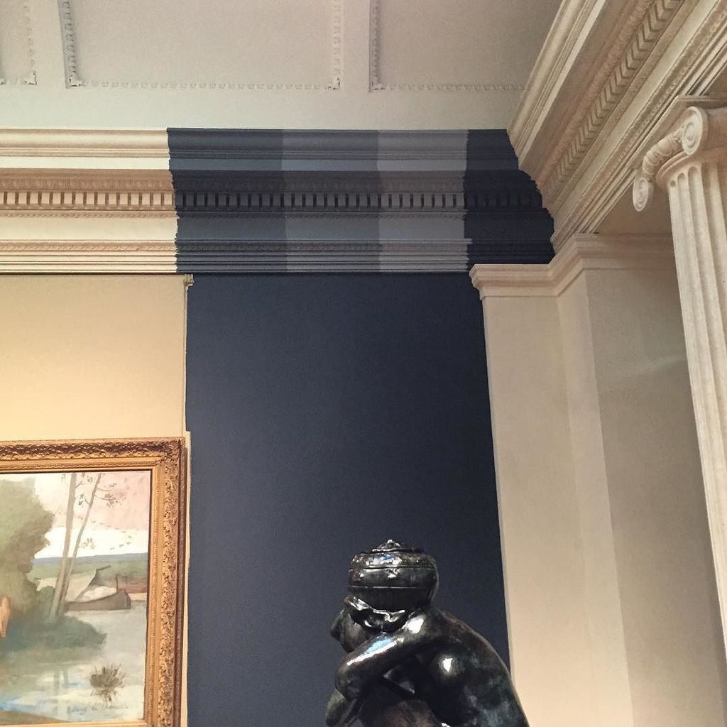
Installation view: Proposte monocrome, gris, 2017, dimensions variable, paint on plaster, as installed at the Metropolitan Museum of Art, June 2017. photo: @bshaykin
If you’re hustling to the Metropolitan Museum to see my work, Untitled (Andiron Attributed To Paul Revere, Jr.), in the American Wing, you might be in for a treat.
Benjamin Shaykin has Instagrammed a beautiful photo of another piece, Proposte monocrome, gris, which is installed, at least for the moment, in the French Impressionists gallery. If you see it, take a pic!
You’ll probably have to hurry, though. And if you don’t make it in time, there’s always the Kawakubo show. And a rare pair of Caravaggios.
@bshaykin [instagram]
Weekend Update: Word is it’s still there. No word on whether it has a label, but it looks good, and right, just like I intend it. [thanks, J]
Previously: Untitled (Andiron attributed to Paul Revere, Jr.), 2014
Proposte monocrome, eBay, rose
Picasso / Breton Photomural @ Art Basel
We haven’t had a good, old-fashioned photomural post on here for a while, and I’m kind of crazy with work and stuck with writing, so I won’t get into it now. But Galerie 1900-2000’s booth at Art Basel this year features a sweet photomural blowup of Andre Breton’s living room as a backdrop for a Dora Maar portrait Picasso gave him. Very nice. [image via Benjamin Westoby for Artsy]
Previously, related architectural photomurals: Barcelona Pavilion photomural for Craig Ellwood’s 1966 Mies van der Rohe show at LACMA
Stephen Shore photomurals or ‘architectural paintings’
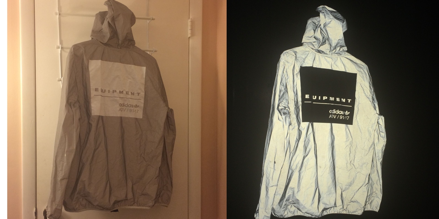
Untitled (Adidas Art Basel), #001, 2017
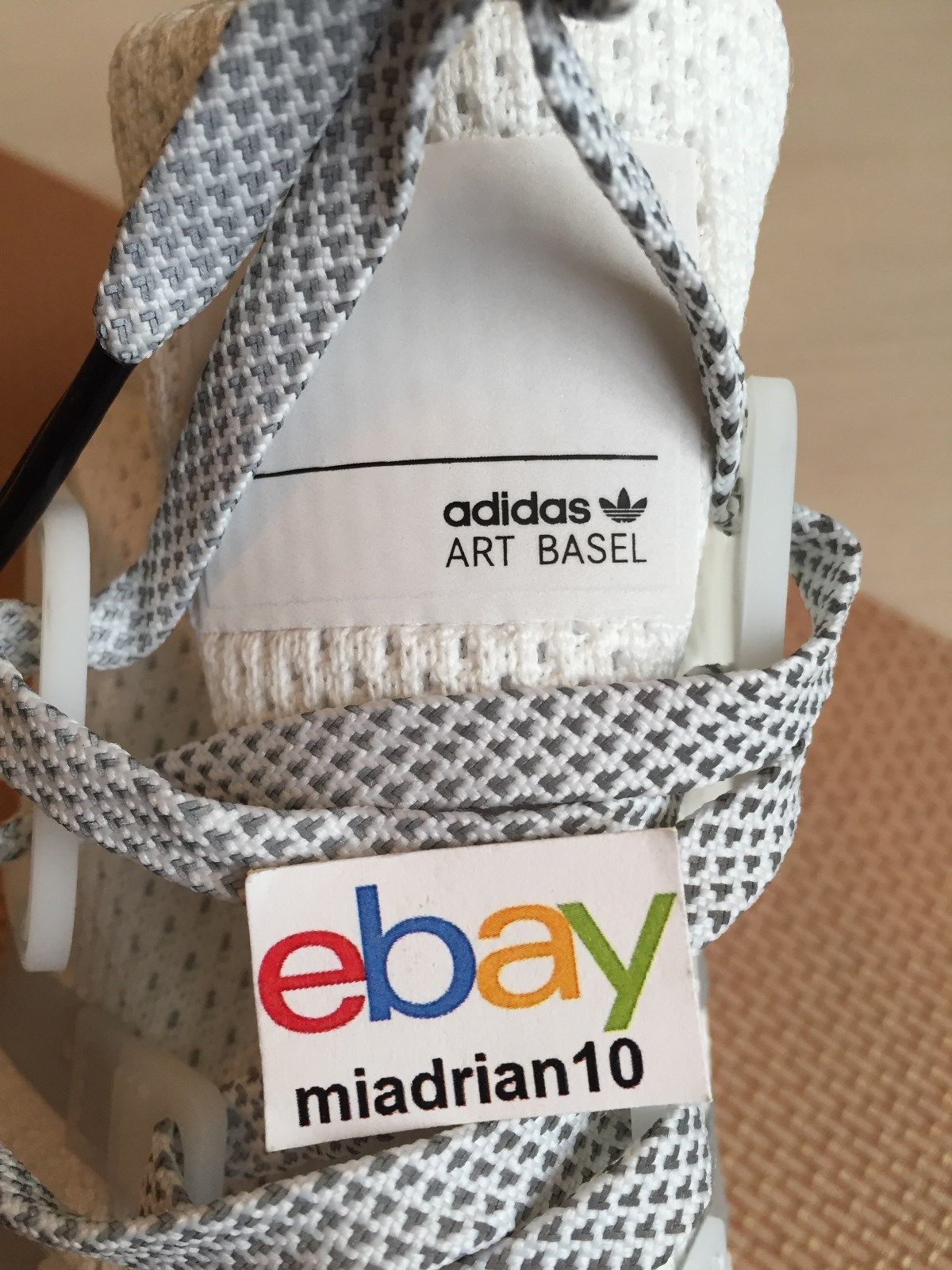
Study for Untitled (Adidas Art Basel), 2017, nylon and ink on Adidas EQT shoe, image: ebay seller miadrian10
Art Basel is suing Adidas for trademark infringement over these kicks. A thousand pairs were given away at a string of branded flashmobs in Miami on November 30th, two days before the opening of the art fair they had no official marketing agreement with. Is there a term for astroturfed flashmobs? Is there any other kind these days? Did you know Adidas been hypin’ kicks at #ABMB since at least 2010? Does a viral flash mob still count if you have to Google it?
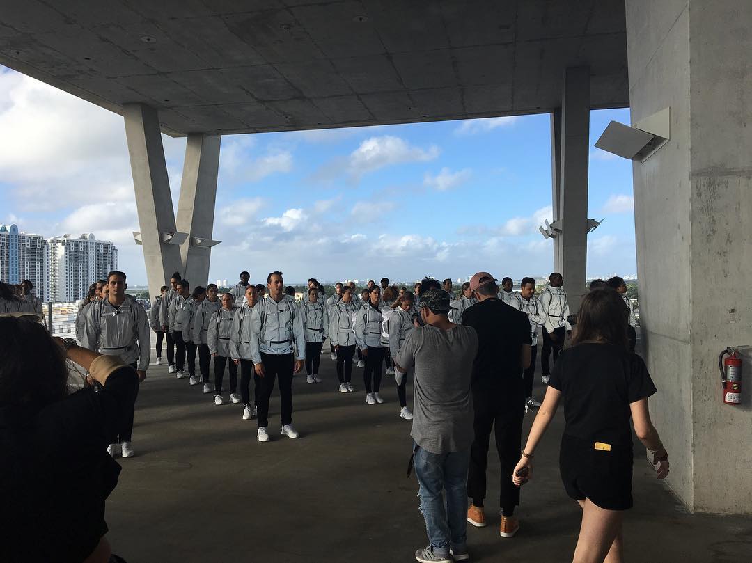
image: taetalentagency
Anyway, 2016. According to hype groupies like high snobiety and World Red Eye, a mirror-wrapped school bus drove 48 performance artist/brand ambassador/whatevers around town. Stops included a high school in the Design District, HdM’s parking garage, and some millennial-branded Hilton in South Beach.
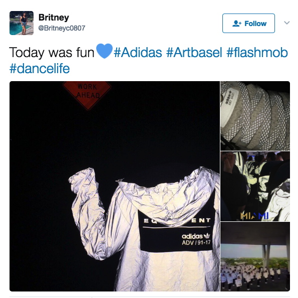
screencap from @britneyc0807
They were decked out in #monochromatic reflective gear. They stood in formation, Vanessa Beecroft-style. They did some dance moves. Ideally, their gear did its retroreflective blast out thing when it was photographed.

image: worldredeye
Then they unloaded their loot, lined it up like a freakin’ Eleanor Antin street team, and, I guess, handed it out to the ‘gramming masses like rations off the back of a UN truck. Then everyone started flipping their swag on eBay. It’s hard to say where the stunt’s brand impact actually landed the hardest: on the 1st-to-know sneaker chasers, the day-of hashtaggers, the eBay resale remoras, or now, on the so-DGAF lawsuit bad bois.
images: ebayseller sorry, lost it
Art Basel is suing over the tongue tags on these free sneakers, and in addition to brand damages, is demanding Adidas destroy all the infringey sneakers it still has. If you budget for ex-post trademark settlements, is it actually a bootleg?
Study for Untitled (Adidas Art Basel), 2017, retroreflective paint and ink on panel, 50x50cm
Untitled (Adidas Art Basel) is a series of 1,000 numbered paintings based on this tongue tag composition, made in various sizes. Or should I say they will be made. Might be. Conceived to be.
Study for Untitled (Adidas Art Basel) photographed, 2017, retroreflective paint and ink on panel, 50x50cm
I know what I’ve written about artists having a successful system, but honestly, it’s debatable whether the world needs 10 more paintings at all right now, much less 1,000. Of these. Can you even imagine having a thousand of these paintings lying around? You literally could not give them away, lawyers or no. Or maybe you can? Just put a few hundred super-shiny posters in a stack and BAM, you’re in Venice.
Ima get to work on one, see if it delivers that retroflective kick the study’s promising. Then I’ll let my estate sort out the rest.
Art Basel is Suing adidas Over its Limited Edition ‘Art Basel’ Shoes [thefashionlaw via artforum, thanks @kyle_petreycik]
Here’s How You Can Get 1 of Only 1,000 Pairs of adidas’s “Art Basel” Limited Edition EQT ADV [highsnobiety]
Adidas Flash Mob in the Miami Design District [worldredeye]
Previously, related: Webdriver Torso as Found Painting System
When Form Becomes Content, or Luanda, Encyclopedic City
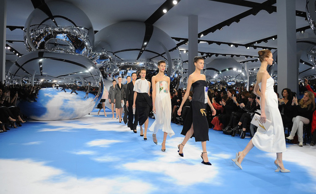
Untitled (Repressed Memory X Raf, Fall/Winter 2013-14)
Untitled (Repressed Memory X Raf FW2013-14), 2017, mylar satelloons, Magritte-ian floor, unidentified trauma, installation shot from Dior F/W2013-4, image: thesartorialist
Oh hi! What do you remember from 2013? More than me, I bet! Take Feb/March 2013, for example. I’m only now realizing I was so busy putting the finishing touches on “Exhibition Space,” the satelloon show I was opening the next week at apexart, that I completely forgot-and obviously forgot to hype-my colabo with Raf Simons. The one where I stuffed a bunch of satelloons onto the runway of the Dior Fall/Winter show.
 Dior F/W2013-4, image: not thesartorialist
Fortunately The Sartorialist was there to document it, or I might never have remembered. To be honest, it’s still all quite hazy. Was I even involved? Why would I have scooped my own show?
“Warhol also echoed in the silvered spheres suspended in the room (like the artist’s iconic ‘clouds’)”, said Vogue, shadily.
Does this mean Raf read my blog? Or that I’m friends with Sterling Ruby? Holy crap, Peter Marino soundbite? It’s all a work now, but if this really happened to me, I can see why I’ve repressed the memory. (thanks, random Russian LJ)
Dating Sturtevant
When you go to the Rauschenberg show at MoMA, take your opera glasses.
A question I was never able to figure out was when, exactly, Sturtevant’s Johns Flag took the place of Johns’ Johns Flag after it was stolen in 1965.
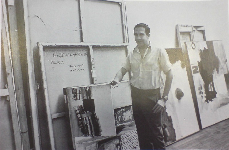
When they split, Johns & Rauschenberg made an agreement that Short Circuit, or perhaps Construction with J.J. Flag, as it had also been known, would not be exhibited. Presumably, with Johns’ Flag gone, Rauschenberg felt free to include the work in a collage-themed group show at Finch College in 1967.
He posed with the work [above], holding the cabinet door ajar to obscure the space where Johns’ Flag had been, and in his artist statement, he said, ” Elaine Sturtevant is painting an original flag in the manner of Jasper Johns’ to replace it.” Is painting, present tense.
Did she finish in time? It’s not clear. All published accounts of the exhibition mention the openable doors with paintings behind them-but also that they were nailed shut. So who knows? Sturtevant’s Johns Flag is like Schrodinger’s Cat, both alive and dead, both in there, and not.
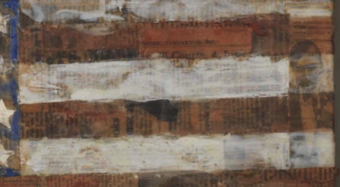
detail of Elaine Sturtevant’s Johns Flag in Rauschenberg’s Short Circuit
But. If you take a close look at Short Circuit‘s Sturtevant Johns Flag at MoMA, you might be able to see a legible scrap of newspaper on its surface. Actually, you can see many, but one has a date: Sunday, January 15, 1967. And a typeface that looks like the Times.
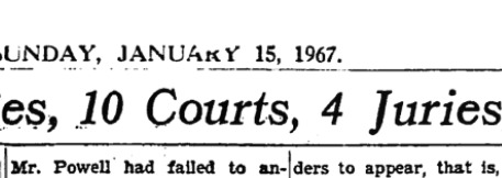
image: nytimesmachine
And sure enough, it is. Page 69. The headline: “Powell Case, in 6 Years, Has Involved 80 Judges 10 Courts, 4 Juries, 15 Lawyers and congress.” The story: a full-page recap of a convoluted lawsuit brought against Rep. Adam Clayton Powell, Jr., involving defamation and allegations of police corruption.
The Finch show opened on March 9th, so it is at least possible that Sturtevant finished her painting in time to put it in. I mean, it can’t be ruled out [the way a scrap of newspaper visible in Johns’ own MoMA Flag dating from after the 1955 exhibition of Short Circuit almost certainly means that the Short Circuit flag was the “first” flag.]
What’s more interesting, though, is to the right. Doesn’t that look like Johns? In a tuxedo? Perhaps attending an opening? I’ve only done the most cursory search so far, and I can’t find a source for that image from 1965-67. Would Sturtevant have kept a party shot clipping from Johns’ Jewish Museum show in 1964? Would Rauschenberg?
Previously, related: Art in Process: Reading Finch College Museum
Jasper Johns’ first Flag
Untitled (Unpainted Wall), 2017
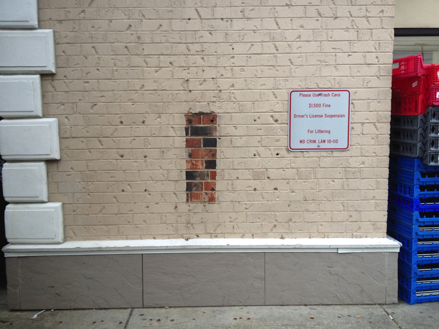
Untitled (Unpainted Wall), 2017, brick, concrete, 18 lag shields, exterior latex paint. Installation view, Chevy Chase, Maryland
In his 1977 Whitney catalogue, Michael Crichton wrote about the origin of Jasper Johns’ 1967 painting Harlem Light:
It has a peculiar background. Johns was taking a taxi to the airport, traveling through Harlem, when he passed a small store which had a wall painted to resemble flagstones. He decided it would appear in his next painting. Some weeks later when he began the painting, he asked David Whitney to find the flagstone wall, and photograph it. Whitney returned to say he could not find the wall anywhere. Johns himself then looked for the wall, driving back and forth across Harlem, searching for what he had briefly seen. He never found it, and finally had to conclude that it had been painted over or demolished. Thus he was obliged to re-create the flagstone wall from memory. This distressed him, “What I had hoped to do was an exact copy of the wall. It was red, black, and gray, but I’m sure that it didn’t look like what I did. But I did my best.”
Explaining further, he said: “Whatever I do seems artificial and false, to me. They-whoever painted the wall-had an idea; I doubt that whatever they did had to conform to anything except their own pleasure. I wanted to use that design. The trouble is that when you start to work, you can’t eliminate your own sophistication. If I could have traced it I would have felt secure that I had it right. Because what’s interesting to me is the fact that it isn’t designed, but taken. It’s not mine.” [p. 54-55]
And that, my friends, is how I am different from Jasper Johns: I got the picture.
Previously typed this in, related: Driving Taxis Through Heavy Neighborhoods To Look At The Paintings
Erased Twombly Drawing
Untitled (Delian Ode), 1960/61, pencil, ballpoint pen, and grease crayon on paper, image: peter freeman
I mean, can you even imagine doing it? I admit it, I can, and I just cannot. De Kooning said he wanted to give away one he’d miss. And one that’d be hard for Rauschenberg to erase. If there’s any other kind of Twombly drawing, I haven’t seen it.
We’ll put this one in the “Think about it”/”Unrealized” category.
Previously, related, badly titled: Ghetto Erased de Kooning Drawing