
image: vintage silver gelatin print, signed, Ezra Stoller, 1939, via morehousegallery
Do turning back another chapter or two in the history of enlarged pictures, photomurals, and photomontages, where do they turn up the most [besides/before the Museum of Modern Art]? Expos and World’s Fairs. Even more than dioramas, and like the grand cyclorama paintings of earlier eras, giant photos were used by architects–in the service of governments and companies–as modernist, machine age, marketing, mass communication, and propaganda. They were basically highly credible-looking billboards.
None of which is necessarily a bad thing in itself, of course. It’s interesting to note, though, who was creating and using them, because for the most part, it was not artists.
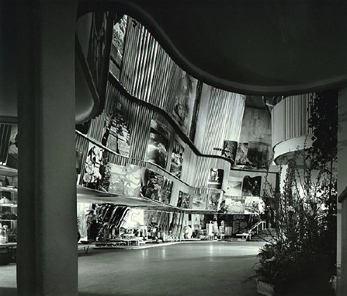
Alvar Aalto’s Finnish Pavilion at the 1939 World’s Fair in New York turns out to have been a stunning and especially instructive example of enlarged photos integrated with modernist architecture. That’s it up top in a photo by –let’s just say I could just as easily title this whole series, “Everything I Know About Photomurals, I Learned From Ezra Stoller.”
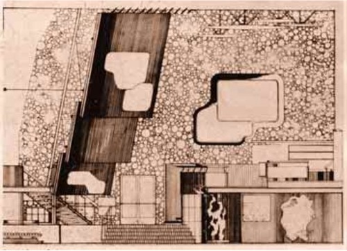
In a plain, rectangular building, Aalto wrapped a second floor exhibition space with an undulating wood-slatted wall, inset with three rows of giant photos [Aalto’s section plan above, via domus, I think] to create a dramatic, infotaining, 52-foot high atrium. A mezzanine restaurant [below] allowed for closer viewing of the photos, which showed, from top down, “Country,” “People,” and “Work,” which culminated, naturally, in the bazaar of real Finnish products underneath.
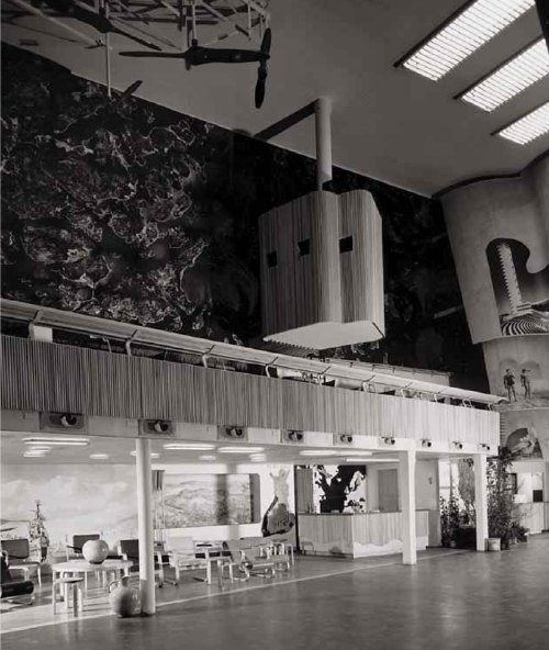
And what’s that box up there hanging dramatically off the wall, besides the key to the photomurals’ media context and appeal? It’s a projection booth. Films, presumably on the subject of Finland’s awesomeness, were projected onto the atrium wall above the exit. I can’t help but see the effectiveness and popularity of large-scale photos as inextricably driven by architects’ attempt to harness the modern media magic of the cinematic experience. And as antecedents for the now-ubiquitous, immersive projection and installation art works. Like steampunk Pipilotti Rist.
1939 Finnish Pavilion info [designboom]
Category: documenta, et al
On The Making Of The Lost Biennale Machines Of Daniel Libeskind
A couple of weeks ago, I got an email from Hal Laessig, a Newark architect, developer, and artist who was a graduate student of Daniel Libeskind’s at Cranbrook, and who came back to build three fantastical, fantasy machines for LIbeskind’s contribution to the 1986 Venice Architecture Biennale, curated by Aldo Rossi. Titled “Three Lessons of Architecture,” the show was an argument-by-metaphorical-object about the post-structuralist concept of architecture-as-text. But the three machines were anything but fantasies: they were incredibly complex, and laboriously and meticulously designed and constructed from the barest possible historical references.
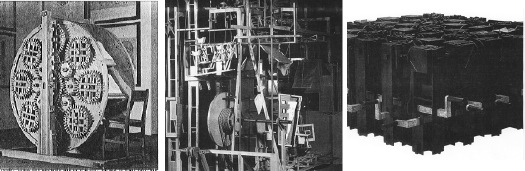
The Reading Machine [l] and The Memory Machine [c] were both based on the 16th century proposals: the former, a design for a multi-book “Reading Wheel” by Agostino Ramelli, and the latter a complete reimagining of the backstage apparatus for Giulio Camillo’s “Memory Theatre.” The machine Laessig worked on, The Writing Machine [r], is commonly described as a realization of an early 20th century concept by Raymond Roussel, but Laessig explained that the actual design originated with a satirical auto-writing machine in Jonathan Swift’s 18th-century classic, Gulliver’s Travels. [See this earlier post for more discussion of the Swift reference.]
Anyway, here is the rest of my conversation with Laessig, which I found to be awesome and hilarious, probably because I didn’t go to architecture school. The tales of Cranbrook in the 80s and Libeskind as a teacher are almost as interesting as the crazy story of the machines themselves–and the indentured servant grad students who built them. [An editorial note: I didn’t take notes during my own talking, so I’ve paraphrased and compiled Laessig’s comments a bit to help the chronological flow.]
G.O: How did you get involved with making these machines for Libeskind in the first place?
H.L: I went to Cranbrook to get my masters in architecture when Daniel Libeskind was there. After I graduated in ’84, he called to say he’d been invited by Aldo Rossi to do an entry for the Biennale.
The first idea was to get all his past grad students to come to Cranbook to charrette and figure out what to do. But nobody besides me wanted to come back, so we didn’t do that. Then he said he’d already figured out what to do, and that he’d have the students build it.
Continue reading “On The Making Of The Lost Biennale Machines Of Daniel Libeskind”
Daniel Libeskind And The Grand Academy Of Lagado
God bless the Internet and all who surf upon her. A couple of weeks ago, I wrote about what I thought was an esoteric topic, even for greg.org: the fantastical lost machines from “Three Lessons of Architecture,” Daniel Libeskind’s exhibition at the 1986 Venice Architecture Biennale.
And yet, within hours of posting about them, I got an email from one of the guys who had been Libeskind’s grad student at Cranbrook and who had built and installed the machines. Hal Laessig is now artist/architect/developer in Newark, and he was gracious enough to share his stories from the “Three Lessons” project, and from Libeskind-era Cranbrook. They range from insightful to hilarious to outrageous, and I’m working on putting our interview together right now.
In the mean time, here’s a clarification about the references for the machine Laessig oversaw, the Writing Machine, which I had incorrectly described as being inspired by Raymond Roussel’s Reading Machine.
As it’s described here, at the very bottom of this ancient article on hypertext, the Reading Machine Roussel exhibited in 1937 was basically a book on a Rolodex. Color-coded tabs helped the reader navigate through multiple layers of cross-references and footnotes. Interesting, but nothing at all to do with the form of Libeskind’s version, which took its inspiration from somewhere else entirely.
Continue reading “Daniel Libeskind And The Grand Academy Of Lagado”
‘We Who Change The World’
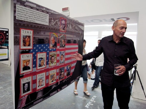
“My cover would go right here.” [image via]
Just like the Wallace Sayre quip about academic politics being so vicious because the stakes are so low, maybe the hubris and self-regard are so extraordinary because it’s the Venice Architecture Biennale. Anyway, let’s call it out quickly, and then look at what Rem Koolhaas has to say about modernism and preservation, because there may be some interesting things there.
[The text, by the way, is Designboom’s exhaustive 4-part guided tour (II, III, IV, pending) of “Chronocaos,” the OMA/AMO installation of research and history-related projects within Kazuyo Sejima’s exhibition.]
So. Hubris. Well, for starters, there’s the introductory wall text, which, wow:
Architects–we who change the world–have been oblivious or hostile to the manifestations of preservation the past. Since 1981, in Portoghesi’s “Presence of the Past,” there has been almost no attention paid to preservation in successive architecture Biennales.
I mean, I’m sure the visitors to the exhibition just ate that up, but should I even be reading it, much less commenting on it? Not being either an architect OR one who changes the world and all?
Then there’s the photo above, and its associated text:
The rise of the market economy has meant the end of the architect as a credible public figure.
Since Philip Johnson in 1979, no architect has appeared on the cover of TIME magazine.
Starchitects accepted a faustian bargain where they became more prominent, but their role less significant …
We’ll get to that public/market economy stuff in a minute; first let’s look at this Cover of TIME [CoTIME] business, which is as alluring as it is non-credible. [I was about to say “useless,” but really, it’s quite useful; it just illustrates something other than what I think Koolhaas intends.]
As it happens, Jonathan Franzen’s CoTIME this week gave Craig Ferhman the chance to do a similar CoTIME analysis for writers:
Time put 14 authors on its cover in the 1920s, 23 in the 1930s, seven in the 1940s, 11 in the 1950s, 10 in the 1960s, eight in the 1970s, four in the 1980s, four in the 1990s, one in the 2000s, and, now, Franzen in 2010.
Ferhman finds that behind the cover, TIME’s profiles of writers are truncated, shallow, reductivist, or otherwise nearly empty of actual content. He cites multiple examples of writers resisting the–what else to call it?– “faustian bargain” of a CoTIME, which was long considered uncritical, low-brow, and hypey. The cover becomes a thing in [and of] itself, a distillation of the magazine’s–and by direct extension, its owner’s–desire to assert authority and control over a cultural agenda.
In this light, and given the close tracking between architects’ and writers’ presence on the cover, one might be led to wonder if it’s not architecture [or literature] which has changed in the last 20-30 years, but TIME and its own role or strategy as a megaphone for culture. Or to question the suitability for a democratic society of monolithic, top-down annointing of public figures’ credibility. That one would not be Rem Koolhaas, though.
In any case, CoTIME reveals as little about the reported “end of the architect as a public figure” as it does about the ego-driven architect’s desire to, well, to appear on the cover of TIME.
And yet. You know, this is right where I was going to acknowledge and explore OMA/AMO’s more salient points, about how, as Designboom puts it,
…this year represents the perfect friction point between two directions: the world’s ambition to rescue larger and larger territories of the planet, and the global rage to eliminate the evidence of the post-war period of architecture as a social project. both tendencies–preservation and destruction–are seen to slowly destroy any sense of a linear evolution of time.
But I think I’ll take those up later. Because I just clicked through to see the CoTIME of the architect I thought would be the least likely candidate for a credible public figure in his day: a January 1963 story on Minoru Yamasaki.

1963. Which turned out to be pegged to his recent selection to design a 15-acre site for the Port Authority in downtown Manhattan:
What form the project may be taking in Yamasaki’s inventive mind is his secret, but simple arithmetic shows that the vast space needs and limited site could force him to record heights or bulk. One thing the center will not be is harsh or cold. In taking the road to Xanadu, Yamasaki has turned office buildings, schools, churches and banks into gentle pleasure palaces that are marvelously generous in spirit. He shuns monuments. He is suspicious even of masterpieces, which he feels often better serve the ego of their creators than the well-being of those who use them. He may have committed some architectural heresies, but if he has, it is largely because he is a humanist with enormously appealing aspirations. He wants his buildings to be more than imposing settings for assorted clusters of humanity; they should also recall to man the “gentility of men.” should inspire “man to live a humanitarian, inquisitive, progressive life, beautifully and happily.” However the Trade Center turns out, it will have that ideal– and it will be built with the ultimate degree of loving care.
It’s hard or impolitic to remember how reviled Yamasaki’s buildings were as architecture and as part of the city. But I don’t think anyone would dare argue about the World Trade Center that it was their architect who changed the world.
Sedia Veneziana, Chaise Bordelaise
via la_biennale
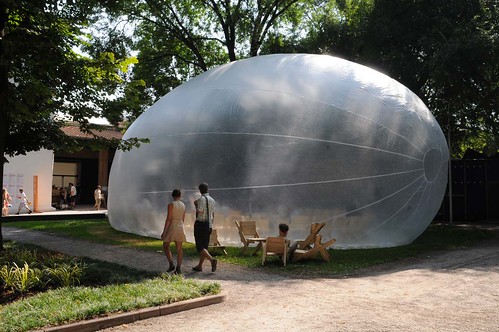
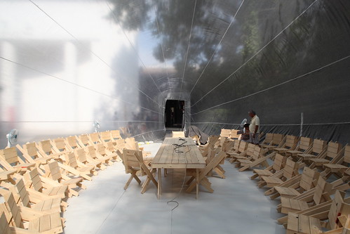
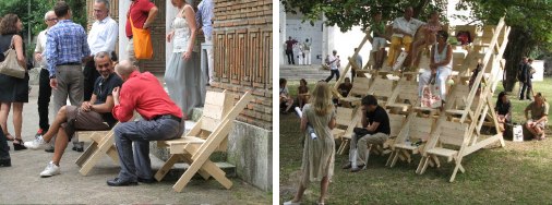
So Venice is not a total bust. Raumlaborberlin have installed their 2006 mobile inflatospace sculpture, „Das Küchenmonument,” in the Giardini.
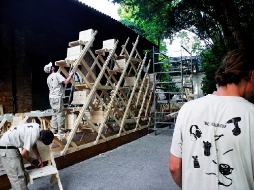
And next to it is The Generator, an on-site workshop for knocking together “sedia veneziana,” which are not just autoprogettazione-style chairs…
via br1dotcom
they’re “future particles of the generator-space-structure,” modular building elements of both social space and structure. autoprogettazione stacking chairs. Awesome.
Which, of course, is related to their exhibition for Arc en Reve in Bordeaux last year, “Chaise Bordelaise.”
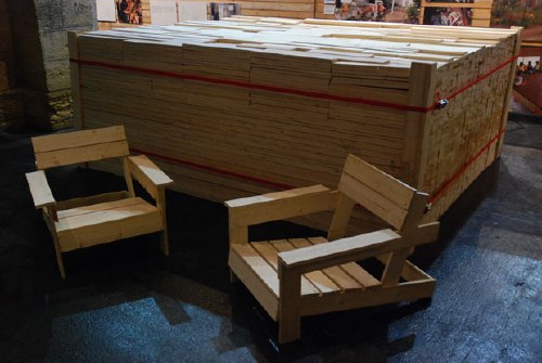
“Chaise Bordelaise” consisted of a 3x3x1m pile of pre-cut, reclaimed lumber, instructions, and some tools. Visitors made some chaises, then took them home.
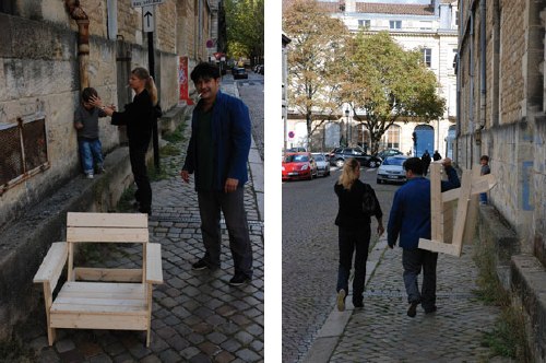
It’s basically an Enzo Mari x Felix Gonzalez-Torres mashup. If greg.org had tags, this post would be giving me a tagasm right now.
Raumlaborberlin: what’s up? exhibitions [raumlabor.net via archinect]
Chaise Bordelaise [raumlabor.net]
related: proposta per un’ auraprogettazione
Venetian Mirror
via tsaaby
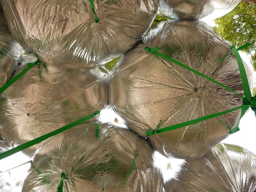
Yeah, so I’d been poking around flickr for a while, looking to see how MOS’s project for the US Pavilion at the Venice Architecture Biennale turned out. Because well, because.

via Erika-Milite
And hmm. What is it about it? The green straps? Should the weather balloons have been upside-down, so gnarly knots and straps take a backseat, and the smoother, more reflective surface is visible instead of pointing to the sky? Maybe instead of straps, string a net across the courtyard, and attach the balloons from above, or maybe let the balloons float up against it to find their own structure?
via
br1dotcom
Do the balloons just not have enough gas, or enough gores?
Because right now, I’m rethinking my entire satelloony look.
CityLAB’s Duck & Cover
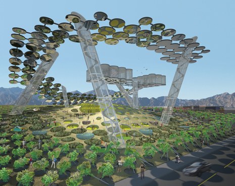
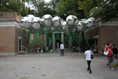
And in other Venice Biennale of Architecture exhibition news: cityLAB, Dana Cuff and Roger Sherman’s architecture think tank at UCLA, is also in the US Pavilion show, Workshopping. One of the projects they’re apparently showing is called Duck & Cover, which appears to be a community garden in the form of a giant Google logo visible from Google Earth.
Looks awesome, but wait, are those mirrors up there? Magnifying glasses? Spiral escalators to nowhere? Also, isn’t the G a little self-referential for Google? I’d think they could get ‘er done quicker if they sell the structure’s shape to the highest bidder. Or make it a Q for Quimby.
cityLAB [workshopping.us]
previously: heads up: roof as nth facade
How To Make A Biennale Pavilion Architectural Intervention

MOS, of the PS1’s woolly mammoth carcass MOSes, is one of seven architecture firms and collaboratives included in “Workshopping: an American Model for Architectural Practice,” at the Venice Architecture Biennale. The exhibit is curated by Michael Rooks of the High Museum and Jonathan Solomon of 306090.
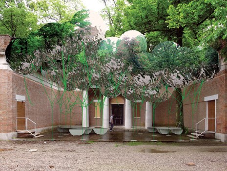
The idea is to creat a canopy of spherical Mylar weather balloons in the courtyard of the US Pavilion. From MOS’s project text:
if you’ve seen the structure, i’m sure you’re wondering, ‘why is it made out of helium balloons, why does it make a canopy, why is there seating, etc… is it referencing other projects? is it analogical? is it utopian? is it micro-? is it urban? is it domestic, what is it? is this even architecture?’ (unfortunately, we can’t answer that last question. this type of project is like diet-architecture, a copy without the calories. it’s got a sort of bitter aftertaste that you might grow accustomed to, or you might not. that’s ok. we like fake architecture.)
we’ve been wondering, what kind of architecture would haruki murakami make? well, when we finally write our text we would definitely tell you that it does, indeed, mean something and it does reference things, but why would you really want to know all of that anyway? do you really think it would make it better? I mean, what about just enjoying this weird artifice, this fake social space? hey, it wiggles. look at this strange alternate environment made of reflections and repetitions. enjoy the visual noise. have you ever seen N.A.S.A.’s echo project? google it. what can we say, we just love the aesthetics of radar reflectors and inflated satellites. they are of another reality. seriously, even if we wanted to fully explain it to you at this very moment, we couldn’t. even though we’re trying not to be, we’re only human. also, they need this text before we’ve finished the design. did we mention that we are working with the son of andy warhol’s ‘silver clouds’ fabricator? we’re very excited about this. he lives in duluth. [emphasis added because, well]
So just Google, aesthetics, and a flip three degrees of Andy Warhol reference and voila, instant pavilion! I can’t wait to see what their actual text is. The exhibition opens Thursday.
MOS, Instant Untitled [designboom, thanks john]
Workshopping.us [workshopping.us]
The Player
I can’t say how I feel about Francesco Vezzoli’s work; that’s not how my mama raised me. I will grant though, that he’s extremely smart and astute and has successfully identified an elemental dynamic of the art world and makes highly successful art that taps into that dynamic. OK, fine. his work embodies almost every superficial, vapid, self-unaware, pseudo-celebrity, luxury consumerist aspect I hate about the VIP Preview art world.
So bully for him that he’s turning the MoCA gala benefit tonight into the set for a performance/piece? This faux-ambivalent account of Vezzoli, his date/star Lady Gaga, and the preparations for the event in the LA Times makes for hilarious reading. I’m sure the event will be the biggest, starchasing cluster$%#& at MoCA since Tom Ford and Naomi Campbell turned the Takashi Murakami dinner into a commemorative plate-stealing riot.

Alas, Vezzoli’s use of art to hustle celebrities into working for free unfortunately reminds me of someone I actually like: Robert Altman. To shoot the benefit scene in The Player, where Tim Robbins’ murderous studio honcho Griffin Mills is honored by several hundred of his best celebrity friends, Altman threw a real fundraiser for LACMA, complete with black & white dress code, then hustled all his celebrity friends to attend–then he filmed them for scale for his movie.
At least now I can finally make sense of Lady Gaga: she is post-op Cher.

Francesco Vezzoli escorts Lady Gaga to MOCA’s gala [lat]
Wait, Which “Ban” Was That Again?
Francesco Bonami, director of the 2003 Venice Biennale, writing for the NY Times’ blog, The Moment:
…the sculptor Bruce Nauman, the Sam Shepherd of Contemporary Art, was awarded the Gold Lion for best national pavilion. (A sign that the Obama effect has lifted the ban that during the Bush era made the US pavilion “unfit” for the award.)
Really? There was a ban? Just so we’re clear what Bonami’s claiming, let’s go to the tape:
49th Biennale, 2001: Germany won for Gregor Schneider’s insane, awesomely claustrophobic house. The US Pavilion showed Robert Gober, who had been selected under the Clinton era. Clear winner: Schneider.
50th Biennale, 2003, Bonami’s incarnation: Luxembourg won for Su-Mei Tse’s sound installation. The US Pavilion showed Fred Wilson, who invited African street sellers to display counterfeit Vuitton/Murakami bags in the courtyard. Clear loser: Wilson. [Obviously, I would’ve given the award to Olafur’s transformative Danish Pavilion, but Wilson shouldn’t have won anything, and didn’t.]
51st Biennale, 2005: France won for Annette Messager’s puppet/stuffed animal thing. The US barely got its shit together in time to pick Ed Ruscha. Clear winner? None, really.
52nd Biennale, 2007: So does that mean that, if it weren’t for a “ban,” Nancy Spector’s installation of Felix Gonzalez-Torres, which was as damning a condemnation of the Bush era and ideology as a could be imagined, could’ve/would’ve/should’ve won over Hungary’s Andreas Fogarasi, who showed black box video of various European street scenes.
Is that what you’re saying, Francesco? Are you just talking post-game smack? Was there really ban, where jurors took a brave, but apparently totally private stand–one that ended up denying an award to an artist who did speak out even after he died? Or was it the kind of stories we tell to ease our minds, like how everyone in France was in the Resistance?
Elmgreen & Dragset & The Collectors
But enough about muscly, young, naked performance art hustlers in Venice staging homoerotically charged events for attention and acclaim for a moment.
My friends Michael Elmgreen & Ingar Dragset just won a Special Mention Award at the Biennale for their awesome, curated installation at the Nordic and Danish Pavilions, The Collectors. Here’s a picture from the Guardian:
Oasis 7, Haus-Rucker, Documenta 5
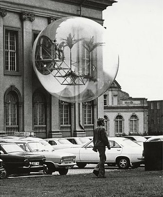
In 1972, the Austrian architecture collective Haus-Rucker installed Oasis Nr 7 at Documenta 5.
A steel pipe structure was cantilevered out the window of the Friedericianum, and a platform, two palm trees, and a hammock were installed. The entire thing was enclosed in an 8-meter translucent vinyl bubble.
Oasis 7 was re-created last September It was built on a fake Friedericianum facade at the Victoria & Albert Museum for the exhibition, “Cold War Modern: Design 1945-1970.
Haus-Rucker project archive [ortner.at]
Time lapse making of video: Oasis 7 in the Victoria & Albert Museum [iconeye.com]
via atelier, where I’ve been lifting all sorts of interesting things this week.
Amar Kanwar’s The Torn First Pages
Last September was the first anniversary of what’s now called the Saffron Rebellion, where Burmese monks took to the streets to protest the military government. As a commemoration of that movement, the Stedelijk Museum showed the first of three parts of Indian artist/documentary filmmaker Amar Kanwar’s work in progress about the Burmese resistance.
The title of the project is The Torn First Pages, 2004, which is a reference to the private, anonymous rebellion of a bookshop owner named Ko Than Htay, who was imprisoned for tearing out the first page of everything he sold, pages which contained mandatory praise for the junta.
Parts of footage for The Torn First Pages come from Burmese democracy activists, who surreptitiously tape and smuggle their work to Kanwar in India.
Kanwar talks about the work with the Stedelijk curator above:
I felt that everybody who writes, be it a poem, be it a novel, be it a fashion magazine, whatever, in one way or the other is indebted or connected to Ko Than Htay, because he’s tearing the first page out from any author. It’s not necessarily a specific book. So in a way, I felt that artists of all kinds, writers of all kinds are connected to this. And in many ways what this is all about is your own relationship with authority and your own defiance. Your own need for defiance. Your own articulation. It’s not necessarily that this articulation is going to become public or recognized. So in some way, in order to understand Burma, if one can understand Ko Than Htay and this act of tearing the first page, you can understand what’s happening in Burma. And if you can understand that, you can understand your own life, regardless of where you are.
…
The Torn First Pages is about presenting evidence of a terrible series of crimes, evidence of amazing resistance. In a way, it’s about saying maybe poetry also has a presence, a validity, in a court of law.
…
Everything you remember, there’s a way to remember. If you remember in a particular way, if you look in a particular way, you’re looking only so that it clarifies you in the present. The purpose of clarifying you in the present is only so that you can take a step forward. In that sense, the act of remembering is really the act of moving forward in time.
Longtime readers of greg.org may remember my swooning at Kanwar’s work when I saw it at documenta 11 in 2002.
Amar Kanwar- The Torn First Pages (Part I), 5.09.08 – 1.10.08 [stedelink.nl]
Video Artist Guy Ben-Ner on WPS1
 Guy Ben-Ner’s in the zone these days; his ingenious video, “Elia – a story of an ostrich chick,” made like one of those anthropomorphizing Disney nature documentaries from the 50’s, is included in PS1’s Greater NY show. Now, he’s representing Israel in the Venice Biennale.
At Venice, Ben-Ner talks with PS1 curator Bob Nickas about his work and how he uses adaptive techniques for shooting under directorial duress. He references silent film, in which the camera couldn’t move, and nature documentaries, where you can’t direct animals. Ben-Ner uses his kids in his videos, which requires a certain creativity to get anything down on tape.
Ben-Ner’s segment lasts about 15 minutes, and then Nickas and his too-smart sidekicks spiral out of control, gushing over Vezzoli’s Caligula trailer–in exactly the critically unaware way that bugs so bad. While Ben-Ner sits silently by for the next 30-40 minutes, the curator/writer conversation encapsulates exactly the kind of hermetic, bitchy Venetian oneupsmanship that shouldn’t be recorded, much less broadcast. Don’t miss it.
WPS1 Venice Conversation – The Bob Nickas Roundtable [wps1.org, updated link to clocktower.org, July 2018]
A 4 week-old baby reviews the Whitney Biennial
She slept through the almost the whole thing*. Until we walked into the Cecily Brown gallery, when she started screaming at the top of her lungs. On this advice, we cut our visit short, leaving via the elevator so as not to disrupt the Julianne Swartz sound installation in the stairway.)
* Truthfully, she also shattered the misty calm of the Gran Canaria forest in Craigie Horsfeld’s video room with a post-bottle burp worthy of a trucker.