

I’ve had Michelle Kuo’s interview with Robert Breer [artforum, nov 2010] open in my browser tabs for months now, ever since Steve Roden posted about his incredible little toy Float, which was sold at MoMA’s gift shop in 1970, at the same time one of Breer’s original Pepsi Pavilion Floats had been liberated from Expo’70 in Osaka and set loose in the Abby Aldrich Sculpture Garden. [A PDF of The Modern’s Aug. 25 press release for the piece, titled Osaka I, said the toy Floats would be sold for $7.95, or two for $15,” in the Museum’s Christmas Shop.]

Kuo’s is one of the best interviews I’ve seen with Breer; most never got past the basic, “how did you get into animation?” “So you lived in Paris on the GI Bill?” chestnuts. With what is now a terrible lack of urgency, I’d made a few attempts to track down Breer this year, in hopes of following up with him about what he’d probably consider the least important aspects of his creative practice: the commercial work and product design and TV animation [including still unidentified segments on The Electric Company] he would bring up–and then insist be kept separate.
Because Breer’s consistently innovative filmmaking and playfully minimalistic/animalistic sculptures–and the fact that he did his most monumentally awesome art work for Pepsi–hinted at the potential relevance of the work he kept in his commercial closet.
Which, amusingly, is not really the point, except to say I want to find a Float of my own, please.
No, the immediate point is, wow, how awesome is Breer’s 1966 sculpture, Rug? This was the work that introduced Breer’s sculpture to me, at a show that also opened my eyes to the revelatory breadth of his filmmaking. It was recreated for the first time in decades in 1999 at AC Projects. Their small second floor space in off-Chelsea was creeping and crawling with little Breer sculptures, while the Mylar Rug slowly shifted around in place. The other works felt alive, droid-like. Rug‘s movements were creepier, more ominous, like something was alive underneath it.
Good for the Walker, it looks like they acquired the mylar Rug [there are others, in other colors/materials] just this year.
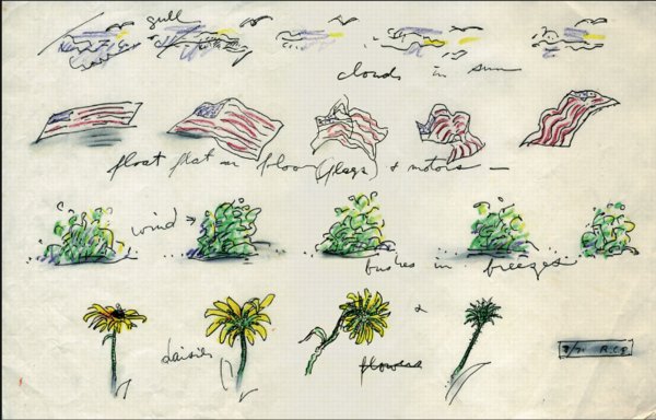
Anyway, while poking around GB Agency, Breer’s Paris gallery, I came across this sketch, dated 8/71, which includes an incredible proposal for a Rug piece made from an American flag. [The text underneath reads, “float flat on floor (flags) + motors”.] The storyboard-like drawing not only ties Breer’s sculptural and animation projects together nicely; the other three sequences–“cloud in sun,” “bushes in breeze,” and “daisies”–help site Breer’s work in observation, duration, and the natural world. Which may have mitigated the political implications in 1971 of something lurking under a crumpled US flag.
In any case, I expect, if not exactly look forward to the day when, this work will be realized for a future Breer retrospective.
Category: documenta, et al
Miami Seat: Mari Thirteen By Jonathan Monk
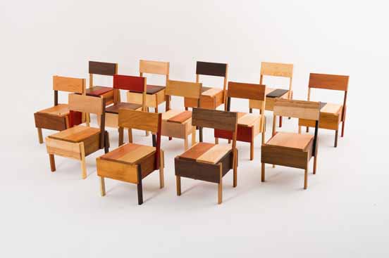
Add Jonathan Monk to the list of artist Enzo Mari fans. For the Brussels gallery D&A Lab’s show at Design Miami Basel Miami Wynwood Art Week Whatever Fair last month, Monk created Mari Thirteen, an edition of Mari’s autoprogettazione chair, Sedia 1. The design calls for 13 pieces of wood, so Monk used thirteen different types of wood, none of them pine: Koto, Padouk, Ash, Maple, Oak, Cherry, Pearwood, Wengé, Afzelia, Ovang, Mahagony, Birch and American Nutwood.
As I understand it, there was one set of 13 chairs to be sold individually for like $9,000 apiece, and one set of 13 to be kept together. No doubt destined to surround some Russian oligarch’s beach-cast, triskaidecagonal Max Lamb dining table.
D&A Lab’s owner Isolde Pringiers says of the project:
Jonathan Monk’s interpretation is just one possible version of the ‘Sedia 1′ of Autoprogettazione and hence in essence is very much part of and a continuation of Enzo Mari’s project but with the appropriation layer, typical of Jonathan’s work. With Autoprogettazione Mari went a step further than Ikea in his time in democratizing design. It broke down barriers in terms of what established design and good taste was. Monk, on the other hand, crosses back over those boundaries in as much as his interpretation offers a fully finished, conceptual object which is anti-Ikea. Enzo Mari offered the liberty of the project and Monk fully indulged.
Which, wow, I think I take issue with just about every single aspect of that statement.
Monk Makes Mari at DesignMiami [designmiamiblog.com]
Sgarbian Backdrops
The near-universal consensus from the VIP opening was that the Italian Pavilion exhibition curated by art critic/Berlusconi apparatchik Vittorio Sgarbi was an unalloyed, over-politicized disaster. Yet so far, I have seen very little substantive criticism or engagement with it. Rome-based art theorist Mike Watson’s column in Frieze is a so-far-rare exception:
…the show appears to have resulted unwittingly from the congruence of a cultural elite who lack political power and a political elite who lack culture, highlighting the negative aspects of both – although ultimately it is the clumsy Berlusconian presence which comes off worse here.
In Italy, a country with a deep cultural heritage, the fine arts are the final refuge from a philistine tendency that affects everyday life with an alarming pervasiveness. Yet it appears that the systemic contradictions which plague the Italian political and cultural sphere – and which serve to keep the powerful grinning their stricken grins – have now invaded the fine arts.
Oddly, when I first started liking this quote last week, it was partly because I’d read it as “the fine arts are the final refuge for a philistine tendency,” an Italian play on patriotism as the last refuge of scoundrels. I imagined a demagoguing, pseudo-populist media mogul’s flailing administration wrapping itself in a fresco at Venice. But apparently not.
Instead, Watson maintains the notion of art as a “refuge from,” a world apart from the [real] world. Watson says this philistine affront occupying “the centre of the most prominent cultural event in the art world’s calendar,” demands “an appropriate response.” But what? A sternly worded petition? Some scathingly derisive remarks over dinner in Basel? Art world folks can tweet their outrage all they want, but when the smoke from Sgarbi’s stinkbomb of a show clears, they’ll still be inside their gilded cage refuge.
The Physiognomy of a Nation [frieze]
Rauschenberg Currents Event
Robert Rauschenberg’s massive 1970 silk screen edition, Currents sure is hard to miss. And not just because it’s 18 meters long.
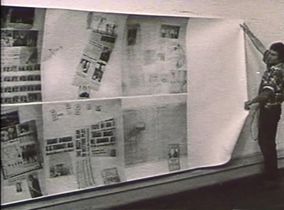
MoMA’s copy from the edition [of just six] has been wrapped around the corner of the second floor galleries for a while now. Which may have helped coax Peter Freeman into bringing out another of the screenprints last week for Art Basel.
But it’s also at the end of the Rauschenberg’s segment in Emile de Antonio’s documentary, Painters Painting [above], which I rewatched recently. Bob unfurls it with a slightly soused, earnestly glib voiceover about how, even though there’s so much information packed into a daily newspaper, most people don’t read it. But if someone spends $15,000 on the info, the artist can get him to pay attention. Or at least not wrap the fish in it and throw it out.
Which is ironic, I guess, because I’ve found that the size and visual uniformity has caused me to stroll by Currents without ever even slowing down. I register it as reworked newspaper content, on a giant roll, just like the real newspaper itself–but I don’t slow down to look closely. I mean, really, at that scale, how much of my time does Rauschenberg really think he’s gonna get?
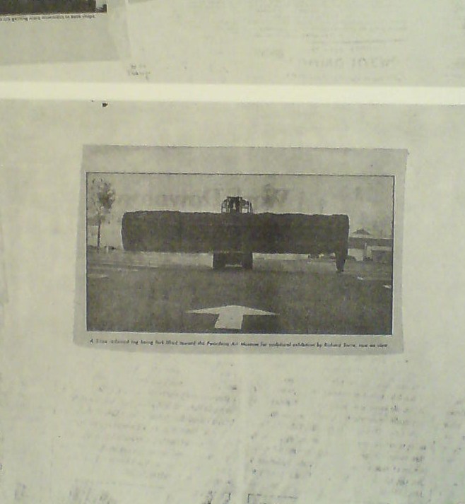
So maybe it was because I’d just run into Richard Serra moments before in the atrium, or because I came at the work head-on this time, instead of from the side. But I’d never noticed, for example, that there is a news photo of a frontloader bringing a massive fir tree trunk to the Pasadena Art Museum for Serra’s 1970 work, Sawing: Base Plate Template (Twelve Fir Trees)
Above it and to the right, I’d swear that row of tract houses is a Dan Graham photo.
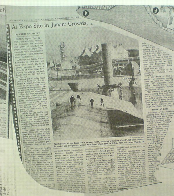
And hey, there’s a story about construction progress on Expo 70 in Osaka, where E.A.T., the collaborative Rauschenberg founded with Billy Kluver, was creating the Pepsi Pavilion, and where Rauschenberg was still thinking he’d show his own work, a plexiglass cubeful of bubbling drillers’ mud called Mud-Muse, which he’d developed with Teledyne for LACMA’s Art & Technology show and the US Pavilion.
If I can spot these now-obvious contemporary art references in Currents, what else must be lurking in there? Was incorporating other artists’ images Rauschenberg’s way of tipping his hat to artists and work he liked, or was he assimilating and subsuming it in his own, sprawling scroll? Was he engaging in a dialogue with the Conceptual and post-minimalist kids coming up or putting them in their place? Or trying to put himself in theirs?
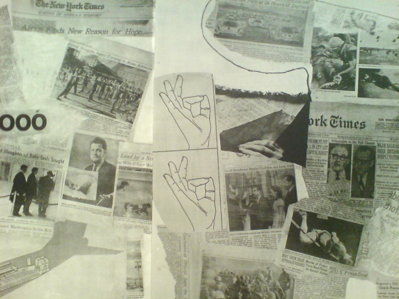
The most intriguing references now, though, turn out to be a little trickier. There are multiple instances of diagrams showing hands throwing the OK sign which remind me of nothing so much as the sign language woodblocks used in the prints at Jasper Johns’ latest show at Marks.
Shrinky Dink 4, 2011, intaglio print, image via
I remember thinking immediately of Rauschenberg when I saw the mirrored newspaper transfer appearing in the upper left of this Johns drawing, Untitled, 2010.
Rauschenberg began using the technique in the mid-60s, and it’s all over Currents. Remind me again how long MoMA’s had their print on view?
Fuller Fly’s Eye Dome Gets Miami Makeover
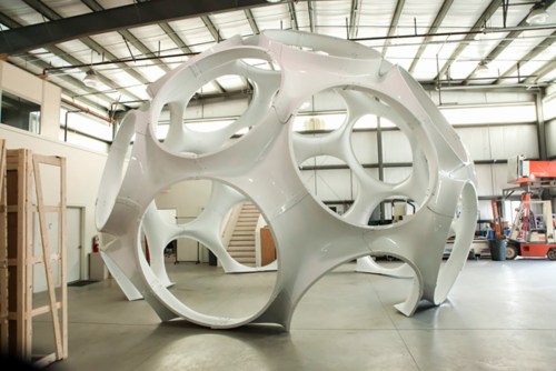
So everyone dutifully reproduced the press release about Craig Robins putting Buckminster Fuller’s 24-foot version of the Fly’s Eye Dome through a “historic restoration” by boat fabricator Goetz Composites, yet no one seems to have followed through with picture of the completed job. Well here you go, from Goetz themselves.
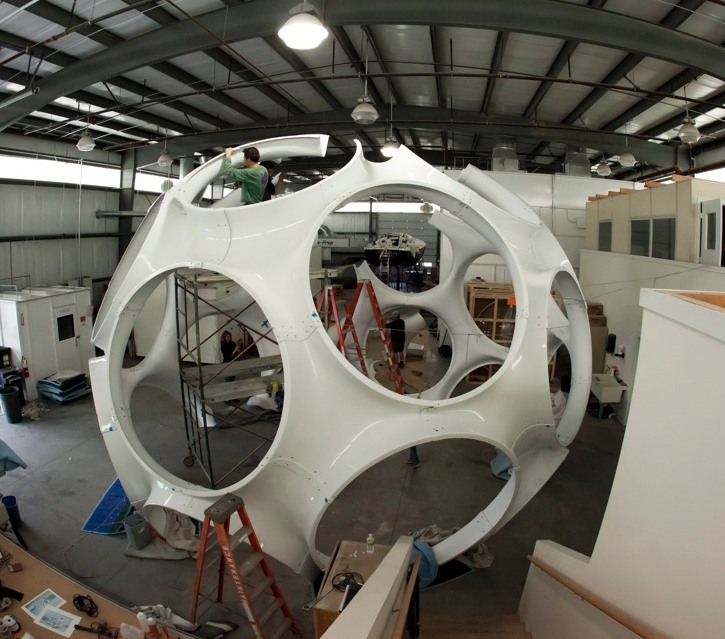
In 2008, Max Protetch exhibited the fiberglass dome, a prototype manufactured in 1976-7–which used to be described as a 26-foot diameter dome, btw–at La Guardia Place in the Village. The photo below is from his installation at Protetch: Beacon last year.
![]()
Said the press release:
Eric [Goetz] and his team, working with Daniel J. Reiser and John Warren who fabricated the original structure with Bucky, have gone to extraordinary lengths to engage this process with the same meticulous detail as a world-class fine art restorer.
Which is apparently not the same thing as restoring a world-class work of art, or even a piece of design, where the patina is to be preserved, even treasured, but more like a Pebble Beach concours-style project, where you chrome-plate all the screws.

Maybe it could be argued that stripping off the blue paint on the inside brings it closer to its “original condition.” But looking at the raw fiberglass interior of the 33-foot dome Jack Lenor Larsen installed at Longhouse Reserve in Easthampton, I wonder if original originally meant something else.
Larsen’s dome was first loaned to him by Fuller’s daughter Allegra Fuller Snyder. It was constructed by John Kuhtik, whose company Emod had by then been working to produce the Fly’s Eye dome “for nearly a decade”, presumably with Fuller’s blessing and involvement.
Anyway, I guess I’m stoked that Protetch hustled and saved one of Fuller’s rare artifacts, even if saving it means stripping it of its history. I’m sure it’ll look shiny and fantastic in Miami.
Restoration of Buckminster Fuller’s iconic Fly’s Eye Dome at America’s Cup [archdaily]
The US Expo 67 Pavilion Has Seven Fathers
I’m getting pretty comfortable with my love affair/obsession with the US Pavilion at the Expo 67 in Montreal. I mean, it’s got Buckminster Fuller; Alan Solomon curating gigantic paintings; photomurals; and satelloons, what’s not to love, right?
So seeing Design for a Fair, the 1968 promo short film by Peter Chermayeff is awesome just as it is. The vintage footage and photos are some of the crispest I’ve seen, and it really is pretty crazy on a whole bunch of levels that this thing existed at all.
But maybe the greatest thing–even better than the giant graphic designed flags that look like a lost Ellsworth Kelly, as if there wasn’t enough giant, escalator-optimized, actual art already–and even better than the sheer soft power/propaganda play that was so drop-dead awesome it won the future for the day–is the voiceover.
Because the whole thing really sounds like Chermayeff’s idea. Every last bit of it, dome to nuts. It’s fantastic. Chermayeff, of course, is an architect and exhibition designer, and his former firm, Cambridge Seven Associates, or C7A, was contracted by the US Information Agency to produce the US Expo entry.
And so, as Chermayeff tells it, they knew they wanted a 3/4 geodesic dome, so they ordered one. And they wanted some giant art, so they ordered that. And the moon stuff, and the Hollywood and all the happy parts of American culture.
Now I don’t doubt a thing; I’m sure that’s exactly how it all went down. It’s just that that’s not how it’s typically remembered. Architects only remember Fuller; the art world only recognizes Solomon and the artists, not the venue or the show or the implications of it; and everything else is artifact and prop. [And the poor lunar photomural, I’ve hardly found anyone remembering that at all.]
The historical focus is either on the general awesomeness of the spectacle and mood, the political context and propaganda, or on the parts in isolation. What Design for a Fair reminds me of, though, is the visitor’s experience, the carefully orchestrated messaging, and the reality that it was orchestrated by a contractor working to a brief provided by the USIA. It was a government-funded gesamtkunstwerk, a massive piece of installation art before the fact, and probably one of the most cost-effective public diplomacy efforts of the Cold War era. It literally seems unimaginable today.
Thomas Hirschhorn Stamps
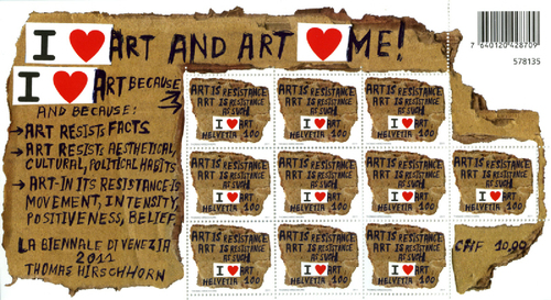
I ♥ the fact that Switzerland had Thomas Hirschhorn make a series of stamps to mark his involvemente in the 2011 Venice Biennale almost as much as I ♥ Thomas Hirschhorn’s stamps.
Stamp | Crystal of Resistance [crystalofresistance.com]
Live From The Gramery Hotel
Warm nostalgia apparently equals d-bag public access video + time.
Reading Andrew’s report from the Dependent Art Fair, I kept flashing back to the Gramercy, and all the art in the bathrooms, and on the beds, and the insanely crowded hallways.
And whaddya know, there’s a link to a 1995 Gallery Beat episode from “the Gramery Hotel,” where those asshats wandered in on work by unknown artists like Mark Dion, and Tracy Emin, who was not quite protected by the utterly baffled Jay Jopling.
I’d totally forgotten how much I hated that show. And now I’ll probably end up watching the entire archive.
Classic Gallery Beat TV [gallerybeat.net via 16miles.com]
I’ve Got Mail
I order so many random books, usually from random independent or used booksellers on Abebooks, that don’t arrive with anything like the robotic precision and up-to-the-minute email notification of Amazon, that I never know what’s come in the mail until I open it. And sometimes I’ve forgotten what I even ordered.
Today’s haul was exceptional, though:
Centerbeam is the 1980 report/documentation for a project that, as far as I can tell, was the largest contemporary public art event ever undertaken on the National Mall: Centerbeam and Icarus, a collaborative experiment/performance organized by MIT’s Center for Advanced Visual Studies, under the direction of Otto Piene.
Centerbeam was unveiled at documenta 6 in 1977, and restaged on the Mall in the summer of 1978. It involved video, lasers, giant inflatable sculptures, smoke machines, sound art, a technotopian extravaganza that was apparently a raging success, but also, from the pictures, might have been a hot mess. Not that those are mutually exclusive. Anyway, I thought I’d bought this book a year and a half ago when I first wrote about Centerbeam, but I had not.
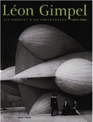
The catalogue for the Musee d’Orsay’s Leon Gimpel exhibition arrived, from Italy, and wow, it’s beautifully produced. The images that get widely reproduced are some of the most arresting, but just a quick look makes me very excited to study Gimpel’s work more closely. The text is only in French, which probably means it won’t get the US distribution presence it deserves. [It looks so easy to buy on Amazon.fr, though.]
And last, whoa, what an incredible surprise: Enclosure 3: Harry Partch? What the hell is this? Experimental composer Philip Blackburn is the last in a series of Partch devotees who labored to publish the visionary composer/ex-hobo’s archive. Most of the Enclosure series is video and audio of performances of Partch’s music, but Enclosure 3 is a dense, daunting, but engrossing facsimile edition of the notes, drawings, clippings, photos, manuscripts, and correspondence Partch kept for himself. It looks utterly fantastic.
I think my version was published in 2005, but the copyright is also from 1997, and there’s only the barest hint at the process of putting the book together. It’s pretty raw. But gorgeous. I’d seen it mentioned on some hip curation webshop, one of those Nieves-type outfits, but when I couldn’t figure out which one it was [turns out it was collectionof.net], I ended up ordering it [much more cheaply] via some Amazon merchant.
Well, my copy arrived, it’s awesome, and it turns out to have come from Squidco, an “improvised, composed experimental music” specialty shop based in, of all places, Wilmington, NC. Who knew, right? Squidco publishes a lot of writing and reviews of experimental music on Squid’s Ear, wow, reaching back to 2003. I had no idea, but now I do, and I’m glad.
On Frieze At 20
Frieze has been around 20 years? That’s crazy. I feel so old.
I’m really liking the dips into the archives by invited Big Thinkers. Jens Hoffmann’s picks focus on biennials and such. My favorite has to be Jenny Liu’s firsthand report of the Sixth Caribbean Biennial, a giant critique-in-a-boondoggle-in-a-biennial organized by Maurizio Catteland–and Jens Hoffmann:
The idea of a biennial without art could have been cool in a marvellously vacuous sort of a way, puncturing the self-importance of the art world by grotesquely aping it. What we got was a furtive and ungenerous gesture, a covert V-sign flipped at the art world behind its back, when more balls could have made it a divinely impudent mooning in its face. As a critique, the Caribbean Biennial was neutered when the organisers and some of the artists felt the need to prescribe the biennial’s public perception and hide the vacation at its heart. The art was so profoundly and deafeningly absent that some artists took to thinking of themselves as both art stars (whose reputations needed protecting) and art civilians (with commensurate expectations of privacy), while curators took on the role of embarrassed publicists and the spectators of poor cousins at a wedding. There’s something sad about so cynical and ambivalent a gesture as the Caribbean Biennial: one would think that a critique of one’s own practices would be ethical, even idealistic. Here, the humour was both a performance of aggression and a weapon of despair, another cheerless rehearsal of irony and parody.
I still talk to people about the Caribbean Biennial all the time, though as time passes, I have to keep reassuring myself that it actually happened. Or didn’t, as the case may be.
But I still remember it as a sly, subversive prank, and Liu’s obviously generous but disappointed review reminds me that it was less romantic than I want it to be. Seriously, guys, how could you let Jenny down like that?
Trouble in Paradise [frieze]
frieze.com/20/ [frieze.com]
‘It’s The First Time In History All These Four Artists Are Gathered Together.’
I cannot believe this has under 1,000 views. I’m only about 8:00 into this YouTube video, and already, Viktor Pinchuk is my hero. While anyone with a yacht or a palazzo could assemble a tranche of the art world powerful on the Grand Canal, only Pinchuk’s inspiring artistic vision can bring them all to Kiev. Well, I’m pretty sure it’s his vision they’re coming for.
Come for the vision, stay for the historic chance to have Jeff Koons, Damien Hirst, Andreas Gursky, and Takashi Murakami together on stage, answering incisive questions from Ryan Seacrest’s Ukrainian doppelganger. And the pitch for free Prada.
Ah, yes, I just got to the end: “Thank you to the thousands, the hundreds of thousands watching online!” It Gets Better!
Cinthia Marcelle receives Main Prize on FGAP Award Ceremony [ThePinchukArtCentre’s YouTube channel, via Gavin Brown’s GBlogÉ, pronounced like the French, Blo-ZHAY]
On Stage
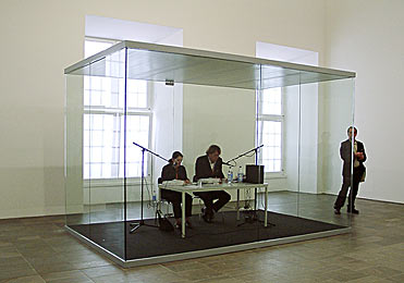
In 2002, as I was still trying on various kinds of public writing, I tried to capture the transformative experience of listening to–no, experience is the better word–On Kawara’s One Million Years.
That post was even titled like a screenplay: “Setting: Fredericianum, Documenta II, Kassel.”
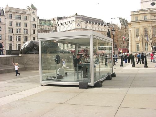
image via mightymac
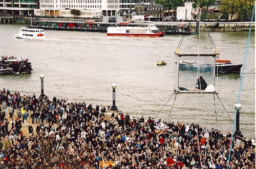
In April 2004, South London Gallery staged a week-long, round-the-clock marathon reading of One Million Years in Trafalgar Square. Many passersby unfavorably compared Kawara’s volunteer readers in their glass box to David Blaine, who had, just a few months before, spent 40 highly publicized days in a plexiglass cube suspended from a crane next to the Thames.
In 2009, when David Zwirner staged a reading/recording of One Million Years, Brian Sholis wrote touchingly and with great acuity about the experience of reading the years 79,936 AD – 80,495 AD with his then-fiancee.
And yet only just now, somewhere between finding Jerry Saltz’s characteristically gossipy, angst-ridden account of reading in the same show, and watching this comical YouTube video of Martin C. de Waal, a Dutch club kid/stylist/Orlan-style conceptual self-portraitist and his dance remix singing partner Marina Prins [!] getting all dolled up for their reading on the open platform at the Stedelijk–the one we’d been standing on a few weeks ago–do I realize the powerful performative essence of Kawara’s piece. And with less than a hundred of an anticipated 2,700+ CDs burned, it’s barely even begun.
The effect of living in a post-Marina world, I suppose
‘Relational Aesthetics For The Rich’ – Friday 12/3, 1PM In Miami
It’s less than a week away, and I can’t believe I haven’t hyped it yet:
I’m giving a presentation this Friday in Miami during Art Basel Miami Beach titled, “Relational Aesthetics For The Rich, Or A Brief History Of The Gala As Art.”
It’s based on this similarly titled blog post, which pulls together a lot of things I’ve been fascinated by over the years, but which was inspired by MoCA’s Annual Gala, which the museum relabeled “a Happening,” and which they turned over to Doug Aitken to design as an artwork.
At least that was Jeffrey Deitch’s original pitch; the results–and the history and context of museum gala art–turn out to be a little more complex.
Anyway, the talk is part of #rank, a program put together by Bill Powhida and Jen Dalton, which will be held at SEVEN, the shared exhibition and program space in Wynwood organized by a group of awesome New York dealers.
There are so many people to thank, starting with Magda Sawon from Postmasters and artist Michelle Vaughan, who are the honorary co-chairs of the presentation. And there are the gift bag sponsors, of course, who will be announced soon. I hope.
The gig goes down at 1pm, and it should be available for live streaming online, in case you are too busy making acquisitions at ABMB or something. But then you won’t get a gift bag…
Sea Force One
Christoph Brech is the master of the meaningful tight shot. In Sea Force One, he focuses in on a pair of workers in a small boat who are scrubbing the hull of Francois Pinault’s black yacht in front of Punta della Dogana during the 2009 Venice Biennale.
The work is included in “Portraits and Power: People, Politics & Structures,” at Strozzina in Firenze. It is interesting to compare their writeup of the piece–
We do not know who was on board the yacht – possibly François Pinault himself, the famous French luxury goods entrepreneur and primary investor in the new Venetian exhibition area. Brech has turned his camera on a moment that would otherwise have gone unnoticed, deliberately choosing not to record the sumptuous affirmation of wealth of the yacht. It is the contrast between the size of the latter and that of the small boat, or between the black hull of the yacht and the evanescent white of the soap and of the reflections upon the water, that brings out the greatness of the vessel, the actual size of which we do not grasp. The artist succeeds in moving beyond the façade of power and wealth by stopping at its surface. He seems to be suggesting that the strategy for the construction of an image of power may lie in its antirepresentation: i.e., the “myth” of power is created by veiling or concealing the identity of those who hold it.
–with the artist’s own:
The yacht Sea Force One is anchored in front of a museum at the Punta della Dogna in Venice. The waves of the lagoon are reflected in the black varnish on the ship´s hull.
From a small boat nearby, workers are cleaning the yacht.
A painting emerges from the broad, white trails of foam on the ship´s dark surface, visible only for a short while until erased by cleansing streams of water.
Once again the reflected waves dapple the yacht.
At first read, I thought Brech’s focus on the formalist, painterly abstraction was notably less political than the Florentine curators’ interpretation. And damned if it doesn’t, in fact, look like a negative inversion of a making of film shot in Franz Kline’s studio.
Which immediately reminded me of the interview Felix Gonzalez-Torres did with Rob Storr, which I’ve reprinted and referenced here several times over the years.
I’m glad that this question came up. I realize again how successful ideology is and how easy it was for me to fall into that trap, calling this socio-political art. All art and all cultural production is political.
I’ll just give you an example. When you raise the question of political or art, people immediately jump and say, Barbara Kruger, Louise Lawler, Leon Golub, Nancy Spero, those are political artists. Then who are the non-political artists, as if that was possible at this point in history? Let’s look at abstraction, and let’s consider the most successful of those political artists, Helen Frankenthaler.
Why are they the most successful political artists, even more than Kosuth, much more than Hans Haacke, much more than Nancy and Leon or Barbara Kruger? Because they don’t look political! And as we know it’s all about looking natural, it’s all about being the normative aspect of whatever segment of culture we’re dealing with, of life. That’s where someone like Frankenthaler is the most politically successful artist when it comes to the political agenda that those works entail, because she serves a very clear agenda of the Right.
For example, here is something the State Department sent to me in 1989, asking me to submit work to the Art and Embassy Program. It has this wonderful quote from George Bernard Shaw, which says, “Besides torture, art is the most persuasive weapon.” And I said I didn’t know that the State Department had given up on torture – they’re probably not giving up on torture – but they’re using both. Anyway, look at this letter, because in case you missed the point they reproduce a Franz Kline which explains very well what they want in this program. It’s a very interesting letter, because it’s so transparent.
I guess it’s the curator’s job to overexplain things [?] but Brech’s title and his discussion of the work in terms of abstraction is plenty political in itself.
¡Pasarán In! The Spanish Pavilion, Paris 1937
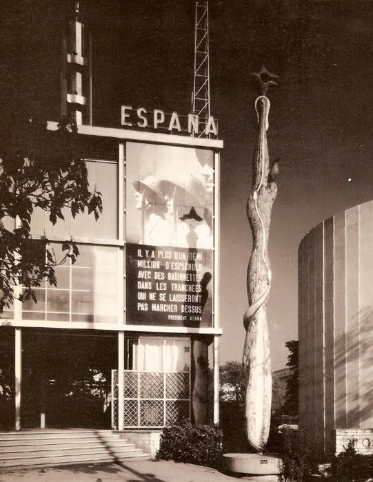
Worlds Fairs turned out to be the perfect venue for photomurals–they were catchy, usually didactic, packed a visual punch, and got the point across to the shuffling masses. And at least in the 1930s, they looked like the future.
So to a government whose future was being immediately threatened, like the Spanish Republic under siege by Franco and his fascist army, a publicity- and sympathy-generating pavilion at the 1937 Paris Expo literally seemed like a matter of survival.
José Luis Sert and Luis Lacasa designed the small, simple pavilion, which didn’t get completed in time for the opening, and which anyway, ended up being overshadowed by the bombastic, dueling pavilions of Nazi Germany and Stalinist Russia.
So to get attention, a huge photomural/banner of Republican loyalists was hung over the entrance. [Intriguingly, in two of the three most widely circulated photos from the Expo, including the Le Monde photo announcing the opening, the mural is cropped out or coincidentally obscured by a tree branch.] As kk_redax’s photo on flickr shows, the photomural was changed periodically:
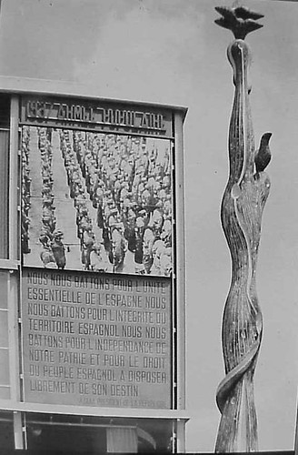
Like breakdancing was to gangs, world’s fairs were designed as a non-violent means for competitive, conflicting nation states to jockey for supremacy. But the Spanish Civil War pushed the Republican government to a new, urgent level of pavilion-building. The war, which was fought on the ground through media, posters, photos and newspapers [and also guns and bombs], also gave birth to modern photojournalism. And the Paris Expo was the site of Spain’s immediate experiement in architecture as military polemic. And then there’s the art.
The Republican government sought to garner international support by assembling modern works by sympathetic artists that express powerful and overt political outrage, including a large painting of an upraised fist by Joan Miro . And unveiled on the ground floor was Picasso’s Guernica.
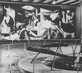
Painted in 24 days in his new Left Bank studio in the spring of 1937, Guernica‘s duotone palette reflects how Picasso and the rest of the world learned of the Nazis’ devastating saturation bombing foray: via newspaper photos and newsreels. Photography had an even more direct impact on the making of Guernica: Picasso asked his companion Dora Maar to document the painting process, and there’s a scholarly case that “the tonal variations Picasso observed in Dora’s photographs appear to have influenced the development of those in the middle stages of the painting.” Though it sets the bar pretty high for the rest, it’s not much of a stretch to call Guernica the greatest photomural of the 20th century.
But wait, that’s not all! In the Pavilion Guernica was installed next to Mercury Fountain, an abstract, kinetic sculptural tribute to the Almaden region of Spain, which at the time produced the lion’s share of the world’s mercury. Oh, the fountain was by Alexander Calder. While Guernica‘s world travels are well known, Mercury Fountain is a Calder whose relocation was both successful and imperative. It currently sits at the Fondacion Miro in Barcelona, sealed behind glass, in order to contain its toxic vapors.
Guernica, meanwhile, is now encased in glass for its own protection.
…The Spanish Pavilion [pbs.org]
A comprehensive post about El Pabellon Espanol, in Spanish [stepienybarno.es]
The Mexican Suitcase, rediscovered Spanish Civil War negatives by Capa, Chim, and Taro [icp.org]