So like you, I’m sure, I was baffled and amused listening to avant-garde cellist and frequent Nam June Paik collaborator Charlotte Moorman’s answering machine recording on Ubu.
It takes a minute to get your bearings, and then you realize it really is John Lennon complaining about a review in the Village Voice by “a couple of bastards, whoever they are,” and also mentioning an ad Yoko placed in the same issue.
And then there’s a spitting mad John Cage demanding Charlotte or Howard Wise write a letter to the Village Voice “protesting Fred McDarrah’s censorship of my name from that article, or I’m never doing anything for you or anybody else ever again,” which, hello, what?
What had Cage been so ignominiously ignored in? It wasn’t even clear what year the tape was from, though Moorman’s callers mention Thanksgiving [and the recording title says Nov. 24 – Dec. 6]. If Howard Wise was mentioned, perhaps it was Moorman’s performance of a Cage composition at the gallery.
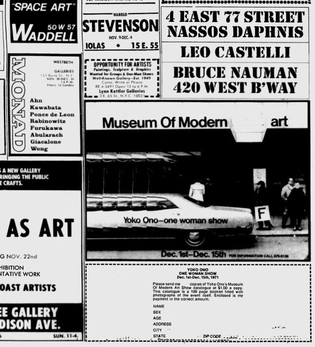
Well, stop worrying, because Lennon’s reference to Ono’s ad means it’s 1971, when Ono advertised her own One Woman Show at The Museum of Modern Art, and its accompanying catalogue, even though the museum was not on board with it.
Ono hired a guy with a sandwich board to walk around in front of the Modern for two weeks, Dec. 1-15, advertising a show that was technically not inside. [Though it confused enough people, apparently, that the membership desk put a little sign up, with Ono’s ad, saying “This is not here,” which was, by so doing, no longer true.] Anyway, the citation given for Ono’s Voice ad is usually Dec. 2, 1971. And the ad does run in that issue.
But the version Lennon was calling Moorman about, “on page 31,” was actually from the week prior, Nov. 25. It’s up top, reproduced, I believe, for the first time online, not counting Google’s still unindexed archive of the Village Voice. NBD.
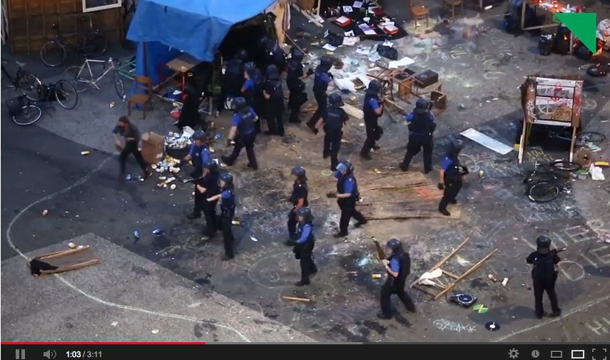
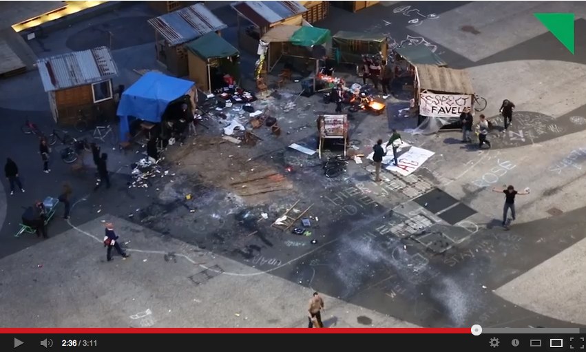
Which is where Fred McDurrah’s article is found, too. It was a report from Moorman’s 8th Annual Avant Garde Festival, a roving project that infuriated and entertained the small New York art world with impressive regularity. 1971’s version was held in the 69th Regiment Armory, and was backed by Barbara & Howard Wise. McDarrah’s ostentatiously jaded account was meant to disparage the multi-media, performative, absurdist circus, but he actually makes it sound kind of interesting. Or maybe reading about it now, during Frieze Week, it just seems normal.
McDarrah writes that Moorman secured the Armory by promising “the Colonel in charge” that there would be “no nudes, no sex, no politics, no dope, no nothing.” Not all of her artist invitees seem to have gotten the message.
I looked at my watch and decided it was time to ask the soldiers the standard “what-do-you-think-of-this-stuff question…A veteran of all the wars who was covered with stars, badges, ribbons, buttons, and braid summarized his feelings: “It’s ridiculous, stupid, the whole damn thing. All those people smoking marijuana back there. I saw them. And using a federal building too. A bunch of kooks. I could bow them bastards to hell. I’d go up in the balcony with a machine gun. I even saw some naked. I’m glad I’m being transferred out.”
Yow, OK then. Did New York’s know how close it came to starring in an art world-meets-Kent State-themed prequel of Inglourious Basterds?
Anyway, sure enough, Cage isn’t mentioned anywhere. Though he’s probably glad to have missed the near massacre. In another, later message on Moorman’s machine, a calmer, more sheepish Cage apologies for not attending a big event, so I’m going to guess that it was Cage’s composition, not his presence, that was snubbed. Unless it was Cage who McDarrah called Moorman about; he left his own message when he heard he’d misidentified someone sitting “cross-legged in the corner and mix[ing] his ‘ohms’ into the abysmal hum and drone of 1000 sounds” as Steve Reich.
And it turns out all I had to do was look a little further. Because computer artist Fred Stern, who did get namechecked in the Voice article, turned Moorman’s recording into a slideshow, synced with clippings and snapshots. Very helpful.
Charlotte Moorman’s Answering Machine Message Tape [youtube]