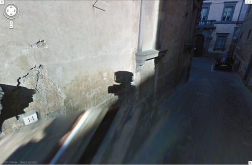
Just because it wasn’t mapped out by the Google Trike crew doesn’t mean there aren’t some nice Street View self-portraits in the fortress-like Italian hill city of Orvieto, the Papal Aspen of its day. [thx brian dupont]
Category: google
Untitled [Extra Street View]
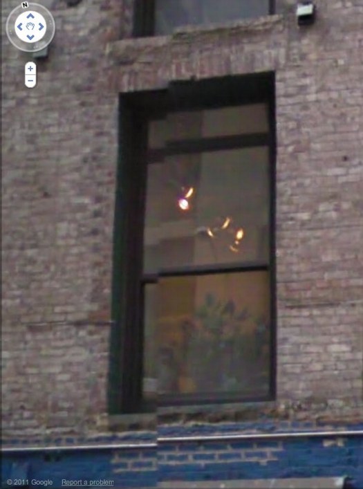
I’m bummed to miss it but “While You Wait,” a group show organized by Brian Dupont in Extra Gallery, his Chelsea art firm’s expropriated lobby is opening right now. [Spoiler alert on the venue’s lobbyness? I can’t quite tell, but I figure it’s clear from the show’s press release.]
Anyway, after Brian invited me, I was trying to figure out what I might do, and saw this image of the building–and the space’s window–on Google Street View. And then it was obvious.
I’ll write some more about the piece later; right now I’ve got to pick up the kid from riding lessons. I mean, proletariat lessons.
OK, comrades, I’m back. Basically, Google Street View is increasingly the first impression, the reference point, even the authority of sorts, for the new places we go in the physical world. In Extra’s case, the distinguishing feature of its unassuming architecture is the mismatched seam Street View gave it. Untitled [Extra Street View] is an attempt to approximate that digital reality in the physical experience of the building, to sort of sketch it into the space. Or maybe to capture it in one spot–the window–or one perspective, from inside the place you’ve just traveled to, looking back toward the pano-mapped street. It’s like a shot reverse shot between the viewer and the Google cam.
Holy Smokes, THAT Doug Rickard!
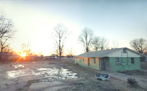
At MoMA yesterday, I was talking about some Google Maps and Street View projects with a trustee, who was all, “There’s an artist in the New Photography show that uses Google Maps, they’re stunning!”
And it only occurred to me at that moment that the Doug Rickard in New Photography 2011 is the Doug Rickard of American Suburb X, and that he was showing his incredible series, A New American Picture. [The show opened last week; I hadn’t seen it, and the galleries were closed yesterday.]
I really should be discussing it more, because A New American Picture is pretty much the most successful and powerful Street View-based art project out there. Rickard’s images are haunting, and he’s right when he said [somewhere, I’ll find it later] that these photos could not be taken by a camera-wielding photographer; the presence of a human with a lens would destroy the scenes.
Which, as I type it, makes me think of the old Michelangelo chestnut about finding the sculpture in the block of marble. In a way, A New American Picture feels like the photos Rickard uncovered in Street View. Now I’ve got to get back to the museum and see the actual show.
American Suburb, A New American Picture, by Doug Rickard [americansuburb]
New Photography 2011, Sept 28 – Jan 16 2012 [moma.org]
Previously: On Bremser on Street View
Extra Street View
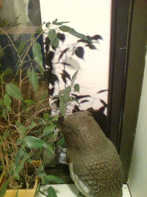
So I got the piece installed last night for “While You Wait…”, organized by Brian Dupont. It really only works in the daylight, so I won’t know yet how it actually looks, but it went in just as I expected it would.
I like this little corner detail here, sort of an Urs Fischer meets William Anastasi meets Roni Horn on Google Street View kind of thing.
Google Evert View
In her post about how her Mario Kart reflexes started cropping up while she was driving a real car, Sally Adee introduced me to a new term, “everting,” which William Gibson introduced in his 2007 novel, Spook Country, and which she explains as “entering the next phase of its evolution by creeping out of the virtual boundaries that once defined it and into what we consider ‘real life.'”
Which I mention here because it turns out to kind of relate to the piece I’m putting in this show in a couple of weeks–right? that’s what I thought, too–a site-specific work about Google Street View.
Brian Dupont has put together “While You Wait…” at Extra Gallery, in Chelsea.
The show opens on October 6th, and I’ll post more about it after it’s done. I, for one, am interested to see how it turns out.
Consensual Hallucination [lastwordonnothing via theawl]
“While You Wait…” at Extra Gallery, October 6 – November 1, 2011 [extragallerynyc]
Well-Meaning Thoughts On Wohlgemeynte Gedanken
Busy? Oh, yes! But never too busy to turn someone else’s PDF into an artist book!
When @borthwick tweeted this yesterday morning about “a spectacular calibration failure at Google Books” where “Beautiful, digital errors become art,” I knew I’d have to do something.
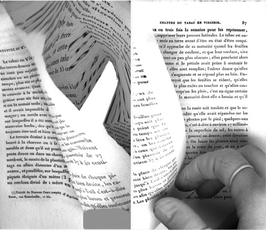
Because as it happens, The Great Picture had me thinking about ways to make a silver gelatin print of the beautiful Google Books scanning distortion I stumbled on last year [above]
The one that turns out to be similar to–a found, readymade version of–Daphne, Sigmar Polke’s handmade photocopy distortion artist book from 2004.
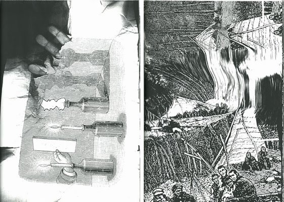
images from Polke’s Daphne via stopping off place
Then as soon as I clicked through, and saw that it was the whole book, well, my course was set.
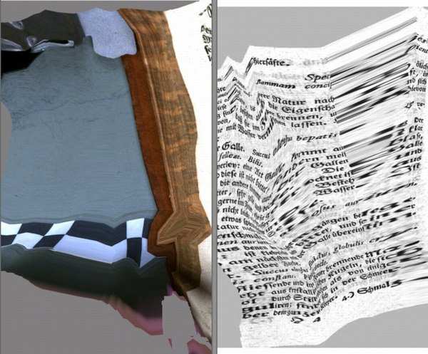
According to Google Books, the book was scanned at the Bavarian State Library in Munich on December 15, 2008, a little over a year into their massive digitization initiative.
The title of this distorted-beyond-all-recognition-and-come-out-the-other-side-as-art book is is Wohlgemeynte Gedanken über den Dannemarks-Gesundbrunnen, which translates roughly as Well-meaning Thoughts on Denmark’s Mineral Waters.
But [much to Geoffrey Nunberg’s continued consternation, I’m sure] that title turns out to be as glitched up as the pages themselves. According to rare booksellers, Wallerius’s two-part book is actually titled, Hydrologie, oder Wasserreich, von ihm eingetheilet und beschrieben: nebst einer Anleitung zur Anstellung der Wasserproben: wie auch dessen Gedanken vom Dannemarks-Gesundbrunnen,, or Hydrology, or Water Kingdom, divided, and described by him: in addition to a manual for the use of water samples: and also his thoughts on Danish mineral waters..
Hydrologie was originally published in Swedish in 1747, and Wallerius worked closely with Denso on the German translation. But, kind of hilariously, that’s not important now.
Google Books has remade Hydrologie into something entirely its own, and it’s awesome. Wohlgemeynte Gedanken is a beautiful, revealing mix of inadvertent making-of documentary and algorithmic abstraction. Reiner Speck’s insight on Polke’s photocopied Daphne seem relevant here:
Process is revealed, over and over again. Motifs accumulate page after page, as do small graphic cycles. The printed dot, the resolution, the subject, and the speed all determine and are determined by the apparently unpredictable and often impenetrable secret of a picture whose drafts are akin to the waste products of a copying machine. Even if the motifs in this book provide but a brief insight into the artist’s hitherto secret files and archives, it is still a significant one.
Even more significant when the artist in this case–Google–has also been very reluctant to disclose the secrets and mechanics of its archiving process.
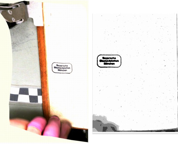
In fact, between the time I started this post last night and this morning, Google Books has removed the distorted copy of Wohlgemeynte Gedanken from its site. In its place now is a plain scan, low-res, but entirely legible, and a digitally generated cover image [but with the same, mangled title]. A side-by-side comparison [above] shows the same underlying scans, which means the distortions–and the fixes–all happened in post.

It also means I’m glad I grabbed the full PDF when I did. And that I formatted it, created a cover, and made it into a print version. Instead of the distorted black and white cover Google Books [still] shows online, I went with a beautiful full-color shot of the gold-stamped leather binding.
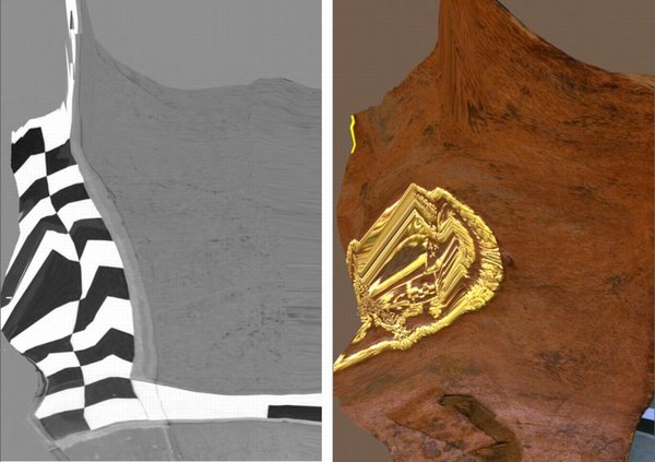
Obviously I’m still waiting for the proofs to arrive, so it may change, but right now Wohlgemeynte Gedanken über den Dannemarks-Gesundbrunnen is available as a 283-page, 6×9 paperback facsimile edition. I’m trying black and white first, because an all-color version seemed prohibitively expensive. But then again, what’s the market? Color may yet be the way to go.
The book also includes Google Books’ 2-page boilerplate foreword explaining what they wish would happen with scans of public domain books. Which is adorable.
2015 UPDATE: As the folks who bought the original 2011 edition can attest, the proofs turned out to be slightly underwhelming, losing some of the visual impact of Google Books’ original. But then no one was really buying it that often, so no biggie. But a few weeks ago I went back to see if I could improve the formatting of the book, and now it looks much better. A full-color option may still come, but in the mean time, the 2015 printings are the way to go.
Buy a print gopy of Google Books’ original Wohlgemeynte Gedanken über den Dannemarks-Gesundbrunnen for $16.99 [lulu.com]
Joanne McNeill’s Kantian view of Distorted Scans on Google Books [rhizome.org]
I’m guessing JWZ’s post was the ur-source [jwz.org]
Previously:
distorted diptych from Google Books’ scan of Nouvel Manuel Complet du Fabricant et de l’Amateur de Tabac
Daphne, as photocopied by Sigmar Polke
Once You Start Looking For A Flag
In Memory of My Feelings – Frank O’Hara, Jasper Johns, 1961
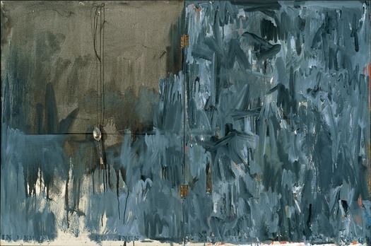
I’m long overdue for updates on the search for the Jasper Johns Flag Painting that went missing from Robert Rauschenberg’s 1955 combine, Short Circuit. I’ll get to them when I get back home to my files.
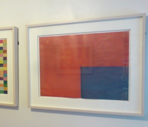
Meanwhile, one by-product of searching for a flag: I start seeing them everywhere.
This little multiple by Gabriel Orozco is the first part of a series that doubles the number of rectangles on each sheet.
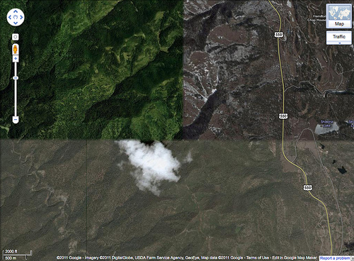
And on C-Monster, Carolina cropped this time-shifted collage she found on Google Maps into a very flaggish shape.
On Bremser On Google Street View

Doug Rickard, Helena-West Helena, Arkansas, 2008, “A New American Picture,” via bremser
Thanks to Joerg, I’ve had it in my browser tabs for almost a month now, meaning to write about it, but the TL;DR version is, Wayne Bremser’s essay on his blog It’s Never Summer is one of the smartest things I’ve read on Google Street View and fine photography.
“How to Photograph the Entire World: The Google Street View Era,” looks at work by GSV photographers like Michael Wolf, Jon Rafman, and Doug Rickard in relation to the greats of earlier generations of like Lee Friedlander, Robert Frank, William Christenberry, and Larry Sultan. [Bremser doesn’t mention, and I just thought it while typing this list, but The Google Gaze is apparently male. Maybe the giant camera stalk with the big balls was the first clue.]
Anyway, Bremser’s analysis is excellent in itself, but his premises also illuminate the contours of the gap that somehow persists between photography and art. Or more properly, between fine photography and contemporary art. At this point, I am coming to see these differences in religious terms: they’re formative, deeply held, esoteric, easily lost on outsiders, and laughable to an atheist.
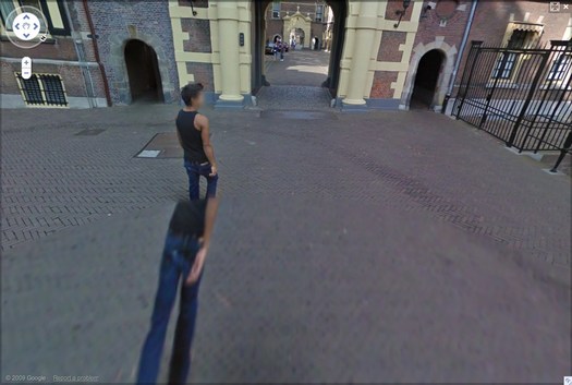
Walking Man – The Binnenhof, 2009, via greg.org
Though his title hints at more audacious possibilities, Bremser focuses on GSV as a tool for human artists:
As a camera, GSV is used by a photographer to rotate around, frame, and click to grab an image. The images that we see on the screen are raw data, gathered by the drivers; these images do not become photographs until a photographer frames them.
So, framing.
Also, I’m happy to take GSV’s ambition to “photograph the entire world” at conceptual face value, and go from there. By the time the Bechers began exploring the futility of documenting typologies of disappearing, industrial manmade structures, astronomers had already begun their second attempt to photograph the entire universe.
From Bremser’s photographer-centric beginning, it’s logical to say that:
One important process-related issue with GSV images that end up as photographs on a gallery wall is this: they are not screen grabs, but photographs of a screen.
Which, hmm.
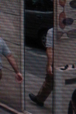
Michael Wolf, Paris, 2008
But it is compelling and awesome to see the moire patterns and magnified pixels of Wolf’s pictures of his computer screen [above] in the context of photographers taking on the tectonic media shifts of their day, such as Lee Friedlander’s “Little Screens” series [below], photos from the 1960s that captured fleeting images on television sets.
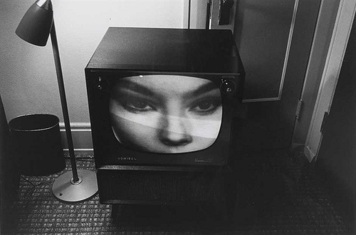
Lee Friedlander, Florida, 1963, via bremser
And then there’s this:
Regardless of how photographs are sourced, it’s still essential to see photography in books and on walls. How do these look in the gallery?
Which, again, hmm.
I have used screenshots from both Google Maps and GSV to make both prints and books, because the screen, or the browser window, or Google Earth, is Google’s native image format. [Technically, that’s not true; Google presumably has much higher-res versions of their imagery which they do not make publicly available.] But I guess this is a distinction between using at Google’s imaging as source, and examining at it as subject. The fascinating, mind-blowing process around here isn’t Wolf’s [or for that matter, mine] but Google’s.
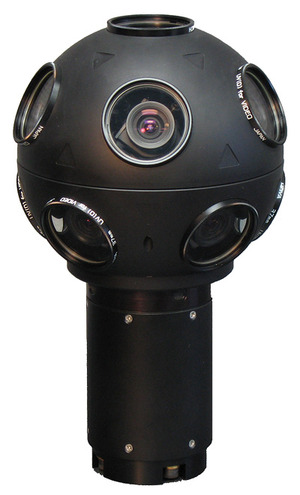
Even though it’s not his point, Bremser still moves the aesthetic ball forward. I’m embarrassed to say for all my Street View obsession, I never bothered to identify the camera system Google uses. Or used, since they seem to have replaced Immersive Media’s 11-lens, Dodeca 2360 pano camera [above] with an even awesomer camera ball [below].
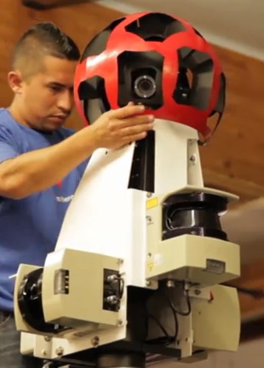
Or maybe they’ve just added the optimized housing. I don’t know, but I should. Because this equipment is not Google’s secret sauce; it’s available. You can take a Dodeca 2360 out to make your own panos or sequences. The Street View aesthetic can now be yours! At least in theory. I suspect I’d find that shooting with a Dodeca 2360 wouldn’t make me Google any more than using a Red would make me Steven Soderbergh.
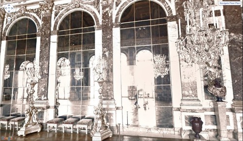
Google Street View camera guy in Versaille’s Hall of Mirrors, via [Google’s] Google Art Project.
Bremser concludes–and I agree–that GSV is rich and varied enough “that Michael Wolf can make photographs like Michael Wolf, Doug Rickard like Doug Rickard.” And Google like Google.
What I Looked At: Sol LeWitt Structures
I finally made it down to City Hall Park to see the Public Art Fund’s installation of Sol LeWitt structures. Which, first or now, you must watch the discussion of working with LeWitt at the New School. Go ahead, I’ll wait.
OK.
So along with the general admiration and pleasure of seeing so many LeWitts, the first thing I think is: picturesque.
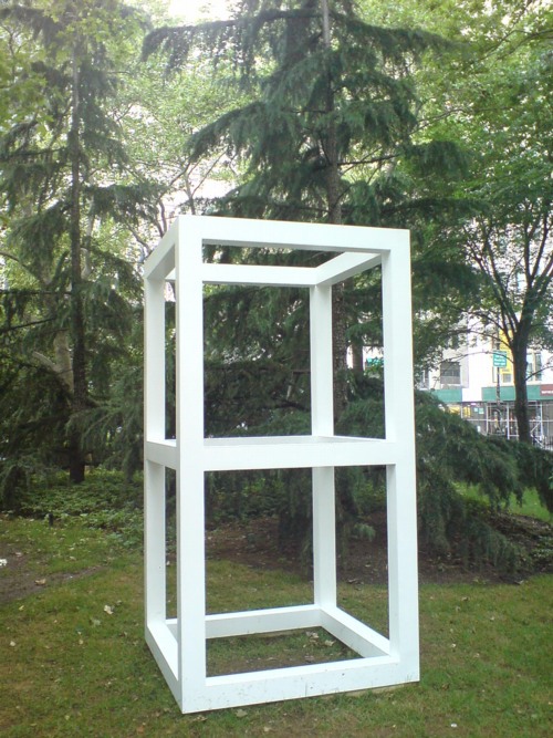
Double Modular Cube, 1969
Lewitt introduced human proportions into these modules, which may somehow account for why it feels like an idyllically sited pavilion or garden folly. But it’s definitely activating something in the landscape, too.
Then there is Complex Forms, 1987:
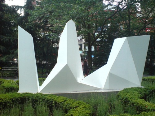
Which, I know, I know, every algorithmically-generated polygon around here gets tied to Dutch Camo Landscapes. But:
For the Complex Forms, the artist drafted a two-dimensional polygon and placed dots at various locations within it. As the form is projected into three dimensions, those interior points are elevated into space at different heights. The elevated points dictate the seams of the object’s multi-faceted surface.
So these things turn out to be topographies “projected” from two dimensions into three. Maps. So it is not a stretch.
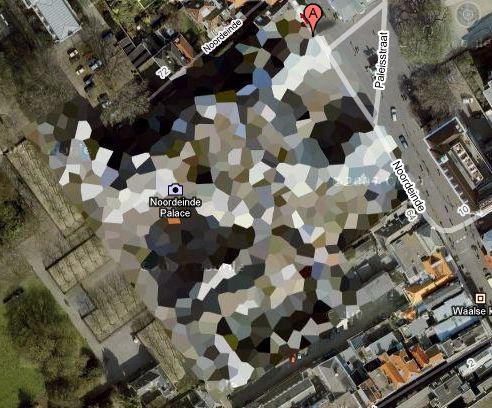
The way I found the Dutch Camo Landscapes in the first place was through architecture. They were 2D patterns generated from photos of 3D structures, which read as 3D structures themselves. As camo deployed against aerial surveillance, I’ve also imagined them as crystalline structures or surfaces, topographies, installed above whatever site is being obscured.
It’s to the point that last fall, I actually went to the Noordeinde Paleis [above] in The Hague, not *really* expecting, but kind of hoping, to see it sitting, safe from terror or whatever, under a giant, polychrome, polygonal tent. It was not. I’ll add that to my project list, though. [note to self: call Queen Beatrix.]
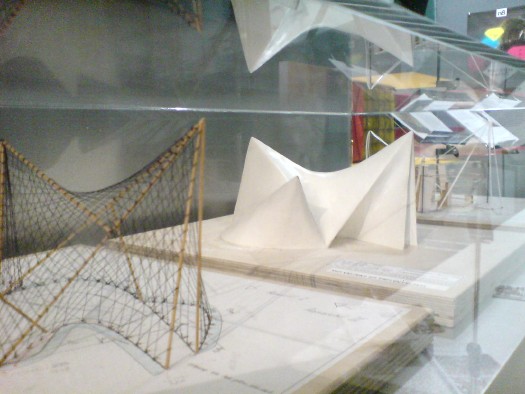
It also reminds me, even more explicitly, of Le Corbusier and Iannis Xenakis’ 1958 Philips Pavilion in Brussels, which, as these two models I found displayed shoved into a corner at ARCAM in Amsterdam one night show, was similarly constructed from 2-dimensional curves and points projected into space.
“The Complex Forms introduce irregularity into LeWitt’s work,” we are told, “which is further explored, for example,” in the Splotches. Which, again, two-dimensional drawing projected into structure via formulas for generating color and height. I can really dig these things, except–I didn’t photograph it, didn’t want to be a crank, but holy crap, I can’t stop staring at that seam.
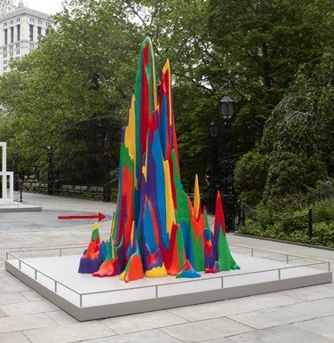
Splotch 15 [with giant $#)%ing seam], 2005
It was not like this when it was exhibited on the Met’s roof garden in 2005, was it?
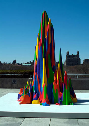
No, I do not think it was. What gives?
The next thing is how lush and classical City Hall Park is. Since this incarnation dates from 1999, I guess historicist is the right word. I don’t remember noticing this as acutely as I do now.
Maybe because so many LeWitts are installed along the park’s radial axis, lined up with that replica fountain just so.
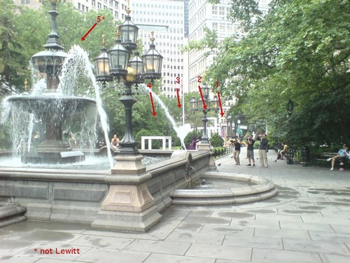
In his opening remarks at the New School, Nicholas Baume described the Public Art Fund’s program as “looking back at radical practices dating from the 1960s and registering their contemporary resonance.” He goes on to cite the appeal of seeing “the interesting juxtaposition of natural landscape [sic], New York City skyscrapers, and the architectural and decorative elements of the park,” which “provide a fascinating and rich context.” But now this installation, I get less sense of juxtaposition, and more assimilation. Radial historicism: 1. Radical practice: 0.
As I’m walking around, trying to figure out how to process this situation, I suddenly looked at the Complex Structures head-on, i.e., the “wrong” way.
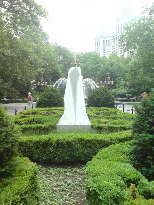
And it turns out to be radially symmetrical itself. A mirror image. And I remember writing about laughing at first at Chinese tourists who didn’t “get” the Iwo Jima Memorial, and who posed for photos at the head of the statue, only to realize they didn’t have the same LIFE Magazine photo-mediated historical context as Americans.
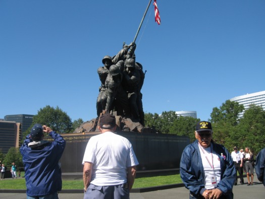
Connecticut veterans at the front of the Iwo Jima Memorial, image: ct.gov
Which, suddenly, LeWitt’s practice of projecting a 2D image into a 3D structure has an entirely new, complicated legacy which I’ve never seen addressed before, but maybe this City Hall Park is a good place to start.
Dutch Camo Domescapes
I love it when a plan comes together. Or at least when several subjects of interest converge unexpectedly.
It seems the Dutch art world is about to be decimated by sudden and substantial government funding cuts and reorganizations. [for angry details, check sven lutticken’s recent post; for plaintive, possibly resigned reaction from the affected institutions, try the open letter at the Dutch public arts organization, SKOR.]
If the proposed changes really do take effect, and the status quo of one of the most highly developed state-sponsored ecosystems for the arts is actually dismantled at a stroke, I think it’s really important to requestion every comfortable assumption of the involvement between art and politics. It has a lot of obvious problems and weaknesses, but the Dutch system, at least as perceived from abroad, has always seemed like the apotheosis of certain ideals of cultural industrial policy, which, Lutticken argues, now “don’t seem to be worth a penny.”
Anyway, not that they saw them coming, but SKOR tried to understand the political shifts that precipitated these cuts in the December 2010 issue [#20] of their excellent journal, Open, which examines populism and the persistent need for narrative and myth in the democratic process.
Dutch populism seems to center on–surprise–issues of immigration, assimilation, and Muslim vs. Christian cultural influence. As it turns out, one of the contributors in Open 20 is Foundland, a graphics, art, and research group that seems part collaborative, part design firm.
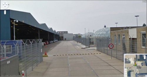
In 2009, Foundland created CACHÉ ÉXPOSÉ, an investigation into the remote, largely invisible, and unreported system of detention and deportation facilities in the Netherlands. The majority of the people imprisoned in the facilities or subjected to the system seem to be immigrants and refugees from largely Muslim countries.
When I read the description of the project, I wanted to see if, like the intelligence- and military-related sites, these politically sensitive detention sites were obscured on Google Maps. Fortunately, Foundland had created a Google Maps list as part of the CACHÉ ÉXPOSÉ project.
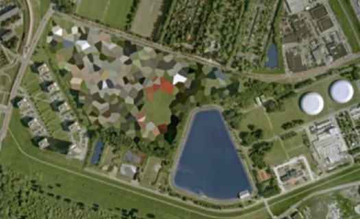
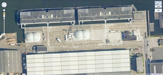
And the short answer is no. Their industrial anonymity is camouflage enough. But then hey-ho, looking at the waterfront detention center in Zaandam, a commercial city northwest of Amsterdam, what do I see? Awesome-looking domes.
Double geodesic domes of unknown purpose, but which look to be at least somewhat transparent or translucent from Street View. What a wonderfully open society the Netherlands must be that in can allow the Google Street View car to drive right up into the middle of its immigrant prisons. Oh wait.
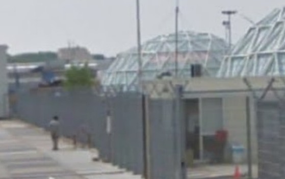
What strikes me, besides the lone figure standing outside the double barbed-wire fence? Is irony the right word to see a geodesic dome, a form which was once erected to great fanfare in Afghanistan, where it served as a symbolic center of friendship, trade, democracy, and political cooperation with the west, being deployed in a back alley prison in Europe filled, presumably, with impoverished immigrants from the Middle East?
Then again, Afghans in 1956 apparently did see the US’s Kabul Dome pavilion as representing The Future. So.
Google Ghost View
Oh, now this is interesting.
Andy links to an interior Street View-style panorama being featured on Google Offers. [Which is also interesting, but.]
But when you step outside into Street View’s street view, this is what you see:
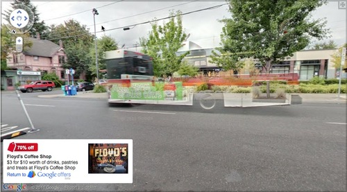
It looks like an enhancement of the way Google deals with obstructions by stitching differently timed images together in their panos. You can imagine that, as Google populates its image database, it will depopulate its published images, erasing more and more of the visual information it deems extraneous or obstructive.
This Google ghost bus will look novel, until it becomes the norm, and then it, too, will be refined out of existence.
Aarhus Madness
O wow.
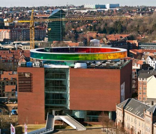
Olafur Eliasson’s Your Rainbow Panorama opens Thursday on the roof of ARoS Aarhus Kunstmuseum in Denmark. It’s a 360-degree glass promenade which paints the cityscape with every color of the spectrum.
Too bad the promenade roof’s not rainbow-tinted glass, too. That’d make one helluva signature on Google Maps.
Image and statement via olafureliasson.net [olafureliasson.net]
More images at designboom [designboom.com]
Previously: Olafur: The Magazine?
Color Experiment paintings
Ghetto Busted Street View
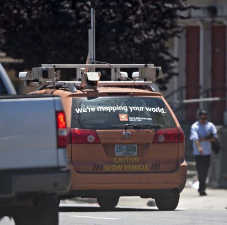
Just when I start to worry that maybe it’s wrong to care how sculpturally sweet the Google Street View’s camera ball is, I see this [scroll way down], a photo of the ramshackle, zip-tied, off-the-shelf mess that is the Tele Atlas street mapping van.
Seriously, people, if you’re not gonna suit up, why even come to the game? [image: sfcitizen.com]
Hotel Palenque Street View

I’ve been meaning to post more about this for months, but now I’m glad I waited. In January curator/writer Pablo Leon de la Barra posted Google Street View photos of the Hotel Palenque on his blog, Centre For The Aesthetic Revolution.
I need to put a [sic] after basically every word in this sentence, but it’s pretty jarring to see a place you know only from an old artwork alive and well and part of the real world. Hotel Palenque was supposed to be a white man’s fictional, archeological non-site, not an actual site, where people stay when they come to town, and certainly not a real, surfable place on Google Street View.
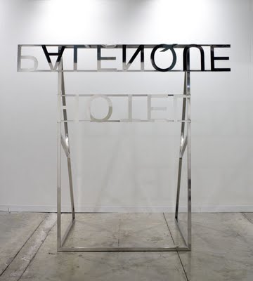
But this is all precisely de la Barra’s point, too. He originally Googled the hotel because he was preparing a text on Jonathan Monk’s Color Reversal Nonsite with Ensuite Bathroom [2009, above] for the Museo Rufino Tamayo in Mexico City. Monk’s work is a mirrored replica of the Hotel Palenque sign, only upside down and backwards, as it would be loaded in a slide projector.
Just as the entropy of development means that once-remote earthworks are now tourist attractions on the GPS grid, de la Barra lays out how Smithson’s exoticized, Yucatan jungle ruin/playground is now more fully recognized as someone else’s [sic] home turf. And while it may be surprising to hear that Smithson’s Hotel Palenque was only presented for the first time in Mexico in 2005, it should surprise no one to learn that Smithson sounded like a drunken gringo.
REVISITING HOTEL PALENQUE THANKS TO GOOGLE MAPS [centre for the aesthetic revolution]
HOTEL PALENQUE IS ELSEWHERE: ON JONATHAN MONK’S HOTEL PALENQUE SIGN’ A TEXT BY PLB IN RUFINO MAGAZINE
Hotel Palenque, 15 Avenida 4 de Mayo on Google Maps [google maps]
Previously: non-site non-art, Smithson’s Hotel Palenque
Visiting Artist: U of U lecture on Smithson
Robert Irwin’s Black Plane
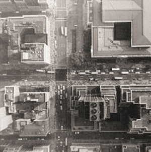
Andrew Russeth has a great post about the making of Robert Irwin’s Black Plane. As part of the Whitney’s 1977 survey of the artist’s work, Irwin had the museum staff paint the intersection of 42nd St & Fifth Avenue, a certain heart of the city, with blacktop sealer. The image above is an aerial photo from the Chinati Foundation newsletter, 2001, which accompanied an interview of Irwin by Marianne Stockebrand.
It, along with the date of the Chinati publication, December 2001, reminds me of a proposal for the rebuilding of the World Trade Center site that Ellsworth Kelly made in October. In early 2003, after seeing an aerial photo of the site in the Times, Kelly painted a green trapezoid as a stand-in for the large grass mound he envisioned, and sent his collage to Herbert Muschamp. The artist also noted that other artists he’d spoken to, including Joel Shapiro and John Baldessari, also thought that nothing should be rebuilt on the WTC site.
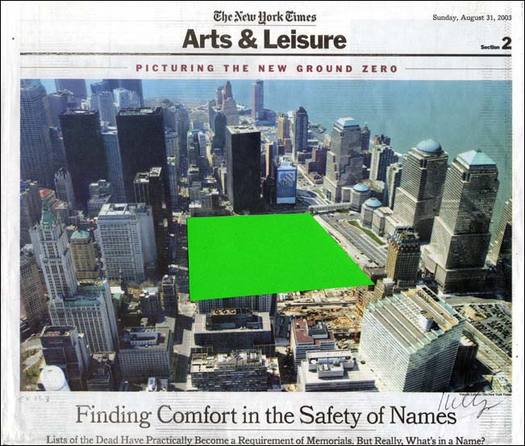
Muschamp arranged for Kelly’s collage to be donated to the Whitney.
