
As they say in Blurmany, this is ucking awesome.
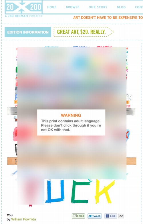
You, a new print by WIlliam Powhida at 20×200.com [20×200.com]
Previously: Google Art Project, or Les Blurmoiselles d’Avignon
Blurmany and the pixelated sublime
Category: google
From Jasper Johns’ A History Of Orgies
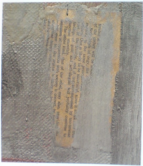
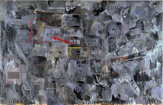
Barbara Rose called this partially obscured page of text “The most tantalizing fragment” visible in Jasper Johns’ 1962 painting, Map, and speculated that it was “probably ripped from a paperback book Johns had in his studio.” The visible word “rebel” resonated with Rose’s idea that Map is akin to a battlefield map, and relates to the Civil War, the centennial of which was being commemorated when Johns, who had recently decamped for his native South Carolina, made the painting.
It turns out the page is from the short, 2-page preface to a hardcover, the 1960 US edition of Burgo Partridge’s 1958 book, A History of Orgies. I bought this book, which is basically one Oxford student’s quick tour through the dirty parts of the classics, followed by a brief history of sexual excesses and hypocritical moralizing in Europe, ending with a call to keep pushing modern society toward a Greek ideal of a sensible, guilt-free sexual culture.
A History of Orgies was apparently a good-, if not best-, seller, both in the UK and the US. After buying a copy online–strictly for research purposes, you understand–I skimmed through it. What I don’t know about orgies could fill several books, but its argument, even its thesis, frankly, seems a bit scattershot. Perhaps more lucid syntheses of orgies have followed Partridge’s? I’ll wait for the orgiast literati to chime in. But it was impossible for me to read the preface without thinking of it in terms of Johns’ work, and also his life in 1960-62, and the culture around him.
Rose calls the visible phrases “chosen and deliberately revealed,” and says they “participate in Johns’s game of peekaboo, which he plays with his audience, much as a stripper suggests that more will be revealed with each succeeding fan flutter,” which is a kind of hilarious image, given the actual source of the text.
And just as the brushstrokes teasingly obscure some of the text, I also can’t help wondering what’s behind, what we can never see: the other side of the page. There are at least three Johns works from this period–Canvas (1956), Fool’s House (1962), and Souvenir 2 (1964, below)–where the artist affixes smaller canvases face down on his larger work, depriving the viewer of knowing what lies underneath. I have no idea if there’s anything in the first page of Partridge’s preface that Johns wanted to not-show, but the full text of what he ended up not-showing is below.
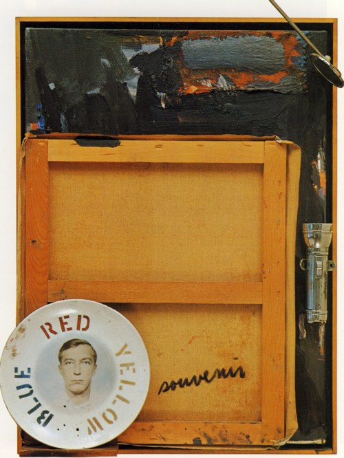
Souvenir 2, 1964, which was in the Ganz collection until 1997 excellent discussion at Christie’s
In the previous post, I referenced the skepticism, voiced by Yve-Alain Bois, of the usefulness of identifying [and thus being tempted to interpret] all the raw materials in Rauschenberg’s combines. It’s not like there’s a unifying, hidden message, a Rauschenberg Code, waiting to be deciphered by some future Tom Hanks. But technology is rapidly making the once-impossible trivial, and art from the past is going to have to deal with it. It took me only a couple of Googling minutes to identify a text that Rose could only speculate on–and which Johns, if he ever meant for it to be identified, has certainly not discussed.
But this impact of instant, ubiquitous information reminds me of how Land Art, once intended to be remote and highly inaccessible, if not impossible to find, ends up on GPS systems and Google Maps. The times, they’re a-changing.
Anyway, ladies and gentlemen, the preface to Burgo Partridge’s A History of Orgies with pagination intact, and the texts visible in Johns’ Map in italics:
Process Color Street View
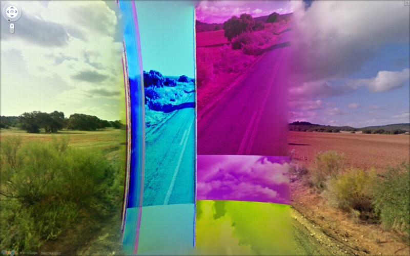
I kid about Jon Rafman, but it’s out of love. Just check out this incredible pano of BF wherever stitched together from different CMYK separations. It could be a Rauschenberg or something. By which I mean it’d make a great painting or print.
And which is kind of what caught me up about it; I’m sure it’s just some automatic step in the Street View imaging process, but I always associate CMYK with print output, not screen. Maybe someone who knows this stuff better can explain the advantages of converting RGB to CMYK for images that are presumably never intended to leave the digital world.
2/12 update: thanks to a Guardian slideshow of 9-eyes, we now know this was shot on CM-4009, north of Polan, Spain. It also appears to be the effect of a wonky rear-facing camera. Similar spectral striations appear all along the road, interspersed with a patch of b/w or desaturated imagery knitted into the pano, which I assume isolates the effect to a single camera. The CCD striations contrast nicely though with the occasional appearance of their optical equivalents: old-school lens flares from the sun. Ironically, the particularly awesome glitch Rafnan highlighted seems to have been removed or reprocessed. Another reminder that Google is watching the watchers.
Previously:
Google Street View’s shiny balls
Google Lens Cap View
Walking Men, or the Google Street View Trike has a posse–who delete images of themselves when they’re published on blogs
Google Street View’s Shiny Balls
People often ask me, “What is it that makes your Google Street View Art so different, so appealing?”
Actually, no one asks me that, they just send me “Hey, look!” emails with links to Jon Rafman and Michael Wolf. But if they did ask me, I’d probably go off about Bergson and the flaneur’s gaze and Deleuzian notions of cinematic time and the panoptic surveil–
“Hey, look! Shiny object! Want that!”
Seriously, chrome that bad boy in an edition of 5, please. I’ll keep the AP.
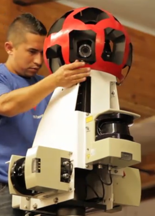
via Behind The Scenes with Street View [youtube]
Fractal, Pixel. Pixel, Fractal.
![]()
“Our lives are spent trying to pixellate a fractal planet.” – A. King in Society. [via mathowie]
Ab Eo Scientia A Quo Googleus
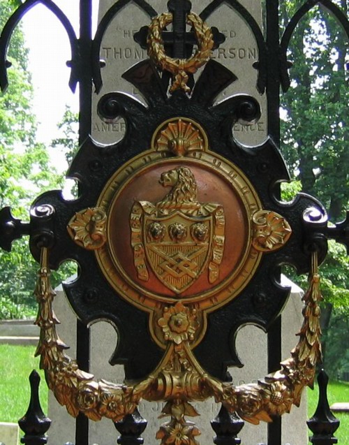
We went to Monticello this weekend–Jefferson was a complicated guy, brilliant, thanks for the Declaration etc, etc., but wow, high maintenance–and came away with a question about the Latin motto in the Jefferson coat of arms, which adorns the gate of the family cemetery where Jefferson and his white lineal descendants are buried.
Though we got the gist of it, the motto, “Ab eo libertas a quo spiritus,” had enough prepositions in it to make it hard to parse. But as we walked down the hill, trying to figure out “eo,” we realized we probably couldn’t. All we could do is look it up, and then we’d know.
That’s the binary situation the net has put us in: we either know something now, or we know it the instant after we look it up. There’s no figuring it out, no hints, just the answer.
Of course, this isn’t true for everything, or even most things–Google’s not just cold telling me where Jasper Johns’ Flag is, that’s for sure–but it’s true for enough things.
And that kind of bums me out a bit.
As for the motto, it does turn out to be a prepositional mess, which Jefferson may have added himself: “The spirit (comes) from he from whom Liberty comes,” or “Liberty comes from he who gives life.”
‘Coaxing the Illusion of Crisp, Clear Light from Pigment’
When I first came across the pixelated Dutch landscapes on Google Maps , I imagined the polygonal camo distortions hovering over the sensitive sites. From the ground, I thought, maybe it looked like a Gerhard Richter overpainted snapshot.
But now I think it looks more like the bright, beautiful gouaches by Louise Belcourt which Sharon featured on Two Coats of Paint recently.
Images: Louise Belcourt’s place in the world [twocoatsofpaint.com]
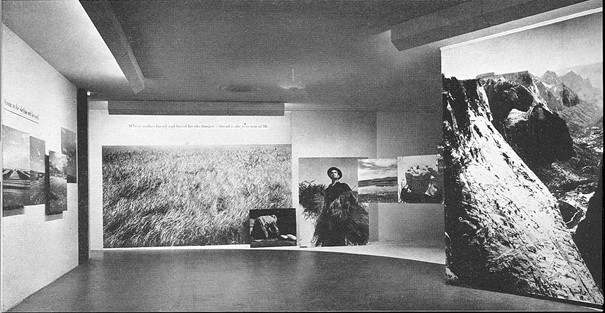
The Road To Victory And Beyond
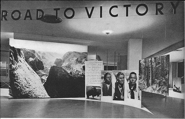
So in my ersatz zigzagging through the history of photomurals, I kind of skipped from Edward Steichen’s landmark Family of Man exhibition in 1955, where Paul Rudolph deployed enlarged photo prints for content and experience, as well as architectural elements in his exhibition design; to Capt. Steichen’s 1945 exhibition Power in the Pacific, which featured the work of the US Navy photography unit he commanded; to Steichen’s participation in MoMA’s first photography exhibition ever, a 1932 photomural invitational, which was intended to serve as a showroom for American artists, who faced stiff mural competition during the Depression from south of the border.
Sensing a trend here? Wondering what I missed? Wow. Michael from Stopping Off Place just forwarded me the link to MoMA’s bulletin for Road To Victory, a stunning 1942 photo exhibition that rolls up so many greg.org interests, it is kind of freaking me out right now. And the man who is bringing it to me? Lt. Comm. Edward Steichen.
I mean, I kind of stumbled onto the photomural trail last October, when a vintage exhibition print of Mies’ Barcelona Pavilion came up at auction. Its size, scale, and iconic modernist subject suddenly made the photomural seem like a missing link in the contemporary development of both photography and painting. And yet it’s also seeming like not many of these pictures survived, because they were merely exhibition collateral, functional propaganda material, no more an artwork than the brochure or the press release.
And yet these things existed. Is it possible at all that any of these prints still exist in some art handler’s garage?
Anyway, it’ll take me time to process this Road To Victory show, so I’m just going to skip across the most stunning parts: the show’s awesome, explicit propagandistic objectives; the utterly fresh painterly abstraction of these giant prints; the spatial, experiential design of Herber Bayer’s installation; the texts surrounding the exhibit, which traveled around the country in 1942 to apparently wild, patriotic acclaim; and the ironic, complicating aspects of authorship of the show and the work in it.
[Hint: they barely identify, much less mention the actual photographers at all. I, meanwhile, am happy and grateful to credit PhotoEphemera for these small versions of much larger scans of MoMA’s 1942 documentation of the show. Definitely worth diving into.]
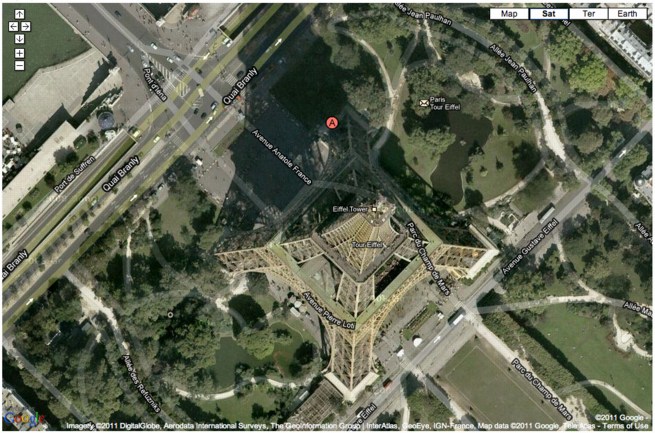
La Tour Eiffel Vu En Ballon
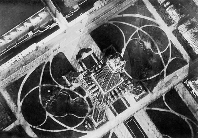
In 1909, balloonist/photographers André Schelcher and Albert Omer-Décugis took this picture from about 50m above the top of the Eiffel Tower. It is one of 40 images they published that year in a book titled, Paris vu en ballon et ses environs.
I just found it in my new Leon Gimpel catalogue, but it turns out to be included in Thierry Gervais’ 2001 article on the beginnings of aerial photography, which I posted about before.
With that angle, I would’ve said Schelcher’s photo looks more Bing than Google Maps, but Google’s got it.
Previously: Le début du point de vue Google Mappienne
MIchael Wolf Wins World Press Photo Honorable Mention For Google Street View Photos
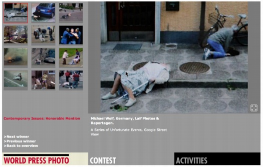
Michael Wolf thought he would be provoking a heated response when he entered four of his series of Google Street View photos in the World Press Photo competition, and he was right. The “A Series of Unfortunate Events” project was awarded honorable mention in the Contemporary Issues category, and some folks are kind of freaking out about it.
At least that’s how the issue is being framed by the British Journal of Photography, who spoke with Wolf:
The work, he tells BJP, is his own. “I use a tripod and mount the camera, photographing a virtual reality that I see on the screen. It’s a real file that I have, I’m not taking a screenshot. I move the camera forward and backward in order to make an exact crop, and that’s what makes it my picture. It doesn’t belong to Google, because I’m interpreting Google; I’m appropriating Google. If you look at the history of art, there’s a long history of appropriation.”
I love that: “The work, he tells BJP, is his own.”
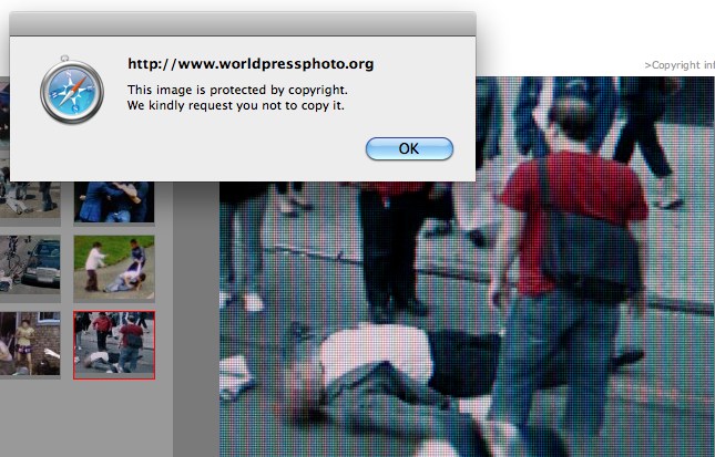
Appropriation’s all well and good, but the art history of rephotography is hardly controversy-free: folks like Sherrie Levine and Richard Prince have both faced the IP wrath of their subjects’ original photographers.
But it’s interesting that Wolf finds his ownership and authenticity in such a contested process as rephotography, though, considering that it was not previously stated or clear.
And when he praises the World Press jury for making “such a conceptual leap,” he’s not referring to this appropriation strategy, but to recognizing “someone that photographs virtually.” Except that he’s so emphatic about not photographing virtually.
I’m sure it’s bold, and I’m sure it is a lot of conceptualism for the photojournalism system to handle, but it sounds like Wolf wants it both ways. He insists his finger on the button preserves his photojournalistic credibility, and there’s no doubt that the Series of Unfortunate Events images he submitted have powerful composition, content, and emotion. As I said before, they look
like archetypal on-the-scene photojournalism, only stripped by any news or context other than place. Though Wolf himself eliminates any place specifics or links, leaving each image to stand on its own.
By completely decoupling these images from their context, from their most basic metadata, even, Wolf is not creating photojournalism, he’s subverting it. He’s finding the images photographers would die to shoot, and then tossing out even the incomplete scraps of geospatial information Google provides for them. Even as he delivers the compelling visual goods, Wolf has obliterated not just the idea that these photographs “mean” something; he’s undermined the photographer’s traditional authoritative role as a witness to the events in his images.
What Wolf is doing is not photojournalism, it is art, art that calls the whole construct of photojournalism into question. No wonder the shutterbugs are pissed.
I’m still surprised to not hear more critical awareness of Google’s role here. If anything, Matt Lutton’s defense of Wolf’s photographic chops seems to wilfully ignore the aesthetic and conceptual implications of Google’s project:
Since everything is photographed in Google Street View, nothing is. It’s a mirror with no intention, art, journalism, or perspective. The photographer, by choosing what he makes a screenshot of (and we’d be fine with this winning if he only made screenshots, by the way) is making the photographs, framing them, choosing what to show. Google did none of those things. Even a screen-grab, if you are composing and choosing a moment, is a photograph.
Anyway, kudos to Wolf, sympathies to the photojournalists, I’ll just be on my way.
World Press Photo: Is Google Street View photojournalism? [bjp-online.com]
Some thoughts on Google Street View and World Press Photo [dvafoto.com via @nancyproctor]
Michael Wolf’s website [photomichaelwolf.com]
my Google Art Project, part 1
Previously: Michael Wolf, Street View Photographer
White House News Photographers Upset At Staged Photos They Don’t Take
Spies Like Us
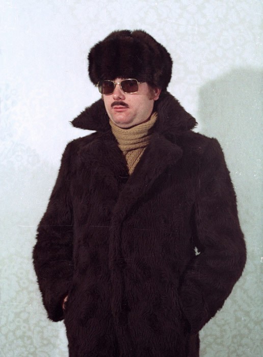
Demonstration from a STASI disguise workshop, via Simon Menner
If Germany’s a little touchy about Google’s Street View panopticon, maybe it has something to do with how, for the last half of the last century, half the country was obsessively spying on each other.
At Conscientious, Simon Menner writes about his utterly fascinating look at the visual and photographic legacy of the STASI.
Things Magazine on Menner’s project: “The aesthetic appreciation of banality is very much a luxury of free democracy.” Ouch.
Simon Menner | Images from the secret STASI Archives [jmcolberg via c-monster]
Mientras Tanto En Mexico,
While poking around online about Tate Modern’s version of the Gabriel Orozco retrospective, I found this rather incredible letter from 2009, written, apparently by Orozco himself, to his dealer Jose Kuri. The letter is an ostensibily-but-not-really private round in an ongoing, public, critical battle for some kind of primacy within the Mexican art world.
Orozco defends and praises his own success and innovation–to his own dealer–while slamming both other artists [cough, Santiago Sierra, Francis Alys] and their critic/curatorial champions [Cuauhtémoc Medina, who I will be adding to the greg.org art pronunciation list shortly.]
Anyway, this kind of veiled subtexts with an apparent academic impartiality and a deficient documentation, derive from a cheap historicism, where the talent of the individual to understand his/her moment, and to do the things that he feels like it and with it finding new art for life and for the work, will never be the reason for his success. If anything, it can seem incredible to those Mexicans, that a co-national has innovated and influenced other artists in the world, which, although is not mentioned -in the breakdown of the ingredients for my success-, is a measure and perhaps the main reason for the success of my work in this years. Novelty, not exoticism, is what makes fortune. And the one that makes something before the others becomes an essential reference point. Success came after the creation of something new… which was successful.
Wow, OK. I have been a diehard fan of Orozco’s work for almost 20 years now; I still see him as having a formative influence on my eye, and on the whole way I see the world in relation to art. Or to his art. And maybe I just don’t/can’t appreciate the nationalist/politicized context in which this debate is occurring.
But I’m trying to come up with examples of other artists who aren’t Julian Schnabel who take such on the record personal affront. I guess Rob Storr loves to deal out the smackdowns, too. Anyway, the Centre For The Aesthetic Revolution has the whole thing. Definitely check it out.
GABRIEL OROZCO ‘THE SECRET OF HIS MIRACULOUS SUCCESS’ A LETTER TO HIS GALLERIST IN DEFENSE OF SOME OF HIS CRITICS [centrefortheaestheticrevolution]
Also from the Centre For The Aesthetic Revolution, word that the Hotel Palenque has finished the renovations, and is open for business. This apparently happened some time between Robert Smithson’s drunken slide lecture about it in 1972 and the arrival of the Google Street View coche.
Google Art Project: The Making Of
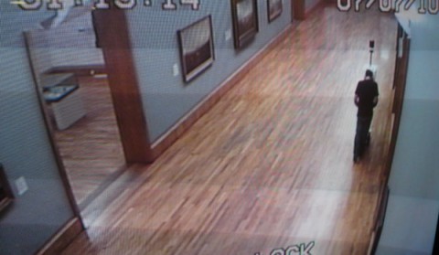
Now we’re getting somewhere. James Davis was Tate Britain’s pointman for the Google Art Project, and he gives an interesting behind-the-scenes account of getting locked in the museum with the Street View Cart overnight:
[It] seemed to me to be a marvellous combination of garden-shed and cutting-edge.
The trolley was not simple. It had lasers and cameras and GPS and all sorts. You could not stand in its view, for fear of being captured. Yet it could see you, left right, up down, back and forth and everywhere in between. So it must be operated by a squirrel (a trained man with a perfectly shaped back) who hides in its visual wake and guides it through the rooms.
Of course, Davis accidentally [sic] found his way into a shot. He’s the one with the blurred head.
Google Art Project: Behind the Scenes
Trolleys in the Gallery [blog.tate.org.uk]
Previously: Street View and “accidental” self-portraiture
Google Ramp View, Or My Google Art Project, Part 2
Sometimes I can’t tell when something is obvious, or when it’s just obvious to me.
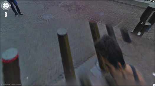
But whichever this was, the idea came to me as soon as I figured out that the unidentified guy who was photographed at least 62 times in Google Street View’s mapping of the Binnenhof in The Hague was almost certainly a Google employee and not, in fact, a tourist who happened upon the Google Trike, figured out what it was up to, and followed along, quietly but persistently inserting himself into the company’s massively ambitious effort to map, photograph, and simulate the entire world.
Obviously, someone should quietly but persistently insert himself into the company’s massively ambitious effort to map, photograph, and simulate the entire world. And if the algorithms that stitch those panoramas together are going to erase everything but the top of that guy’s head, it might as well be me.
Google Trike and Google Guide at Kasteeltuinen, the Netherlands
Not to say that the Binnenhof Walking Man didn’t plan and execute his awesome portrait series–an inside job–but just to make sure, it’s important to re-create it by following a Google Trike somewhere. But where? Google’s been using the Trike as a non-threatening promotional tool, running contests to gin up excitement about where it should roll next. So anywhere the company would be likely to go on its own is already, by definition, a somewhat compromised artistic context.
And just angling to get your picture on Street View’s no good, either. There are plenty of people who ambush the Street View camera, or who react to or engage it, whether as an act of protest or “Look, ma, I’m on TV!” giddiness.
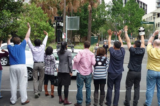
man with panda puppet, others waving at the Street View car in Sydney [via smh]
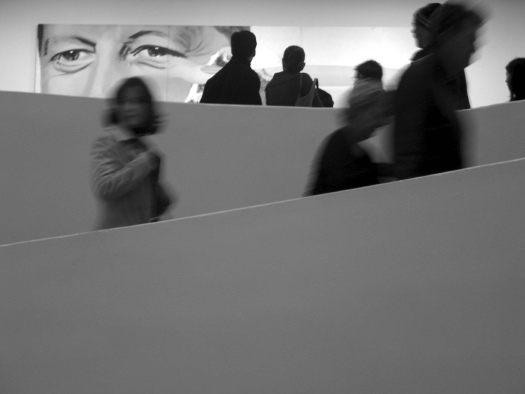
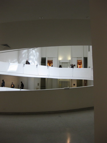
So it would need to be an art context. That’s a Google Trike no-brainer, or at least Google Trike-compatible. Ideally, it’s interesting in its own right, spatially, architecturally. If it had some spiraling and doubleback elements that could help replicate the atemporal incongruities of Walking Man’s walk around the Binnenhof. Is it obvious yet?
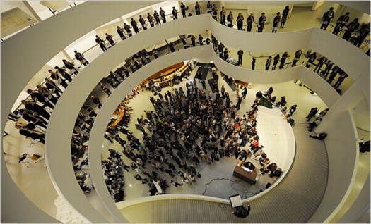
Henry Brant’s “Orbits” performed in the Guggenheim rotunda in 2009 [via nyt]
The real problem I saw for taking the Google Trike into the Guggenheim and up the ramp was neither logistics nor permissions. The Google Trike’s first outing was offroad, on far rougher, steeper terrain than Frank Lloyd Wright’s rotunda would offer. And the Guggenheim has obviously made itself available for artists’ productions, from Matthew Barney to Vanessa Beecroft to Francesco Vezzoli.
via newyorkinfrench.net
Even curatorially, the obstacles did not seem insurmountable. In 2010 Nancy Spector launched Intervals, a site-specific projects series that was inspired by, among other programs, Hans Ulrich Obrist’s Migrateurs projects at the Musee d’Art Moderne in Paris. In a 2009 interview Spector did with Sarah Hromack, she tapped one of my formative memories of the Museum:
SH: It’s a compelling space. Frank Lloyd Wright tucked many interesting details into the museum’s tertiary areas; they are so easily overlooked.
NS: The triangular staircase, for instance, is a beautiful space. It has been rarely used by artists-in fact only twice if I recall correctly: in theanyspacewhatever exhibition Douglas Gordon installed his phrases in the stairwell. And Felix Gonzalez-Torres installed one of his light strings in 1995.
She went on to describe Intervals as interesting artistic responses to “situations that could be perceived as marginal.” Forget marginal; there’s nothing more marginal than not appearing in the museum in the first place. I figured that the best way to execute Walking Man was to not exhibit it at all, but just to let it appear, and be found organically on Street View itself. No announcement, no press release, no opening; one day it’s just there to be discovered.
And that is where I was confounded. The biggest obstacle I saw was persuading Google to ever be interested in adding the interior of any building–even one as awesome and iconic as the Guggenheim–to Street View.
via keithbradley’s flickr
When I went to the YouTube Play event at the Guggenheim last fall, I’d discussed a bit of this with Spector, and later, when talking about the Binnenhof series with a Google PR, I floated the idea of bringing the Trike up the ramp. In retrospect, now that I know the Google Art Project was well under way, and Street View images from 17 museums were already in the can, her bemused and slightly cagey responses make more sense.
via rhino8888’s flickr
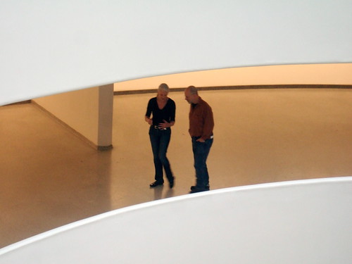
So now the idea’s out there, but the context is somewhat changed. Seeing the Guggenheim’s rotunda on Street View would now generate less surprise than it would have a couple of weeks ago. But the modernist, curved abstractions and planes would still make for the most spectacular interior on Street View. Better than Versailles, you ask? Well, let’s put the Gugg on there and find out!
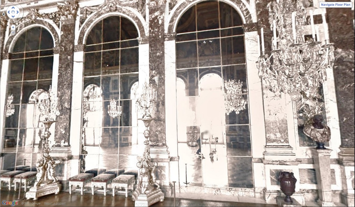
Oh look, there’s the guy pushing the Street View camera through the Hall of Mirrors!
And it really is and should be about the space. The other idea that seemed crucial to me was shooting the rotunda empty, focusing on the architecture [and avoiding the rights clearance issues that blurred half the artworks on MoMA’s Street View foray.] That means mapping while the rotunda is closed for deinstallation of a show. Have it full of crates, or workers–populate the panos with the staff themselves, make it a [blurred out] portrait of the Museum as an organization and a network as much as a space.
Anyway, that’s the idea.
My Google Art Project, Part 1A
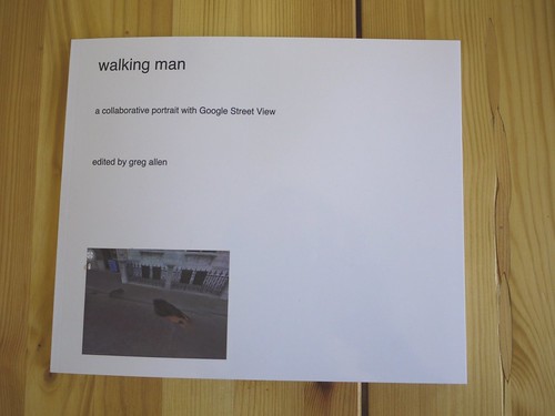
Here’s the introductory text I wrote last Spring for Walking Man – A Collaborative Self-Portrait With Google Street View. I made some proofs, but I’m still figuring out the best size. If I do decide to publish it, I may polish up the title a bit.
And I’ll probably revise it. Street View’s imagery and technique seems to me to turn a lot of critical thinking about photography on its head, but as much as the theoretical implications fascinate me, every time I start writing about them, I feel like a poseur.
As ongoing enhancements and even promotional stunts like Google Art Project affirm, Google executives are working to make Street View the primary tool for us “visual animals,” a browser for the physical world. Robert Smithson wrote about studying massive infrastructures like dams to discover “unexpected aesthetic information.” Google is creating the most massive visual infrastructure project right now, and it is chock full of unexpected visual information.