
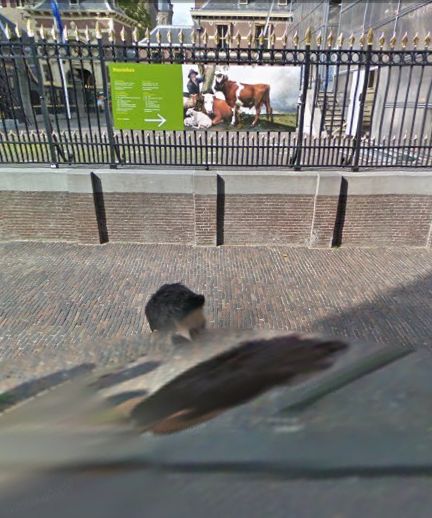
Last February, I realized that the subject of this awesome, distorted Google Street View portrait was not just a random pedestrian. Hundreds of thousands, if not millions, of people around the world have been photographed once by Google’s roving, robotic cameras. This guy appears at least 63 times.
binnenhof 01, all images 2010
Category: google
‘The Excess of Unimportant Information’
Though to a guy making something called Atlas in his spare time it still probably feels pretty empty and limited, Gerhard Richter’s website is pretty expansive. Via Twitter, we learn that his web elves have just added a quotes section, most of which is taken from Gerhard Richter: Text. Writing, Interviews and Letters 1961-2007 (2009), the UK edition of the artist’s second collection of writings, both of which were edited by Hans Ulrich Obrist.
I was about to bit the bullet and buy the expensive, out-of-print The Daily Practice of Painting: Writings 1962-1993 when the new edition came out, and I’ve hesitated, waiting to see how or if the two volumes overlap. So far, I’ve seen nothing; I guess I’ll have to pigeonhole Hans-Ulrich at the next global 24-hr art lecture marathon.
Meanwhile, I went ahead and bought Gerhard Richter: Writings 1961 – 2007, the US edition, so I’m just a couple of days away from seeing whether this awesome quote about blurring from 1964-5 [!] is, in fact, on page 33:
I blur things to make everything equally important and equally unimportant. I blur things so that they do not look artistic or craftsmanlike but technological, smooth and perfect. I blur things to make all the parts a closer fit. Perhaps I also blur out the excess of unimportant information.
We Are All Google’s Art Project
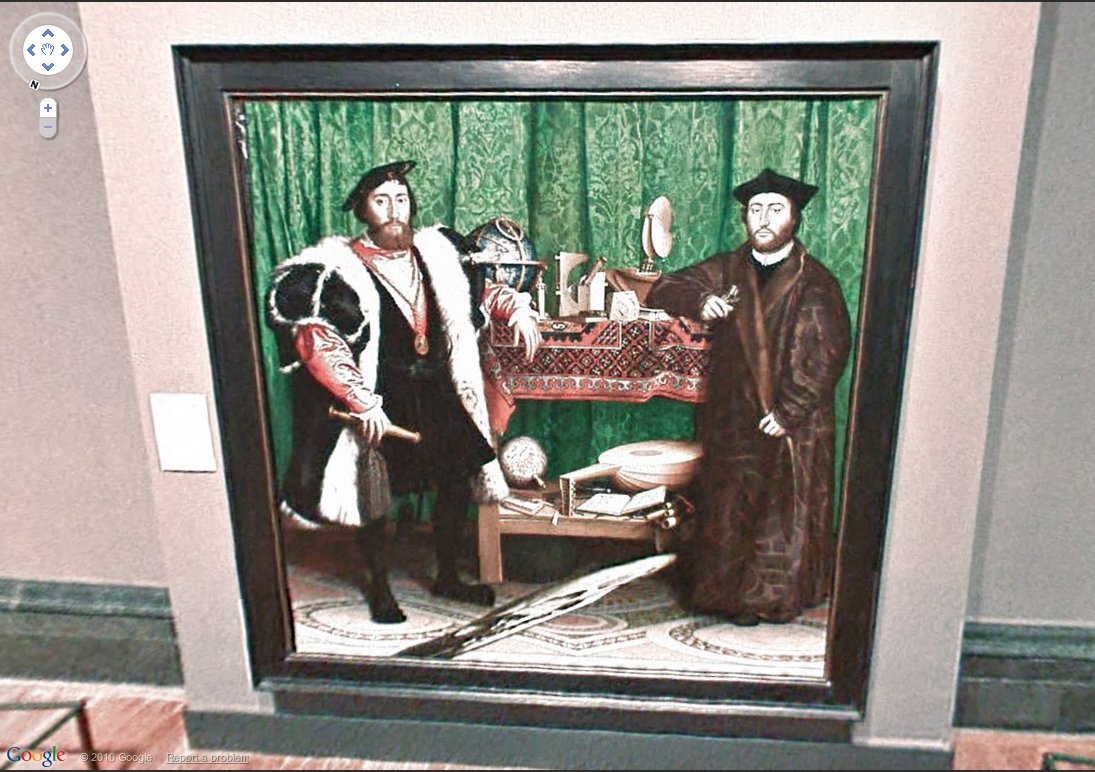
Nice, someone on the Google Art Project has a sense of art historical awareness, or at least a sense of humor. The gallery included in the British National Gallery contains Hans Holbein the Younger’s painting The Ambassadors, which is famous for containing an anamorphically distorted skull in the foreground.
Which is similar to the distorting effects created by stitching panos together in Google Street View. They can launch pictures of paintings in virtual museums all they want, but the truth is, we’ve been living in Google’s Art Project for quite a while now.
Previously: “Google’s Cubist-meets-Robert Lazzarini-meets-Julia Scher-meets Hans Holbein the Younger portrait style.”
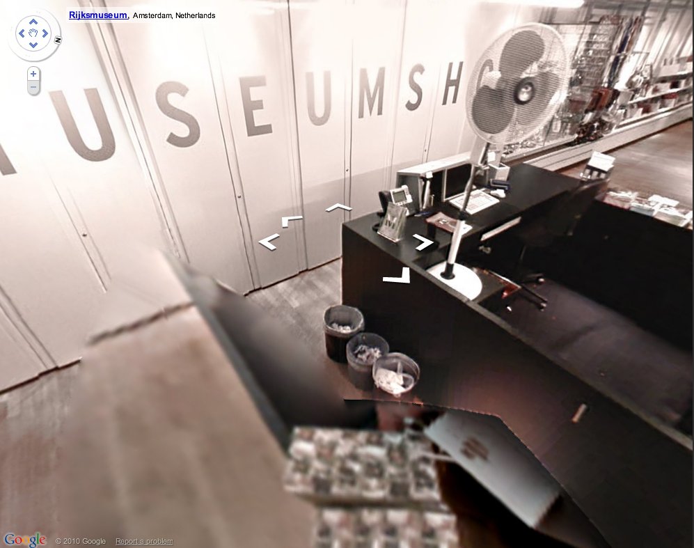
UPDATE: Oh boy, it looks like I could surf this all day. The Rijksmuseum’s selection for Google Art Project is the gallery with Rembrandt’s Night Watch, which is like the National Painting of The Netherlands or whatever–and the museumshop. Where Google’s distortive effects only enhance the absurdist tableau. I half expect to see Dali and some flying cats.
Alright, getting creepy now. Tate Britain’s gallery shows an installation about “Art and The Sublime.” It’s like Google’s stalking me. Is this some hypertargeted web content 3.0 beta? Can anyone else actually see this Google Art Project, or is it just me?
Les Blurmoiselles d’Avignon
Alright, this is kind of killing me right now, not just with its awesomeness, but because I have been planning to do a very similar project, and also because like half my blog these days could be called Google Art Project, and well…
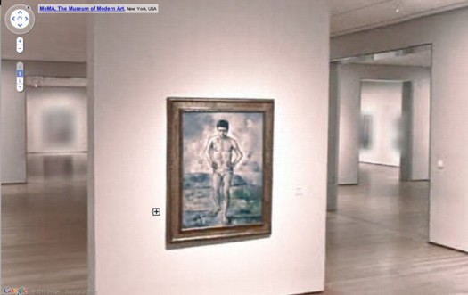
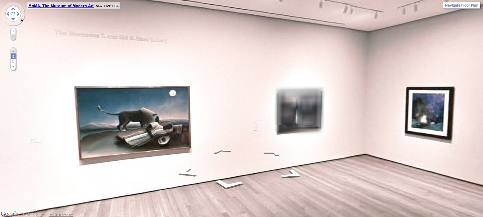
But let me agonize in private while we first praise the awesome. Google has released Street View-style navigation for galleries in seventeen major museums around the world, including the Museum of Modern Art. MoMA’s only got the lobby and one room on there, the first gallery on the fifth floor, which contains Cezanne’s Bather and Starry Night.
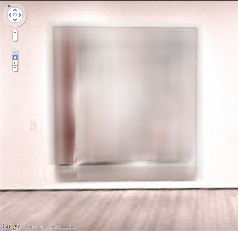
The resolution and color look awful, frankly, but who cares? It’s Starry Night as you’ve never seen it before–in an empty gallery. But still. Check out the background, what they had to do to all the artwork in the adjacent galleries, the stuff they didn’t clear the rights for:
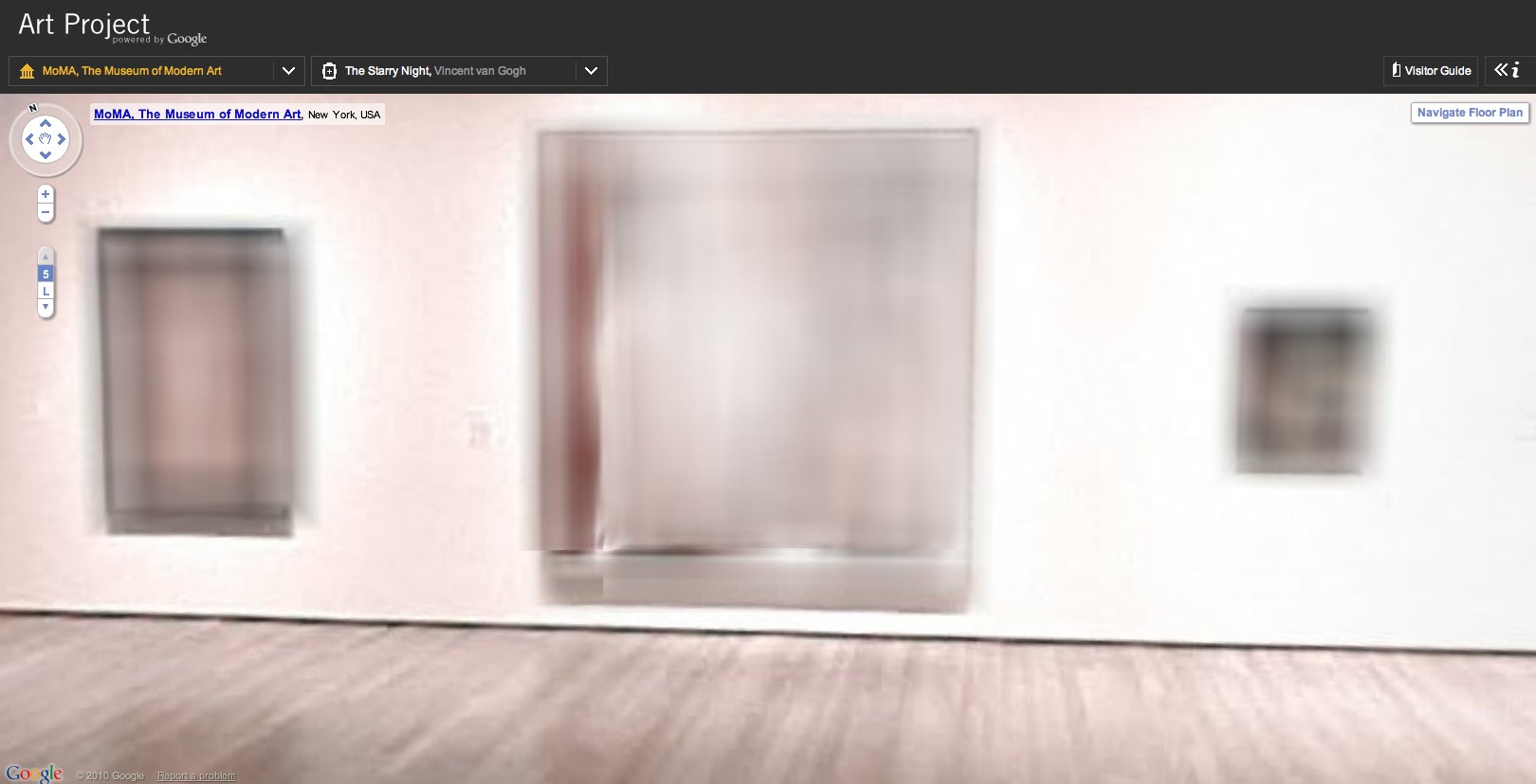
That’s Les Demoiselles d’Avignon there in the middle:
Which makes this, Picasso’s Boy Leading A Horse:
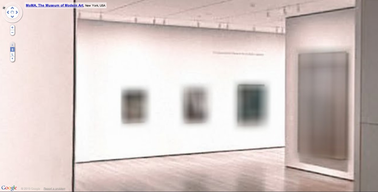
What’s crazy is that whatever’s hanging next to Rousseau’s Sleeping Gypsy is blurred out, too. By definition, it has to be in the public domain, right? 19th century? What is it?
The shoot for The Googlecam Was Present seems to have taken place almost a year ago; in the lobby, Marina’s still listed as “coming soon.” And they’ve rehung Gallery 1, there, so it’ll take a little flickrdiving to figure out what that was.
UPDATE: Thanks to MoMA scout Dan Phiffer, the work is identified as Edward Munch’s 1893 painting, The Storm.. [Munch died in 1944, so depending on which copyright regime applies, it may not enter the public domain until 2014. The image of the painting on MoMA’s website is rather boldly claimed to be copyright 2010 by the Munch Museum.]
But meanwhile, I’m prowling the other 16 museums for more blurred material. Richter must be so pissed right now.
Previously: Blurmany and the pixelated sublime
Sherrie Levine’s Meltdown series
Eye On Saarinen; Camo On MoMA; Photomural On Wall
You know what, it’s been too long since we had a good, old-fashioned photomuralin’ around these parts.
And one that combines a bit of Google Maps-ready, roof-as-facade architecture? And camo? Even better.
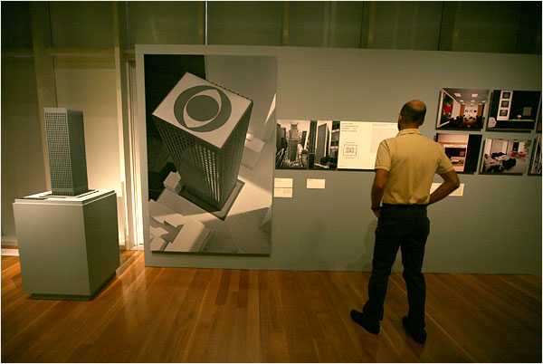
I only go to the Museum of the City of New York for their gala, and I’m the loser for it: because I missed “Shaping the Future,” curator Donald Albrecht’s Fall 2009 exhibition of Eero Saarinen.
The show included the 1939 model for the unrealized Smithsonian Gallery of Art, which he designed with his father Eliel, and which would have sat across the Mall from John Russell Pope’s just-finished neo-classical National Gallery.
But it also included some sweet, giant photos, as the NY Times’ slideshow shows. Check out the big CBS-eye view of Saarinen’s model for Black Rock:
The Google Maps reality is, alas, not so clean. Saarinen’s CBS HQ has the usual skyscraper cruft on the roof.
But fortunately, it’s right across the street from MoMA, where landscape architect Ken Smith’s 2005 Roof Garden is clearly visible. As the American Society of Landscape Architects noted when it gave Smith an award in 2009, the design is rooted in historic concepts of camouflage and the abstracted simulation of natural forms.
And speaking of simulation, check out this giant color photomural from the MCNY exhibition, which almost makes you feel like you’re right there in the living room of Saarinen’s 1953-7 Miller House [which the family recently donated to the Indianapolis Museum of Art].
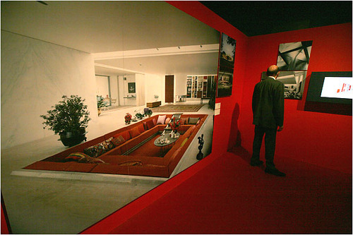
Weird, the angle of the Times photo really exaggerates the sense of perspectival space in ways that a straight-on shot like the one arthag took does not.
Review | Eero Saarinen: Shaping the Future [nytimes, for full-size images: Librado Romero/NYT]
Stedenboek
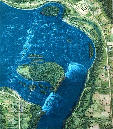
This just in from the greg.org Department of Stunningly Beautiful Digitized Maps of The Netherlands:

Bibliodyssey has some highlights from the National Library of the Netherlands’ fresh upload one of the rarest and most beautiful atlases in history, mid-17th century Dutch cartographer Frederik de Wit’s Stedenboek, or Book of Cities.
Who knew that the Dutch had such a long, rich, aesthetically awesome history of defense-related polygonal alterations of the urban landscape?

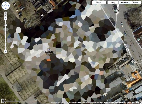
At least maybe now we have some idea where that crazy camo blob in Nordwijk came from:
Stedenboek [kb.nl]
Dutch City Atlas [bibliodyssey]
Matrix Or Minecraft?
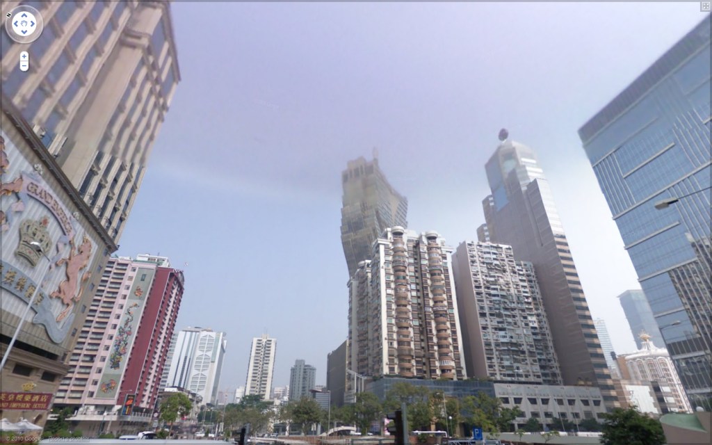
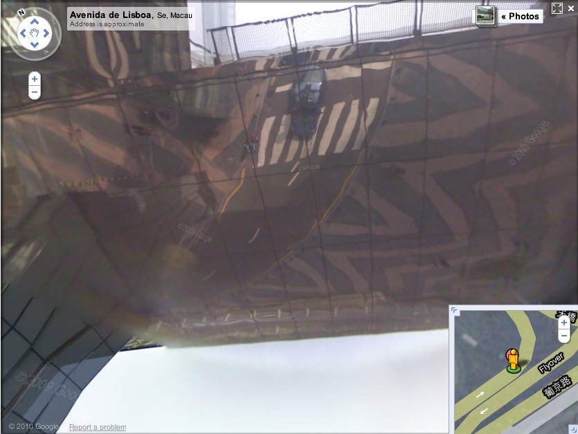
Via one of my Senior Street View Scouts John comes this eerie shot from Simple Ranger’s Street View essay of Macau. [Here’s the live link.]
Seriously, is that building real? Even if I wander over to look at it up close, my doubts only increase.
And frankly, looking up at the sky and seeing the Google Street View car reflected in the curved, mirrored underside of the Grand Lisboa Casino’s elevated pedestrian walkway is not helping.
Bondeno Street View
Compared to Germany’s digital scrim effect, the Italian Google Street View opt-out regime is extraordinarily, even romantically, naturalistic.
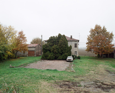
Haha, no. It’s a photo from Elmar Haardt’s careful and unassuming project documenting Bondeno, a seemingly unremarkable small town in Ferrara. [via the incomparable mrs deane]
What I Looked At Six Months Ago: Douglas Coupland’s Roots Paintings
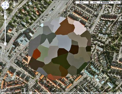
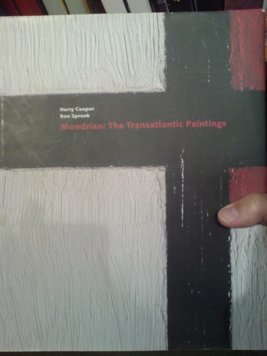
Holy smokes, it’s been 15 months since I found the Dutch Camo Landscapes on Google Maps; just over a year since I started systematically screengrabbing them; a little less than a year since Google’s particularly beautiful Delaunay triangulation distortion was replaced by a more typical pixelation algorithm; and about the same time since I last posted one of the “What I Looked At” installments, where I tried to figure out how to approach painting these things by studying the techniques of other hybrid, found, hard-edge, geometric digital, photographic, reductivist, surveillant, abstract, or Dutch Landscapes. Folks from Albert Cuyp and Picabia to Arthur Dove and Sheeler to Mondrian to Sherrie Levine [below].
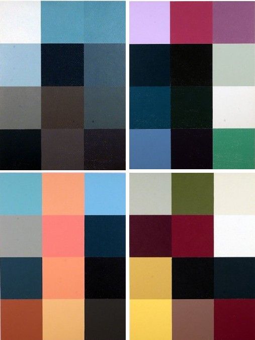
The longer I take to think about how to paint without actually trying to paint, the more I keep accumulating and questioning potentially resonant work. And I wonder: what would it mean to consciously appropriate someone else’s technique? if I taped my edges, would there be more of a connection to Odili Donald Odita? If I made little polygonal stencils and squeegeed, would it be too Brillo? Is there an implication in the kind of precise painterly edges of Mondrian as opposed to the surprisingly tentative edges of Sheeler, or the just-fill-it-in forms of Dove? Should I skip the paint, and just blow those bad boys up and print the hell out of’em on the biggest canvas/paper I can find?
It [basically, obviously] boils down to some ongoing uncertainty or doubt or skepticism or insecurity or whatever over whether these things should exist. Emphasis on things and should. Does everyone who makes stuff feel that? It’s like Baldessari’s classic fortune cookie of a painting, “I will not make any more boring art,” but with the make in flux as much as the boring. I just remained unconvinced about the justification for these images as objects. [On the “bright” side, like the unshot film in the director’s mind, the unmade artwork does remain perfect–for me, anyway.]
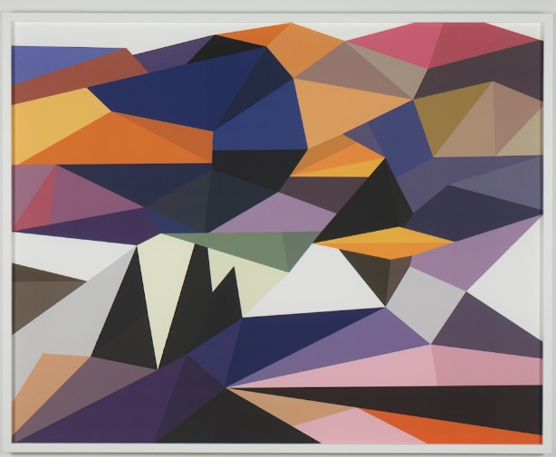
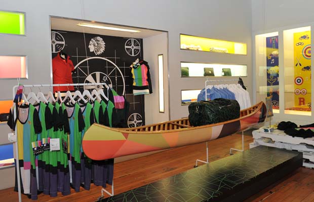
Anyway, all this comes to the fore because last summer, I saw images of some polygonal abstracted landscape paintings by Douglas Coupland, which were part of, or inspiration for, or somehow connected to, the Fall/Winter clothing and home furnishings colabo he designed for the Canadian retailer Roots. They were exhibited and for sale in Coupland X Roots pop-up stores in Vancouver and Toronto.
There was zero info online, so last summer and fall, but I deduced that they were digital reductions of iconic paintings by the Group of Seven, the early 20th century landscape painters who rather self-consciously set out to create a national cultural and visual identity for Canada via its landscape. Coupland’s Roots collection was an extension of that national branding project, only he referenced the unifying forces of electrification, television, and moose logos.
At least that’s what I gleaned from the web and press releases. I tried in vain to get any information on the paintings from Roots, Coupland, or his galleries, but it was total radio silence. So I ignored them back. Only now, as I check back, do I find that “culture guru” Coupland has a show up of the paintings, through this week, at Monte Clark Gallery in Vancouver. Faux-encrypically titled G72K10, the paintings turn out to be exactly what I thought they were.
“Thomson (Sunset), 2010, Oil on canvas, 58 x 72 inches” image: monteclarkgallery.com
To a point. Because though the captions say things like “oil on canvas” and “acrylic and latex” and “unique pigment print” it is completely unclear whether the images on the dealer’s website are of the objects themselves or of their digital sources. Maybe it doesn’t matter to Coupland. Here’s how the gallery describes them:
By digitizing the likeness of specific works, Coupland has produced large-scale hard-edged paintings on canvas, presenting his own vision of the Group of Seven in 2010.
Doesn’t sound like he’d use something as retardataire as a paintbrush for a forward-looking project like that. Though it’s hard to tell from the jpg, the date on this unidentified type of limited edition print being auctioned next month by the Writers’ Trust looks earlier than 2010. Or not.
So while I still can’t decide if my painterly obsession is a vice, Coupland’s project is at least makes clear that materialist indifference in the pursuit of digitized aestheticism and conceptual slickness is no virtue.
Browser Tab Cut Or Run
So much to blog, so little time. I may have to institute a new practice of dumping my interesting-looking browser tabs if I don’t write about or use them within a month, or blogging about them.
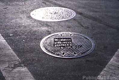
For example, ever since seeing a Le Corbusier manhole cover from Chandigarh sell for almost EUR18,000, I’ve been meaning to take this list of locations for Lawrence Weiner’s 2000 Public Art Fund project, and see which of his 19 downtown manhole covers looks the most lootable. But you know how it is with scheduling, holidays, pangs of conscience, snow, &c. &c…
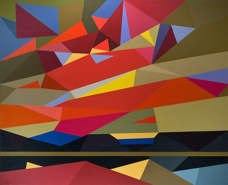
So via Zelkova’s long essay on interactivity and digitization, I find this intriguing 2003 project, C & C, from the Lyon design studio Trafik. Joel, Pierre, and Julien all responded [merci, fellas!] to explain that C & C began as an exploration for a method to create designs for a handmade carpet. So they created a program in C that used the 3D coordinates of shapes created in Autodesk 3ds Max [above] to generate a 2D vector graphic [below].

Needless to say, I like the translational aspects of the project almost as much as I do the Dutch camo landscape-like polys.
One nice consequence of my recent Short Circuit research is seeing and reading up on Sturtevant. From Bruce Hainley’s Aug 2000 essay in Frieze:
As Sturtevant puts it: ‘Warhol was very Warhol’.
This is a complicated statement. How did Warhol get to be ‘very Warhol’? How does one come to recognise – see, consider – a painting, film , or anything by Warhol once he and everything he’s done are slated only to be ‘a Warhol’? It is Sturtevant who knows how to make a Warhol, not Warhol. It is Sturtevant who allows a Warhol to be a Warhol, by repeating him. Copy, replica, mimesis, simulacra, fake, digital virtuality, clone – Sturtevant’s work has been for more than 40 years a meditation on these concepts by decidedly not being any of them.
I’m kind of disheartened by how interesting Chris Burden’s post-minimalist undergraduate work sounds in this fully illustrated repro of Robert Horvitz’s Artforum cover story from May 1976 [volny.cz]
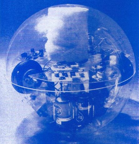
Via the awesome cyberneticzoo.com comes Toy-Pet Plexi-Ball a the 1968 artist/engineer colabo sculpture by Robin Parkinson and Eric Martin, which was included in Pontus Hulten’s MoMA show, “The Machine: As Seen at the End of the Mechanical Age.” The light-and-sound-activated Toy-Pet rolled around the gallery following viewers, until you put it in its fake fur bag. Which made it look like a tribble. Which can’t be a coincidence, can it, Pontus? If you have an engineer collaborating with an artist a year after the Star Trek episode airs?
Awesome kinetic/robotic artist James Seawright was one of the six artists–along with Aldo Tambellini, Thomas Tadlock, Allan Kaprow, Otto Piene, and Nam June Paik–who contributed to WGBH’s groundbreaking TV show/happening The Medium Is The Medium. Which is right in front of my face. And I’ve been staring at everyone but Seawright and Tadlock for a year. At this rate, I’ll be fawning over Tadlock sometime next summer.
Since my Google Street View Trike book project is entirely about the subject, I suspect I’ll keep Olivier Lugon‘s November 2000 Etudes Photographiques essay, “Le marcheur: Piétons et photographes au sein des avant-gardes,” open a little longer. Along with the Google translation.
Italian Line, Farm Journal
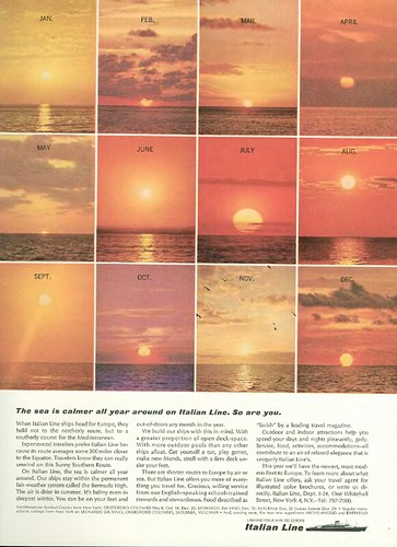
The New Yorker obsoleted my old New Yorker Magazine Database by finally letting Google index their website and adding a search function, and making their archive available online, and that’s as it should be.
But whenever I browse the DVD facsimile of the magazine’s archive, I am reminded of how much content remains unindexed and invisible. So maybe it’s time to liberate the vintage ads of the world from their back issue prisons. Because if I can find ads this awesome completely at random, don’t you wonder what else is out there?
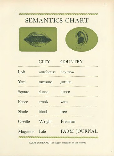
Haymow!
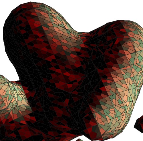
Blurmany: The Dortmund School
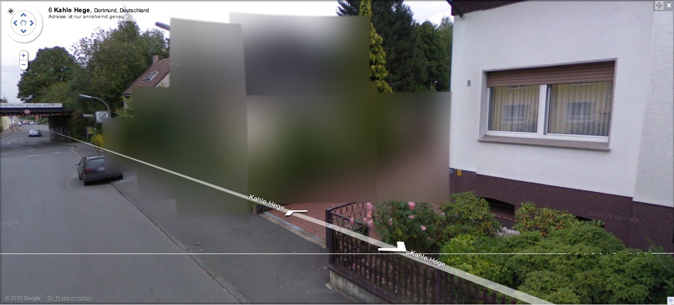
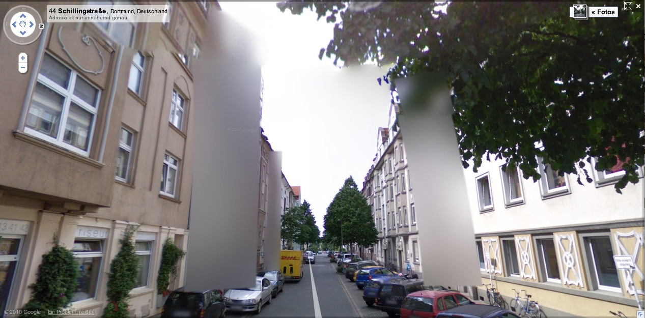
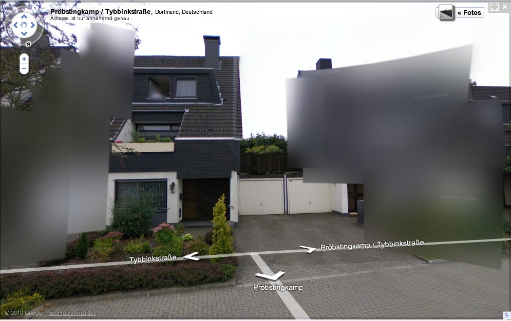
More of Germany is appearing on Google Street View, and we can start to see what 240,000 blurred out residences looks like in a country of 8 million-plus: a lot. Far from being a marginalized fraction, the blurred structures pop right out; they’ll be the prominent, even the defining feature of Google’s virtual German landscape.
[How ridiculously cursory is this opt-out scheme, by the way? Does the blur go with the house, or the owner? Can an owner take his Street View privacy with him when he moves? Will blurred residences have an easier or harder time selling? Who gets to decide to blur a multi-family apartment? The landlord? A majority of the tenants? Whatever else they think of it, Germans should recognize that this blurring is unsustainable as it stands, and that Google is certainly treating it as a transient fix for getting through the immediate political situation.]
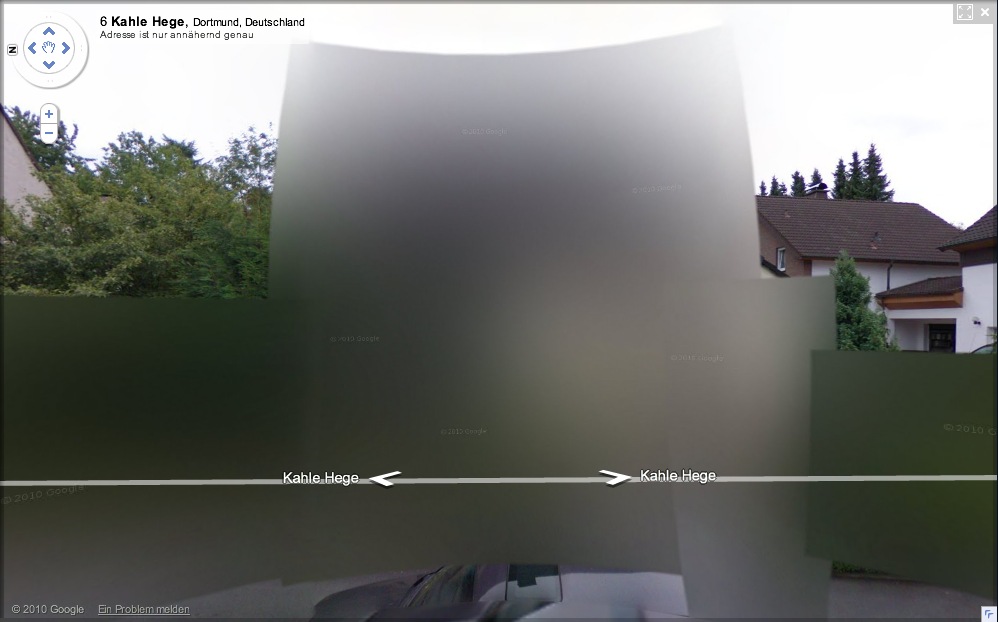
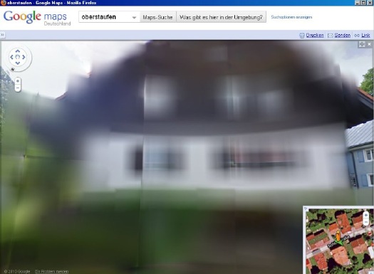
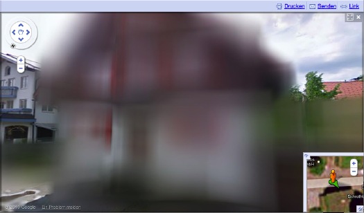
And in just a matter of days, it seems that the algorithm Google is using to blur out the houses has changed. The result, as seen in this completely random collection of houses I just surfed up in Dortmund, is all blur and no pixel.
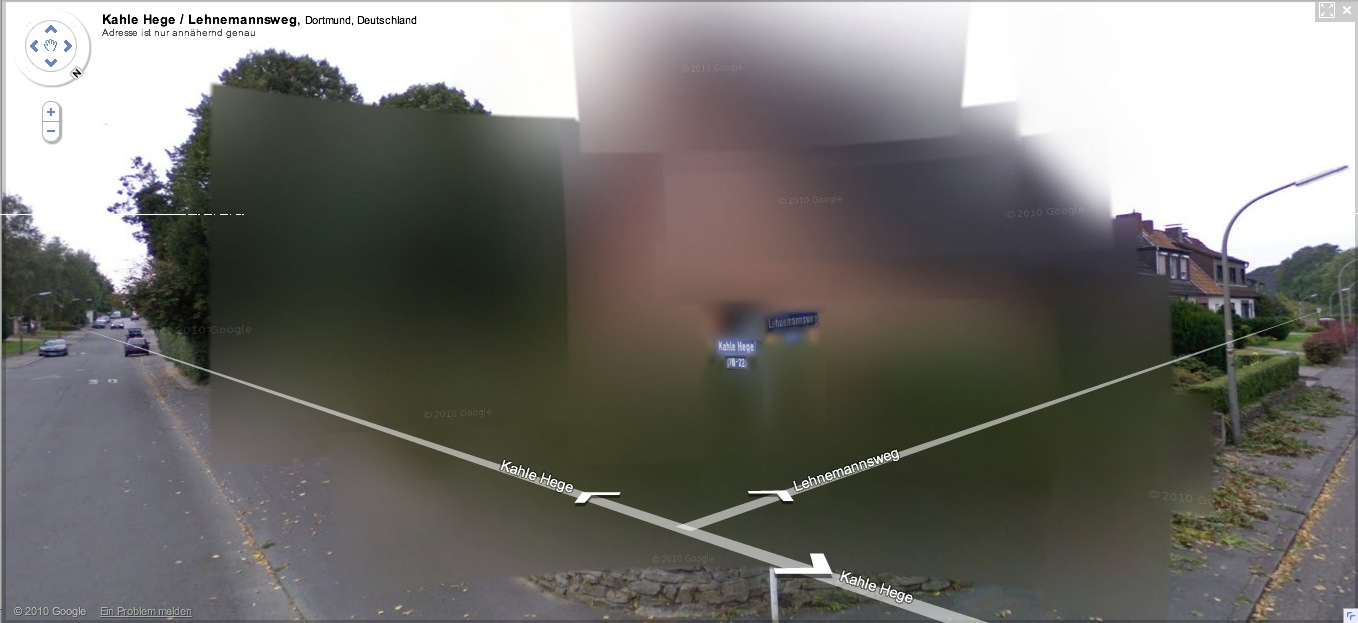
It’s also distinctively planar, with large, overlapping, color-averaging tiles, like looking through scrims or through a construct of semi-opaque glass. If they’re still Richters, they’re the glass paintings,
![]()
as assembled in space by Helio Oiticica.
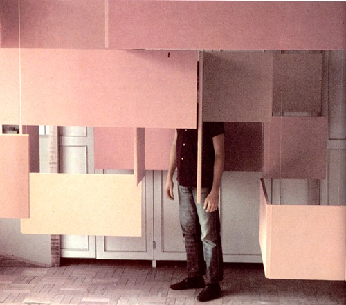
At least that’s what I’d probably use to reconstruct the blur structures in real life. Probably set up a very slight scaffolding of polycarbonate sheets, experiment with the films and filters to get the right optical effect. And then rephotograph the whole site.
Without searching through the German web, I’ll naturally assume that I’m the first to think of this brilliant artistic idea. But I’m just as sure someone on the ground will beat me to the execution. And as Germans acclimate to this Street View, I’m sure that the Blurman landscape will begin to creep into the aesthetic consciousness in a whole host of ways.
Previously: Blurmany and the Pixelated Sublime
Blurmany And The Pixelated Sublime
Ausgezeichnet, this is so awesome.
Amidst a fierce, ongoing, politicized debate, Google has released the first Street View panoramas for Germany. To assuage privacy concerns, the company is allowing homeowners to assert their Verpixelungsrecht, that is, their Right to Pixelation.
Some 240,000 locations are thus set to be blurred out. From what I can understand, though, the rollout is still in its early stages, and so only a handful of blurred buildings have gone live.
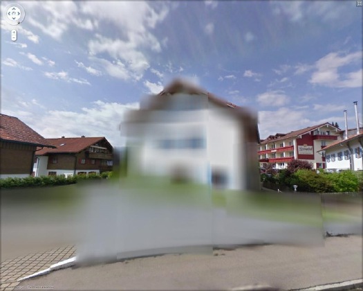
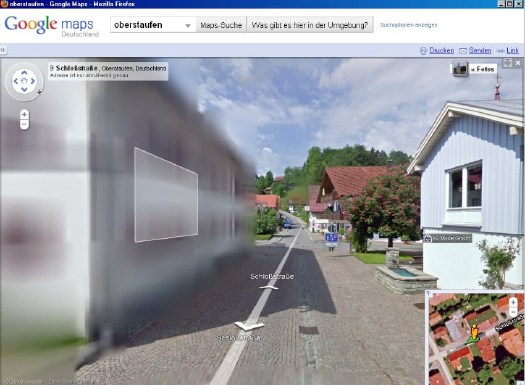
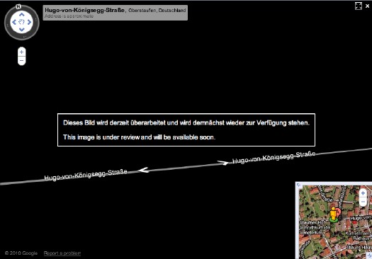
And the hunt is on. The few opt-out houses spotted so far have fed the media firestorm anew, and the examples cited by Der Speigel or FAZ [Google Translate] from Oberstaufen, the tourist village which first invited Street View to town, have been removed by Google “for review.”
At the center of the debate is my old blogging 1.0 buddy Jeff Jarvis, whose rather hyperbolic post on the subject, “Germany, what have you done?” was translated and republished by FAZ. [thanks greg.org reader/cinematographer Sanne Kurz, who tweeted about Jeff’s column.]
Sanne had referenced Germany’s complicated history of a giant state surveillance apparatus that elisted millions of citizens to spy on each other. Jeff’s having none of it:
This is not a matter of privacy. And don’t tell me it has a damned thing to do with the Nazis and Stasi; that’s patently absurd. If anything, the Stasi would have exercised their Verpixelungsrecht to obscure their buildings from public view, taking advantage of the cloak of secrecy the idea provides. That’s the danger of this.
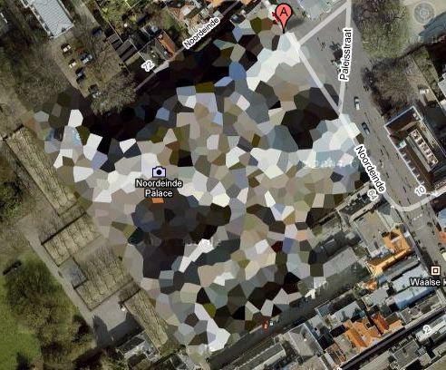
Well, who’s Stasi now, because that is exactly what is happening next door in the Netherlands, where the Intelligence and Defense Ministries actively distort the Google Maps imagery and block Street View access for dozens of sites they have unilaterally deemed sensitive. [Search greg.org for “Dutch Camo” for details, such as they are.]
While obscuring active military bases or the royal palaces may be justified for security reasons, the Dutch government’s Google Maps pixelation program also renders maps of entire villages and town centers unusable as it hides abandoned NATO weather stations–or nothing at all.
The state needs to be held accountable in its efforts at information control and censorship, but I can’t disagree more strongly with Jarvis’s unnecessarily extreme, incendiary language to criticize the individual assertion of some control over his own data. Referencing the Street View pano above:
Ugly, isn’t it? As someone in the audience said when I spoke on the topic at a meeting of the Green party in Berlin a few weeks ago, it is as if they are digitally bombing the German landscape.
Actually, no it isn’t, and–holy crap, wtf?–no it isn’t.
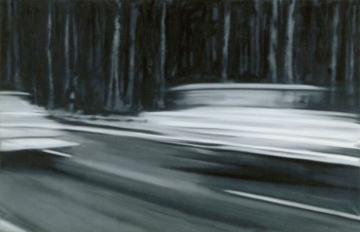
Google’s German Street View blurring looks utterly fantastic. And for that matter, fantastically German. By which I mean, of course, that it looks like a Gerhard Richter painting.
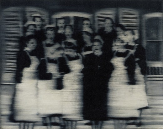
Nurses, 1965, image: gerhard-richter.com
Richter’s signature blurring technique calls into question the status, context, and veracity of the photographs that are his source material. Richter, Rosemary Hawker has argued,
refers not to the visual plenitude and truth that we usually associate with photography, but rather to its moments of representational inadequacy, to photographic blur and lack of focus that results in deliberately obscured imagery.
It’s worth noting that Richter began his blurred photo-painting series soon after fleeing East Germany.
I would think that the persistence of a few deliberately obscured images on Google Street View will serve as a useful corrective to the convenient, info-rich panorama’s seductive call, and will help remind users that they are, in fact, not in “the German Landscape,” but in a corporately controlled, commercial, and contested simulacrum of it.
Two Fiats, 1964, via gerhard-richter.com
Far from “bombing” the supposed digital public sphere, the people who exercise their Verpixelungsrecht are asserting the individual’s right to virtual protest, to engage the digitization of his entire world on his own terms.
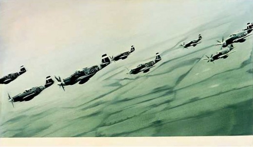
Mustang Squadron, 1964, image: gerhard-richter.com
Google has filed for patents to place advertising, “virtual billboards,” within Street View, reserving for itself the right to control and alter its ostensibly objective representation of the world for its own reasons, including, but not limited to, its own commercial gain. If someone painted their URL on the front of their store, would there be an outcry if Google threatened to blur it out unless they got a piece of the action?
Jeff argues that it’s folly for politicians to restrict innovation like geo-tagged facial recognition that, who knows, might be useful in locating Katrina victims. But who’s to say that, when our reality gets augmented to death with advertising and tracking, opt-out blurring isn’t where the real value will be? It’s the unlisted number of the future.
Or the vanity phone number. As an inadvertent-but-eager connoisseur of Google Map pixelation techniques, I could just as easily envision a premium Street View image management business emerging out of this controversy. In fact, it’s already started.
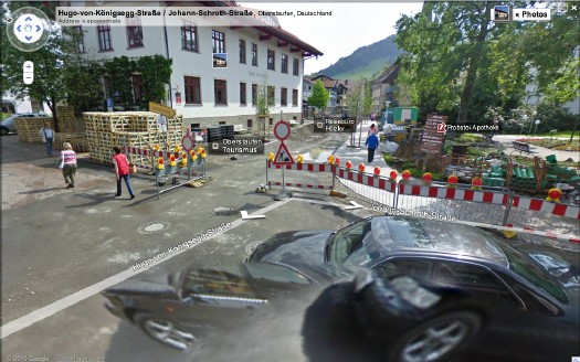
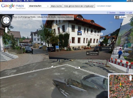
Just look at the unsightly street closure and construction project right in front of the Tourism Office of the otherwise-scenic Oberstaufen. Sheesh, no wonder they baked Street View a cake. Now check out the screenshot Spiegel got, where an embedded photograph from Panoramio helps clean things right up, mostly:
The Street View we see now is a mere shadow of the virtual world–or the virtualized real world–to come, and I’d like to think that when it comes to building and designing that world, digital citizens will be able to vote with more than their wallets.
At the very least, when people start paying Google to decorate their Street View houses with Blingee crap and animated gifs, mark my words: we’ll be grateful for the visual respite these Richterian Street View sites will provide.
Related, actually from over a year ago: Gerhard Street View
George Catlin’s Bird’s Eye View
Now I knew George Catlin did some bird’s eye views, but I did not realize he also did some Bird’s Eye Views. This is one of the latter, an 18-inch gouache from 1827, Bird’s Eye View of Niagara Falls.
He got it pretty close, too. Did he use a map or something?

Cretto Street View
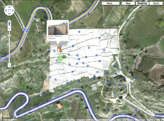
Christopher Knight took the occasion of an Alberto Burri retrospective in Santa Monica to tweet about Cretto, the artist’s absolutely incredible 20-acre memorial/earthwork, in which the earthquake ruins of the Sicilian town of Gibellina were encased in a grid of concrete. I’d mentioned Cretto in 2006, including a basic Google Map image.
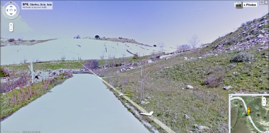
Well, Street View has come to Gibellina. At some point, I suspect no one will marvel at the idea of using your laptop to drive around the backroads of Sicily, or to dive into geotagged photos of remote land artworks. But that point is not yet. The Street View images in particular have a great, desaturated feel that makes me imagine I’m right there for the ribboncutting. The future and the past is now.
Cretto, Alberto Burri/Ruins of Gibellina [google maps]
Related: finding Double Negative has never been easier