And in other Venice Biennale of Architecture exhibition news: cityLAB, Dana Cuff and Roger Sherman’s architecture think tank at UCLA, is also in the US Pavilion show, Workshopping. One of the projects they’re apparently showing is called Duck & Cover, which appears to be a community garden in the form of a giant Google logo visible from Google Earth.
Looks awesome, but wait, are those mirrors up there? Magnifying glasses? Spiral escalators to nowhere? Also, isn’t the G a little self-referential for Google? I’d think they could get ‘er done quicker if they sell the structure’s shape to the highest bidder. Or make it a Q for Quimby.
cityLAB [workshopping.us]
previously: heads up: roof as nth facade
Category: google
Michael Wolf, Street View Photographer
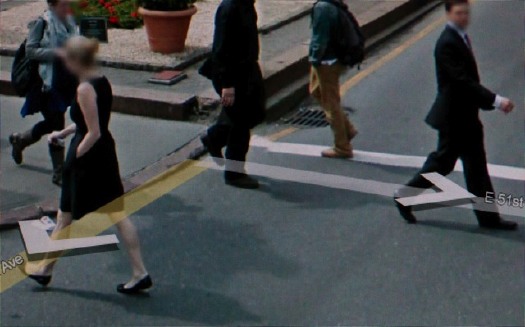
I’m glad and not surprised to see I’m the only person using Google Street View as an artistic source. Since at least last year, photographer Michael Wolf has been making a series of Street View-based works that explore urban life as it’s experienced, seen, and transmitted.
Wolf roams Google Street View in classic street photographer tradition, searching for the hidden, the unexpected, the sublime, the beautiful, the overlooked, images which reveal something about the character of a city and its residents. So far, he’s done Street View Manhattan and Street View Paris.
According to his Amsterdam dealer, Galerie Wouter van Leeuwen, where he showed this Spring, Wolf has spent over 400 hours searching Street View, which sounds like a direct translation of street technique to the virtual world. His careful cropping and composition, too, resonate with street photography’s quest for stolen, fleeting, magic images.
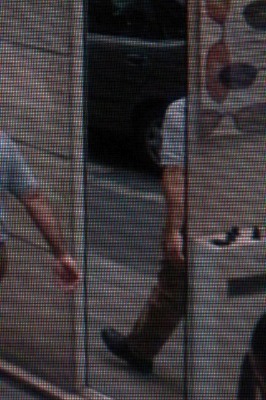
Some of his images carry Street View’s trademark aesthetics: blurred out faces [but not as many as I’d expect], navigation overlays and cursors, and occasionally the fractures and distortions of the pano image knitting algorithms. From the prominence of the screen pixels, it looks like he actually reshoots images on his screen, or as one press release put it, “pictures of pictures.”
His series Street View A Series of Unfortunate Events looks like archetypal on-the-scene photojournalism, only stripped by any news or context other than place. Though Wolf himself eliminates any place specifics or links, leaving each image to stand on its own.
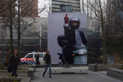
In March, the photography museum FOAM and the Virtueel Museum Zuidas staged an exhibition of Wolf’s Paris Street View photos on the street. Giant prints were placed around Gustav Mahlerplein, a plaza in a modern culture and office complex on the ring road south of Amsterdam. Unfortunately, no images of the exhibition have made their way back into Google Maps.
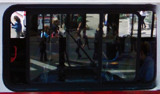
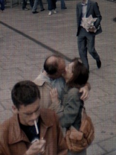
While Wolf’s quote of Robert Doisneau’s Hotel de Ville kiss is the most obvious, my favorite throwback images are like the ones here, where he finds in Google layers of reflections and perspectives that’d do Lee Friedlander and Harry Callahan proud. Really beautiful stuff.
Michael Wolf photography [photographymichaelwolf via things magazine]
Casting Long Shadows
This has been sitting on my desktop since last month, when Google Maps announced the addition of 45-degree Aerial View imagery for new locations, including Dortmund, Germany.
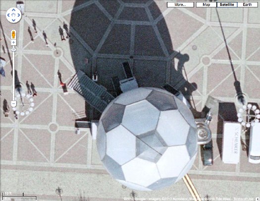
So I clicked over to Dortmund, and zoomed in there to the central platz [Friedensplatz, actually], just getting more and more psyched to see that sweet-looking geodesic soccer ball pavilion up close, and then poof, at the last minute, the final zoom, the Aerial View showed up, and it was from much later. The soccer ball was gone.
But then I forgot all about Google’s 45-degree View when I saw the sun doing it for me. These attenuated morning shadows are just awesome. Like 19th century silhouette portraits as reimagined by Giacometti–and shot from outer space.
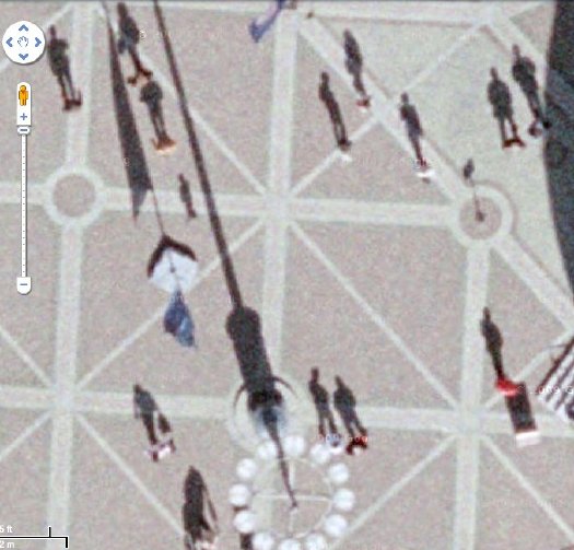
Which reminds me of the statue of a horse and rider in front of the Noordeinde Paleis in The Hague, the first building I saw on Google Maps which had been obscured by the Netherlands’ unique polygonal camo pattern:
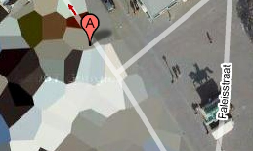
[An update on those Dutch Camo Landscape paintings I was talking about making: I’m still going to do it. One thing I’m very glad for is taking all the screenshots I need for the images I want. I first noticed the changes last winter, but now every the camo on site I’ve mentioned on greg.org has been replaced with typical square-pixel obscuring. Functionally, the camo still works, but aesthetically, it’s a real loss.]
Now about that ball: It is probably better known to the millions of soccer fans in Germany as the WM-Globus. It was conceived in 2003 by artist/musician/actor André Heller, who ran the cultural and arts program for the Deutscher Fußball Cultural Foundation. Described by Heller as a “consulate of anticipation,” the Globus was sent on a 1000-day, 12-city tour in advance of Germany’s hosting of the 2006 World Cup. It’s 18 meters high, weighs 50 tons. Two interior floors contained football memorabilia and multimedia installations, while the pressurized scrim exterior contained an LED map and nightly light shows. Lighting effects designer Anthony Quodt has several articles on the making of the WM Globus and its specs on his site, lightlife.de. Too bad it predates the YouTube era, because the stills look like a hot, glowing mess.
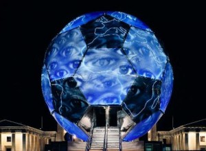
After the World Cup, a Hamburg entrepreneur named Dr. Alexander Extra purchased the Globe from the DFB for EUR300,000, with plans to transform it into a permanent museum of sports culture, the Sporteum. Alas, no money was forthcoming, and the Sporteum failed to materialize. So Dr. Extra put the Globus on eBay last summer. Which turns out to have been a bad time for the geodesic soccer ball-shaped pavilion market, because bidding stopped reached just EUR50,000. The unidentified buyer was reportedly also from Hamburg, so I expect it’s still sitting in the warehouse, but I’ll look into it.
Google Lens Cap View?
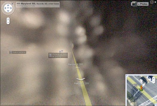
I was on the phone, trying to give directions to a friend to a small Japanese grocery store in Rockville, Maryland, so I pulled it up on Google Street View. Which turned out to be useless, but weirdly beautiful. Turns out all the Street View panos on that section of the busy road are out of focus, with mottled light patterns that look like the inside of a perforated coffee can.
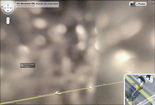
Either last week’s earthquake has sucked Rockville Pike into a wormhole, or someone skipped the “1. Remove cover from panoramic camera stalk” step in his Street View Driver’s Manual.
All The Named Buildings On The Ocean Road Strip
View Larger Map
Like leisure boats, beach houses in Emerald Isle, NC, where our family has gone for many years, are often given names. It appears that the practice tracks somewhat the expansion of the beach cottage rental directory business.
It may be nostalgia-induced prejudice and my disdain for the neon Floridization of Outer Banks cottage architecture, but it seems to me that older cottages’ names aim for a kind of naturalistic postcard sublime, while the newer, larger, flashier McVillas have punnier, more self-congratulatory, more yacht-like names.
Anyway, on a recent trip, I decided to catalogue the house names along a stretch of Ocean Road, heading eastward, and ending with the best name of all, which is on the house above:
Top Notch
Windy
Sunspot
Impossible Dream
Granted Wish
Skinny Dipper
Continue reading “All The Named Buildings On The Ocean Road Strip”
Olafur Street View
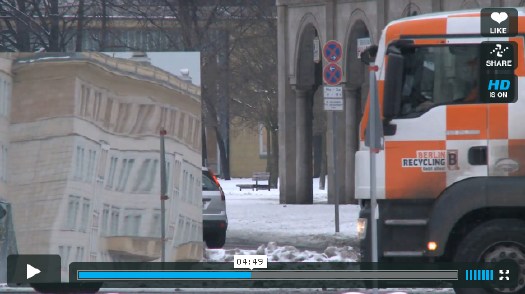
One of the simplest, best parts of Innen Stadt Außen [Inner City Out], Olafur Eliasson’s multiple public and museum projects in his adopted hometown of Berlin this year, is now online as a short film.
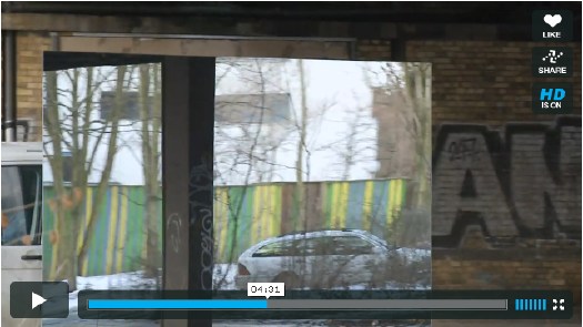
In what feels like the diametric opposite of Google’s Street View scanning, Olafur and his studio rigged a truck with a giant mirror and drove it around town. Part of me wants to not say what it is, but to let viewers figure it out. But the whole exhibition was promoted with photos of the truck. And I knew what it was, and I still was enthralled by every sequence and cut in the film.
Innen Stadt Aussen, from Studio Olafur Eliasson, 10’31” [vimeo via @grammar_police]
Arshile Gorky Was An Expert Camoufleur
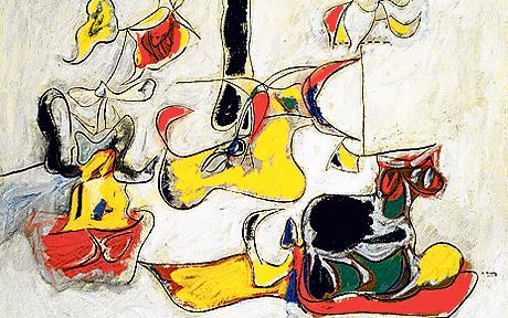
I like writing the word camofleur.
In response to the burning question [sic] that arose from Ad Reinhardt’s chronology, what was up with Arshile Gorky wanting to start a camouflage school in 1943?
Because everyone knows that Gorky was already teaching camouflage in 1942. He’d spent at least a year, and possibly longer, trying to get a camouflage class started, partly because he and other artists saw it as an alternative for getting called up in the draft. “Can’t fight, too busy camouflaging!”
This need intensified after Pearl Harbor, and even after Gorky was rejected by the draft board for being too old. But that was also because Gorky needed money, and a class of 20 students paying $15/each a month sounded very appealing.
[Hayden Herrera has a chapter called “Camouflage” in her 2005 biography, Arshile Gorky: Life and Work. Most of this info comes from there.]
In his prospectus, Gorky wrote, “What the enemy would destroy, however, he must first see. To confuse and paralyze this vision is the role of camouflage. Here the artist, and more particularly the modern artist, can fulfill a vital function, for opposed to this vision of destruction is a vision of creation…
“Mr. Gorky plans a studio workshop in which each student becomes a discoverer…” The coursework would include modern theory, scale modeling, and “abstract constructions.”
One of Gorky’s particular concerns was how colorblindness might thwart camouflage. He also, we read, had “a plan to camouflage the whole of New York City,” which he felt should be promoted heavily by the New York Times.
According to one of his most satisfied pupils, the then-future art dealer Betty Parsons, the class ran for from three to six months, and was highly popular. Of course, according to Harry Rand’s book, Gorky’s camo course “fared poorly.” If the goal was to provide a steady source of income, I guess these can both be true.
And that might explain Gorky seeking help from Reinhardt to revive or rework the camo school idea in 1943. In any case, Gorky’s eventual dealer, Julian Levy, said that camouflage was the key to the artist’s character, whatever that means.
Previously: Civilian Camouflage Council
image: Garden in Sochi, 1943, Arshile Gorky, via Tate, and Telegraph UK
Say Amen, Yves Klein!
I may have something to write later about Yves Klein, I don’t know. Peter Schjeldahl summed up what I’d already noticed, that the art discourse is very uncomfortable–or at least largely silent–on the topic of Klein’s apparently deep or abiding religiosity/spirituality. I thought that again at the Hirshhorn discussion when Kerry Brougher would actively ignore or steer the heavily spiritualist, cosmic comments made by the artist’s widow Rotraut Klein-Moquay.
 But that’s not important now. What I’m fascinated by at the moment is the very end of this 1959 recording of Klein himself speaking at the Sorbonne. I can’t quite tell what this is–I found it at Ubu.com, but the slightly loopy text and original mp3 rip appear to come from Waxidermy–a commenter calls it a conference on “L’Architecture de L’Air,” but the quote below matches an artist’s text of the same name published in Mon Livre. So it’s likely he just read his texts.
Klein’s talking about the “monochrome propositions” he showed at the Galerie Apollinaire in 1957 and how, though they’re identical, each one is received differently by the public. Then the kicker:
l’observation la plus sensationelle est c’est des acheteurs. Ils choississent parmi les onzes tableaux exposés, chacun le leur et ils le paient chacun le prix demandé–et les prix sont tous différents, bien sûr.
The most sensational observation is of the buyers. They chose among the eleven paintings shown, each to his own, and they each paid the price demanded–and the prices were all different, of course. [my translation]
Then the crowd oohs and roars in approval, Hallelujah! It’s like a good old-fashioned tent revival there in the Sorbonne.
On the one hand, there’s Klein’s presentation of the prices, the transactions, the market interaction, as somehow central to the concept of Klein’s monochromes, as dispositive evidence of–what? I’ll go with the artist’s privilege to characterize his own work and its attributes, of his collectors’ readily accepting [indulging?] his value/price-related constructs. The market, of course, has been the other third rail [sic] of art history. Does the market still honor Klein’s price differentials for these monochromes, I wonder? Somehow I doubt it.
But it’s the other hand, the audience reaction itself, that has me thinking. I made the preacher reference because it seems germane to Klein’s charisma and penchant for showmanship. But the give & take also makes me think of a [possibly peculiarly French?] appreciation of rhetoric as spectator sport; the crowd wasn’t enthralled by the monochrome paintings, per se, so much as by the deftly argued [and proved! by the market!] monochrome propositions. Klein ran the market gantlet and survived with his propositions intact.
The oohlalas reminded me a bit of Ridicule, Patrice Leconte’s classic film of the court at Versailles, where wit and mastery of small talk and jeux de mots are essential to social/political/cultural success.
And the existence of Klein’s art in that time and that milieu made me wonder about the historical popular context contemporary art inhabited in the US. What was the perception and reception of art in post-war America? Today we bemoan art’s loss of primacy as a touchstone of cultural expression, and the decline of art appreciation among the general public. The art world has become, we’re told, too insular and self-absorbed, abandoning its common touch and the concerns and interests of real people. But is that how it went down?
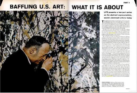
One specific example: I wonder what the role of LIFE Magazine was in shaping the broader view of art, and of influencing artists’–and the art world’s–views of themselves? Surely there are worthwhile dissertations on this topic, either written or in process.
The New York-based LIFE seemed to operate as–or at least consider itself–both a kingmaker and a tastemaker. But LIFE seemed to want it both ways: to declare a trend from its privileged vantage point, and then to proclaim its empathetic bafflement on behalf of John Q. Public. LIFE’s 1949 anointing of Jackson Pollock as “America’s Most Important Living Artist” began a decade of incredulous coverage of Abstract Expressionism as THE American Art.
Just yesterday, I found a 1965 article about Buffalo’s Festival of The Arts Today, a remarkable assemblage of avant-garde theatre, music, film, art, and dance, that drew an equally remarkable, diverse-sounding crowd of over 165,000 people in a remote city whose population at the time was just over 500,000:
Can this be Buffalo?
The far-out Festival of the Arts Today was as full of come-ons as a county fair, running from a nude dance number to orchestral works with popping paper bags, to four bizarre plays by Ionesco, to kinetic art that often looked like pinball machines on a jag. Buffalo took it all–the hokum and shocks included–with healthy curiosity and good-humored appreciation, proving how refreshing the arts can be when approached for genuine enjoyment instead of for genuflection.
How well did LIFE’s editorializing about far-out hokum and county fair come-ons capture the persepctive of the people who attended the Festival, and how much of it was projected upon them from Manhattan?
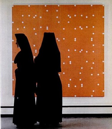
The photo next to this paragraph showed a pair of nuns standing in front of a Larry Poons painting at the Albright-Knox:
Walking Man? What Walking Man?
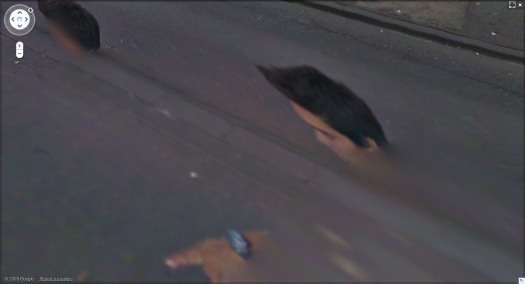
Alberto Giacometti’s figures look the way they do because he tried to capture what he called, “The moment I see them” and the way “they appear in my field of vision…” Arthur C Danto said this accounted for “the somewhat ghostly feeling of his figures, as if they were persons whose bodies had been all but erased.”
These ideas of figures, distorted, hovering on the edge of perception were very much in my mind when I found the incredible-looking sequence of [self] portraits of a man in the Google Street View panos of the Binnenhof, the Dutch Parliament complex in The Hague. The guy is almost certainly a Google Street View worker who accompanied the new Google Trike as it scanned and photographed the pedestrian-only area.
By walking alongside the Trike, the guy ended up inserting himself into thousands of photos, and basically every stitched-together panorama. The stitching algorithm, though, often tried to erase him, or replace his photo with a better [i.e., unobstructed] image of the same spot. The result is a series of fragmented collage portraits, disembodied heads, hairdos and limbs.
I gathered full-sized screenshots from every pano, focusing not of the site itself, but on the guy, and then I bundled them into a book, which I titled, after Giacometti, Walking Man. That was in mid-April.
As I’ve been tweaking the book the last few weeks, though, I found that several of the Binnenhof panoramas have been removed from Google Street View, including all the coverage of the inner courtyard, and every one I illustrated in my blog post.
Google has been getting heat in Europe for its Street View datagathering practices. I’d suspect that investigations in Germany and across the EU–and now even in the US–for surreptitiously collecting personal data across wi-fi networks is a bigger issue for them than ye random blogger’s artbook-ish attempt to fit Street View into critical history of street photography. And yet.
Google had already had the Binnenhof in the bag when they announced the Google Trike last summer, and invited the public to suggest where it should shoot first. Whatever else it was, this seemed like a canny move designed to deflect any possible political heat from the Street View effort: we’ve already got the Parliament on board, who wants to be next?
Now, though, it seems like someone, either within Google or within the Dutch government, or both, is actively deciding it doesn’t want people to examin either the Binnenhof OR the Street View process too closely. And that includes Walking Man, whose portraits are being all but erased.
Nouveau manuel complet du fabricant et de l’amateur de photos
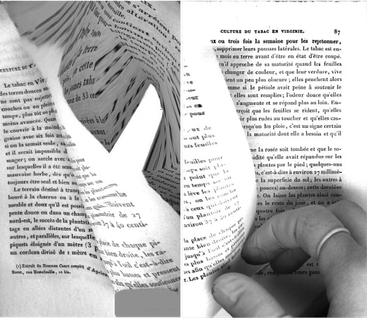
So fantastic. I stumbled across this inadvertent diptych in Google Books, it’s pp. 86-7 of P. Ch. Joubert’s 1844 addition to the Manuels Roret series, Nouveau manuel complet du fabricant et de l’amateur de tabac.
It’s beautiful, somewhere between the process-heavy, content-free abstraction of Walead Beshty and the reverential physical investigations of Abelardo Morell, with a bit of those weird Weegee funhouse mirror photos thrown in for good measure.
And yet they’re also entirely of their own time, place, and making.
A few years ago at John Connelly, my buddies Jonah Freeman and Michael Phelan showed some sweet prints of crumpled aluminum foil shot on a flatbed scanner. [Mitterand+Sanz has images] Which could be a great process here. But I’d really love to figure out how to create negatives from these scans and make up some big, old school silver gelatin prints. [thanks GF-R for the heads up on Morell]
Related from last October: Why is Google giving us the finger? [designobserver.com]
Google Image collection of Google Books Finger [via BoingBoing]
The Civilian Camouflage Council
December 1942, the US is at war, and everyone is tinkering in his basement, doing his part to protect the civilian and industrial landscape against the latest technological threat: aerial photo reconnaissance. From a lengthy, fascinating article in Popular Mechanics:
But today civilians around the world, particularly in the United States where the home workshop abounds, are beginning to do what nature forgot: fooling the spy in the sky with camouflage. A recent estimate indicates that more than 5,000 civilians have taken up camouflage research as a serious occupation.
That number did not include the teams of artists and theater designers and architects at various museums, or much of the art and design departments at Pratt, where dean James Boudreau could be seen demonstrating Pratt’s “sun machine,” which “duplicates sun-shadow conditions at any given moment of the year”:
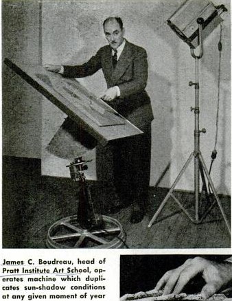
“Since military camouflage is well in hand,” Pop Mech said reassuringly, and while “the government has not yet completely coordinated local civilian camouflage efforts,” the field is “wide open to patriotic and inquisitive minds.”
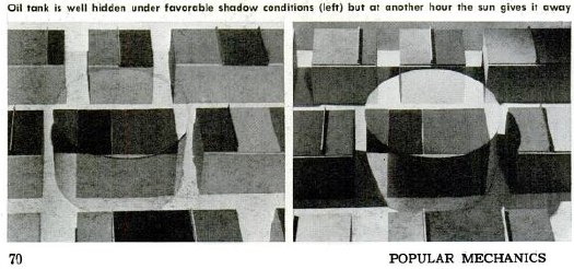
There followed a primer on basic camo strategies–including Dazzle painting–shadow and lighting, and photo mapping, all illustrated with photos of people photographing painted and sculpted models as if from the air.
Though they were namechecked, the groundbreaking, eerily prescient work of New York’s Civilian Camouflage Council [!] went unremarked.
Founded by Long Island architect Greville Rickard, the CCC had, with Pratt’s Boudreau, organized an exhibit of industrial camouflage designs at the Advertising Club, which opened December 8, 1941. In Dec. 14 review of the show titled, “Art In A Practical Service To War,” the NY Times’ Edward Alden Jewell said,
This is a show that every one should see. It illustrates vitally important defense methods as applied to needs that are immediate all over this country. A fortnight ago such needs might have been looked upon by the public as remote and more or less theoretical. Such is the terrible swiftness with which events have moved, they must now be recognized as of prime consequence.
Jewell then went on to discuss shifts in camouflage as they related to art history:
The progress of the art of camouflage in, say, the last three decades seems not altogether unrelated to certain “key” phases in the development of painting and sculpture. As I understand it, principles oof Impressionism and even of Cubism were examined and to some extent adapted to the uses of the camoufleur during the last World War. But in contradistinction to this trend, teh present trend parallels what in art parlance we designate as Naturalism. It may be said that in the year 1941 camouflage, whether industrial or strictly military, goes with marked singleness of purpose “back to nature.”
The show also included contributions from Stanley McCandless, then at Yale, who is known as the father of modern stage lighting.
In August 1942, the CCC-sponsored Pratt exhibit had been combined with military material and restaged at The Museum of Modern Art. Organized by The Modern’s Carlo Dyer, “Camouflage in Civilian Defense” was one of at least eight war-themed shows The Modern organized and sent on tour in 1942. Doing its part to beat back isolationism!
Fooling the Spy in the Sky, Pop Mech Dec. 1942 [via google books]
Walking Men, Or The Google Street View Trike Has A Posse

Some interesting developments since putting the Walking Man self-portrait collection out there. Thanks for the feedback and responses.
I think it’s becoming clearer that walking man is not, as I wrote, a guy who “came upon the Google Street View Trike preparing to map the Binnenhof” and who “decided to tag along.” Instead, he’s probably part of the Google Trike crew.
I’d always entertained the possibility, and when, after the initial burst of discovery and image extraction, I found some additional panos from around the lake that made it clear his relationship to the Trike was at least a factor in his appearances.
From the intro I wrote for the proof [which I’ll probably publish at some point, even as I plan to revise it for any future editions]:
His actions in the final two panoramas lend themselves to speculation: In his penultimate appearance, walking man becomes pointing man; he is seen gesturing across the plane, breaking the fourth wall, as it were, by addressing the Google Trike driver himself.
Perhaps this crossed a line about the presumption of passivity for Google’s photographic bystanders. Or maybe it violated some rule of non-engagement, a Street View Prime Directive. Is it possible that he’d been talking with the Trike rider, his personal [sic] camera operator, all along?
Yes, yes it is.
Continue reading “Walking Men, Or The Google Street View Trike Has A Posse”
Google Trike Plus One?
I have no idea who walking man is, and ultimately it doesn’t really matter to me; the portraits of him that got inserted repeatedly throughout Google Street View ultimately stand on their own.
But at the very end of his tagalong, there’s a shot where he points across the Google Trike’s path. He’s gesturing, perhaps even to the cyclist/Trike operator himself. Which underscores the possibility that walking man did not just happen across the Google Trike; he may be involved with it somehow, as a tech, or a chaperone, or even the driver’s friend.
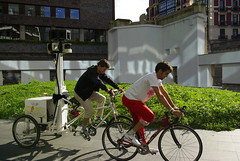
When I saw artberri’s flickr photos [above] of the Google Trike and Buddy circling the plaza at Arata Isozaki’s riverfront tower complex in Bilbao, I began wondering if a two-man team might be standard Google Trike operating procedure.
If so, the top of that other guy’s head might be a prominent feature when these Street View images come online. We may have a whole series of Trike-based portraits on our hands.
walking man – a self-portrait collaboration with Google Street View
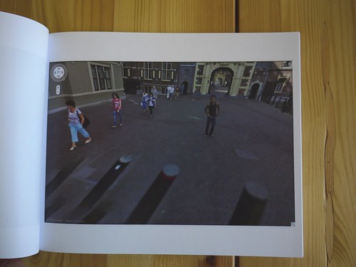
In the Summer of 2009, an unidentified young man came upon the Google Street View Trike preparing to map the Binnenhof, the center of the Dutch government, in The Hague. He decided to tag along.
The man walked alongside the Google Trike, persistently inserting himself in the foreground of its nine computer-controlled cameras’ panoptic fields of vision.
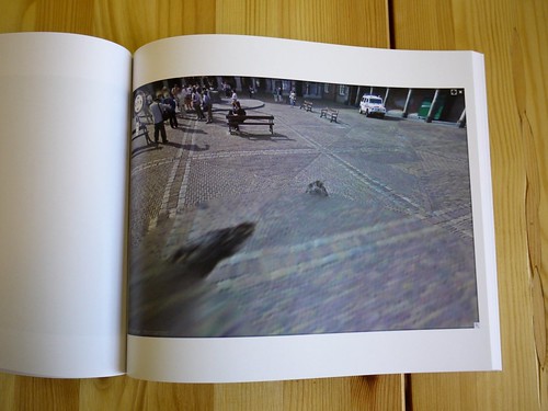
Meanwhile, Street View’s automated panorama generation system read his presence as a data anomaly and consistently attempted to erase him from the photos.
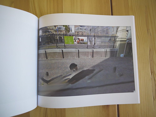
The resulting images, extracted from nearly every Street View panorama of the Binnenhof complex, reveal the history and process of their own making. They are at once a minute detail in Google’s extraordinary, ongoing portrait of the entire world, and one man’s wresting of control of his own image and his audacious assertion of his own presence.
I discovered these images in February 2010.
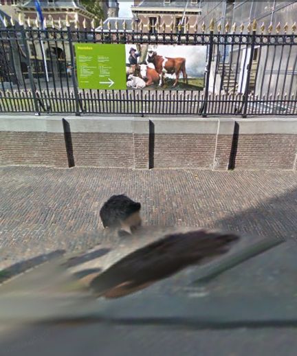
At first, it was the distortions of time, space and perspective in these photos that caught my eye. As I began mapping out [sic] the scope of the project, however, I became fascinated by how this man seemed to travel almost precisely at the distance that simultaneously kept him in frame, but also all but guaranteed his algorithmic erasure.
Then I tried to understand the images as portraits, or self-portraits. As the exercise of the flaneur. The product of the flaneur’s gaze. An artifact of a moment in time, in space, evidence of the photographer’s decisions. As photos or cinema. Surveillance or subversion. Indexing, seriality. As virtual or real, documentary or manipulation, strategies or tactics. I looked at Muybridge and Marey. I went back to re-read Benjamin, Bergson, Barthes, de Certeau, Sontag, but these images seemed to thwart every attempt to put them into a critical or historical context as photographs.
And yet they’re so easy to look at and use; we all become Street View-proficient, if not fluent, within moments of our first encounter with it. And the walking man apparently made them on a whim, by doing nothing more than strolling along.
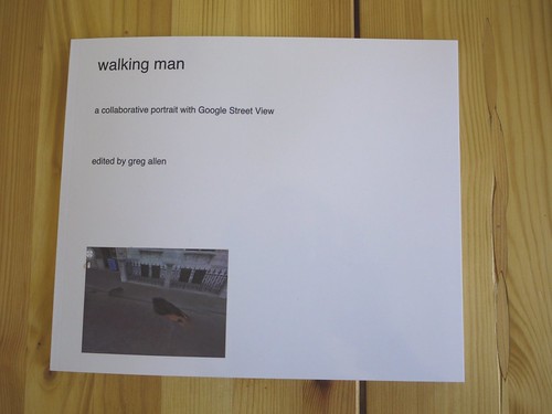
I decided to extract, compile, and print the entire set of photographs as a book. The title, walking man, is a reference to Alberto Giacometti, whose sculptural notions of distance and vision I was studying at the time. “Self-portrait” is an acknowledgment of their subject’s creative intent, and “collaborative” refers not only to Google’s operation of the camera, but also to their first pass at selecting images, and to the crucial aesthetic impact their manipulations have on the images they ended up publishing.
The images are actually screencaptures from Google Maps in Safari that include every appearance of walking man within each panorama. Though I composed each screenshot, I consider this a found work, or a work made of found images. Which is why I’ve been looking lately at work by folks like Sherrie Levine and Larry Sultan.
With three exceptions, each of the 55 Street View panoramas in the set is represented by one photograph which includes all portrait elements. The first panorama in the series includes both the walking man and his reflection in the window of the Binnenhof security office, but they are at too wide an angle to include in one screencapture. So the images were extracted separately After sending the book to the printer, I found that another panorama also included a nearly straight-down image of walking man’s legs, which would not fit within the browser window on my laptop monitor. The other exception, below, was just too beautiful to resist, there are so many awesome things going on in this photograph.
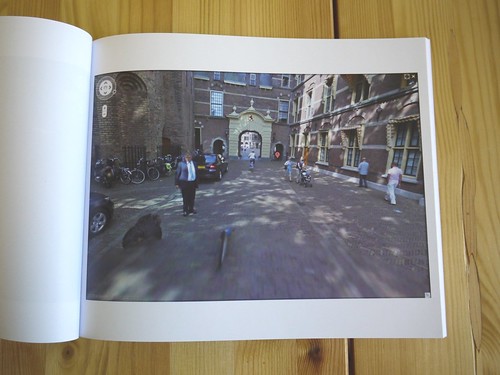
This proof copy was created using blurb.com. It’s 120 pages, and includes 57 portrait images and a reference Google Map, and a short introduction to the project. I thought the format might be too big, but it turns out it looks fantastic. The photos are a little dark, but that’s only because most of them were shot in the morning shade. My photos are dark because I shot them inside without a flash.
I am considering a limited print run, including editions reserved for the artist and the photographer, both of whom are currently unidentified.
There are several more shots from the proof on flickr.
Previous, related: How your Street View panoramas are made
The Meaning Of Maps, By Google’s Michael Jones
He’s pretty harsh on unnamed governments who complain about unblurred faces, and got more than a bit of engineer’s arrogance, which is why, I guess, he works for Google, but Michael Jones’s talk, “The Meaning of Maps,”at O’Reilly’s Where conference last week is pretty great.
Maps are not just place, they’re culture. Also, you get to see the Google Trike in action around the 13:00 mark.

