
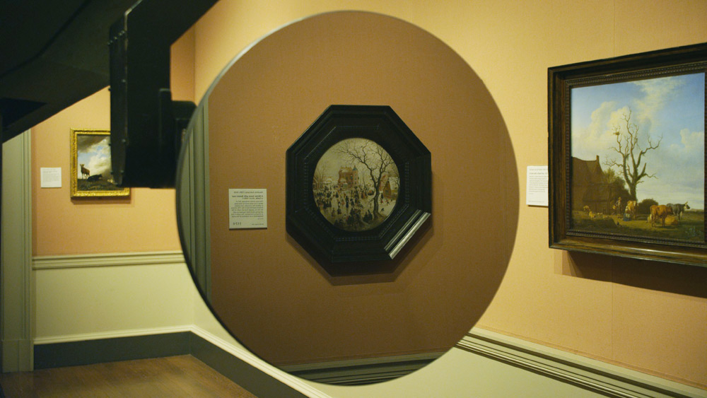
So you should really read Daniel Kasman’s review of the Venice debut of Mark Lewis’s awesome-sounding short film, Black MIrror At The National Gallery, because Kasman is sensitive to both the tone and surprise/reveal of the film in a way that the official synopsis, oddly, does not.
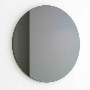
But if you’re not going to read either of those, I’ll just say it sounds like Russian Ark meets 2001, with the Marquis de Custine replaced by Martin Szekely’s silicon carbide “Black Sun” mirror, the Hermitage replaced by the National Gallery, and everyone and everything else replaced by Hendrick Avercamp’s Dutch Golden Era tondo A Winter Scene with Skaters near a Castle.

Sounds awesome.
Venice 2011. Art Is Terror from Any Other Angle [mubi.com]
Orizzonti – BLACK MIRROR AT THE NATIONAL GALLERY – MARK LEWIS [labiennale.org]
Miroir- Soleil Noir, 2007 [galeriekreo.fr]
Avercamp’s A Winter Scene with Skaters near a Castle, 1609 [nationalgallery.org.uk]
Category: making movies
‘And I AM. An American Sculptor.’
Between 1981 and 1985, Paul Tschinkel and Marc H. Miller produced 17 episodes of ART/newyork, a subscription-based video magazine about contemporary art for use, incredibly, in public schools and libraries.
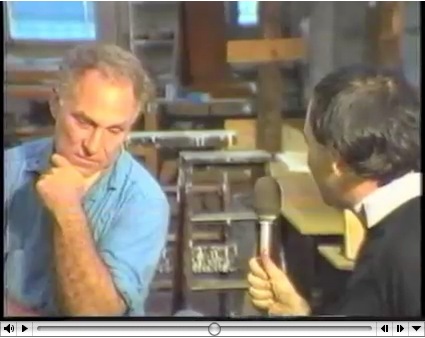
Their 1982 interview with Richard Serra, a Yale classmate of Tschinkel’s, came just as the Tilted Arc controversy was heating up. And speaking of heating up, hoo-boy, does Serra get going about the Pennsylvania Avenue Development Agency conflict with Robert Venturi. Fiery fun stuff.
His 1980 interview with Douglas Crimp covers a lot of the same PADC territory with a bit more specificity. By pointing out, for example, that Venturi’s proposed motif was also favored by Albert Speers, not just that they might as well stick swastikas on Pennsylvania Avenue.
But his story about being told that he’d never get work in this town again is basically the same.
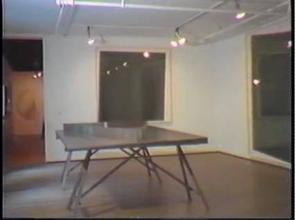
Also interesting, if less incendiary: Serra used to exhibit models of site specific projects-in-progress, such as this rather sexy steel tabletop version of Twain. Do want.
ART/newyork – Richard Serra’s Tilted Arc artist interview [98bowery.com]
order copies of ART/newyork to this very day [artnewyork.org]
‘Rirkrit Tiravanija’s Favorite Farmer’
Chiang Mai farmer/laborer Lung Neaw has worked with RIrkrit Tiravanija for several years now. He helped build the artist’s house. Tiravanija’s footage of him has appeared in various gallery and museum installations.
And Saturday, Tiravanija’s film, Lung Neaw Visits His Neighbors, will have its world premiere at the Venice Film Festival. Maybe there should be a spoiler alert somewhere, because from the synopsis, the title pretty much gives the entire 2.5 hour movie away.
In a Q&A on the Lung Neaw website the artist says he sees the film not as “a documentary and not a narrative, perhaps it’s more of a portraiture.”
He and his longtime Mexico City dealer’s brother Christian Manzutto shot a week or so at a time:
So we shot over a period of two years and another to edit and postproduction, the film was really made very simply and with very little by way of crew and equipment, in that relationship for me very much like a documentary but also very much like how an artist would approach the production, also with very small but cost-effective budget. We shot in film (super 16mm) so rather small and light unit but with frames and quality which was not video.
An interesting choice, and an interesting approach. Two of his galleries, kurimanzutto and Gavin Brown’s Enterprise, have associate producer credit.
See the Lung Neaw Visits His Neighbours trailer [vimeo]
Thai media article on the project: Lung Neaw goes to Venice [nationmultimedia.com]
Blade Runner: The Making And Damage-Controlling Of
“Decent people really didn’t live below 40 stories above the street.” -Syd Mead
Oh man, the groovy disco music that opens this 1982 13-minute, making-of convention reel for Blade Runner tells you all you need to know.
There are nice, matter-of-fact interviews with the movie’s design principals, Scott, Mead and Trumbull, but the best thing is the lights-on footage from the set and the model shop.
[via openculture.com]
Ekphrasis
Sam Thorne in this Summer’s Frieze looks at writers writing about looking at fictional art. He includes the hero [sic] of David Foster Wallace’s Infinite Jest, the post-poststructuralist filmmaker James O. Incandenza, whose lost masterpiece gives the novel its title:
Incandenza is one of the few conceptual artists in fiction (he is preceded by Maria Turner, a joint creation of Sophie Calle and Paul Auster who pops up in the latter’s 1992 Leviathan – the novel’s accounts of her works were subsequently enacted by Calle herself). Many of Incandenza’s films are described as technically or conceptually unfilmable (one is ‘unfinished due to hospitalization’), while his video Infinite Jest is itself said to be ‘lethally entertaining’ – once viewers start watching they cannot stop and remain transfixed until they starve. This elusive videotape, of which all copies are missing, is wrapped up with the unbearable pleasure of seeing. The visual is thematized as entirely other to language, as Wallace insinuates that the visual can make claims on our attention that the verbal cannot. Within the logic of the novel, the video would be impossible to sufficiently describe; it evades all attempts at ekphrasis – a shortcoming which is in this case redeemed, in that the ability to properly visualize it would result in death.
That writing fiction may finally be incompatible with adequately describing a work of art is the worry that shadows many of these novels. But, like Bergotte’s dying realization, they also suggest that the knowledge of this shortcoming is what makes writing worthwhile.
I did not realize that Incandenza had a show. While at Columbia last year, Sam Ekwurtzel invited a couple dozen artists to create works for A Failed Entertainment: Selections from the Filmography of James O. Incandenza. The show is still touring the country with him. Ekwurtzel, that is. Incandenza still does not exist.
Unmentioned by Thorne: Henry Codax, the fictional conceptual monochrome painter in Bernadette Corporation’s novel Reena Spaulings, who also had a show this year, courtesy of Jacob Kassay and Olivier Mosset.
Works on Paper [frieze]
Ekwurtzel speaks: Behind the scenes of an Infinite Jest-inspired art show [flavorwire]
On Roy Lichtenstein’s Films, Also Prop For A Film
I was intrigued by Roy Lichtenstein’s Prop For A Film when it showed up last summer at Phillips in London. Obviously, the main thing was the work itself: a large [3.5 x 8 ft] abstract, shaped field of Ben-Day dots, pretty fantastic, actually, which turned out to be a beach. The other thing about it, also obviously, was hey wha? Lichtenstein made a film? A film he showed at both LACMA and the US Pavilion at Expo70 in Osaka?
I was already pretty fixated on several of these related topics at the time, so I started poking around on the story of Lichtenstein, his film–films, actually–and his Prop For A Film. It’s all pretty odd and interesting, and somewhat complicated, and though I started gearing up to write about it, I’ve kind of held off, or haven’t gotten around to it, I guess, for almost a year now.
But then today, I see that Andrew Russeth reported for the Observer that Prop For A Film, which failed to sell at Phillips last summer, has turned up in Sotheby’s New York contemporary sale next month, albeit with a much lower estimate.
And though Sotheby’s catalogue copy seems almost identical to Phillips’, they added a note that the Whitney will show Lichtenstein’s films in October, the first exhibition of them in over 40 years.
So yeah, Prop For A Film. To get right down to it, I’m not sure it’s really a painting. Which doesn’t mean it’s not a very interesting Lichtenstein.
Starting around 1964, when the world was still trying to come to grips with the painterly implications of his print-related imagery and Ben-Day dots, Lichtenstein was already experimenting with other techniques and materials that challenged the definition of painting. His Electric Seascapes combined dots with new, high-tech materials like Rowlux [above], a prismatic plastic sheeting originally developed for reflective highway signs.
Fish and Sky (from Ten from Leo Castelli), 1967, screenprint, photo and offset, ed. 200, via wright20’s Sept. 15 contemporary sale
When Maurice Tuchman invited Lichtenstein to partner with Universal Studios for LACMA’s ambitious Art & Technology Program in 1968, the artist decided to continue his seascape experiments with motion, perception, and the flat picture plane by creating an actual “moving picture” of a landscape. So yes, this whole thing really fell into place around a seemingly simplistic, even banal play on words.
Sotheby’s pitch boils down the “moving picture” concept as it was exhaustively described in LACMA’s A&T report/catalogue:
[He used] sequences of filmed landscape fragmetns in combination with synthetic images using his trademark Ben Day dot grids or textured aluminum. The project expanded upon ideas he had explored in his landscape collages of 1964 and 1965, which were his most abstract compositions to date. In these works, the constituent elements of landscape were drastically reduced to two or three large areas of Ben Day dots representing sea, land and sky.
Because of cross-country logistics, Lichtenstein ended up doing almost all actual production with his friend, independent filmmaker Joel Freedman. Roy and Joel spent the summer of 1969 in Southampton, filming the props against the sky or the waves. Assistants would hold the props steady or rock them to simulate the motion of the ocean.
Only it never worked. The movie camera couldn’t accommodate different exposure levels for each component, and the depth of field never resolved to produce the planar flatness Lichtenstein was after. So they threw out the props, shot straight-on shots of the sky and lapping waves, and then added all the graphic elements in post.
I’ll leave the details of the films themselves for a separate post, but the point is, Prop For A Film never ended up in any of the films. And so the exhibition history–both Phillips and Sotheby’s list LACMA and Expo70–is tenuous at best. [Sotheby’s seems to realize this, threading a needle by saying “the work travelled to” Osaka, meaning the film installation. They also get the dates wrong; 1969 was the start of filming. A 2-screen installation at the Expo came first, in 1970, followed by LACMA’s 3-screen version in May 1971.]
Which, whatever, it’s still a large, stunning, early Lichtenstein painting, right? And its provenance, OK Harris–the gallery founded by longtime Castelli director and Lichtenstein discoverer Ivan Karp–is unassailable. Well, it’s certainly a Lichtenstein something.
When I first contacted Freedman last year, he told me how he’d saved the piece–it’s Magna on wood, not canvas–after the project ended, and had it on the wall of his loft for several years. The trademark dots meant people would visit and recognize it immediately as a Lichtenstein. Then, when he was in need of completion funds for a documentary–if I remember correctly, it was the mid-70s, so probably Broken Treaty at Battle Mountain–he gave the work to Karp to sell. At Karp’s suggestion, Freedman asked Lichtenstein if he’d help his project by signing the piece, and Lichtenstein generously agreed. The work was sold, and documentary was finished and released to great acclaim.
When he signed it in Karp’s gallery, Lichtenstein also wrote the title on the back. Or maybe it wasn’t a title, so much as a description: Prop For A Film.
Passed at Phillips, Roy Lichtenstein ‘Prop’ Moves to Sotheby’s [observer.com]
Lot 28 Prop for a Film, 1967, est. $400,000-600,000 [sothebys.com]
Lichtenstein’s project writeup from the1971 A&T catalogue [lacma.org]
Previously: Lichtenstein’s Electric Seascapes
BONUS: Freedman is running a Kickstarter campaign to complete a followup film, Land of the Brave. It ends in four days. [kickstarter]
Autoprotestazione
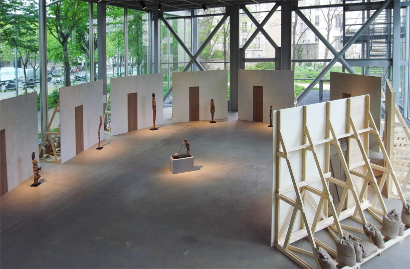
image: designboom
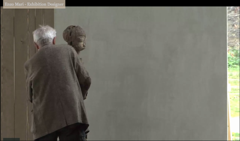
Enzo Mari was brought in to design the exhibition at the Fondation Cartier, Vaudon-Vodun, African Voodoo Art from the Collection of Anne and Jacques Kerchache. It’s simple and spectacular, and designboom has, as usual, rather comprehensive visual coverage of the project.
Above, a “film set” Mari calls The Village, autoprogettazione-esque backdrops to evoke the original context in which Kerkache would have first encountered the impressive household guardian figures. At least that’s how Mari explains it in the exhibition’s making-of interview video:
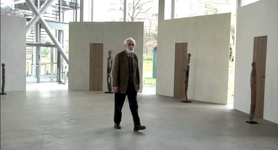
Holy smokes, filmmakers having Mari manhandle one of the guardians! Whether it’s our aging Maestro or the conservators, your insanely staged B-roll stunts are gonna give someone a heart attack!
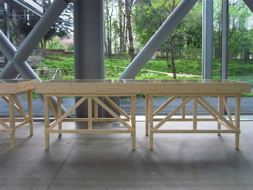
You don’t bring in a legend like Mari for his finesse at grouping sculptures. You bring him in to fill your glitzy Nouvel folly of a museum with endearingly humble-deluxe, purpose-built pine furniture!
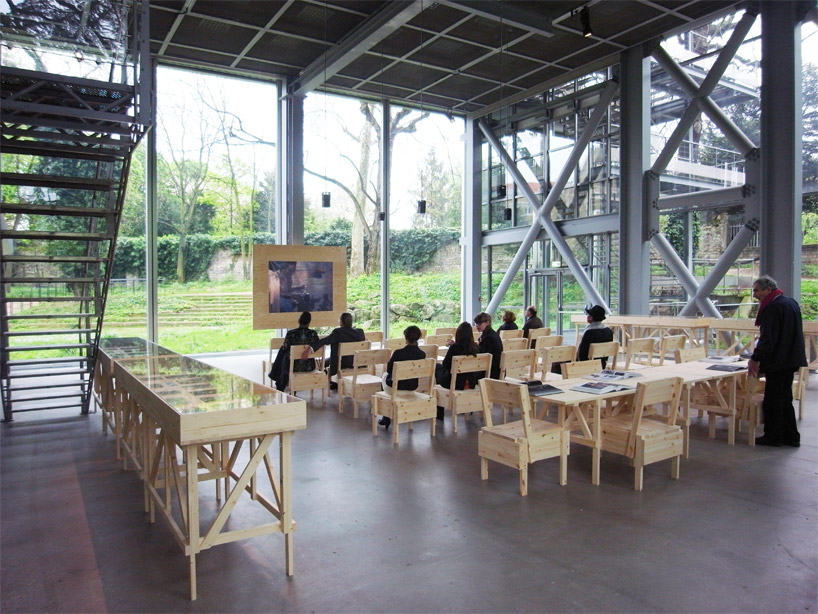
image: designboom
For the major autoprogettazione moment in the film/lecture/reference/public event space, with EFFE tables and SEDIA I chairs. Mais, qu’est ce-que c’est ca? New additions to the series? What’s that wood-framed flatscreen?
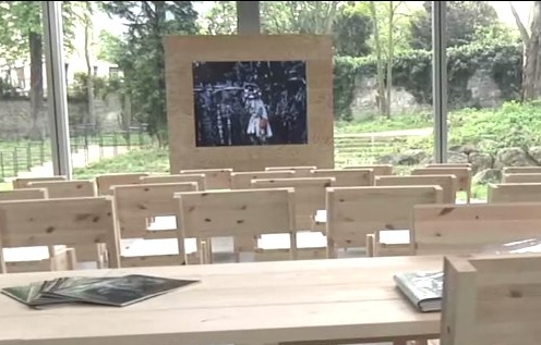
And are those DIY display vitrines ringing the room?
images above via designboom.com
Because the laborer should be able to knock together his own home theater–autoprogezzione?–and a case for his ephemera collection in a weekend using just the most humble materials from the corner hardware store. Or as designboom puts it, and quotes Mari:
the showcases, designed for this exhibition, partake of the same vocabulary.
“‘autoprogettazione’ has been a project for making furniture that the user could assemble simply from raw planks of wood and nails. a basic technique through which anyone with a critical mind could address the production of an object.”
So it’s for the [vitrine] user with a critical mind. Autoprogettazione as Institutional Critique. Can I have my show now, please?
Let’s go to the tape: “There’s a display stand.”
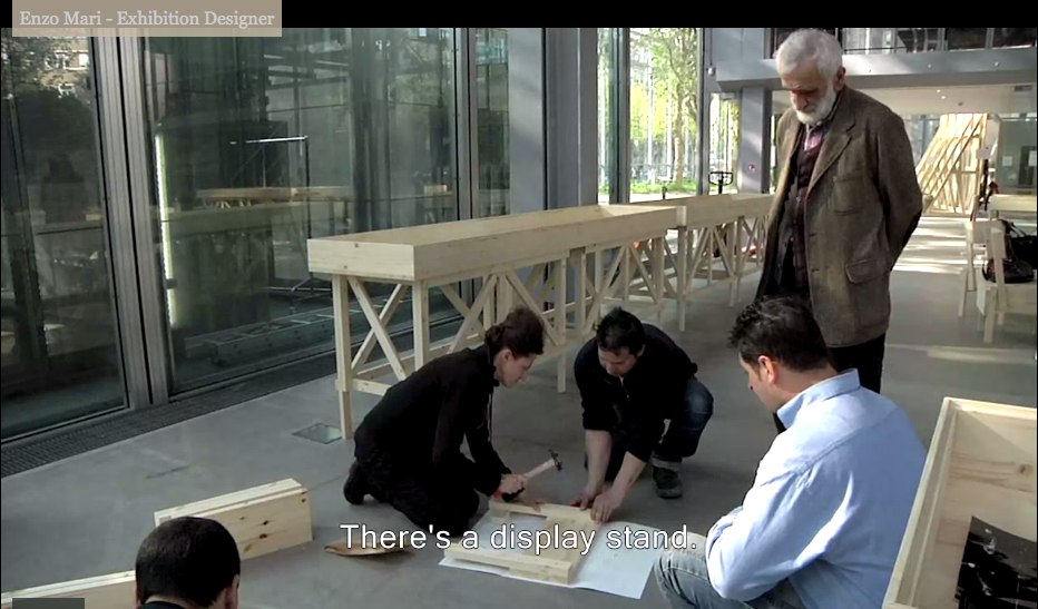
No no, no pressure, just Enzo #$()%ing Mari watching you build his iconic chair there.
“It must be simple.” Oh no, you B-roll knucklehead don’t do–
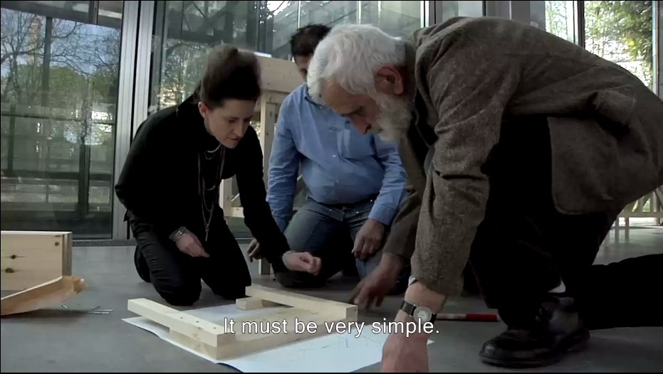
“A stand without the arrogance” YOU DID IT! YOU MADE HIM PICK UP THE HAMMER!
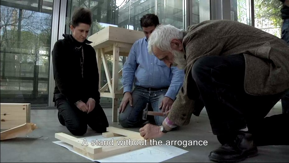
Oh, the horror. Why not just take him to a computer and make him fake type something for you? Or walk faux-purposefully down the Boulevard Raspail? How could– No.
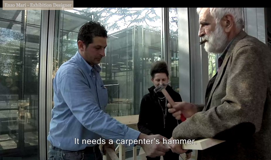
You did not just ask Enzo Mari to hammer something while he was holding it. If you can’t get your $#)(%ing shot, that’s your problem, don’t take it out on a great man like Prof. Mari. “It needs a carpenter’s hammer”? It needs a revolution. Langlois did not lose his job at the Cinematheque so that museum marketing video directors could wrap their late capitalist tyranny in the honorable flag of auteur theory. To the autoprogattazione barricades!
Right after we lock down the salvage rights to those 30 chairs, four tables, eight vitrines–and one flatscreen.

Here’s a shot, though, from Comrade Elena Vidor’s flickr.
UPDATE woo-hoo, and here’s an update from Venice, where Bruno Jakob has installed Breath, a very similar-looking, seven-part series of invisible paintings in and around the Arsenale.

Breath, 2011, via
Vaudou-Vodun, runs through Sept. 25 [vaudou-vodun.com]
Great Minds Think Alike, But Only Some Of Us Write For The New Yorker
I’m a bit embarrassed to admit I didn’t read it earlier, and I have to read it now, obviously, now that it’s finally been published in the US. But I wonder if my first short film may be an inadvertent adaptation of Geoff Dyer’s 1994 essay on World War I and the Memorial to the Missing of the Somme at Thiepval, France.
The Millions has a nice interview with him about it:
TM: You write in the book, “The issue, in short, is not simply the way the war generates memory, but the way memory has determined – and continues to determine – the meaning of the war.” Can you describe the meaning of the war?
GD: Always in the book I’m just trying to articulate impressions of it. It’s certainly not a history book. I always have faith in this idea that if I remain honest and open about my own confusion, the blurriness of my impressions – it’s not because I’m short-witted or stupid – the chances are those feelings will be shared by other people. And I just had this very distinct sense of the First World War as being something rather buried in its own memory. There’s so much discussion, as the war is going on, about how it will be remembered, or if it will be forgotten. So right from the start it just seems preoccupied with how it will be remembered. The other crucial thing is that distinction I make with the Robert Capa pictures of D-Day, where it all seems to hang in the balance and there’s a great sense of immediacy. With the First World War there’s no immediacy to it. It comes buried in so many layers of myth and memory.
Hmm, actually, maybe not. Or maybe the opposite. In 2001-2, I was looking at what a place of horrible destruction was like when there was no one left who did remember it. The difference between remembering and knowing, perhaps. Or the past and the experience of the present.
Also, Spiral Jetty first re-emerged in 1994, not 1999. I’d have thought the New Yorker would’ve caught that.
The Millions Interview | Geoff Dyer on the London Riots, the Great War, and the Gray Lady [themillions.com]
The Missing of the Somme (Vintage) [amazon]
In The Actor’s Studio
The backlog around here is so big, I was joking with a friend this morning that I should rename the blog, “Things I’ve Been Meaning To Write About.” But for some reason, I can’t let another day go by without saying something about the upcoming auction of items and artwork [!] from The Estate of Tony Curtis.
Tony [actual name, Bernie Schwartz] was not only a famous actor, he was a dedicated artist. A painter, mostly, though he also made objects, sculptures, shadowboxes filled with found objects, slightly less creepy than Joseph Cornell’s.
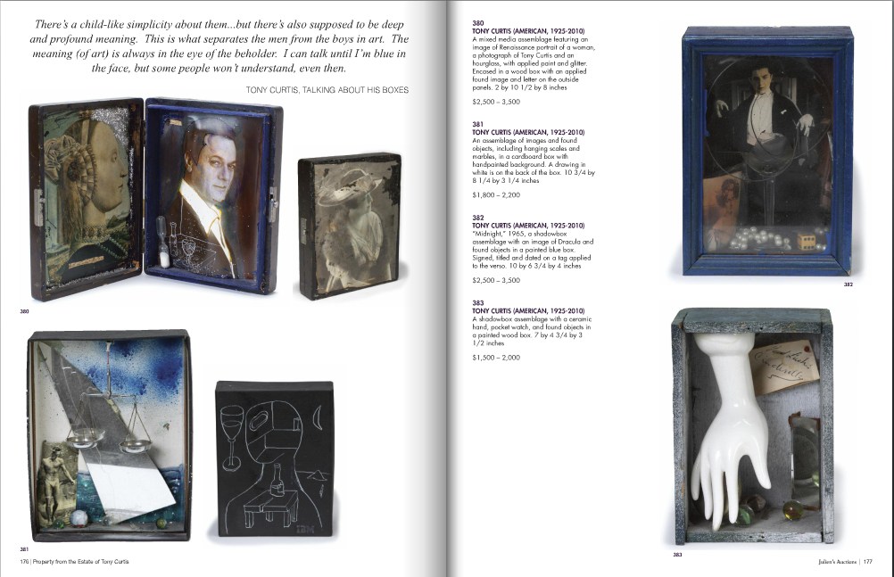
The Julien’s Auctions catalogue has some big pull quotes from the late artist himself. The best one is on the boxes:
There’s a child-like simplicity about them…but there’s also supposed to be deep and profound meaning. This is what separates the men from the boys in art. The meaning (of art) is always in the eye of the beholder. I can talk until I’m blue in the face, but some people won’t understand, even then. [emphasis added]
Anyway, it’s really, really not the art that interests me, so much as something like an admiration, maybe with a mix of pathos? Sympathy? Is that too presumptuous? About the mix of over-the-top celebrity living combined with a generally unappreciated pursuit of artmaking.
[According to the Independent, art was his primary occupation for the last 25 years of his life. The article is also strangely focused on how such a manlyman as Curtis could produce such feminine art: Matisse-inspired paintings and Bourgeois [uh, no, really??]-inspired boxes.]
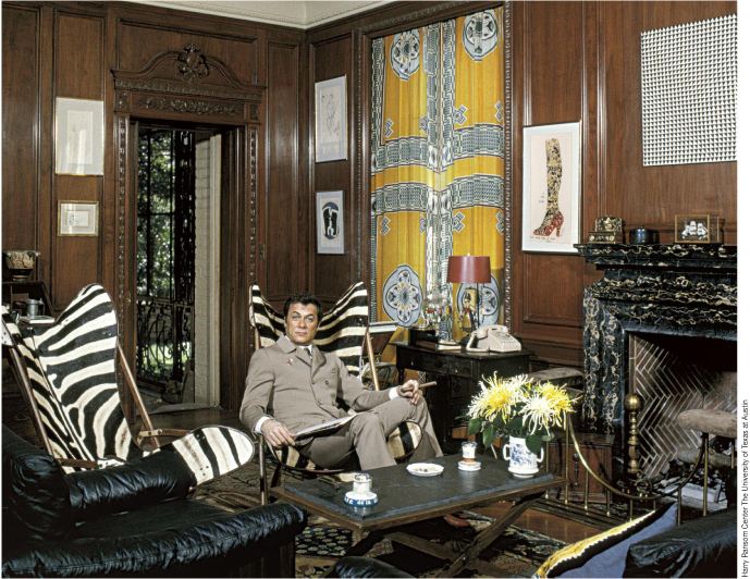
First, up top, just wow. Collector AND artist. There are several photos in the Julien’s catalogue from this shoot, which I assume was in Curtis’s old Beverly Hills place. Mondo Blogger wondered what that Op Art piece over the fireplace is? It’s not in the sale. Neither are those zebra skin butterfly chairs. Too bad. The Warhol Some Like It Hot Shoe drawing is, though.
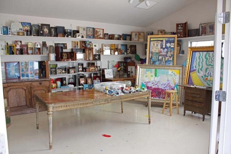
A lot of boxes in his studio. Holy smokes, did you know that he got his faux 18th-century dining/work table from Marlene Dietrich?? [Lot 385: est. $2-4,000]
According to the Independent, art was Curtis’s primary occupation for the last 25 years of his life. But it must also have been his lifelong passion. Just look at the young Curtis there working shirtless at his easel.
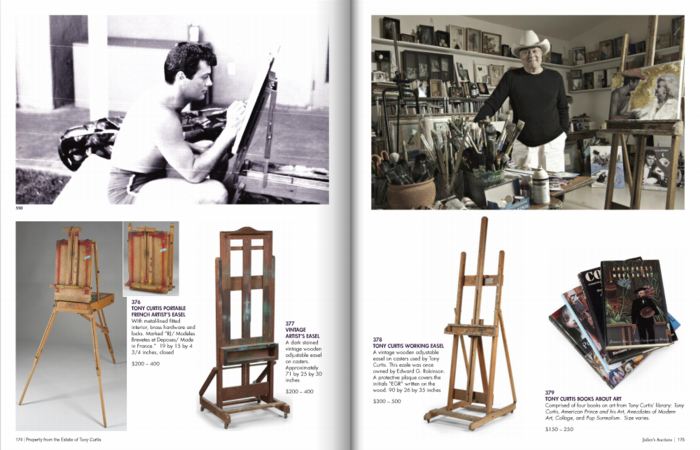
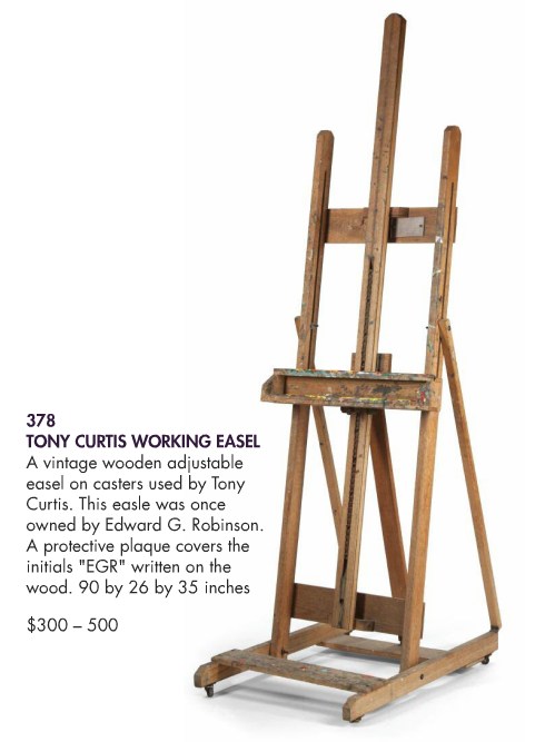
That article is also strangely focused on how such a manlyman as Curtis could produce such feminine art as his crafty little shadowboxes, or his Matisse-inspired paintings. Speaking of paintings and easels, did you know Curtis got this easel from Edward G. Robinson? He even put a protective plexi cover over EGR’s initials.
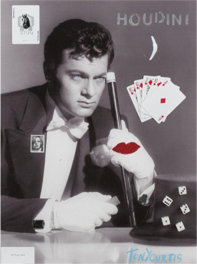
Curtis was apparently selling limited edition gliclee prints on canvas of his work, signed and with “applied objects and handpainted enhancements,” on his website, which, good for him. The original overpainted photo of Curtis and Sinatra is probably my favorite of his works. He really cut loose. Very Vegas.
But it kind of breaks my heart a little to read the lot descriptions for some of these prints [actually, the Sinatra piece is the original]: “Numbered 9/250 on the verso. NOTE: According to the Tony Curtis Estate, only 15 copies of this giclee were produced.”
But these late painting/print/whatevers, as well as many of the shadowboxes, appear to be explorations of Being Tony Curtis. With maybe a little exploitation thrown in. I guess he figured his celebrity was what people wanted [to buy], hopefully in editions of 250. Oh well.
There are mountains of household tchotchkes and objets, too, typical ticky-tacky decorator infill–and yes, I think having Tony Curtis’s porcelain elephant plant stands would be cooler than having generic Pasadena antique store porcelain elephant plant stands, but not by much.
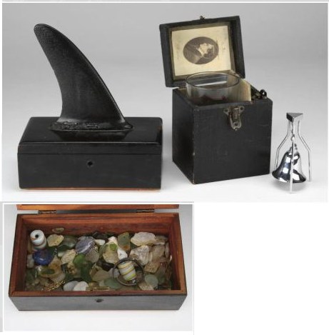
But there are a few things that seem to bear the mark of the artist’s hand more than others. The pair of black-lacquered cedarwood boxes, for example, one filled with sea glass and topped with a shark fin-like surfboard skeg, and the other lined with one of Houdini’s bookplates. I mean, right?
If I end up bidding, though–and this may be why I’m writing about it, to psyche myself up or out of bidding–there’s only one thing I’m going for: the Tony Curtis Artwork Chandelier.
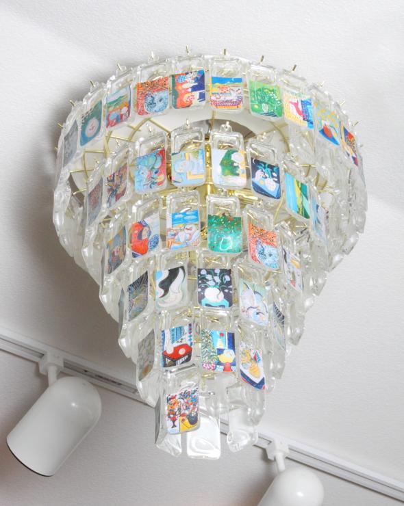
A unique piece, it’s described as “A spiral brass hanging light fixture with multiple Lucite tags, each featuring a different piece of Tony Curtis artwork.” An entire Curtis retrospective in a spiral light fixture. It’s Boite en Valise-meets-The True Artist Helps the World by Revealing Mystic Truths. [Lot 400: est. $300-500] Maybe I’ll hang it over Marlene Dietrich’s dining table.
Property From The Estate of Tony Curtis, Sept 17, 10:00AM PST [julienslive.com]
On Bremser On Google Street View
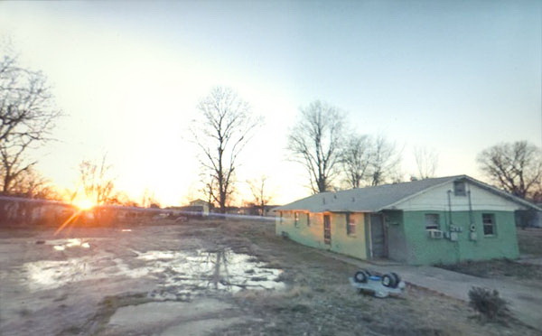
Doug Rickard, Helena-West Helena, Arkansas, 2008, “A New American Picture,” via bremser
Thanks to Joerg, I’ve had it in my browser tabs for almost a month now, meaning to write about it, but the TL;DR version is, Wayne Bremser’s essay on his blog It’s Never Summer is one of the smartest things I’ve read on Google Street View and fine photography.
“How to Photograph the Entire World: The Google Street View Era,” looks at work by GSV photographers like Michael Wolf, Jon Rafman, and Doug Rickard in relation to the greats of earlier generations of like Lee Friedlander, Robert Frank, William Christenberry, and Larry Sultan. [Bremser doesn’t mention, and I just thought it while typing this list, but The Google Gaze is apparently male. Maybe the giant camera stalk with the big balls was the first clue.]
Anyway, Bremser’s analysis is excellent in itself, but his premises also illuminate the contours of the gap that somehow persists between photography and art. Or more properly, between fine photography and contemporary art. At this point, I am coming to see these differences in religious terms: they’re formative, deeply held, esoteric, easily lost on outsiders, and laughable to an atheist.
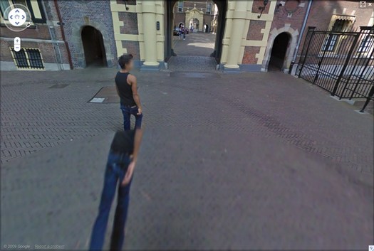
Walking Man – The Binnenhof, 2009, via greg.org
Though his title hints at more audacious possibilities, Bremser focuses on GSV as a tool for human artists:
As a camera, GSV is used by a photographer to rotate around, frame, and click to grab an image. The images that we see on the screen are raw data, gathered by the drivers; these images do not become photographs until a photographer frames them.
So, framing.
Also, I’m happy to take GSV’s ambition to “photograph the entire world” at conceptual face value, and go from there. By the time the Bechers began exploring the futility of documenting typologies of disappearing, industrial manmade structures, astronomers had already begun their second attempt to photograph the entire universe.
From Bremser’s photographer-centric beginning, it’s logical to say that:
One important process-related issue with GSV images that end up as photographs on a gallery wall is this: they are not screen grabs, but photographs of a screen.
Which, hmm.
Michael Wolf, Paris, 2008
But it is compelling and awesome to see the moire patterns and magnified pixels of Wolf’s pictures of his computer screen [above] in the context of photographers taking on the tectonic media shifts of their day, such as Lee Friedlander’s “Little Screens” series [below], photos from the 1960s that captured fleeting images on television sets.
Lee Friedlander, Florida, 1963, via bremser
And then there’s this:
Regardless of how photographs are sourced, it’s still essential to see photography in books and on walls. How do these look in the gallery?
Which, again, hmm.
I have used screenshots from both Google Maps and GSV to make both prints and books, because the screen, or the browser window, or Google Earth, is Google’s native image format. [Technically, that’s not true; Google presumably has much higher-res versions of their imagery which they do not make publicly available.] But I guess this is a distinction between using at Google’s imaging as source, and examining at it as subject. The fascinating, mind-blowing process around here isn’t Wolf’s [or for that matter, mine] but Google’s.
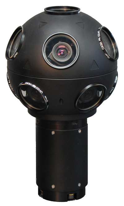
Even though it’s not his point, Bremser still moves the aesthetic ball forward. I’m embarrassed to say for all my Street View obsession, I never bothered to identify the camera system Google uses. Or used, since they seem to have replaced Immersive Media’s 11-lens, Dodeca 2360 pano camera [above] with an even awesomer camera ball [below].
Or maybe they’ve just added the optimized housing. I don’t know, but I should. Because this equipment is not Google’s secret sauce; it’s available. You can take a Dodeca 2360 out to make your own panos or sequences. The Street View aesthetic can now be yours! At least in theory. I suspect I’d find that shooting with a Dodeca 2360 wouldn’t make me Google any more than using a Red would make me Steven Soderbergh.
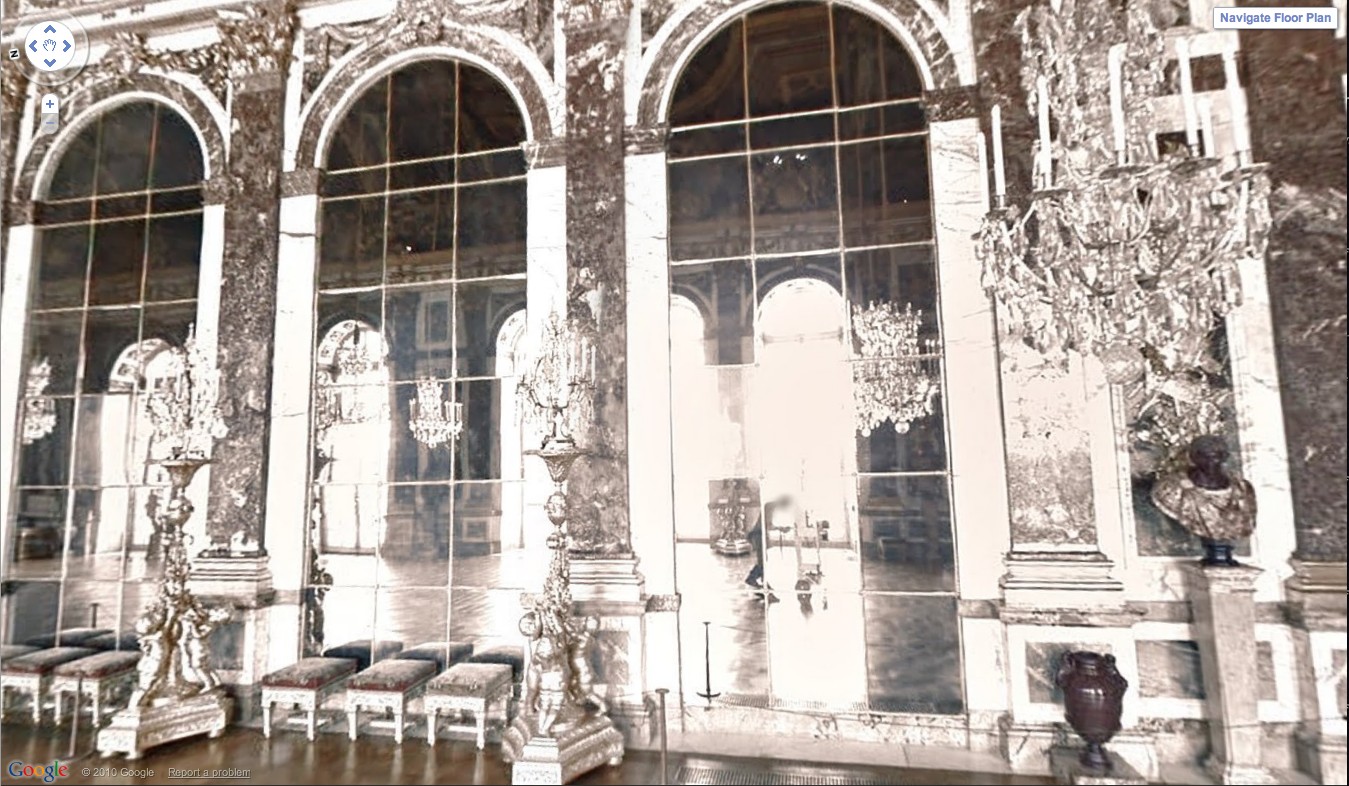
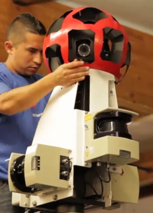
Google Street View camera guy in Versaille’s Hall of Mirrors, via [Google’s] Google Art Project.
Bremser concludes–and I agree–that GSV is rich and varied enough “that Michael Wolf can make photographs like Michael Wolf, Doug Rickard like Doug Rickard.” And Google like Google.
Projecktions
In May, Steve Roden wrote very nicely about Fionn Meade’s “Time Again” show at Sculpture Center, especially the conversation between one of his paintings and a little-known photograph of Projecktion, a Blinky Palermo project from in 1971, in which a painting was projected onto the facade of a building.
palermo’s “projektion” seems to shift certain conditions of an existing architecture through the addition of color and light, while my painting was the first that i have made that was directly influenced by the existing architectural conditions within which it was made (i.e. i could not have been made the painting anywhere else as its visual motif was built through my conversation with specific visual qualities of the space). in this way, palermo and i begin to talk about both painting and architecture in relation to ideas of site specificity, and in particular, i believe that as these works create a kind of conversational ouroboros around architecture and painting, where blinky imposes a painting upon an architecture, while in my own work an architecture is allowed to impose itself upon a painting.
That rather indelible Palermo image has turned up again, this time at CCS Bard’s show, if you lived here, you’d be home by now, which pairs it with similar, architectural/cinematic projections by Palermo pal Imi Knoebel. On the Sculpture Center. Knoebel’s Projection X was a video collaboration with Gerry Schum. In writing about these works on the SC website, Meade promises more to come. So stay tuned.
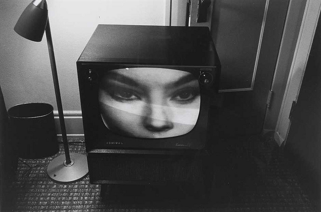
On Tacita Dean’s Photographs
As I mentioned the other day, I’ve been going through our storage space, getting these time capsule-like pops of memory from old files and boxes and stuff. One of the more unexpectedly unexpected encounters: print photos. I just don’t have envelopes of photos or snapshots sitting around anymore, not like I did in the 1990s.
And in that way, at least, I am like Tacita Dean, an artist whose films I’ve long admired, but whose work in photographs I haven’t really thought of much until now.
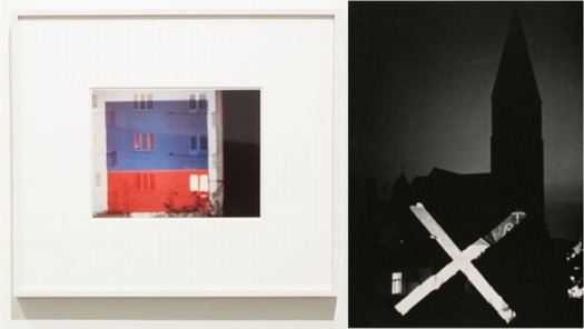
For her 2003 show at the Kunstverein Dusseldorf, Dean excavated a set of forgotten negatives she shot while living in Prague in 1991. As Catrin Lorch put it in her review of the show for Frieze:
[Dean] printed almost all of them to make a series of black and white, small-format photos. The almost forgotten scenes reveal a cross-section of the early years of post-communist Central Europe: broken-up cobbles, blurred, speeding trains, gracefully curving stairwells suffused with the crumbling charm of Eastern European modern architecture. A woman’s fat legs in black tights; a friend at the breakfast table. Looking at these photos arranged in open wooden boxes on a small table was like opening a message in a bottle.
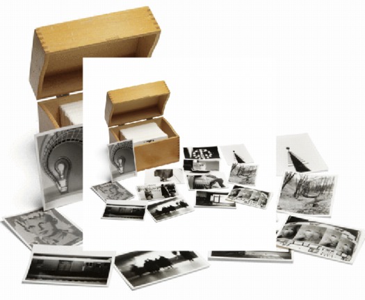
In 2008, Sotheby’s sold a set of Dean’s Czech Photos, which she’d published in a small edition, for a remarkable 3,750 GBP. [Sotheby’s flash-based e-catalogue site, where this screwed up double image comes from, is a web-breaking disaster,, btw.]
And then this morning, the lately irascible Jonathan Jones [h//t modernartnotes] mentions Dean’s “ambitious prints derived from photographs,” which he calls “her most powerful creations.” Well, which, what?
Sure enough. And ever true to her analogue roots, they’re photomurals. And overpainted photomurals to boot.
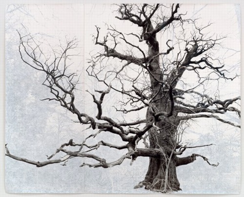
Beauty, 2006, 3.6 x 3.75m, collection sfmoma
Dean showed these large-scale works in her 2007 show at Frith Street Gallery in London, titled Wandermüde, which is the little-known corollary of Wanderlust. She made what are essentially portraits of the oldest trees in Southeast England, printed them on a large scale–using Steichen-style photomural-as-wallpaper technique–and then painted out the non-tree elements of the photo with gouache.
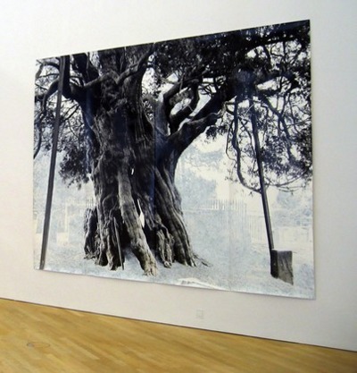
Crowhurst, 2007, 3x4m, collection: moma
That’s one in SFMOMA’s collection up top. Above is Crowhurst, from MoMA’s collection. I like how the oblique view clearly shows the work’s materiality, its seams and curled edges. MoMA’s website says they showed Crowhurst in 2007-8, but I confess, I don’t remember seeing it. I hope I didn’t mistake it for a Ugo Rondinone tree drawing and keep on walking.
Man At The Center With A Movie Camera

I’ve had this image of Dziga Vertov’s filmmaking process/org chart on my desktop for a couple of weeks now, ever since it was image of the day at mubi.com.
It’s specifically for his “Kino Korrespondent” films, which he produced in 1922-25. There’s crew in concentric circles, expanding out from the director. And the four quadrants of the wheel are apparently “fronts”: documentary, literary, recording, and editing. It seems like a cycle, or an iterative process.
MoMA just completed a major retrospective of Vertov’s films, including, for the first time, all his Kino-Pravda works. The working diagram immediately reminded me of the poster that was the icon for the series, from the 1930 film, Enthusiasm: Symphony of the Donbass. Enthusiasm is an experimental film symphony of synched documentary image and concrete sound.
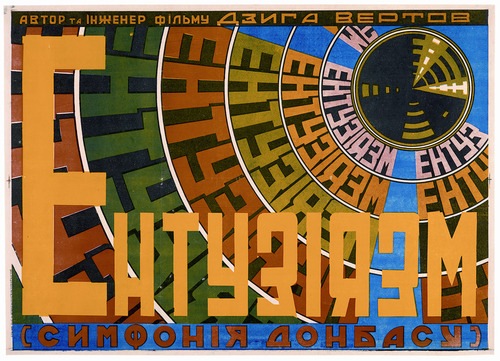
image of the day: how Dziga Vertov organizes filmmaking [mubi.com]
Image, obviously, from the Austrian Film Museum’s Dziga Vertov Collection [filmmuseum.at]
Dziga Vertov, 15 Apr – 4 June, 2011 [moma.org]
Esso De Cherbourg
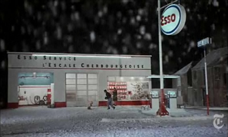
It may not be the absolute origin of my desire to live in a converted, modernist gas station, but AO Scott’s recent reminiscence reminds me that the Esso station at the end of Jacques Demy’s incomparable Les Parapluies de Cherbourg is one of my formative cinematic and architectural experiences.
I got completely blindsided by the film in the early 1990s when I basically wandered into the Time Warner screening room at MoMA and watched a preview of the restoration of the film spearheaded by Demy’s widow, Agnes Varda, who was on hand to discuss it. Truly not worthy, but there you go.
Uh-oh, something looks screwy with these prices; is there an issue with US availability of the DVD? [amazon]
‘The Whole Kit And Caboodle’
So I’m kind of dying because there’s a screening next week, and I’m trying to figure out how to go.
Three houses were used for the principal location; the production moved from one to another depending on the direction of the sun. “Terry’s not really a stickler for continuity,” Mr. Fisk said.