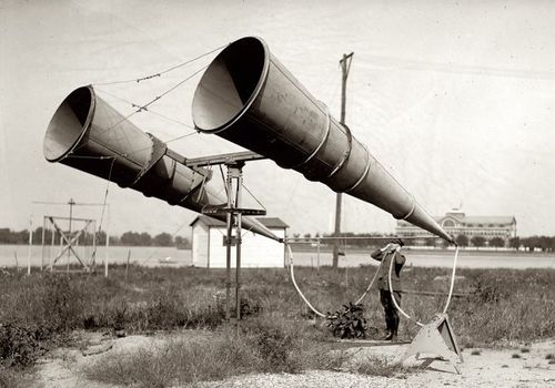
I’m feeling more serious about turning Richard Neutra’s Cyclorama building at Gettysburg into an educational monument to the wounded and a wheelchair-accessible battlefield observation platform.
War becomes history, reduced to its most basic contours, a date, a bodycount, and a winner:
Future years will never know the seething hell and the black infernal background of countless minor scenes and interiors, (not the few great battles) of the Secession War; and it is best they should not. In the mushy influences of current times the fervid atmosphere and typical events of those years are in danger of being totally forgotten.
…
The present Memoranda may furnish a few stray glimpses into that life, and into those lurid interiors of the period, never to be fully convey’d to the future. For that purpose, and for what goes along with it, the Hospital part of the drama from ’61 to ’65, deserves indeed to be recorded–(I but suggest it.) Of that many-threaded drama, with its sudden and strange surprises, its confounding of prophecies, its moments of despair, the dread of foreign interference, the interminable campaigns, the bloody battles, the mighty and cumbrous and green armies, the drafts and bounties–the immense money expenditure, like a heavy pouring constant rain–with, over the whole land, the last three years of the struggle, an unending, universal mourning-wail of women, parents, orphans–the marrow of the tragedy concentrated in those Hospitals–(it seem’d sometimes as if the whole interest of the land, North and South, was one vast central Hospital, and all the rest of the affair but flanges)–those forming the Untold and Unwritten History of the War–infinitely greater (like Life’s) than the few scraps and distortions that are ever told or written. Think how much, and of importance, will be–how much, civic and military, has already been–buried in the grave, in eternal darkness !……. But to my Memoranda.
That’s Walt Whitman’s foreword to his Memoranda During the War, a compilation of his diary entries, which he published in 1875.
In a country at war, so seemingly polarized by political disagreements, it’s odd how easy it is to forget that not only was there a civil war, there was an aftermath, where millions of Americans had to put their lives, their families, their cities, and their country back together again. Is forget the right word for something you presumably knew, or should have known, but really never gave a thought to?
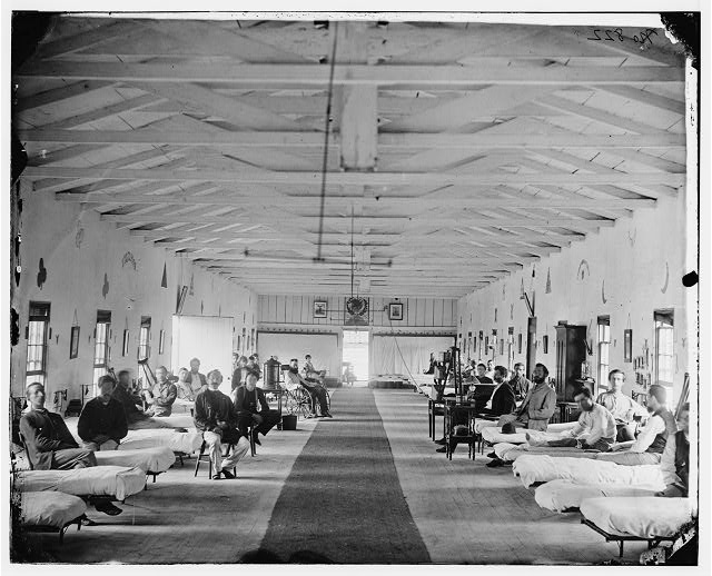
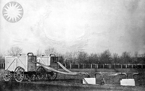
Armory Square Hospital, 1865, via loc.gov
Because I didn’t forget so much as never realized, never put it all together, that the wartime hospitals, where I knew Walt Whitman attended to wounded and dying soldiers, were not in Brooklyn, where the Whitman in my mind lives. They were in Washington, DC, where he’d come looking for his brother George, who’d been wounded in the battle of Fredericksburg. He stayed on, and tended over 80,000 men who belonged to what he called, “The Great Army of the Sick”:
June 25, (Thursday, Sundown).–As I sit writing this paragraph I see a train of about thirty huge four-horse wagons, used as ambulances, fill’d with wounded, passing up Fourteenth street, on their way, probably, to Columbian, Carver, and Mount Pleasant Hospitals. This is the way the men come in now, seldom in small numbers, but almost always in these long, sad processions.
Whitman also visited the hospitals at the Patent Office [now the Smithsonian Museum of American Art] and at Armory Square [above, now the site of the National Air & Space Museum]. His compiled letters to his mother, published in 1897 under the title of an 1863 poem, The Wound Dresser, contain additional details of his experience.
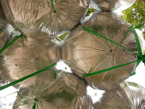
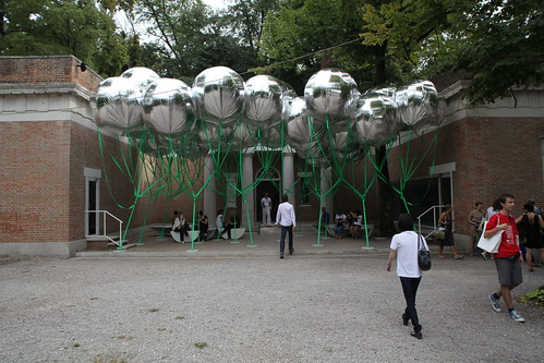
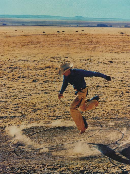
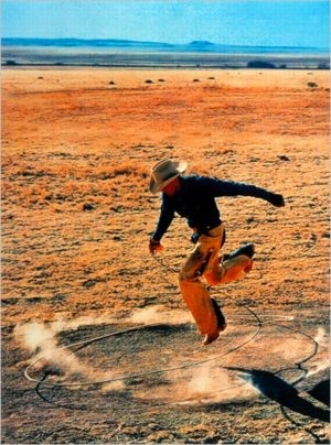
awesome torqued circle image by marc nielsen via flickr
Originally published as “The Dresser,” the poem is the centerpiece of Drum Taps, Whitman’s collection of war-related poems first published in 1865, and included in subsequent editions of Leaves of Grass, beginning in 1867.
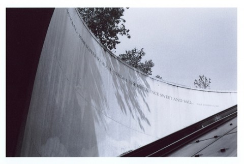
A stanza of “The Wound Dresser,” or at least part of one, wraps around the cylindrical granite wall of the entrance to the DuPont Circle metro station:
Thus in silence in dreams’ projections,
Returning, resuming, I thread my way through the hospitals;
The hurt and wounded I pacify with soothing hand,
I sit by the restless all dark night – some are so young;
Some suffer so much – I recall the experience sweet and sad…
– Walt Whitman, 1867
New York carpetbagger and infrequent DuPont metro traveler that I am, I’d always assumed it was installed in the early 90s, an oblique sop of acknowledgment of the AIDS crisis. Ahh, yes and no.
The idea for the poems did originate with a community request to “honor those who cared for people with HIV/AIDS,” [2025 update: internet archive link] but this had been expanded to include caregivers for all kinds of illnesses. And so the D.C. Commission on the Arts and Humanities sponsored a competition for poems as part of the Metro’s Art in Transit program. In 2007.
One would think that a 150-year-old poem by America’s greatest poet could survive a seemingly routine governmental agency arts collaboration unscathed. But I guess the public art doctors felt they must amputate to save the patient. With the last two stanzas cut off the inscription serves as an inadvertent memorial to what must still be sacrificed to make a permanent mark on the official landscape of 21st century Washington:
(Many a soldier’s loving arms about this neck have crossed and rested,
Many a soldier’s kiss dwells on these bearded lips.)
For much, much original Whitman material and even more Whitman scholarship, visit The Whitman Archive [whitmanarchive.org]
Next, related: Toward a Cyclorama-shaped Gettysburg Memorial to The Wounded

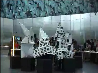
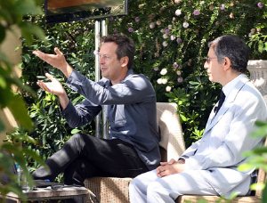 Doug Aitken was speaking at MoCA’s “Salons by the Shore,” a brunch series conceived and organized by trustee [and Gala co-chair] Lilly Tartikoff Karatz, which was held in a location that saves trustees from having to schlep all the way downtown on the weekend: the 5-acre Malibu home of

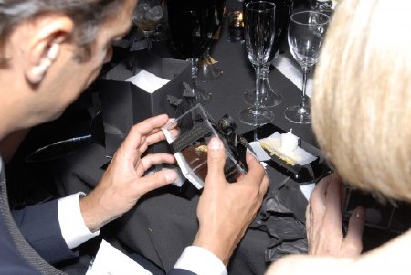
 Murakami is an example of an artist engaging directly with elements of the gala. In addition to decorating the tent with the same flowered wallpaper used in the galleries, each place setting had a matching Kaikai Kiki placemat for a gift/party favor. [right, image of TM, Pharrell, Kanye, Nigo and placemat, and white guy, via