I know that what’s really needed around here is a redesign, and probably the addition of a few thousand tags. But right now that’s an 8th burner project, and I’ve only got a 4-burner stove.
But in the mean time, I’ve noticed–and perhaps you have too?–that many projects and ideas around here relate in some way to Google, and to the way Google shapes our perceptions and interactions with the art, architecture, information, people, and the world.
So I rolled it all up into one, big Google category. Besides my own projects, it ranges from this morning’s post on Michael Wolf’s photos; to the whole sculpture and roof facades on Google Maps thing; to my 2005 attempt to re-create Ed Ruscha’s Every Building on The Sunset Strip using the failed Street View predecessor, Amazon’s A9; and all the way back to my early 2002 experiments with Google AdWords poetry, and to my Jan.. 2002 request for permission to use the word “Google” as a verb in my first short film. Weird, interesting stuff.
greg.org/google/
Category: projects
Michael Wolf, Street View Photographer
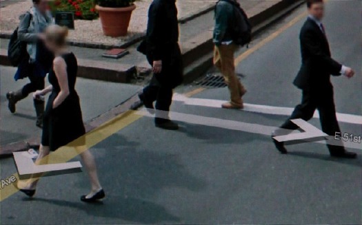
I’m glad and not surprised to see I’m the only person using Google Street View as an artistic source. Since at least last year, photographer Michael Wolf has been making a series of Street View-based works that explore urban life as it’s experienced, seen, and transmitted.
Wolf roams Google Street View in classic street photographer tradition, searching for the hidden, the unexpected, the sublime, the beautiful, the overlooked, images which reveal something about the character of a city and its residents. So far, he’s done Street View Manhattan and Street View Paris.
According to his Amsterdam dealer, Galerie Wouter van Leeuwen, where he showed this Spring, Wolf has spent over 400 hours searching Street View, which sounds like a direct translation of street technique to the virtual world. His careful cropping and composition, too, resonate with street photography’s quest for stolen, fleeting, magic images.
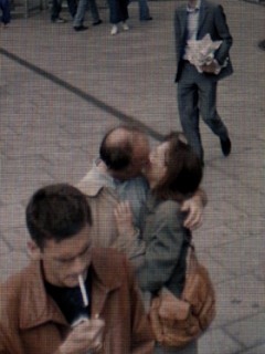
Some of his images carry Street View’s trademark aesthetics: blurred out faces [but not as many as I’d expect], navigation overlays and cursors, and occasionally the fractures and distortions of the pano image knitting algorithms. From the prominence of the screen pixels, it looks like he actually reshoots images on his screen, or as one press release put it, “pictures of pictures.”
His series Street View A Series of Unfortunate Events looks like archetypal on-the-scene photojournalism, only stripped by any news or context other than place. Though Wolf himself eliminates any place specifics or links, leaving each image to stand on its own.
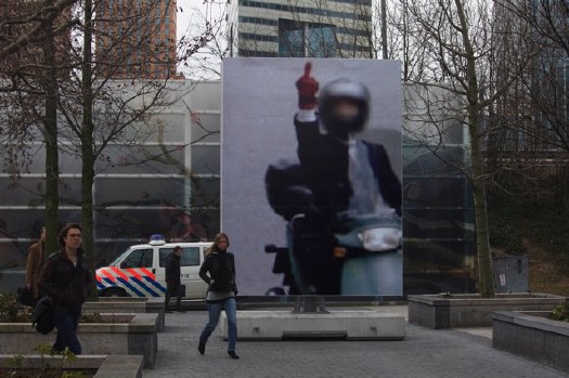
In March, the photography museum FOAM and the Virtueel Museum Zuidas staged an exhibition of Wolf’s Paris Street View photos on the street. Giant prints were placed around Gustav Mahlerplein, a plaza in a modern culture and office complex on the ring road south of Amsterdam. Unfortunately, no images of the exhibition have made their way back into Google Maps.
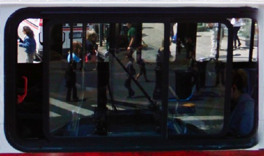
While Wolf’s quote of Robert Doisneau’s Hotel de Ville kiss is the most obvious, my favorite throwback images are like the ones here, where he finds in Google layers of reflections and perspectives that’d do Lee Friedlander and Harry Callahan proud. Really beautiful stuff.
Michael Wolf photography [photographymichaelwolf via things magazine]
Wary Mari
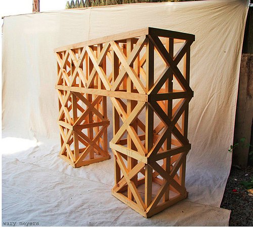
And thus we see the painful difference between meaning to buy Wary Meyers’ awesome-looking design project book Tossed and Found and actually buying it. I would have been inspired by their Enzo Mari autoprogettazione-esque mantle many months ago. What progettazione have I not thought of in that time? I’ll never know.
Progettazione 1×2 [warymeyers]
How To Make Lantern Slides Of Spiral Nebulae
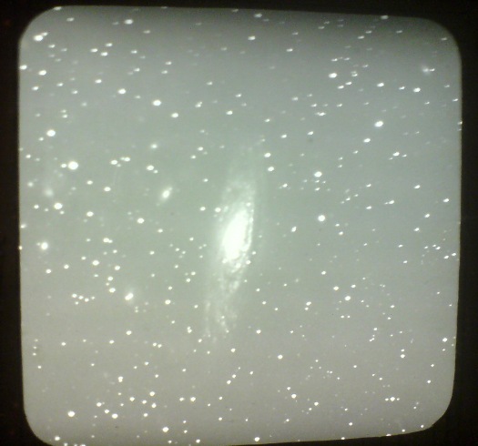
While wandering through the National Air and Space Museum [family’s in town], I stumbled across James Keeler’s lantern slides of spiral nebulae, taken at the Lick Observatory outside San Jose beginning in 1888.
Keeler was a pioneering astronomer at what was the largest reflector telescope at the first permanent mountaintop observatory in the world. He wasn’t the first astrophotographer [moon photos don’t count; everyone from Daguerre forward shot the moon], but he was a great one, and his deep sky photo survey is one of the earliest and most ambitious I’ve found. Keeler photographed hundreds of spiral nebulae and boldly estimated that at the rate he was finding them, there were at least 100,000 of them out there.
Three of his slides are on display at the museum. In the midst of what it called the “photographic fad” of 1890, The New York Times covered a lantern slide presentation Keeler made in December of that year at the New York Camera Club on Fifth Avenue. [Alfred Stieglitz joined the Camera Club soon after in 1891.]
Keeler’s slides, which he acknowledged were executed by a staff member at the observatory, were nevertheless described as “excellent in their make” and “some of the best specimens of star photography.” He went into great depth on the technical challenges of making telescopic photographs of the stars:
The usual method of keeping the star on the plate in photographing was by moving the telescope, but owing to the size of the instrument at the Lick Observatory this was impossible, as the telescope weighed seven tons. The plan adopted, therefore was to make the plate movable by means of turning screws.
…
…it happens that a different focus is obtained in the big telescope. The dry plate is therefore placed in the tube nine feet from the eye piece, a hole having been cut in it for that purpose…When the plate is developed the operator has to go it in a blind sort of fashion, as the smaller star images will not appear till the developing work is done.
…
Photographing stars, especially the small ones, is tedious work, as in some cases teh exposure must last for several hours. During all that time the plate or telescope must be moved so that the image of the star will continue in one place.
Keeler was the director at Lisk when he died suddenly in 1900, and his colleagues undertook to publish his sky survey and photos.
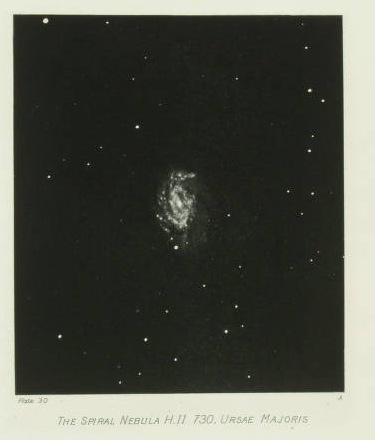
Photographs of NEBULAE AND CLUSTERS. Made with the Crossley Reflector was published in 1908 by the University of California. It contains 70 full page, hand-printed heliogravures [which is French for photogravures, which is actually French for any kind of photo-based printing technique, not just the copper plate-based intaglio-style prints associated with photogravure in English].
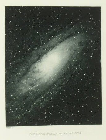
The Clark Art Institute has helpfully digitized all 70 of Keeler’s posthumously published plates. So far, I have not found information on the extent or state of his negatives, slides, or other prints. I imagine I’ll be digging into the Lisk and UC archives soon.
Westinghouse World’s Fair Pavilion, Or Eliot Noyes’s Huge Shiny Balls
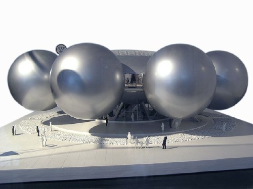
I love Eliot Noyes as much for his own designs as for his role as catalyst, instigator and patron for some of the greatest modernist objects and buildings of the postwar era.
And yet somehow I hadn’t made the connection to his unrealized design for the Westinghouse Pavilion at the 1964 New York World’s Fair, which consisted of eight 45-foot diameter silver spheres floating off of a central domed foyer. Giant silver spheres in 1961? Wherever would the idea for such a form come from?
Thanks to dealer-turned-design curator Henry Urbach, SFMOMA acquired the Westinghouse maquette in 2006, but the museum’s description doesn’t make any reference to Project Echo or any design references at all.
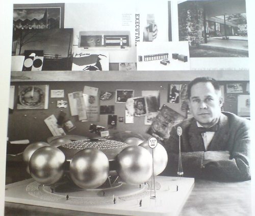
Next, I turned to Phaidon’s sleek-yet-frustrating Eliot Noyes monograph, written by Noyes’s longtime collaborator Gordon Bruce. Though it’s chock-full of info and photos [including the one above, of Noyes posing with his maquette], it turns out to be more bio snapshot than design history. There’s a little about the bureaucratic wrangling that nixed the pavilion [and replaced it with a second company time capsule, to match the 1939 one], but nothing about the design.
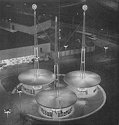
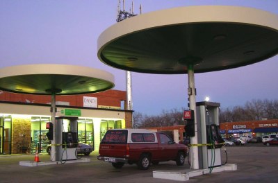
Oddly, there’s no mention at all of the scaled-down pavilion which was eventually built [image via], even though it has the maquette’s signage, and it looks awfully similar to the round gas station canopies Noyes would design for Mobil a couple of years later. [image via agilitynut.com’s great collection of gas station design photos]
update: indeed, Noyes & Assoc. are credited in the World’s Fair Time Capsule Pavilion Brochure, which turns out to be the uncredited source for Wikipedia’s image. That’s the torpedo-shaped time capsule right there, btw, suspended 50-ft above the ground by the three masts.
Eliot Noyes, Westinghouse Pavilion, 1961 [sfmoma.org]
Light Space Modulator, Remade
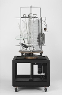 I’d known Laszlo Moholy-Nagy’s 1930 kinetic sculpture Light Space Modulator indirectly as a film subject, and then in 2002 through incredible color photographs Oliver Renaud-Clement showed at Andrea Rosen in 2002. [And again, in direct relation to the artist’s sculptures in 2007.]
The press release for that show quotes Moholy-Nagy on the LSM:
…a structure that is made to develop the sense of space and explore the effective relationships which must be within the quality range of any architecture – an ABC of architectural and projective space…
The mobile was so startling in its coordinated motions and space articulations of light and shadow sequences that I almost believed in magic.
Which is nice.
But I came to know it not as an object itself, a sculpture, and not as a film prop [the original title for the work is Light Prop for an Electric Stage], when I began researching the replication a similar object, Ray and Charles Eames’ Solar Do-Nothing Machine.
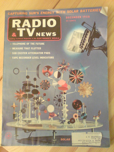
Eames called their creation, built in 1958 for an Alcoa ad campaign, a “toy,” not a work of fine art. My own interest was to use the context of art to recreate the Do Nothing Machine–I want one and want to see and experience it in person. But it quickly became apparent to me that the Eameses’ modernist, experimentalist work already resonated with the contemporaneous history of light and kinetic sculpture. Which Moholy-Nagy’s work both prefigured and directly influenced.
Filled with dazzling close-ups of whirring, colorful components, the Eameses’ film of the Solar Do-Nothing Machine could be a Technicolor Hollywood remake of Moholy-Nagy’s film, Lichtspiel. But the Light Space Modulator turns out to be directly related to this project in another not insignificant way: it’s actually a replica.
Moholy-Nagy worked on the LSM for an easy decade until 1930, but he also tweaked, repaired and altered it for use and exhibition up until his death in 1946. His widow Sibyl Moholy-Nagy gave the work to Harvard’s Busch-Reisinger Museum in 1956.
But that was not what was exhibited when light and kinetic was the new hotness in 1970, both at the Howard Wise Gallery in New York, and at the Venice Biennale. And it’s not what is exhibited now or since, or what is shown in nearly every image of the Light Space Modulator published these days. Those are all refabrications, or replicas, or approximations, really, of the original–or at least of its final state.
So from Eames, I’ve been diverted by the fascinating history and reincarnations of the LSM. Which I’ll get into in a minute.
Gerhard Richter 4900 Colours Microsite
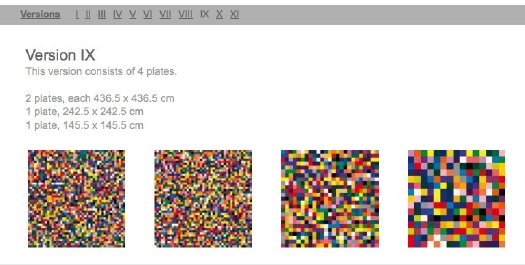
In addition to the world’s greatest artist website, artist Gerhard Richter also makes paintings.
Now these two endeavors come together with the debut of a micro-site devoted to 4900 Colours, the set of 196 5×5 grids of 25 randomly applied enamel-painted squares, mounted on Aludibond panels. 4900 Colours can be exhibited in any of 11 configurations. Above is Version IX, which I chose for its apparent zooming-in-on-pixels quality.
One point of note: the website lists 4900 Colours in the /editions/ folder. Update: the microsite URL has changed; it is now listed in /paintings/
And two points of great relief: the 4900 individual squares were indeed sprayed-on enamel, not handpainted by the finely dressed artist; and there are no drop shadows. I think we are making real progress here.
www.gerhard-richter.com/art/paintings/4900-colours/ [gerhard-richter.com via @gerhardrichter]
Previous coverage of 4900 Colours:
The Making Of, with special guest star Benjamin Buchloh
About facture and that handpainted square
About drop shadows and diagrammatic abstraction
The Wildman Of Chelsea
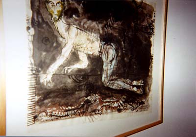
So woohoo, Andrew Russeth pointed back to a Charlie Finch artnet gossip column from 1998, and just wow. I was there, I mean, I remember a lot of that stuff, and it is freaking me out how alien and long ago and far away it all sounds.
One thing I didn’t know or remember, was Finch’s story from John Weber, about how he found a 1961 Robert Smithson painting in his storage while preparing his move to West 20th Street. It was called The Wildman of Chelsea.
Finch’s is the only mention I could find of it online.
But it got me thinking [again]. Smithson’s Floating Island was posthumously realized based on a simple 1970 sketch, right?
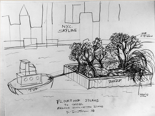
And Smithson left plenty of other comparably detailed sketches for projects. Who’s to say that The Wildman of Chelsea isn’t an early work in the series?
What’s to stop someone from realizing Wildman right now, right here? With all the beards and jorts pegged jeans around town these days, it could probably be done and posted to flickr before dinnertime.
Obviously, what’s really needed is a band of historically accurate enthusiasts to start researching this stuff in depth, and then re-presenting it, for both the aesthetic benefit of the public, but also for one’s own experiential edification. It’s like Marina Abramovic’s white-coated MoMA crew meets Civil War re-enactors. For Smithson.
The Robert Smithson Re-enactors Society.
If You Love greg.org, You’ll Love History Detectives!
Wow, I knew about the Moon Museum segment because Jade Dellinger emailed about it. But I didn’t know the first episode of this season’s History Detectives also included a whole segment on satelloons and Project Echo. I love how they search for satelloons online–and then crop out the top few search results.
I guess if the Detectives suddenly discover an undocumented Richard Neutra house in Utah, I’ll have to start making some calls. Meanwhile, watch History Detectives on your local PBS station! I’m sure you’ll like it! [thanks cliff for the heads up]
The Planck All-Sky Survey
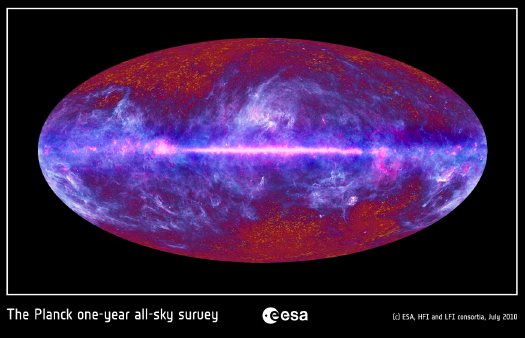
ESA has released images of the first all-sky survey from the Planck space observatory, which is currently in orbit around Lagrange-2, a balancing point between the gravitational exertions of the moon and the earth.
Planck rotates at a constant 1 RPM, and it continually repositioned to avoid the sun, enabling it to produce a full survey of the entire sky in about a year. This computer animation video demonstrates how the survey image was constructed:
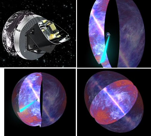
When Planck’s data is added to the American Museum of Natural History’s Digital Universe Atlas, it should help fill in that gigantic torus marked, “empty areas we have yet to map.”
Planck all-sky image depicts galactic mist over the cosmic background [esa.int via javierest]
Scanning the microwave sky with Planck [esa.int]
Blow
This FT essay by Daphne Guinness about buying Isabella Blow’s estate before it was dispersed at Christie’s is a wonderful, sad, incredible thing. [via @artnetdotcom]
All the way back in 2002, I overwrote a long post about Blow, Walter Benjamin, Bill Cunningham, fashion, and street photography. The occasion was Guy Trebay’s writing about street fashion.
Frankly, I’m surprised at how much of it I’d forgotten. Did Benjamin really call the flaneur “a spy for the capitalists, on assignment in the realm of consumers”?? That is awesome, I could totally use that!
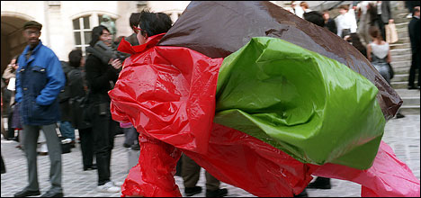
What I’ve never forgotten, though, is Cunningham’s expertly serendipitous street photo of Isabella Blow blowing into a fashion show in Paris:
A Pixel Is Not A Little Square! [Except When It Is]
Thanks to greg.org reader Fred for sending along a link to a memo computer graphics pioneer Alvy Ray Smith wrote in 1995, soon after his company Altamira [the one he founded after Lucasfilm and Pixar] had been assimilated by Microsoft.
The Title: “A Pixel Is Not A Little Square, A Pixel Is Not A Little Square, A Pixel Is Not A Little Square!” [pdf via alvyray.com, a year later, he added, “(And A Voxel Is Not A Little Cube)”] Two guesses what it’s about.
Alvy’s rant sounds exactly like what I’d expect from circa 1995 Microsoft: brilliant, self-assured, and presumptuously prescriptive. Which is not, alas, the same thing as being entirely right or even aware of its own limitations.
Because it gets a little rambling, and because I am basically arguing pixels with the guy who worked on the Project Genesis sequence in Wrath of Khan, I have moved it all after the jump.
Continue reading “A Pixel Is Not A Little Square! [Except When It Is]”
Wherein The Inventor Of The Pixel Totally Agrees With Me, Even Though I Don’t Totally Agree With Him
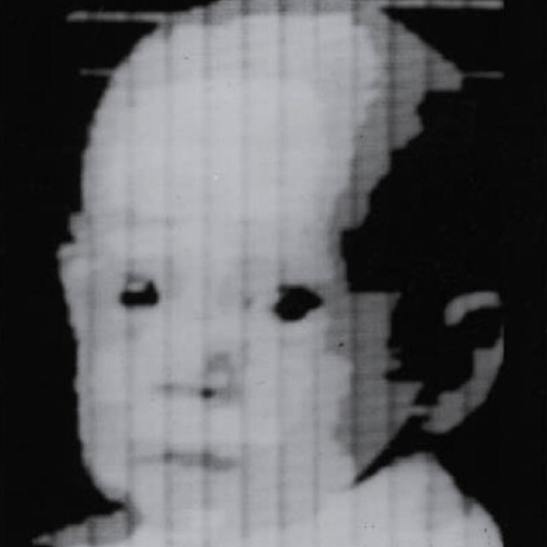
53 years later, the guy who invented the square pixel regrets the error.
In 1957, NIST computer expert Russell Kirsch scanned the world’s first digital image [a photo of his infant son, above] using the country’s first programmable computer. To accommodate the memory and processing capacity of the available equipment, Kirsch had the computer break the image up into a 176×176 grid, and to assign a binary color value, black or white, to each of the resulting 30,976 square pixels.
Apparently, it’s been eating at him ever since, because he has, at age 81, published a suggestion for increasing the “precision and accuracy in scientific imaging” by replacing uniformly square pixels with pixels of variable shapes.
I do not know enough about compression algorithms and data/information loss to know whether Kirsch’s proposed method is either necessary or superior to the state of the art. But it is most fascinating to see one of the inventors of digital imaging remain so engaged and critical of the system he helped bring forth.
And frankly, though I don’t know any of the history or the context, I don’t necessarily agree with him that the grid and the square pixel was an “unfortunate” solution. In the 50+ years since the square pixel became the irreducible unit of visual information, it has acquired its own aesthetic and cultural context.
[Looking through the NIST Museum site, it sounds like the “serious mistake” was using a binary [i.e., b/w] basis for computer scanning in the belief that it was an accurate representation of human neural activity and visual data processing. It also sounds like the NIST folks started trying to correct for it almost immediately.]
When he completely agrees with me and validates my own assumptions, however, I agree with him completely. The man is a genius and a living legend:
…we show that the usual assumption that increased precision is accomplished with higher resolution of square pixel images does not necessarily result in the increased accuracy that can be achieved with the use of variable shape pixels…
PDF: Kirsch, Russell A., “Precision and Accuracy in Scientific Imaging” [nist.gov]
Square Pixel Inventor Tries to Smooth Things Out [wired.com thanks Joerg Colberg, who has been experimenting with cooler-shaped pixels himself lately]
related? coloring the pixels of Mariner 4’s first image of Mars by hand
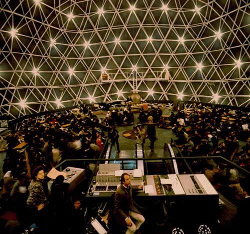
Wilkommen To The German Dome
Walking Man? What Walking Man?
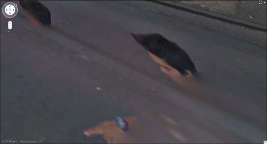
Alberto Giacometti’s figures look the way they do because he tried to capture what he called, “The moment I see them” and the way “they appear in my field of vision…” Arthur C Danto said this accounted for “the somewhat ghostly feeling of his figures, as if they were persons whose bodies had been all but erased.”
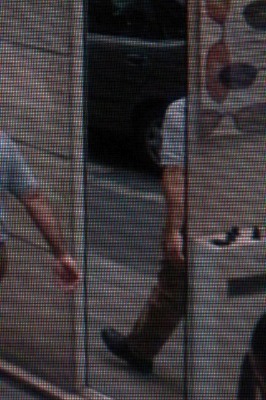
These ideas of figures, distorted, hovering on the edge of perception were very much in my mind when I found the incredible-looking sequence of [self] portraits of a man in the Google Street View panos of the Binnenhof, the Dutch Parliament complex in The Hague. The guy is almost certainly a Google Street View worker who accompanied the new Google Trike as it scanned and photographed the pedestrian-only area.
By walking alongside the Trike, the guy ended up inserting himself into thousands of photos, and basically every stitched-together panorama. The stitching algorithm, though, often tried to erase him, or replace his photo with a better [i.e., unobstructed] image of the same spot. The result is a series of fragmented collage portraits, disembodied heads, hairdos and limbs.
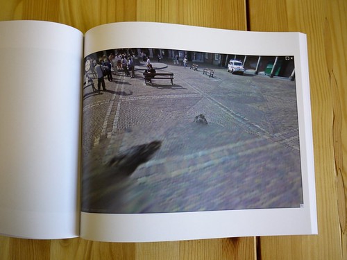
I gathered full-sized screenshots from every pano, focusing not of the site itself, but on the guy, and then I bundled them into a book, which I titled, after Giacometti, Walking Man. That was in mid-April.
As I’ve been tweaking the book the last few weeks, though, I found that several of the Binnenhof panoramas have been removed from Google Street View, including all the coverage of the inner courtyard, and every one I illustrated in my blog post.
Google has been getting heat in Europe for its Street View datagathering practices. I’d suspect that investigations in Germany and across the EU–and now even in the US–for surreptitiously collecting personal data across wi-fi networks is a bigger issue for them than ye random blogger’s artbook-ish attempt to fit Street View into critical history of street photography. And yet.
Google had already had the Binnenhof in the bag when they announced the Google Trike last summer, and invited the public to suggest where it should shoot first. Whatever else it was, this seemed like a canny move designed to deflect any possible political heat from the Street View effort: we’ve already got the Parliament on board, who wants to be next?
Now, though, it seems like someone, either within Google or within the Dutch government, or both, is actively deciding it doesn’t want people to examin either the Binnenhof OR the Street View process too closely. And that includes Walking Man, whose portraits are being all but erased.

