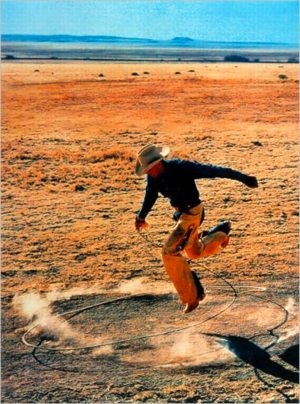
 When I offhandedly declared a jpg of Richard Prince’s 2003 rephoto, Untitled, (Cowboy) to be my own work a year ago, I had no idea it would ever leave my blog post.
As an idea, appropriating an appropriation might be funny/interesting for about 30 seconds. Or it might be a useful provocation for a discussion about fair use, and the unacknowledged constraints it places on our cultural dialogue and production.
Untitled (300 x 404) may look like a jpeg of Richard Prince’s Untitled (Cowboy), but it turns out to look nothing like Prince’s actual, 30×40 inch work. [Which, itself is actually an enlarged photo of Sam Abell’s Marlboro Man ad from a magazine.]
And that’s something I only began to realize when I started looking around for the best way to print this jpg file in real life. Obviously, it can be reproduced infinitely online–here, have one! But printing it without dramatically altering the original data turned out to be a challenge.
So when Jen Bekman and I started talking about publishing an edition with 20×200, my first question was for their printer. Since they knew their printer was awesome and could pull it off, their first question was for their lawyer.
But as soon as we saw the proofs come in in various sizes, with the pixels rendered in velvety, matte inkjet pigments on that heavy paper, it was obvious that this piece really needed to be published, and it needed to be done by 20×200.
I have no claim on the image, or the idea, or the technical skill of making them, and yet I feel incredibly proud of these prints, which are these beautiful, physical things.
As I figure out how best to photograph them, I’ll post some image of the prints themselves over the next little while. But it might be tough. They’re really the kind of thing you want to see in real life.
Check out prints and details about Untitled (300 x 404) at 20×200 [20×200.com]
Read Jen’s email announcement of the edition [20×200.com]
Previous greg.org posts:
May 18: West Trademark F(*#$Up
May 20: 300 x 404 [sic]: The Making Of
June 10!: Richard Prints: Untitled (300 x 404)
Category: projects
Prints: I Did An Edition With 20×200.com. It Comes Out Tomorrow.
 Look, no one is more surprised than I am about this. But when Jen Bekman and I started talking about it a while back, it started sounding like the awesomest thing in the world.
So I’ve done an edition with 20×200.com. It looks fantastic. And it will be released tomorrow.
You can get the first look at it–and the first chance to buy one–by joining the 20×200 mailing list.
Actually, it looks even better in various sizes, so I recommend buying several.
After it’s released, I’ll post a bit about the piece and the ideas and work that went into it.
Meanwhile, a huge shoutout to Jen, Eric, Sara, John and the other folks at 20×200.com, who have been great to work with. Thanks, and stay tuned!
20×200.com/mailinglist [20×200.com]
The Race To The Moon Museum
Whoa, check that out! The Moon Museum’s on the Tee Vee! Or it will be, June 21st.
The PBS show History Detectives is trying to figure out whether the Moon Museum, a SIM card-sized ceramic wafer created in 1969 by Forrest Myer, with help from an engineer at Bell Labs, which contains drawings by Myer and five other contemporary artists, actually made it to the moon.
The show uses Tampa-based curator/writer Jade Dellinger’s copy of the chip as the hook. They’re making an open plea to viewers with any info on the identity of “John F,” the Grumman engineer supposedly responsible for secretly attaching a chip to the leg of the Apollo 12 lunar landing module.
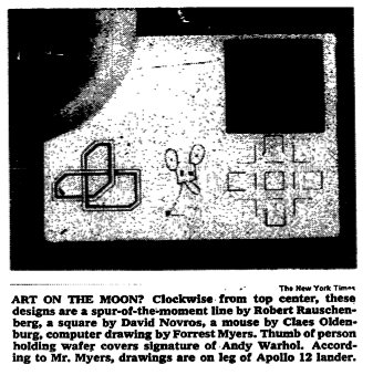
After I posted the NYTimes’ picture of the chip in 2008, it got picked up by Melissa Terras’ Blog, where several people involved in the Moon Museum came forward. The comments now hold a discussion between family members of the Bell Labs engineers who worked on the chips, including Fred Waldhauer, Burt Unger, and Robert Merkle.
Though Myers told PBS that 16 or 20 chips were made, Amy Waldhauer [whose mother Ruth Waldhauer donated the chip to MoMA which was exhibited last year at PS1’s 1969 show], said there were 40.
Also chiming in: curator Annick Berraud, who exhibited a chip in Paris last year, and who is apparently also working on an extended article on the Moon Museum for Leonardo, MIT’s arts journal.
It’s all awesome, but it also sounds like I gotta step up my game if I want to get me a Moon Museum chip. Or at least reopen the comments around here.
Pour Copie Conforme
After bagging on Blake Gopnik’s comments on Marcel Duchamp playing the buyers of his readymades for fools, I started looking more closely at Duchamp’s actual statements and working process. It’s so easy to consider him as just a source of ideas, and to forget that in fact, he expended a great deal of effort and time on the creation of objects.
On the other hand, that dude would sign just about anything that wasn’t nailed down. Including readymades that were really made, or found, or bought, by others. All over the place. The only thing that stopped him, it seems, was Arturo Schwartz, who insisted Duchamp stop signing stuff to protect the value of the 1964 readymade editions.
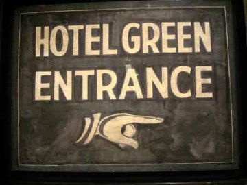
One example: when the late photographer, painter, and avant garde filmmaker Dennis Hopper met Duchamp on the day of the opening of his 1963 retrospective in Pasadena, he grabbed a sign from the Hotel Green, where Duchamp was staying, and asked him to sign it. And he totally did.
Another, from Francis Naumann’s incredible practice history, Marcel Duchamp: The Art of Making Art In The Age Of Mechanical Reproduction, which I picked up at the suggestion of John Powers [Naumann’s gallery was the site of that fantastic Duchamp chess show last year.]:
During the time of the Pasadena exhibition, Duchamp was invited to attend a breakfast in his honor at the home of Betty Asher, an important collector of contemporary art who lived in West Los Angeles. Among the thirty or more guests she invited, one of them, Irving Blum, then owner of the Ferus Gallery in Los Angeles, asked Duchamp if he would consider signing a bottle rack he had found and purchased from a local thrift shop. Just in case the artist agreed, Blum brought the item along with him to the breakfast. When Blum asked, Duchamp responded: “Gladly,” whereupon Blum retrieved the work from the trunk of his car and Duchamp signed it on the bottom rung, adding the usual inscription, “pour copie conforme,” and the date: “1963-14”. When Blum was in the process of returning this treasured artifact to the trunk of his car, Richard Hamilton reportedly rushed out of the Asher house and quipped: “You are, of course, aware of the fact, Mr. Blum, that in order to devalue his work, Duchamp signs everything.” [p.235, emphasis added for the awesome parts]
Indeed, and one of the last things he signed was the replica of Bicycle Wheel which Hamilton had made, and had asked Duchamp to sign the next time he passed through London. [Blum donated his Bottle Rack, below, to the Norton Simon Museum in 1968 after Duchamp’s death.]
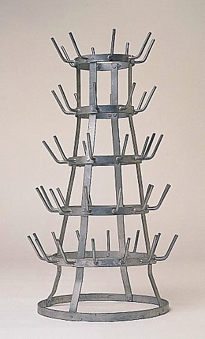
And Pontus Hulten told how Duchamp said the Modernamuseet could save money by making a bunch of readymade replicas for a show instead of shipping them: “Duchamp later signed everything. He loved the idea that an artwork could be repeated. He hated ‘original’ artworks with prices to match.” [p.213]
Which is making me nod and laugh out loud right now as I sit here, with a pile of pens, signing my name over and over and over on the stack of certificates for the edition I’m doing with 20×200.com, which is going to be announced very soon. Stay tuned.
Of All The Satelloon Photos I’ve Loved Before
A digitized collection of vintage NASA Goddard Space Flight Center newsletters led me to the June 23, 1963 issue of LIFE Magazine. If it were possible for any photo of a Project Echo satelloon to be slightly less than awesome, this photo would move forward to be the awesomest:
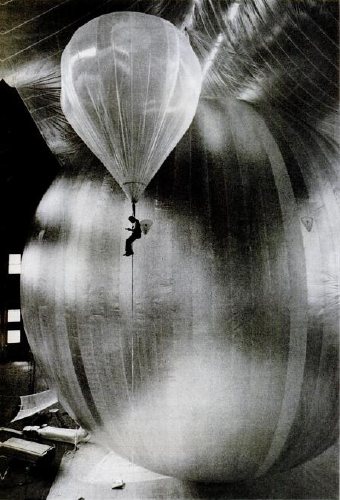
It’s a technician inspecting for leaks during a test inflation of the Echo II at Lakehurst, New Jersey, which was long the Navy’s site for giant inflatable vehicles. From the 1930s construction photos of the massive dirigible hangars to the parades of Navy blimps during WWII, the “Lakehurst” is a stealth candidate for awesomest single search term Google’s LIFE Magazine image archive. Unfortunately, this photo is not included. I’d love to find it, though; someone deserves a credit.
Here’s one of the same test, only there’s no location, and it’s misdated. credit: NASA. And it’s public domain. Here’s one of the first ever photos of an Echo satelloon; famous LIFE photojournalist Grey Villet took it while standing next to the antenna used to bounce the first radio signal off Echo I in 1960.
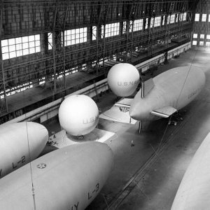
All of this is related to my master plan to show a satelloon as an art object, sure, but it’s also precipitated by NASA’s latest, the Bullet 580, dubbed, depressingly, “the world’s largest inflatable airship,” which was test inflated last weekend. At 235 feet long and 65 feet across, it practically fills the Garrett Coliseum in Montgomery, Alabama [below]
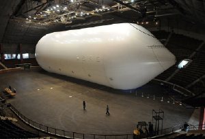
If there were a clearer sign that Our Nation has lost its way in the field of Giant Balloons And The Buildings That Hold Them, I can’t think of it. A sad, sad day. [images: George Strock/LIFE; AP]
Non Realizzate: Proposta Per Un’Auraprogettazione
Apex Art just announced that Courtenay Finn and Gary Fogelson were selected for this year’s open curating slots. Finn’s proposal uses a work by Bruce Nauman as a jumping off point for a show about “the role of reading in artistic practice.” Fogelson’s will tell the incredible-sounding history of alternative, arts, and experimental filmmaking shown in the 1970s on Boston’s WBBI TV. Congratulations to both of them, and get cracking, time’s a wastin’!
I’d had an idea for a show percolating for a while, so I submitted it. As I re-read it now, it’s fascinating how much of it is stuff I’ve blogged about over the last couple of years. In a real sense, the blogging process was central to the development and coalescence of the show’s ideas, if not for the actual proposal, which I wrote up and submitted anonymously, as Apex Art requires.
It tied for 45th place out of 320 entries. 86th percentile, which is alright, I guess, in a B-show kind of way.
Anyway, it was inspired, as the title suggests, by Enzo Mari. It challenges the common conception of aura by applying Mari’s autoprogettazione reproduction strategy to instructions-based art practice.
And because it also includes references to the great gatherer of Unrealized Projects, Hans Ulrich Obrist, I thought I’d go ahead and share my proposal here. If you’re one of the 40 international, anonymous judges who rated it less than 4/5, I do hope you’ll drop me a line and tell me what might have improved it for you.
Many thanks to those folks who gave me feedback and art historical suggestions on the idea as I was putting it together, too. I don’t want to sound namedroppy–until we polish this bad boy up and put on this jargon-laden, Stingelpainting party somewhere else, then I’ll be thanking you often and loudly, I’m sure.
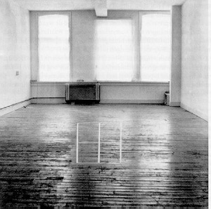
Proposta per un’auraprogettazione
A project for making easy-to-assemble furniture using rough boards and nails. An elementary technique to teach anyone to look at present production with a critical eye. (Anyone, apart from factories and traders, can use these designs to make them by themselves. The author hopes the idea will last into the future and asks those who build the furniture, and in particular, variations of it, to send photos to his studio…) – Enzo Mari, Proposta per un’autoprogettazione, Duchamp Center, Bologna, April 1974
Walter Benjamin’s concept of aura is commonly understood as a quality that distinguishes an original art object from its mechanical reproduction. Recent alternative readings [Samuel Weber, 1996], particularly of cinema–Benjamin’s archetypal medium of modernity–consider aura as something not lost in (re)production, but instead contingent upon it. Aura is generated through contextualized reception via dispersed, multiple ‘originals,’ as literary or musical aura is transmitted via books and scores.
When coupled with Benjamin’s functional reconfiguration of the distinction between author and reader [“through a highly specialized work process…the reader gains access to authorship”], production of an auratic artwork at a [spatial/temporal] remove from the artist herself becomes feasible. The instruction performs such a distancing function.
From Moholy-Nagy through Lewitt, artists have used instructions and plans to challenge the privileging of gesture and authorship. The emergence of Conceptual art saw the concurrent normalization of instruction-based practice and the “dematerialization of the art object” [Lucy Lippard, 1973].
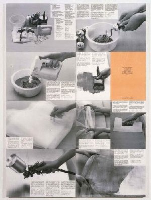
Lippard’s own seminal exhibition 557,087 (Seattle, 1969) was executed remotely using artists’ instructions, which comprised the show’s catalogue. Similarly, Do It (1993-) an ongoing exhibition/archive by Hans-Ulrich Obrist, solicits, executes and disseminates instructions from contemporary artists. [“With Do It in hand, you will be able to make a work of (someone else’s) art yourself.”]
Despite their critique of object/market complicity, instructions are regularly sublimated by capitalist constructs [i.e., editioning, certificates of authenticity] that reassert control and facilitate commodification.
Authorization thus emerges as a crucial and highly contested point of inflection/exchange for instruction-based work. Only five of 168+ instructions in Do It generate objects. One, a Felix Gonzalez-Torres candy pour (1994), was problematized when the artist’s catalogue raisonné [Cantje, 1997] reclassified it as “non-work” and reconfigured fabrication authority only for Do It‘s curators, not its audience.

A more conceptually robust corollary is art that applies a model exemplified by the Italian designer Enzo Mari, whose 1974 exhibition/catalogue, Proposta per un’autoprogettazione, (Proposal for a self-project) included not just blueprints for making 16 pieces of furniture, but explicit authorization to do so.
Mari’s autoprogettazione structure synthesizes Benjamin’s potential for multiple, auratic originals with the critical empowerment of readers-qua-authors, consumers-qua-producers, viewers-qua-artists.
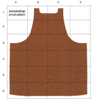
Auraprogettazione will be the first ever survey of this distinctive, exceptional genre: auratic objects, fabricated by whomever, in accordance with artists’ published instructions and authorization. Preliminary research has identified consonant works–painting, sculpture, photography, assemblage, clothing–by at least eleven artists: Daniel Buren, Jan Dibbets, Stephen Kaltenbach, Lia Maisonnave/Ciclo de Arte Experimental, Yoko Ono, Tobias Rehberger, Rudolf Stingel, Joep van Lieshout, Franz West, Zhuang Da, and Andrea Zittel.
Alongside the ‘originals’ exhibition, the gallery may be activated as a site of open, facilitated art production, or as an aggregator/repository of audience-made originals. Additional artists may be solicited to create new, permissioned, instruction-based work. And as with Mari’s original, Auraprogettazione‘s publications in print and online will propagate instructions for the exhibited works.
On Photographs, Stars, Abstract Images, Reality
More from Giuseppe Panza’s 1985 Archives of American Art Oral Histories interview with Christopher Knight, this time on Panza’s preference for abstraction:
But I believe that the modern science reveal to our knowledge a world which is far above the possibility of our eyes to see. Our eyes have limit in having perception of reality. But knowledge is going well above this limit. For this reason we don’t need anymore to use images which our eyes can perceive. Because the world which we can know through our intellect, through our knowledge, is wider than the image coming through our eyes. If you look at the microscope, anything which is around us, you see an abstract image. If you look to photographs of stars, they are abstract images. For this reason, abstraction is a closer image of the real which is above around us. It’s a tool more efficient to inform us about reality.
This especially stuck out because it resonates so well with my idea to re-create one of the most extraordinary photographic achievements in history, the National Geographic Society-Palomar Observatory Sky Survey, a 10-year mission to create an atlas of the universe [actually, those detectable objects in the slice of sky visible from the Northern Hemisphere]. The NGS-POSS produced a grid of 935 pairs of photographs of the night sky, which were printed and distributed to universities around the world [country?]
Scientifically, they are completely obsolete; paper prints of the glass negatives turned out to be a poor research medium. And subsequent surveys have had orders of magnitude greater resolution.
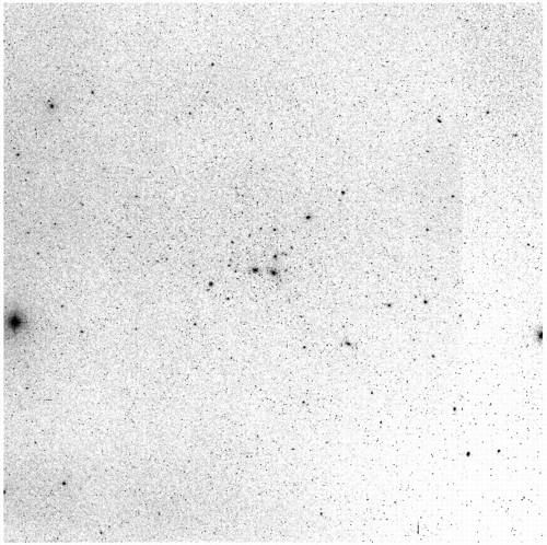
So the only justification I can see for their continued existence is as an art object; they certainly are beautiful. Printing another set would underscore their both their obsolescence and their beauty, and the ambitious folly of such scientific endeavors, which later artists such as Bernd and Hilla Becher would only begin to hint at in their work
Art Fleet: Domes & Trucks & Art Things That Go
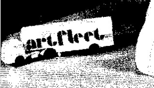 While researching the National Gallery of Art’s Barkley L. Hendricks paintings, which were purchased by J. Carter Brown with money from Michael Whitney Straight, I came across one of the crazier space-meets-art moments in the history of exhibition design: Art Fleet.
In an amusingly transparent move to manage his own complicated story, Straight wrote a biography of Nancy Hanks, the founding chairwoman of the National Endowment for the Arts, who had been appointed by Richard Nixon. [Straight himself had been approached to found the NEA by the Kennedy administration, at which point, he disclosed his history as a KGB spy. He became the deputy chairman, instead, a post which did not require Senate confirmation.]
Anyway, Art Fleet. We begin in San Clemente, 1970:
In the same spirit of loyalty to the president who had appointed her, Nancy committed the Endowment to supporting a project entitled Art Fleet. She had asked the president, when she met with him in San Clemente, what he would like the Arts Endowment to do. He had replied that “it was extremely important to get the arts out into the country.” Nancy had agreed. She was reminded of the technical problems involved in moving art masterpieces around the nation. She dismissed them. As Bill Lacy, our program for Architecture and Environmental Arts, recalls, “Nancy contended that if we could put a man on the moon, we could surely send the Mona Lisa around the country.” [p.149]
Surely, why not, but seriously, why?
And what do you want to do with the Mona Lisa again?
Continue reading “Art Fleet: Domes & Trucks & Art Things That Go”
Walking Men, Or The Google Street View Trike Has A Posse
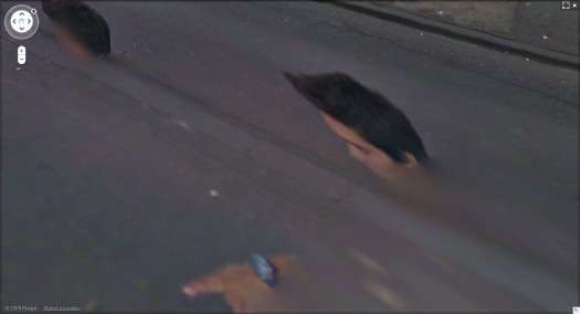
Some interesting developments since putting the Walking Man self-portrait collection out there. Thanks for the feedback and responses.
I think it’s becoming clearer that walking man is not, as I wrote, a guy who “came upon the Google Street View Trike preparing to map the Binnenhof” and who “decided to tag along.” Instead, he’s probably part of the Google Trike crew.
I’d always entertained the possibility, and when, after the initial burst of discovery and image extraction, I found some additional panos from around the lake that made it clear his relationship to the Trike was at least a factor in his appearances.
From the intro I wrote for the proof [which I’ll probably publish at some point, even as I plan to revise it for any future editions]:
His actions in the final two panoramas lend themselves to speculation: In his penultimate appearance, walking man becomes pointing man; he is seen gesturing across the plane, breaking the fourth wall, as it were, by addressing the Google Trike driver himself.
Perhaps this crossed a line about the presumption of passivity for Google’s photographic bystanders. Or maybe it violated some rule of non-engagement, a Street View Prime Directive. Is it possible that he’d been talking with the Trike rider, his personal [sic] camera operator, all along?
Yes, yes it is.
Continue reading “Walking Men, Or The Google Street View Trike Has A Posse”
Echo I: The Making Of – Giant Clothespins
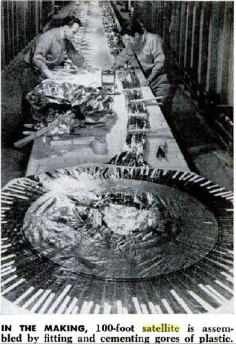
While I remember where it came from, here’s another image found in that Jan. 1961 Popular Science story starring William O’Sullivan Jr, who headed Project Echo and the whole satelloon paradigm at the fledgling NASA.
When you see a couple of guys at a 50′ table, assembling, folding, and gluing Echo I’s Mylar gores using not much more than a pile of footlong clothespins, you can understand why I still hold out hope of replicating one for exhibition as an art object. [On earth first, of course. Baby steps.]
Google Trike Plus One?
I have no idea who walking man is, and ultimately it doesn’t really matter to me; the portraits of him that got inserted repeatedly throughout Google Street View ultimately stand on their own.
But at the very end of his tagalong, there’s a shot where he points across the Google Trike’s path. He’s gesturing, perhaps even to the cyclist/Trike operator himself. Which underscores the possibility that walking man did not just happen across the Google Trike; he may be involved with it somehow, as a tech, or a chaperone, or even the driver’s friend.
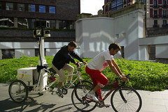
When I saw artberri’s flickr photos [above] of the Google Trike and Buddy circling the plaza at Arata Isozaki’s riverfront tower complex in Bilbao, I began wondering if a two-man team might be standard Google Trike operating procedure.
If so, the top of that other guy’s head might be a prominent feature when these Street View images come online. We may have a whole series of Trike-based portraits on our hands.
Whoa, Autoprogettazione X Artek Mashup
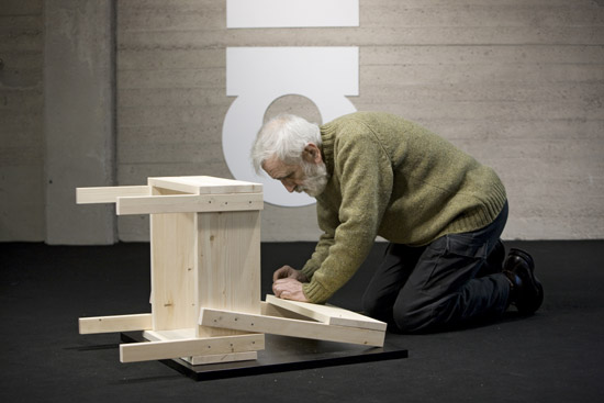
HUGE news from on the Enzo Mari autoprogettazione X [Scandinavian Furniture Giant] mashup front:
The Finnish manufacturer Artek will announce ‘sedia 1- chair,’ “the first object from Mari’s thought-provoking project ‘autoprogettazione’ to go into production” with the company. “the first”!
Like the original “manufacturer,” Simon International, run by Dino Gavina, Artek will sell you a stack of pre-cut pine boards, some nails, and the instructions. Look at those wide boards, they’re built up, just like the tabletops on certain other autoprogettazione pieces I’ve seen from the region.
For the full press release/preview, and more shots of Mari building his own damn chair, thank you very much, go to designboom. [thanks andy]
Previously: the Enzo Mari X IKEA mashup saga
walking man – a self-portrait collaboration with Google Street View
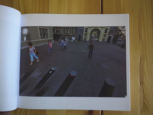
In the Summer of 2009, an unidentified young man came upon the Google Street View Trike preparing to map the Binnenhof, the center of the Dutch government, in The Hague. He decided to tag along.
The man walked alongside the Google Trike, persistently inserting himself in the foreground of its nine computer-controlled cameras’ panoptic fields of vision.
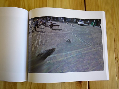
Meanwhile, Street View’s automated panorama generation system read his presence as a data anomaly and consistently attempted to erase him from the photos.
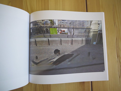
The resulting images, extracted from nearly every Street View panorama of the Binnenhof complex, reveal the history and process of their own making. They are at once a minute detail in Google’s extraordinary, ongoing portrait of the entire world, and one man’s wresting of control of his own image and his audacious assertion of his own presence.
I discovered these images in February 2010.
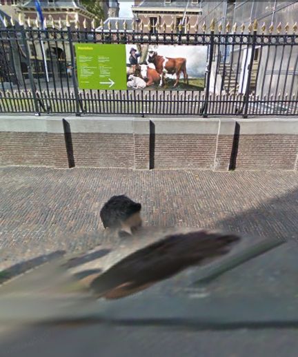
At first, it was the distortions of time, space and perspective in these photos that caught my eye. As I began mapping out [sic] the scope of the project, however, I became fascinated by how this man seemed to travel almost precisely at the distance that simultaneously kept him in frame, but also all but guaranteed his algorithmic erasure.
Then I tried to understand the images as portraits, or self-portraits. As the exercise of the flaneur. The product of the flaneur’s gaze. An artifact of a moment in time, in space, evidence of the photographer’s decisions. As photos or cinema. Surveillance or subversion. Indexing, seriality. As virtual or real, documentary or manipulation, strategies or tactics. I looked at Muybridge and Marey. I went back to re-read Benjamin, Bergson, Barthes, de Certeau, Sontag, but these images seemed to thwart every attempt to put them into a critical or historical context as photographs.
And yet they’re so easy to look at and use; we all become Street View-proficient, if not fluent, within moments of our first encounter with it. And the walking man apparently made them on a whim, by doing nothing more than strolling along.
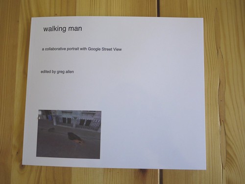
I decided to extract, compile, and print the entire set of photographs as a book. The title, walking man, is a reference to Alberto Giacometti, whose sculptural notions of distance and vision I was studying at the time. “Self-portrait” is an acknowledgment of their subject’s creative intent, and “collaborative” refers not only to Google’s operation of the camera, but also to their first pass at selecting images, and to the crucial aesthetic impact their manipulations have on the images they ended up publishing.
The images are actually screencaptures from Google Maps in Safari that include every appearance of walking man within each panorama. Though I composed each screenshot, I consider this a found work, or a work made of found images. Which is why I’ve been looking lately at work by folks like Sherrie Levine and Larry Sultan.
With three exceptions, each of the 55 Street View panoramas in the set is represented by one photograph which includes all portrait elements. The first panorama in the series includes both the walking man and his reflection in the window of the Binnenhof security office, but they are at too wide an angle to include in one screencapture. So the images were extracted separately After sending the book to the printer, I found that another panorama also included a nearly straight-down image of walking man’s legs, which would not fit within the browser window on my laptop monitor. The other exception, below, was just too beautiful to resist, there are so many awesome things going on in this photograph.
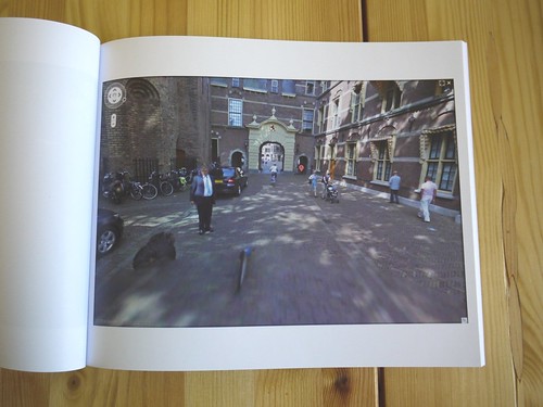
This proof copy was created using blurb.com. It’s 120 pages, and includes 57 portrait images and a reference Google Map, and a short introduction to the project. I thought the format might be too big, but it turns out it looks fantastic. The photos are a little dark, but that’s only because most of them were shot in the morning shade. My photos are dark because I shot them inside without a flash.
I am considering a limited print run, including editions reserved for the artist and the photographer, both of whom are currently unidentified.
There are several more shots from the proof on flickr.
Previous, related: How your Street View panoramas are made
The Meaning Of Maps, By Google’s Michael Jones
He’s pretty harsh on unnamed governments who complain about unblurred faces, and got more than a bit of engineer’s arrogance, which is why, I guess, he works for Google, but Michael Jones’s talk, “The Meaning of Maps,”at O’Reilly’s Where conference last week is pretty great.
Maps are not just place, they’re culture. Also, you get to see the Google Trike in action around the 13:00 mark.
How Your Street View Panoramas Are Made
I’ve been looking into how Google Street View panoramas are made, and it’s been kind of awesome. Each equirectangular panorama is stitched together on the fly out of 21 photos.
Equirectangular projection, or plate carrée (flat square), is a technique that maps coordinates onto an evenly spaced grid of latitude and longitude, which produces significant distortions, especially along the perimeter. Like how Antarctica ends up looking bigger than the rest of the continents put together. Flickr user swilsonmc’s images of flattened out Street View panoramas show the axis of distortion quite nicely.
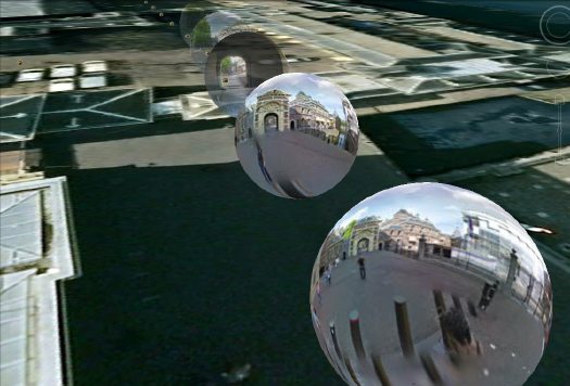
I think there are other distorting elements in Street View, though; it appears that each panorama is anchored to a specific set of lat/long coordinates. [The Street View data layer on Google Earth shows this beautifully by plopping these 3D pano bubbles down on its own 3D landscape. (top) It’s like simulation-within-simulation. Also, they look like inverted satelloons, only they’re projecting back their surroundings from the center, rather than reflecting from the surface. I mean, just check out the highly reflective surface of the PAGEOS global mapping satellite for a minute. Am I right? Wait, did someone say mapping?]
Anyway, the panoramas pull together the best images of that spot, which are not necessarily taken at that spot. Google’s roving cameras are shooting constantly, so there images approaching and leaving a particular panorama site. This introduces multiple POV and perspectival distortions into a single panorama. Which can result in awesome, zig-zagging thickets of tree trunks, fence posts, stanchions, and disembodied pedestrians. And which all remind us that these panoramas are not photos, but photomontages.
But wait, that’s not all! swilsonmc also created a php script that turns every flattened Street View panorama into a frame of video. The flickr video above shows the trip up the Long Beach Freeway in LA, from Seal Beach to Glendale. It reads as a continuous trip, of course, but if you watch the traffic and the clouds, the other Street View distortion–time–so obvious it’s invisible, becomes clear: there are photos taken on different days.
Roland Barthes described photography as “the presence of a thing (at a certain past moment).” The always didactic John Berger said,
Photographs bear witness to a human choice being exercised in a given situation. A photograph is a result of the photographer’s decision that it is worth recording that this particular event or this particular object has been seen
and on the intrinsic temporal content of photography, he said, “This choice is not between photographing x and y: but between photographing at x moment and not at y moment.” I think it becomes clear that in the traditional, theoretical sense, whatever Google Street View images are, they are not photography.

