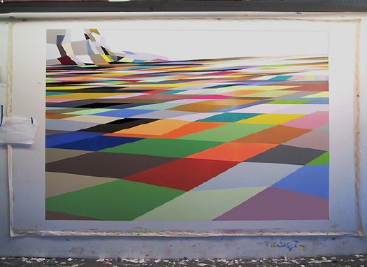
So the last couple of months, I’ve been working on an idea for book, and I wanted to see a mockup/proof. It’s mostly photographs/images, with a very text introduction, and I wanted only one image per spread, like a nice little monograph. Which means a lot of blank facing pages. Which is fine if you’re printing a run of books, even a small one. But it sucks if you use an on-demand printer, which usually start charging $1-1.50 for each page over, say 20.
I decided to use Blurb.com for the proof, partly because they offer a nice variety of formats and finishes, but also because their stepped pricing structure was quite reasonable. Also, their BookSmart tool is pretty flexible for putting the book together. There’s a large selection of page layouts, which I was able to pare down and edit to my own liking. So far so good.
Here’s my first and only tip for anyone thinking about using Blurb & BookSmart: BE $)(%ING SURE AND HAPPY WITH THE SIZE AND FORMAT OF YOUR BOOK, BECAUSE IF YOU WANT TO CHANGE IT, YOU’LL HAVE TO START OVER FROM $#*(%(ING SCRATCH. HOW THE HELL CAN SOMEONE CALL AN APPLICATION “BOOKSMART” WHEN IT IS TOO )($*#%ING STUPID TO BE ABLE TO ACCOMMODATE THE MOST BASIC CHANGE OPTION OF ALL?
So yeah, the proof arrives in a few days, we’ll see how it looks [besides, too big, obviously.]
Category: projects
Shiny Space Balls? Yes, Please, I’ll Take Two. No, Four.
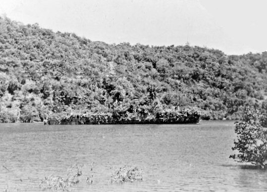
I could feel Mondo-Blogo was baiting me as I scrolled through the photos from MoonFire, Taschen’s luscious 2009 commemorative book for the anniversary of the Apollo 11 landing. He was amped about the text by Norman Mailer, and the multiple insane limited edition versions of the book–with or without embedded lunar asteroid fragments and lander-style display cases–designed by Marc Newsom. I, meanwhile, was sensing some ur-satelloon spheres coming on, and–BOOM. This photo above.
But what was it? I couldn’t tell the mission, and I couldn’t find the same or similar images of such Sputnik-like satellites in progress, no matter how hard I Googled. And from the preview, neither Mondo nor I could read the captions. The trade edition of the book wasn’t out yet, at least in the stores–and space bookshops, and the National Air and Space Museums–I visited last week. What to do? I asked Taschen’s publicist for help, and voila. Project Vanguard.
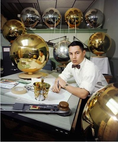
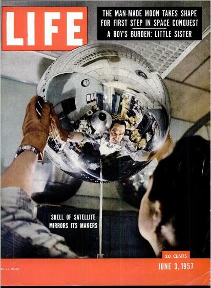
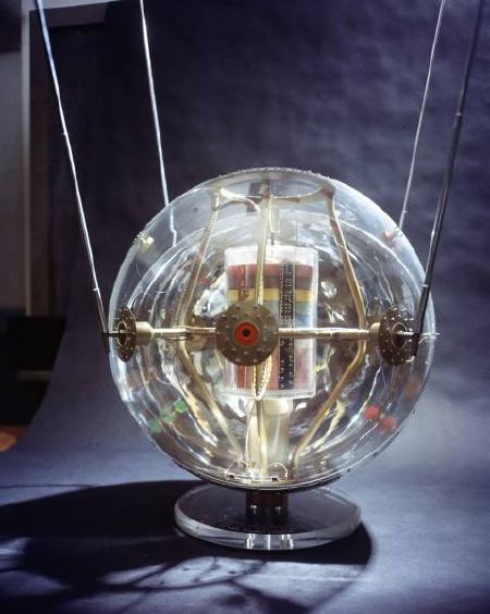
This is a previously unpublished 1957 image from LIFE Magazine photographer Hank Walker of the Project Vanguard team at the Naval Research Laboratory, hard at work on the world’s first “earth satellite.” [Well, not quite the first, as it turned out.] But almost no one in the US knew about Sputnik on June 3rd, 1957 when LIFE ran an excited cover story about Vanguard’s development [“Man-Made Moon Takes Shape,” “Shell of Satellite Mirrors its Makers”] That’s Vanguard scientist Alexander Simkovich, by the way.
Walker’s other LIFE photos of Project Vanguard from the Spring of 1957 are just as awesome. Some of the most artistic highlights:
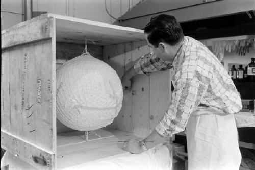
The crating: Apparently, at least 35 Vanguard and Vanguard II satellite shells were manufactured in Detroit by Brooks & Perkins, then shipped to Washington for assembly. I have to wonder what Eva Hesse was doing while these things were being packed:
The see-through model: Instead of an internal sphere full of scientific instruments, the 20-inch Vanguard II satellites were designed with a suspended, miniaturized, stacked core, as this plexiglass model showed:
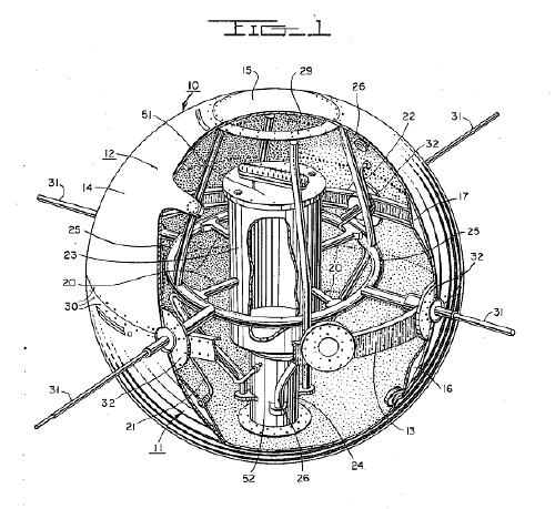
This looks remarkably like the cutaway drawing for the first patent ever issued for a satellite structure. Satellite team leader Robert C. Baumann filed the patent in August 1957, and it was granted in 1958. In the mean time, of course, the Soviet Union had launched two Sputniks and the rocket carrying the first, grapefruit-sized Vanguard satellite, had exploded on the launch pad on live television [that satellite was recovered intact and is on view at the Air & Space Museum, btw]:
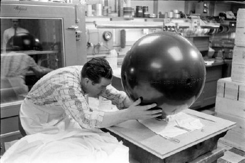
The making of: Brooks & Perkins manufactured the vanguard shells from sheets of magnesium [below], then plated them with gold. A remarkably detailed Time Magazine article from April 15, 1957 explains the rest of the manufacturing process:
When the satellites came from their manufacturer, Brooks & Perkins, Inc. of Detroit, they were thin-skinned magnesium spheres plated with gold. Aluminum is better for reflecting sunlight, but since aluminum will not stick to gold, the gold had to be covered with a thin film of chromium. Aluminum will stick to chromium, but it also mixes with it and loses part of its reflecting power. So the chromium film in turn had to be coated with glassy silicon monoxide, and then with aluminum.
The delicate work of depositing the coatings was done by the Army Engineers at Fort Belvoir, Va. Each satellite was put in a vacuum chamber and turned, like a chicken on a spit while the materials in the coatings were evaporated electrically and deposited on its surface. The final coat was a second layer of silicon monoxide.
In terms of the Space Race, Project Vanguard was only a fair success, and it was quickly superseded. A Vanguard II satellite launched in 1958 is currently still in orbit and is the oldest man-made object in space. So that should mean that at least a couple dozen of these iridescent masterpieces still roam the earth–or are stuck in crates in NASA scientists’ grandchildren’s garages waiting to be liberated and exhibited. The search is joined.
Oh, look, here’s one that’s off the list: a 1958 Vanguard Lyman Alpha replica or flight spare on display at the National Air & Space Museum’s Udvar-Hazy site at Dulles.
Catching Up With Vito Acconci
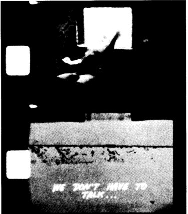
While rummaging around in Vito Acconci’s early exhibition history for traces of Kathryn Bigelow’s work [more on that in a second], I came across a set of three early, short Super 8mm films I’d never heard of: Three Attention Studies, 1969.
They’re all 3min. each, the length of a Super 8 cartridge, and made in conjunction with Peter Lupario, but it’s the last one that’s most interesting:
In Catching Up, the performer and cameraman walk side by side across a field. Sometimes the performer falls as the camera continues its pace; the performer must make an effort to catch up and return into the frame.
If that’s Lupario in the still above–and it doesn’t look like 1969 Acconci to me–these three films are notable for featuring the artist behind the camera, as the viewer, instead of in front, as the performer/subject.
These studies preceded by several months the 1970 body-related performance pieces for which Acconci became known. In a 1983 retrospective of the 8mm works at the Whitney, curator John Hanhardt said Acconci is “one of the first artists to successfully develop a significant oeuvre in the Super-8 film format.” [PDF via vasulka.org]
So this Catching Up, I’d like to see. If anyone knows where it exists digitally, I’d love to hear about it.
Now back to Bigelow. I’m beginning to think that the Acconci project that most closely matches the dates, descriptions, and details of Bigelow’s recollections is his 1973-4 Super 8 “feature,” My Word. [Of course, I haven’t seen it, even though it showed at X-Initiative last September.]
At two hours [or 90-something minutes, which may be an earlier, pre-1983 version], it required a lot of shooting. Hanhardt describes it as
composed of written statements alternating with shots of the artist in his studio and around his building. Acconci is the central protagonist whose gestures, actions, and written statements are all addressed to women–women are the other, unseen, presences in this work. The point of view of the camera can be interpreted as that of the women, silently confronting Acconci, or that of Acconci himself, mirroring his every move.
I don’t like to, but I can imagine that’s Acconci riding some kind of bondage apparatus with a large film projection behind him in the My Word frames below:
My Word was a turning point, the last time Acconci included himself on-camera in his work. If this is the one, Bigelow actually shot some, part, or all of one of Acconci’s most significant works. Too bad the Academy doesn’t have some kind of lifetime achievement in dues-paying hardship award.
Previously: Tracking down Kathryn Bigelow’s early conceptual oeuvre
The Lady In Blue Meets The Lady In Red
“The lady clad in bright red silk was having her picture taken from every angle around Abramovic’s performance. It was spectacular.”
C-Monster has an awesome photoset and a firsthand account of experiencing Marina Abramovic’s MoMA performance, The Artist Is Present. She touches on the intensity of the line, and the realization that the artist is making you sit and wait, possibly for hours, too, and how the entire atrium is transformed around the silent artist. When all is said and done, thousands of people will have projected their own experiences and “performances” onto Abramovic; it’s an aspect of the piece I hadn’t considered before.
This is my favorite of C-Mo’s shots, though, because it so perfectly captures the idea of an individual with her own strategy using the media to insert herself into Abramovic’s piece.
This is interesting me right now for other reasons, which may be why it caught my eye.
Photo Diary: Marina Abramovic at MoMA. [c-monster.net]
Selections From The NASA Library: How-To Build A 100-Foot Satelloon
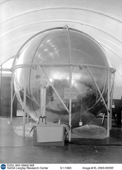
Part of re-creating the Project Echo satelloons as art objects is tracking down the documentation and history of it all, identifying archives and primary source materials, and finding out how, exactly NASA built these early, early satellites.
Because it’s more than technically possible to replicate their efforts. America’s first forays into space were literally ad hoc: the prototype Echo satelloon was twelve feet in diameter because that’s how big the ceiling was in the workshop. They figured out how to fold the balloon after one engineer saw his wife’s rain bonnet. They pressure-tested the Mylar skin on an armature made of 1-by lumber, pulleys and weights. [image above: nasaimages.org]
I thought I’d have to track down a NASA archive facility in some Maryland backwoods, and make an appointment, and I may still. But it turns out NASA has converted a lot of the technical and fabrication documents for Project ECHO–ECHO I and ECHO II–to PDF format. The compilation of links at Astronautix.com is pretty high in the Google results.
Here’s what I especially like:
- NASA Report, Development of the Fabrication and Packaging Techniques for the Echo II Satellite, Web Address when accessed: http://ntrs.nasa.gov/archive/nasa/casi.ntrs.nasa.gov/19670014586_1967014586.pdf.
- NASA Report, Postlaunch Structural Analysis of Echo II Satellite, Web Address when accessed: http://ntrs.nasa.gov/archive/nasa/casi.ntrs.nasa.gov/19660007648_1966007648.pdf
- NASA Report, Mechanical Properties of Echo II Laminate, Web Address when accessed: http://ntrs.nasa.gov/archive/nasa/casi.ntrs.nasa.gov/19640016629_1964016629.pdf
- NASA Report, Mechanical and Physical Properties of the Echo II Metal-Polymer Laminate, Web Address when accessed: http://ntrs.nasa.gov/archive/nasa/casi.ntrs.nasa.gov/19660025569_1966025569.pdf
- NASA Report, Buckling of the Echo-A-12 Passive Communications Satellite, Web Address when accessed: http://ntrs.nasa.gov/archive/nasa/casi.ntrs.nasa.gov/19640015999_1964015999.pdf.
- NASA Report, Strain measurements conducted on a full scale Echo II passive communications satellite balloon, Web Address when accessed: http://ntrs.nasa.gov/archive/nasa/casi.ntrs.nasa.gov/19660010463_1966010463.pdf.
- NASA Report, The Echo I Inflation System, Web Address when accessed: http://ntrs.nasa.gov/archive/nasa/casi.ntrs.nasa.gov/19640012106_1964012106.pdf.
‘Preparing An Exhibit For The House Space Committee’
I’m still looking for the c. 1958-9 images of the 12-foot satelloon prototype being inflated in the US Capitol Building as part of NASA’s push to fund the 100-foot version.
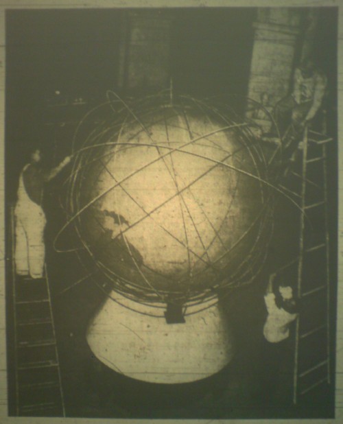
But look what I found in the March 14, 1961 edition of the Washington Evening Star, right above the story about the Mclean bridge club’s Ab Ex artist hoax:
Workmen preparing an exhibit for the House Space Committee put another ring around a huge globe in the rotunda of the old House Office Building. Each ring represents the path of a satellite…
that’s where my photo of the microfilm got cut off, but they’re both Russian and US satellite paths. No idea yet what the hearing discussion was [see update], but this was just a couple of weeks before Yuri Gagarin became the first person to orbit the earth, so I’d imagine this exhibit, whatever its purpose, was soon forgotten.
I’m sure it’s too much to hope for, that the metal bands of satellite orbits hand-assembled 50 years ago for a congressional hearing exhibit [?] have survived in a government warehouse somewhere. But the photo’s credited to the AP, so at least there’s a chance of finding a vintage print of it, right?
UPDATE: Eh, from the Washington Post coverage a few days later, the Space Committee, which by 1961 was called the House Committee on Science and Astronautics, was contesting Defense Secretary Robert McNamara’s rushed order for the Air Force to take over all military space development and to prepare to subsume NASA. So there you go.
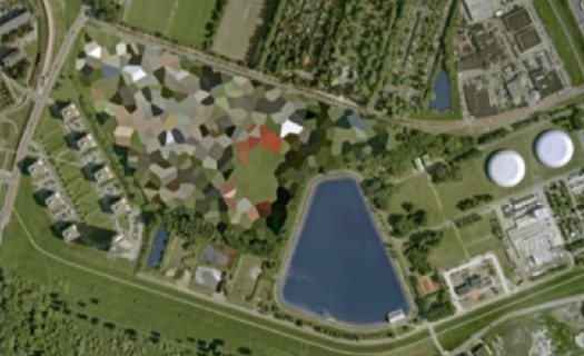
Molly Dilworth’s Painting For Satellites
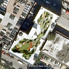
Last fall as the Dutch Landscape paintings idea was kicking into gear, artist Molly Dilworth emailed me a link to her rather awesome project, Paintings for Satellites.
For the last couple of years, since the dawn of the Google Earth Era, Dilworth has been exploring different techniques for creating giant paintings for the once-invisible, now-primary facade known as the roof.
As you can see above, she used a piece of Google/Aerodata’s distinctive polygonal Dutch camo in the study for her most recent piece, which was executed in November on the roof of 547 West 27th street in Chelsea.
The finished painting is more free-form and organic, and is executed, as are all her rooftop works, out of found, discarded paint, so the color’s always a surprise. Very nice work, I hope it’s still visible when the snow thaws.
Paintings for Satelites photo set [flickr via c-monster]
On Thomas Ruff At Aperture
Joerg has an interesting recap of Thomas Ruff speaking with Philip Gefter a couple of weeks ago at Aperture.
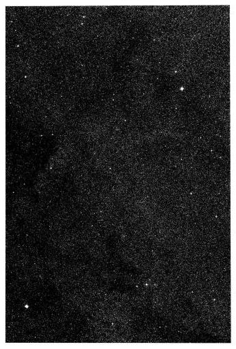
I’m a fan of several of Ruff’s series of work–and distinctly not a fan of others, but hey. Here’s a bit about the Sterne/Stars photos, one of several of Ruff’s appropriation series:
Ruff has worked a lot with images that are not his own, be it the stars, the newspaper clippings, or the images of machines he found on a set of glass plates he bought. Each of those series centers on investigating the essence of authorship or reality in photography: The stars he picked as the most objective photographs one could possibly produce (as an astronomer I’m not sure I agree with this)…Here’s a photographer who not just decided to play with images to have them fit his artistic vision – instead, it’s a photographer who has looked at what photographs can do from a very large number of angles…
I love that Joerg’s an astrophysicist/photographer.
Though Ruff uses contemporary plates from an entirely different survey form a different observatory in an entirely different way, his Sterne are definitely an inspiration for my plan to show and reprint the NGS-Palomar Observatory Sky Survey.
Also an antecedent, if not a direct influence: Ruff’s Jpegs series, which blows up low-res web-scavenged images to grand, pixelated scale. Even though the discussion was scheduled to promote Gefter’s new book and the limited edition of Ruff’s Jpegs catalogue [published by Aperture, with an essay by my buddy Bennett Simpson], the jpeg images didn’t make it into Joerg’s notes.
Neither, alas, did much input from Gefter. He’s a very attuned guy, and it was great to work with him on some of my pieces for the Times. So basically, I’m a 360-degree fanboy over this event, and am hoping Aperture will indeed post video of it soon. Or ever.
update: aha, they did. right here. Thanks again, Joerg.
Ein Abend mit Thomas Ruff [jmcolberg.com]
Thomas Ruff: Jpegs
Some Writings On Giacometti & Looking
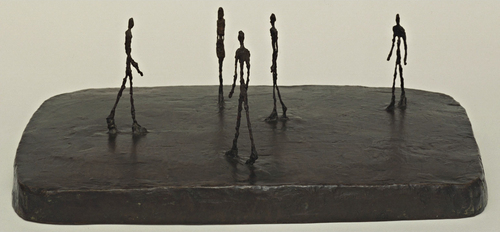
These are mostly for me, just kind of gathered here without order or comment for the moment. I’ve been thinking about Alberto Giacometti lately, and his sculptural, spatial pursuit of that moment when a figure comes into view.
Arthur C Danto in The Nation 2001 about Sartre in 1948 on Giacometti:
Sartre says something even more striking about Giacometti’s figures. “The moment I see them, they appear in my field of vision the way an idea appears in my mind.” This is a way of explaining the somewhat ghostly feeling of his figures, as if they were persons whose bodies had been all but erased. Giacometti was legendary for destroying his work–his studio floor would be found littered with broken plaster in the morning, after undoing a night’s work. I think this was the result of an impossible effort to eliminate whatever gave them the solidity that belonged to their material condition as sculpture.
Rosalind Krauss in Artforum 2001 quoting Sartre in 1948 on Giacometti:
“Giacometti,” Sartre wrote, “has restored an imaginary and indivisible space to statues. He was the first to take it into his head to sculpt man as he appears, that is to say, from a distance.” And because this is man as he is perceived, it is fitting that these sculptures should all be vertical, since Sartre equates perception with walking, traversing space, doing things, just as he links imagining with the body’s repose. If one dreams lying down–as in the sculptor’s earlier, Surrealist, s leeping women–one perceives standing up.
Michael Kimmelman in NYT 2001 on Giacometti’s MoMA retrospective:
In the 1940’s and 50’s, when he made extremely thin heads, flattened on both sides like pancakes, Giacometti talked about the effect of looking at somebody straight on, then from the side. He was rejecting the Cubist idea that it was possible to keep different views of the same person in sight at the same time. ”If I look at you from the front, I forget the profile,” he said. ”If I look at you in profile, I forget the front view.” Which is precisely what happens: if we move 30 degrees left or right off-center of these heads, the face becomes a profile. Back six inches, the profile disappears. If we move: the work is about our distance from the figures, our position vis-a-vis the heads or striding men or standing women.
Kimmelman in the NYT 1996 reviewing David Sylvester’s incredible book, Looking at Giacometti:
The issue for Giacometti became the pursuit of what he called likeness. Roughly, it had to do with trying to represent the real experience of seeing, apart from artistic conventions: on the simplest level, conveying the actual swimmy sense of distance and engulfing space when viewing figures across, say, a broad street, or conversely, the vertiginous foreshortening you get when standing face to face with someone. Likeness also had to do with something less tangible but still real: the intense sensation of the shared gaze between living artist and living model. Mr. Sylvester contrasts Giacometti with Matisse in this respect. “The Matisse sculptures present a figure seen whole and entire now, in an instant of time, in any instant of time, meaning outside time,” he writes. “The Giacometti sculptures seem to present figures as they are perceived while time passes.”
I’ve GOT to get Sylvester’s book out of storage this weekend. That, and Herbert Matter’s photobook of Giacometti’s sculptures. I have my Bonnefoy, of course, which is beautiful to look at, but nearly impossible to read. Just, wow, what is going on there?
image: City Square, 1948, via moma.org
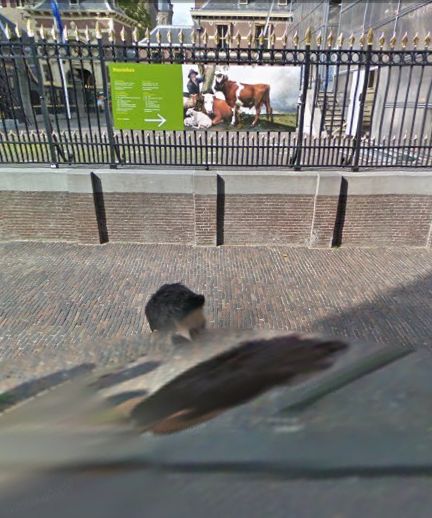
Mauritshuis Gets Google Street View Camo?
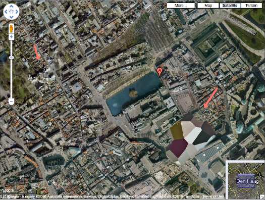
Because I now appear to be constitutionally incapable of doing otherwise, after mentioning the Mauritshuis, the Vermeer-loaded Royal Picture Gallery in The Hague, I checked to see if was camo-obscured on Google Maps.
[I kind of knew it wasn’t, because it’s situated smack in between two prime Dutch Camo Landscapes: the Noordeindepaleis and the Ministry of Defense HQ, but I looked anyway.]
And while we knew that Google Street View has come to Den Haag, I didn’t realize it was just a couple of months ago. And with the Google Trike, no less.
Here’s where the museum–a 17th century mansion, is supposed to be, but whoa.
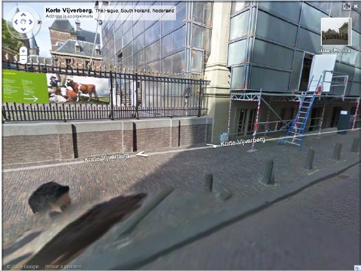
It’s apparently camouflaged as a generic glass & steel office building. Took me three passes to find it. By which point, I became kind of fascinated with the way Street View knits together its panoptic images, particularly when they include people. I love Google’s Cubist-meets-Robert Lazzarini-meets-Julia Scher-meets Hans Holbein the Younger portrait style.
Dutch Camo Landscapes On Google Streetview? Nee
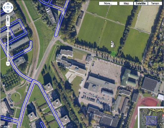
You may recall how Google Maps recently changed the polygonal camouflage on one of the Dutch landscapes I was using for my painting project.
I was back there, getting a clean shot of the nicely distorted grid plaza–the site belongs to the Koniklijke Marine, the Royal Navy, and is apparently the home address for the Royal Marine Band–when I saw that the Streetview icon was activated. Looks like Google’s camera cars reached the football field-filled outskirts of Rotterdam.
But not all of them. The available imagery shows that Google is excluding all street-level imagery from around the camo’d compound. The previous official explanation for camo-obscuring intelligence-sensitive sites was that the Dutch government claimed jurisdiction to censor aerial photography, but not satellite imagery. I guess there’s another law that forbids street-level photography from public roads, too? Yes and no.
A quick stop at the ur-Dutch Camo Landscape, the Noordeinde Paleis in The Hague, shows that Streetview is unavailable for its entire perimeter. But the other camo’d complex, a Royal Garage or something, to the northwest through the park, shows up just fine. The south perimeter of that giant, cut-n-past camo blob is just fine, which makes me think that the building being camo’d–I think it’s the HQ of the Defense Ministry itself–is on the next street up, which is, indeed, blocked. Unfortunately, Noordwijk ann Zee, the beachfront town that is the site of my favorite inexplicable, airdropped camo blob, has not yet been added to Streetview.
Update: In actual governmental/military news, the Dutch coalition government just collapsed in the face of growing opposition to extending the deployment of 2,000 Dutch troops in NATO’s operations in southern Afghanistan.
What I Looked At Today: Sherrie Levine’s Meltdown
Reductivist abstraction and pixelated photo-appropriation? If only it could involve a short film, an Ikea table, or a White House stage set, I could wrap this whole blog up with a bow and go home.
From Peter Blum Editions’ text accompanying Sherrie Levine’s 1989 print series, Meltdown:
The twelve-color woodblock prints in the portfolio Meltdown have been created by Sherrie Levine by entering images, after Duchamp, Monet, Kirchner, and Mondrian into a computer scanner that spatially quantizes and transforms these images into the minimum number of pixels, thus determining each of the colors in the four prints.
after Duchamp et al, means these are pixelated prints based on Levine’s own photographic reproductions of photoreproductions of [clockwise from upper left], a Monet’s Rouen Cathedral, Kirchner’s Potsdamer Platz, Berlin, Mondrian’s Composition No. II, and Duchamp’s L.H.O.O.Q..
I’d started tracking down links to the “original” works, Levine’s source paintings, before realizing that kind of missed the point. In fact, as with her earlier rephotographic series, Levine’s source images are reproductions in books. In 1987 she showed 40 photos, all 1982, of reproductions of works by Monet, Kirchner, and Mondrian at the Wadsworth Athenaeum. [pdf of the exhibition brochure].
For one contemporary reviewer, Levine’s use of a computer, her deployment of algorithmic color averaging, and the whole “pixel” concept gave Meltdown the whiff of suspicious techno-novelty. I obviously think it’s a fresh and worthy approach, which now makes me wonder a bit. I’m also kind of fascinated by her use of woodblock, which was either a 4- or 12-color process. Either way, it seems an important, digital-to-analog color translation step is being largely ignored.
What’s also remarkable is that Phillips ran the After Mondrian image on the cover of the catalogue for it editions auction last fall, even though the suite for sale was an unsigned, undeclared set outside the edition [35 + 10AP], which was marked simply “WKSHP 1/2.” It still sold for $12,500.
Levine made at least one other pixelated print series. Equivalents: After Stieglitz 1- 18 are greyscale inkjet prints from 2006, and were shown at the last Whitney Biennial.
What I Looked At In 2000: Torben Giehler
As soon as I started thinking that Dutch Polygonal Camo on Google Maps would make great abstract landscape paintings, I thought of a some giant, abstract, polygonal landscape paintings I’d seen way back in 2000-2. But for the life of me, I couldn’t remember the artist’s name. From Julie Mehretu to Edvard Haberkost, to Benjamin Edwards to Kevin Appel to Carla Klein to Jules de Balincourt to Thomas Scheibitz, large-scale, geometrical/architectural/spatial/digital/landscape abstraction has not been in short supply. And of course, it was none of the above.
I’d seen one at “Collector’s Choice,” the exhibition I co-curated at Exit Art in the winter of 2000-1. It was on Norman Dubrow’s crazy, salon-style wall. Then the one that really haunted me was in a 2001 show at Caren Golden Gallery, curated, I think, by David Hunt. And then there was another show somewhere later, a solo show.
Well, thanks to, of all people, Mark Kostabi, I just realized it was NY/Berlin painter Torben Giehler. And the gallery was Leo Koenig, in 2002.
In her 2002 review of Giehler’s Koenig show, Roberta Smith described the artist as one of several interested in “formalist abstraction, digital cartography and photography.” She also guessed that making the paintings “must require hours of applying masking tape.” And sure enough, the many studio photos on Giehler’s website show piles of balled up blue tape, and also small printouts taped next to the canvas. It looks like he begins his work on a computer, and then enlarges and transposes the compositions by hand. [This 2004 Art in America review is excellent for describing the painting’s production, while adding absolutely nothing to their context or understanding.]
Some of Giehler’s landscapes are gridded; the earliest painting on his site is an explicit Mondrian flyover, a psychdelic reworking called Boogie Woogie. But his polygonal landscapes seem to form structures of their own. Like the mountain series he showed at Koenig. K2 is a favorite. [And a favorite of Giehler’s, too, apparently; he made a series of prints of it with Fawbush.] And Matterhorn has a very Dutch color scheme.
Glad to clear all that up.
above: Tomorrow World, 2001, by Torben Giehler, exhibited in “Superimposition,” Caren Golden Gallery [torbengiehler.com]
Torben Giehler’s website [torbengiehler.com]
Dutch Camo Mashup Goodness
I guess that’s the whole point of camo, you just never really know what you’re gonna see.
In February 1942, the Dutch minesweeper the HNLMS Abraham Crijnssen survived the Battle of the Java Sea, in which the Japanese Navy crushed Allied forces [AU, UK, NL, US] and invaded the Dutch East Indies [aka Indonesia].
To evade detection from the air and retreat to Australia, the Crijnssen‘s captain ordered the 186’ ship disguised as an island by covering it with branches.
Unlike the official, formal Razzle Dazzle camouflage technique used in WWI to confuse submarines, the Crijnssen‘s improvised approach worked. The ship survived and eventually ended up in the Dutch Navy Museum at Den Helder, the city at the tip of the North Holland peninsula which has long been a strategic nexus of Dutch naval and shipping operations.
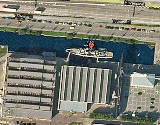
In fact, when you look up the Crijnssen on Google Maps, there turns out to be a huge complex of Dutch Polygonal Camo just to the east, the main base for the Royal Dutch Navy.
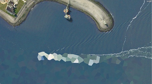
And the camo extends out into the water in order to cover a ship caught by Google’s Aerodata photographers just as it passed by the world’s most undeniably phallic breakwater. Wonder what the sailors’ nickname for that is.
Here a Google Map with both generations of Dutch naval camo, side by side:
View Larger Map
HNLMS Abraham Crijnssen at the Historical Naval Ships Assn [hnsa.org via boingboing]
The Everchanging Dutch Camo Landscape
Gather ye screengrabs while ye may, I guess.
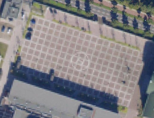
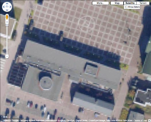
The camo-obscuring of sensitive sites on Google Maps by the Dutch Intelligence Service (MVID) is a dynamic process. One of my favorite sites I found last November is a complex along the Maas in Rotterdam. The polygonal camo zone is surrounded by an equally artificial-looking geometric landscape:
But when I pulled up that old post, the embedded Google Map showed a new, unobscured image:
Thereby revealing the existence of a previously classified football field.
But wait, the image isn’t unobscured after all; it’s just obscured at a higher resolution. Oh no! It’s Dutch Camo 2.0!
My project just got overlaid with a thick, historicizing blanket of obsolescence. Which, for a bunch of Dutch landscape paintings, is probably just as well.
And I must say, I DO like what they’ve done to that helipad-equipped grid.