
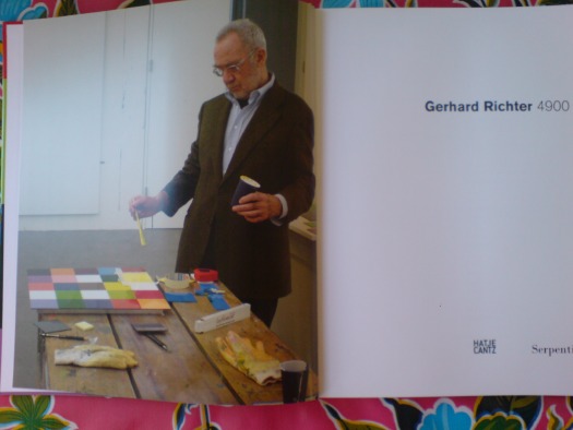
So my copy of the Serpentine Gallery’s catalogue for “Gerhard Richter: 4900 Colours“ finally came. This is the frontispiece, a photo by Joe Hage [who is turning up everywhere in Richterland now? He’s the collector who’s helping the artist with his evermore-info-intensive website. The staff of whom are also running the @gerhard-richter Twitter feed. He bought a half-interest in September, RIchter’s little painting of the World Trade Center, which he and the artist donated to MoMA. And now he’s hanging out with the artist as he puts the finishing touches on the 4900th colour? (It’s tough when you start out on a parenthetical, only to end up with it as your main thought. Makes me want to just leave off the last bracket.)]
Anyway, my points–besides, “notice how sharply Mr. Richter is dressed for work”–are two, and somewhat inter-related:
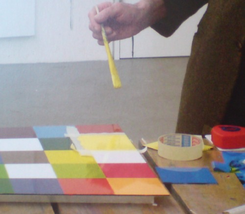
He is painting with a brush and taping his edges. Enamel on aludibond, a European brand of aluminum composite panel. Not being any kind of painter, I’ve been slightly obsessed with what Benjamin Buchloh regularly calls facture, the technique for application of the paint. And frankly, I’ve been wary/nervous/feelin’ like a cheater for thinking about taping my polygonal edges on my Dutch Landscape Paintings, for whatever reason.
So when I posted his 2001 quote to Michael Kimmelman this morning, before the book arrived, “Idiots can do what I do,” I didn’t think it would feel like such a personal invitation. “Thanks, I will!”
But now to the issue of Richter using tape and a brush. 4900 Colours is comprised of 196 48.5 sq. cm panels, each with 25 squares. That’s [hold on, doing the math] 4900 squares–ah, right–in 25 colors. The colors were arranged on each panel following a randomizing computer program.
4900 Colours has 11 “Versions,” which I believe refers to their possible configurations on the wall. Version I was all 196 in a single 49×49 square. The Serpentine showed Version II, 49 2×2 squares. And so on. The position and orientation of each panel is similarly determined in aleatory fashion. But as far as I understand it, there is only one set of 196 panels, not eleven. But even if there are not 1,960 additional panels that Richter had to paint with masking tape, a brush, a Dixie cup, and a fine tweed jacket, that’s still a helluva lot of squares to paint.
Why that surprises me? I guess I just saw the vast, pixilated scale of this work, and the industrial luster of the panels themselves, and I assumed he had it fabricated. That the paint was mechanically applied. That he just hit ENTER on his random colorgrid generator app and exported the data file to a shop. That they glued the acrylic paint chips to the Aludibond, so mechanical and repetitive, an idiot could do it. And then a couple of weeks later, a truck backs up to his studio with all those gorgeous crates. It appears this was not the case at all, and that is really pretty stunning.
[But surely, this is not standard operating procedure? Is that how massive, repetitive/mechanical images like the electron microscopic photo mural made for the atrium of the De Young, made, too? Entirely by Richter’s hand? Doesn’t he have people for that? He’s closing in on 80, I want him to have some people for that. See, here I am again with the parenthetical wrapup.
update: eh, bad example. The De Young’s Strontium is made of C-prints.
update update: with encouragment from @manbartlett, I checked all 196 panels, and I can’t find one with that color configuration. Which would mean it’s a one-off or a study or a prototype. Whew.
Buy Gerhard Richter: 4900 Colours for around $43 at amazon [amazon]
Previously: What I looked at today – Gerhard Richter
Category: projects
Richter On Idiots
A 2001 visit to Gerhard Richter’s studio, from when Michael Kimmelman used to write about art:
He puts a canvas on an easel at the end of the room and slides the photograph into a projector. The photo appears, projected onto the canvas, and Richter begins to trace it with a piece of charcoal and a ruler. Tracing each minute detail of a photograph, as he does, usually takes Richter a couple of hours. Then he is ready to paint.
”Idiots can do what I do,” he says, although of course he doesn’t really think so. ”When I first started to do this in the 60’s, people laughed. I clearly showed that I painted from photographs. It seemed so juvenile. The provocation was purely formal — that I was making paintings like photographs. Nobody asked about what was in the pictures. Nobody asked who my Aunt Marianne was. That didn’t seem to be the point.”
The point, among other things, was to distance himself from the clichés of artistic expression — all the spontaneous, fiery, warm and fuzzy modes of painting — so as to make people really look and not reflexively swoon. By using deliberately banal photographs, impersonally mimicked, he was doing the exact opposite of what painting was expected to do, not grabbing a viewer by the lapels but methodically copying an everyday image. In time, some of the pictures have come to look expressively painted, perceptions having changed, but making methodical copies was Richter’s intent.
An Artist Beyond Isms [nyt via john bailey]
As Seen On TV: Echo II Satelloon Inflation Video
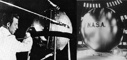
I’ve been searching for historical and primary source material for Project Echo, one of NASA’s earliest missions, which kicked into high gear in 1958. The giant, inflatable satelloons were functional–passive reflection communication satellites. That they were shaped just like Sputnik, only a hundred thousand times bigger, and were visible to the entire world with the naked eye, were, I’m sure, just a happy Space Race coincidence.
Echo I [above, right] was 100 feet in diameter and launched in 1960. Echo II was 135 feet, and launched in 1964. By then engineers at NASA’s Langley Research Center figured out that over-stressing the aluminized Mylar would help the giant sphere keep its shape, even if it deflated a little bit. [Echo I was found to have partially caved in a few months after launch.]
Film and TV cameras were included in the Echo II rocket–the film canisters were recovered in the ocean, but I haven’t found images from the footage. Video of the Echo II Inflation, however, is right here. Retired Goddard engineer Ron Muller screened it as part of a history of The Echo Project at a 2004 NASA conference on solar sails. It’s pretty awesome, right down to the end. [The avi is available for download at the conference page.]
I put a little film strip together after the jump, too:
Continue reading “As Seen On TV: Echo II Satelloon Inflation Video”
German Landscape Paintings? Triangulation X Gerhard Richter
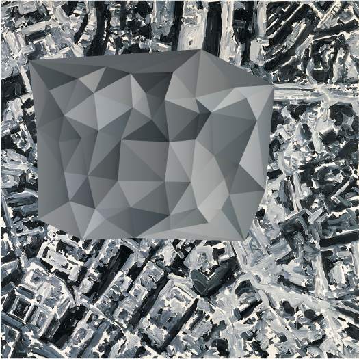
Now that I can make any map or image into a color-averaged, triangular camo abstract wonderscape, I am in big trouble.
Triangulation – web interface [triangulation.jgate.de via andy]
original image: Stadtbild PL, 1970, Gerhard Richter [gerhard-richter.com]
IKEA X Michelangelo Antonioni Mashup: The IVAR Dolly
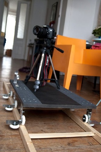
So awesome. With a few skateboard wheels, some L-brackets, and some grip tape, Brussels-based videographer VJ Aalto turned the ladder-shaped side bracket from Ivar, my Ikea component system of choice, into a EUR18 dolly track.
The great-looking test videos are on Vimeo, and the complete parts list is
in the comments on Ikeahacker.
EOS 7D + DIY dolly / 1st indoor test from Aalto on Vimeo.
Hey, look, next to the window, another bookshelf waiting to be sacrificed! Run it from the ceiling for a Professione: reporter remake!
Ivar loves dolly [ikeahacker via @MatthewLangley]
On Abstraction And The Ready-Made Gesture
As someone who backed into a project last September of making paintings of readymade abstraction, I was nervous, stoked, and inspired by “Besides, With, Against, and Yet: Abstraction and the Ready-Made Gesture,” the group show curated by Debra Singer which just closed yesterday at The Kitchen.
I feel like I have no business making paintings, frankly, and no matter how fantastic I find the Dutch Landscape images I’m using, I can’t help but wonder about the soundness of my basic idea. That said, it’s invigorating to see, just as I started poking deeper into the techniques and drivers of various strains of abstract painting, an abstraction show full of artists I really like.
Colby Chamberlain articulates the show’s ambivalence quite nicely in his Artforum review:
Thus merged, abstraction and the readymade risk canceling out each other’s legacies. The secondhand status of a readymade sunders abstraction from its aspirational and emotive content, whereas the uninflected appearance of an abstract painting curbs the readymade’s penchant for mischief. (To this day, nothing accommodates the definition of “art” so comfortably as stretched canvas.)
Add photography to the mix, and it only gets more complicated. I think of an artist like Liz Deschenes whose work regularly and rigorously addresses painting and abstraction at the same time it pushes the understanding of the photographic subject and process. And then there’s the whole OG school of found abstractionists like Aaron Siskind. And Richter. I still can’t help but think that readymade and abstraction are just two of the many balls he keeps in the air as he paints. Anyway, I’m rambling now. Great show at a great space with a beautiful website that’s as tauntingly useless as a diamond ring encased in a paperweight.
Lindsey Adelman’s Autoprogettazione Chandelier
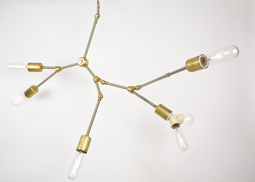
I’ve recently stepped up my search for more examples of objects that resonate with Enzo Mari’s autoprogettazione model: artists and designers who offer not just the non-authorial conceit of “made by anyone,” but “permission to make it yourself.” It’s a surprisingly fine filter that keeps a lot of nominally instruction-based pieces off the list.
Anyway, I’ll make an open plea later. Right now, though, I’ll just give NY designer Lindsey Adelman a huge high five for publishing her “You Make It” chandelier. Adelman’s main practice is creating intensely produced chandeliers and lighting made from custom, modular hardware systems and handblown glass. They’re several thousands of dollars, and it shows.
Which makes it remarkably easy for Adelman to be so generous with the level of detail she offers on technique and parts sourcing for a $120 You Make It option; despite the beauty and conceptual similarity, there is no mistaking the one product for the other.
You Make It Chandelier [lindseyadelman.com via @ianadelman]
Related: Enzo Mari X IKEA mashup, ch. 4: Finish Fetish
‘Little Uglies’
I’ve had a research question simmering on the back burner for a while, trying to figure out what the history of modernism and contemporary art have been in Washington DC. Partly, it was the dearth of good modernist architecture that got me wondering, then a crash course in the history of contemporary art and official Washington generally, and the odd genesis of the Hirshhorn Museum specifically. Then there was some sporadic attempts at securing Washington’s place at the art world table [more on those later].
Then last spring, I attended a dinner in the State Department’s Diplomatic Reception Rooms. Though they were originally built in an off-the-shelf, 1950s corporate modernist style that matched the building, in 1969, Walter Annenberg, Richard Nixon’s newly appointed ambassador to Great Britain, gutted the space and installed the current veneer of neo-colonial splendor. That gut job stood in nicely for the essentially anti-modernist hostility of the Washington Establishment. Little did I know.
In the the latest batch of White House documents released by the National Archives and the Nixon Library this week is an incredible 1970 memo from Nixon to his chief of staff H.R. “Bob” Haldeman, outlining a direct, political assault on the NEA’s support of “the modern art and music kick,” which he he associated with “the Kennedy-Shriver crowd,” art whose supporters “are 95 percent against us anyway.”
The LA Times’ Christopher Knight has some great context and quotes, but the full document is well worth a read [pdf]. My favorite part is the postscript, which has Annenberg’s fingerprints all over it:
P.S. I also also want a check made with regard to the incredibly atrocious modern art that has been scattered around the embassies around the world…I know that [Kenneth] Keating has done some cleaning out of the Embassy in New Delhi, but I want to know what they are doing in some of the other places One of the worst, incidentally, was [career Foreign Service Officer Richard H.] Davis in Rumania.
We, of course, cannot tell the Ambassadors what kind of art they personally can have, but I found in travelling around the world that many of our Ambassadors were displaying the moder art due to the fact that they were compelled to because of some committee which once was headed up by Mrs. Kefauver and where they were loaned some of these little uglies from the Museum of Modern Art in New York. At least, I want a quiet check made–not one that is going to hit the newspapers and stir up all the troops–but I simply want it understood that this Administration is going to turn away from the policy of forcing our embassies abroad or those who receive assistance from the United States at home to move in the direction of off-beat art, music, and literature.
The “little uglies” probably came from MoMA’s International Council, which, along with the DC-based Woodward Foundation, often arranged embassy art loans.
Until the creation of the committee Nixon referred to, that is. The Art in Embassies Program was started in 1964 by Nancy Kefauver, who was selected by John and Jackie Kennedy for the post. In a 1990 NY Times history of the AIEP, David Scott, who helped Kefauver get going, recalled that Washington was scorning modernism just fine before Nixon took over:
“It was at a time when we were still fighting the battle of whether modern art was seditious or evil or un-American…As a result of the McCarthy period, people were very suspicious about having any government agency deal with abstract art. If you didn’t like the art, maybe the person was a Communist.”
Digging around, I’m kind of intrigued by Michael Krenn’s 2005 book Fall-out shelters for the human spirit: American art and the Cold War, which looks at the US Government’s interactions with the private art world, primarily through the State Dept, the USIA, and the Smithsonian. From the preview:
What the government hoped to accomplish and what the art community had I mind, however, were often at odds. Intense domestic controversies resulted, particularly surrounding the promotion of modern or abstract expressionist art. Ultimately, the exhibition of American art overseas was one of the most controversial Cold War initiatives undertaken by the United States.
At $50, though, I might need a little more than a Google Book preview.
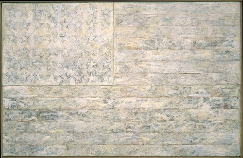
Meanwhile, poking around MoMA’s archive site to try and see what some of these ‘little uglies’ might have been, I found the 1966 exhibition, “Two Decades of American Painting 1945-1965,” organized by Waldo Rasmussen, which included 111 works by 35 postwar artists, including Gene Davis, Hans Hoffman and Jasper Johns.
It was a straight-up museum exhibit, not embassy art, but it did travel to India and Australia from Japan, and was accompanied by a film program, The Experimental Film in America, which sounds specifically designed to give Nixon an aneurysm.
And the Johns that was in the show? the a White Flag painting from 1955, which the artist held onto until 1998, when he sold it to the Metropolitan Museum.
‘The Most Important Unreported Stories In The Art World’
Inspired by Hans Ulrich Obrist’s perennial interview question, I wrote about artists’ unrealized projects a few years ago for the NY Times. As I stack up some [as-yet] unrealized projects of my own–including, alas, catching up on my unread e-flux journals–I’m glad to hear HUO’s still got the fire:
I see unrealized projects as the most important unreported stories in the art world. As Henri Bergson showed, actual realization is only one possibility surrounded by many others that merit close attention.13 There are many amazing unrealized projects out there, forgotten projects, misunderstood projects, lost projects, desk-drawer projects, realizable projects, poetic-utopian dream constructs, unrealizable projects, partially realized projects, censored projects, and so on. It seems urgent to remember certain roads not taken, and–in an active and dynamic, rather than nostalgic or melancholic way–transform some of them into propositions or possibilities for the future.
“Manifestos for the future”, e-flux journal #12 [e-flux.com]
The Battle of Hürtgen Forest
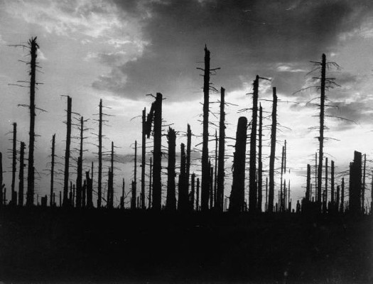
For the Allied forces, The Battle of Hürtgen Forest was the longest and one of the bloodiest, most pointless battles of World War II. Between October 1944 through February 1945, over 33,000 US soldiers were killed in the dense fir forest filled with minefields and fortifications.
Even when the battle turned immediately hellish, far-off Allied generals kept pressing for “victory,” which at the time basically meant preserving the pride of the US Army by not retreating, even though there was no apparent strategic value to the German territory.
At least that’s Charles Whiting’s point in The Battle of Hürtgen Forest, his harrowing-to-overwrought, GI-friendly history, published in 2000. [I bought my copy on Amazon.]
As Wikipedia points out, though, Germany suffered almost as many casualties defending the forest because it stood between the US and a potentially vital dam, and it was a staging ground for the fast-approaching Ardennes Offensive/Battle of the Bulge.
Still, none of that was known or acted upon at the time by US forces, and it certainly wasn’t communicated down the line to the soldiers pinned down for days in their nearly useless foxholes.
The photos in Whiting’s book are somewhat cursory, and when I imagine the conditions, I inevitably fall back to the episode on the wintertime siege of Bastogne from HBO’s Band of Brothers. So Dmitri Kessel’s 1951 photo for LIFE, depicting the bombed out, burned out ruins of the once-impenetrable forest kind of caught me off guard.
My great uncle Lark was a staff sergeant in Hurtgen Forest. He’d already fought in Africa, Sicily and France when he was killed on October 9th, one of the earliest casualties of the battle. When it published his obituary a month later, The Richfield Reaper (UT) said only he died “somewhere in Germany.” I’m not sure if anyone in my family has ever inquired after or discussed Uncle Lark’s experience during the last months and days of his life. But I suspect it was pretty damn grim.
Hurtgen Forest, Germany, 1951, photographed by Dmitri Kessel for LIFE Magazine [life@google]
The Battle of Hürtgen Forest [wikipedia]
The AMNH’s Digital Universe Atlas
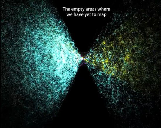
The American Museum of Natural History maintains a Digital Universe Atlas, which maps all the objects in the universe using the most current data available.
They just released The Known Universe, an animated version of the data, in conjunction with the Rubin Museum of Art [which presumably paid to have the Powers of Ten-style roundtrip through all time and space begin and end in Tibet.]
While it’s encouraging to see so much empty-looking orbital space for me to put my satelloon, this is my favorite shot: “the empty areas we have yet to map.”
Watch The Known Universe by AMNH in HD [youtube via kottke]
Download or visit the Digital Universe Atlas [haydenplanetarium.org/universe]
Previous posts on the charming concept of trying to depict everything in the universe: On The Sky Atlas And The NGS-Palomar Observatory Sky Survey
The Eames Solar Do-Nothing Machine – The Remaking Of
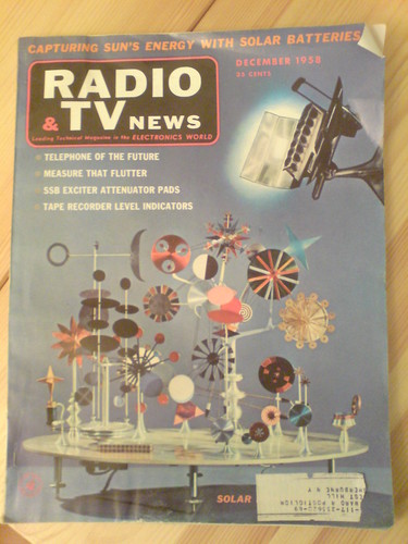
I’m fallen in love all over again with the Solar Toy Ray and Charles Eames created around 1956-7 for Alcoa.
Writing about it in 1958, Charles Eames also called it the “Do Nothing Machine.” As Steve Roden discussed a couple of years ago, Eames’s view of the functionless machine/toy was rather Zen: “It is not supposed to do. It is supposed to be. Its whole function is in its being.” Or, I would add, rather sculptural.
The Solar Toy was never meant for production, just promotion. As far as I know, a single unit was commissioned by Alcoa’s Oscar Shefler for the innovative-sounding “Forecast Collection.”
I’ve been stewing on it for more than three years now, and I think I must track down what happened to it, and what archives and records remain of its creation. And then I must either find it and exhibit it, or remake it and exhibit it. But either way, it should really be seen today.
Beyond the Toy’s sheer, self-evident beauty, it could shine a light, so to speak on some of the intellectual, cultural, technological, and environmental complexities of the intervening 50 years.
What has happened, how have we done since the archetypal prophet of American, can-do, corporate modernity dazzled us with his shiny, functionless object powered by the limitless energy of the sun?
Or as the article in Radio & TV News puts it in their cover story, “Will our future electricity all come from the sun?”
Intrigued by the possibilities of a future where man would use an energy source 93-million miles distant, Eames fashioned a design so that people may “see a living demonstration of the fantastic potential of the work that solar energy can perform for mankind.”
Fantastic! Let’s see how that turned out.
Continue reading “The Eames Solar Do-Nothing Machine – The Remaking Of”
Domes In Dutch Landscapes: Awesome Worlds Collide
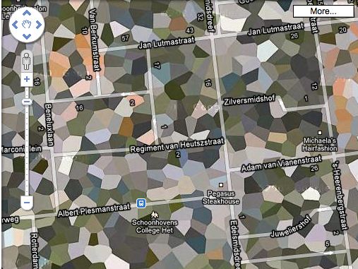
I love it when several plans come together. Apparently, not all the Dutch Google Maps landscapes camo’d out by the Military Intelligence Department are actually sensitive sites. And some sites will toggle in and out of camouflage without warning or explanation.
One such site is the southern town of Schoonhoven, which has been poly’d off the map for most of the last four years, for no security reason at all.

It’s no secret that NATO operated a SATCOM weather station on the north edge of town. The giant, geodesic dome that hid the doppler equipment is a prominent roadside landmark. But the base was decommissioned in 2005, just before Google’s contractor, AeroData, began its hi-res geoimaging flights over the Benelux region.
It was too late to get off the Defense Department’s polygon list, though, and so the entire town is obscured, even the Pegasus Steakhouse [above].
By 2008, with plans for the residential redevelopment of the abandoned base well under way, it was reported that townsfolk were finally being promised year-round, un-camouflaged Google Earth access to their homes. Maybe today was just a bad day.
06-2008: No More Blind Spot [ad.nl, image via ad.nl]
Urbex – NATO Schoonhoven photoset by Marc Duiker [flickr]
What I Looked At Today – Gerhard Richter
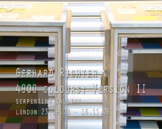
Gerhard Richter used a randomizing computer program to place the 11,500 hand-blown squares of glass in 72 different colors in his 2007 stained glass window for the Cologne Cathedral.
He used the same program at the same time to create 4900 Colours, a work which revisits the color chart and color chip paintings he made in the 1970s. For 4900 Colours, square acrylic paint chips were glued to Aludibond, a European brand of aluminum composite panel.
4900 Colours, Version II, shown at the Serpentine Gallery last fall, consists of 196 panels, each nearly 1m square and containing 25 computer-placed chips. The panels were hung in randomly selected groups of four to make one work comprised of 49 panels. Hans Ulrich Obrist talks about the work and its various versions in this video.
I can’t get over how gorgeous they look, even in the crates. Watching the installation and listening to the several random elements Richter deployed reminds me of John Cage’s rolywholyover exhibit from 1993-4. Using a a list and map created each day by an I Ching-based program, the museum’s art handlers would essentially perform by installing, moving, and removing artworks selected for the show. When not on the walls, paintings and such were stored on rolling walls, still visible, in a roped off section of the gallery. One of my absolute favorite art experiences ever.
So They’re Surrealist Dutch Landscapes?
Been trying to think about where the idea of painting an intentionally obscuring, computer-generated, institutionally applied abstract pattern onto a systematically produced aerial photographic map of the entire world fits into the historical painting/photography, abstract/representational context.
From Andre Bazin’s 1945 essay, “The Ontology of the Photographic Image” [pdf]
…[P]hotography ranks high in the order of surrealist creativity because it produces an image that is a reality of nature, namely, an hallucination that is also a fact. The fact that surrealist painting combnes tricks of visual deception with meticulous attention to detail substantiates this.