
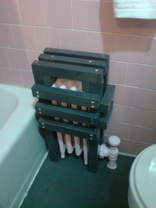
The uncovered radiator was starting to seem a little dangerous in the kids’ bath, and since I had a bit of Ikea shelving left over, and a leftover can of primer turned out to match perfectly the color of my newly installed rubber floor, I took a page from Max Lamb’s Reference Library x Apartamento Magazine playbook.
And that’s how I saved $187 [$195 for a custom radiator cover, minus $8 for a pint of pink paint] and learned a nice lesson in the importance of proportion, all in one afternoon.
Category: projects
Enzo Mari X IKEA Mashup, Ch. Last
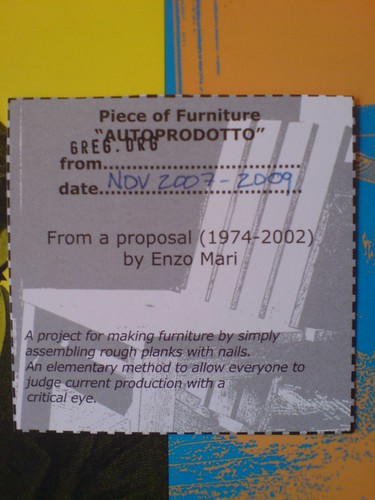
home stretch, from Thanksgiving 2007 to Thanksgiving 2009.
And it is done. [more pictures here]

A quick recap:
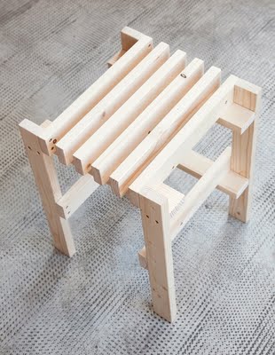
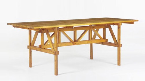
An EFFE table based on a 1974 design by Enzo Mari, but made entirely from unfinished pine components of Ikea’s Ivar shelving system. The vertical and diagonal elements are the square corner posts. [Some revisions were made mid-construction.] Horizontal elements are the pre-assembled shelving side trusses. [The center truss uses two trusses intact, while the end trusses use disassembled pieces.] The top is glued up from four Ivar shelves, which are braced underneath. [compare to Mari’s original design below.]
Though Enzo Mari’s original design calls for the low-grade pine to remain untreated, I decided to finish the entire thing with Sutherland Welles tung oil varnish. Components received five coats of wiping varnish, with sanding in between, before the trusses were constructed [finishing nails and #10 stainless screws]. The trusses and top then received six more coats of medium lustre varnish. The top will get two more, then a final sanding with steel wool.
Not only did the varnish cost more than the wood, all this hand-finishing turns out to be an insane amount of time and effort. Even so, the incredibly uneven quality of the Ikea pine resists a fine finish. This top may be conceptually ideal, but a more practical solution may be required if we decide to use the table daily.
Previously:
Autoprogetazzione: The Making of an Enzo Mari dining room table
Ch. 1: Enzo Mari x Ikea Mashup
Ch. 2: Parts
Ch. 3: Decisions, Decisions, adapting Mari’s design for Ikea lumber
Ch. 4: Finish Fetish
Ch. 5: In Process (Rev.)
Ch. 6: Ikeaness
Neuester Himmels-Atlas, By Christian Goldbach
Just another, particularly beautiful, addition to the list of sky atlases throughout history which showed the entire universe. Or the known universe. Or the known universe that they could show:
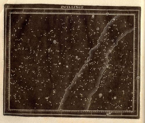
Zwillinge (Twins : Gemini), a 1799 constellation map by Christian Goldbach from his book, Neuester Himmels – Atlas . Here is some discussion of Goldbach’s depiction and technique, from the Linda Hall Library, where a full scan is available:
“The print style and technique was unusual. White stars are shown against a black background. The first pressing was made before the constellation figures and text details were added. These prints looked like a night sky. Then the finished plate was printed once more, providing a comparison with figures. The copper plates were printed in relief rather than the more common intaglio. While not the first to use this technique, his atlas was very influential on those that followed. His maps represent the stars with a Flamsteed projection.”
[image via USNO rare book library by way of bibliodyssey]
What I Looked At Today [Until My Eyes Glazed Over] – Goethe
I don’t know who Bruce MacEvoy is, but his is the most exhaustive series of comparative analyses of various theories of color theory I’ve found. [aha. A web guy/artist who sold YHOO better than I did.]
As I debate in my mind whether to order paint colors for my Dutch Landscape paintings or to mix them myself, I find once again that painting, which I thought I knew something about, has deep historical, theoretical, and practical tranches which I’d never seriously considered.
Anyway, here’s a tiny bit of MacEvoy’s discussion of Zur Farberlehre (1810), the monumental, idiosyncratic, combative, and too-obscure treatise/polemic on color that consumed Johann Wolfgang von Goethe for nearly two decades:
This approach is exemplified in the watercolor Color Magnet (right), painted after a long evening discussion about the “polarity” of color with the poet Friedrich Schiller. The short vertical bars (far right) represent primordial yellow and blue refraction fringes (discussed below); the curved bars (at left), which are drawn to resemble the curve of iron filings across the opposing poles of two magnets, show the mixtures that result when “attracting” fringes are overlapped to produce the “union” mixture green (below) and the “deepening” extraspectral mixture purpur (above). These combinations produce Newton’s spectrum (horizontal bar, center bottom) and the extraspectral purples (horizontal bar, center top). Linking all mixtures together end to end, just as bar magnets can be linked at their opposite poles, produces the central vertical bar, the circumference of the hue circle, with the light emitting colors of sun and sky at the center. There is an almost mystical simplemindedness in this pursuit of patterns, resemblances and associations, but it is the essence of the Goethean approach to color.
Unfortunately, Goethe’s ambitious project has been rendered incoherent both by the deleted sections and by the English translation title: Farbenlehre simply means “chromatics,” with no “theory” implied (just as Sprachlehre means “grammar” and not “theory of speech”). Given Goethe’s sensitivity to language, it is not irrelevant to note that the root meaning of lehre is “lesson,” “teaching” or “learning from experience”. In the same way that a grammar of language simply describes the patterns in how we speak, Goethe wanted to develop a holistic “grammar” of color that describes how color behaves. He was looking for patterns in color experience — not for a theory of colors extracted from physical experiments. This makes his book an important precursor to German phenomenology. All these complexities have disappeared from the truncated English version of the book.
And then there’s this bit from further down, which seems to sidle up to the edge, to so speak, of these discrete polygons of algorithmic color I will paint:
Next, in what he motivates as a pedagogical move, Goethe illustrates the “primordial” shadowing or distorting of images with the colors produced by a prism. These illustrate what is probably the central analogy of his book: that color, to the extent it has an external, physical origin, results in the blending of edges or boundaries between dark and light; edges are both the essential element of an image and the primordial cause of color appearance:
“[When viewed through a prism], we have found all unbroken surfaces, large or small, to be colourless, yet at the outlines or boundaries [edges], where the surface is relieved upon a darker or lighter object, we observe a coloured appearance. Outline, as well as surface, is necessary to constitute a figure or circumscribed object. We therefore express the leading fact thus: circumscribed objects must be displaced by refraction in order to exhibit an appearance of colour.” (¶197-198)
Not that Goethe was at all correct, of course. [Or as MacEvoy puts it, “Even when charitably summarized, Goethe’s theory of color is incomplete, inconsistent and incomprehensible.”] But it’s still kind of fascinating.
Project Echo & Satelloon Conservation
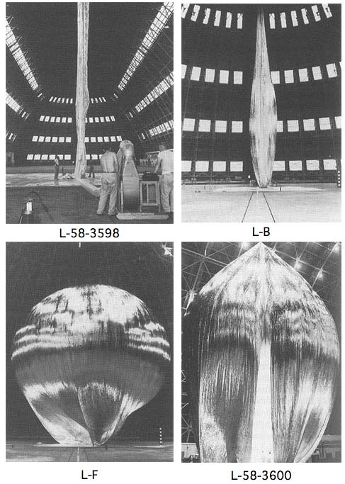
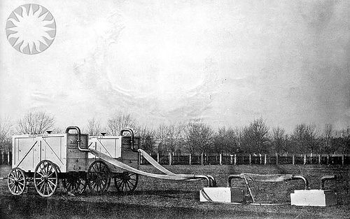
The first Project Echo satelloon may have started out as a 100-meter sphere, but it didn’t stay that way. Echo IA launched on August 12, 1960, and it stayed in orbit and visible to the naked eye until May 24, 1968. It inflated successfully, but as a paper in Bell Labs Report, Sept. 1961 explains, by May of that year, its shape had already been somewhat deformed in orbit:
On several early passes the average “scatering cross section” was equal to that corresponding to a perfectly conducting 100-foot sphere. From this it is assumed that the balloon inflated as planned.
There apparently has been a long-term decrease, of a few db, in the average “scattering cross section.” As of last May, Echo I [technically IA, since Echo I burned up soon after launch in March 1960] was probably an approximately spherical object with a diameter of no less than 70 feet, and a somewhat wrinkled skin. There may have been a few flattened areas, as indicated by occasional deep fades in the radar signal, but voice communication was then still possible as shown by successful tests with NRL on May 25.
One factor may have been the solar sail effect, the slight pressure generated by photons from the sun bombarding the satelloon’s skin.
image: The Odyssey of Project Echo [history.nasa.gov]
What I Looked At Today – Alex Brown
Though they’re pixelated abstractions, and though they’re almost as likely to be landscapes as people, Alex Brown’s paintings feel a bit like the opposite of what fascinates me about the Dutch Landscape paintings I’m working on.
From a q&a with Brown that accompanied his most recent show this February at Feature:
.who or what are some of the things that inspired your interest to have your work delve into the interdependent relationship of representation and abstraction? Lack of skill as a painter in a more traditional sense of the word? Unwillingness to give you a clear picture of what’s really going on in my brain?
That relationship is a direct result of the manner in which I have chosen to paint. I have always been confused by abstraction. Confused because of a lack of orientation. Taking something realized and turning it into something unrecognizable makes sense to me. I try not to think in those terms so much. They’re all just paintings and some look more like something that you’ve seen in your experience than others do. It all trickles down in varying degrees from a clear source image to finished painting. My abstractions are really just less than overly clear realizations.
Brown developed his approach after realizing he can’t paint straight; he deploys a grid and a filter on an undistorted source image, then painstakingly transfers the result to canvas. I imagine it’s a process similar to Chuck Close’s, whereby a photo is reconstituted, pixel-shaped abstract blob by pixel-shaped abstract blob.
But the distorting abstractions that unmoor the image from its specific subject and turn it into a painting are all Brown’s. The abstract polygons in these Dutch Camo Landscape images have all been put there by someone else–who wants to obscure and despecify the underlying representation. In an odd, inverted sense, paintings of them will look abstract, but will be representational.
Anyway, there are many more wonderful images of Brown’s work at Feature’s website. Above: Fairgrounds, 2008 [featureinc.com, thanks 2 coats of paint for the reminder]
Before There Were Satelloons: Prof. Thaddeus SC Lowe And The Union Army Balloon Corps
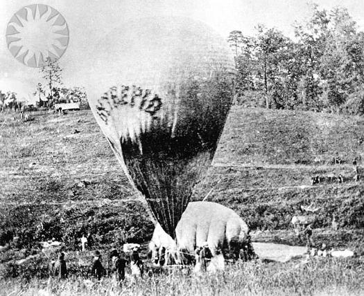
Thaddeus S. C. Lowe was once one of the country’s most famous aeronauts. His grand plan to fly a balloon across the Atlantic was shelved by the outbreak of the Civil War. He preferred to be called Professor. On July 11, 1861, with the help of Prof. Joseph Henry of the Smithsonian Institution, Lowe demonstrated the aerial reconnaissance capabilities of his varnished silk, gas-filled balloon Enterprise by ascending 500 feet above the Columbia Armory [on the site of the National Mall where the National Air & Space Museum now stands] and transmitting the first aerial telegram to President Abraham Lincoln.
Like many first messages, Lowe’s telegram is mostly about itself:
This point of observation commands an area near fifty miles in diameter. The city with its girdle of encampments presents a superb scene. I have pleasure in sending you this first dispatch ever telegraphed from an aerial station and in acknowledging indebtedness to your encouragement for the opportunity of demonstrating the availability of the science of aeronautics in the military service of the country.
Lowe persuaded Lincoln to appoint him Chief Aeronaut and to establish the Union Army Balloon Corps.
Lowe ordered seven balloons be fabricated in Philadelphia, while portable gas generators were built in Washington:
The generators were built at the Washington Navy Yard by master joiners who fashioned a contraption of copper plumbing and tanks which, when filled with sulfuric acid and iron filings, would yield hydrogen gas. The generators were Lowe’s own design and were considered a marvel of engineering. They were designed to be loaded into box crates that could easily fit on a standard buckboard. The generators took more time to build than the balloons and were not as readily available as the first balloon.
They sound fantastic, and I love the standardized buckboard-scale design. It’s at once obvious and totally subjective. Do any of these things survive?
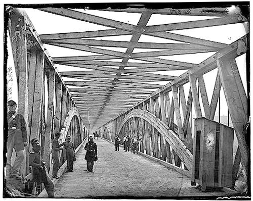
Anyway, even more than the establishment of Balloon Camp, this is my favorite part of the Balloon Corps story, partly because I cross the Chain Bridge at least once a weekday when I’m in DC:
By October 1, 1861, the first balloon, the Union, was ready for action. Though it lacked a portable gas generator, it was called into immediate service. It was gassed up in Washington and towed overnight to Lewinsville via Chain Bridge. The fully covered and trellised bridge required that the towing handlers crawl over the bridge beams and stringers to cross the upper Potomac River into Fairfax County. The balloon and crew arrived by daylight, exhausted from the nine-hour overnight ordeal, when a gale-force wind took the balloon away. It was later recovered, but not before Lowe, who was humiliated by the incident, went on a tirade about the delays in providing proper equipment.
The Balloon Corps continued with somewhat more success until Lowe resigned in 1863. The top photos are credited to Matthew Brady and date to 1862. They are from the Smithsonian’s collection of awesome, unnecessarily watermarked public domain photos of military and scientific balloons. The bridge one is from wikipedia.
On This Spot [blog.nasm.si.edu]
Union Army Balloon Corps [wikipedia]
What I Looked At Today – Hiropon Factory
![]()
I didn’t realize it until I surfed across this half-pixelated Takashi Murakami painting, but I have Murakami’s factory lodged in my brain as a model of digital-to-analog painting and production.
Back before the whole Louis Vuitton thing, even before Kaikai Kiki, I used to go to Hiropon Factory, Murakami’s Brooklyn studio, somewhat regularly. It seems quaint now, compared to the scale of the Murakami machine. But there’d be teams of painters carefully translating computer-generated illustrations to canvas, one mixed-and-matched color at a time. It was a Superflat paint-by-numbers.
For all the hype, there’s something refreshingly cynical about Murakami’s practice, which I think looks quite different in a Japanese/Asian context than it does from within the Western Art World.
The group show this painting was in, “Hi & Lo,” was curated by trendchasing fashion guru Hiroshi Fujiwara at the Kaikai Kiki space last October. It included Murakamis and works from Fujiwara’s collection, as well as works by Fujiwara fabricated by Murakami’s staff. And there was merchandise–jeans, tote bags, t-shirts–“which used the paintings as a foundation.”
Except that the paintings themselves are based on something: Murakami’s underlying IP–his characters, visual language, design elements, etc. It’s the same basis which gets translated into products and media from paintings to plush toys to cell phone charms, all at different price points. In the Japanese context, there is no distinction between craft and object and art. It’s a perspective that makes me weigh my own assumptions and motives for making a painting vs a photo vs a print, an edition vs a unique work.
for this image and many more: “Hi & Lo” Curated by Hiroshi Fujiwara and Presented by Takashi Murakami [slamxhype.com]
Hi & Lo Opening [kaikaikiki.co.jp]
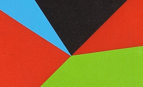
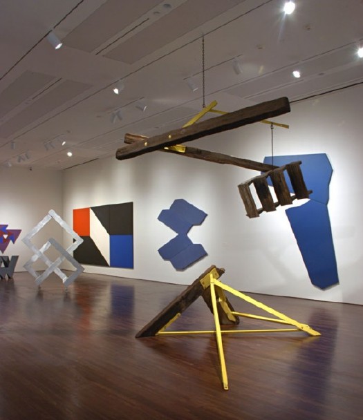
What I Looked At Today – Dean Fleming
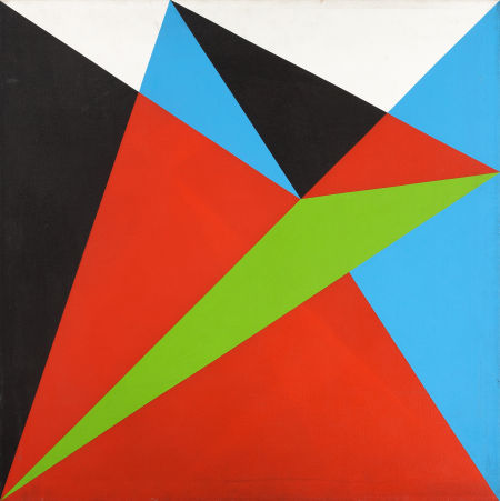
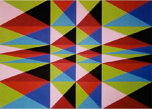
You never know what’ll turn up. In the same sale as that Sheeler study is this 1965 geometric abstract painting by Dean Fleming, one of the pioneers of SoHo. In 1962, Fleming founded the Park Place Gallery, an artist co-op, with a small group of other artists, including Mark diSuvero, Frosty Meyers, and Robert Grosvenor. Their first gallery director was John Gibson, and their second was Paula Cooper. Park Place was the first gallery in SoHo [though technically, it was north of Houston on LaGuardia Place], which made it basically the first center of the New York art world that emerged in the 1960s.
By 1966-7, Fleming was feeling burned out on the art scene/market. As he told Michael Fallon in 2005, “In New York I was the ‘parallelogram’ painter, which I thought sucked beyond belief.” Well, I’m sure no one wants to sit around taping paint edges day in and day out to meet the uptown demand [detail below], but it sure looked great while it lasted.
Fleming’s early 1960s abstraction is proto-minimalist, proto-op-art, a bit of East Coast Hard Edge, if there was such a thing, basically resistant to the canonical categories of 1960s New York as we’ve received them.
Last year, Linda Dalrymple Henderson curated a show about the Park Place Gallery artists at UT-Austin’s Blanton Museum. Here’s a quote Sharon Butler pulled when she blogged about the show that kind of brings it all home:
“Park Place artists were united by their multifaceted explorations of space. Their abstract paintings and sculptures, with dynamic geometric forms and color palettes, created optical tension, and were partially inspired by the architecture and energy of urban New York. The group regularly discussed the visionary theories of Buckminster Fuller, Space Age technologies, science fiction, and the psychology of expanded perception, and these ideas become essential to their work. Dean Fleming’s paintings of shifting, contradictory spaces were intended to transform viewers, provoking an expanded consciousness. Di Suvero’s allegiance was to Einstein’s Theory of Relativity, and his kinetic sculptures explored gravity and momentum in space.
Buckminster Fuller? No wonder the show looks like The Future. It’s like going simultaneously forward and backward in time. [Here’s a smaller slideshow with bigger images than the truly tiny UT-A site. The parallelogram in the background is the second-best Fleming painting in the show; Lime Line, also from 1965, looks like a perfect companion piece to the square Untitled.]
Fleming’s got a shed full of 50 years of work out back of his 40-foot geodesic dome studio at Libre, Colorado, the artists community/commune he co-founded in 1968. I have no idea what his current stuff looks like, but this sweet example from a fascinating, seminal center of activity that’s long overdue for re-examination looks like a steal.
Lot: 67085: Untitled, 1965, Dean Fleming, acrylic on canvas, 32×32 in. est $1,200-1,600 [ha.com]
What I Looked At Today – More Charles Sheeler
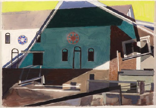
To be honest, I’ve never felt very interested in the late paintings of Charles Sheeler. After his Precisionist, industrial peak, and his consistently strong, modernist photography, the delicate, highly constructed, cubist/abstract Pennsylvania barn compositions seemed a little twee. They certainly weren’t where the action was in the 40s and 50s, either; that would be Action painting.
But I guess I’ll need to take another look. I kind of like this loose little tempera study for one of his last paintings. Apparently, Sheeler would work out his composition in several preliminary stages; after paper came this one here, tempera on Plexiglass, which seems an odd step. Then came board, and finally canvas.
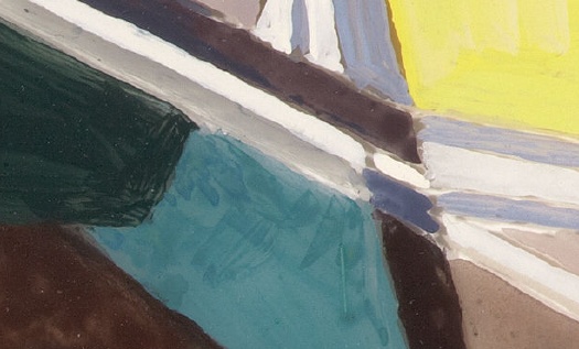
Maybe it’s nothing great. Maybe it’s just nice to be able to zoom all the way in and see what brushstrokes look like on a glossy, hard surface. Heritage Auction in Dallas certainly wins the prize for best online photodocumentation of its lots.
Lot 66036: Barn Decorations (Hex Signs), 1959, Charles Sheeler, tempera on plexiglass, 6.5 x 9.5 inches [ha.com]
Previously: starting the dutch landscape paintings project
Digital To Analog Paint Matching?
Maybe I’ve just been living in the digital world too long, but I’d like to somehow extract a color list from these polygon-laden Google Map images, and then order paint that matches. Only I’m not finding a vast, well-developed, digital-to-analog paint matching infrastructure in place. Does anyone have any ideas?
Obviously, I can see why no one would want to match colors to a JPEG or PNG; the range, accuracy, and quality of color in the physical world significantly outstrips the digital approximations. And it’s not like there’s a common, systematized language of color that crosses the digital/analog border. Binhex or RGB for paint? Pantone for Photoshop?
I’ve been talking to several painters about this the last few weeks, and they’re all for mixing my own colors, or at least having an artist mix them for me, by hand/eye. And I can respect and understand that. With mediums and grounds and consistencies and undercoats and transparency and absorption, paint turns out to be a vast, complex, multifactored thing, and I’m fascinated by how quickly these conversations of a topic I nominally thought I knew something about leave me in the dust.
But the digital essence of the original seems germane here. Although I suspect the blob in the Noordwijk image above was just cut and pasted there by the obscurer [like the Dept. of Defense HQ clearly was], the camo polygons are usually generated by software, an algorithm that carves up the underlying [sic] digital image and then reduces each component to a dominant or average [sic] color. The data aspect will have to yield to the object at some point, if only when the paint actually hits the printed photograph’s surface. Since the loss of information–or its censorship, or its transformative destruction–is one of the most interesting elements of these images, I’d like to make sure I’m accounting for the changes at each step along the way as best I can.
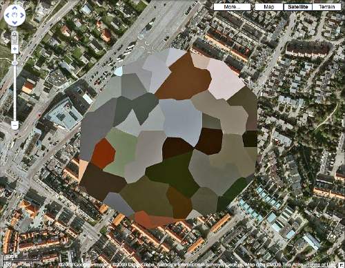
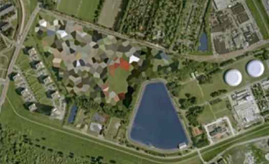
Collecting Dutch Landscapes
I just got the first prints of Dutch Landscapes to paint. And I’ve captured a few more to prep for printing. Here are a few more of the camo-obscured Dutch sites I also like but haven’t gotten around to capturing and printing yet. Most are military or intelligence installations of some kind, culled from the Onherkbaar/Unrecognized list here:
View Larger Map
The landscape and architecture around this one on the Maas in Rotterdam has a really nice, explicit geometry of its own. The light in some of these is just wonderful, too. So strong and clear. Which is what you’d want, obviously, for aerial photomapping. As Stefan reported on Ogle Earth back in 2006 when this dataset debuted, the fact that these were not satellite images is intrinsic to their camo censorship. Satellite imaging is considered to be beyond Dutch jurisdiction, but permits are required for aerial surveying, and the images are reviewed to censor “vital” military or intelligence buildings and sites.
View Larger Map
More landscape geometry. This one reminds me of Isamu Noguchi’s admiration of hatake, the rice paddy landscape of Japan, a terrain which, like the Netherlands, was the product of centuries of intensive human sculpting and engineering. [That said, I can’t find any mention of the Noguchi quote I’m thinking of.]
View Larger Map
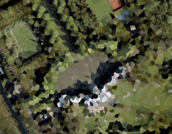
This one’s the Palace Huis ten Bosch, the Queen’s residence. I love that the tennis court and the sculpture garden at the top are not considered “vital” sites. While trying to identify any of the installed works, I learned that H.M. Queen Beatrix is quite a fan and practitioner of sculpture and maintains at studio there at the palace.
What I Looked At Today: Theo van Doesburg Edition
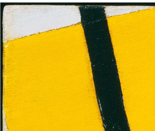
It’s hard to see Theo van Doesburg’s work up close these days, especially paintings. But for this Dutch Landscapes paintings project, the technical and theoretical logic of both Mondrian and van Doesburg is pretty inarguable.
Though the de Stijl folks were pursuing geometric purity and truth, not deploying abstraction as an obscuring, information-smothering blanket, the boundaries of their color planes and lines are interesting reference points.
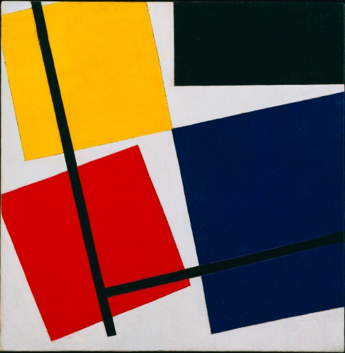
And fortuitously, a new, expansive exhibition of van Doesburg and his network of influence across the avant-garde, just opened at the Stedelijk Museum De Lakenhal in Leiden. It will travel to the Tate Modern in February. Which is as convenient an occasion as any for the release of a beautiful hi-res image of Simultaneous Counter-Composition, 1929-30, which is on loan from MoMA’s collection. Just look how the yellow brushstrokes come up right against the black line. And the free edge on that little white wedge up there,
Autoprogettazione Updates From All Over
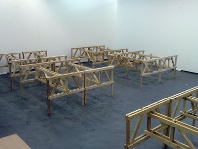
Sheesh, as if I wasn’t painfully aware of the nearly finished Enzo Mari x Ikea Mashup table sitting behind my sofa, I get this, from Peter Nencini, [above] which frankly just hurts:
A couple of weeks ago we reassembled 32 studio tables, originally built last year to Enzo Mari’s Autoprogettazione plans, published in 1974.
I’ll assume that they’re not putting twelve coats of hand-rubbed tung oil on theirs. At least I can hope my next 31 tables will go much more quickly.
Then there’s Wallpaper magazine swooping in with Autoprogettazione Revisted at the Architecture Association in London, where AA students and a few name designers show off their Mari-inspired hacks, and there’s even a lecture by Mari himself, which is alternately animated and tedious, and thanks to the on-the-fly translation, twice as long as it would normally be.
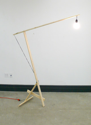
But even as I worry a bit about missing a trend–or worse, finding myself caught up in one–I’m reading the AA’s catalogue and instructions for the show–because yeah, I’d totally make Kueng-Caputo’s awesome lamp, wouldn’t you?–and I find this:
Mari was ultimately disappointed with the original response to Autoprogettazione, believing that ‘only a very few 1 or 2% understood the meaning of the experiment’…Enzo Mari hoped that the idea of Autoprogattazione would last into the future. Autoprogettazione Revisited reveals that it has done just that. Not all of the artist/designer responses in Autoprogettazione Revisited can be duplicated by the enthusiast, but they are inspirational and without a doubt follow the Mari principle that ‘by thinking with your own hands, by [making] our own thoughts you make them clearer.’
I’ve always understood Mari’s project to be a critique of the self-important distinction between the “artist/designer” and the “enthusiast.” In his lecture, Mari actually said that of the many thousands of requests for Autoprogettazione plans, only 1-2% of them were from design professionals. I can totally imagine the head of an architecture school gallery thinking that those two tiny, so-enlightened populations are the same, but I’m not at all sure Mari would agree with her. [thanks andy for the links]
100-ft Spheres In The Center? On Buckminster Fuller’s Original Expo 67 Pavilion
From the Other Things I Didn’t Know About What Goes Inside Geodesic Dome Pavilions Department:
Christine Macy and Sarah Bonnemaison devote a chapter in their 2003 book, Architecture and nature: creating the American landscape to geodesic domes, including this description of Buckminster Fuller’s original vision for the US Pavilion at Montreal’s World Expo 67:
His [Fuller’s] design of 1964 featured a dome nearly twice the size [of the 250-ft diameter, 3/4 dome by Fuller and Shoji Sadao that was realized] with a massive interior gallery. From this elevated vantage point, the viewer would focuse their attention inward to a hundred foot diameter Earth tranforming slowly into an icosahedron, before it opens up, unfolding like a flower as it descends to the floor. [what a sentence. -ed.] In this way, Fuller’s “geodesic” globe transforms into his “Dymaxion” map of the Earth before the visitors’ eyes, displaying the “one world island in one world ocean.” And then it would come to life. Wired with tens of thousands of miniature light bulbs, this great map would begin to pulsate with patterns–showing world resources, electricity generation, the flow of transportation and communication systems across the Earth. This interactive display, this giant bio-feedback device, would be the playing surface of the “World Game.” Assembling in teams or playing by themselves, visitors were intended to chart out optimal paths to link resources with industries and population centers, to streamline transportation flows and maximize satellite coverage The aim, according to Fuller, was to “make the world work successfully for all of humanity…without anyone gaining advantage at the expense of another.”
Since he had not actually been asked to design the exhibit, just the pavilion, this idea was rejected and replaced by a selection of quilts, duck decoys, and Cary Grand billboards.