
So it looks like we won’t be finding the Warhols just yet. The Kickstarter project deadline came today, and only $265 of the $1400 or so required to print and ship a batch of giant Wanted posters had been pledged. A huge thanks to all the folks who pledged, though; it was and is very encouraging.
This doesn’t mean there won’t be giant Wanted posters; because frankly, they’d look awesome, and seeing them is at least half the point of the project. The project had to tread a fine, meandering line through that poster awesomeness on the one hand, the unofficial, unsanctioned publishing of the LAPD’s poster on the other, and–wait, how many hands do I get?–the obvious intellectual property issues. And of course, underpinning the entire thing is the obvious challenge it poses to our sympathies and sense of value: is it harder or more problematic to feel altruistic and volunteerish towards someone who’s lost 11 of his 80-plus Warhol paintings? Is the world actually a worse place because one of eight sets of these portraits is now missing? Did the answers to these questions change after the insurance company’s reward was rescinded and Weisman started trashtalking the investigators?
My own interests and motives–to realize and propagate these giant Warhol posters in various back rooms and offices of the art world–still depend on this presumption of a community chipping in and keeping an eye out to help find these missing artworks. It’s acting as if the art world is a small subdivision, where everyone joins the search to find the lost puppy. If there’s a more hilariously inapt metaphor for the art world than that, I guess I don’t know what it is.
Category: projects
It’s So Hard To Get Good Help Finding The Warhols These Days
Yeah, well it’s like five days until the Find The Warhols! project expires on Kickstarter, and we’re still a ways to go from our goal. Normally this would right about the time that a groundswell of sympathy for the victim kicks in, and everyone grabs a couple of posters and hits the streets of Bel Air, trying to find those damn Warhols and bring them home before the storm hits.
A groundswell which might be dampened somewhat by the collector unloading on the LAPD to the LA Times:
Richard L. Weisman, the noted art collector who made news recently when he decided to forgo a multimillion-dollar insurance policy for stolen art, had some critical words for the LAPD detectives investigating his case.
“Maybe if they would do their job … and spent some time looking for the art instead of being accusatory of the person who had it stolen, they might actually find it,” Weisman said in an interview last weekend.
Weisman then tiptoed into Pebble Beach Pollock territory with this denial of any involvement in the paintings’ disappearance: “The idea that I would steal from myself is the most ridiculous thing I’ve ever heard.”
So then you haven’t heard about the attempt to crowdsource 500 giant copies of the LAPD’s awesome Warhols wanted posters?
Collector who reported Warhol paintings stolen has tough words for LAPD [latimes]
Original = Higher Resolution
 Lawrence Weschler narrates a slideshow of David Hockney’s iPhone/Brushes drawings for the NY Review of Books:
When he finishes one of these drawings, he sends it out into the world…
There’s about 15, 20 people, and he assumes that we send them on to other people if we like it.
One of the things that’s quite fascinating in this whole thing is that we have the original on our iPhone. Which is to say there’s no version that’s higher resolution than the one we have; we all have the same resolution. The ones you’re looking at right now are originals as well.
Technically, there are images and .brushes files. If you send Brushes images as .brushes files, their creation can be replayed like an animated movie. [It makes me interested to try to animate a Brushes work the way, say, William Kentridge does, treating the buildup of strokes as a narrative device. But that’s not the point right now.] But if Hockney just sends out images, then his friends have a file that is distinct and different from the “original,” and all its embedded generative data. It is certainly different from the image embedded in a slideshow.
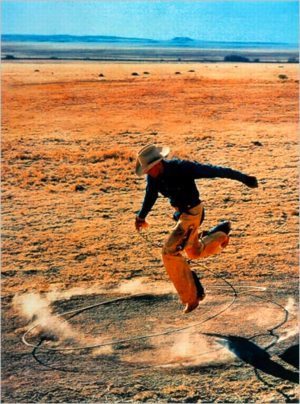
But that’s a highly particular assumption of originality that pertains to this app. Weschler’s assumption that a copy is lower-resolution than an original has much broader implications. It’s an assumption that’s hardcoded into almost all our image reproduction technology, as I inadvertently discovered when I began trying to accurately reproduce the 300×404 pixels of 300×404, after Untitled (Cowboy) 2003 by Richard Prince, the original of which is a .jpg file.
An image invisibly but irrevocably sheds a phenomenal amount of data and time- and process-related content when it goes from .brushes file to .png or jpg. In precisely the opposite way, transferring 300×404 to anything other than the jpg it is turns out to involve the addition of an incredible amount of data, via interpolation, upgrading and smoothing and blending algorithms. Those original 121,200 pixels get drowned out completely.
Audio Slide Show: Lawrence Weschler on David Hockney’s iPhone Passion [nybooks]
Previously: 300×404: The making of
On Second Thought, Don’t Find The Warhols??
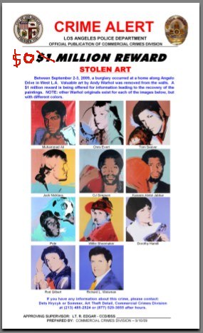
Well that’s complicating. Richard Weisman has withdrawn his $25 million insurance claim for the 11 Andy Warhol paintings he reported stolen last month from his home in Los Angeles. As a result, the insurance company, Chartis, has withdrawn its offer of a $1 million reward for the works’ recovery.
As the Seattle Times reports,
he simply couldn’t stand the thought of insurance investigators poring through his personal records and interrogating his family and friends before he stood any chance of collecting.
“They turn you into a suspect. I just finally told them, ‘I’m not going to go through it for three to five years. Forget it,’ ” Weisman said. “That’s the only reason, and it’s a good enough reason.”
…
“It’s a lot of money he gave up,” [LAPD Art Detective Don] Hrycyk said. “It’s one of those puzzling aspects you have to take into account when you do your investigation.”
Uhm, ok! Hrycyk’s partner Mark Sommer also said his office had been having a difficult time contacting Weisman about the theft. Mhmm.
Weisman commissioned eight sets of the Athletes paintings in 1977. He has since given away four sets, and has kept a set or two on the market for the last few years. So obviously, he’s not short of Warhol Athletes. Bully for him, but what about the rest of us?
While I worried for a second or two, I realized that even without the reward, the Find The Warhols Project is still desperately needed. With so many Warhols out there, it’s more important than ever for collectors, traders, and brokers to have a handy reference to check the hotness of their wares.
I assume LAPD will issue a new Wanted Poster [update: they did, for the third time, apparently], but for the FTW! Project, I’m inclined to stick with the original. When posters go out, I will personally add the up-to-date reward information to each work by hand. Just like Thomas Kinkade.
And since Chartis, better known until July as the commercial insurance operation of AIG, is owned by the US government at the moment, taxpayers just saved $1 million – $25 million! It’s win-win-win!
Only 10 days left to join the Find The Warhols! Project [kickstarter.com]
See the original Find The Warhols! Project post [greg.org]
What I Looked At Today – Phillips Edition
Why, I feel just like Alma Thomas, what with my shopping around for a modernist painting technique to use on my Dutch camo Landscape series…
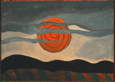
Anyway, I headed over to the Phillips Collection in search of Arthur Dove paintings. Huge trove, you know; Duncan Phillips was a longtime supporter of the artist and his work. Until yesterday, they had eight Doves up. But they started some work in a gallery, and so today they have just one: Red Sun, 1935, which is hanging in the little half stairway going to the Goh Annex. His line is promising, not nearly as fastidious as the 17th c. Dutch, of course, and thicker paint, which he mixes and blends on the canvas.
A couple of other unexpected pieces made it well worth the trip:
Continue reading “What I Looked At Today – Phillips Edition”
Echo I
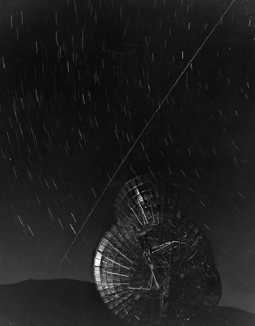
This 1960 LIFE Magazine photo by Grey Villet of Antenna bouncing first message off Echo I satellite is a great, uh, echo of Trevor Paglen’s The Other Night Sky series.
What I Looked At Today
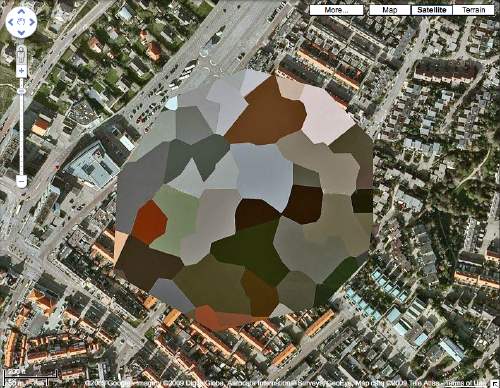
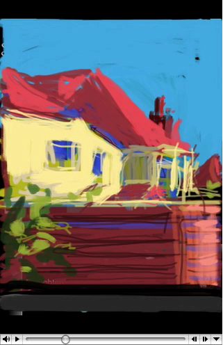
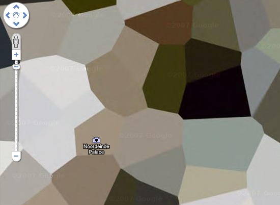
So I decided to make the Dutch landscape paintings I wanted to see made from those incredible security-obscured Dutch Google Maps I found a couple of weeks ago.
I’ll print the images out and paint over them. Since they are Dutch landscapes, I figure they’ll be nice, little domestic-sized paintings I can make on a table.
I’ve been trying to puzzle out how to get the paint on there and what it should look like. My first idea was to keep the process as mechanical as possible, both to produce crisp, sharp polygons, but also to mediate between the image and me–and my utter lack of painting experience or technique. But my brother-in-law, an excellent artist with an extraordinary sensitivity to technique and material, made the case for just painting the damn things with a brush.
So I’m convinced, though I’m still not quite settled on how I’ll do them. But we set out today to look upclose, extremelyclose, at some 17th century Dutch landscape and cityscape paintings, and see how they were done. Of course, we missed the much-hyped Dutch Cityscapes exhibition at the National Gallery last spring.
Here’s what we saw today at the National Gallery:
BeDazzled At RISD
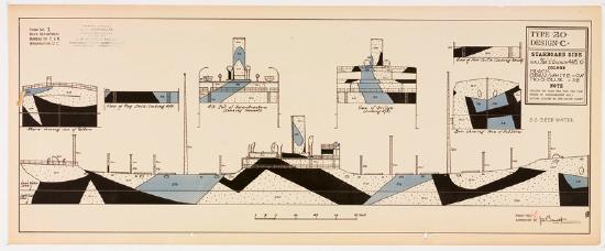
BeDazzled was an exhibition organized by the appropriately named RISD librarian Claudia Covert of the library’s collection of WWI Dazzle Camouflage patterns and photographs from the US Shipping Board:
Maurice L. Freedman donated the plans and photos in the collection of the Fleet Library at RISD. Maurice was the district camoufleur for the 4th district of the U.S. Shipping Board, Emergency Fleet Corporation. The Shipping Board was a precursor of today’s Merchant Marine. The Navy gave dazzle plans to each Shipping Board district. Maurice’s job was to take the plans and hire painters (artists, house painters) to paint the ships accordingly.
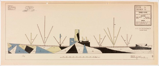
Freedman went on to design the first version of the game Battleship, which is set to be ruined by a giant Hollywood movie.
The rather excellent website for BeDazzled, which closed in April 2009 [risd.edu/dazzle]
Razzle Dazzle
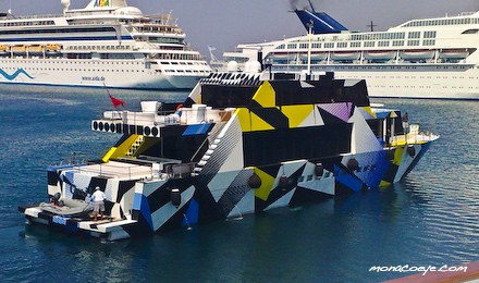
Last year Jeff Koons covered Dakis Joannou’s angular yacht Guilty [designed by Ivana Porfiri] with a pattern inspired by WWI naval camouflague. The technique, known in the US as Razzle Dazzle and in the UK as just Dazzle Painting, was created by the British artist Norman Wilkinson.
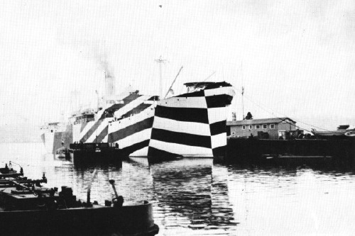
Dazzle deployed Cubism’s multiple perspective and fragmentation to thwart the aim of German U-boat attacks by obscuring the ships’ dimensions and traveling directions. The advent of sonar eliminated the need for visual targetting–and the utility of Dazzle Painting.
Ironically, Koons camo design made it exponentially easier for the yachtspotters at Monaco Eye to shoot Guilty in port last summer.
Dazzle Painting history and images [gotouring.com]
The US Navy apparently kept using Razzle Dazzle techniques through WWII. A large collection of 455 lithographs of camouflage designs was discovered in 2008 at RISD, the 1919 donation of an alumnus, Maurice Freedman, who was a camouflage painter during the war. They were exhibited for the first time last spring. [Dazzle Camouflage on Wikipedia]
Houses Of Orange
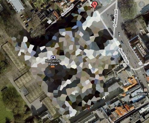
NL Architects thinks it might make a good Herzog & deMeuron project, but I think Google Maps’ security pixelization of the Dutch Royal House’s Noordeinde Palace in Den Haag would make an absolutely fantastic series of landscape paintings.
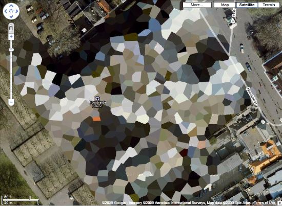
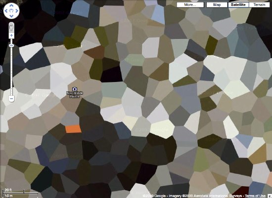
Where else in the world are such things? The DRH’s summer palace at Huis ten Bosch; an AZF chemical weapons factory in Toulouse…
There’s a surely incomplete list of obscured satellite images on Wikipedia, and a map. Which includes Mastercard’s corporate headquarters in Westchester, which actually looks like it was painted over. They call it “watercolored.” Perfect.
here’s the list of camo’d Dutch sites I’ve been working with.
Previously:
architecture for the aerial view, including WWII factory roof camouflage: the roof as nth facade
art for the aerial view: Calder on the roof
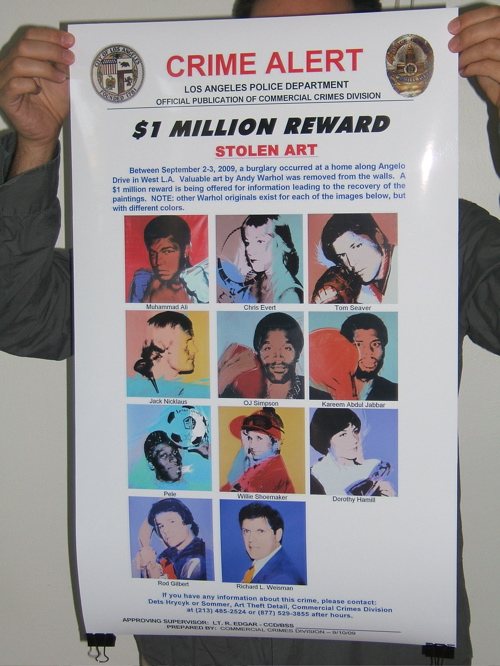
Have You Seen Me? The Find The Warhols Project
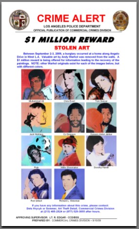
Earlier this month eleven portrait paintings by Andy Warhol were reported stolen from the home of Los Angeles collector Richard Weisman. The paintings, known the Athletes Series, depict some of the greatest athletes in the world in 1977, plus Weisman. There is a $1 million reward for information leading to their return.
When one man’s Warhols are stolen, all our Warhols are stolen, because no matter how many Warhols you technically own, Warhol belongs to all of us. It’s imperative that we band together to help these Warhols return to their rightful home [so they can be sold]. Which is why greg.org is announcing The Find The Warhols Project.
MISSION
The Find The Warhols Project seeks to facilitate the safe return of the Weisman Warhols by assisting in the dissemination of crucial identifying information where it is needed most: on the front lines of the art world.
FTW will educate and empower an ever-vigilant grass roots army of Warhol Watchers who will be able to quickly spot the stolen Warhols from among the thousands of Warhols streaming through the art world every day.
THE PROJECT
Many, many Warhols look the same, especially the 40×40-in. square silkscreened portraits of seemingly random people who were rich and/or famous in the 70’s and 80s. This can make it hard to tell if a Warhol is hot or not.
For example, just look at these three seemingly identical Muhammad Ali portraits. Can you tell which one is stolen, which one sold for triple its high estimate, and which one was still available last summer in Beijing?

Fortunately, on September 10th, 2009, The Los Angeles Police Department’s Art Theft Detail released a one-page, notepad-sized Crime Alert [top] with reproductions of the exact eleven stolen paintings and a critical detail: “NOTE: other Warhol originals exist for each of the images below, but with different colors.”
This is an invaluable crimebusting tool that needs to be distributed as widely as possible and studied regularly whenever you buy, sell, see, hang, ship, frame, conserve, appraise, authenticate, license for marketing, or critique a Warhol.
To that end, FTW will take this crucial-but-small Crime Alert and make larger versions which will enable quick and certain detection at a glance. These giant, poster-sized versions will be offset print in full color on 100-lb glossy paper, and will be suitable for hanging by Warhol Watchers at key art world locations with high Warhol traffic, including:
- Art gallery backrooms
- Private dealers’ showrooms
- Hedge fund conference rooms
- Park Avenue cosmetic surgeons’ waiting rooms
- West Village real estate developers’ conference rooms
- West Village townhouse stagers’ conference rooms
- Collectors’ offices
- Private curators’ offices
- Museum curators’ offices or cubicles
- Independent curators’ hallways, since it is unlikely they have offices
- Curatorial studies graduate program student lounges
- Auction house cube farms
- Art magazine offices
- Art magazine freelance writers’ walls above the beds where they write because they can poach the neighbor’s wi-fi from there
- Art organization benefit auction organizers’ conference rooms
- Art fair booth backrooms
- Art fair concierge desks
- Art fair VIP lounges
- Art fair sponsor VIP lounges
- Fractional ownership jet terminals
- Museum development directors’ assistants’ offices
- Museum registrars’ offices
- Museum freight elevators
- Crate fabricators’ workshop offices
- Framers
- &c., &c.
HOW YOU CAN HELP
- Get some FTW Crime Alert posters.
- Put them up in your own corners of the art world.
- Study the details of the Stolen Warhols frequently to keep them fresh in your mind.
- Whenever you buy, sell, or otherwise encounter a Warhol, check it against the Crime Alert poster to see if yours is one of the Stolen Warhols.
- Encourage others to do the same by writing about the FTW Project on your blogs, by giving posters to other collectors and dealers and art world friends, by holding FTW Happenings in your lofts to build awareness and learn the paintings, &c.
FTW Crime Alert posters are available for pre-order through Kickstarter starting at $10 for two, to cover the cost of printing [$883] and shipping [$3.62/order]. Orders will only be processed and the posters will only be printed and shipped as soon as 141 pre-orders are received. If the Stolen Warhols are found before FTW reaches 141 pre-orders, the Project will cease, no posters will be printed, and no orders will be charged or fulfilled. The FTW Project Kickstarter page has more information, including details of how Kickstarter pledges work, as well as options for ordering multiple posters, for international shipping, and for collectors who own more than 11 Warhols.
BACKGROUND
The Warhols, known as the Athlete Series were commissioned by Richard Weisman in 1977 for the purpose of bringing the world’s two greatest leisure pastimes–sport and art–together. They are all portraits of famous athletes posing with the primary implement of their chosen sport next to their heads. Plus a headshot of Weisman himself, whose mother co-founded the Museum of Contemporary Art in Los Angeles, and whose uncle Norton Simon founded the Norton Simon Museum.
Warhol produced eight complete sets of the paintings for Weisman, plus an unidentified number of additional individual paintings. Two sets were broken up and given to each athlete and his or her sports governing body. Weisman donated two sets to university collections. Weisman’s three kids each got a set. And he kept one for himself. Total price tag for the project: a reported $800,000.
All the works are 40×40 inches, silkscreen and polymer paint on canvas. Warhol also created other, differently sized versions of some images. Except for the Muhammad Ali paintings, all the canvases were signed by the athletes at the time of their completion. For Ali, Weisman had Ali sign five paintings [presumably the non-donated ones: his own, his kids’ and one extra, see below] during a visit to Los Angeles in 1991. Each silkscreened canvas was painted in a unique color combination.
Weisman began marketing his set several years ago. He loaned it to the Warhol Museum in 2005. In 2007, it was offered for sale in London by the dealer Martin Summers for $28 million, along with several individual paintings. It was still for sale in 2008, when he showed it in Beijing during the Olympics.
The 2007 show also included a loosie Ali portrait with a purple ground, above right.] A couple of months later, Ali’s own red & green painting [above middle], which had been given to his ex-wife, sold at Christie’s for $9.2 million.
So you can see how vitally important these Warhols are, especially to Weisman. They’re practically his children. Children he can sell for an eight-figure price. And children whose safe return could bring a million dollars to the one who makes it happen. Won’t you help?
On The Public-Sculpture Gravy Train
It’s got shiny spheres, and science re-creations, and DC artists and quotes from curator and museum director friends. But it’s been a few weeks now, and the only thing I can say about Blake Gopnik’s mind-numbing/blowing article on Jim Sanborn is that this passage on public art is pretty damn funny:
The fame of the CIA commission “funded me for all the years since,” Sanborn says. It put him on the public-sculpture gravy train. He stopped living in his scruffy studio building in Northeast Washington (it’s where he met his wife, Jae Ko, a well-known local sculptor), bought a house in Georgetown, designed a home in the Shenandoahs and continued to fund his more “serious” art, such as “Atomic Time.”
But lately, the commissions have dried up. Today’s selection panels, he complains, go for “decorative embellishments.”
Damn those panels. If only noted art historian/author Dan Brown would write a book about Washington, he could include another mention of Sanborn’s work.
??!!??: Sparking Interest Within the Sphere of Art | ‘Physics’ May Be Most Substantive D.C. Piece in Half-Century [washingtonpost via man]
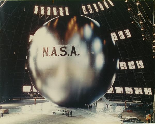
Floating Cloud Structures, Or We All Live In A Fuller Satelloon
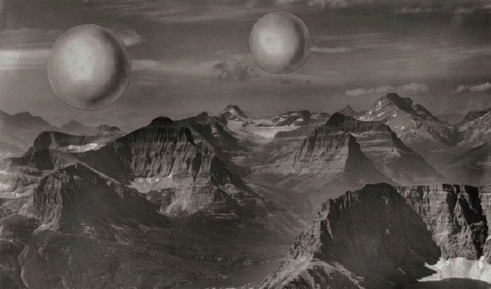
Just like how, once you’ve learned it, you start hearing a word all the time, now I see satelloons everywhere. Including at the Buckminster Fuller retrospective last year at the Whitney [which went on to Chicago this summer.]
Buckminster Fuller and his architecture partner Shoji Sadao mocked up this photo of a photocollage, Project for Floating Cloud Structures (Cloud Nine) , around 1960. Cloud Nines are self-contained communities of several thousand people living inside enclosed geodesic spheres a mile wide, which float over the earth’s surface.
Because the geodesic structure increases in strength as it gets bigger, and its surface increases at a power of two, while its volume increases at a power of three, Fuller hypothesized that heating the interior air even one degree will set the Cloud Nines aloft.
Obviously, as a sexy, futuristic utopian image, Cloud Nine is hard to pass up, but holy crap, Bucky, did you think for two seconds about the urban fabric and the social experience of living trapped in a floating dome? I’d love to see someone write an SF story about it. Because I think it might be a fantastically totalitarian disaster.
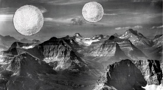
There are two versions of the Cloud Nine image: [the earlier?] one has smooth, silvery, featureless spheres. I’d call them satelloons, even. The other [above] has line drawings of the geodesic structure collaged onto it.
It was only now, as I get around to finally posting about them, that the relationship between Cloud Nines and satelloons might be more than formalistic. The original satelloon, Project Echo launched in 1960, the same year Fuller and Sadao designed their giant floating spheres. Could there have been a connection?
The easiest, most obvious thing to do might be to ring up Shoji Sadao. What is he up to these days, anyway? You’d think that given the recent interest in Fuller’s work, a guy who worked so closely with Fuller on so many major projects–he’s credited with the dome at the 1967 World Expo in Montreal, arguably the most spectacular Fuller structure ever realized–would be all over the place. I mean, it was only a few years ago that he gave up his position as executive director of the Noguchi Foundation in Long Island City. And then he curated that great Fuller-Noguchi show in 2006. [Sadao was also a longtime collaborator with Noguchi and the chief overseer of his legacy.] Anyone spoken with him lately?
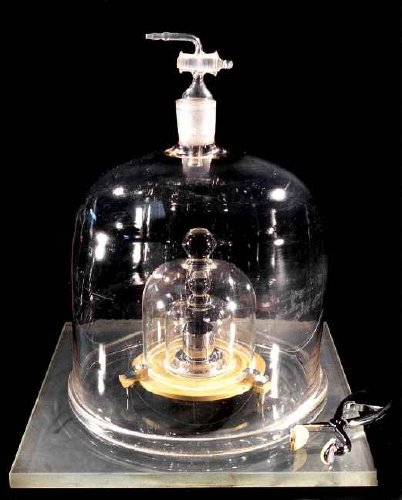
The International Prototype Kilogram, Or Le Grand K
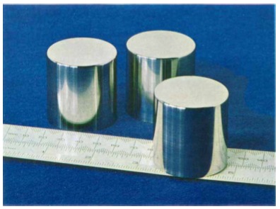
Caught this on the CBC last night. I always assumed a kilogram is equal to the mass of a liter of water. But it turns out to be messy/tricky/complicated to measure water accurately enough, plus, some scientists decided to change the definition soon after it was decreed, so a kilogram is actually equal to the mass of the kilogram, the International Prototype Kilogram, or IPK, also known in France as Le Grand K. It’s the only unit of measure, says Wikipedia, “that is still defined in relation to an artifact rather than to a fundamental physical property that can be reproduced in different laboratories.”
The IPK is made of a platinum alloy known as “Pt‑10Ir”, which is 90% platinum and 10% iridium (by mass) and is machined into a right-circular cylinder (height = diameter) of 39.17 mm to minimize its surface area. The addition of 10% iridium improved upon the all-platinum Kilogram of the Archives [originally made and adopted in 1799. -ed.] by greatly increasing hardness while still retaining platinum’s many virtues: extreme resistance to oxidation, extremely high density, satisfactory electrical and thermal conductivities, and low magnetic susceptibility. The IPK and its six sister copies are stored at the International Bureau of Weights and Measures (BIPM) in an environmentally monitored safe in the lower vault located in the basement of the BIPM’s Chateau de Breteuil in Sèvres on the outskirts of Paris. Three independently controlled keys are required to open the vault. Official copies of the IPK were made available to other nations to serve as their national standards. These are compared to the IPK roughly every 50 years.
The IPK is stored under three bell jars, and its six sister copies are each stored under two.
The IPK and two other cylinders were manufactured in 1879 by Johnson Matthey, assayers and refiners for the Bank of England. [IPK is the third, KIII.] Johnson Matthey made 40 replicas in 1884, which were calibrated to IPK. 34 were distributed in 1889 to signatories of the Meter Convention for use as national standards. Two of this original batch, K4 and K20, are in the US. K20 was designated the US standard prototype in 1889.
The process and protocols for comparing these replicas to IPK, known as “periodic verification,” have evolved over the years. The BIPM was apparently not so distracted between 1939 and 1946 that they couldn’t develop “The BIPM Cleaning Method,” which involves a chamois, ether, ethanol, and steam cleaning with bi-distilled water. [Considering the Metric system itself was implemented in the midst of the French Revolution, and proceeded even as key scientists were being guillotined, I guess it’s not so surprising.] Models have developed to describe the rate of surface contamination.
What has become clear after the third periodic verification performed between 1988 and 1992 is that masses of the entire worldwide ensemble of prototypes have been slowly but inexorably diverging from each other. It is also clear that the mass of the IPK lost perhaps 50 µg over the last century, and possibly significantly more, in comparison to its official copies.
Given this variation and divergence, much of which cannot be explained, the CIPM [Committee &c.] in 2005 recommended redefining the kilogram as a constant of nature. So far, a suitably stable, reproducible constant has eluded metrologists.
One method is to define the number of carbon-12 atoms in a 1kg cube. Another, part of the Avogadro Project, is to create a single-crystal sphere of silicon, then measure the sphere radius and its internal crystal lattice with interferometry, and then polish it with single atomic level-accuracy to reach 1 kg. A sample is presented here with rather dramatic flair by a master optician at the Australian Centre for Precision Optics:
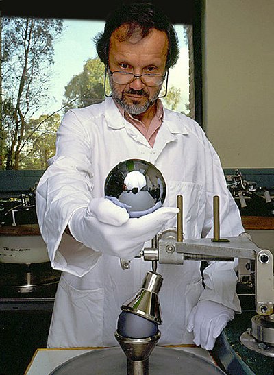
Its appearance might look familiar to regular readers of this website.
The human attempt to account for the world through exacting science results in a minimalist object that transcends other Minimalist objects, all while inhabiting a conceptual framework that transcends Conceptualist frameworks.
And I want some. And when I get my kilogram[s], I’ll put them on the shelf next to my satelloons and my photos of the entire universe from the Palomar Sky Survey.
Kilogram, Grave [wikipedia]
photos of the International Prototype Kilogram [bipm.org]
“The kilogram and measurements of mass and force,” Journal of Research of the National Institute of Standards and Technology, Jan-Feb, 2001 [findarticles.com, PDF original at nist.gov]
Frosty Myers Winners
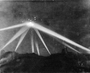
Before I realized that if I wanted to see an exhibit of a 100-ft silver balloon, I’d have to make it myself, I was still just ruminating on art I hoped/wished someone would make. One of those projects I want/need to see is a re-staging of the Los Angeles Times photo of the panicked air raid searchlights that criss-crossed the sky on the night of Feb. 25, 1942. Six civilians died in that apparent, still unexplained false alarm, and the Times’ caption on the photo above described how the “searchlights built a wigwam” over the city. Wouldn’t that be fantastic?
Well, now I wonder if there is someone to get to do it.
16 Miles pointed to an awesome 2001 Art in America article by Suzaan Boettger on Sculpture in Environment, a pioneering New York City-wide show of public sculpture organized by Sam Green, the director of the ICA in Philadelphia, which took place in October 1967.
The main focus of Boettger’s article is an intriguing and prescient unmonumental work by Claes Oldenberg, and Robert Smithson’s seminal roadtrip article/work, “The Monuments of Passaic,” which [not] coincidentally, he made the day before. And the hook for 16 Miles’ post is the death of Tony Rosenthal, whose Alamo cube still spins where it was shown, in Astor Place. But there are other great details: Oldenberg had first proposed creating a traffic jam; Robert Morris’s jets of steam proposal was considered “too ephemeral.” Isamu Noguchi was still pitching his playground idea [“too expensive.”] Alexander Calder liked to help the Negros. &c. &c.
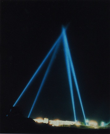
But anyway, Boettger mentions this “a nocturnal event by Forrest Myers, who projected four carbon arc searchlights from Tompkins Square Park.” It’s not clear what they were called, but this description from a 2006 Art in America profile of Frosty Myers explains what these sculptures were:
“Searchlight Sculptures,” nighttime installations of carbon-arc searchlights that were sited at the four corners of Tompkins Square Park in the East Village in 1966, in Union Square in 1969, in a park in Fort Worth in 1979, and elsewhere. The beams tent upward to join at an apex in the manner of a vast pyramid.
Elsewhere included Artpark in Lewiston, NY, where Myers created a Searchlights pyramid in 1975 [see above]. You must admit, it does look very wigwammish.
You may know Myers from such previous greg.org appearances as: being instrumental in E.A.T. and the art/tech collaborative’s ambitious artfest-in-a-mirrored-dome, the Pepsi Pavilion at the Osaka ’70 Expo. And maybe being one of six artists whose work was secretly smuggled onto the moon on the Apollo 12 lunar module.
Remembering Tony Rosenthal, Remembering “Sculpture in Environment” [16miles.com]
A Found Weekend, 1967: Public Sculpture and Anti-Monuments, Art in America, Jan. 2001 [art in america via findarticles]
[Searchlights imagevia ekac.org]