
This just in from the greg.org Department of Stunningly Beautiful Digitized Maps of The Netherlands:

Bibliodyssey has some highlights from the National Library of the Netherlands’ fresh upload one of the rarest and most beautiful atlases in history, mid-17th century Dutch cartographer Frederik de Wit’s Stedenboek, or Book of Cities.
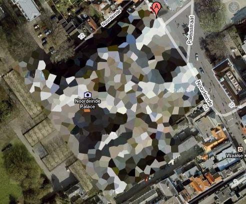
Who knew that the Dutch had such a long, rich, aesthetically awesome history of defense-related polygonal alterations of the urban landscape?

At least maybe now we have some idea where that crazy camo blob in Nordwijk came from:
Stedenboek [kb.nl]
Dutch City Atlas [bibliodyssey]
Category: projects
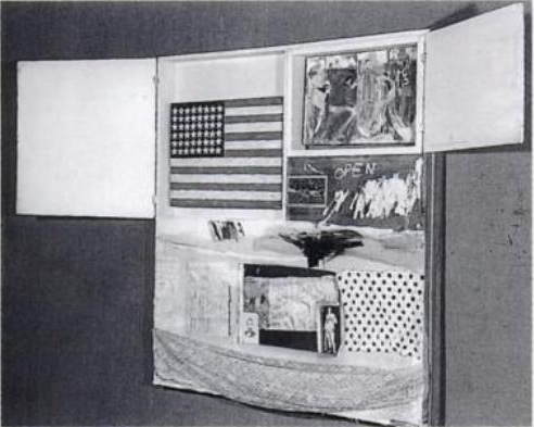
‘Loss of Painting – American Flag – Jasper Johns’
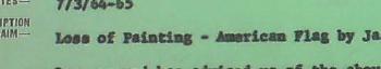
So here is where, after a few months of searching, I basically get caught up to the editors of Johns’ collected writings, who noted in 1996 that Johns’ Flag painting disappeared from Leo Castelli’s warehouse sometime “before June 8, 1965.”
After a couple of days of digging through the newly opened Castelli Gallery archives at the Archives of American Art, I found that date on the gallery’s insurance claim reporting the “Loss of Painting – American Flag by Jasper Johns valued at $5000 $12,000.” [the higher figure is written in by hand.]
The insurance company’s memo acknowledging the claim said that “Mr. Mellors is to meet with the assured on Wednesday afternoon regarding the details of the claim.”
June 8th was a Tuesday, and sure enough after his visit, Mr. Mellors had more to add. A follow-up memo is titled more clearly, “Theft of Painting – 6/6/65 – “Desk Explosion 65″ by Lichtenstein.” Mr. Mellors, it said, “…when discussing the loss on “American Flag” by Jasper Johns was informed of the above loss by Mr. Castelli.”
So what we have now is not just a “before June 8,” and a “loss” [although that is still the word used in relation to the Johns], but a date: “June 6” and a “theft.” And not just one work, but two.
The only other documentation I could find is a small note, “Call headquarters for 9th Precinct,” “Warehouses/ 75 Cliff St/ 25 First Ave” and the name [?] “Kay Kaz.”
The 9th Precinct is the East Village, which makes me think it was the First Avenue location. Kay Kaz, I have no idea, and I can’t find anything online so far. But this was not Leo’s handwriting, so I am assuming someone was taking this information down on the phone.
Frankly, I can’t tell if I’m more Law & Order: Art Victims Unit or Columbo, but this is feeling very real to me, trying to piece together what happened, where, when, and with whom, just using a few old memos.
The 6th was a Sunday, so it seems as if someone made a weekend visit to the warehouse, found the Johns missing from Short Circuit, called the police, then called the gallery to give instructions about following up with the police. And then on Tuesday, they filed a claim for the Johns, while seeing if anything else was missing. And by Wednesday, they found a Lichtenstein gone, too.
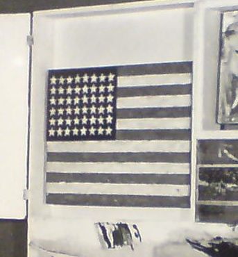
As it turns out, both works are similarly sized: small and portable. The Johns Flag is 13 1/4 x 17 1/4 inches, and Desk Explosion is 20 x 16 x 4–wait, 4-in? It’s a sculpture. An enamel-painted metal freestanding sculpture on a 4-inch deep base, made in an edition of 6:
Small….Explosion (Desk….Explosion), 1964, : image via lichtensteinfoundation.org
Either way, maybe tracking the Johns is now a matter of tracking the Lichtenstein.
So what do we know now? First, that the AAA’s Castelli Archive is awesome. I could blog those boxes out for days if the photo restrictions were a little more conducive. Instead, I find them more illustrative of the way that art historical information is still transmitted: in relatively hermetic dribs and drabs.
My previous assumption that the Johns may not have been “stolen” stolen because it was never reported as such turns out to have been wrong. Well, those reports existedtl, anyway, even if the Johns wasn’t exactly described as “stolen.” [I was also wrong about a couple of other assumptions and speculations I made in earlier posts, which I’ll get to separately and soon.] But generally, the information I’m finding does appear to have been found by at least someone, sometime, before. So I wonder what I’m doing: if all these curators and scholars have already been over this before, am I just playing art detective for my own belated educational amusement?
But questions still arise that keep me on the hook:
- Where’d those precise dimensions come from? Castelli? Rauschenberg? Johns himself? Someone had them on hand at the time the police were notified. I guess that answers the question about whether the Flag was an autonomous work?
- Why were Rauschenberg or Short Circuit not mentioned at all in the insurance claim?
- And the claim–and a half dozen 8×10 glossies of Rudy Burckhardt’s original photograph of Short Circuit was in Castelli’s Johns file, not his Rauschenberg file? [Just end it with an uptone and it becomes a question.]
- And what was Short Circuit even doing in Castelli’s warehouse? Wasn’t it in Rauschenberg’s own collection his whole life? In which case, why wasn’t he filing insurance claims on it?
- What IS up with that Lichtenstein?
- Rudy Burckhardt?
- And obviously, who is Kay Kaz, and what’s s/he doing in the middle of the memo about the polce?
What I Looked In 2007 & Again Just Now: Myron Stout
Doug Ashford ended the 2009 presentation I just posted about, “Abstraction as the onset of the real,” with a slide of this beautiful painting, Untitled, 1950 (May 20) by Myron Stout.
Washburn Gallery had a sweet little early Stout show in 2007, which I’d completely forgotten about. Back when he was still writing about art, NY Times chief art critic Michael Kimmelman reviewed the show:
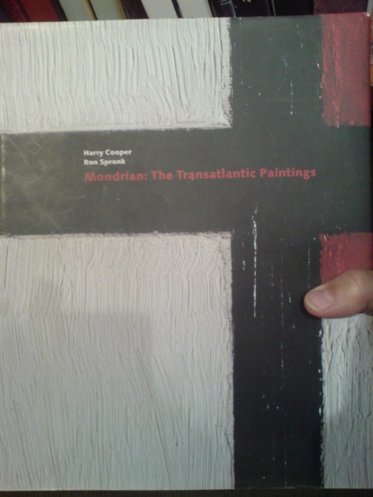
…his mentor remained Hans Hofmann, who helped him see how to construct a purely abstract picture, while his great inspiration was Mondrian, about whom Stout observed that “the tangible and sensational world was still the raw material for the universality which he would create for himself.” In other words, Mondrian, like Stout, remained firmly connected to nature and the real world.
Things that happened in 2007 can seem so long ago and far away. I need to hustle up some Stouts to look at, pronto.
What I Looked At Six Months Ago: Douglas Coupland’s Roots Paintings
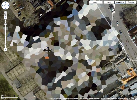
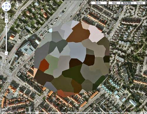
Holy smokes, it’s been 15 months since I found the Dutch Camo Landscapes on Google Maps; just over a year since I started systematically screengrabbing them; a little less than a year since Google’s particularly beautiful Delaunay triangulation distortion was replaced by a more typical pixelation algorithm; and about the same time since I last posted one of the “What I Looked At” installments, where I tried to figure out how to approach painting these things by studying the techniques of other hybrid, found, hard-edge, geometric digital, photographic, reductivist, surveillant, abstract, or Dutch Landscapes. Folks from Albert Cuyp and Picabia to Arthur Dove and Sheeler to Mondrian to Sherrie Levine [below].
The longer I take to think about how to paint without actually trying to paint, the more I keep accumulating and questioning potentially resonant work. And I wonder: what would it mean to consciously appropriate someone else’s technique? if I taped my edges, would there be more of a connection to Odili Donald Odita? If I made little polygonal stencils and squeegeed, would it be too Brillo? Is there an implication in the kind of precise painterly edges of Mondrian as opposed to the surprisingly tentative edges of Sheeler, or the just-fill-it-in forms of Dove? Should I skip the paint, and just blow those bad boys up and print the hell out of’em on the biggest canvas/paper I can find?
It [basically, obviously] boils down to some ongoing uncertainty or doubt or skepticism or insecurity or whatever over whether these things should exist. Emphasis on things and should. Does everyone who makes stuff feel that? It’s like Baldessari’s classic fortune cookie of a painting, “I will not make any more boring art,” but with the make in flux as much as the boring. I just remained unconvinced about the justification for these images as objects. [On the “bright” side, like the unshot film in the director’s mind, the unmade artwork does remain perfect–for me, anyway.]
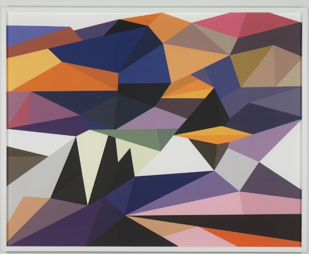
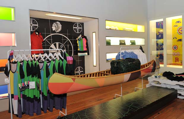
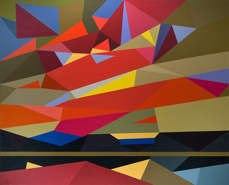
Anyway, all this comes to the fore because last summer, I saw images of some polygonal abstracted landscape paintings by Douglas Coupland, which were part of, or inspiration for, or somehow connected to, the Fall/Winter clothing and home furnishings colabo he designed for the Canadian retailer Roots. They were exhibited and for sale in Coupland X Roots pop-up stores in Vancouver and Toronto.
There was zero info online, so last summer and fall, but I deduced that they were digital reductions of iconic paintings by the Group of Seven, the early 20th century landscape painters who rather self-consciously set out to create a national cultural and visual identity for Canada via its landscape. Coupland’s Roots collection was an extension of that national branding project, only he referenced the unifying forces of electrification, television, and moose logos.
At least that’s what I gleaned from the web and press releases. I tried in vain to get any information on the paintings from Roots, Coupland, or his galleries, but it was total radio silence. So I ignored them back. Only now, as I check back, do I find that “culture guru” Coupland has a show up of the paintings, through this week, at Monte Clark Gallery in Vancouver. Faux-encrypically titled G72K10, the paintings turn out to be exactly what I thought they were.
“Thomson (Sunset), 2010, Oil on canvas, 58 x 72 inches” image: monteclarkgallery.com
To a point. Because though the captions say things like “oil on canvas” and “acrylic and latex” and “unique pigment print” it is completely unclear whether the images on the dealer’s website are of the objects themselves or of their digital sources. Maybe it doesn’t matter to Coupland. Here’s how the gallery describes them:
By digitizing the likeness of specific works, Coupland has produced large-scale hard-edged paintings on canvas, presenting his own vision of the Group of Seven in 2010.
Doesn’t sound like he’d use something as retardataire as a paintbrush for a forward-looking project like that. Though it’s hard to tell from the jpg, the date on this unidentified type of limited edition print being auctioned next month by the Writers’ Trust looks earlier than 2010. Or not.
So while I still can’t decide if my painterly obsession is a vice, Coupland’s project is at least makes clear that materialist indifference in the pursuit of digitized aestheticism and conceptual slickness is no virtue.
‘Someone May Have Located The Stolen Painting’
It’s exactly the kind of scribbled note I dug through five boxes of Smithsonian archival material hoping to find: “Someone may have loc. stolen ptg. So Charles will talk to Bob about it.”
Well, I talked to Charles about it. The artist Charles Yoder worked for Robert Rauschenberg for five years, until around 1975-6. So I called him, and unfortunately, he had no idea where the Johns flag painting was, the one which had been removed from Short Circuit in the mid-60s [Michael Crichton says before 1965.] He did say there was “scuttlebutt,” at the time, a general awareness that there was a Johns flag painting on the loose. But it never went beyond the, “I heard some guy was trying to sell it on the Bowery,” type urban legendry.
But though I didn’t find any smoking guns, or burned flags, in the records from Walter Hopps’ 1976 Rauschenberg retrospective at the National Collection of Fine Arts, I did learn some more interesting details about Short Circuit and its complicated history.
Like, for one thing, the 1955 combine was not actually shown in Hopps’ retrospective.
Continue reading “‘Someone May Have Located The Stolen Painting’”
Browser Tab Cut Or Run
So much to blog, so little time. I may have to institute a new practice of dumping my interesting-looking browser tabs if I don’t write about or use them within a month, or blogging about them.
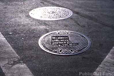
For example, ever since seeing a Le Corbusier manhole cover from Chandigarh sell for almost EUR18,000, I’ve been meaning to take this list of locations for Lawrence Weiner’s 2000 Public Art Fund project, and see which of his 19 downtown manhole covers looks the most lootable. But you know how it is with scheduling, holidays, pangs of conscience, snow, &c. &c…
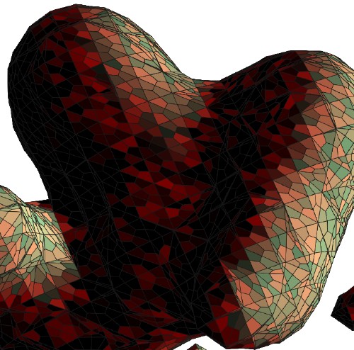
So via Zelkova’s long essay on interactivity and digitization, I find this intriguing 2003 project, C & C, from the Lyon design studio Trafik. Joel, Pierre, and Julien all responded [merci, fellas!] to explain that C & C began as an exploration for a method to create designs for a handmade carpet. So they created a program in C that used the 3D coordinates of shapes created in Autodesk 3ds Max [above] to generate a 2D vector graphic [below].

Needless to say, I like the translational aspects of the project almost as much as I do the Dutch camo landscape-like polys.
One nice consequence of my recent Short Circuit research is seeing and reading up on Sturtevant. From Bruce Hainley’s Aug 2000 essay in Frieze:
As Sturtevant puts it: ‘Warhol was very Warhol’.
This is a complicated statement. How did Warhol get to be ‘very Warhol’? How does one come to recognise – see, consider – a painting, film , or anything by Warhol once he and everything he’s done are slated only to be ‘a Warhol’? It is Sturtevant who knows how to make a Warhol, not Warhol. It is Sturtevant who allows a Warhol to be a Warhol, by repeating him. Copy, replica, mimesis, simulacra, fake, digital virtuality, clone – Sturtevant’s work has been for more than 40 years a meditation on these concepts by decidedly not being any of them.
I’m kind of disheartened by how interesting Chris Burden’s post-minimalist undergraduate work sounds in this fully illustrated repro of Robert Horvitz’s Artforum cover story from May 1976 [volny.cz]
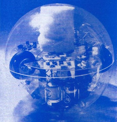
Via the awesome cyberneticzoo.com comes Toy-Pet Plexi-Ball a the 1968 artist/engineer colabo sculpture by Robin Parkinson and Eric Martin, which was included in Pontus Hulten’s MoMA show, “The Machine: As Seen at the End of the Mechanical Age.” The light-and-sound-activated Toy-Pet rolled around the gallery following viewers, until you put it in its fake fur bag. Which made it look like a tribble. Which can’t be a coincidence, can it, Pontus? If you have an engineer collaborating with an artist a year after the Star Trek episode airs?
Awesome kinetic/robotic artist James Seawright was one of the six artists–along with Aldo Tambellini, Thomas Tadlock, Allan Kaprow, Otto Piene, and Nam June Paik–who contributed to WGBH’s groundbreaking TV show/happening The Medium Is The Medium. Which is right in front of my face. And I’ve been staring at everyone but Seawright and Tadlock for a year. At this rate, I’ll be fawning over Tadlock sometime next summer.
Since my Google Street View Trike book project is entirely about the subject, I suspect I’ll keep Olivier Lugon‘s November 2000 Etudes Photographiques essay, “Le marcheur: Piétons et photographes au sein des avant-gardes,” open a little longer. Along with the Google translation.
The Gala As Art As Slideshow
The Gala As Art, greg.org, at #rank 2010 from greg allen on Vimeo.
Here’s the narrated slideshow I did at #rank during Art Basel Miami Beach.
Many thanks to Jen and Bill for inviting me, to Magda for instigating, to all the SEVEN galleries for hosting, and to Michelle Vaughan for sharing her sharp gala insights. And a huge thanks to Jean, whose advice helped structure a drive-by blog post into a more coherent [I hope] argument. And who insisted I go do the talk, even though it meant celebrating our tenth anniversary early and late.
Thanks, too, to the artists and photo sources, including, in random order as I think of them: Andrew Russeth/16miles.com, Artforum.com, Andrea Fraser, MoCA, LACMA, the Rubell Family Collection, Jennifer Rubell, Kreemart, Christoph Brech, Getty Images, Patrick McMullan, the daily truffle, billionaire boys club, Vernissage TV–don’t these credits make you just want to hit play right this second??
The audio’s rough, the aspect ratio wonked out at the last minute, and I’d do better to just rebuild the whole thing rather than adapt my Keynote slides. And while there’s no gift bag at the end, I did manage to edit out a whopping 12 minutes of um’s, pauses, and “wait, I want to go back to the previous slide”s. I guess media training is NOT like riding a bike.
Gala As Art Talk: The Making Of
I was nervous, I admit, but I really had a blast last week giving my Gala As Art presentation last week at #rank. The crowd was great; the other #rank folks I met were nice, with interesting projects and conversations; SEVEN looked fantastic, a really smart, low-key way to show a fair’s worth of work [I hope all the participating galleries made a bundle of money.]
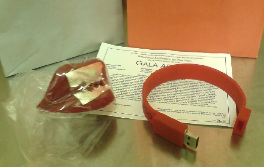
It seemed obvious that the talk required gift bags, so I decided to do them as an edition. The artist-licensed perfume I hoped to include didn’t pan out, though. I’d toyed with the idea, no pun intended, of making a version of Marina Abramovic’s party favor/dessert for the The Artist is Present gala, where the dessert art foundry Kreemart cast her lips in Belgian chocolate covered with gold leaf.
Then I priced edible gold leaf, and opted for silver leaf on edible wax lips, which really set the gift bag’s entire color scheme. [Actually, Diet Coke probably set the color scheme without me being aware of it.] Applying silver leaf was a pain in the butt, but there were only a couple of rejects. They traveled amazingly well, thanks to Jean’s careful wrapping. The certificate is designed like an invite, with a bajillion artists and collectors and curators on the committee, everyone I mentioned [or planned to, anyway.]
And at the last minute, I decided that burning and printing 50 DVDs full of the gala-related video and pdf files I’d assembled would be not so interesting. [A friend pointed out that no one ever opens the jewelcases in their gift bags, and I realized, in 20 years, I never had either.]
So I hustled to find a cool USB drive I could load. Maybe get my logo or url on it. Or maybe find anything at all in stock. Finally, I found exactly what I was looking for, and I ended up loading, signing and numbering the silicone bracelet flash drives the morning I left.
I’m discussing them at length here because they’re apparently so stealth, several people didn’t realize they were anything more than a wristband. So now you know. I saved a couple for the archive. And because I didn’t want to leave the lips melting in the trunk, I ended up not going to Art Basel at all. Crazy.
Meanwhile, I’m trying to find the best/easiest way to release the slideshow and audio together, either as a screencast or a podcast or something. Watch this space.
Jasper Johns’ ‘Short Circuit’ Flag: One Place It Isn’t
After a brief break, during which I briefly pwned Miami Art Basel, the search for the Jasper Johns flag painting which was included in Robert Rauschenberg’s 1955 combine-painting Short Circuit [above], continues.
Actually, because I had to carry on the oddball contents of the gift bags I did for my #rank presentation, I went to the airport freakishly early and ended up with extra lounge time, which let me read through all the details and footnotes in my pristine, OG copy [apparently from the library of Artforum!] of Dr. Roberta Bernstein’s definitive 1985 dissertation-cum-catalogue raisonné, Jasper Johns’ Paintings and Sculptures 1954-1974, “The Changing Focus of the Eye.”
Only guess what, it wasn’t there. Not a mention, not a photo, not a footnote, not a trace.
[UPDATE: Since posting this in December, I have communicated with Dr. Bernstein about the Short Circuit flag and its absence from her thesis, as well as its status in her forthcoming Johns catalogue raisonne. Scroll down for her gracious and informative reply.]
Continue reading “Jasper Johns’ ‘Short Circuit’ Flag: One Place It Isn’t”
Henri LaChambre And His Nancy Balloon
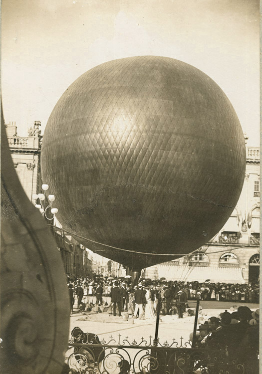
Rather than post this beautifully composed 1895 photo of Henri LaChambre’s rather awesome gas balloon inflated at Nancy, I should’ve freakin’ bought it by now.
Of course, my problem is that, now that I’ve seen it, I’ve filed it away for future flea market reference, where I’m sure I’ll just stumble upon a photomural-sized print of it for a euro.
Anonymous – Henri Lachambre and His Balloon at Nancy, France, $450 [vintageworks.net, thanks to whoever sent this to me, I forget, sorry]
Previously: Les Ballons du Grand Palais
‘Relational Aesthetics For The Rich’ – Friday 12/3, 1PM In Miami
It’s less than a week away, and I can’t believe I haven’t hyped it yet:
I’m giving a presentation this Friday in Miami during Art Basel Miami Beach titled, “Relational Aesthetics For The Rich, Or A Brief History Of The Gala As Art.”
It’s based on this similarly titled blog post, which pulls together a lot of things I’ve been fascinated by over the years, but which was inspired by MoCA’s Annual Gala, which the museum relabeled “a Happening,” and which they turned over to Doug Aitken to design as an artwork.
At least that was Jeffrey Deitch’s original pitch; the results–and the history and context of museum gala art–turn out to be a little more complex.
Anyway, the talk is part of #rank, a program put together by Bill Powhida and Jen Dalton, which will be held at SEVEN, the shared exhibition and program space in Wynwood organized by a group of awesome New York dealers.
There are so many people to thank, starting with Magda Sawon from Postmasters and artist Michelle Vaughan, who are the honorary co-chairs of the presentation. And there are the gift bag sponsors, of course, who will be announced soon. I hope.
The gig goes down at 1pm, and it should be available for live streaming online, in case you are too busy making acquisitions at ABMB or something. But then you won’t get a gift bag…
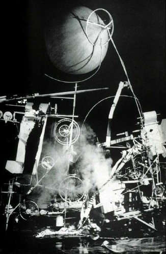
Tinguely’s ‘Black Tie Dada,’ Or Worlds Collide In MoMA’s Sculpture Garden
So fantastic. When I started digging around a bit on its history, I just assumed Jean Tinguely’s kinetic masterpiece, Homage to New York, would itself be the most interesting find. Not quite.
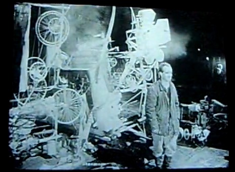
After making a name for himself in Europe with his “meta-matics,” automatic drawing machines, Tinguely came to New York in the early winter of 1960 and spent three weeks building Homage in the Sculpture Garden of the Museum of Modern Art. Billy Kluver helped him build the self-destructing sculpture from parts scavenged, thanks to multiple trips with curator Peter Selz, from the Newark dump.
Homage was performed? exhibited? destroyed? before an invited audience of around 250 on the evening of Thursday, March 17, 1960. I haven’t figured out who was there, but in a 2008 Brown Bag Lunch Lecture on the work, Columbia art historian Kaira Cabanas said someone referred to it as “Black tie Dada,” which might have just earned it a mention in my history of the gala-as-art movement.
The popular story is that the piece somehow malfunctioned, caught fire, and prompted NY firefighters to intervene just 30 minutes into the 90-minute event. Actually, even the Museum’s description of its own artifact from Homage says this. But it also has the incorrect date for the event, March 18, so perhaps not.
March 18 is the stated publication date for the Museum’s press release [pdf], though, which said the machine would be “set in motion” and “shown” only from 6:30 to 7:00. So it’s possible that everything went as planned.
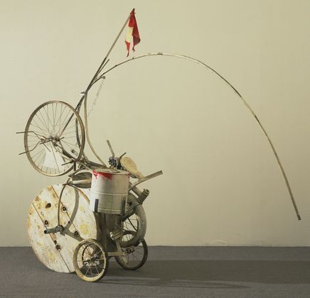
[Also, people apparently picked through the wreckage for souvenir fragments, but I can’t find any mentions of them surfacing. Besides MoMA’s conveniently self-contained hunk, above, the Tinguely Museum has a few manageable pieces.]
But really, the press release and the pamphlet/handout prepared for the event, is a gold mine of quotes and commentary. I double dog dare you to think of Alfred Barr the same way after reading his statement:
Forty years ago Tinguely’s grandadas thmbed their noses at Mona Lisa and Cezanne. Recently Tinguely himself has devised machines which shatter the placid shells of Arp’s immaculate eggs, machines which at the drop of a coin scribble a moustache on the automatistic Muse of abstract expressionism, and (wipe that smile off your face) an apocalpytic far-out breakthrough which, it is said, clinks and clanks, tingles and tangles, whirrs and buzzes, grinds and creaks, whistels and pops itself into a katabolic Gotterdammerung of junk and scrap. Oh great brotherhood of Jules Verne, Paul Klee, Sandy Calder, Leonardo da Vinci, Rube Goldberg, Marcel Duchamp, Piranesi, Man Ray, Picabia, Filippo Morghen, are you with it?
I am, Brother Alfred, I am! Say amen, somebody!
Ahem, also, did you see that weather balloon that was part of the piece? Here’s the sketch from the brochure:
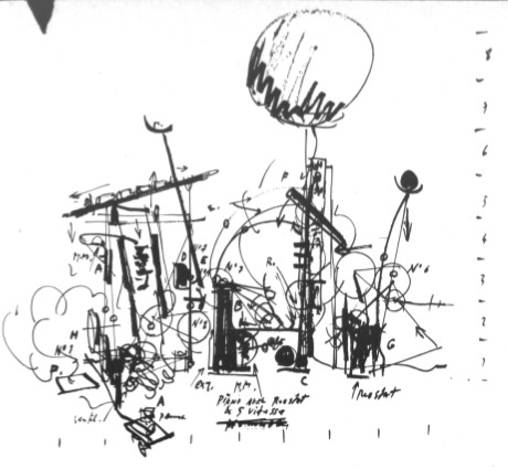
And here it is, atop another performance photo, probably, again, from David Gahr:
The brochure quote from original Dadaist Richard Huelsenbeck adds back some of the fatalistic frisson that can be lost in a nostalgic, artifact-centered look back at a troubled historical moment:
There are times in human history when the things men have been accustomed to doing and have long accepted as a part of the established order erupt in their faces. This is the situation right now–the universal crisis is forcing us to redefine our cultural values. We are like the man who is astonished to discover that the suit he has on does not fit him any longer. Religion, ethics, and art have all transcended themselves, especially art, which, instead of being art as we know it, has come to demonstrate man’s attitude toward his basic problems. So it is senseless to ask whether or not Tinguely’s machines are art. What they show in a very significant way is man’s struggle for survival in a scientific world…
He goes on to call Tinguely a Meta-Dadaist, which is quite nice. And to someone who lived through the horrors that produced it, it makes more sense than being nostalgic for Dada.
Anyway, Robert Rauschenberg was an early fan of Tinguely’s, and soon became an exhibition collaborator. Last winter the Tinguely Museum in Basel had a show about their working friendship. Which featured this awesome photomural of Homage To New York:
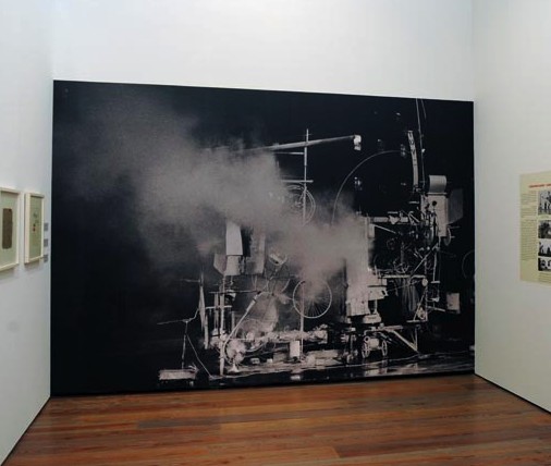
It’s probably from one of the performance images David Gahr shot for Kluver and MoMA. I don’t think it’s archival in any way, but it’s a great way to evoke the physical presence and scale of the assemblage.
I can’t find it now, but someone wrote how Tinguely kind of announced the Kinetic Art movement with Homage To New York, and then declared its end with “a similar” installation in front of the Duomo in Milan in 1970. Which cracked me up, because, hello, have you seen what Tinguely put in front of the Duomo in 1970? And was that similar to what Homage to New York was? Because I doubt it, but if so, wow.
Actually, let’s go to the tape. Or the film. Because D.A. Pennebaker shot the event, and made a documentary short, Breaking it up at the Museum, which features Tinguely previewing the piece, some details of the machine in motion, the takedown, the crowd, the applause, Tinguely’s curtain call, and a couple of audience member reactions:
Jean Tinguely – Homage to New York (1960)
“It’s one of the most exciting things I’ve seen in the art season in New York.”
“Why?”
“Well, it was something new, and visually, it was marvelous.”
“I felt like being in ze Twenties again.”
As Patrick said, a time machine.
Announcing A Landscape Show I Will Be Curating At The Smithsonian
I am aware of the argument that because a) I have never spoken to anyone at the Smithsonian1 about this show, it follows that, b) the specific venue, date, and funding for this show being, to say the least, TBD, my announcement of it is premature.
There is another argument, however, that a) it’s been over ten years since I first conceived of it, and in the intervening years, and b) the artists and works in the show have remained both stable and intriguing, and c) no one else seems to have made a similar curatorial investigation, my announcement is, in fact, long overdue.
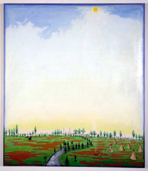
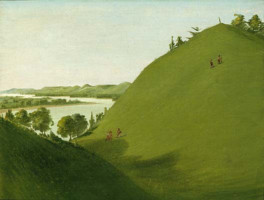
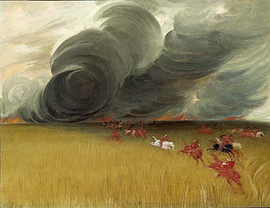
And one could argue that, with George Catlin’s American Indian Gallery now deinstalled at the Renwick, seemingly permanently, there’s no better time than the present. Or the future.
Anyway, They’re understandably overshadowed by the portraits, but I’ve always thought there was something fascinating and proto-photographic about Catlin’s landscapes. Catlin’s whole Plains Indian project was documentary, a function of painting that was soon to be usurped by photography. The landscapes feel like the most direct account of what Catlin actually saw on his road trip [and boat trip] to Indian Country.
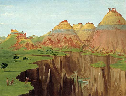
Unlike the epic landscape painting of, say, the Hudson River School or Caspar David Friedrich sought to capture the sublime and the overwhelming, transcendence or romanticism of Nature, Catlin’s landscapes seem content to have captured a moment. They’re like snapshots, with all the freshness, immediacy, and banality that entails.
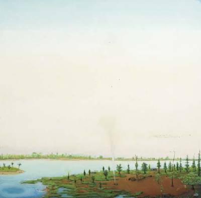
And seen together, the landscapes, like Catlin’s paintings of Indian scenes and ceremonies, reveal both typologies, and the artist’s own pictorial and compositional modes.
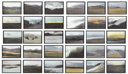
Olafur Eliasson’s The Landscape Series (1997) stood apart from most of his photogrids up to that point; instead of cataloguing a feature in the landscape–cave mouths, or lighthouses, or glacier boulders–it catalogued views, the very idea of a Landscape.
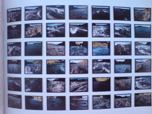
In the following years, Olafur added another strategy to his photography, which resonated even more closely with Catlin’s process. The Walk Series (1999) and The River-Raft Series (2000) are comprised of photos taken along a journey. They document the artist’s passage through and perception of the landscape.
Verne Dawson, meanwhile, is a vital conceptual link between these two otherwise disparate artists. Especially in the late 1990s, Dawson was painting in what might be called an enlightened retro vernacular style. His self-consciously simplistic technique and subject matter felt like it might have come from the Catlin era, but for two factors: his fantasist scenes featuring both Indians and airplanes collapsed or distorted time [or History, really]; and their savvy embrace of abstraction betray Dawson’s existence on the near side of 20th century painting. The skies on some of his paintings remind me of a less depressed Rothko.
And yet. Dawson’s mythologies underscore the exoticism, stereotyping, and subjectivity that Catlin’s project could ultimately not escape. And the quick, sketchy, painterly reductivism of Catlin’s landscapes have an abstract quality that feels impossibly modern.
Once you lay out the discussion between painting and photography, abstraction and landscape–and by you, I mean me–then I’d want to bring folks like Liz Deschenes into the show. And if they give me some more rooms, I’d probably put the original Western photographers in there, too, like O’Sullivan, maybe coupled with Mark Rudewel, or Trevor Paglen.
Catlin set out to document and preserve a world that he knew was being lost. Dawson imagines a world that seems like it might have been, but wasn’t. And Eliasson reveals how the reality we each construct is continually disappearing as we pass through time.
Or something like that. I think I still have a little time to work out the details.
1 Of course, it doesn’t have to be at the Smithsonian; I was just trying to make it easier to get the Catlins.
[images via si.edu, gbe, and wherever]
Enzo Mari, Artist
Look, I don’t doubt that Enzo Mari hates the art world as much as he hates design. Even more, probably, since he’s a faithful communist in an era when–Picasso bedamned–it’s really hard out there in the art market for a Red.
But.
Mari is just as resolute about not distinguishing between art and design. And he makes art. Objects. And has, for over 60 years.
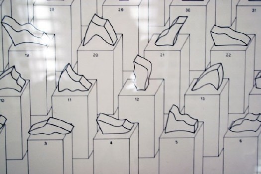
Just check this out, 44 valutazioni, a suite of 44 abstract sculptures Mari exhibited at the 1976 Venice Biennale.
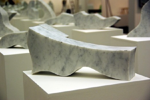
When they’re listed in order the title from each piece becomes the line in a poem by Francesco Leonetti, and when they’re assembled, well, hello, comrade! A hammer and sickle! Old school.
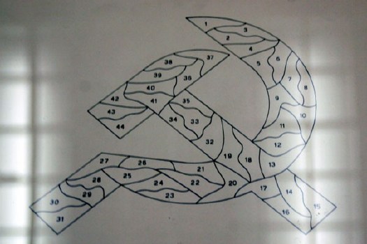
installation images of Mari’s GAM Torino show from designboom‘s extensive galleries.
We’ve brought Group ZERO back, right? At some point, the art world, and art history, are going to have to take Mari’s artworks into account, because, damn. He was doing minimalism and seriality a full decade before Judd and Lewitt.
What are these struttura of which no one really seems to speak? [Except here, in a 30-year-old Italian monograph titled, naturally, Enzo Mari, Designer, which includes a chapter on Mari’s “research of form” and these “instruments of perception”?]
1956, struttura no. 301? Really? The only thing more eyebrow-raising than your date is your estimate: EUR6-8,000 at Dorotheum.
[OK, so maybe six years before Lewitt. Here’s his 1962 painting Objectivity at the National Gallery of Art:]
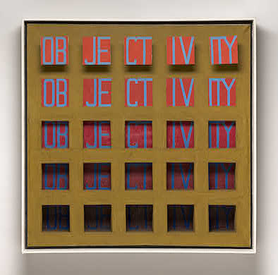
[I guess I was thinking of Lewitt’s 1967 Dwan Gallery show–and exhibition poster/print–and his 1968 photo object, Schematic Drawing for Muybridge, as seen here in flickr user clarkvr’s snap:]

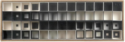
But then there’s kinetic art, too. And what in the world is this? Omaggio a Fadat, 1967, a machine for “creating virtual volume” made from 64 lights, switches, steel, and perspex?
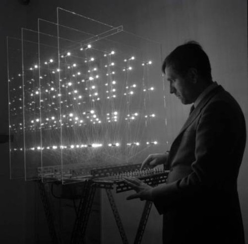
I mean, I know he had a show last year [2008-9, actually] at GAM Torino, but even if you call it “The Art of Design” and include a bunch of awesome sculptures, shoehorning 60 years of stuff into one gallery of a municipal museum is not exactly a retrospective. Look at this Omaggio, for example, if you can:
Also, he curated the show himself. Or designed it himself, using objects selected by his friends. Believe me, I know DIY’s his big thing, but seriously. It’s not like Mari’s an unknown quantity, and his influence is readily acknowledged–hell, he’s a huge influence on me, and building his autoprogettazione table as an art exercise, then devising an exhibition based on his principles of authorized reproducibility have kept him on the top of my mind for much of the last four years, at least–but he seems relegated to the designer’s corner, and his artwork–oh how sweet, the designer makes art, too!–with him.
Or am I missing something? Please say yes. [hmm, after some market-related digging, Mari’s problem may be that he makes Italian art, and only two Italian artists are allowed to become well-known outside of Italy each decade. Not much to be done about that, I guess.]
Eduardo Catalano’s Raleigh House
I couldn’t really articulate it at the time, but the overwhelming absence of modernist architecture was an integral part of growing up in Raleigh, North Carolina. The country roads were widened, and winding capillaries and cul de sacs were cut into the pine forests on either side, which were given ever more oblique English-sounding names, and whose lots were promptly filled with tens of thousands of Colonial Williamsburg knockoffs.
But I did date a girl in high school who lived in an early 70s, wood-clad, contemporary-style house. It was just off of Ridge Road.
Just off of Ridge Road was also where the Argentine-by-way-of-Harvard architect Eduardo Catalano designed himself a house in 1954, when he came to teach at the just-founded School of Design at NC State. How did I never go to this house?
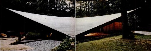
Catalano’s house was an 1800 square foot glass box underneath an absolutely stunning 3600-sf hyperbolic paraboloid roof which, holy crap. It’s, well for one thing, it was Wolfpack Red.
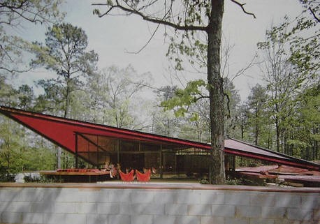
LIFE Magazine called it the “Batwing House” in 1957, and noted that “the shape makes it possible to have a thin roof with great structural strength [apparently, thin meant just 2.5 inches. ed.]. It is supported on the ground at only two points. Catalano is now trying to arrange mass production of its roof in aluminum instead of costly laminated wood strips.”
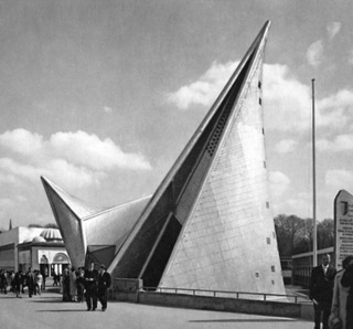
Aluminum? How about poured concrete? That’s what Le Corbusier and Iannis Xenakis built the striking paraboloid peaks and folds of the Philips Pavilion out of at the 1958 World Expo in Brussels. How quaint of Brussels and Corbu, to be only 3-4 years behind the architectural innovations of Raleigh, North Carolina.

But Williamsburg will out. Catalano left for Boston in 1956 and sold what he always called the “Raleigh House” to some locals. Who sold it to some people who rented it. Who sold it to a guy who asked Karl Gaskins, the architect who, it turns out, designed my HS friend’s house, to design an addition, which was never realized. And who abandoned it behind chainlink fencing for six years so it could rot. That was from 1996 to 2001, exactly the miniscule window of time when the last vestiges of my intention to move back to North Carolina “someday” overlapped with my own dotcom bubble. When no saviors could be found, the house was razed and the lot divided for two McMansions in 2002.
And Catalano spent the last eight years of his life trying to have his Raleigh House roof, at least, re-created, maybe at the NC State Museum of Art? At the garden of his former school, NCSU? At the former, he was politely rebuffed. At the latter, he faced a surprisingly vocal opposition from professors in the landscape design department.
To these pine tree-pushing philistines, I say, “Whatever.” And I will add Catalano’s house to the list of Things I Want To See, And So Must Rebuild.
Triangle Modernist Houses has the whole happy/sad tale of Catalano’s masterpiece, and a bunch of photos [trianglemodernisthouses.com now usmodernist.org]