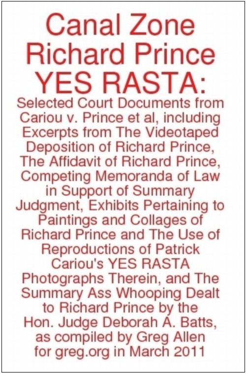
from greg.org: Canal Zone Richard Prince YES RASTA: Selected Court Documents, &c., &c. in
hardcover, 290pp. $24.99 [updated link info below]
Because really, why not?
It’s always bugged me when I read a news story about a legal case, or a scientific report, and there’s no link to the original source material. And since I’ve been quoting from them a lot lately, I have been fielding a lot of requests for copies of the court filings and transcripts in the Patrick Cariou vs. Richard Prince & Gagosian case.
It was yesterday afternoon, though, when I was sending my fourth email [or eighth, since the attachments are so big] that I realized Richard Prince’s deposition is not only the longest interview he’s ever given, it’s probably the longest interview he’ll ever give. [Go ahead, Hans Ulrich, you just try!]
I mean, seriously, the guy talked for seven hours. Under oath. In insane detail about his work, process, and ideas. Granted, he was being grilled by a guy whose art ignorance is only surpassed by his obvious contempt for Prince, a lawyer who can’t tell a photograph from a painting from a reproduction in a book. But still, he got Prince talking.
And Prince was surprisingly [to me, anyway] and admirably consistent and credible, at least in terms of his work. Yeah, it’s a nice bit of fact-checking trivia to strip away the coy mystery crap that surrounded his Guggenheim retrospective: Prince testified that he is Prince, and that he did live in the Panama Canal Zone, but only as a very young child.
But I found his explanation of his early formative inspirations, particularly Warhol and punk rock, to be both relevant and sincere. The deskilling argument that you could pick up a guitar for the first time, and by the end of the week, go up on stage and perform, with visceral effect, sounds real to me. It makes sense, at least in its own context [and in my own high school experience.]
The cover of the paperback edition includes the full title. 290pp 376pp, $17.99
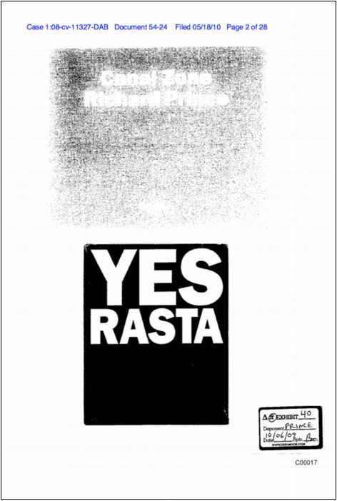
Anyway, Prince’s entire deposition transcript has not been released [update: it has now; see below], but a patchwork of 250 or so pages out of about 375 were attached as supporting documents to various filings and motions in the case. So I sifted through and pulled them all out, and then placed them in numerical order. There are a lot of gaps, of course, and legalistic joustings, but there’s a lot of information, too.
Combined with his 28-page affidavit, it really is the most extensive discussion of his work, practice and biography I’ve ever seen Prince make. The fact that it’s all coming out in the context of a copyright infringement lawsuit is really too perfect to pass up.
Into this I wove the major documents and exhibits Cariou’s lawyers discussed with Prince: all the Canal Zone series paintings; installation shots from the Eden Rock hotel in St. Barth’s; Prince’s “Eden Rock Pitch,” a rough movie treatment whose characters and story fed into the paintings; and Cariou’s extensive visual comparison of Prince’s Canal Zone paintings and the YES RASTA images that ended up in them.
And for good measure, I added both sides’ memoranda, where they make their fullest legal arguments for their fair use/transformative use and copyright infringement positions. And of course, I included Judge Batts’ ass-whooping of a ruling.
In all, 290 pages, all taken–appropriated, one could say–from the court record, but organized into a clearer, more readable format. And with a focus, not on an exhaustively documenting the case itself, but on Prince and his work.
If you were to download all of this material from pacer.gov, it’s run you upwards of $24 [$0.08/page]. And then you’d still have to sort it all out. For that money, I thought, you could have a nicely printed book. And so that’s what I did.
There are hardcover and paperback editions, and electronic copies, too, which I haven’t tested yet. I’m still tinkering with the cover design. Both versions are included inside the book, as frontispieces or title pages or whatever, but right now, the b/w cover cover is on the hardcover, and the red, made-with-Preview’s-default-annotation-settings version is on the softcover.
This is definitely an experiment, so any and all feedback is welcome. But if you’re looking for the perfect book to take to spring break, or to class up your summer share, then you have come to the right place. Enjoy!
Buy your own copy of Canal Zone Richard Prince YES RASTA: Selected Court Documents, &c., &c. in
hardcover [$24.99] or in paperback [$17.99]. [createspace.com]
APR 2011 UPDATE: OK, the response to this book really caught me off guard, so I’ve done some more work on it. The new, expanded edition now includes Prince’s entire deposition transcript, an additional 101 pages of testimony not previously released publicly, and several additional key legal documents from each side. In addition, while lulu.com was a quick and decent way to release a book almost instantly, I decided to switch to a higher quality printer for the new edition. The facsimile pages are a little smaller, which I’m still working on, but the quality of the book is noticeably higher. It now clocks in at 376 pages, for $17.99.


 It’s true, I like
  You can’t go too architectural without treading on