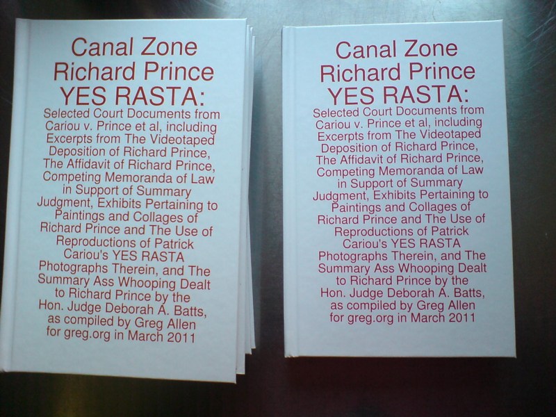
You never know what you’ll find digging around in archives, even your own. While looking back at greg.org posts about Alexander Payne and Dany Wolf, I bumped into this gem from 2003, the reconstructed list of artworks Sam Waksal bought from Gagosian Gallery without paying NY state sales tax, and how much he paid.
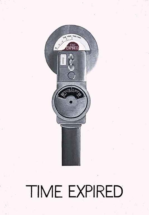
At the time, I’d written that not only had Waksal, the CEO of ImClone whose case broke around the same time his friend Martha Stewart was getting charged with insider trading, the newbie collector hadn’t negotiated a discount from the gallery beyond the sales tax. And that the ploy of having empty boxes–or in some of Waksal’s purchases, just the invoices–sent out of state, had “been tripping up art world naifs since the 80’s, at least.”
Well, this statement was incorrect on several fronts. The investigation of Waksal had followed on the fraud investigation of certified art world naif Tyco CEO Dennis Koslowski, remember, which had been triggered by an art sales tax evasion inquiry involving the fictitious shipment of 3rd-rate Monets to a factory in New Hampshire. But in a subsequent 2004 wrap-up on the caper, the NY Times’ Timothy O’Brien reported that as many as 90 art world figures were implicaited in DA Robert Morgenthau’s investigation, including many non-naifs.
And as for the 80’s, well.
On a recent visit to the Leo Castelli Gallery collection at the Archives of American Art, I came across a letter from the gallery to Mr. Frederick Weisman, one of the biggest collectors around, who had apparently been confused by the arrival of an empty box at his Sunset Blvd office. The letter was dated Jun 22, 1965:
The package you received was intentionally empty. It represents a Lichtenstein banner that Richard purchased. The package was sent to your California address to side-step New York City tax. I hope this hasn’t caused you any unnecessary concern.
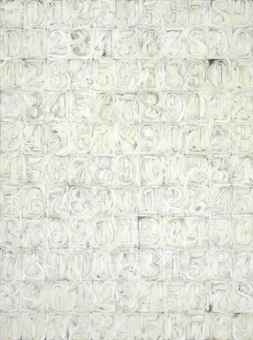
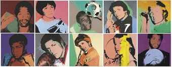
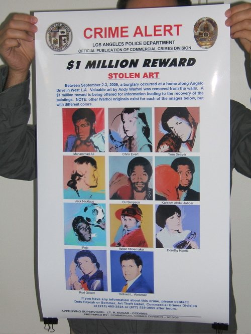
It’s not specified, but I’ll assume the banner was Pistol, 1964, the best of the three Lichtenstein made with the Betsy Ross Flag & Banner Co., Richard, of course, is the Richard Weisman of Find The Warhols! fame, who does in fact live in California. And so, it would seem, does the banner.
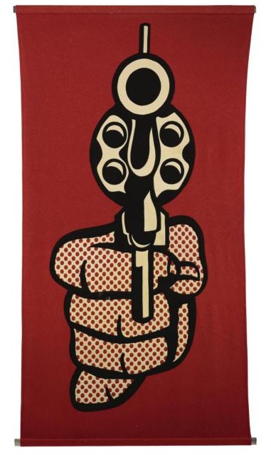
The history for a Pistol banner sold at Sotheby’s in 2008 mentions its inclusion in a 1967 exhibition at the Pasadena Museum, which Weisman’s uncle Norton Simon would soon take over.
It appears the only nair around here is 2003 me.
 Artwork become landscape
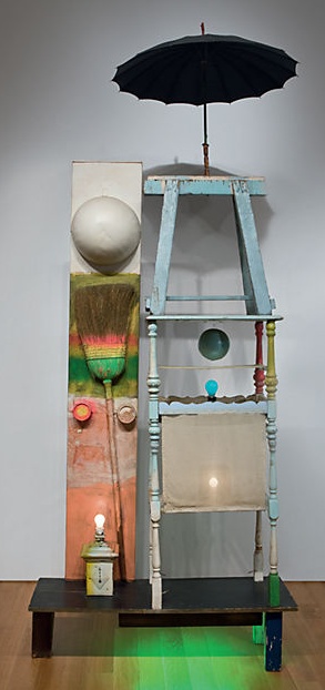 Christie’s is selling The Tower, a 1957 combine by Robert Rauschenberg which Victor and Sally Ganz bought from Betty Parsons in 1976. The work is a double portrait assembled from found, painted objects and light bulbs, and was originally part of the set for a Paul Taylor Dance Company production based on the myth of Adonis. The
 Dear pwn0,