

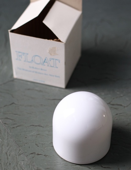
I’ve had Michelle Kuo’s interview with Robert Breer [artforum, nov 2010] open in my browser tabs for months now, ever since Steve Roden posted about his incredible little toy Float, which was sold at MoMA’s gift shop in 1970, at the same time one of Breer’s original Pepsi Pavilion Floats had been liberated from Expo’70 in Osaka and set loose in the Abby Aldrich Sculpture Garden. [A PDF of The Modern’s Aug. 25 press release for the piece, titled Osaka I, said the toy Floats would be sold for $7.95, or two for $15,” in the Museum’s Christmas Shop.]
Kuo’s is one of the best interviews I’ve seen with Breer; most never got past the basic, “how did you get into animation?” “So you lived in Paris on the GI Bill?” chestnuts. With what is now a terrible lack of urgency, I’d made a few attempts to track down Breer this year, in hopes of following up with him about what he’d probably consider the least important aspects of his creative practice: the commercial work and product design and TV animation [including still unidentified segments on The Electric Company] he would bring up–and then insist be kept separate.
Because Breer’s consistently innovative filmmaking and playfully minimalistic/animalistic sculptures–and the fact that he did his most monumentally awesome art work for Pepsi–hinted at the potential relevance of the work he kept in his commercial closet.
Which, amusingly, is not really the point, except to say I want to find a Float of my own, please.
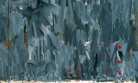
No, the immediate point is, wow, how awesome is Breer’s 1966 sculpture, Rug? This was the work that introduced Breer’s sculpture to me, at a show that also opened my eyes to the revelatory breadth of his filmmaking. It was recreated for the first time in decades in 1999 at AC Projects. Their small second floor space in off-Chelsea was creeping and crawling with little Breer sculptures, while the Mylar Rug slowly shifted around in place. The other works felt alive, droid-like. Rug‘s movements were creepier, more ominous, like something was alive underneath it.
Good for the Walker, it looks like they acquired the mylar Rug [there are others, in other colors/materials] just this year.
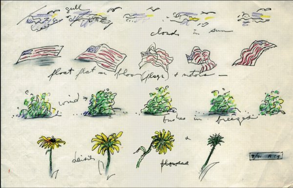
Anyway, while poking around GB Agency, Breer’s Paris gallery, I came across this sketch, dated 8/71, which includes an incredible proposal for a Rug piece made from an American flag. [The text underneath reads, “float flat on floor (flags) + motors”.] The storyboard-like drawing not only ties Breer’s sculptural and animation projects together nicely; the other three sequences–“cloud in sun,” “bushes in breeze,” and “daisies”–help site Breer’s work in observation, duration, and the natural world. Which may have mitigated the political implications in 1971 of something lurking under a crumpled US flag.
In any case, I expect, if not exactly look forward to the day when, this work will be realized for a future Breer retrospective.
Category: projects
On Jacob Kassay And Collaboration
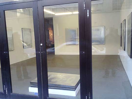
image: portlandart.net
I confess, I was as taken as the next guy by the Shiny Object-ivity of Jacob Kassay’s electroplated solo debut at Eleven Rivington in 2009. Next guys like Portland Art’s Jeff Jahn, who wrote the show felt “more in touch with the unsettled world of 2009.” And Andrew Russeth, who nailed the charred & mirrored monochromes as “look[ing] like elegantly abused luxury goods.”
And I had a big setup here, which I just deleted, about how I’m really not trying to add to the burgeoning body of Kassay concern trolling, articulated most clearly by Sarah Douglas, about the risks of overnight market success on the emerging artist.
But then I read Ed Schad’s earnest attempt to strip the market hype preconceptions from his review of Kassay’s current show at L&M Gallery in Los Angeles. And I have some issues.
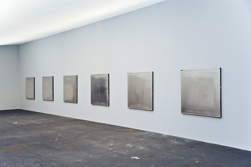
On their face, Kassay and his silvered paintings seem almost too perfectly suited for the Art World’s Next Top Model cautionary tale. It’s like they’re a trap, paintings perfectly calibrated to separate the most narcissistic collectors from their dough. The installation of silvered paintings at Art Basel [below] didn’t help, and neither did Kassay’s dealers’ assertion that the paintings, a suite of eight, would only be sold together–and to a museum–for somewhere around EUR250,000.
It’s hard to counter this narrative; or to wonder how much discourse around Kassay’s work is critical backfilling prompted by dealers or other vested interests. And I think Schad captures the difficulty well, questioning the conceptual underpinnings of Kassay’s show in the face of his monochromes’ unambiguous, materialist beauty:
I get the impression that the center of L&M’s show, a large work on paper placed on rough 2 x 4 studs with a ballet barre positioned in front, is Kassay’s attempt at giving us what may be a position, although that its orientation towards giving the show a conceptual reading also does a disservice. The work is ineffective, pitching a now typical rough D.I.Y look that is often misconstrued for sincerity and humility. Work like this neither sincere nor humble, but instead uses tropes of sincerity and humility as a cop-out for rigorous thinking. I have to admit, that Kassay’s center piece looks grad-school and virtually destroys the mood of refinement and elegance created by the smaller works.
I can’t fault Kassay entirely for this. After all he is young, and perhaps the impulse is to bring a little resolution and a little art history positioning to a practice that is probably more at home in explanation-less experimentation and straight ahead aesthetics. With the ballet barre, suddenly we are allowed to think of performance, of metaphor, of the history of Rauschenberg, his performative collaborations, and his white paintings, the idea of a monochrome as blank surfaces or “landing strips” for dust, light and shadow
Schad’s identification of the monochrome as Kassay’s field of bold engagement is right-on, but I think his skeptical de-emphasis of the artist’s reference to Rauschenberg, the conceptual and the collaborative is a mistake. These may turn out to be central elements of Kassay’s practice.
From the L&M press release:
This installation conceit engages Kassay’s interest in artist collaborations such as Rauschenberg and Johns designing sets for Merce Cunningham performances and an abundant history of multi-media collaborations. It evokes these ideas, but also takes into consideration the gallery as a place for practice, repetition and the natural gradients provided by the light, the white walls and the work itself.
Which, hmm. There’s a crossed up analogy there–sets and performance vs barre and practice–which effectively conflates gallery show with studio practice [all puns presumably intended].
I didn’t want to be all Johnny one-note, but since he/they mentioned him first, I can now point out that the paradigm Kassay’s debut on the art world stage most closely resembles is not Ryman or Klein, or even Rauschenberg, but Johns. Rauschenberg’s 1953 Stable Gallery show of white and black monochromes was more scandale than succes, and he fought the unserious bad boy image for many years, while Johns’ work was hailed–and sold–right out of the gate. And while flags and targets might stand out, most of Johns’ earliest exhibited works [1957-58] were monochrome paintings.
And though Rauschenberg’s reputation as a dance collaborator is well known, somehow Johns’ image of painterly solitude persists [at least for me], even though he was deep in the mix. Here’s a quietly remarkable comment Johns made in 1999, while discussing the creation of the artists-for-artists-oriented Foundation for Contemporary Arts, which he still heads:
In 1954 I had helped Bob Rauschenberg a bit with his Minutiae set, his first for Merce Cunningham, and I continued to assist him with most of his stage work through 1960. We were friends with Merce and John Cage and saw them frequently. In 1955 there was an evening of Cunningham/Cage performances at Clarkstown High School in Rockland County where we met Emile de Antonio. In 1958 de, as he was known, Bob and I formed Impresarios Inc. which financed and produced the 25-year retrospective concert of John Cage’s music at Town Hall in New York.
I guess this is all an aside, but the Walker is preparing Dance Works I: Merce Cunningham and Robert Rauschenberg, a show this fall of their Cunningham archive holdings which, at least in the title, doesn’t consider Johns’ collaborative role. Not that the Walker ignores Johns’ dance work; they have his Duchampian set structures for Walkaroundtime, after all.
henry codax, installation view, via carriage trade
So what’s this got to do with Kassay? Are his only collaboration references in his L&M show? In fact, he’s apparently got another show up right now which takes the model collaboration and the issue of individual artistic creation and authorship head-on. Andrew Russeth reports that Carriage Trade’s current show, an exhibition of monochrome paintings by the fictitious artist Henry Codax, is actually a joint project of Kassay and the minimalism-inflected French Swiss conceptual artist Olivier Mosset.
And now that you mention it, in May 2010, before any of the auction madness, Kassay opened his show in Paris with a collaboration as well. Iconic minimalist trumpter/composer Rhys Chatham performed at Art Concept, with a pair of Kassay’s silvered paintings as a backdrop. Watching video of the gig [Here are parts 2 and 3, total runtime is about 55 minutes.], I’m struck by how the paintings function as screens, reflecting the movements of the small, otherwise invisible crowd.
For the two previous summers, at least, the Paris-based Chatham loomed large in New York. His landmark composition, A Crimson Grail, an orchestra for 200 electric guitars, was rehearsed and rained out at the last minute in 2008 as part of Lincoln Center’s Out of Doors series. It was finally, triumphantly performed the next year. Andrew Hultkrans recounted the euphoric experience for Artforum.
In September, Primary Information is releasing a limited edition LP of the Kassay performance, with an additional work, under the title, Rêve Parisien. And in October, Kassay is having a show at the ICA in London, which is apparently still operating. For the moment, Eleven Rivington is surprisingly not mentioned in ICA’s brief bio of Kassay.
UPDATE Ultimately I’m glad I ended so abruptly; maybe it was enough to spur Andrew into action. He reminded me of the collaboration I’d forgotten, the one which had finally pushed me over the colabo-writing edge. From Karen Rosenberg’s NYT review of this year’s so-called Bridgehampton Biennial, where the backyard is strewn with Lisa Beck’s satelloon-lookin’ sculptures, and the front yard features a 1964 Ford Galaxy awaiting “an ‘artist’s renovation’ by Servane Mary, Jacob Kassay and Olivier Mosset.” Those shiny silver balls’ll throw me ever’ time. [Of course, this show also brings up Bob Nickas’s role in launching Kassay’s work into the discourse. This is at least the third Nickas-curated show to include Kassay. Dance with the one who brung ya.]
Well-Meaning Thoughts On Wohlgemeynte Gedanken
Busy? Oh, yes! But never too busy to turn someone else’s PDF into an artist book!
When @borthwick tweeted this yesterday morning about “a spectacular calibration failure at Google Books” where “Beautiful, digital errors become art,” I knew I’d have to do something.
Because as it happens, The Great Picture had me thinking about ways to make a silver gelatin print of the beautiful Google Books scanning distortion I stumbled on last year [above]
The one that turns out to be similar to–a found, readymade version of–Daphne, Sigmar Polke’s handmade photocopy distortion artist book from 2004.
images from Polke’s Daphne via stopping off place
Then as soon as I clicked through, and saw that it was the whole book, well, my course was set.
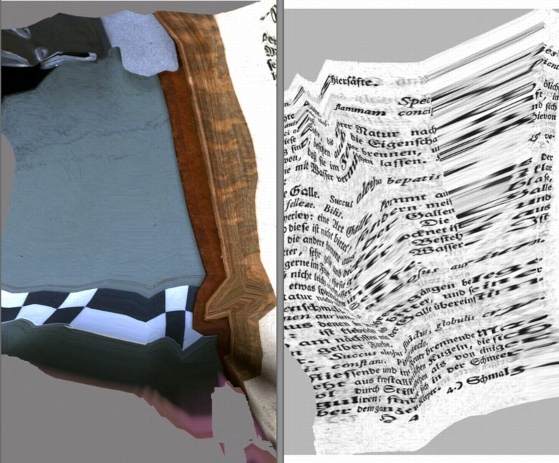
According to Google Books, the book was scanned at the Bavarian State Library in Munich on December 15, 2008, a little over a year into their massive digitization initiative.
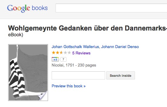
The title of this distorted-beyond-all-recognition-and-come-out-the-other-side-as-art book is is Wohlgemeynte Gedanken über den Dannemarks-Gesundbrunnen, which translates roughly as Well-meaning Thoughts on Denmark’s Mineral Waters.
But [much to Geoffrey Nunberg’s continued consternation, I’m sure] that title turns out to be as glitched up as the pages themselves. According to rare booksellers, Wallerius’s two-part book is actually titled, Hydrologie, oder Wasserreich, von ihm eingetheilet und beschrieben: nebst einer Anleitung zur Anstellung der Wasserproben: wie auch dessen Gedanken vom Dannemarks-Gesundbrunnen,, or Hydrology, or Water Kingdom, divided, and described by him: in addition to a manual for the use of water samples: and also his thoughts on Danish mineral waters..
Hydrologie was originally published in Swedish in 1747, and Wallerius worked closely with Denso on the German translation. But, kind of hilariously, that’s not important now.
Google Books has remade Hydrologie into something entirely its own, and it’s awesome. Wohlgemeynte Gedanken is a beautiful, revealing mix of inadvertent making-of documentary and algorithmic abstraction. Reiner Speck’s insight on Polke’s photocopied Daphne seem relevant here:
Process is revealed, over and over again. Motifs accumulate page after page, as do small graphic cycles. The printed dot, the resolution, the subject, and the speed all determine and are determined by the apparently unpredictable and often impenetrable secret of a picture whose drafts are akin to the waste products of a copying machine. Even if the motifs in this book provide but a brief insight into the artist’s hitherto secret files and archives, it is still a significant one.
Even more significant when the artist in this case–Google–has also been very reluctant to disclose the secrets and mechanics of its archiving process.
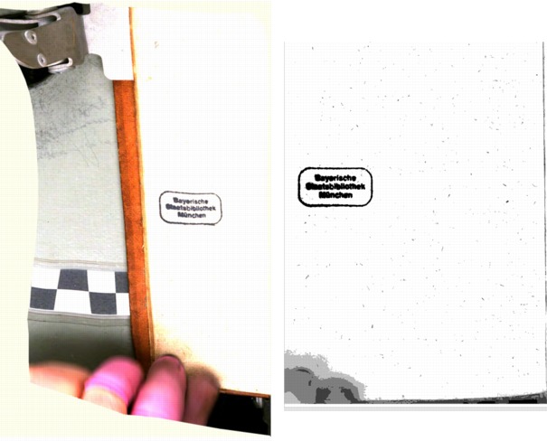
In fact, between the time I started this post last night and this morning, Google Books has removed the distorted copy of Wohlgemeynte Gedanken from its site. In its place now is a plain scan, low-res, but entirely legible, and a digitally generated cover image [but with the same, mangled title]. A side-by-side comparison [above] shows the same underlying scans, which means the distortions–and the fixes–all happened in post.
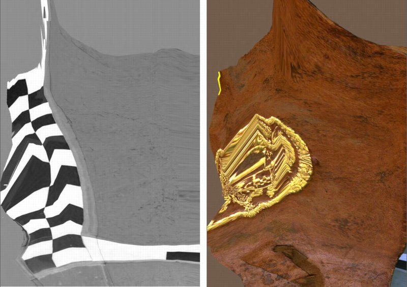
It also means I’m glad I grabbed the full PDF when I did. And that I formatted it, created a cover, and made it into a print version. Instead of the distorted black and white cover Google Books [still] shows online, I went with a beautiful full-color shot of the gold-stamped leather binding.
Obviously I’m still waiting for the proofs to arrive, so it may change, but right now Wohlgemeynte Gedanken über den Dannemarks-Gesundbrunnen is available as a 283-page, 6×9 paperback facsimile edition. I’m trying black and white first, because an all-color version seemed prohibitively expensive. But then again, what’s the market? Color may yet be the way to go.
The book also includes Google Books’ 2-page boilerplate foreword explaining what they wish would happen with scans of public domain books. Which is adorable.
2015 UPDATE: As the folks who bought the original 2011 edition can attest, the proofs turned out to be slightly underwhelming, losing some of the visual impact of Google Books’ original. But then no one was really buying it that often, so no biggie. But a few weeks ago I went back to see if I could improve the formatting of the book, and now it looks much better. A full-color option may still come, but in the mean time, the 2015 printings are the way to go.
Buy a print gopy of Google Books’ original Wohlgemeynte Gedanken über den Dannemarks-Gesundbrunnen for $16.99 [lulu.com]
Joanne McNeill’s Kantian view of Distorted Scans on Google Books [rhizome.org]
I’m guessing JWZ’s post was the ur-source [jwz.org]
Previously:
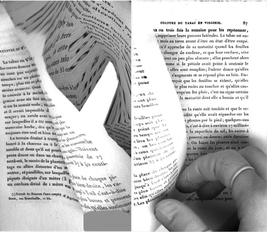
distorted diptych from Google Books’ scan of Nouvel Manuel Complet du Fabricant et de l’Amateur de Tabac
Daphne, as photocopied by Sigmar Polke
The Great Picture, The Big Picture

image: the legacy photo project
Where’d I get this link to The Great Picture, the world’s biggest photograph taken with the world’s biggest camera?
In 2006, a group of photographers working as part of The Legacy Project, which is documenting the history and decade-plus transformation of the decommissioned El Toro Marine Air Station into the 1,300-acre Orange County Great Park, turned the aircraft hangar into a pinhole camera, and made a 31×111 foot panoramic photograph of the surrounding landscape.
The Great Picture, as it’s known, was exhibited briefly a couple of times since 2006, and is now on view at UC Riverside’s Culver Center for the Arts, along with The Great Crate, and some other contemporary-style artworks and installations.
Which, hmm.
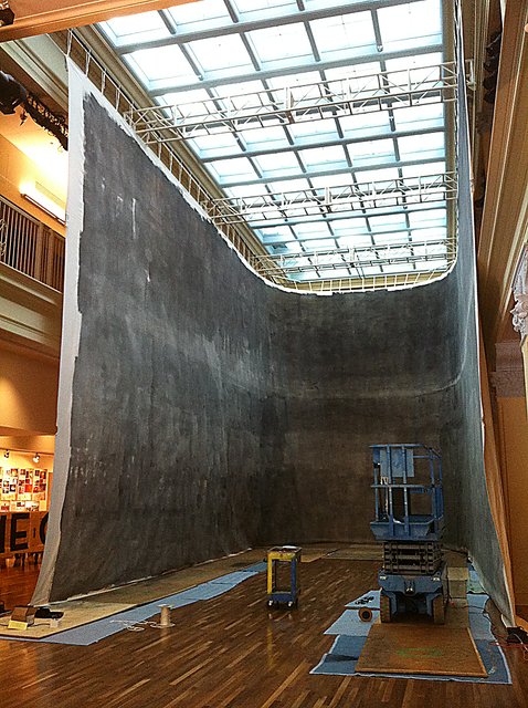
image via UCR Arts Block, picsplz
First of all, wow, what an installation. I guess the Culver Center is trying to keep Riversiders guessing whatever will they hang in that old department store next? On the bright side, this wraparound installation does make the photo look more panoramic, sort of like a peace dividend version of Paul Philippoteaux’s massive Cyclorama painting of the Battle of Gettysburg.
The post at Design Art Daily, is by Peggy Roalf, who, in 2005, bless her heart, had just published Colorama: The World’s Largest Photographs, just months before The Great Picture was taken. [See the greg.org post on Kodak’s Colorama photos.]
Coloramas were 11×60 foot transparencies, assembled from 18- or 36-inch rolls. The biggest photomurals, such as those done by Edward Steichen for his WWII-era propaganda exhibits at MoMA, were printed and assembled the same way, like wallpaper. Steichen’s folks then retouched the print and blended the seams using paint, and applied a nice coat of varnish.
All of which I mention here because while Legacy Project photographer Douglas McCulloh talked about The Great Picture’s intrinsic photographicity:
“The Great Picture is an object that to me is kind of a summation, a full circle statement about photo history. It’s a camera obscura which is where photography started. And the moment we hung it up, still wet, it was turned into pixels and broadcast around the world. So it starts at the beginning of photography, sums it up and becomes electronic overnight.”
It’s The Great Picture’s painterly qualities which stand out for me, which complicate the once-stark distinctions between painting and photograph, and their separate, often unequal histories.
Because The Great Picture was produced in negative directly on muslin canvas which had been covered–painted, actually, with brushes and mops–with gelatin silver emulsion. I’d even say that the all-over brushstrokes of the emulsion are the dominant characteristic, if not the content, of the image:
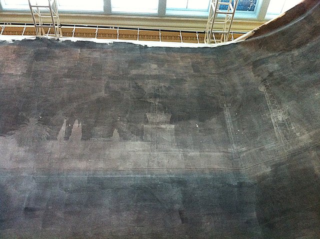
image via ucrartsblock
Which is pretty sweet. And which all reminds me of Wade Guyton’s massive Epson-printed monochrome painting last year at the Museum Ludwig in Cologne. Well, 25×40 feet seemed massive at the time.
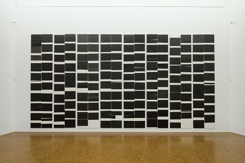
image: museenkoeln.de
The Great Picture at UC Riverside [design art daily via someone awesome]
Gerhard Richter Drop-Shadow Redux
I’m looking into ways to paint on aluminum, and so I’ve come back to Gerhard Richter’s 4900 Farben, which is made up of 196 Alu-dibond panels, each with 25 lacquered [aluminum?] squares mounted onto them. Whatever the exact process, they are definitely painted objects, not just paintings.
Which is partly why, when, in a Snowpocalypse-bound frenzy, I wrote rather obsessively about the Serpentine’s 2008 exhibit of the work, particularly how the images in the catalogue were actually not of the work itself, but a digital facsimile. Which included illusory drop-shadow effects.
So you can guess what the first thing was when I saw the image of three related 25 Farben panels in Sotheby’s day sale last spring:
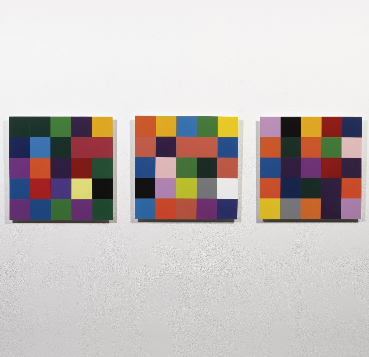
I mean seriously, just look at those shadows. Horribly lit, sure, but at least you know they’re real; and I suspect a CG rendering wouldn’t bring $200k apiece for those panels.
11 May 2011, Lot 412: 25 Farben [Three Works], est $300-400,000, sold for $590,500 [sothebys.com]
Richter’s 25 Farben paintings are nos. 901- and 902-, all 2007 [gerhard-richter.com]
Previous greg.org 4900 Colours coverage starts here and ends here. The discussion of facture and faking the fabrication is here, followed by the drop shadows and diagrammatic abstraction diatribe.
Site Specifics: Why I’m Bidding On The Lease For The Spiral Jetty Site
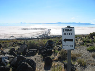
I’ve begun speaking to enough people on the ground that it wouldn’t have gone unnoticed for much longer, but now word’s got out that I’ve established a foundation to bid on the site of Robert Smithson’s Spiral Jetty, a 10-acre parcel of State-owned lakebed in Great Salt Lake. In the simplest terms, I’m bidding for the lease because it seems irresponsible not to.
Several weeks ago, it was reported that the Dia Foundation’s lease had expired, and it was not immediately clear that the Utah Department of Natural Resources would grant Dia a new lease as a matter of course. When I called the Department to ask to be notified if the State decided to open the lease for competitive bidding, I was told I’d be added to the list. At that moment, it occurred to me that parties other than Dia were expressing interest in the lease.
As weeks passed, with no resolution, the possibility that Dia might not automatically get a new lease grew, along with the uncertainty of Spiral Jetty‘s fate. Once I received assurance that submitting an application would not automatically trigger an open bidding situation, I felt the responsible thing to do was to present apparently undecided State officials with the most constructive, credible set of choices: the status quo, or an independent, locally based institution whose purpose is to manage the site and collaborate with the artwork’s owners as they fulfill their own missions.
Let me underscore their continued involvement, because it was also important, whatever the status of the lease or the site, that there was an acknowledgement in the process of Dia’s undisputed ownership of the Spiral Jetty artwork, and the Smithson Estate’s ownership and control of the intellectual property rights associated with it. Any responsible proposal, I felt, should endeavor to support and facilitate Dia’s stewardship of Spiral Jetty, not usurp it.
In trying to craft the most effective alternative to the status quo ante, the importance of local engagement came quickly and repeatedly to the fore. There are many significant issues that directly impact Spiral Jetty in its site. To constructively address them, increased local engagement seems critical: environmental, land use, and lake management initiatives; economic development, tourism and energy issues; and art and cultural institutions within the State.
The Jetty Foundation’s mission is three-fold:
- Support the wise stewardship of Robert Smithson’s Spiral Jetty artwork in accordance with artist’s vision.
- Facilitate informed, productive engagement among Spiral Jetty stakeholders, including the artist’s Estate and the Dia Foundation; State and local government entities; lake and land use, tourism, economic development, environmental and community organizations; and arts, museum and cultural institutions within Utah and beyond.
- Support and encourage a greater appreciation of Spiral Jetty in the specific context the artist chose for it: in Utah, in Great Salt Lake, at Rozel Point.
If lease evaluations or bidding proceeds, the Foundation will expand its board to include leaders and stakeholders in Utah as well as recognized figures from the larger art and museum community.
If the State awards The Jetty Foundation the site lease, the board will have responsibility for managing the lease and for identifying and addressing issues that affect the site, in collaboration with the owners of the artwork, who would remain the key stewards of the artwork itself. The details of the board makeup and how the Foundation would support and work together with Dia and the Estate are all things to be figured out if or when it’s necessary.
As for the no-doubt invigorating conceptual implications any such arrangement might entail, I will not speculate. It was precisely the recognition that the administrative uncertainty surrounding Spiral Jetty called for more action and less sideline rumination that compelled me along the current course.
If the State decides that administration of the site by a locally engaged institution is preferable to the previous set-up, I want to make as certain as I can that such an organization operates wisely, effectively, and with respect for Dia’s and the Estate’s standing regarding the artwork. Should the State decide to award Dia a new lease on the site, I would hope that the Foundation’s role will be constructive and catalytic in bringing the importance of site and local engagement to the fore for the decades ahead.
Stay tuned.
Miami Seat: Mari Thirteen By Jonathan Monk
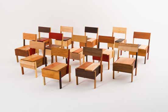
Add Jonathan Monk to the list of artist Enzo Mari fans. For the Brussels gallery D&A Lab’s show at Design Miami Basel Miami Wynwood Art Week Whatever Fair last month, Monk created Mari Thirteen, an edition of Mari’s autoprogettazione chair, Sedia 1. The design calls for 13 pieces of wood, so Monk used thirteen different types of wood, none of them pine: Koto, Padouk, Ash, Maple, Oak, Cherry, Pearwood, Wengé, Afzelia, Ovang, Mahagony, Birch and American Nutwood.
As I understand it, there was one set of 13 chairs to be sold individually for like $9,000 apiece, and one set of 13 to be kept together. No doubt destined to surround some Russian oligarch’s beach-cast, triskaidecagonal Max Lamb dining table.
D&A Lab’s owner Isolde Pringiers says of the project:
Jonathan Monk’s interpretation is just one possible version of the ‘Sedia 1′ of Autoprogettazione and hence in essence is very much part of and a continuation of Enzo Mari’s project but with the appropriation layer, typical of Jonathan’s work. With Autoprogettazione Mari went a step further than Ikea in his time in democratizing design. It broke down barriers in terms of what established design and good taste was. Monk, on the other hand, crosses back over those boundaries in as much as his interpretation offers a fully finished, conceptual object which is anti-Ikea. Enzo Mari offered the liberty of the project and Monk fully indulged.
Which, wow, I think I take issue with just about every single aspect of that statement.
Monk Makes Mari at DesignMiami [designmiamiblog.com]
On Bremser On Google Street View
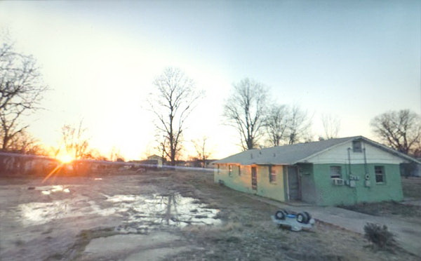
Doug Rickard, Helena-West Helena, Arkansas, 2008, “A New American Picture,” via bremser
Thanks to Joerg, I’ve had it in my browser tabs for almost a month now, meaning to write about it, but the TL;DR version is, Wayne Bremser’s essay on his blog It’s Never Summer is one of the smartest things I’ve read on Google Street View and fine photography.
“How to Photograph the Entire World: The Google Street View Era,” looks at work by GSV photographers like Michael Wolf, Jon Rafman, and Doug Rickard in relation to the greats of earlier generations of like Lee Friedlander, Robert Frank, William Christenberry, and Larry Sultan. [Bremser doesn’t mention, and I just thought it while typing this list, but The Google Gaze is apparently male. Maybe the giant camera stalk with the big balls was the first clue.]
Anyway, Bremser’s analysis is excellent in itself, but his premises also illuminate the contours of the gap that somehow persists between photography and art. Or more properly, between fine photography and contemporary art. At this point, I am coming to see these differences in religious terms: they’re formative, deeply held, esoteric, easily lost on outsiders, and laughable to an atheist.
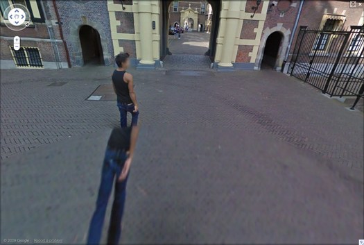
Walking Man – The Binnenhof, 2009, via greg.org
Though his title hints at more audacious possibilities, Bremser focuses on GSV as a tool for human artists:
As a camera, GSV is used by a photographer to rotate around, frame, and click to grab an image. The images that we see on the screen are raw data, gathered by the drivers; these images do not become photographs until a photographer frames them.
So, framing.
Also, I’m happy to take GSV’s ambition to “photograph the entire world” at conceptual face value, and go from there. By the time the Bechers began exploring the futility of documenting typologies of disappearing, industrial manmade structures, astronomers had already begun their second attempt to photograph the entire universe.
From Bremser’s photographer-centric beginning, it’s logical to say that:
One important process-related issue with GSV images that end up as photographs on a gallery wall is this: they are not screen grabs, but photographs of a screen.
Which, hmm.
Michael Wolf, Paris, 2008
But it is compelling and awesome to see the moire patterns and magnified pixels of Wolf’s pictures of his computer screen [above] in the context of photographers taking on the tectonic media shifts of their day, such as Lee Friedlander’s “Little Screens” series [below], photos from the 1960s that captured fleeting images on television sets.
Lee Friedlander, Florida, 1963, via bremser
And then there’s this:
Regardless of how photographs are sourced, it’s still essential to see photography in books and on walls. How do these look in the gallery?
Which, again, hmm.
I have used screenshots from both Google Maps and GSV to make both prints and books, because the screen, or the browser window, or Google Earth, is Google’s native image format. [Technically, that’s not true; Google presumably has much higher-res versions of their imagery which they do not make publicly available.] But I guess this is a distinction between using at Google’s imaging as source, and examining at it as subject. The fascinating, mind-blowing process around here isn’t Wolf’s [or for that matter, mine] but Google’s.
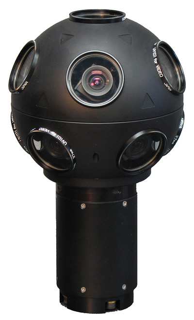
Even though it’s not his point, Bremser still moves the aesthetic ball forward. I’m embarrassed to say for all my Street View obsession, I never bothered to identify the camera system Google uses. Or used, since they seem to have replaced Immersive Media’s 11-lens, Dodeca 2360 pano camera [above] with an even awesomer camera ball [below].

Or maybe they’ve just added the optimized housing. I don’t know, but I should. Because this equipment is not Google’s secret sauce; it’s available. You can take a Dodeca 2360 out to make your own panos or sequences. The Street View aesthetic can now be yours! At least in theory. I suspect I’d find that shooting with a Dodeca 2360 wouldn’t make me Google any more than using a Red would make me Steven Soderbergh.
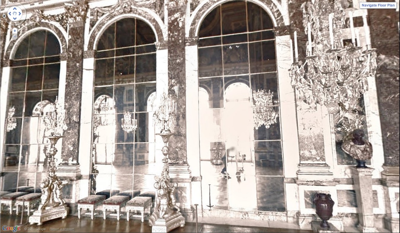
Google Street View camera guy in Versaille’s Hall of Mirrors, via [Google’s] Google Art Project.
Bremser concludes–and I agree–that GSV is rich and varied enough “that Michael Wolf can make photographs like Michael Wolf, Doug Rickard like Doug Rickard.” And Google like Google.
ABC & POD at Printed Matter Thursday Night
So when I first published the Richard Prince Canal Zone YES RASTA book in March, I got some nice responses from people, including a couple of folks who suggested I look at joining ABC, the Artists’ Book Co-operative. ABC is an interesting-looking coalition of artists and photographers who come together to support and discuss print-on-demand publishing and to bring attention to their projects.
As it turns out, Printed Matter is hosting a reception and conversation tomorrow night with active members of ABC, which is in conjunction with an exhibition of ABC/POD titles that runs until June 30th.
It should be positively informative and delightful, and I look forward to going, to meeting some of the folks there, and to possibly seeing a greg.org reader or two as well. At this point, I think I will not endeavor to join ABC, but to continue to admire them from a distance.
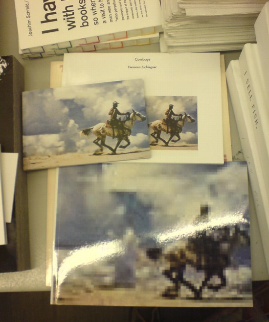
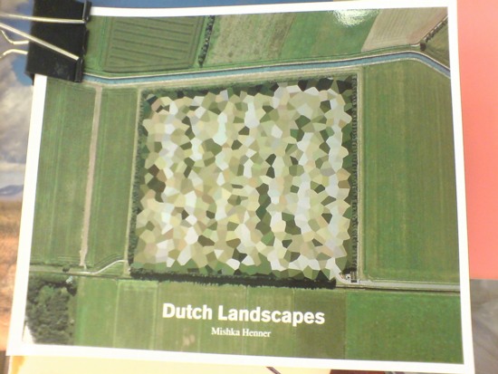
Seeing as how they already have at least one guy who copies jpegs of Richard Prince cowboy photos in volume, and another who just released a collection of Google Maps images showing of the peculiarly aesthetic polygonal camouflage technique used to obscure sensitive sites in the Dutch landscape, maybe a little more distance would be better for all concerned.
ABC Artists’ Book Co-operative conversation and reception, Thursday, June 16, 5-7 PM [printedmatter.org]
De Rijkshuisstijl & The 1 Logo Project
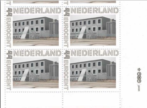
As part of their project Caché-Exposé, investigating the Netherlands’ largely invisible detention and deportation system, the Amsterdam art & design collaborative Foundland documented obscure, anonymous detention sites around the country. Then they used a highly official, public system to distribute their images: design-it-yourself postage stamps.
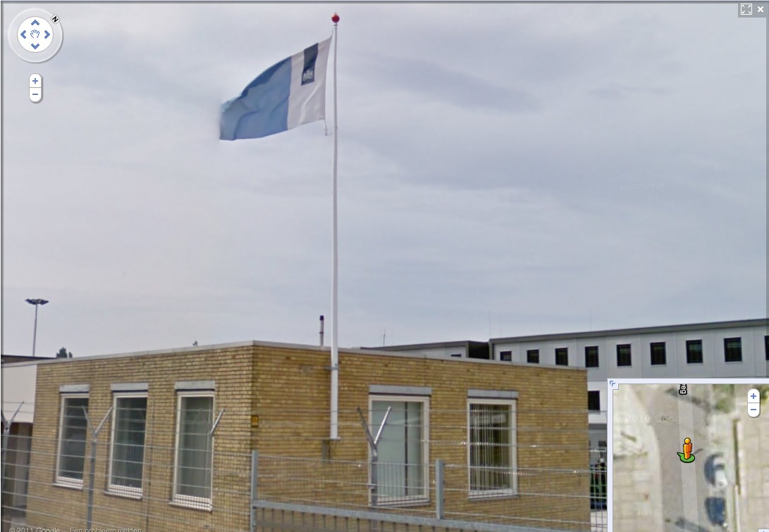
What with the domes, the minimalist/industrial architecture, these stamps, and–hello, this awesome flag they shot in 2008–I can’t help noticing how beautifully designed the Dutch immigrant prison system is. So thoughtful.
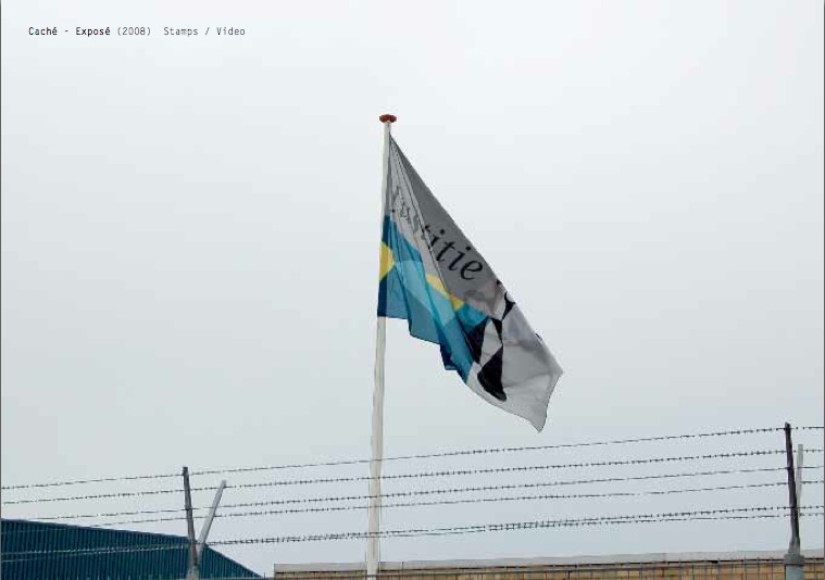
That is the Ministry of Security & Justice flag there, flying over the Zaandam waterfront dome prison. The biomorphic shape is a perspectival view of the scales of Justice, a fragment of the Ministry logo, which is an abstracted, blindfolded Justice.
![]()
Is, or was. Because on Google Streetview, the flag is different. Much simpler.
That is the new Rijkshuisstijl, which is officially called the Central Government Visual Identity, but which I gladly transliterate as the State House Style, a four-year effort begun in 2007 to centralize and redesign the Dutch government’s corporate identity. Part of that initiative was the 1 Logo Project, a replacement of 125+ separate ministry and agency logos with a single logo, the national coat of arms on a vertical blue bar.
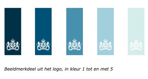
Ah, I’m told it’s a ribbon. Here’s the English version of the style guide.
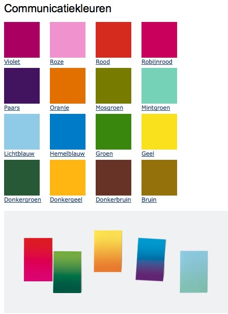
Oh, man, the color palette, 16 colors “inspired by the colorful Dutch landscape painting,” plus five gradients. Get me Colby Poster on the horn.
I am kind of geeking out over this. On the one hand, it’s a normal redesign gig, tastefully done, but typical to the point of banality. On the other, because it’s the state, I can’t help but read every platitude in the mission statement and objectives, every justification of every design decision and element, through a politicized filter. Without knowing really anything about the details or shifts in Dutch poltiics beyond recent surges of right-wing populism, I can’t help but interpret the identification of problems the Rijkshuisstijl was intended to fix as criticism of the parties and governments then in power.
Partly, it’s the Rijkshuisstijl’s incredibly bold assertions of design’s importance and function. And the grand assertions of meaning:
“The symbol exists of a blue ribbon with the coat of arms. Subtle and unpretentious, an authority without being authoritarian.”
The color of the logo is Rijksoverheid Blue. Inspired by the Dutch skies and Dutch light. Blue for calm and reliability. Blue for tradition and enduring values. Blue for harmony and balance.”
“The wide variety of logos previously used by various government organisations made them less recognisable, causing confusion among the public and business community. People were no longer able to see the wood for the trees. Central government organisations seemed to be competing rather than cooperating with each other. This approach compounded the widely held view that central government was fragmented.”
“The mission statement and the motto both underline what central government stands for. They give the central government logo (Rijkslogo) real meaning.”
And then there’s the irony of context, the subjective happenstance of discovering the Rijkshuisstijl while looking at an exposé criticizing the Netherlands’ unjust treatment of immigrants, a project which I’d discovered in turn while reading about the current populist government’s massive cuts to the country’s arts infrastructure. Is this what modernism and Good Design signed on for? Because it’s what they got.
Oh, and there was a symposium, and a book, De stijl van het Rijk/ Style and the State, produced last fall by the Stichting Design den Haag.
Foundland [foundland.org]
Rijkshuisstijl guide in English [rijkshuisstijl.nl]
UPDATE: So the work was actually done by Studio Dumbar in Rotterdam, announced on their site in 2007 [studiodumbar.com]
Dutch Camo Domescapes
I love it when a plan comes together. Or at least when several subjects of interest converge unexpectedly.
It seems the Dutch art world is about to be decimated by sudden and substantial government funding cuts and reorganizations. [for angry details, check sven lutticken’s recent post; for plaintive, possibly resigned reaction from the affected institutions, try the open letter at the Dutch public arts organization, SKOR.]
If the proposed changes really do take effect, and the status quo of one of the most highly developed state-sponsored ecosystems for the arts is actually dismantled at a stroke, I think it’s really important to requestion every comfortable assumption of the involvement between art and politics. It has a lot of obvious problems and weaknesses, but the Dutch system, at least as perceived from abroad, has always seemed like the apotheosis of certain ideals of cultural industrial policy, which, Lutticken argues, now “don’t seem to be worth a penny.”
Anyway, not that they saw them coming, but SKOR tried to understand the political shifts that precipitated these cuts in the December 2010 issue [#20] of their excellent journal, Open, which examines populism and the persistent need for narrative and myth in the democratic process.
Dutch populism seems to center on–surprise–issues of immigration, assimilation, and Muslim vs. Christian cultural influence. As it turns out, one of the contributors in Open 20 is Foundland, a graphics, art, and research group that seems part collaborative, part design firm.
In 2009, Foundland created CACHÉ ÉXPOSÉ, an investigation into the remote, largely invisible, and unreported system of detention and deportation facilities in the Netherlands. The majority of the people imprisoned in the facilities or subjected to the system seem to be immigrants and refugees from largely Muslim countries.
When I read the description of the project, I wanted to see if, like the intelligence- and military-related sites, these politically sensitive detention sites were obscured on Google Maps. Fortunately, Foundland had created a Google Maps list as part of the CACHÉ ÉXPOSÉ project.
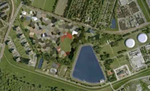
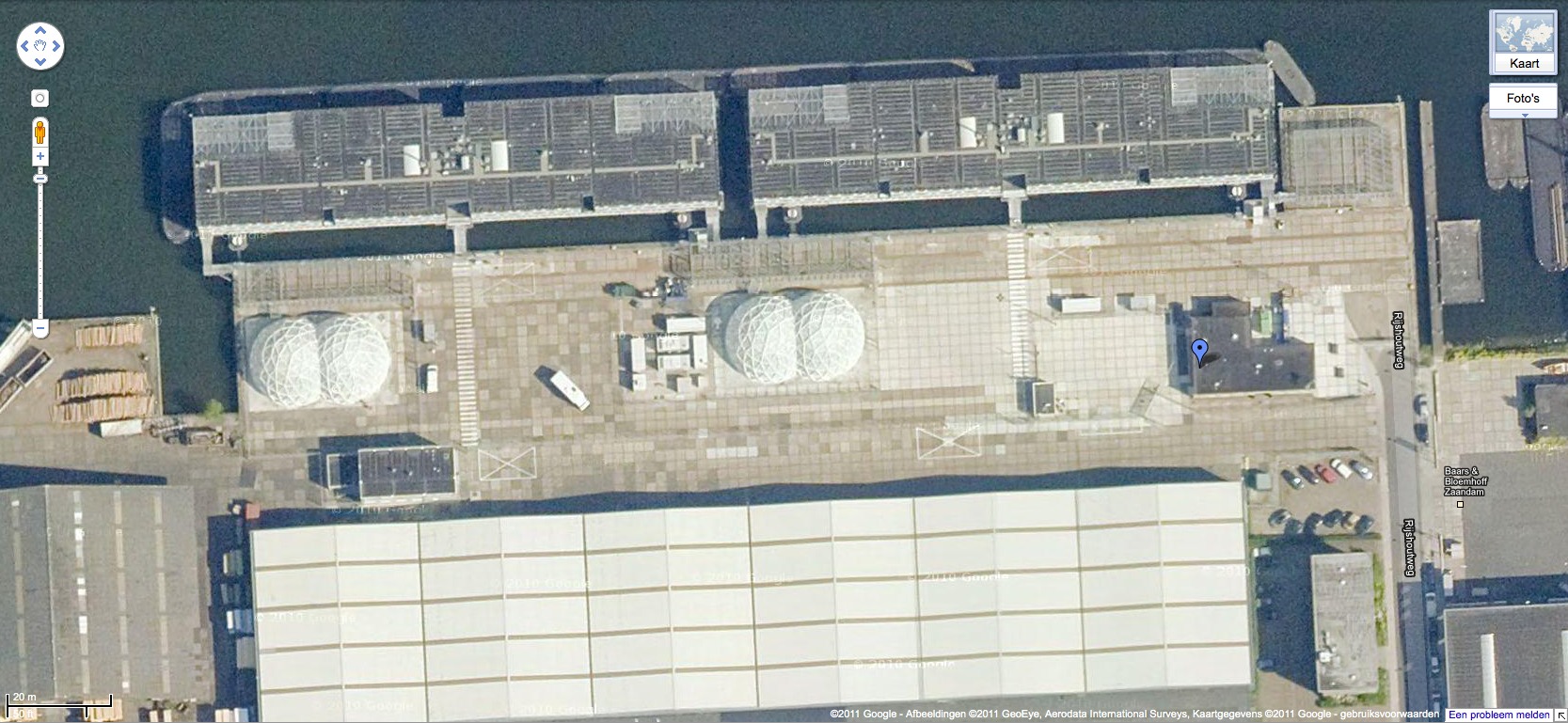
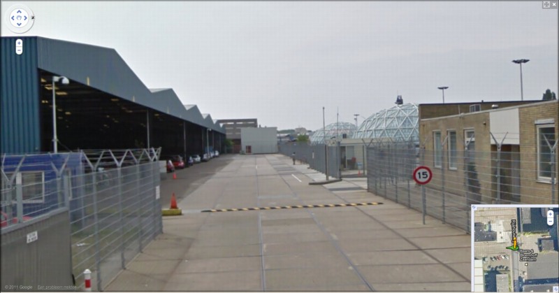
And the short answer is no. Their industrial anonymity is camouflage enough. But then hey-ho, looking at the waterfront detention center in Zaandam, a commercial city northwest of Amsterdam, what do I see? Awesome-looking domes.
Double geodesic domes of unknown purpose, but which look to be at least somewhat transparent or translucent from Street View. What a wonderfully open society the Netherlands must be that in can allow the Google Street View car to drive right up into the middle of its immigrant prisons. Oh wait.
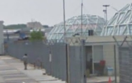
What strikes me, besides the lone figure standing outside the double barbed-wire fence? Is irony the right word to see a geodesic dome, a form which was once erected to great fanfare in Afghanistan, where it served as a symbolic center of friendship, trade, democracy, and political cooperation with the west, being deployed in a back alley prison in Europe filled, presumably, with impoverished immigrants from the Middle East?
Then again, Afghans in 1956 apparently did see the US’s Kabul Dome pavilion as representing The Future. So.
iIkea: Furniture In The Cloud
An aside from Dan Hill’s extended examination of physical retail:
a conversation earlier today, spiraling out of the fact that we have some Ikea furniture (a bed) in a shipping container somewhere, traveling from Australia to Finland, and the thought occurs that Ikea could replace that physical shipping by simply sending a copy of the bed from the Espoo store, and picking up the old one in Sydney. A form of fabrication possible with their already distributed network of components.
On Retail [cityofsound]
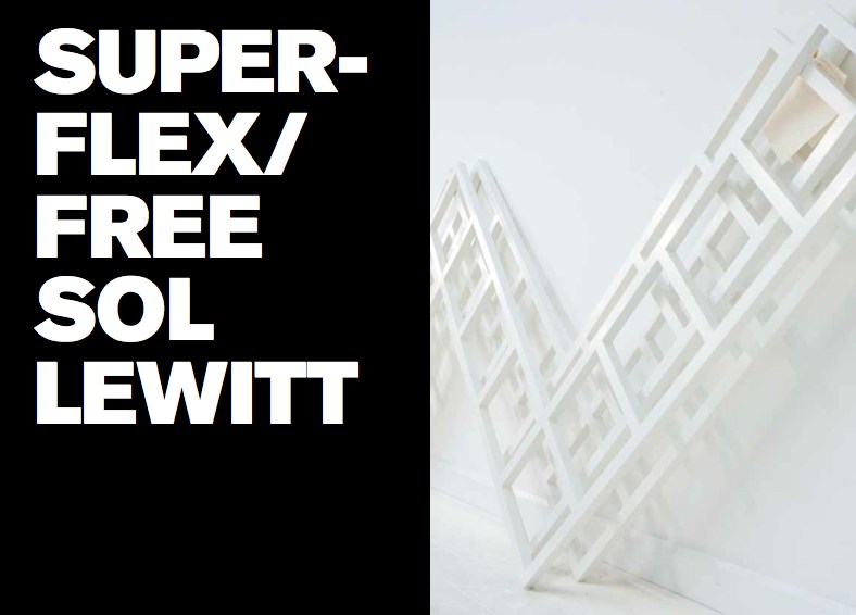
Faux Sol Mio: SUPERFLEX/ FREE SOL LEWITT
So awesome, yet, so annoying. How did I not know of this? When it was going on? I was emailing with the Van Abbemuseum at the time about replicas of artworks, particularly their refabrications of Laszlo Moholy-Nagy’s Light Space Modulator and his Raum der Gegenwart. I’d just been working on an exhibition proposal myself for turning a gallery into a production site for sanctioned art replication. I was hanging with SUPERFLEX themselves last October after the Creative Time Summit, just weeks after the show closed. I was knee-deep in museums and artists and copyright as I released my edition with 20×200.com. And yet I only find out about FREE SOL LEWITT this morning from Half Letter Press’s tweet?? Obviously, I bought the print version of the catalogue before the download for the free pdf version was complete. So I am clearly doing something wrong to have missed this.
Anyway.
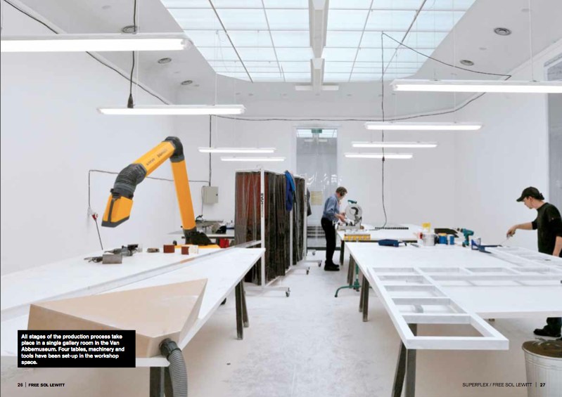
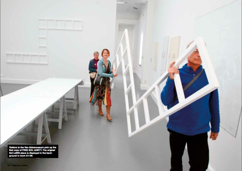
In 2010 the Danish artist collective SUPERFLEX curated an exhibition at the Van Abbemuseum in Eindhoven, “In Between Minimalisms,” that included a work of their own. [Which was in turn curated by curator-turned-lawyer Daniel McClean] FREE SOL LEWITT is a machine, a small-scale factory set up inside the museum, which created exact replicas of a work in the collection, Sol Lewitt’s Untitled (Wall Structure) (1972). The replicas, certified as new works by SUPERFLEX, were then given away to the public.
Some of the details of this production remain unclear, like how many were made. I gather that by working four hours/day, the aluminum cutter, welder, sander, and painter were able to produce 1-2 FREE SOL LEWITTs per week during the 20-week run of the show. Five were “almost finished” within the ten day interval between the opening of the show and the symposium held at the museum on the question, “Who Owns the Artwork?”.
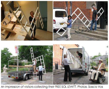
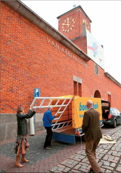
Or what happened to them. The FREE SOL LEWITTs were awarded by lottery to museum visitors who expressed interest in filling out a form. Except for the cheery faces of the lucky recipients of a few structures, who were photographed loading the almost comically large, unwieldy 2×3.5-meter work, unprotected, into rental trailers and vans, I can’t find any news of where or how the SUPERFLEX pieces are being put to use.
SUPERFLEX chose to replicate Lewitt’s work because his pioneering ideas of conceptualism, seriality, and art objecthood resonated with the collective’s own position toward copyright, exchange, and control.
In both essays and interviews in the catalogue, they challenged museums to make countering the constraints of copyright an integral part of their institutional missions. They spoke of the “artistic commonwealth” in which artists borrow and copy freely from each other, and artists and their estates and artists’ rights agencies do not shut down each others’ creative processes by the invocation of copyright. The project’s shape was inspired by Lewitt’s statement in 1973 that “ideas once expressed become the common property of all” and that “we artists, I believe are part of a single community sharing a common language.”
And then I laughed. Because though it’s clear Richard Prince is a citizen of the Artistic Commonwealth, it’s equally obvious that the United States is not a member.
SUPERFLEX/ FREE SOL LEWITT, April – Sept. 2010 [vanabbemuseum.nl]
Buy the FREE SOL LEWITT catalogue, $25 at Half Letter Press [halfletterpress.com]
SUPERFLEX [superflex.net]
Colorama
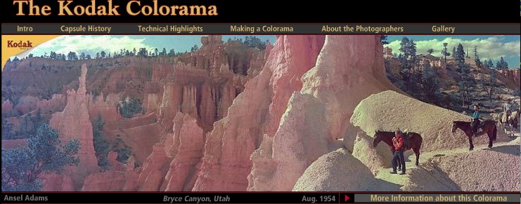
I really need a photomurals tag at this point. The Kodak Colorama billboard was installed in the Great Hall of Grand Central Station from 1950 until around 1990, when the station began a long-overdue restoration.
Anyway, 18×60 foot backlit, color transparencies, “the biggest photographs in the world,” one a month for forty freakin’ years. It’s like if Norman Rockwell had a son named Jeff Wall who went into advertising.
According to the Kodak Colorama mini-site, company executives Adolph Stuber and Waldo Potter originally thought to recreate “Kodak’s success with projecting color slides to a staggering size for the 1939 World’s Fair,” but the Great Hall’s sunlight forced them to go the backlit route.
Just as regular photomurals were first printed in wallpaper-like strips, the Colorama transparencies were made of 18-inch [and later 36-in] rolls pieced together witn tape.
Colorama was designed to promote “a critical cause — photography for photography’s sake.” Which means something different to a company that sells cameras and film. The majority of the Colorama pictures were by Kodak staff photographers, who inserted amateur photographers in glorious landscapes.
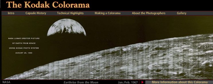
But not all. There are several Coloramas over the years by Ansel Adams, including the August 1954 panorama of Bryce Canyon, Utah up top. The 1967 Earthrise image above is the only black & white Colorama photo. Apparently, it had been covered a lot immediately after NASA received the transmission from the Lunar Orbiter, and the Colorama appearance kind of leveraged that familiarity.
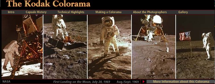
Contrast that, though, with the 1969 Apollo 11 images, where Kodak engineers rushed to print NASA’s just-released negatives from the moon landing, and ended up scooping Time, Newsweek and Life, to the benefit of the “awed crowds.”
The Kodak Colorama [kodak.com]
Last summer, Kodak donated the Colorama Archive to Eastman House [eastmanhouse.org]
‘One Of The First Works That They Made After Becoming A Couple’
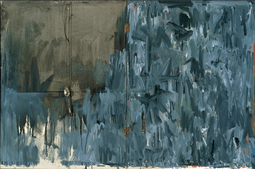
In Memory of My Feelings – Frank O’Hara, 1961, Art Institute of Chicago
I’ve had a jpg of Jasper Johns’ 1961 painting, In Memory of My Feelings – Frank O’Hara on my desktop for months now. It was one of the most important works in the National Portrait Gallery’s “Hide/Seek” exhibition, and I took the chance to study it up close several times throughout the run of the show.
I have also been a little wary to write much about it, and its seemingly powerful resonance with Johns’ Short Circuit flag, partly because I was unsure of how much to read in, and how relevant or not the associations I was seeing really were.
In Memory of My Feelings definitely relates to the other, larger Flag–at 40×60 vs 42×60, it’s nearly identical in size. But unlike the 1955 Flag, or any other flags, it’s made of two canvases hinged together. Hinges, functional and not, are just one unexamined element that appears in both Johns’ and Rauschenberg’s early work. [Light bulbs are another. Maps, just barely.]
When In Memory is discussed, the somber, grey tones come first. Then there’s Johns’ stenciled inclusion of the words “dead man” next to his own name on the bottom. And the overpainted skull that you can barely make out in the upper right quadrant somewhere. And that’s it, and then the Frank O’Hara reference takes over, and the irony that Frank O’Hara would die five years after this was made–as if this had anything to do with the painting, or Johns’ painting of it.
And so I wondered why I couldn’t find anyone talking about what IS clearly visible through the overpainting in the lower right section [detail above], which is a series of vertical red and white stripes. A flag. Or maybe two. Photos weren’t allowed in NPG exhibition, and I can’t remember now. But there is at least one flag painting under there.
One person who does talk about In Memory of My Feelings, though, is “Hide/Seek” co-curator Jonathan Katz. In a gallery talk video, Katz talks about putting Johns’ and Rauschenberg’s works side by side to show it for the first time in the context of their relationship, and particularly their breakup.
Katz talks matter-of-factly about these artists’ relationship and collaboration in a way that no curator ever has. And keeping the bitterness of the breakup in mind certainly brings a lot of content to the fore in Johns’ painting. It feels especially necessary for understanding why Johns might have chosen to reference this poet and this poem. [Spoiler: it’s about dealing with the despair of a breakup.]
But Katz, whose delivery is slick and precise, not a word out of place, drops what I think is a bombshell? And just keeps on going:
When [Johns] and Rauschenberg met, one of the first works that they made after becoming a couple, was the famous–even iconic–Jasper Johns American Flag painting. This is a picture of that flag, in grey, reversed. The obverse of the picture that they made when they got together.
In one sense, it’s obvious, and in another, it’s ridiculous. Or at least unheard-of. Yes, definitely unheard-of. Katz is proposing, in passing, fundamental changes to the understanding of bodies of work, practices, and histories of two of the most important artists of the last 100 years.
This is the compelling thing for me about Short Circuit, an early 1955 Rauschenberg combine with a Jasper Johns flag behind a hinged door. A work which was originally/also titled Construct with J.J. Flag, and which was exhibited by Alan Solomon under both their names in 1958. It makes the otherwise incredible, even shocking assertion that Johns and Rauschenberg collaborated and made some of their most important work together seem perfectly obvious.