
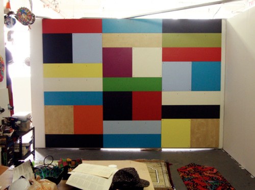
Here’s a look I’m calling Red Steel.
The other side. These stalactites form after the panels are put away to dry, I guess by the paint settling across the surface. Then I have to sand them down before doing the next coat.
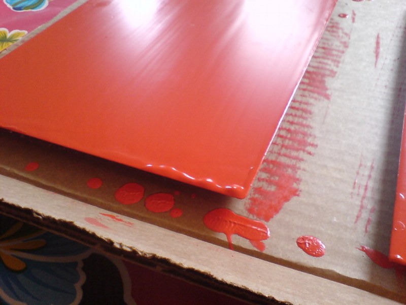
last coat, I switched up the direction of the brushstrokes, which has created a bit of a cross-weave and stalactite thing to sand down. Plus all these bubbles, not sure how those got there.
Seriously, this is like the most boringest thing in the world to be typing right now.
Category: projects
Autoprogettazione Items I Didn’t Win On eBay
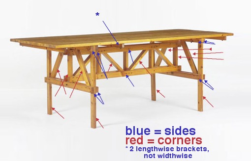
Mondo Patrick tipped me off to this a little while back, and for a while there, it was kind of turning my table world upside-down.
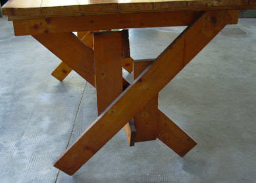
It’s an autoprogettazione table by Enzo Mari, of course, model 1123 xE, one of the most picnic tabliest of them all, made from the original 1970s precut wood kids produced by Simon Gavina.
It was really tempting, but ultimately the condition issues–there were some split and badly repaired wood pieces on one side which would probably mean losing some of the original wood–and really, the shipping from somewhere outside Torino to, wherever really, where am I going to put a second table project on no notice? And maybe if I could wait for the euro to collapse it’d make financial sense, but–anyway, I passed on it.
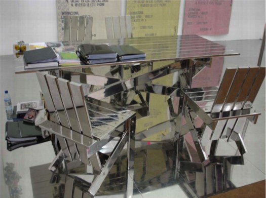
That hammered, golden patina still shines in my dreams, though. Let’s watch the European auctions for a while and see if this bad boy reappears. Meanwhile, I still have this image of Rirkrit’s chrome ghost of 1123 xE to keep me company.
Swedish Splinter Camo And The New Aesthetic
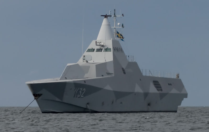
“K32 HMS Helsingborg Anchored off Gotska Sandoen, cropped,” wikipedia via tna
Every time I go back to James Bridle’s tumblr The New Aesthetic, I’m like, “The New Aesthetic! I’m soaking in it!” and remind myself to visit more often.
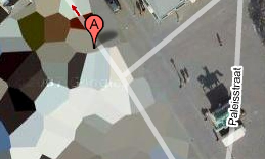
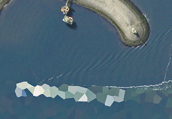
For example, an awesome roundup of splinter-style camo which bears a striking resemblance to the polygonal camo applied to intelligence-sensitive sites on Dutch Google Maps [above, below] which I’ve been tracking–and promising myself I’d paint–for, hey, look at that, exactly two years now!
Anyway, Sweden in particular is still keeping the polygon faith, with their M/90 camo pattern, much sought after by paintball aficionados.
The image above is of a Swedish naval vessel, the new K32 HMS Helsingborg corvette, delivered in December 2009. I know the dates don’t match up, but it sure looks like this ship Google photographed pulling into a Dutch naval base in 2006:
Eyeballed Autoprogettazione
Toronto-based designer Maté Szemeredy didn’t have the plans to make Enzo Mari’s Autoprogettazione Square Table, so he eyeballed it, based on online photos and published dimensions of finished tables. I’d say he got pretty damn close–those crosspieces may be inside-out and upside down, or maybe they just look cleaner that way–and he got a pretty sweet finish. And all in just two days, too. Nice.
Enzo Mari Autoprogettazione photoset by Datum-Datum [flickr]
Szemeredy’s blog, Things Take Time
Google Evert View
In her post about how her Mario Kart reflexes started cropping up while she was driving a real car, Sally Adee introduced me to a new term, “everting,” which William Gibson introduced in his 2007 novel, Spook Country, and which she explains as “entering the next phase of its evolution by creeping out of the virtual boundaries that once defined it and into what we consider ‘real life.'”
Which I mention here because it turns out to kind of relate to the piece I’m putting in this show in a couple of weeks–right? that’s what I thought, too–a site-specific work about Google Street View.
Brian Dupont has put together “While You Wait…” at Extra Gallery, in Chelsea.
The show opens on October 6th, and I’ll post more about it after it’s done. I, for one, am interested to see how it turns out.
Consensual Hallucination [lastwordonnothing via theawl]
“While You Wait…” at Extra Gallery, October 6 – November 1, 2011 [extragallerynyc]
What I Looked At Today: Ellsworth Kelly’s Writing
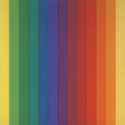
Spectrum IV, 1967, image via moma
Amazing how you can look at something so often, for so long, how you can like it, seek it out, even, follow it, poke around the awesome/odd parts, all without really realizing what it is you’re looking at.
So as I start trying to paint some monochrome metal panels in a variety of colors, I can still somehow end up not thinking about Ellsworth Kelly. Which is a mistake.
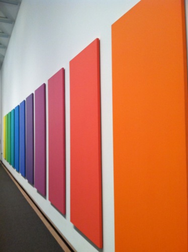
Spectrum V, metropolitain museum, image via jeffdtaylor
And not just any Ellsworth Kellys, but the Kellys I see most regularly: Spectrum paintings from the late 1960s that anchor both MoMA and the Met. [Jeffrey Taylor’s photo on his Tumblr finally set me straight this morning.]
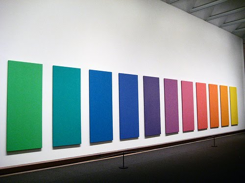
image via patrick-paine
But anyway, Kelly’s writing. “Notes of 1969” was first published in a 1980 catalogue at the Stedelijk, and was revised slightly in 1993 for inclusion in Theories and Documents of Contemporary Art: A Sourcebook of Artists’ Writings in 1996:
The new works were to be objects, unsigned, anonymous.
Everywhere I looked, everything I saw became something to be made, and it had to be exactly as it was, with nothing added. It was a new freedom; there was no longer the need to compose. The subject was there already made, and I could take from everything. It all belonged to me: a glass roof of a factory with its broken and patched panels, lines on a road map, a corner of a Braque painting, paper fragments in the street. It was all the same: anything goes.
I felt that everything is beautiful but that which man tries intentionally to make beautiful, that the work of an ordinary bricklayer is more valid than the artwork of all but a very few artists.
[via Google Books]
I mean, I could have written wish I’d written that yesterday. Except that Kelly wrote it in 1969, and I had no idea about it.
UPDATE: Or maybe I had no idea that’s where I got it. In 2009, I was reading Kelly on his early development and his interest in “painting objects,” a noun, and the use of fabric for canvas as a “ready-made color”:
Another important example of a panel painting that explores the idea of the mural was Red Yellow Blue White (1952). It’s the only one I ever did using actual dyed fabric of ready-made colours, which moves the painting into the realm of real objects. It consists of five vertical panels, each with five canvases. The vertical panels are separated on the wall and the intervals of the wall surface between them are part of the painting.
Only, at the time, I was just researching the kind of incredible oddness of an Ellsworth Kelly dress for someone else. 1952, eh, Blinky?
Previously: Dress, 1952, by Ellsworth Kelly??
What Ikea Lack
Once again, I’m getting burned for procrastinating on a project. And once again, I’m forced to reckon with how susceptible we are to the illusion a company can create of cultural stability and reliability, even as it constantly effects changes that suit its own business purposes.
Which is a lot to pile onto a tiny, cheap-ass Ikea Lack side table. Even before I finished my Ikea X Enzo Mari autoprogettazione table in 2009, I had the idea of making another one.
For the first, I’d found the single Ikea product that felt closest to the original lumber Mari specified for his designs: the unfinished pine components of the Ivar shelving system.
I wanted to realize the second table, though, in the product that felt the most Ikea: the Lack table. The Lack collection is pure Ikea: high modern, highly engineered, and super-cheap. The Lack is a marvel of perfect crappiness: sawdust legs and honeycomb cardboard tops encased in a structural plastic shell. You can’t cut a Lack without destroying it, but the series’ tables and shelves all share proportional dimensions, so it’s possible to tile them together.
my favorite Lack reference: MVRDV’s 2007 proposal for the Boijmans von Beuningen Museum Depot in Rotterdam. Alas, unbuilt.
The other day when Man Bartlett posted on his tumblr about visiting Brent Birnbaum’s studio, this awesome image made my heart leap–off the Ikea ferry, and then to promptly sink into the East River.
On the wall of Birnbaum’s studio is a piece called Untitled (Ikea), which is assembled from a veritable rainbow of Lack tables and shelves the artist has collected around town. It’s like, “WHOA, DOUBLE RAINBOW!” And exactly the patchworked minimalist look I was hoping for.
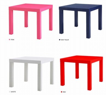
And the killer thing is, when I came up with the idea 2+ years ago, there was a literal rainbow of Lack side tables stacked in a spiral on the catalogue cover and in every store. But when I finally decided to make it about eight months ago, I found that after introducing a bunch of pastel colors in 2010, Ikea had all but discontinued colored Lack, leaving just red, white and black, and just a couple of wood “effect” finishes. [Seriously “birch effect” is such a sad concept.]

I had some pieces that I’d stashed or stored: a navy blue shelf, dark grey and dark green side tables, and either dumped or gave away a while ago because seriously, it’s Ikea. Just go get another one. But it’s precisely this misplaced belief that it’ll always be there that tripped me up. Ikea IS always full, and it DOES always look and feel the same in its way, but the specific products, even the iconic ones, are constantly in flux.
There were hints, warning signs, which I chose to ignore. A Lack side table was always ridiculously, disposably cheap: $12 or something. But in 2010, Ikea began value engineering them, eliminating packaging, and tweaking the materials a bit, to get the price even lower. For a while, they were $5.99. Now I think they’re $7.99. Rationalizing inventory and SKUs was obviously part of this ongoing, profit-wringing process.
And that brings up the implications of Ikea’s product choice winnowing, which are thoroughly depressing, yet fascinating. I’ve been scanning craigslist for months, trying to find any colorful Lack pieces. I’ve missed a couple in New York because I couldn’t get them in time, and I found one pink table in Alexandria, Virginia. But otherwise, the craigslist selection is relentlessly constrained: it’s almost entirely these fake wood finishes. And I can’t tell what came first: Ikea’s eliminating all color from their lowest-end table offerings, or the [$5 table-offloading] public’s total embrace of printed plastic that simulates [and poorly] actual wood.
The greatest/saddest listing I saw was from an American University student, who described his Lack side table as, “exactly the same table that everyone else has.” And it’s becoming even more so every day.
So anyway, if you have a lead on some colorful Lack side tables or hanging shelves [medium or small], definitely drop a line. Because I’m definitely buying.
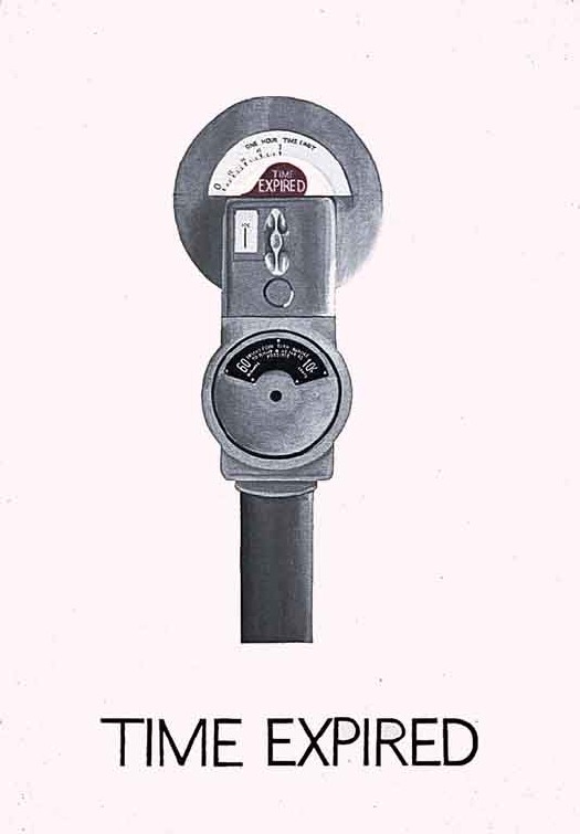
On Vern Blosum At MoMA
“You cannot imagine how happy I was to read your email.”
That was the almost-immediate reply to my request to stop by MoMA’s Painting & Sculpture department to discuss Vern Blosum and to review the collection file for Time Expired, the 1962 parking meter painting the Museum acquired in early 1963, just as Pop Art was evolving.
When we met a couple of weeks later, Mattias, who managed P&S, told me that the Vern Blosum mystery had been nagging the department for years. And he wasn’t kidding.
Shortly after the painting came into the collection, questions and rumors arose about its creator. Which I’ll get to, but which were apparently answered well enough for Time Expired to go on view, and repeatedly, through the 1960s. As I mentioned last spring, as late as 1967, the NY Times was reporting on visitor questions which the museum would forward to the artists to be answered. Blosum replied that his parking meters formed “a series of time paintings culminating in a giant expiration.” Which strikes me as a very conceptual, 1967 thing to have painted back in 1962.
But that’s the last mention I’ve been able to find. It doesn’t appear that Time Expired has been shown at the Modern since the late 60s. And I expect that is because of unanswerable questions Alfred Barr and Dorothy Miller had–and that their successors inherited–about Blosum’s identity and its implications for their painting. It turns out in 1973 the museum took the extraordinary, even unprecedented step, of searching the birth and Social Security records in Colorado around the time Blosum’s bio claimed he’d been born, trying to confirm that he existed. And when they couldn’t, the painting went into some kind of archival limbo, a cold case file, which would periodically resurface to perplex curators and interns and archivists.
Which is all kind of amazing, when you consider where the Blosum came from in the first place: Leo Castelli Gallery.
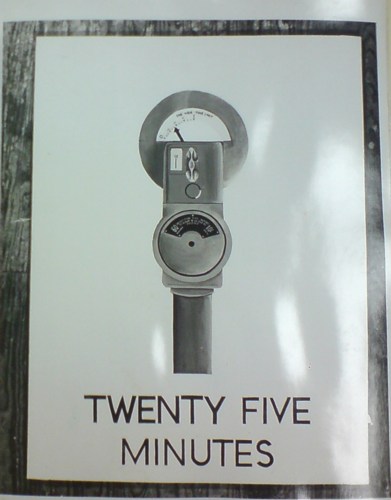
Vern Blosum: Famous For 25 Minutes
So, my mind is kind of blowing because Vern Blosum is in a show opening tomorrow.
Blosum’s work was included in some of the very first exhibitions of Pop Art in the early 1960s. His deadpan paintings of objects from New York City life: parking meters ticking down in five minute increments, like proto-serial art, were acquired by some of the most influential collectors of the day. Thanks to an emerging artist fund set up by Larry Aldrich, MoMA acquired a large Vern Blosum painting in 1963, which was regularly on view for many years.
And then he disappeared. No work, no shows, no nothing. I came across Verne Blossum [not sic] almost two years ago now, when his work Violation ran next to Warhol’s in the Washington Post’s March 1963 preview of Alice Denney’s pioneering show, “The Popular Image.”
Then I found the MoMA painting, Time Expired, and started digging.
I’m going to cut to the chase here and reveal that I have found Vern Blosum. I have met Vern Blosum. And I have seen Vern Blosum’s work in person. And his story is utterly fascinating. As you may have intuited from the varied spellings as early as 1963, Blosum’s own identity has been as much in flux as the history of Pop Art itself once was.
It’s taken a while, and a fair amount of research, and negotiating, and puzzling, but I think it’s alright to go ahead and tell Blosum’s story now. Or at least to tell my story with Blosum, because the artist is still alive and working, and should have the prerogative of defining his own body of work.
Meanwhile, the immediate trigger for this post is an intriguing show that opens in Los Angeles tomorrow, timed to the Pacific Standard Time events. Cardwell Jimmerson in Culver City has put together “Sub-Pop,” a survey of early, “non-famous” Pop artists. These are folks who featured prominently in the first draft of Pop’s history, and who were included in Walter Hopps’ and John Coplans’ formative Pop exhibitions.
In “Sub-Pop,” according to the gallery’s statement,
the smug success sotry of Pop Art is replaced by a somewhat more poignant “failure” story, that loaded word defined in the reductive sense bequeathed us by Warhol as simply, “the failure to become famous.”
While researching their show, the gallerists contacted me about Blosum [his West Coast spelling], and we were able to track down the Blosum painting that John Coplans had shown in “Pop Art USA,” which he curated in 1963 at the Oakland Museum.
To get my own Blosum saga caught up, I’ll start tonight with a post about MoMA’s painting. And then next week, I guess, I’ll tell about tracking down Blosum, and meeting him, and seeing his work. Because I think he’s more than just an amusing story, or an overlooked artist; he and his work occupy a remarkable moment–and an important space, however tiny it may seem right now–in the history of contemporary art.
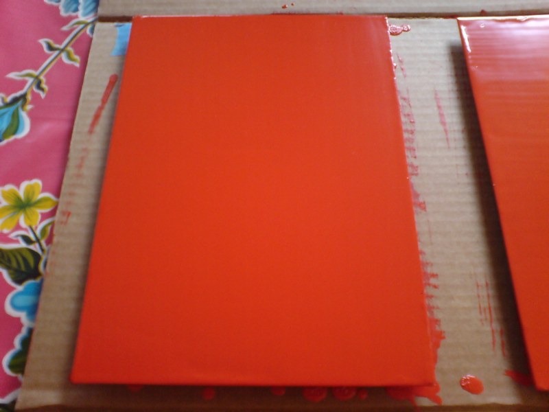
Rijksoverheid Rood

So.
Found the local Pantone shop and brought home a liter of Hollandlac oil-based enamel in Rijksoverheid Rood, aka PMS 485c.
Ordered some small galvannealed steel and white aluminum panels, both paint-ready, and cut as close to A4 as North Carolina metal shops not called Metal By The Millimeter are able to get. They arrived very neatly packed.
And so I used some of the packing to make a little nest, so they can be covered, with circulation, while the paint dries in between coats.
Diet Coke. Leatherman left in the car, whoops. Tape everything down. Float the panels on little bubblewrap sheets so I can get to/around the edge.
MIneral spirits to clean the surfaces. Oh, right, there’s a protective film on the aluminum. More Diet Coke.
Do people really still listen to NPR all day? I can’t imagine. I want listen to youarelistening.to, but New York is down, so I head to Montreal. Police scanner with that awesome Quebecois twang.
Nabisco Ginger Snaps, the dog biscuits of the gods. Seriously, how did I fall into this box of tough yet improbably delicious cookies? More Diet Coke.
Unwrap the brush. Open the can. Wow, it seems much oranger than the web version, or the offset ink version. Is it–no, it has to be right. The Netherlands has ceded sovereignty over their Central Government palette to Pantone, Inc., a wholly owned subsidiary of X-Rite, LLC of Grand Rapids, Michigan. One PMS code to rule them all.
Stare at the foam brush again, try to remember what she–no, I’m pretty sure she said she was using foam for acrylic enamel, not oil. Go with the brush, even though foam seems somehow less painterish, and thus less daunting,
Load is not quite the word for what I do to the brush. Introduce. Poke. Alight the brush with paint. Whatever it is, it’s not enough paint. A fair amount of pull, this oil.
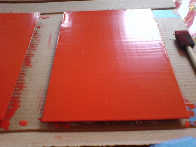
The steel panel is first. I really am not going to do a stroke-by-stroke account here. The steel feels better. The aluminum plate is so light, it moves with the brush; I have to hold it down. Paint’s not as self-leveling as I was originally hoping.
I knew there will be extra coats; I’d hoped there wouldn’t be much sanding. But there are definitely still brushstrokes in there. Texting with my brother-in-law, a highly skilled painter of entirely different types of monochromes, he diagnoses it immediately: ‘the brush needs to be loaded and moved with confidence.’
I would probably say those are problems #2 and #1, respectively, but loading the brush will be much easier to address. I will leave my paranoia about little paint stalactites on the edges in the kitchen the next time I get a Diet Coke.
But of course, the next coat will only go on 24 hours or so from now. I guess I never quite understood how much of painting is waiting for the paint to dry.
What I Look At Many Days: Gerhard Richter Colour Charts
I am aware of the work of Pablo Neruda Gerhard Richter.
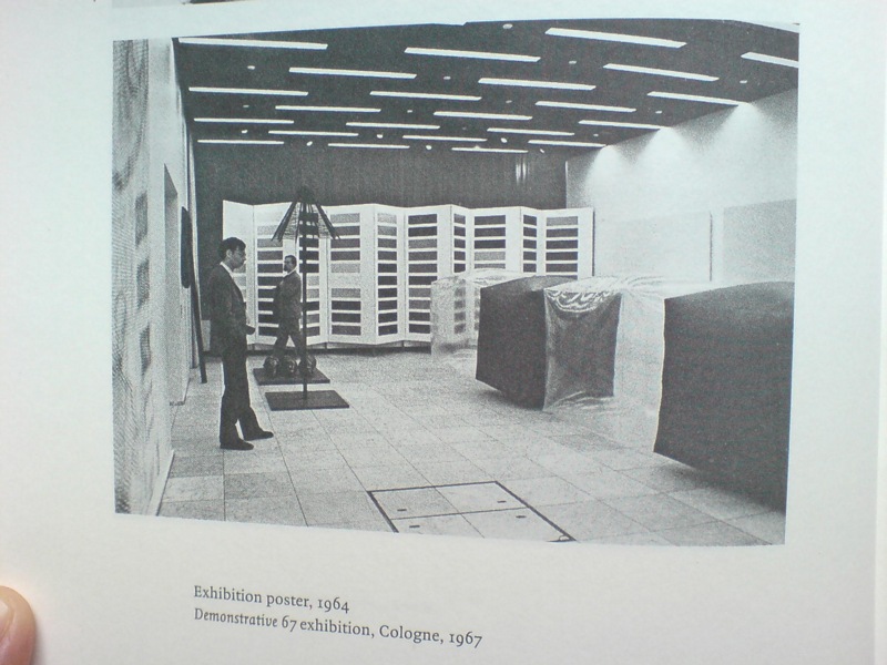
I have not been reading Gerhard Richter: Writings 1961-2007 straight through, of course, but it’s been with me a lot lately. And it’s kind of annoyed me that there is not really anything about this incredible photo, showing part of the installation of Demonstrative 1967, Galerie Heiner Friedrich’s weeklong exhibition at DuMont Publishers, down the street from the inaugural Cologne Art Fair, from which he had been excluded.
In addition to Richter, the display included works by his Capitalist Realist cofounders Sigmar Polke [I think that’s a raster bild there on the left] and Konrad Lueg [the inflatable cube structures], as well as by Blinky Palermo, Reiner Ruthenbeck, the British painter John Hoyland–and Cy Twombly.
Now about that Richter. That giant color chart painting which looks like a folding screen. For a while, it threw me off precisely because it looked like a folding screen. Considering 1967 was also the year Richter started working with glass panes and doors and other materials that related to a painting plane but were not, I was wondering if this painted, free-standing panel object embodied some lost chapter in the color charts’ “pop meets abstraction, quietly upends both” story.
Orrrr maybe, the painting was just too big to go on that wall, and Blinky needed that other wall, and Lueg’s balloons block everything anyway, and what the hell, it’s a week, and an art fair.
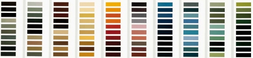
Ten Large Colour Charts/ Zehn große Farbtafeln, 1966, via gerhard-richter.com
Because there is no color chart folding screen. That work is Ten Large Colour Charts (1966), a ten-panel painting in the K20 collection in Dusseldorf. It is one of the earliest color chart paintings Richter ever showed, but it’s probably the first that many German art worlders ever saw. [Eighteen Colour Charts was the first first shown, in Richter’s one-person show at Friedrich’s Munich gallery in May 1967.]
Anyway, point is, or one point is, I think, that looking at Richter’s color chart paintings, and his 4900 Colours grids before that, and his Cologne Cathedral stained glass window before that, and so on, changes the way you look at the world. And by you, I mean, of course, me. It changes the way you look at color samples, whether in the paint store, or at the moment, in a grid laid out on a governmental stylebook website.
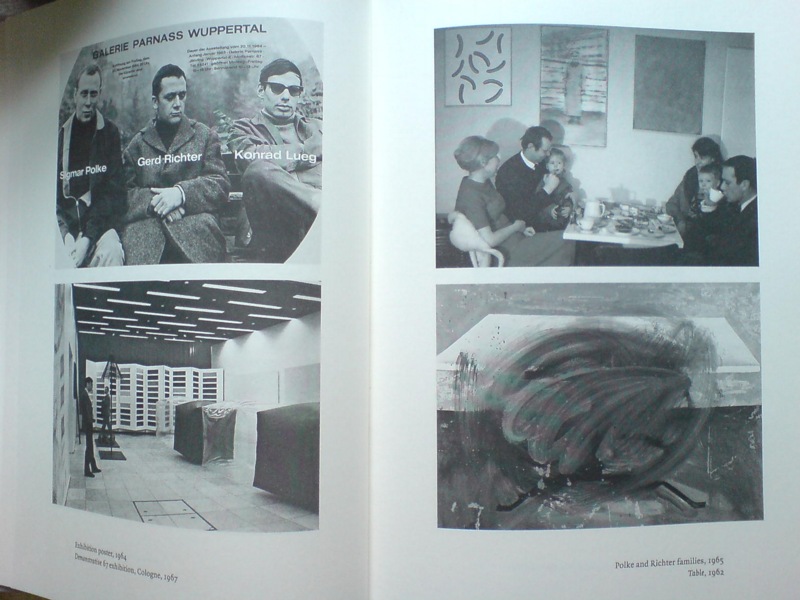
And it’s not just a matter of this looks like that, or not entirely. Because there’s also the context in which Richter painted his color charts–and the larger biographical/political context that shoots through Richter’s entire practice. That Demonstrative 67 photo is in a spread with what may be my favorite snapshot in the Writings book: on the right there, not Table, 1962, CR-1 [!]–which, if Christopher Wool can take up painting with that thing already in the world, color charts are not gonna hold me back–the one on top, with the caption, “Polke and Richter families, 1965.”
Oh, just drinking some tea with the kids and Uncle Rudi.
What I Looked At Today: Kabinetstukken
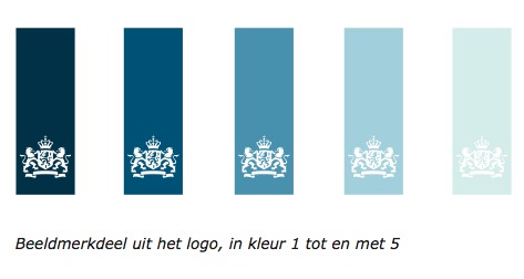
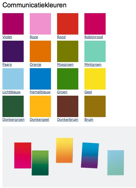
So lately, I’ve been thinking a lot about The Dutch, and their politics and art. The Rijkshuisstijl and 1 Logo Project, which redesigned and centralized the Dutch government’s visual identity, which happened to coincide with political shifts to the right, and swelling anti-Muslim intolerance, and suddenly, drastic budget cuts meant to cripple or destroy the liberal and visual arts establishment in the country. And a visual identity which ironically derives its central element, a 21-color palette, from the light and landscape as seen in Dutch Golden Age paintings.
And so of course, I have been thinking hard, still, about Vermeer painting his serene scenes in the midst and aftermath of a continent-wide, generations-long religious war.
And then someone, I can’t remember who, pointed last week to Morgan Meis’s discussion from Antwerp of Frans Hals, who was treading fine religious lines to make his proto-modernist paintings in a Dutch/Flemish culture where painting itself had become highly, politically and theologically charged.
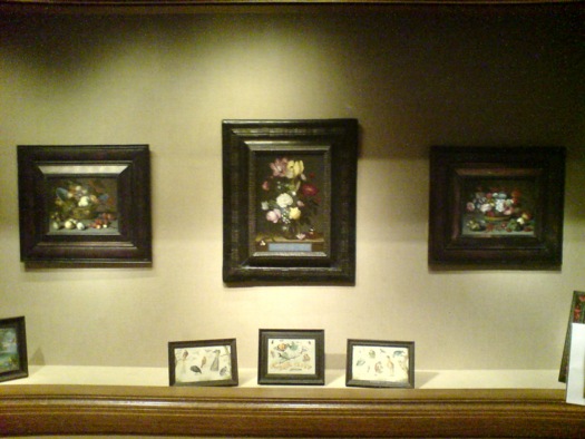
So I went to the National Gallery, where their Vermeers are tucked away in the Cabinet Galleries, a series of three tiny rooms carved out of a forgotten storage space in the mid 1990s. The scale approximates the collection rooms in 17th century Dutch & Flemish homes for which the small paintings were originally created.
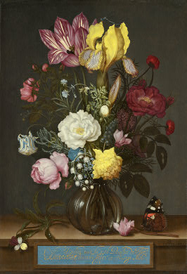
Bouquet of Flowers in a Glass Vase, Ambrosius Bosschaert the Elder, 1621, via nga
Here are three little paintings of a type I would have barely glanced at or ignored, if it weren’t for my peculiar Dutch color palette fixation: I mean, right? Still lifes of flowers and fruit? And yet they really are pretty amazing. And then you think about where and when and why they were made. According to the Cabinet Galleries brochure, which I had never picked up, such tiny paintings [7×9, 8×12] were called kabinetstukken, cabinet pieces.
The center painting, Bouquet of Flowers in a Glass Vase, was made in 1621 by Ambrosius Bosschaert the Elder. The NGA says without elaboration, “Bosschaert, who was born in Antwerp, moved to Middelburg after 1587 for religious reasons.” He was 14 at the time.
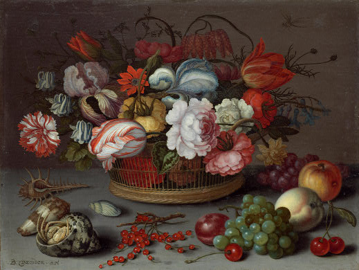
Basket of Flowers, 1622, Balthasar van der Ast, image: nga
This pair of kabinetstukken by Balthasar van der Ast apparently hung in the private chamber of Amalia van Solms whose husband Frederik Hendrik ruled over the Protestant Netherlands his father William of Orange fought to establish.
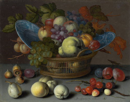
Basket of Fruits, 1622, Balthasar van der Ast, via nga
They are listed as gifts of Mrs. Paul Mellon.
Previously: the first What I Looked At Today included bigger, flashier Dutch painting: Van Dyck, Cuyp, etc.
Autoprotestazione
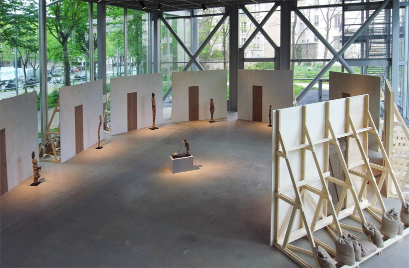
image: designboom
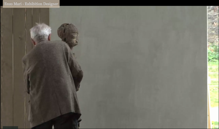
Enzo Mari was brought in to design the exhibition at the Fondation Cartier, Vaudon-Vodun, African Voodoo Art from the Collection of Anne and Jacques Kerchache. It’s simple and spectacular, and designboom has, as usual, rather comprehensive visual coverage of the project.
Above, a “film set” Mari calls The Village, autoprogettazione-esque backdrops to evoke the original context in which Kerkache would have first encountered the impressive household guardian figures. At least that’s how Mari explains it in the exhibition’s making-of interview video:
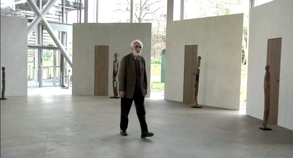
Holy smokes, filmmakers having Mari manhandle one of the guardians! Whether it’s our aging Maestro or the conservators, your insanely staged B-roll stunts are gonna give someone a heart attack!
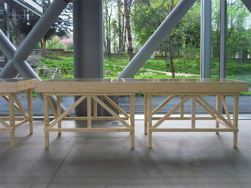
You don’t bring in a legend like Mari for his finesse at grouping sculptures. You bring him in to fill your glitzy Nouvel folly of a museum with endearingly humble-deluxe, purpose-built pine furniture!
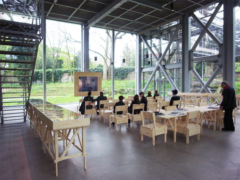
image: designboom
For the major autoprogettazione moment in the film/lecture/reference/public event space, with EFFE tables and SEDIA I chairs. Mais, qu’est ce-que c’est ca? New additions to the series? What’s that wood-framed flatscreen?
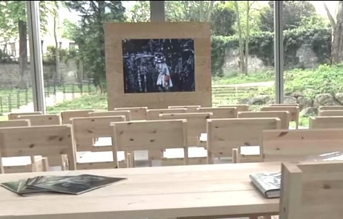
And are those DIY display vitrines ringing the room?
images above via designboom.com
Because the laborer should be able to knock together his own home theater–autoprogezzione?–and a case for his ephemera collection in a weekend using just the most humble materials from the corner hardware store. Or as designboom puts it, and quotes Mari:
the showcases, designed for this exhibition, partake of the same vocabulary.
“‘autoprogettazione’ has been a project for making furniture that the user could assemble simply from raw planks of wood and nails. a basic technique through which anyone with a critical mind could address the production of an object.”
So it’s for the [vitrine] user with a critical mind. Autoprogettazione as Institutional Critique. Can I have my show now, please?
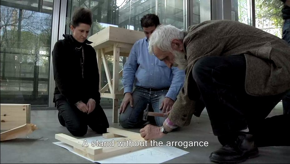
Let’s go to the tape: “There’s a display stand.”
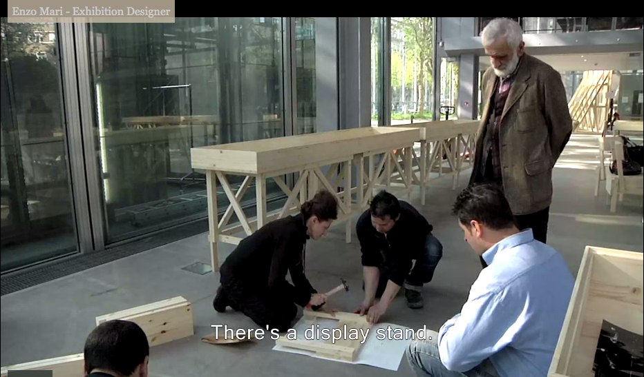
No no, no pressure, just Enzo #$()%ing Mari watching you build his iconic chair there.
“It must be simple.” Oh no, you B-roll knucklehead don’t do–
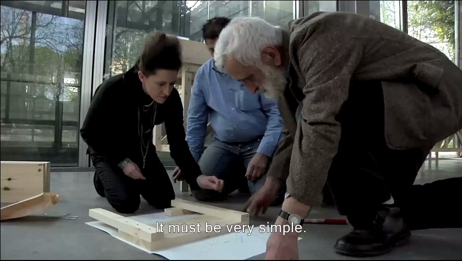
“A stand without the arrogance” YOU DID IT! YOU MADE HIM PICK UP THE HAMMER!
Oh, the horror. Why not just take him to a computer and make him fake type something for you? Or walk faux-purposefully down the Boulevard Raspail? How could– No.
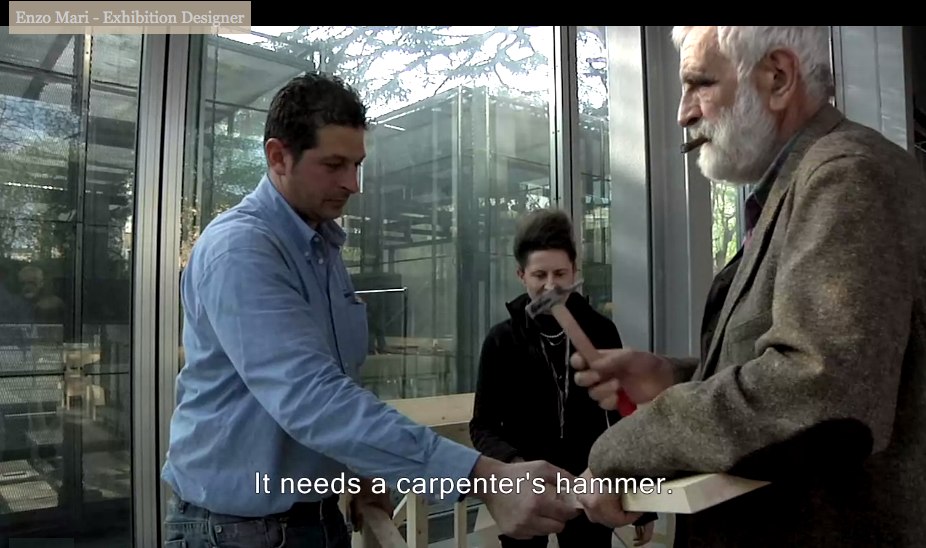
You did not just ask Enzo Mari to hammer something while he was holding it. If you can’t get your $#)(%ing shot, that’s your problem, don’t take it out on a great man like Prof. Mari. “It needs a carpenter’s hammer”? It needs a revolution. Langlois did not lose his job at the Cinematheque so that museum marketing video directors could wrap their late capitalist tyranny in the honorable flag of auteur theory. To the autoprogattazione barricades!
Right after we lock down the salvage rights to those 30 chairs, four tables, eight vitrines–and one flatscreen.

Here’s a shot, though, from Comrade Elena Vidor’s flickr.
UPDATE woo-hoo, and here’s an update from Venice, where Bruno Jakob has installed Breath, a very similar-looking, seven-part series of invisible paintings in and around the Arsenale.

Breath, 2011, via
Vaudou-Vodun, runs through Sept. 25 [vaudou-vodun.com]
Not Steinberg, Wallace, Nabakov Or Qaddafi
Oh brother, I have this giant post mostly written about how Leo Steinberg’s awesome 1997 lecture Encounters With Rauschenberg includes all these references that show that, not only did he recognize the intimate interrelationships between Johns’ and Rauschenberg’s early works, he also identified hints of dialogue, reference, in works made decades later.
And of course, I’m referring to Steinberg’s discussion of The Ancient Incident, the 1981 Combine/sculpture of a pair of lover/chairs pyramided atop some old steps, which is going to be in Gagosian’s Rauschenberg show in Paris next month. [Hold on, unless that’s the bronze replica Rauschenberg made of the sculpture in 2005. I think it may be. Except I just read the title of the image file, so no. 9/14 update: Except I just read the caption on the email announcement of the same show, and sure enough, this is patinated bronze, and, confusingly, is also titled The Ancient Incident (Kabal American Zephyr), but it has a date, 1981-2006, like it’s the same work, except it’s a different one, or. Anyway.]
I was really going to publish it, but it feels a little, I don’t know, sappy, hokey, romantic, even. But not crazy, AFAIK. As I write out these 2.25 paragraphs, I’m starting to wonder if the best way to put the info out there isn’t as an annotated, footnoted, republished version of Encounters With Rauschenberg, which reveals the lecture to actually be a secret, epic poem of the founding of Bob & Jap’s hometown of Zembla. I so totally called it.
But while busily not writing that, then, and worrying my over-conversational voice, over-excited art historical imagination, and my over-reliance on semicolons and footnotes is a sign of my over-doing it on the David Foster Wallace homage front–but see, Maud, my footnotes are from Pale Fire, not Infinite Jest! I don’t think I’m not copying Wallace; I think I’m not copying Nabokov! Nice work in the NYT Mag, btw!–John Powers matter-of-factly produced the greatest greg.org post ever. On his own blog, Star Wars Modern.
It’s all about the connections between previously overlooked satelloon mentions by Arthur C. Clarke and J.G. Ballard and Robert Smithson and Spiral Jetty. And with some steampunk Contact thrown in for free. I bow my head in awe and gratitude, and I look forward to seeing you back here after you’ve finished reading it.
And then I didn’t post it last night because, well, Libya, of course. Did anyone else notice this crazy, masking tape rebel flag behind these doctors treating a pro-Qadaffi soldier? [nyt/ap]

And then I didn’t fix the post because I was interested in Art In America’s report [via rkjd] that several months ago, John Chamberlain and Gerard Malanga quietly settled their lawsuit over the sale of 315 Johns, which Malanga and like a million other people insisted was his work, made of tons of silkscreened Chamberlain portraits as “an homage” to Warhol, but which Chamberlain claimed he had traded for with Warhol, and that Andy, he, and Henry Geldzahler had cooked it up in the first place, which is how Chamberlain managed to get it authenticated–and which he sold for $3 million at Art Basel “to an unidentified collector.” Mhmm.
My favorite part is how the case got resolved “a few weeks before the May 5 opening of Chamberlain’s first show at Gagosian.” Actually, that’s my second favorite part. My favorite part is the awesome quote Malanga’s lawyer Peter Stern gave AiA:
“[T]here has been no retraction of allegations in the complaint and no one has acknowledged that they are in possession of or know the whereabouts of the painting.
Well now. Glad that’s all cleared up.
Johns On Rauschenberg: A Show In Tokyo
Fear not, I have not given up the search for the missing Jasper Johns Flag painting. The one which was in Robert Rauschenberg’s 1955 combine, Short Circuit, a combine which was originally shown with the title, Construction with J.J. Flag. The combine which was the subject of an unusual agreement between the two artists after their bitter 1962 breakup, that it would never be exhibited, reproduced or sold. Which technically did not happen, since the flag painting was taken out in 1965, and Rauschenberg put the piece, with the title, Short Circuit, on a national tour in 1967 as part of a collage group show organized by the Finch College Museum.
Which, point is, in looking for the flag, I keep finding more things I had never heard about Rauschenberg’s and Johns’ time together, a point at which they each were making hugely important, innovative work. And frequently, it seems, they were working on it together. His, mine, and ours.
For a few months now, I’ve been thinking about a letter Johns wrote to Leo Castelli, which I’d come across at the Smithsonian’s Archives of American Art. I’ve been kind of slow to mention it, partly because it just feels a little weird, like going through someone else’s mail. Which I guess it exactly what an archive is, but still. Also, I’ve been wary of reading too much into a single letter, or of over-interpreting a single statement.
But then I’m constantly struck by how frequently a particular phrase uttered in a single interview can get echoed across the writing about an artist, as if that one statement from decades earlier is somehow not just a snippet of a conversation, but a key to deep meaning. So this overdetermining tendency is not mine alone, and whatever, take it for what it’s worth.
In the spring and summer of 1964, while Johns traveled to Japan, he scouted out Kusuo Shimizu’s Minami Gallery for a future Rauschenberg exhibition sometime after the fall. Johns had some pretty specific suggestions about what kind of Rauschenbergs would work in the small, tight space:
I should think that smaller works as different as possible from one another would be good. Or if Bob is going to
use repeatedrepeat images in all the paintings, one work the size of a wall + several much smaller things. If Bob were willing, I think a good effect could be made by having one large painting + several smaller ones which used the same silk screen images but reduced in size. That is, two screens should be made of each image – one large + one small. The opposite would also work – a large painting with smaller images + smaller ptgs. with larger images.
It’s not that Johns is prescriptive, designing his ex-partner’s paintings at a distance. His language is very careful to couch the decisions as Rauschenberg’s to make. But Johns also has a marked fluency in Rauschenberg’s composition and process, and he seems comfortable discussing it, at least with their mutual friend and dealer.
Johns could discuss Rauschenberg’s silkscreening techniques in detail in 1964, even though Rauschenberg only began using silkscreens in 1962, the year the two finally broke up. [Crocus, done in the late summer/early fall of ’62, is one of the first/earliest silkscreen paintings.]
In any case, one more datapoint. As it turns out, Rauschenberg’s show at Minami never ended up happening. Fresh off his hyped and controversial grand prize win at the Venice Biennale, but while he was still also working as the stage manager for the Merce Cunningham Dance Company’s world tour, Rauschenberg visited Minami Gallery in the fall of 1964.
According to Hiroko Ikegami, Rauschenberg walked in, saw an exhibition of Sam Francis, [“who was still respected and popular” in Japan], and walked right out. Shimizu was offended, and canceled Rauschenberg’s show. Maybe before Rauschenberg canceled it himself, who knows? The Merce tour was a personal disaster for Rauschenberg, and a rift developed between him and Cage and Cunningham which took several years to heal.